

Karina Caverdos – Chernenko
Quality dividend growth is core to how I build stock portfolios, so when the iShares Core Dividend Growth ETF (NYSEARCA:DGRO) popped up on my radar this morning, I thought I’d take a look at how this ETF compares with how I might build a dividend stock portfolio. Some of my main observations on DGRO, elaborated on below, include:
- DGRO’s expense ratio of 0.08% is cheap relative to the effort of creating a more focused dividend stock portfolio, but still almost three times the cost of a broader market index fund like Vanguard Total Stock Market ETF (VTI).
- Consistent with the idea that “you get what you pay for”, DGRO’s 2.1% yield is only slightly higher than VTI’s 1.5%, and the historic dividend growth rate of DGRO does not seem much higher than VTI’s.
- DGRO’s holdings seem to focus more on “hugging” the performance of a benchmark like VTI rather than providing a deeper focus on dividend yield or dividend growth.
- I believe an investor can do better than DGRO by simply selecting a few of DGRO’s “upper right quadrant” holdings, as described below, rather than this watered-down fund.
DGRO’s Performance
DGRO now has a live track record of 8 years, so although past performance is not my favorite metric of a fund, this next chart does tell me that we can suspect DGRO is a “benchmark hugging” fund relative to a benchmark fund like VTI.
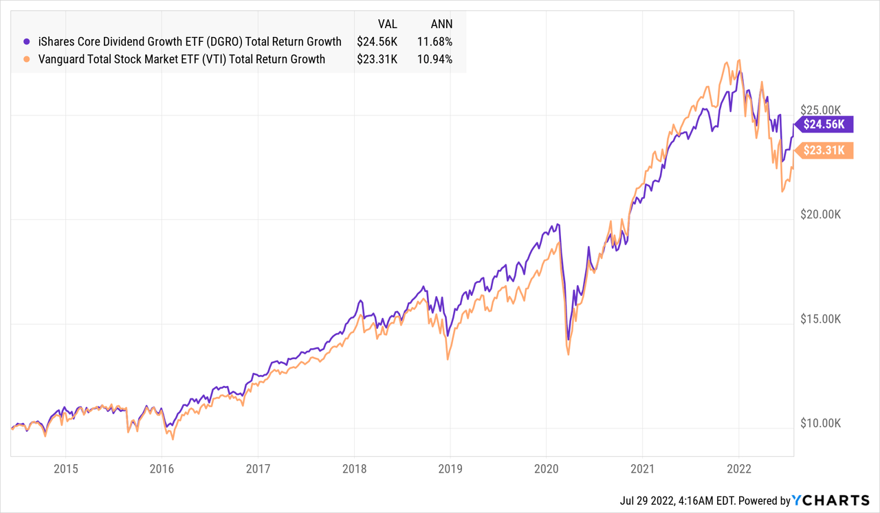
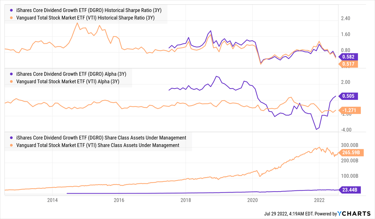
The above chart indicates that DGRO had slightly outperformed over the four years leading up to the COVID crash of 2020, then lagged VTI over the 20-month recovery following that crash, then outperformed by falling less than VTI so far in 2022. The following chart measures these relative “regimes” of outperformance vs. underperformance using Sharpe Ratio and Alpha metrics. Given these metrics, I find it quite remarkable that DGRO has managed to raise almost 1/10th the AUM of VTI even with its higher expense ratio, but that tells me more about how DGRO is marketed than how it is constructed.
DGRO’s Yield and Dividend Growth
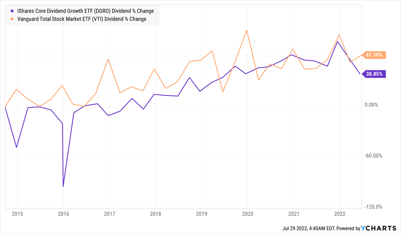
For a fund branded as “dividend growth”, many fund buyers would probably expect:
- A higher and more consistent dividend growth rate than the broader benchmark, and second
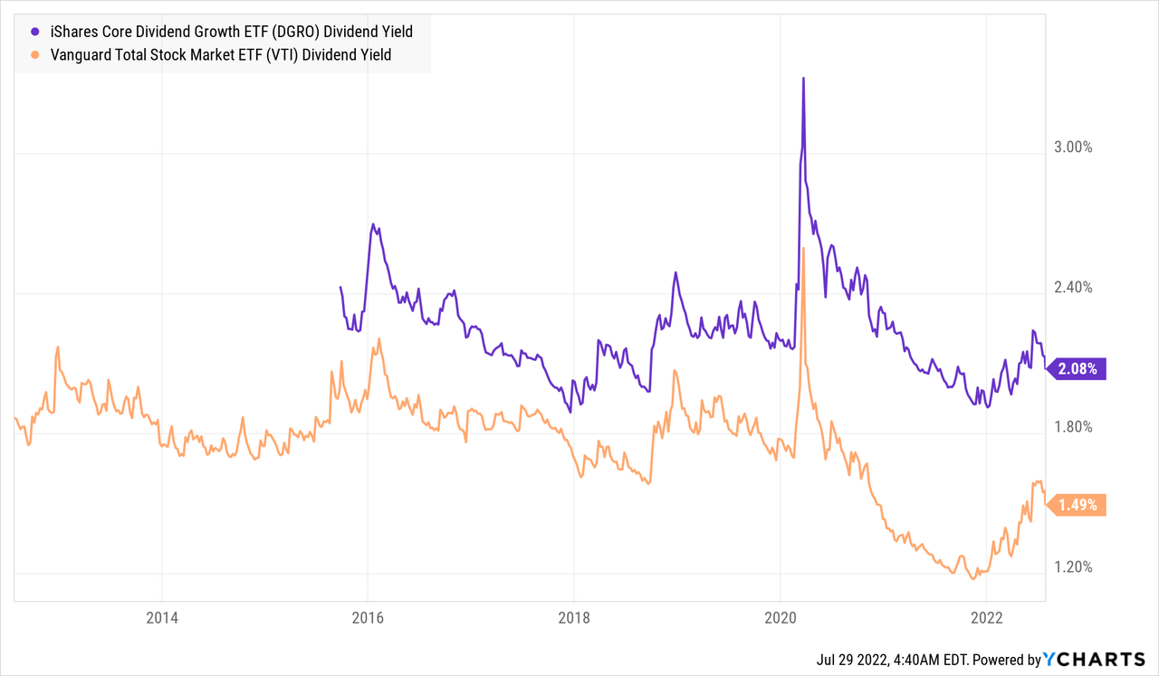
- A higher dividend yield than the broader market.
On the first metric, DGRO’s historic dividend growth rate seems to hug that of VTI’s, and at least according to this chart, has experienced slightly slower dividend growth than the benchmark.
This lack of faster dividend growth seems to be partly made up for by DGRO maintaining a slightly higher yielding portfolio than VTI, and this yield spread has widened to almost 60 basis points as of this writing. That said, a yield just above 2% is unlikely to satisfy many investors for whom dividend income is a priority, so without a significantly higher yield or dividend growth rate, prospective DGRO buyers should ask what they’re getting for an expense ratio almost 3x higher than that of VTI’s 0.03% per year.
DGRO’s Holdings
The core of a fund analysis should focus on what the fund currently holds, how those holdings got there, and whether you are better off buying those holdings in this fund package versus simply selecting a few of the best holdings directly. Here I break down the analysis of DGRO’s holdings into two parts:
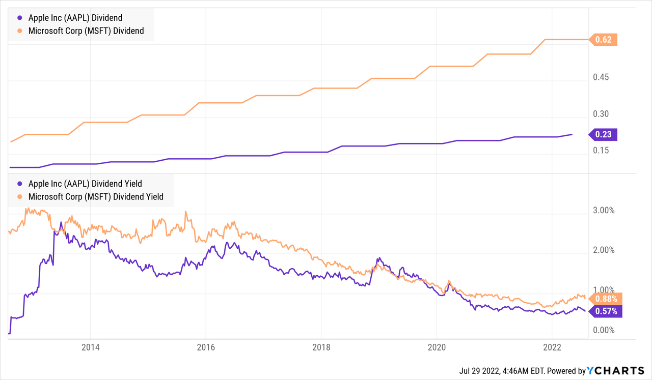
- Two of DGRO’s biggest holdings, Apple Inc (AAPL) and Microsoft Corp (MSFT), which I believe reflect how this fund hugs US large cap benchmarks, and how this pushes down the yield of the overall portfolio, and
- The distribution of dividend yield and growth among DGRO’s holdings, and some extremes on this chart worth a closer look.
DGRO’s Biggest Holdings
DGRO’s two largest holdings happen to be two of VTI’s largest holdings as well: Apple and Microsoft. Both do meet the definitions of being consistent dividend growers over the past 10 years, but their strong performance over those past 10 years has pushed their dividend yields below 1%. As each of these holdings are 3% of DGRO, inclusion of these mega-cap low yielders may make DGRO cheaper, more liquid, and more likely to hug the benchmark, but it also keeps DGRO’s yield lower than it would be if it instead focused on higher-yielding stocks.
DGRO’s Yield vs. Dividend Growth Scatterplot
Scatterplots are some of my favorite ways to visualize the fundamentals of a fund’s holdings, and the one below plots each stock’s past 5 years’ dividend growth rate on the x-axis, and dividend yield on the y-axis. A dividend growth fund should aim to screen out companies on the left side of this chart, while one focused on higher yield should focus on stocks in the upper parts of this chart.
Koyfin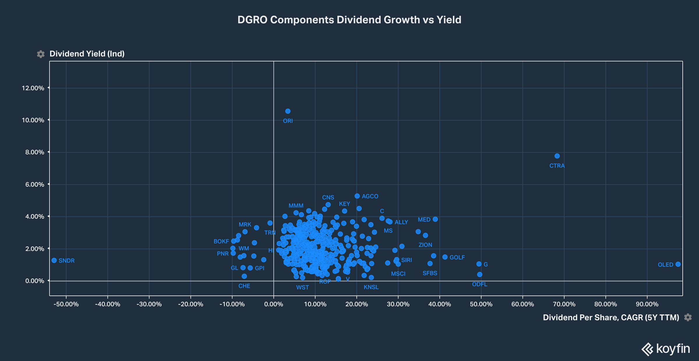
Three other holdings I thought worth picking out from the above chart are Waste Management Inc (WM), which appears on the lower left of the chart, 3M Company (MMM) from the upper-middle of the chart, and Broadcom (AVGO) from the middle-right of the chart.
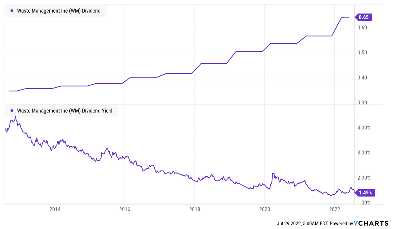
Outlier #1: Waste Management
Waste Management is 0.3% of DGRO’s portfolio, and is one of the dots on the left side of the above chart, indicating Koyfin records WM had cut its dividend over the past 5 years. The below chart indicates that the Koyfin data is wrong, and in fact WM has been raising its dividend consistently every year for the past 19 years. Like MSFT and AAPL, WM’s yield has declined significantly, and is now below that of the overall DGRO portfolio, so would probably be left out of a portfolio targeting higher yields. That said, the take away from sampling WM from the above chart is that the chart has errors, but the overall picture of DGRO holdings centering around 2% yield and high single-digit dividend growth rates is probably accurate.
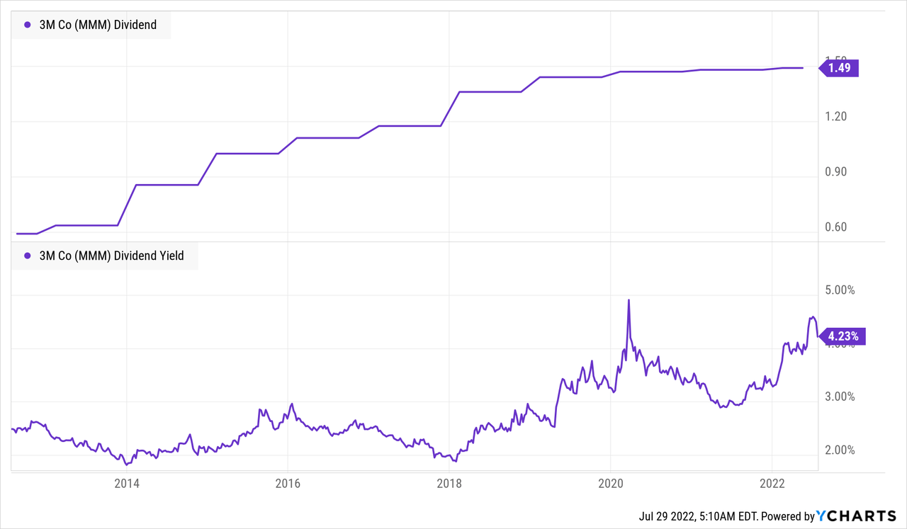
Outlier #2: 3M Company
MMM makes up almost 1% of DGRO, and is a name I have been accumulating more and more of now that its yield is back above 4%. The trade-off is that MMM’s dividend growth has slowed to what I sometimes refer to as a “dishonourable club” of companies that hike their quarterly dividend by one penny per year simply to maintain qualification as a “dividend aristocrat“. That said, I still think MMM is a good company and reliable dividend payer with some growth ahead of it, which is why I own it.
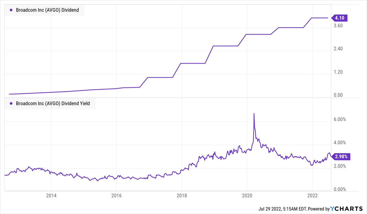
Outlier #3: Broadcom Inc
Last but not least in my sampling of DGRO holdings is AVGO, which makes up 1.9% of DGRO and seems to be above average in both yield and historic dividend growth. I have a small position in AVGO because it passed my quant screens, but have kept it small because I admit I don’t understand AVGO’s business as well as I understand any of the above four companies. That said, a “better than DGRO” dividend growth stock portfolio probably starts with selecting a few more patterns like AVGO’s.
Conclusions
Even though DGRO’s 0.08%/year expense ratio is still cheap in absolute terms, I see little advantage in paying up for a portfolio that seems more focused on keeping a low tracking error versus a fund like VTI than in focusing on the “upper-right quadrant” of dividend yielders and growers. MMM is an example of a higher yielding stock, and AVGO is an example of one with faster dividend growth, and investors would do better building their own portfolios focused on this quadrant, or finding a fund that does.
Be the first to comment