

Bet_Noire
IUSV strategy and portfolio
The iShares Core S&P U.S. Value ETF (NASDAQ:IUSV) has been tracking the S&P 900 Value Index since July 2000. It has 739 holdings, a distribution yield of 2.18% and an expense ratio of 0.04% (cheaper than most ETFs).
As described by S&P Global, S&P 900 constituents are classified in two “Value” and “Growth” styles using a systematic process based on three valuation ratios and three growth metrics. The valuation ratios are book value to price, earnings to price and sales to price. By construction, 33% of S&P 900 constituents exclusively belongs to each style, and 34% belong to both styles. The “Value” style subset serves as S&P 900 Value Index and is rebalanced annually. It is capital-weighted, with a “style strength” adjustment for constituents belonging to both styles.
IUSV invests mostly in U.S. based companies (98.7% of asset value). Large and mega-cap companies weigh about 74%, mid-caps about 22% and small caps less than 4%. As there is no S&P 900 fund, I will use a Russell 1000 index ETF (IWB) as a benchmark.
As expected, IUSV is cheaper than IWB regarding usual valuation ratios, reported in the next table.
|
IUSV |
IWB |
|
|
Price/Earnings TTM |
16.96 |
18.95 |
|
Price/Book |
2.56 |
3.5 |
|
Price/Sales |
1.61 |
2.22 |
|
Price/Cash Flow |
11.73 |
14.12 |
The top five sectors are healthcare (16.6%), financials (15.3%), industrials (13%), consumer staples (11.1%) and technology (10.7%). Other sectors weigh no more than 8% individually and 33% together. Compared to the Russell 1000, the fund overweight the top 4 sectors, along with energy, utilities, and to a lesser extent materials and real estate. It underweights technology, consumer discretionary and communication.
IUSV sector breakdown (Chart: author; data: iShares)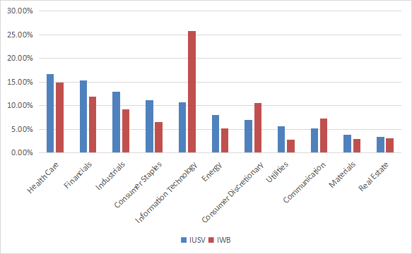
The top 10 holdings, listed in the next table with valuation ratios, represent 17.7% of asset value. The heaviest one weighs less than 3%, so risks related to individual stocks are low.
|
Ticker |
Name |
Weight |
P/E TTM |
P/E fwd |
P/Sales TTM |
P/Book |
P/Net Free Cash Flow |
Yield% |
|
Berkshire Hathaway, Inc. |
2.94 |
N/A |
21.95 |
2.35 |
1.53 |
34.96 |
0 |
|
|
Johnson & Johnson |
2.42 |
24.88 |
17.79 |
4.95 |
6.38 |
76.48 |
2.53 |
|
|
Exxon Mobil Corp. |
2.38 |
9.03 |
7.91 |
1.19 |
2.49 |
10.38 |
3.29 |
|
|
Procter & Gamble Co. |
1.84 |
25.87 |
25.68 |
4.64 |
8.64 |
85.86 |
2.45 |
|
|
Chevron Corp. |
1.69 |
10.38 |
9.49 |
1.55 |
2.23 |
13.49 |
3.11 |
|
|
UnitedHealth Group, Inc. |
1.5 |
26.29 |
24.38 |
1.62 |
6.82 |
19.95 |
1.23 |
|
|
Merck & Co., Inc. |
1.43 |
18.27 |
14.86 |
4.66 |
6.28 |
33.45 |
2.66 |
|
|
The Coca-Cola Co. |
1.28 |
27.96 |
25.63 |
6.53 |
12.16 |
64.14 |
2.76 |
|
|
Walmart, Inc. |
1.13 |
47.40 |
25.38 |
0.69 |
5.75 |
470.35 |
1.46 |
|
|
JPMorgan Chase & Co. |
1.11 |
11.50 |
11.81 |
2.91 |
1.58 |
5.14 |
2.94 |
Performance
Since inception (7/24/2000), IUSV has outperformed IWB by 86 bps in annualized return, but its maximum drawdown is deeper by almost 5 percentage points (see next table). Volatility (standard deviation of monthly returns) is not significantly different from the benchmark.
|
Total Return |
Annual Return |
Drawdown |
Sharpe ratio |
Volatility |
|
|
IUSV |
424.80% |
7.70% |
-60.43% |
0.45 |
15.94% |
|
IWB |
338.13% |
6.84% |
-55.68% |
0.4 |
16.08% |
Data calculated with Portfolio123
IUSV has alternatively beaten and lagged the broader index:
IUSV vs. IWB since July 2000 (Portfolio123)
In 2022, IUSV beats IWB and some competitors (SCHV, JVAL), but lags the Avantis U.S. Large Cap Value ETF (AVLV) by a short margin.
IUSV vs. competitors and IWB in 2022 to date (Portfolio123)
Comparing IUSV with my Dashboard List model
The Dashboard List is a list of 60 to 80 stocks in the S&P 1500 index, updated every month based on a simple quantitative methodology. All stocks in the Dashboard List are cheaper than their respective industry median in Price/Earnings, Price/Sales and Price/Free Cash Flow. An exception in Utilities: the Price/Free Cash Flow is not taken into account to avoid some inconsistencies. Then, the 10 eligible companies with the highest Return on Equity in every sector are kept in the list. Some sectors are grouped together: energy with materials, communication with technology. Real Estate is excluded because these valuation metrics don’t work well in this sector. I have been updating the Dashboard List every month on Seeking Alpha since December 2015, first in free-access articles, then in Quantitative Risk & Value.
The next table compares IUSV performance since inception with the Dashboard List model, with a tweak: here, the list is reconstituted once a year to make it comparable with a passive index.
|
Total Return |
Annual.Return |
Drawdown |
Sharpe ratio |
Volatility |
|
|
IUSV |
424.80% |
7.70% |
-60.43% |
0.45 |
15.94% |
|
Dashboard List (annual) |
1187.63% |
12.12% |
-57.52% |
0.68 |
17.14% |
Past performance is not a guarantee of future returns. Data Source: Portfolio123
The Dashboard List beats IUSV by a wide margin in return and risk-adjusted performance (Sharpe ratio). However, the ETF performance is real, whereas the model performance is hypothetical.
IUSV fundamental shortcomings
The two strategies are similar in complexity, so why is the difference so big? Most value indexes have two shortcomings in my opinion, and IUSV is no exception. The first one is to classify all stocks on the same criteria. It means the valuation ratios are considered comparable across sectors. Obviously they are not: you can read my monthly dashboard here for more details about this topic. A consequence is to privilege sectors where valuation ratios are naturally cheaper, especially financials. Some other sectors are disadvantaged: those with large intangible assets like technology. Companies with large intangible assets are those with a business model based on massive R&D, or a strong branding, or large user databases, or operating in a field where competition is limited by an expensive entry ticket. All these elements are not correctly reflected by valuation ratios.
The second flaw is using the price/book ratio (P/B), which adds some risk in the strategy. Intuitively, a large group of companies with low P/B contains a higher percentage of value traps than a same-size group with low price/earnings, price/sales or price/free cash flow. Statistically, such a group has a higher volatility and deeper drawdowns in price. The next table shows the return and risk metrics of the cheapest quarter of the S&P 500 (i.e.125 stocks) measured in price/book, price/earnings, price/sales and price/free cash flow. The sets are reconstituted annually between 1/1/1999 and 1/1/2022 with elements in equal weight.
|
Annual.Return |
Drawdown |
Sharpe ratio |
Volatility |
|
|
Cheapest quarter in P/B |
9.95% |
-72.36% |
0.48 |
21.05% |
|
Cheapest quarter in P/E |
11.25% |
-65.09% |
0.57 |
18.91% |
|
Cheapest quarter in P/S |
12.62% |
-65.66% |
0.6 |
20.46% |
|
Cheapest quarter in P/FCF |
12.23% |
-63.55% |
0.61 |
19.05% |
Data calculated with Portfolio123
This explains my choice of using P/FCF and not P/B in the Dashboard List model.
Takeaway
IUSV tracks a value index based on 3 valuation ratios. It holds over 700 stocks and its heaviest sectors are healthcare, financials and industrials. It is cheap in management fees, it has slightly outperformed the market since inception in 2000, and it beats most competitors in 2022. However, there are two points I don’t like in the underlying index: it ranks stocks regardless of their sectors, and one of the three metrics adds some risk in the strategy. An efficient value model should compare stocks in comparable sets (sector, industry), like I have been doing in the Dashboard List since 2015. My model also uses three valuation metrics, but prefers price/free cash flow to price/book. Moreover, a basic profitability rule helps filter out some value traps and normalize the number of components.
Be the first to comment