

24K-Production/iStock via Getty Images
In the last 80 years (including this year), the S&P 500 Index (not including dividends) has gained 9.2% on average (annualized return is 8.1%, dividends are not included.)
S&P 500 Yearly Chart With Returns and Statistics (Price Action Lab Blog – Norgate Data)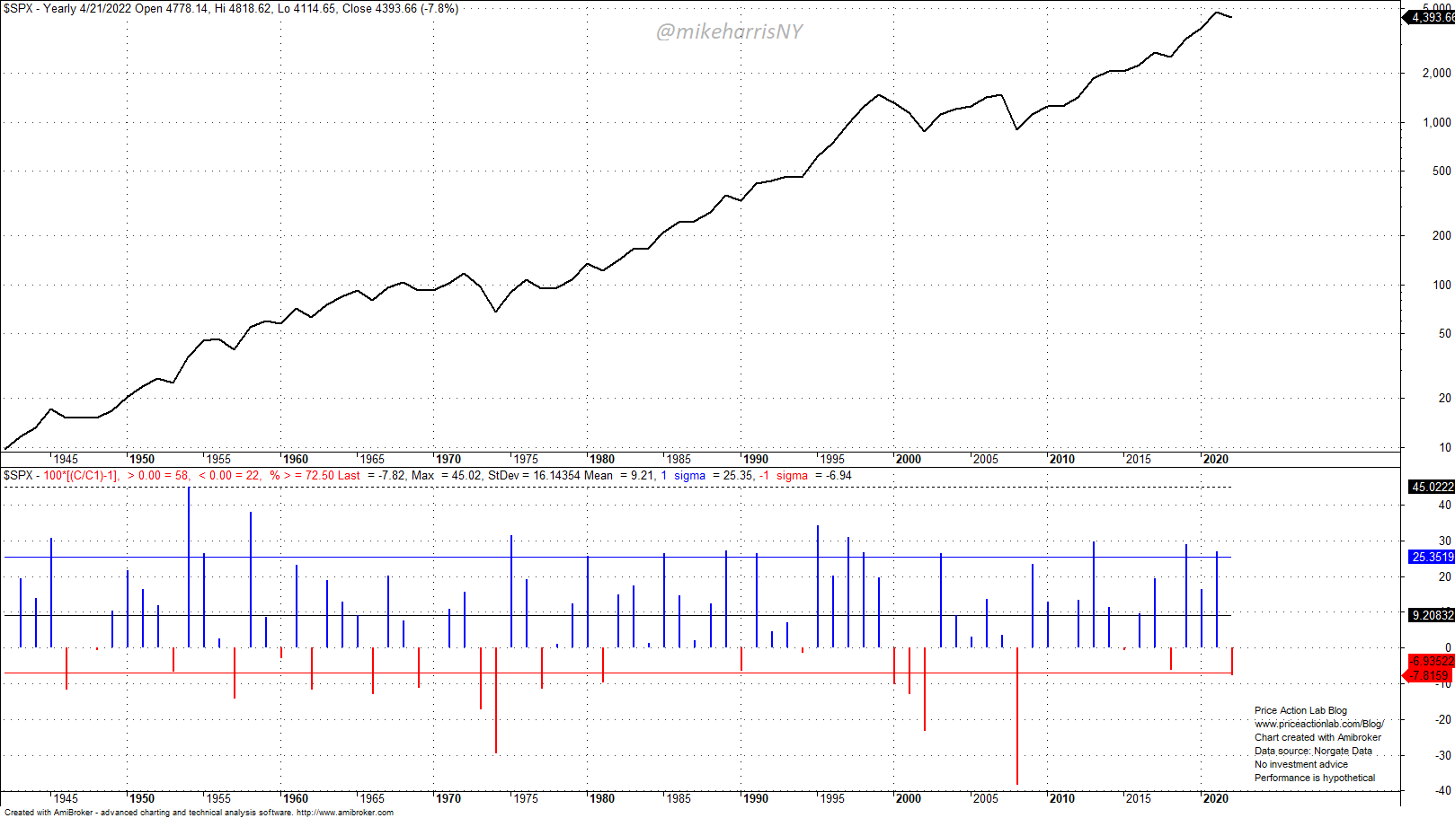
The index has gained in 58 years, or in 72.5% of the time. This is a high win rate and as a result, any forecasts of an up year are naïve in the mathematical sense. Investors are more interested in bear market forecasts for several obvious reasons:
- Protecting their portfolio value.
- Avoid large drawdowns and uncle points.
- Boosting returns by adding near bottoms.
Due to the long-term and persisting uptrend of the equity markets, bear market forecasts have a low probability of success. In the last 12 years, there have been numerous bear market forecasts by many market analysts, save the permabears, and they have all proven wrong.
Bear markets are inevitable but their timing cannot be established by any indicators and especially those based on the macroeconomic variables. The financial system is too complex and compressing it in a dual-axis chart is often an exercise in futility.
I look at a group of idiosyncratic indicators of price action in the hope they will provide clues about a bear market top formation while keeping in mind all shortcomings of this type of analysis and especially the small samples that limit any statistical significance. Four of these indicators are shown below.
1. Ratio of Nasdaq-100 (NDX) to Dow Jones Industrial Average (DJI)
NASDAQ-100/Dow Jones Industrial Average (Price Action Lab Blog – Norgate Data)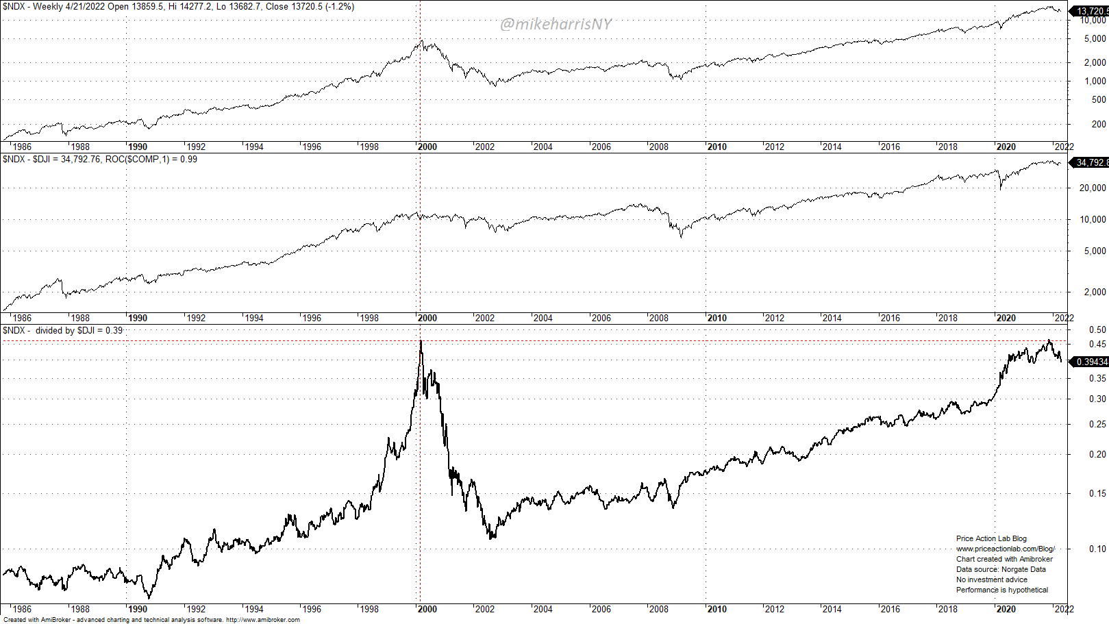
This is an indicator of “irrational exuberance” in a sense and it can be seen that it peaked at 0.46 in 2000 and at the top of the dot com uptrend. After a significant downtrend towards 0.1 that coincided with the 2000-2003 bear market, the indicator rose slowly to the same high value late last year. Is this signal of a bear market top? It could be but this is the smallest possible sample of one, although the indicator has some inherent fundamental value that indicates a high level of exuberance in the markets.
2. S&P 500 Growth to Value Ratio
S&P 500 Value to Growth Ratio (Price Action Lab Blog – Norgate Data)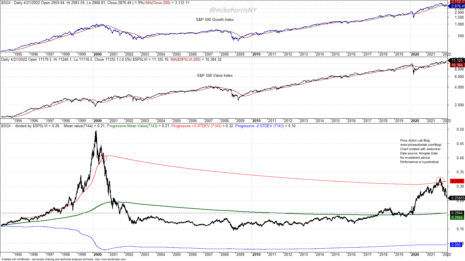
I like this indicator and in a way, it is related to the first one. The top chart shows the S&P 500 growth index, the middle chart the S&P 500 value index, and the third chart is their ratio. The progressive mean of the ratio and the two standard deviations progressive bands are shown on the chart.
I have indicated with red circles when the ratio broke below the upper two standard deviations band, the first time when the dot-com correction turned into a bear market. Another rise above the upper band followed by a break below occurred late last December. There may be a reversion to the mean with the ratio falling to the mean value of around 0.20. If this happens, then the current correction may turn into a bear market. Again, as with the previous indicator, this is a sample of one, but there is a real shortage of recent bear markets and there are no larger samples.
3. S&P 500 Average Return and Rolling Annualized Return
S&P 500 Average Returns and Rolling Annualized Return (Price Action Lab Blog – Norgate Data)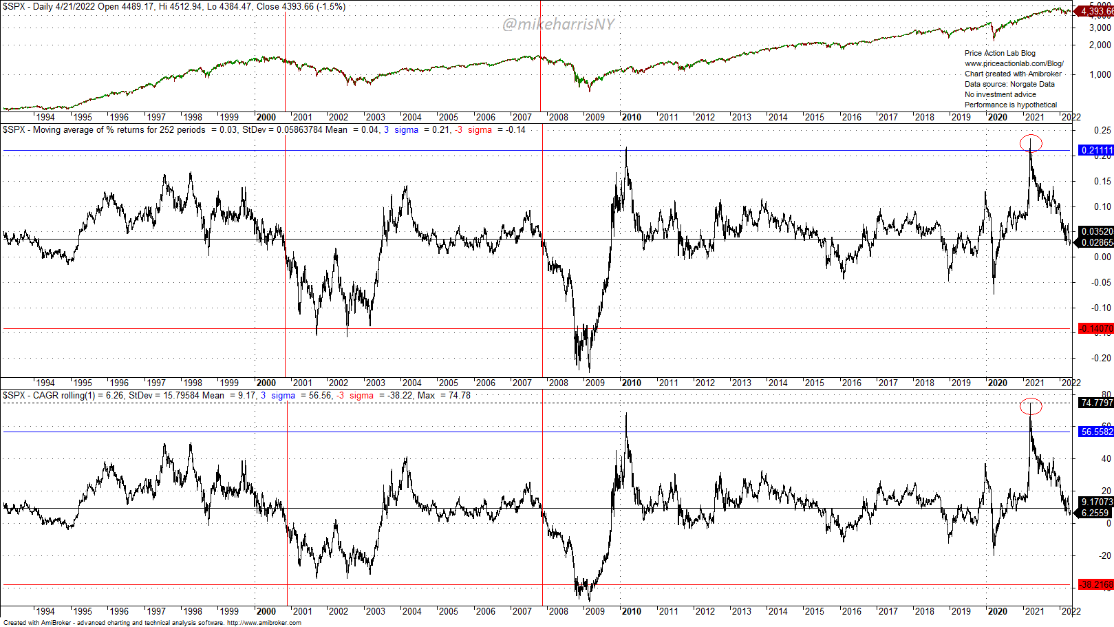
I especially like those two indicators (they are related) because they reflect performance. The second chart shows the rolling moving average of daily returns in a 252-day lookback period and the bottom chart shows the rolling annualized return in the same period.
The two vertical red lines show that in the past, bear market tops formed when these two indicators reverted to their mean values. Also note that in March of last year, these indicators reached new, all-time high values, but have already reverted to their mean values. The combination of extreme values and the reversion to the mean increases the odds of continuation, as it occurred after the 2000 and 2007 reversions. Again, we have a sample of two and several false signals in the past but we evaluate these indicators as part of a group and not in isolation.
4. Number of Days With Higher Open and Lower Close in SPY ETF (NYSEARCA:SPY)
SPY ETF Number of days with higher open but lower close (Price Action Lab Blog – Norgate Data)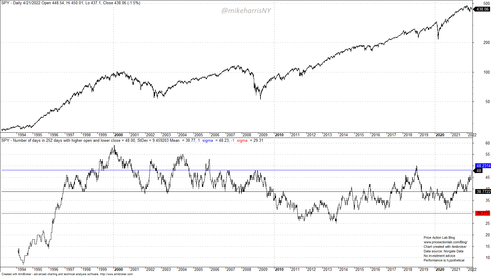
I use a 252-day rolling period. I like this indicator because extreme values during a strong uptrend indicate increasing weakness as traders sell the rips. In early 2000 this indicator reached an all-time high while the uptrend was strong and a bear market followed. Any causality here may be random. There were also a few false signals in the 2000s. The indicator value broke above one standard deviation of the available sample before the 2018 correction and it has now nearly matched those levels. This indicator is not flashing a bear market signal, at least not yet, but any gains above 50 could signal the deteriorating strength of the market. Normally, if traders and investors are selling intraday rips, this is not a good indication of market strength. By the way, this is what occurred yesterday, April 21, 2022, with the market opening higher and then reversing to close much lower.
Summary: There is no single indicator that conveys the state of the market. Usually, traders and investors look at an array of indicators they think can provide useful information. I have listed four such indicators above and discussed some of the problems and limitations.
Be the first to comment