

RichVintage/E+ via Getty Images
Over the last few months, I have written a host of articles about the tech sector and cyclical stocks, and this has been an argument embedded within a larger thesis on the market as a whole (essentially the S&P 500) and commodities. I am bearish on all of these, but I am most negative on tech stocks, especially the large caps, over the long term. I expect cyclicals, especially small-cap energy stocks, will outperform tech and the market as a whole over the remainder of the decade. But where do financials fit in to such a narrative? In this article, I am going to look at the relationship between financial stocks and the commodity and bond markets, as well as the broader equity market. Unsurprisingly, for readers of my previous articles, I am negative on the benchmark Financial Select Sector SPDR Fund (NYSEARCA:XLF). It might serve as a useful short-term hedge against rising rates and inflation, but commodities or commodity stocks (e.g., energy, mining, steel) would probably do this better.
Overall market outlook
Why ought we be pessimistic about long-term returns for the market as a whole? In brief, on previous occasions where we have had both a low earnings yield (that is, a high PE) on the market and high levels of long-term earnings growth, a long-term negative growth shock has occurred that brings earnings well below that suggested by the market PE ratio.
Long-term earnings growth and the earnings yield have historically been positively correlated in a manner reminiscent of the ” Gibson Effect“-the historical relationship between commodity inflation and the earnings yield-which I described in my last piece on commodities. This correlation has only broken down at the conclusion of “secular” bull markets, and has been followed by a growth shock. These relationships are summarized in the following two charts, which I pulled from The Death Of Irrational Exuberance, Part 4.
Chart A. When earnings growth and the earnings yield are negatively correlated, subsequent long-term growth is weak. (Robert Shiller data) Chart B. Correlations between growth and the earnings yield tends to occur near the peak of valuations. (Shiller data)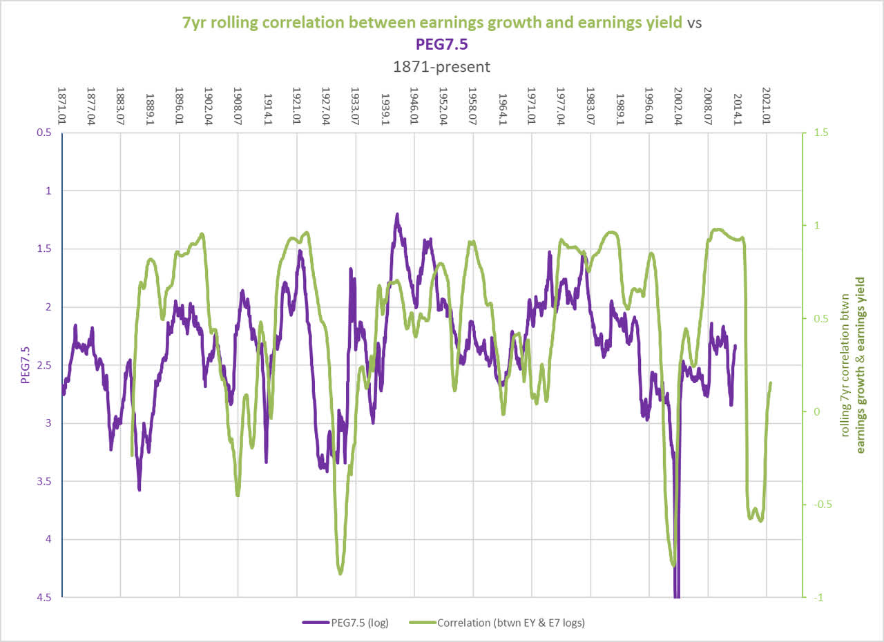
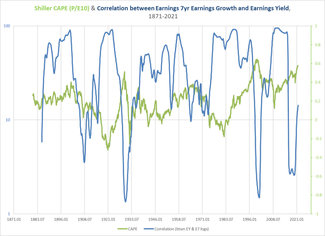
As I described in ‘The Death Of Irrational Exuberance, Part 5’, Shiller’s CAPE ratio can be thought of as the ratio between current PE times long-term earnings growth. In the last century, these two measures have only risen simultaneously in the 1920s, 1960s, 1990s, and the 2010s, and on each occasion the realized PEG ratio spiked and markets were flat to negative for roughly 14 years.
These high growth/high PE periods also saw strong performances in the tech sector and weak performances in energy. Once that sectoral pattern reversed (as in the 1930s, 1970s, and 2000s), markets as a whole did poorly. This is a point I tried to make in ‘Where Ruchir Sharma And I Disagree On The Coming Decade’: except where markets are recovering from a depression, anticipation of a long-term outperformance in the energy sector implies anticipation of a bear market for the equity space as a whole.
So, how has that impacted financials?
The composition of the XLF
If you look at the relative performance of XLF in the following chart, you can see that it has effectively tracked the S&P 500 for the last decade, slightly better when things are relatively good and slightly worse when things are not so good.
Chart C. The XLF/SPY ratio has traded within a range for the last decade. (Stockcharts.com)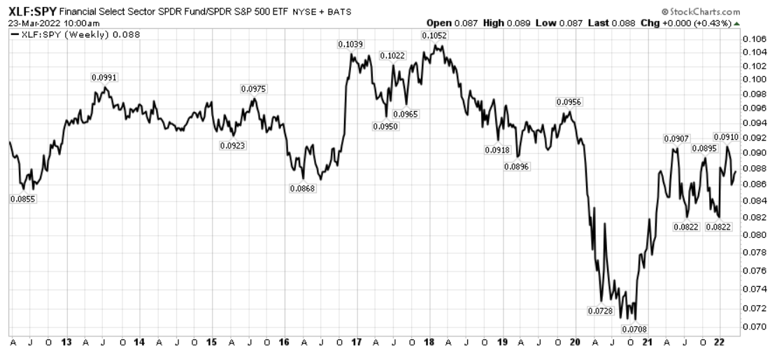
Based on the earlier work I have published on long-term sector rotations (defined here as inversions of sectoral hierarchies), that suggests that under current conditions, XLF might not be expected to appreciably separate itself from the index.
In other words, XLF is likely not among the cyclicals that will outperform the broader market over the remainder of the decade. That is partly because financials do not seem to have been especially cyclical historically, although that has changed to some degree in recent decades. I measure cyclicality primarily by the degree to which cyclical changes (changes relative to 36-month moving averages) in a factor correlates with cyclical changes in S&P earnings, but I will also introduce a new measure for gauging cyclicality later in the discussion.
I determined this by analyzing Fama-French industry data that goes back to 1926. In the following table of XLF’s top 20 holdings, I listed the Fama-French 12-sector designation each company would be assigned based on its SIC classification.
|
The Financial Select Sector SPDR Fund holdings as of 21-Mar-2022 |
||||||
|
Name |
Ticker |
Weight |
Cumulative weight |
GICS Industry |
FF12 |
|
|
Berkshire Hathaway Inc. Class B |
14.9 |
14.9 |
1 |
Diversified Financial Services |
Money |
|
|
JPMorgan Chase & Co. |
9.6 |
24.4 |
2 |
Banks |
Money |
|
|
Bank of America Corp |
7.1 |
31.5 |
3 |
Banks |
Money |
|
|
Wells Fargo & Company |
4.6 |
36.1 |
4 |
Banks |
Money |
|
|
S&P Global Inc. |
3.3 |
39.4 |
5 |
Capital Markets |
Other |
|
|
Charles Schwab Corp |
3.1 |
42.5 |
6 |
Capital Markets |
Money |
|
|
Morgan Stanley |
3.0 |
45.6 |
7 |
Capital Markets |
Money |
|
|
American Express Company |
2.7 |
48.3 |
8 |
Consumer Finance |
Money |
|
|
Goldman Sachs Group Inc. |
2.7 |
50.9 |
9 |
Capital Markets |
Money |
|
|
Citigroup Inc. |
2.6 |
53.6 |
10 |
Banks |
Money |
|
|
BlackRock Inc. |
2.4 |
56.0 |
11 |
Capital Markets |
Money |
|
|
Chubb Limited |
2.1 |
58.1 |
12 |
Insurance |
Money |
|
|
CME Group Inc. Class A |
2.1 |
60.2 |
13 |
Capital Markets |
Money |
|
|
Marsh & McLennan Companies Inc. |
1.9 |
62.1 |
14 |
Insurance |
Money |
|
|
PNC Financial Services Group Inc. |
1.9 |
64.0 |
15 |
Banks |
Money |
|
|
Truist Financial Corporation |
1.8 |
65.8 |
16 |
Banks |
Money |
|
|
Intercontinental Exchange Inc. |
1.8 |
67.6 |
17 |
Capital Markets |
Money |
|
|
U.S. Bancorp |
1.8 |
69.3 |
18 |
Banks |
Money |
|
|
Aon Plc Class A |
1.6 |
70.9 |
19 |
Insurance |
Money |
|
|
Progressive Corporation |
1.5 |
72.4 |
20 |
Insurance |
Money |
|
Ninety-four percent of XLF’s holdings fall within the Fama-French 12 Money index, so that is the data set we will use to look at historical financial behavior. In broad terms, the index is roughly equally divided between banks, insurance, and capital markets.
Chart D. XLF is roughly equally divided between banks, trading houses, and insurance. (State Street Global Advisors)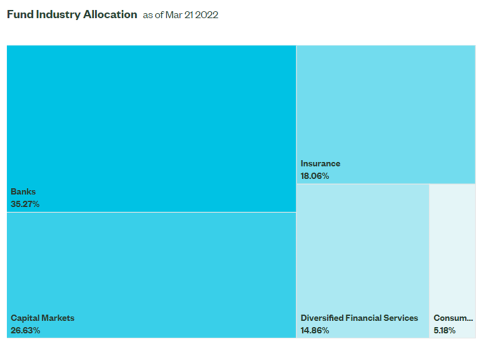
These numbers tend to vary a bit over time, as the following chart from S&P Global suggests.
Chart E. The specific proportions among financial industries vary a great deal over time. (S&P Global)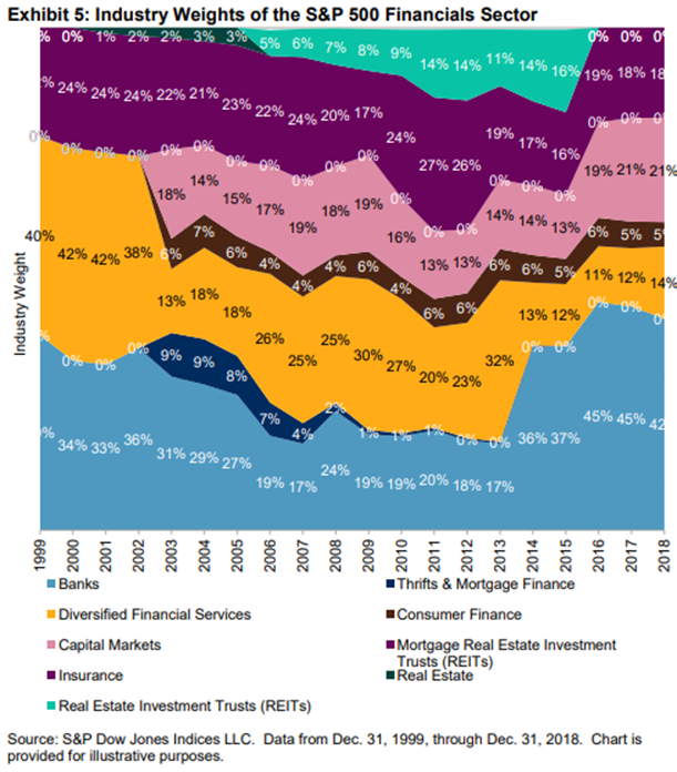
So, let’s look at the history of the Fama-French Money sector to see what kind of conditions favor or impair financial stocks.
Historical performance of financial stocks
Let’s begin with the relationship illustrated in Chart C. Below is the relative performance of financials and the S&P Composite. Large caps have generally traded with the S&P over very long timeframes.
Chart F. The ratio of large-cap financial stocks to the S&P Composite has traded in a range for the last century. (Fama-French data, Shiller data)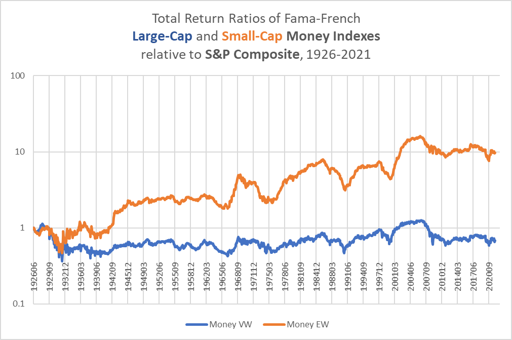
Unlike with other sectors I have covered in Seeking Alpha, particularly tech-heavy indexes like XLC, XLK, and XLY, and cyclicals like XLE, XLB, and XLI, financials seem to have consistently tracked the performance of the market as a whole. The following chart shows the relationship between the dividend yield for financials and the S&P.
Chart G. The dividend yields on financials and the S&P track each other. (Fama-French, Shiller)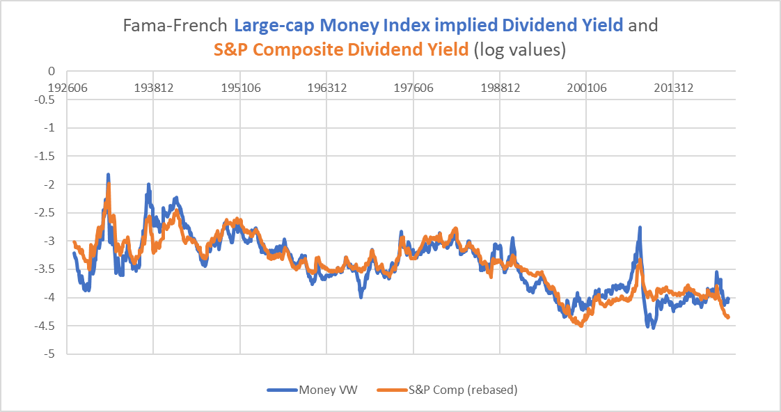
This is reflected in the relative positions of the dividend yields of XLF and SPY.
Chart H. The dividend yield on XLF is modestly higher but this has made little difference in terms of long-term relative performance. (Seeking Alpha)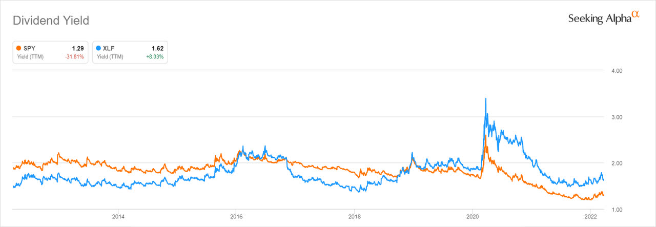
There is only a very modest correlation (0.18) between the spreads on these yields and subsequent relative returns, but there is a slightly more robust correlation between the absolute yield and financial returns, which is illustrated in the following chart.
Chart I. The dividend yield has anticipated future returns more often than not. (Fama-French)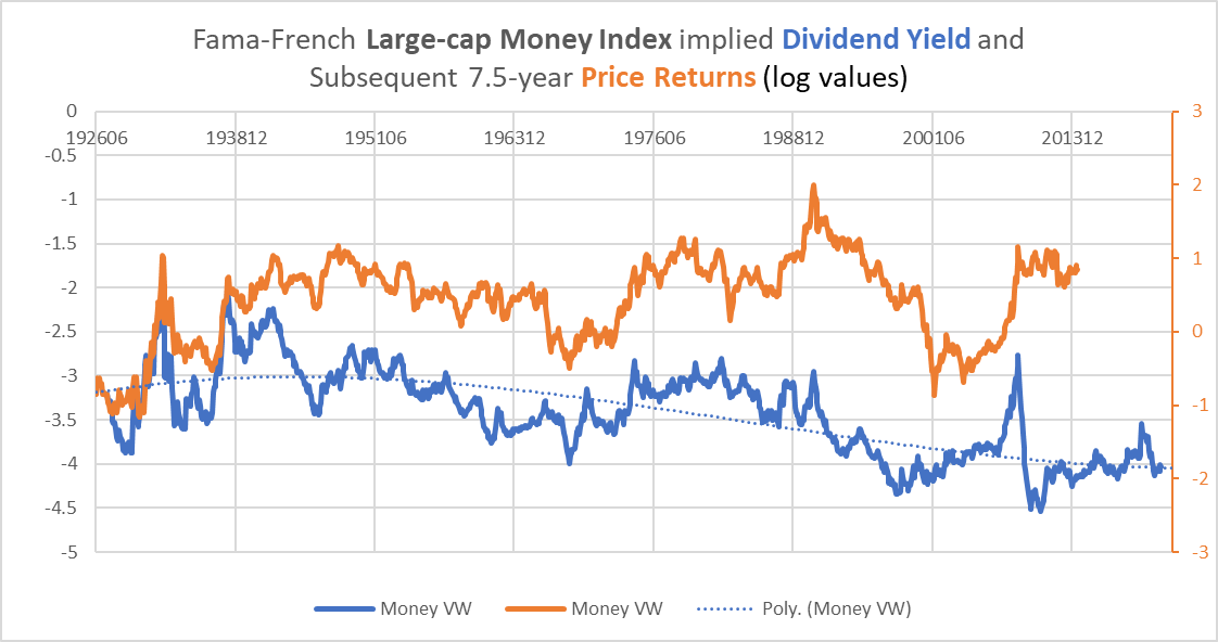
The correlation between the yield and subsequent total returns is 0.39, and if the yield is naively detrended to take account of the structural decline in dividend yields, the correlation rises to 0.61. If one accepts that there is a relationship here and that the yield is historically low, that raises the odds that future returns in financials will also likely be low. If one accepts the first part of that argument but believes that the structural decline in dividend growth is a trend that will continue into the foreseeable future, then the yield does not appear that low, and we might expect modest future returns. As I have argued in previous articles, but most especially in “The Death of Irrational Exuberance” series, these yields are likely to normalize in coming decades. Therefore, I suspect they are on the low side and indicate lower returns over the remainder of the decade.
Financials and dividend growth
Unlike most industries and sectors covered here in the last couple months, financial stocks tend to trade with their dividend growth.
Chart J. Somewhat unusually, dividend growth and stock price performance move together in the financial sector. (Fama-French)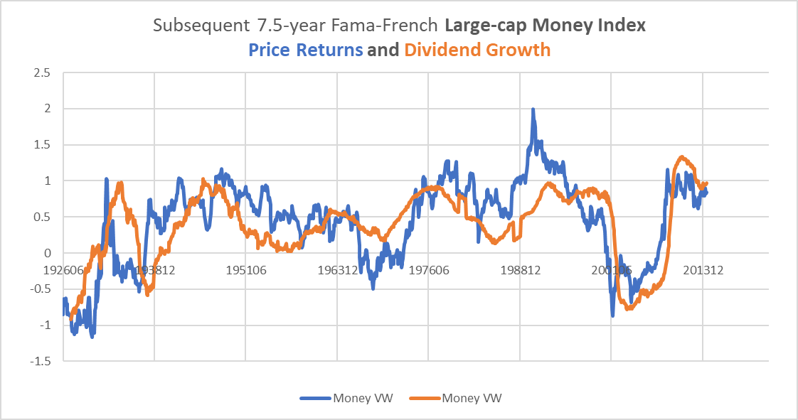
In software stocks, for example, discussed primarily in my article on XLC, we found that earnings and prices tend to move inversely of one another. This is a tendency in technology stocks generally.
Chart K. In tech stocks, growth and price tend to be negatively correlated. (Fama-French)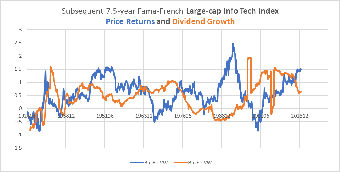
Interestingly, since the 1950s, dividend growth in financials seems to lag long-term earnings growth in the S&P Composite by a couple of years. I have tried to illustrate that in the following chart, which shows long-term dividend growth in financials in blue and long-term S&P earnings growth in orange, as well as a 7.5-year moving average in earnings growth in black.
Chart L. Oddly, dividend growth in financials seems to lag earnings growth in the S&P. (Fama-French, Shiller)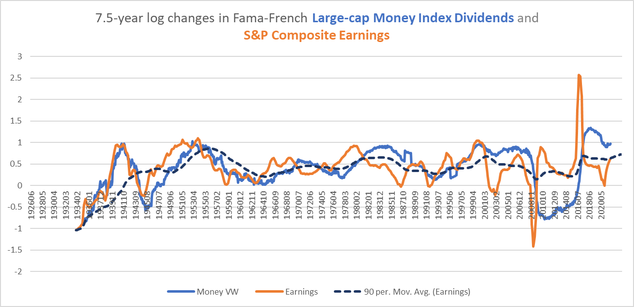
The correlation between this moving average of market earnings growth and dividend growth in financials is 0.67, but perhaps it is spurious. I also checked the relationship between this lagged earnings growth and smaller industrial categories in the Fama-French data. The correlations were highest in Insurance (0.61) and Banking (0.58), with Trading (that is, Capital Markets) at 0.46.
Dividend growth has been unusually high due probably in part to the recovery from the damage caused in the GFC of 2008. All else being equal, we might expect that to normalize, especially as the rate of long-term earnings growth normalizes.
Financial stock prices
We get a similar but somewhat weaker pattern if we compare a moving average of earnings growth with the stock price, but there are some instances where stocks fail to live up to their potential, such as in the 1970s and 2000s.
Chart M. Financial stock prices are much less correlated with lagged earnings growth. (Fama-French, Shiller)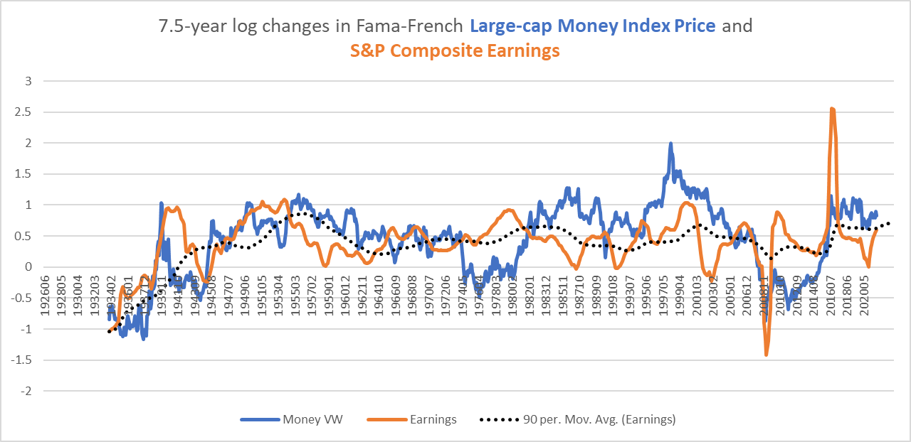
The chart below shows long-term growth rates in the S&P Composite, financial stocks, and commodity prices.
Chart N. Financial stock price performance is highly correlated with the S&P. (Fama-French, Shiller, World Bank, St Louis Fed, Warren & Pearson)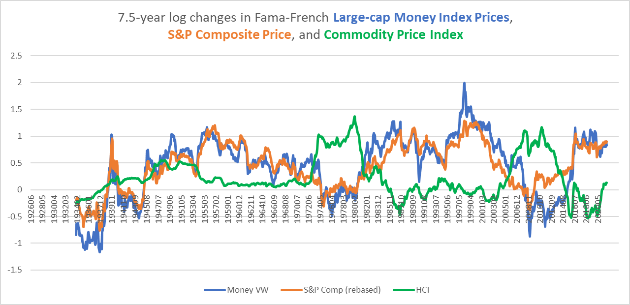
Periods with high commodity prices saw sharply lower price returns in financials. Indeed, in every secular bear market in the S&P (for the purposes of this argument, low to negative long-term price returns), financials underperformed (e.g., the 1930s, 1940s, 1970s, 2000s).
We can see in the following chart that, as with most other sectors, as long as earnings growth in the broader market (orange) remains higher than commodity inflation (green), financial stocks (blue) should remain positive.
Chart O. As with most sectors, financials do well when S&P earnings beat commodity inflation. (Fama-French, Shiller, World Bank, St Louis Fed, Warren & Pearson)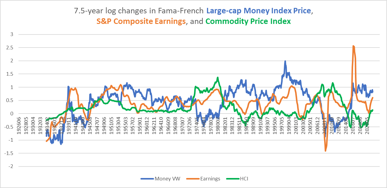
So, the ingredients of a strong long-term financials market are a strong market in general, strong earnings growth across the market, high levels of dividend growth in financials, and relatively low commodity inflation.
Summary of long-term trends
My opinion, of course, is that almost none of these conditions will still hold by the end of the decade, except perhaps low commodity inflation, and the trigger is likely to be the current spike in commodity prices. This goes back to my thesis, updated here, that changes in the long-term market behavior (both at the market and sector levels) is largely determined by changes in the long-term trend of energy prices, and that changes in the long-term trend of energy tend to occur when there is a high degree of sectoral dispersion (as we have had in the last decade), and those changes tend to coincide with energy shocks (as in 1999-2000, 2008-2010, and at present). Long-term tectonic shifting in the energy market suddenly erupts into price spikes and when those spikes end, the terrain is no longer the same. And, the transition does not have to be from ‘energy bear’ to ‘energy bull’. Even a transition to ‘energy flat’ is good enough. The massive decline in commodity prices in the 1920s was followed by a gentler rate of decline in the 1930s, with some spikes along the way. The decline in the early 1980s coincided with a bull market that came to a crashing halt in 1987, when oil prices nearly doubled. What followed was a flatish oil market and slower appreciation in stocks. Some form of this pattern is likely to be the case in the remainder of the 2020s, as we shift from a regime in which prices went to $0 a barrel to something more sustainable.
Financials and the market cycle
Over the shorter term (one to three years), this is likely to lead to a crash in stocks, including financials, and a relative outperformance in bonds. The following chart suggests that most crashes in financials (here measured as 36-month drawdowns in monthly averages of the financials/bond ratio) have coincided with or been preceded by spikes in energy prices.
Chart P. Financials tend to lose to bonds after energy shocks. (Fama-French, Shiller, St Louis Fed)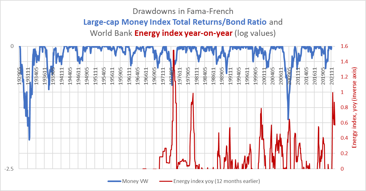
Do financials make a good hedge against rising rates in the meantime? Maybe. If you google “XLF interest rates”, the search engine will produce a host of articles with titles like “Best ETFs for rising interest rates” which recommend XLF because of the net interest margins expected from higher yields, but the relationship between financials and long-term interest rates is at best a mixed bag.
Historically, financials had not been especially correlated with interest rates until the last twenty years. If financials were correlated with yields over cyclical durations, we might expect to see the ratio of financial stocks to bond returns correlate with Treasury yields, a measure I have illustrated in the following chart. (The bond returns here are calculated using a reconstructed set of historical long-term Treasury yields prior to the 1950s; using annual values for Treasury yields from Shiller as a baseline, I approximated monthly moves using corporate bond changes within a given year and then cross-referencing the result with New England municipal bonds. Data for historical corporate and municipal bonds can be found on the St Louis Fed’s website).
Chart Q. If financials responded meaningfully to interest rates, this correlation would be consistently positive. (Fama-French, Shiller, St Louis Fed)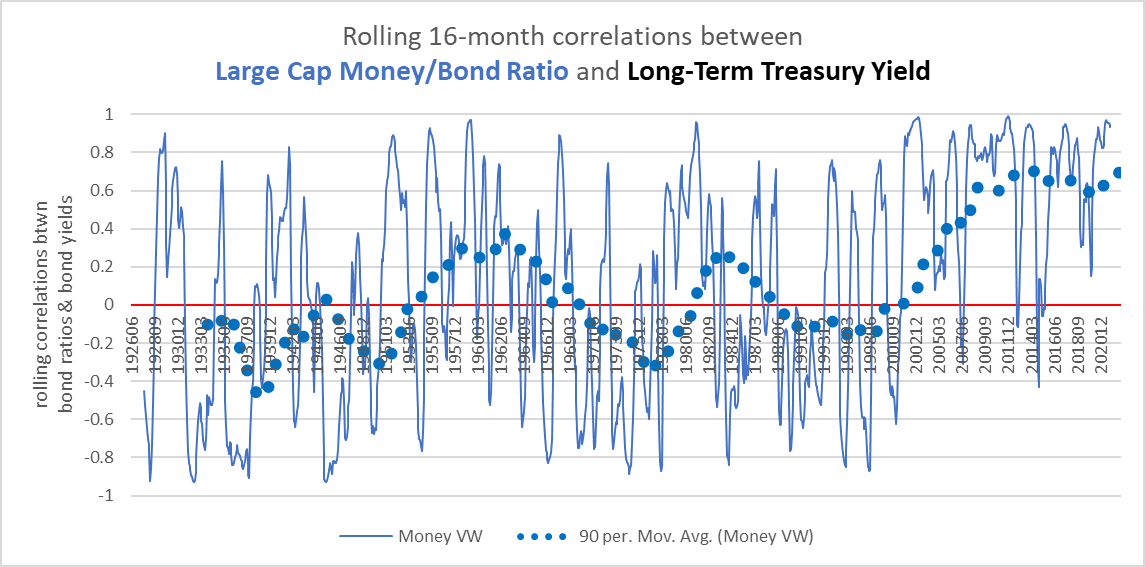
But, up until the early 2000s, there had been effectively zero long-term correlation between the two. In fact, financials have one of the lowest correlations of all the sectors (with banks being one of the lowest of the Fama-French industries). Unsurprisingly, energy and steel have higher correlations, but so do a lot of other industries. This rise in the correlation of the last twenty years has been experienced across nearly every sector and industry, so this particular development is not something that is confined to financials. What is unique in financials is how low the correlation had been prior to the 2000s.
Most of this holds true for the relationship between financial return cycles and S&P earnings cycles, as well. There have only been two occasions in which financial stocks were highly correlated with the earnings cycle: the 1930s and the last twenty years.
Chart P. Financials have only been correlated with the market cycle in the 1930s and 2000s. (Shiller, Fama-French)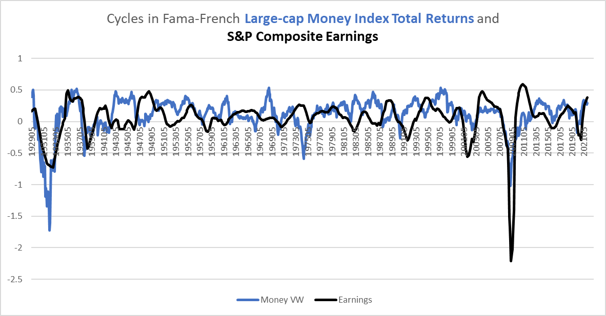
So, all else being equal, financials might be a good place to hide out from a storm of rising yields, but do not be surprised if that relationship breaks down in the future.
Chart Q. This relationship is likely to hold…for now. (Stockcharts.com)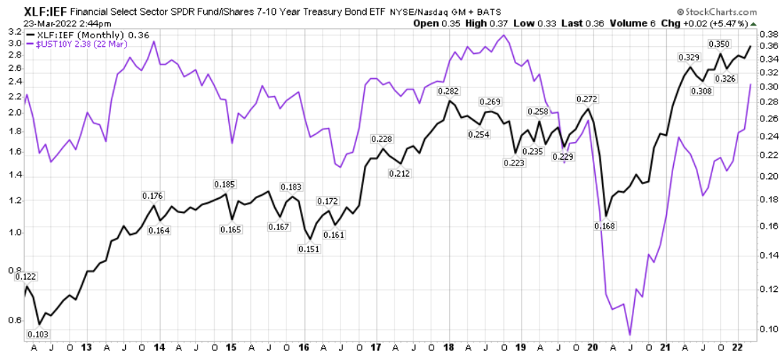
Conclusion
I expect that this relationship is more likely than not to hold over the short-term. As the spike in commodities burrows away into the soft underbelly of a bloated market, this is likely to ultimately turn investors to the safety of Treasuries, thus lowering rates and the financials/bond ratio simultaneously. But, it has to be kept in mind that this has hardly been a rock solid relationship.
Ultimately, the performance of the financial sector will likely rise and fall with the market as a whole. There are very few instances where the market has been able to maintain both high PEs and high long-term growth rates. Typically, an inflationary cyclical energy shock followed by a deflationary earnings shock puts an end to that bull market regime. That seems the likeliest outcome for this market, as well. And, in every instance of a long-term bear market in the S&P, financials have underperformed. As long as the momentum of commodities and yields holds, financials may remain relatively strong, but over the longer term, they are likely to underperform the rest of the market, although not to the degree to which tech stocks do. For a speculative rising yield/inflation play, commodities are likely a better bet.
Editor’s Note: This article covers one or more microcap stocks. Please be aware of the risks associated with these stocks.
Be the first to comment