

sankai
As I’ve argued in recent posts, there’s plenty of evidence to suggest the Fed has already tightened by enough to bring inflation down: the dollar is super-strong, real yields have risen sharply, the yield curve is inverted, commodity prices are plunging, and the housing market has run into a brick wall.
Yet the Fed seems determined to tighten even more. I think they’re driving by looking into the rear-view mirror. They’re trying to burnish their reputation as an inflation fighter, after having fallen miserably behind the inflation curve in 2020 and 2021.
And I think that the long-discredited Phillips Curve (which posits that unemployment must rise if inflation is to fall) still haunts the Fed governors’ minds. It’s all so unfortunate.
Fortunately, however, a recession is neither imminent nor inevitable. Industrial production and jobs are still growing at decent rates, 2-yr swap spreads are still in normal territory, and real interest rates are not prohibitively high.
But the economy could fall into a recession if the Fed doesn’t change course (aka “pivot”) before too long. There’s a precedent for this – in January 2019, when the Fed realized it had become too tight and reversed course – and I don’t see why they can’t do it again.
Chart #1
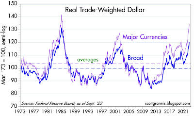
Chart #1 shows two measures of the inflation-adjusted and trade-weighted value of the dollar. By any measure the dollar is very strong. This is fully consistent with US monetary policy being tight and much tighter than that of any other major economy.
Demand for dollars is strong, and there is no shortage of reasons for why that is so: geopolitical turmoil in Europe and East Asia would surely suffice. From an economics point of view, it would be highly unusual for a very strong currency to also be experiencing inflation (otherwise known as a loss of purchasing power). Prices all over the world, when translated into dollars, are falling.
Chart #2
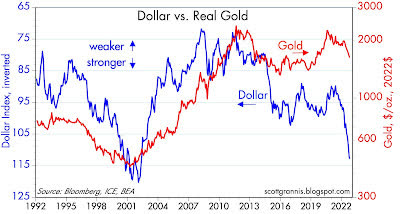
Chart #2 compares the inflation-adjusted value of gold (red line) to the inverted value of the dollar (blue line). Big moves in the dollar’s value almost always accompany inverse moves in commodity and gold prices.
What’s striking about today is that gold and commodity prices have not fallen further given the strength of the dollar. Long-time readers will note that this chart, which has appeared many times in recent years, has correctly predicted falling gold prices.
Chart #3
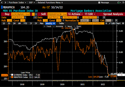
Chart #3 compares the nationwide average rate for 30-yr mortgages (orange line) to an index of new mortgage originations (mortgages taken on to finance the purchase of a new home). Mortgage rates have doubled this year, and new mortgage originations have fallen by half. That’s a huge development!
In other words, soaring mortgage rates combined with very high prices have dealt a heavy blow to the housing market. This is a perfect example of how higher interest rates can change incentives and also slow the economy.
People today are much less willing to borrow (which implies higher money demand) and much less willing to buy (which also implies a demand for cash rather than goods.
The sharply increased demand for money is acting directly to neutralize much of the extra M2 money supply that was created a few years ago. And that, in turn, means declining inflation pressures. (Recall that M2 has been flat for the past 9 months or so.)
Chart #4
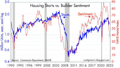
Chart #4 compares housing starts (blue line) with an index of homebuilders’ sentiment. Sentiment has plunged in recent months as homebuilders have seen a sudden slowdown in home purchases.
In the past, sentiment has often been a very good predictor of housing starts. We could be on the verge of seeing a big slowdown in residential construction, and that would be a surefire contributor to a recession. Chairman Powell, please take note!
Chart #5
The top portion of Chart #5 compares the average rate on 30-yr mortgages (white line) with the yield on 10-yr Treasuries (orange line). The bottom portion shows the difference between the two, which looks to average about 150 bps in normal times.
The spread today, in contrast, is over 300 bps; no wonder the housing market is in trouble. As the bottom chart also suggests, such peaks in spreads is typically short-lived, since they most likely reflect panicked selling and hedging by institutional players. Something is likely to change before too long, and it’s likely that mortgage rates and spreads to Treasuries will decline.
Chart #6
Chart #6 compares the value of the dollar (orange line) with the real yield on 5-yr TIPS. As I’ve noted before, 5-yr real yields on TIPS are equivalent to the market’s expectation for what the real Fed funds is going to average over the next 5 years.
Real yields have soared by almost 400 bps in just over a year, which is not only unprecedented but also indicative of an extreme tightening of monetary policy.
Chart #7
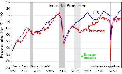
Chart #7 compares an index of U.S. industrial production with a similar one in the Eurozone. Without a big decline in industrial production it is very unlikely that the U.S. economy is experiencing a recession.
And so far, industrial production continues to grow. The Eurozone economy has been battered by the Ukraine conflict and soaring energy prices, yet industrial production has yet to decline. Both economies have an urge to recover what was lost to the Covid shutdowns.
Chart #8
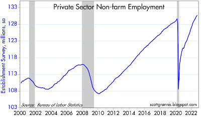
Chart #8 shows the level of private sector non-farm employment, which continues to grow at a healthy pace. Recessions are famous for throwing people out of work, but we have yet to see any sign of that in the U.S. economy.
Chart #9
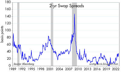
Chart #9 shows the level of 2-yr swap spreads, my favorite indicator and predictor of the health of the U.S. economy and financial markets. Swap spreads are still within a “normal” range, which implies that liquidity is still abundant and the corporate profits and the economy are likely to remain reasonably healthy.
As the chart suggests, swap spreads would have to rise appreciably before one might expect to see a recession on the horizon. Note also that swap spreads have tended to decline in advance of recoveries.
Chart #10
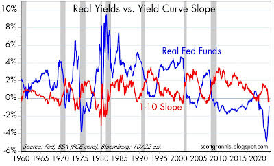
Chart #10 is my favorite recession “dashboard,” since it tracks two key indicators of monetary tightness and how they interact to produce recessions. Every recession here was preceded by an inversion of the yield curve (red line) and a significant rise in real short-term interest rates (blue line).
As I noted in Chart #6, the market expects the Fed to raise short-term real interest rates (a key measure of Fed tightness) to at least 2% in coming years, but that has yet to happen, and so far the yield curve is only mildly inverted. To be fair, I’d score this chart as tentatively predicting a recession within the next year or so.
Summing things up, there is little doubt that the Fed has already tightened monetary conditions to a significant degree. Sensitive prices (e.g., the dollar, commodity prices, gold) have turned down meaningfully, which alone would be a decent indicator of lower inflation to come.
It would be a real shame if the Fed were to continue on its present tightening course in the belief that only by crippling the economy (e.g., higher unemployment, falling industrial production, and a collapsing housing market) can they hope to get inflation back under control.
My recommendation would be for Dr. Powell to give the economy a “tincture of time,” not higher interest rates.
Editor’s Note: The summary bullets for this article were chosen by Seeking Alpha editors.
Be the first to comment