

SergeyChayko
Oddly enough, one of the things I miss most about living in Hong Kong was being surrounded by British expats I could regularly taunt about the decline of their once-great empire. There are probably few places in the world better than Hong Kong or Singapore to see how great that empire once was, while at the same time seeing how similar systems implemented in different places can have such radically different results. In this article, I wanted to take a look back at the UK homeland and comment on what is going on with its very volatile bond market, and what that means for its currency (the British Pound) and for investors like me in UK equities. US based investors will generally start looking at British stocks through an ETF like the iShares MSCI United Kingdom ETF (NYSEARCA:EWU), though there are also several US-listed ADRs I prefer to trade directly and will mention later. For the bond portion, unfortunately I don’t believe there is any US-listed ETF focused on UK bonds, but the UK bond market is the 6th largest weight at around 6.5% in the Vanguard Total International Bond Market ETF (NASDAQ:BNDX), which hedges foreign currency bonds back to US dollars. Although what I will say here about UK gilts only directly impacts a small part of BNDX, the drivers of the UK yield curve are factors you should consider for the other foreign bonds in BNDX as well.
I start with two charts that specifically popped out at me and made me think it was worth writing an article focused on the UK bond market: the almost 50% decline in the S&P UK Inflation Indexed Gilt Index, and the rapid rise in UK bond yields to mid-2008 levels.
The first chart, not surprisingly, is from S&P Dow Jones Indices, showing an almost 42% decline in the index year on year, and over 47% decline from its high on December 3rd, 2021. A 40-50% decline in a year might be expected of a stock index, but this is an index of inflation-indexed government bonds, which I’ve heard some say are supposed to be “even safer than bonds” because they even protect against the risk of inflation eroding their purchasing power over time. The reason the price decline in these bonds was so dramatic is because less than one year ago, these indexed bonds were selling at record low real yields of -3.242% for 10 years and -2.3883% for 50 years. As real yields rose this year, to around +1.3% according to the iShares GBP Index-Linked Gilts UCITS ETF site, this fund, which has a duration of 15.6 years, also fell by around 45%, reflecting a roughly 300bp rise in the real yield demanded by the market.
S&P Dow Jones Indices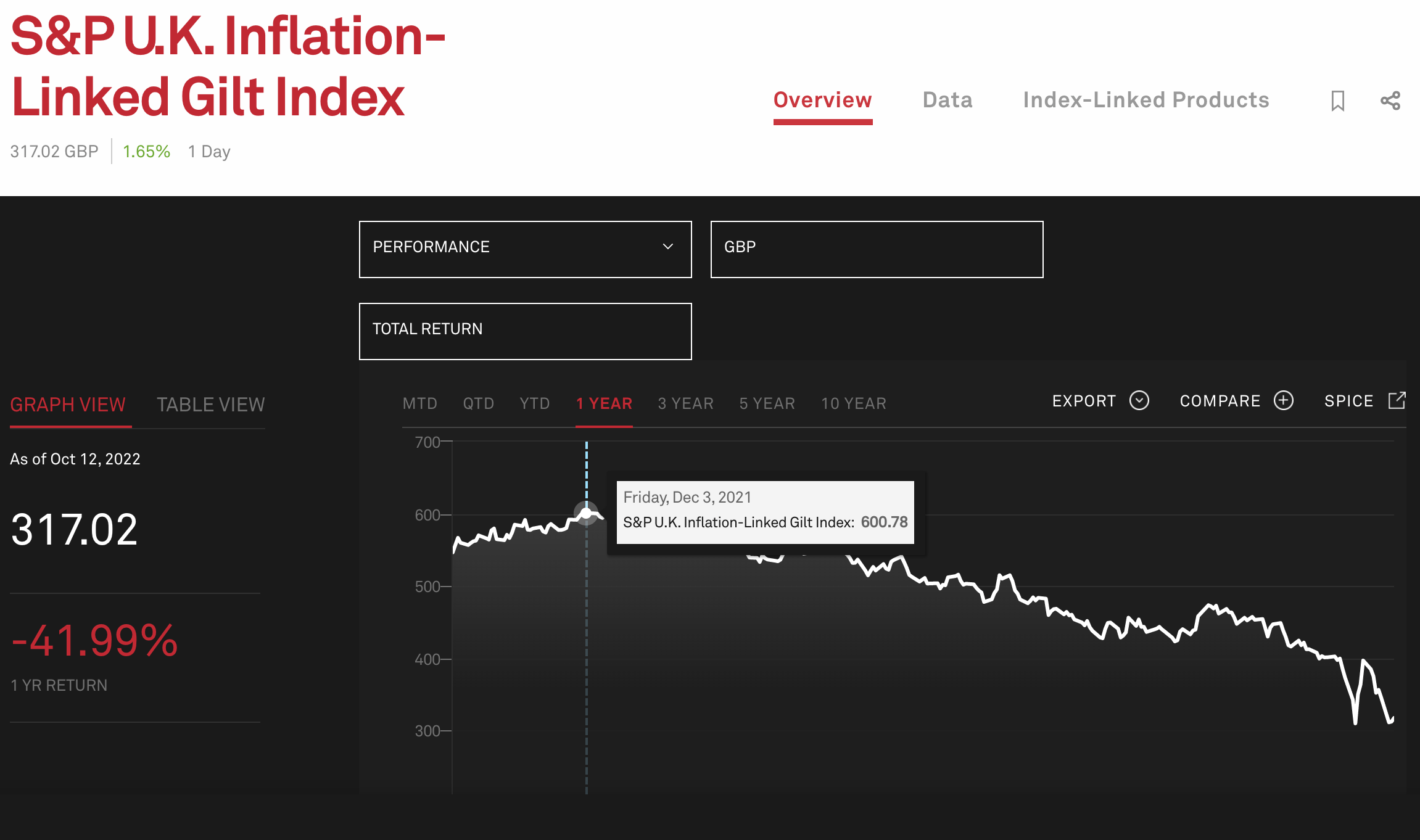
The second chart shows how rapid this rise in yields was across the curve, though I was only able to get this historical yield chart for nominal (not inflation-indexed) gilts. In this chart we see how in just the past 10 months, UK gilt yields across the curve rose from under 1% to almost 5%, levels last seen just before the 2008 crash and global financial crisis. At that time though, only the short end of the curve fell below 1% so quickly, while 20-30 year gilt yields slowly drifted down and only made a sustained break below 1% during the COVID-19 pandemic. Like in the US, the yields have rapidly risen across the curve, but unlike the US, those longer term rates of 4.8% are a full percentage point over the 3.8% yield now seen on similar term US treasuries. As mentioned in my last article on long-term US treasuries, the real yield on US inflation-indexed bonds (known as “Treasury Inflation Protected Securities” or “TIPS”) is also around the same 1.3% level seen in UK indexed gilts. This means these higher gilt yields are entirely due to the bond market expecting UK inflation to be 1%/year higher than US inflation over the next few decades.
Koyfin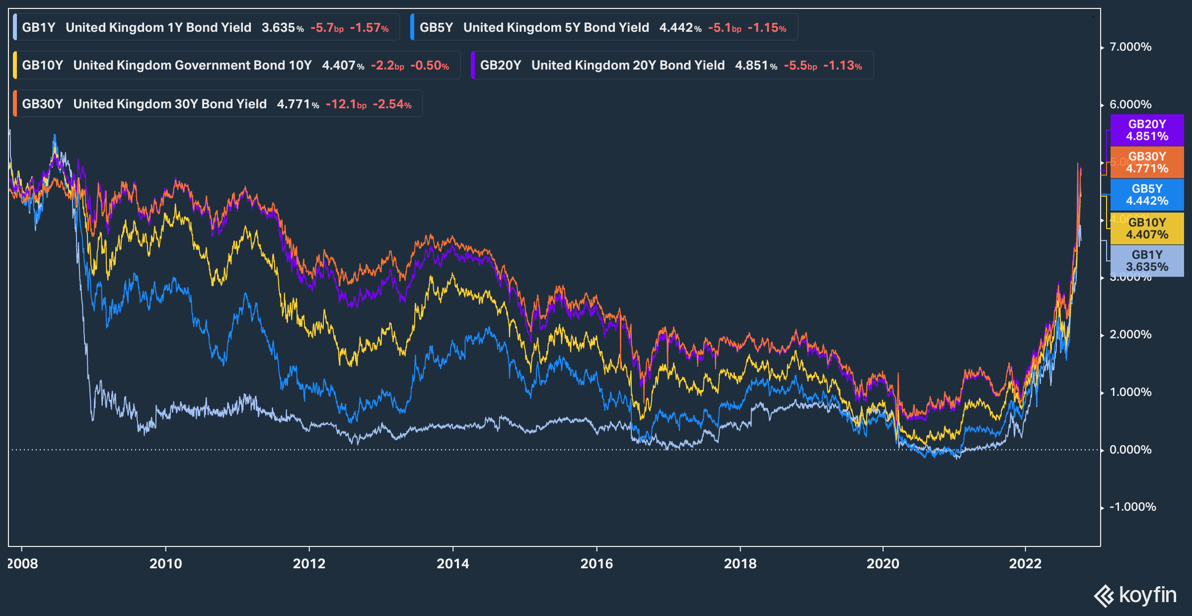
All else equal, UK inflation being 1%/year higher than in the US implies the pound is on track to continue weakening against the dollar at a base rate of 1%/year. This puts a mid-range GBP/USD target at 1.000 (“cable at parity”) within the decade, and the pound at $0.80-0.90 within another decade or two. I’m not sure which should surprise me more: the number of opinions I’ve been hearing about now being a good time to buy the pound, or the number of people who seem to think the pound at $0.80 is unthinkable. I’m sure the dollar trading at 80 yen was also unthinkable to many investors and economists a decade or two before that happened as well.
As some background context for the long-term downtrend in the British Pound against the US dollar, I find it worth sharing the below chart of the exchange rate going back to 1791. For most of American history, with the 1861-1865 civil war being one big exception, the pound was quite stable at around US$4.80 until the start of the second world war. Since 1939, the long term trend in the pound has been a volatile but consistent decline towards its current level around US$1, and whenever I see a long-term trend like this, I ask what has changed that might cause it to stop or reverse. While I seek comments on this, I don’t see any change in the relative trajectories of the US and UK economies and central banks that would make this trend any different over the next few decades than it has been over the past seven. The data for the below chart is from the Bank of International Settlements, and I have published several other charts with this data here.
Bank of International Settlements, Author’s Chart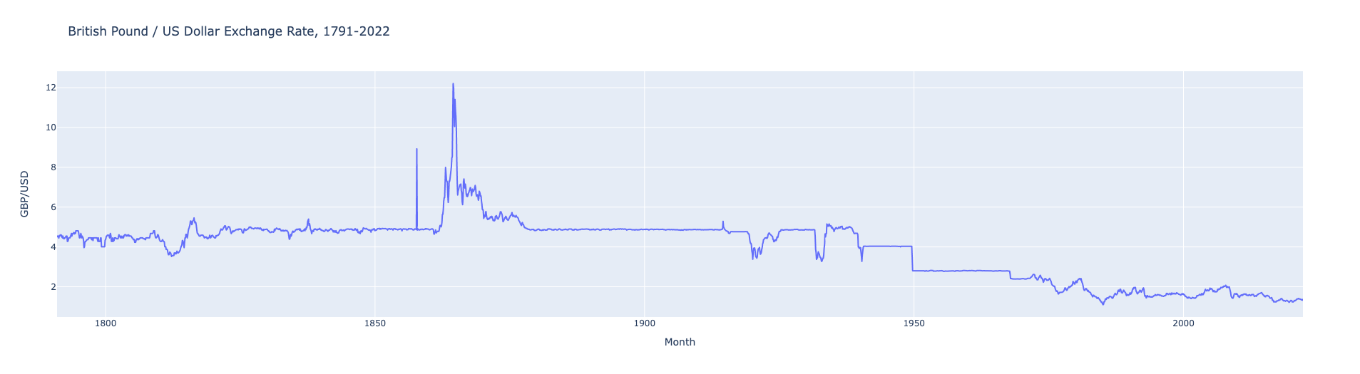
4.8% long-term bond yields may seem attractive to a UK-based retiree planning to spend pounds, though if current indexed bond yields are to be believed, that only reflects a 1.3% real rate of return, and the remaining 3.5% per year needs to be set aside for inflation. As explained in my article on US treasuries, the best case scenario for a holder of long-term UK gilts is a deflationary depression, where the UK goes down a Japan-style path of declining rather than rising prices, with a contracting economy and stagnant stock index level. The highest weighted bond market in BNDX is Japan, and as the below chart shows, Japan remains exceptional as one bond market where yields haven’t risen as significantly this year (though zero to +0.25% is not nothing to a Japanese bond trader). Bond yields in France (good proxy for the Eurozone) and Canada have both risen as dramatically as they have in the US this year, but this chart clearly shows how much faster UK yields have risen than the others. Again, part of that reflects the rise in real yields to that 1.3% level, but if I’m worried about inflation, I’d rather own dividend growth stocks, and save these long-term bonds as my hedge against that deflationary depression scenario. What this chart means for a BNDX investor is that UK yields have the farthest to fall to drive BNDX’s upside, followed by Europe and Canada, with one bear case for BNDX being a rise in yields on its 17.2% Japan bond allocation to “western” levels.
Koyfin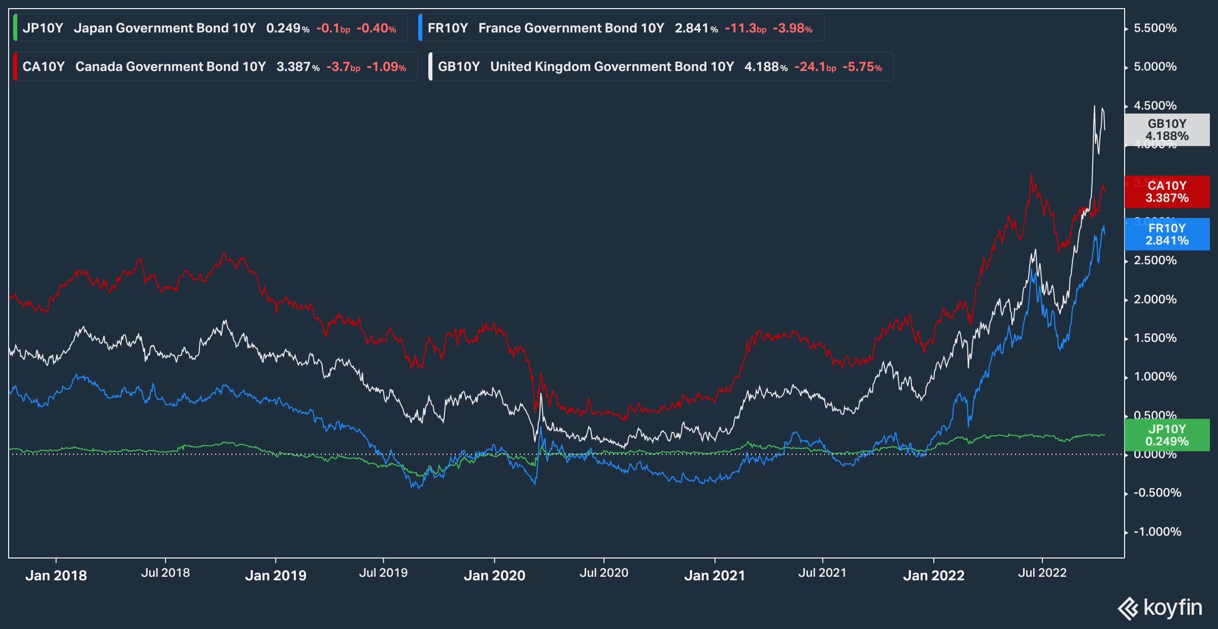
When looking ahead at how high or low rates can go, one metric I’ve started paying a lot more attention to is a country’s working age population. The below chart from the World Bank shows how the UK’s working age demographics aren’t as bad as Japan’s or France’s, but they also aren’t as young as the US’s or Canada’s either. Declining working age populations tend to be deflationary and growth-limiting for a number of reasons, and the below chart is yet another reason I don’t think UK rates can remain higher than US rates for long.
World Bank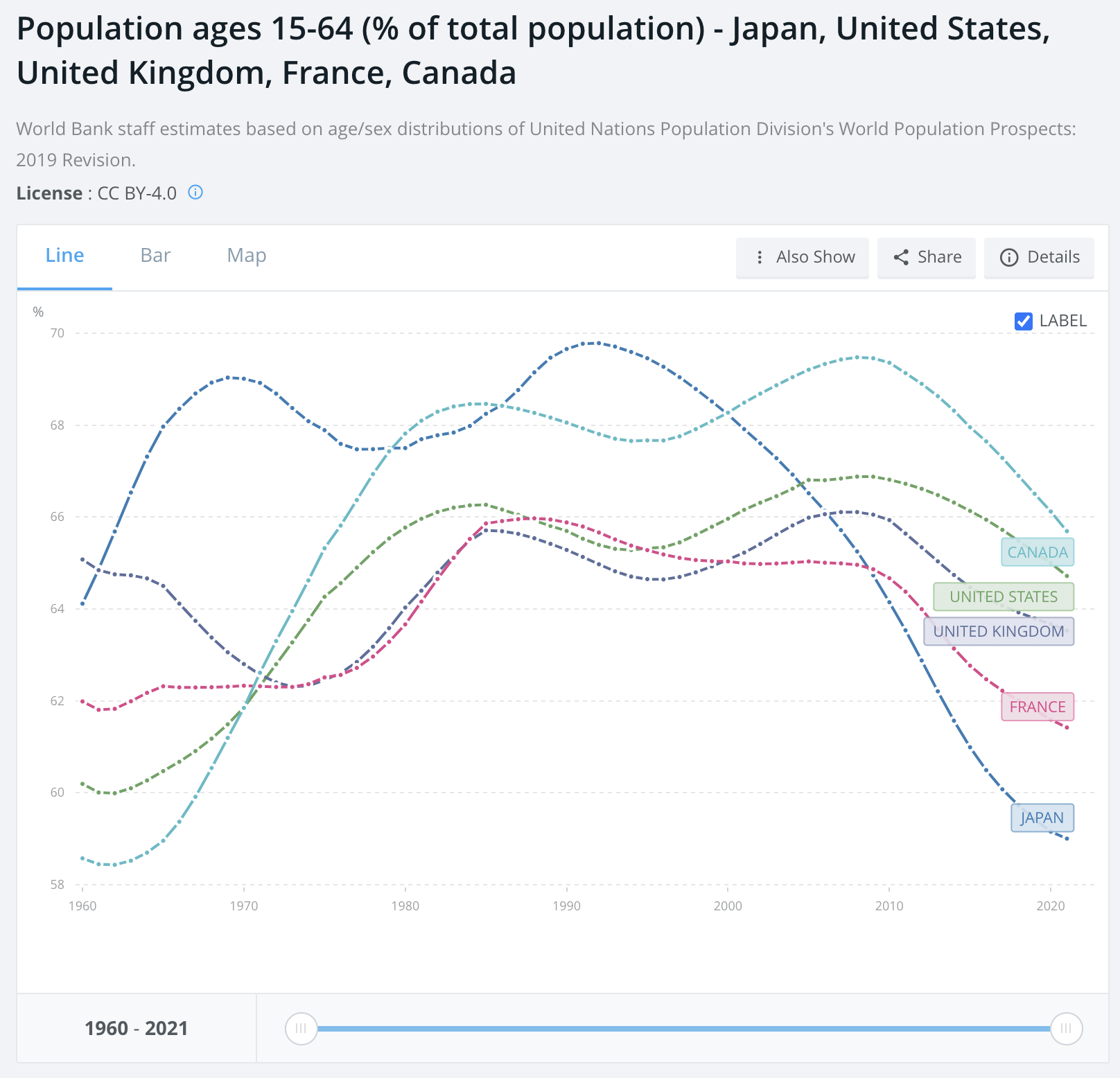
On to what this means for stocks, the first thing to note is that British stocks look cheap, not only compared to other markets, but also compared to its own historical averages. The below chart is from Barclays.
Barclays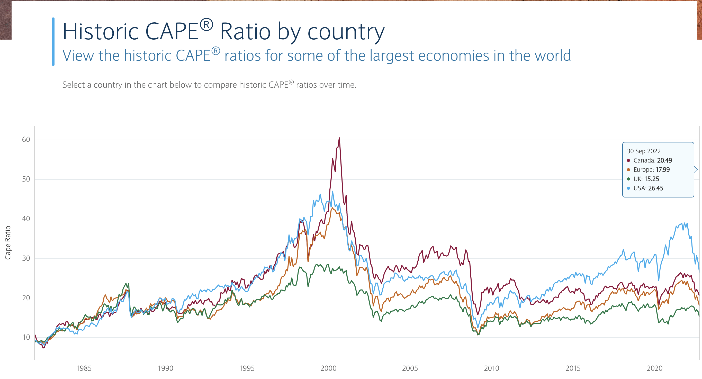
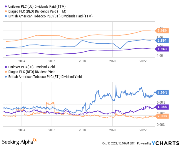
While I do take valuation ratios like CAPE with a grain of salt, especially if there are large differences in industry exposures like in Canada versus the US, it is notable that the largest sector in EWU at 21% is consumer staples. Of the top 10 holdings in EWU, my three favorites which I prefer to hold directly are Unilever Plc (UL), Diageo Plc (DEO), and British American Tobacco Plc (BTI). All three have strong, globally recognized consumer brand portfolios with significant sales and pricing power internationally, and a declining pound is good for this business model, since a bar of Dove soap, pint of Guinness, or Vuse vape refill sold abroad translates into more pounds of profit back home. The below chart simply shows the dividend growth and yield history of these three names, and I expect this dividend growth path to continue in most non-apocalyptic scenarios. I don’t have such strong opinions on the other top components of EWU, largely since they aren’t as strong in the way of having globally distinct consumer brand portfolios.
Conclusion
Although many investors think bonds are boring, and the only thing more boring is foreign bonds, I have hopefully made clear why I see long-term UK bond yields as an important indicator on the direction of the world’s 10th largest economy and its currency. While some investors may see its relatively high long-term bond yields as attractive, these are only as high as US yields in real terms, and are only likely to outperform if the UK enters a deflationary depression. Rather, I prefer to invest in UK-based companies with global brands that will benefit from a continuing decline of the pound as their overseas sales get translated into higher profits, making it more likely that even the dollar value of their dividends will continue rising.
Be the first to comment