

Pgiam/iStock via Getty Images
This article is part of a continuing series of articles (here, here, here, here and here) on how to use metrics of investor buying in specific ETF’s to help determine the direction of the stock market and specific sectors of the market. This article focuses on the largest energy ETF – NYSEARCA:XLE
Investor Activity in XLE Signals Caution
Investor Activity in XLE (Michael McDonald)
This chart displays a 12-year price history of XLE plotted against two metrics – 1) the number of shares outstanding and 2) a measure of how much investor buying is occurring in XLE.
The red line shows the number of shares outstanding. Notice the surge that began in early 2020 which accompanied the price gain from a low of $30 up to a high of $90? The scale is logarithmic, so the size of a movement shows relative percentage change. Large surges in SO that accompany price increases are often a good contrary opinion indicator since it signals too much investor agreement with the trend.
The blue line, which shows the amount of average daily buying in XLE as a percent of assets, confirms this. Careful inspection shows this metric usually increases right at, or the beginning of, a price advance. The lack of buying after the recent June price decline makes us cautious here.
The End Of The Oil Price Rise
Buying in SCO Implies oil top (Michael McDonald)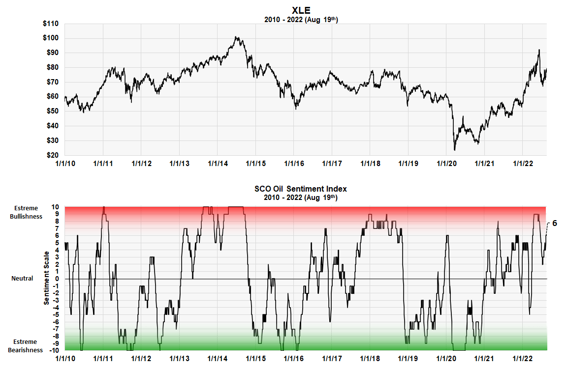
We have found it useful when forecasting the stock market or a commodity to measure investor activity in ProShares ETFs, especially the amount of buying in a leveraged short ETF. Too much short selling often indicates a market bottom and lack of it, a market top. The ProShares ETF with the ticker NYSEARCA:SCO is short the Bloomberg oil index. The chart above shows levels of investor buying in SCO using our proprietary scale. The scale goes from +10 the -10.
The red zone represents extreme bullish sentiment while the green zone represents extreme bearishness. It’s a contrary opinion indicator. Although this metric is measuring investor sentiment about oil, the correlation of the price of oil with oil stocks is usually very close.
It is easy to see the correlation between extremes in investor sentiment in SCO with tops and bottoms of XLE. The deep levels of investor bearishness on oil (green zone areas) that occurred at the very bottom of the market at the start of the pandemic in 2020 is a clear example.
Red zone areas are also somewhat obvious. The current reading on investor buying of SCO is at 6.0 on the index. While not yet in the red zone, the fact that it didn’t drop below neutral during the recent price decline in oil is worrisome to us. We don’t believe oil will go much higher and think this puts an upward limit on XLE as well.
Our Sentiment Scale or Ranking
Our investor sentiment scale goes from -10 to +10. Minus 10 represents extreme bearish sentiment while a plus 10 represents bullish sentiment.
These levels are determined for each indicator by its past history. We go back as far as possible and determine the range that contains the highest 5% of its values. Then we determined the range that contains the next highest 5%. This procedure was continued in 5% increments down to the final 5% band, which contains the smallest values. These “range of values” are labeled plus 10 down to minus 10.
The MSI Red and Green Zones
As you can see it oscillates between 10 and -10. Large white area in the middle represents periods with no extreme opinion. The red area on the chart represents when the indicator is getting into the “extremely bullish” range. The lower green band shows when the index is getting into the “extremely bearish” range. There is no sudden demarcation line but a graduated area that shows greater or lesser degrees.
The Scale Advantage
This procedure allows us to put every indicator we use on the same 21 level scale. Different indicators can therefore be compared or even combined into a composite indicator. The master sentiment indicator (MSI) that we update every month is just such a composite.
XLE Trading Range (Michael McDonald)
An XLE trading range
This graph highlights what we believe is the probable trading range for XLE over the next year or two. It’s based on the idea that buying of oil stocks and XLE has been overdone and needs to be digested. We believe this is supported by the facts presented.
Be the first to comment