

mphillips007/iStock via Getty Images
Real home prices are going to fall, and it’s going to cause a massive negative wealth effect.
In this article, we’re going to talk about the coming decline in real home prices, why it’s going to happen based on reliable leading indicators, and what it’s going to mean for the rest of the economy and the developing 2022 recession.
To start, we’re going to be looking at REAL home prices, or home prices after adjusting for inflation. Why real home prices and not nominal home prices?
Real home prices are much more impactful for the wealth effect. Many people invest in real estate as an asset to beat inflation. If inflation is 10% and your home goes up 15%, you beat inflation by 5%, and thus, you are 5% wealthier in real terms.
If inflation is 10% and your home goes up 5%, you lost 5% of your purchasing power in an asset that is supposed to give you protection, and you are actually worse off.
Also, real home prices are the best measure of the true performance of real estate as an asset class across long periods of time. You can’t compare home prices today to home prices in the 1970s without looking at them in real or inflation-adjusted terms.
This chart shows real home prices since the 1970s, and you can see that real home prices have declined several times, mainly around the recessionary periods.
FHFA, BLS, FRED, EPB Macro Research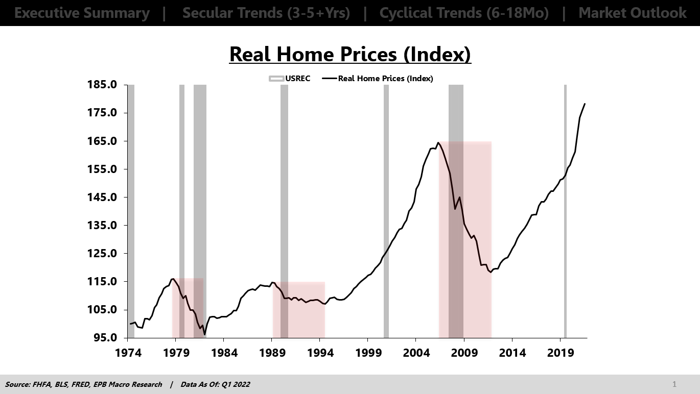
The 2000s recession was an outlier in which home prices ROSE in real terms.
The financial crisis in 2008 caused home prices to decline almost 30% in real terms. It took until 2021 to regain the peak in real home prices from 2006, 15 years!
If we look at the growth rate in real home prices, we can see that real home prices were rising at a 13% rate in 2021, higher than the peak rate of home price growth in 2006.
S&P, Dow Jones, FRED, EPB Macro Research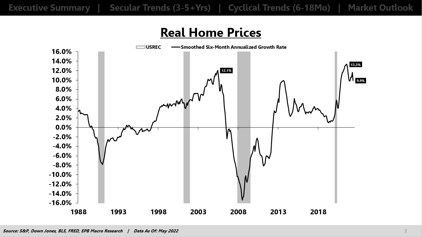
Real home price growth was positive from 1996 until mid-2006, 10 straight years, which created this belief that home prices don’t fall.
And here we have another 10-year period, since 2012, where real home price growth was positive, and massively positive at that.
Over the last 10 years, real home price growth averaged 4.5%, which is way higher than the 20-year average of 2.0%.
S&P, Dow Jones, BLS, FRED, EPB Macro Research
Consumers and investors became accustomed to home prices rising sharply above the rate of inflation and a source of wealth building, particularly when using high amounts of leverage and mortgage debt.
With the feeling that home prices would always rise above inflation, and nearly 5% above inflation, a prevailing sentiment was born that you could leverage your way to wealth.
But now, real home prices are starting to decline. One month is certainly not a trend, but this is where the EPB Macro research process becomes very powerful and why studying leading indicators is critical when determining what is noise and what’s the start of a new trend.
Zillow, BLS, FRED, EPB Macro Research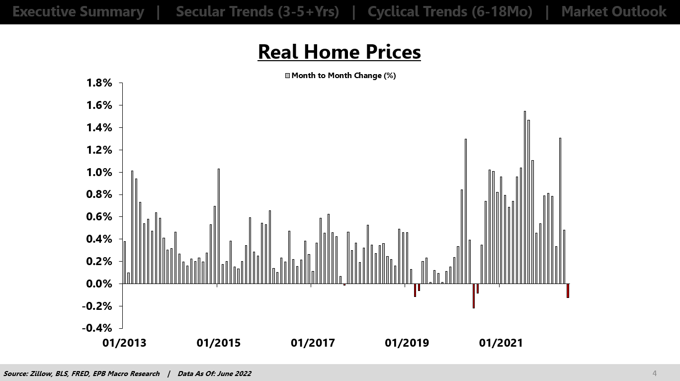
There are several key leading indicators of real home prices, but we’ll just cover three.
To be a leading indicator, it’s not good enough just to look good on a chart. It has to make logical sense, have a proven track record of leading cyclical inflection points, and have a long history or sample.
First is the months supply of new homes. Months supply is a measure that tells you how long it will take to clear the existing stock of inventory at the current pace of sales. This is an inventory metric, almost like the ratio of new orders to inventory for the manufacturing sector.
This makes logical sense as a higher months supply figure means there’s a growing imbalance between inventory and sales.
In this chart, the months supply number is inverted, so when the green line is moving lower, that means the months supply figure is RISING.
FRED, Census Bureau, HUD, FHLMC, EPB Macro Research
You can see how the months supply indicator declined in advance of the 2007 price declines, in advance of the 2013-2014 downturn in real home price growth, and led the rise in real home price growth in 2019 before COVID.
This metric also tells us why real home prices didn’t decline in the 2000s recession. The months supply figure wasn’t showing any signs of a downturn.
Today, the months supply indicator started showing signs of a top in real home price growth at the end of 2020, which led the actual peak in real home price growth by about one year.
Today there’s a huge imbalance shown in the months supply data of new homes and one that is a very reliable leading indicator of coming declines in real home price growth. So the one-month decline is not just noise, it’s likely the start of a trend.
Next, we have to look at the SPREAD between mortgage rates and Treasury rates. The spread is way more informative than the mortgage rate itself because the spread represents RISK.
In this chart, the spread is inverted, so a wider mortgage spread is shown by the green line moving lower.
FRED, EPB Macro Research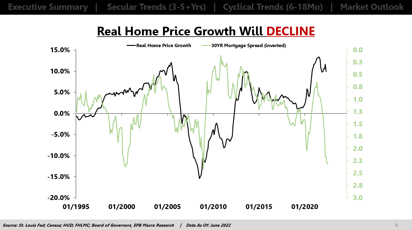
Mortgage rates can decline because Treasury rates are declining or because mortgage spreads are tightening.
Declining Treasury rates can reflect worsening economic conditions, which is why we have to separate whether the mortgage rate is declining from the Treasury rate or the spread. A widening mortgage spread preceded the decline in 2007, and a tightening mortgage spread was a strong indicator of recovery in 2010.
There was a false signal into the 2000s recession where spreads were suggesting worsening home price growth that never materialized. That is why it’s important to use a basket approach and look at many indicators and how they are ALL moving vs. relying on any single indicator.
The months supply metric was showing no signs of declining home price growth, so it’s very important to take the signal from the collective basket vs. any metric in isolation.
Today, mortgage spreads are widening sharply, which is a negative sign for future home price growth.
Lastly, we’re going to look at real M2 growth or real money supply growth, which is a bit more volatile or erratic but gives good timely indications of recovery because excess liquidity will clearly help any asset price, including home prices.
Major surges in real M2 lead to large increases in real home price growth, like we saw in 2020 and 2021.
St. Louis Fed; Census; HUD; FHLMC; Board of Governors, EPB Macro Research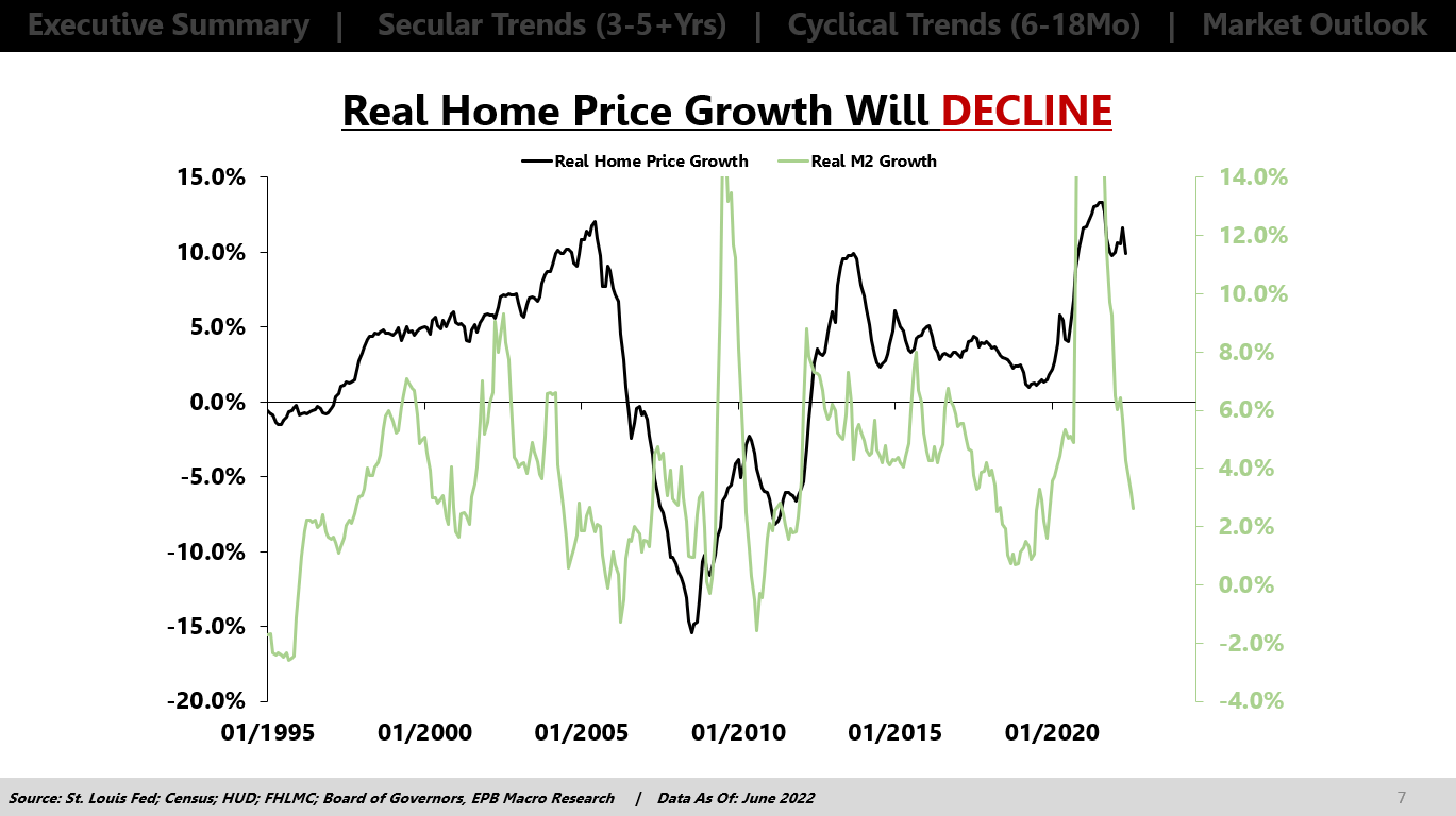
Today, excess liquidity is not on the side of home price appreciation and is rather implying a sharp deceleration in home price growth.
So if we take the collective signal from the basket of three logical and proven leading indicators of real home price growth, the direction is clear.
The months supply of new homes is rising, which means home builders are going to cut back on production and reduce prices of their existing inventory. The mortgage spread is widening, which means mortgage lenders see greater risk in the housing market, and the Fed is rapidly tightening liquidity.
So higher supply, more risk, and lower liquidity.
This chart takes an average of the three metrics shown, and the direction is reliable over time and clear about where real home price growth is heading.
St. Louis Fed; Census; HUD; FHLMC; Board of Governors, EPB Macro Research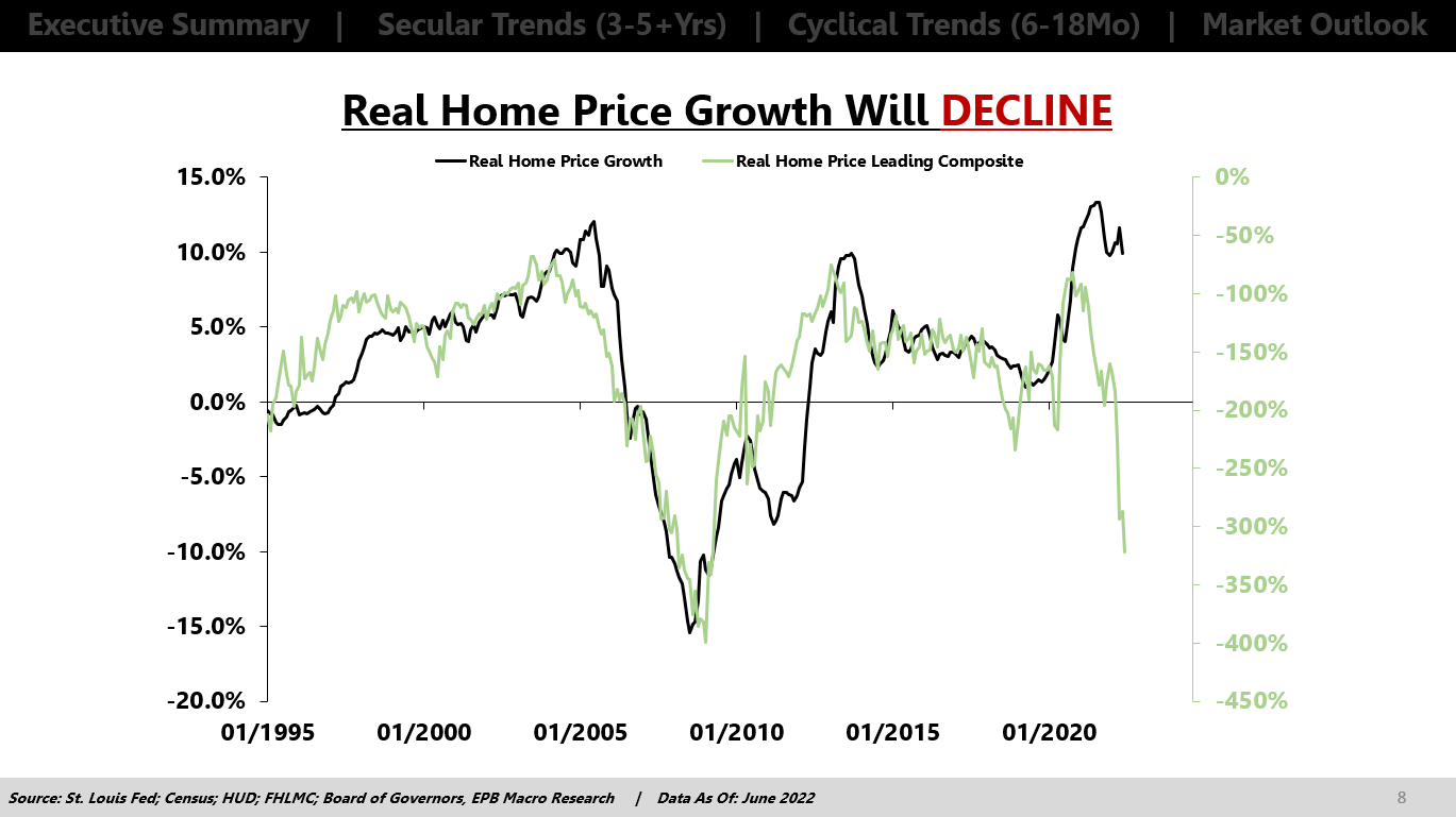
The collective signal from the basket is clearly lower, and we already have declines starting.
Why is this so important? As I mentioned at the start of this article, real home price growth is very important for the wealth effect.
If home prices are regularly rising 5% or 6% above inflation, consumers are getting wealthier just by owning a home, and many people use this appreciation as an ATM. Drawing money out of their newfound equity.
Obviously, this is not a wise strategy, but it’s very common. People have become accustomed to using their home as a perpetual ATM, rising in value every year and an endless stream of cash in the form of home equity lines of credit.
If real home values are going to decline, meaning that the home is LOSING value to inflation, that means that one of the largest assets for most people is causing them to become less well off.
Most people’s largest asset is a home. Most of their money is trapped in this asset. If it massively outpaces inflation while you’re doing nothing, great. You are wealthier and have more purchasing power.
If all your money is trapped in an asset that is losing value to inflation, then you are becoming worse off every day.
Robert Shiller of Yale, famous for creating one of the best measures of home prices, The Case Shiller Index, wrote a research paper on the wealth effect.
The conclusion of the paper was that there is virtually NO wealth effect at all from rising stock prices. Very few, if any, people borrow against their stock holdings, and no one spends more money because their stock portfolio rose in value. It is simply too volatile. This is well documented in the research.
COMPARING WEALTH EFFECTS: THE STOCK MARKET VS. THE HOUSING MARKET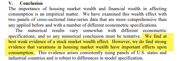
However, the paper concluded that there was strong evidence of a wealth effect in the housing market. When home prices outpace inflation, people feel much better off, and they feel that newfound equity is easily accessible and safe in the form of equity lines of credit.
When real home prices decline, that will have a highly negative impact on consumer psychology and contribute to a downward spiral in consumption that we are already beginning to see, with most people falling behind due to gas prices and food prices.
Real home prices are going to start to decline, and it’s going to cause a massive negative wealth effect that will amplify the intensity of this economic downturn that is already nearing recession.
Be the first to comment