


MF3d/iStock via Getty Images
As I write this, crude oil prices are down 33% since their spring peak, natural gas is down 40%, heating oil is down 30%, and gasoline prices are down nearly 50%. Energy prices are almost always volatile, so we should not be surprised to see lots of movement up and down along the way, but the medium- and long-term is likely to see depressed prices in the energy commodity space. This is likely to be negative for any commodity ETFs with large exposure to any energy commodities, but in this article, I am going to focus on the Invesco DB Energy ETF (NYSEARCA:DBE) which tracks, in near equal measure, WTI crude, Brent crude, natural gas, heating oil, and gasoline futures, partly because I think this portfolio has possibly even more downside potential than crude oil alone.
This outlook is based on a larger thesis I have been developing over the last year or so that is itself rooted in centuries of historical patterns, patterns that point to factors at play that are not well understood by traditional forms of economic analysis but that were touched on by, most notably, Keynes, Schumpeter, and Kondratiev nearly a century ago.
Some of the key points of this outlook are:
- Long-term underperformance of tech stocks.
- Long-term outperformance of energy stocks (and other key cyclicals).
- Long-term depressed overall equity returns.
- Long-term disinflation.
- Long-term depressed returns in commodities.
- An earnings depression (see link in #3).
- Long-term cyclical volatility across all asset classes (including at least two cyclical crashes).
- A cyclical downturn in equities.
- A cyclical downturn in commodities beginning with gold, running through industrial metals, agricultural commodities, fertilizers, and energy.
- A cyclical downturn in earnings (see #6).
- A cyclical rise in bonds.
“Long-term” here is, essentially, to the end of the current decade.
My long-term commodity thesis was outlined in March (see the link in Point #5), and I have updated the respective cyclical statuses of some of the key commodity classes along the way. Industrial metals, agricultural commodities, and grains only a month ago. In that grains article, I mentioned my energy outlook: “Looking forward, I continue to expect general downward pressure across the commodities space, but the pressure appears to be growing on the late-cycle commodities like grains, fertilizers, and energy. I expect we will see sudden drops in these prices over the next year or so as the cyclical bear market resumes.” Also, “There is also a better than even chance that they [i.e., grains] will underperform industrial metals but outperform energy.”
In this article, I am going to briefly review some larger elements of my thesis, particularly with respect to commodities, and then focus on the shorter-term indicators for energy. If this short-term outlook is correct, it probably has larger ramifications for, unsurprisingly, energy equities but also the market as a whole. Specifically, it suggests that we are probably entering the next phase of the current cyclical bear market, a phase that will likely have a somewhat different feel than the January-October slide.
Macro outlook
Over the decade leading up to the end of 2021, markets were dominated by a PE-expansion led by the tech sector while energy wallowed in the mud. Over a cyclical duration, the picture was somewhat more complicated at the end of 2021: commodities—most notably energy—and corporate earnings were surging. As I wrote late last year (see Point #1 above), this combination of factors was quite typical of the period that preceded long-term bear markets that would soon see tech-sector depression, a long-term bear market in equities generally, long-term energy outperformance, long-term cyclical volatility (repeated two-year booms and busts), and, over a cyclical duration, a crash in commodities, earnings, and yields, not to mention equities. In other words, many of the items presented on the list above.
In the spring of this year, I wrote a series that showed that these patterns are probably linked to “fundamentals”—the evolution and diffusion of disruptive innovations, global sociopolitical stability, and global financial conditions—but not in an a priori, linear fashion. In other words, these factors are not linked in the way a bottom-up logic would suggest. You have to begin with the data first and then work from there, not build up your theories and then try to hammer the data into your preconceptions.
A perfect example of this is the relationship between supply, demand, and prices in commodity markets. I have not been able to find much evidence that some ratio between supply and demand is correlated with price behavior. In fact, from what I have been able to observe primarily in the metals data of the last century, but also in more recent agricultural commodities and even in the whale oil market of the previous two centuries, is that commodity prices are primarily linked to macro conditions as reflected in the yields on equities, global sociopolitical stability, innovation supercycles, and the status of inflation, and they have virtually no link to the respective balances of supply and demand in given commodities. Commodity prices move with these “macro” factors while supply and demand remain in long-term balance.
The only place where I was able to find what appeared to me a convincing relationship between supply, demand, and price in commodities was the whalebone market of the 1800s and 1900s. Whalebone was a byproduct of whale harvests that was used for its plastic qualities but seems to have died out sometime around World War II. But the primary commodity that whales were slaughtered for, whale oil, appear to have behaved just as all other primary commodities did. Prices for whale oil moved up and down with other commodities, even as supply and demand was thrown (in and) out of whack. When consumers began shifting to petroleum in the late 19th Century, supply and demand fell off roughly in conjunction with one another, but the pattern of whale oil prices was left virtually unchanged. The demand for whale oil really came into its own in the 20th Century—just after the entire whaling industry had been declared dead by experts—when it began to be used as a food additive (for example, in margarine) and a key machinery lubricant (apparently as late as the 1970s). It is difficult to find extensive data sets on 20th Century whale oil prices, but the bits of pieces of data I have found for the early 20th Century and even prices of the last few years suggest that, even as the whaling industry was destroyed, whale oil prices remained within a range suggested by a model that used global fundamentals as the determining factor.
The whale oil industry has been cited by researchers as the likely template that the global fossil fuel industry would follow. Rather than a “peak oil” scenario in which we ran out of fossil fuels, better, technologically-derived alternatives would emerge that will make these older fuels obsolete. As they became obsolete, demand would wane, and prices would crash. I would not hold my breath for such a scenario. Even if fossil fuels are to go the way of the dinosaurs from which they came, this is more likely to be felt at the industrial level (i.e., the profits of firms that produce these fuels) than the prices of the commodities themselves.
Recently, I have posted a summary on my blog explaining why I am not convinced that the minute weighing and balancing of supply and demand dynamics is an effective way of anticipating commodity prices. At certain scales and in certain situations this may make sense, but in general, I cannot find much evidence that it adds a lot of value to commodity price analysis.
What does drive commodity prices? I simply do not know. I am only arguing that it appears to be very closely linked to global fundamentals at the systemic level. The chart below, for example, shows long-term commodity inflation in green alongside the earnings yield in blue and the long-term rate of change in the earnings yield.

Chart A. Rates of change in commodities and equity yields have been consistently correlated. (World Bank; Robert Shiller data; University of Michigan; Warren & Pearson index; Federal Reserve)
The earnings yield is very responsive to inflation pressures generally, so perhaps long-term commodity prices are driven by “inflation”. But that does not quite appear to be the case either. If you subtract the rate of change in the earnings yield from the rate of change in commodity prices, you will come up with something that looks a lot like long-term consumer inflation, as illustrated in the chart below. I am not a statistician, but this appears to me a volatile but consistent relationship.
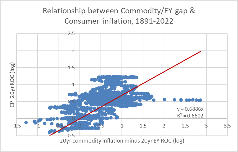
Chart B. The difference in the rate of change of commodity prices and the rate of change in the earnings yield roughly approximates the long-term rate of consumer inflation. (World Bank; Shiller; University of Michigan; Warren & Pearson; St Louis Fed)
In short, commodity prices are, like everything else, driven in part by inflationary pressure, but real commodity prices are driven by fundamentals—just not the fundamentals that our Econ 101 professors taught us. As I have shown in previous articles, some as long as a decade ago, this relationship between real commodity prices and yields stretches back nearly 300 years.
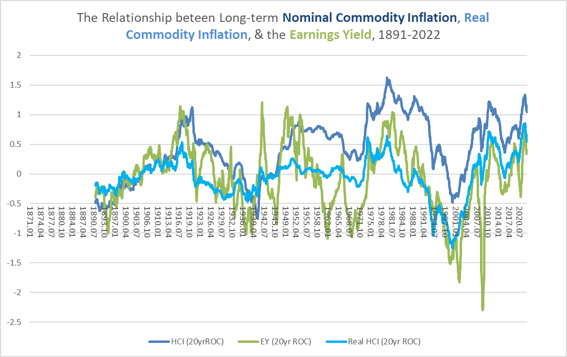
Chart C. Both real and nominal commodity inflation track changes in the earnings yield. (World Bank; Shiller; University of Michigan; Warren & Pearson; St Louis Fed)
That it is primarily a connection between yields and real prices rather than nominal prices suggests that there are genuinely fundamental factors at play, not merely monetary ones. The chart below shows the earnings yield (in red) alongside real commodity prices (in green), rather than their rates of change.
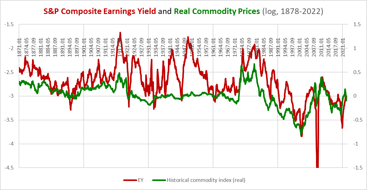
Chart D. The correlation between absolute levels in real commodity prices and earnings yield suggest fundamentals beyond monetary factors are driving this relationship. (World Bank; Shiller; Warren & Pearson; St Louis Fed)
If we compare these charts, not only can we see that there is a correlation between the rates of change in yields and commodities (real and nominal), but the rates of change tend to be correlated with the absolute values. That is, I am arguing that both the earnings yield and commodity prices are driven by real factors but that they are also “driven by” momentum. Momentum is real, to coin a phrase.
The chart below contrasts three rates of change in nominal prices with the absolute level of nominal prices. (We could do the same thing with the earnings yield, but that is a different article). The cyclical rate of change (i.e., “CycROC”) is the rate of change relative to a 36-month moving average.
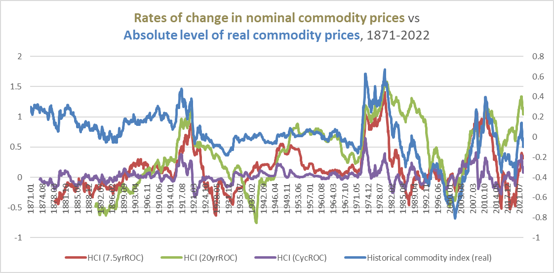
Chart E. Real commodity prices are consistently correlated with the momentum in nominal prices. (World Bank; Warren & Pearson; St Louis Fed)
Whether momentum is real or not, it is rarely wrong. The chart below shows the rolling correlations between these rates of change above and real prices.

Chart F. Momentum in nominal prices is consistently correlated with levels of real prices. (World Bank; Shiller; Warren & Pearson; St Louis Fed)
The average correlations range from 0.51 for the 7.5-year rate of change to 0.77 for the cyclical rate of change.
As I have pointed out in previous articles, which rate of change you should use depends on what question you are trying to answer. In commodity supercycles, those 5- to 10-year periods, such as in the 2000s, in which commodities remain in a state of frenzy, cyclical rates of change tend to be more bearish than is warranted and should be deemphasized. Outside of those situations, shorter-term indicators are more reliable. I have described why I do not believe we have been in a commodity supercycle in the articles linked above.
Right now, I am not sure it matters which indicators we use, because nearly everything is pointing down.
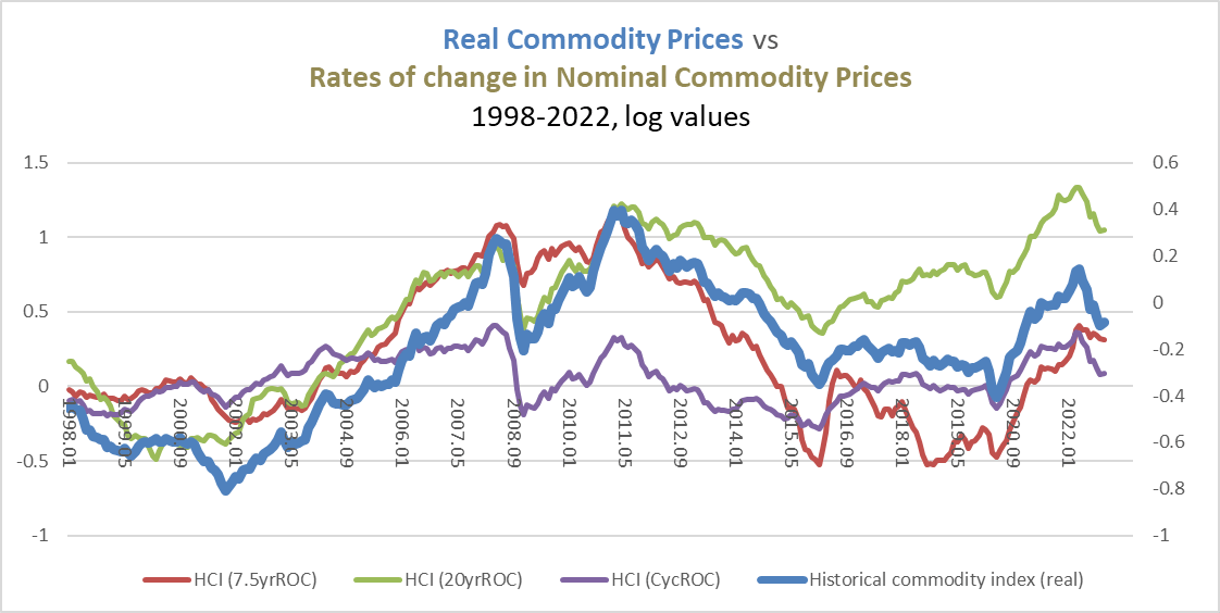
Chart G. Commodity momentum has been in decline since the spring. (World Bank; St Louis Fed)
We will come back to momentum later, but before we do so, we need to talk about energy’s place in the evolution of the market cycle.
Energy in the market cycle
Individual commodities and classes of commodities are less correlated with macro-factors than are commodities as a whole. The following chart shows long-term changes in the World Bank energy index (in red) alongside an equal-weighted average of select commodities (in blue) since 1967.
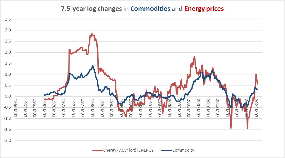
Chart H. Energy prices move along with the rest of the commodity complex. (World Bank)
Energy prices are the most volatile of any major class. The chart below shows volatility for various World Bank classes as well as the S&P 500, S&P 500 EPS, and CPI over various intervals.
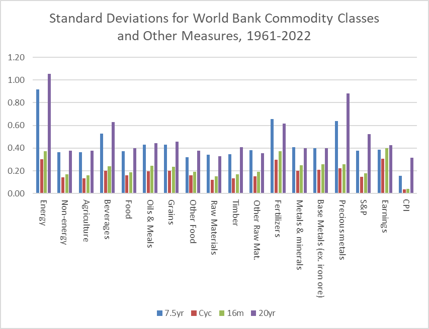
Chart I. Energy prices are volatile. (World Bank; Shiller; St Louis Fed)
That makes energy prices dangerous to play with. You can be a genius one day and broke the next, or so I have heard.
But there is more than volatility at play. At least since 1960, which is when World Bank commodity data begins, there has been a fairly reliable succession in relative strength throughout market cycles. First, precious metals rise, then industrial metals and corporate earnings, then textiles (cotton, rubber) then food commodities, then fertilizers, and finally energy. Bond yields also tend to peak towards the end of the cycle; equities have a relationship of their own with the cycle that is more complex.
If cycles tend to last three to five years from peak to peak or trough to trough, momentum tends to shift from one end of the commodity complex to the other over time in a somewhat standardized fashion. And, because momentum in these commodities tends to be tied to absolute levels, there is a tendency for relative strength to point to absolute returns at the cyclical level (at supercyclical intervals, as I tried to describe in my recent article on gold, energy prices tend to lead rather than follow, and precious metals lag rather than lead).
In the following chart, the gold/oil ratio (in red) has tended to lead momentum in oil prices (in blue) by about 16 months.
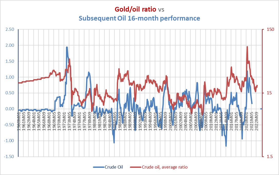
Chart J. The gold/oil ratio leads oil performance by about 16 months. (World Bank)
Thus, a bottom in the gold/oil ratio has tended to be followed by negative momentum 16 months later, but this is more reliable outside of periods like commodity supercycles in which cyclical momentum is less misleading. If the May 2022 level in the gold/oil ratio was the bottom, then that points to depressed momentum going well into September 2023. Another 30% down would be normal under such circumstances, putting WTI near $50 a barrel.
If the precious metals/energy ratio is a good way to anticipate changes in momentum, relative strength is also a good way of tracking those changes along the way. The ratios of precious metals, industrial metals, and grains relative to energy prices have all shown themselves to be reliable. Over the last three months, precious metals, industrial metals, and grains have strengthened relative to energy commodities, as shown in the following chart.
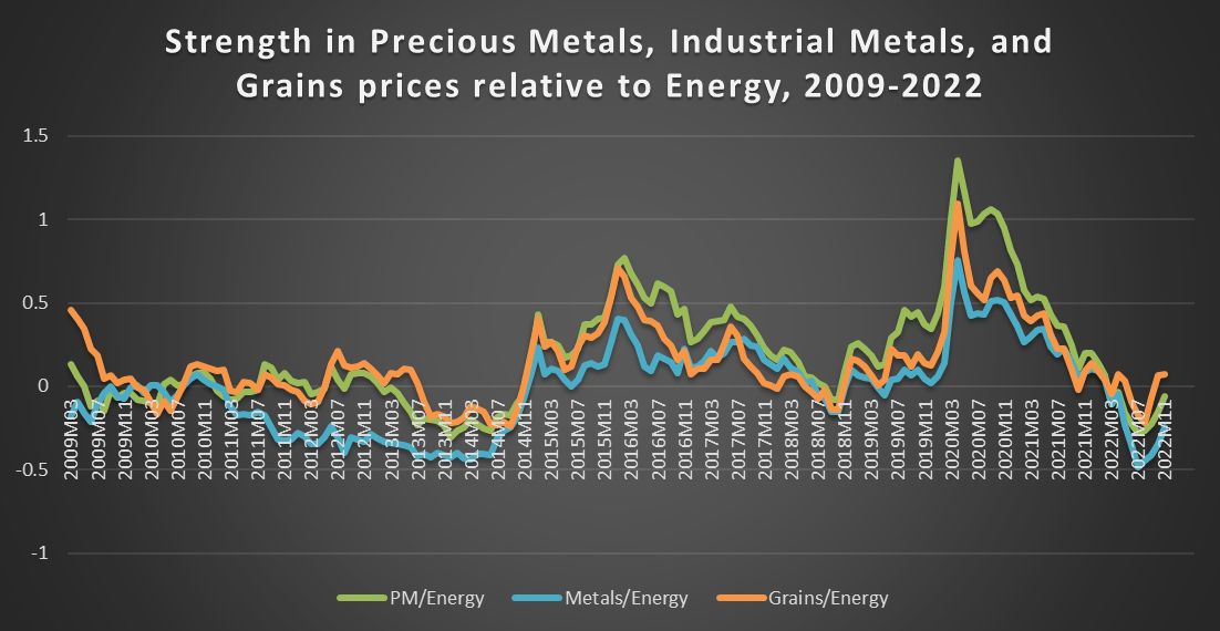
Chart K. Precious metals, industrial metals, and grains have been rising relative to energy this fall. (World Bank)
I have found that using averages of the 10-month highs and lows of the respective ratios has been a good indicator for changes in relative strength. In October, two of these three (the precious metals and grains ratios) broke above those averages. Industrial metals were on the brink as of November.
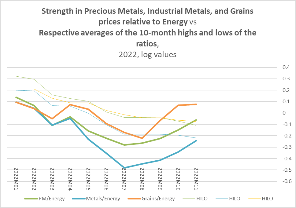
Chart L. Precious metals and grains have broken above their price channel medians relative to energy. (World Bank)
More high-frequency data, here using the GSCI indices, suggests that industrial metals broke out, relative to energy, at the end of November. The dark blue line is a 5-week exponential moving average of the ratio, and the dashed orange line is the moving average of the ratio’s highs and lows over the previous 46 weeks (about 10 months).
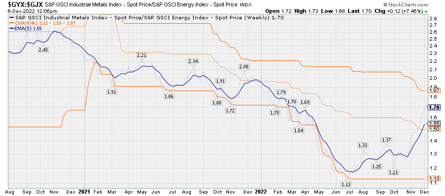
Chart M. The industrial metals/energy ratio has also broken out in recent weeks. (Stockcharts.com)
The nature of the market cycle, as outlined earlier, combined with the momentum that commodities tend to exhibit and the volatile nature of energy suggest that one of the biggest winners of the last two years has worn itself out, especially relative to other commodity classes.
Energy and Treasuries
Because cyclical momentum in Treasury yields tends to positively correlate with momentum in the market cycle—especially late-cycle commodities like energy—using the ratios of commodity prices to Treasury indices can help us amplify the cyclical signals. There should be a tendency for energy to decelerate just around the time that Treasuries begin to accelerate. DBE, for example, has been weakening relative to Treasuries, here represented by the iShares 7-10 Year Treasury Bond ETF (IEF), since May and appears to be crossing over the average of the 46-week highs and lows right now.

Chart N. DBE is threatening to breakdown relative to US Treasuries. (Stockcharts.com)
If we break DBE into its constituents, we can see that the most important of these, crude oil prices, have already broken through.
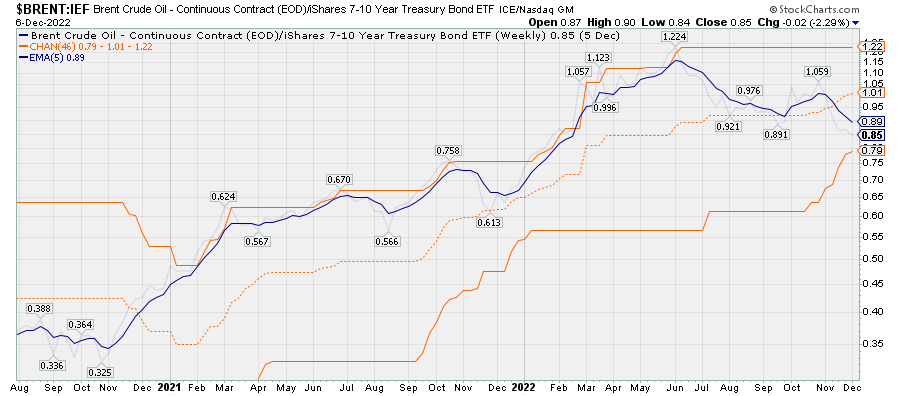
Chart O. Crude oil is underperforming US Treasuries (Stockcharts.com)
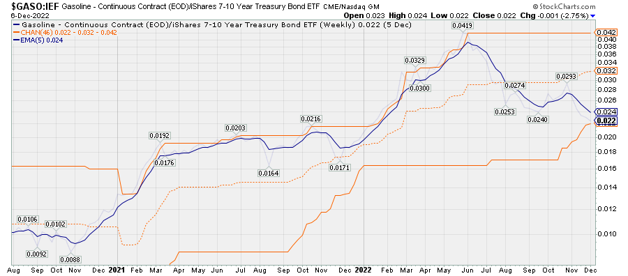
Chart P. Gasoline prices are clearly underperforming Treasuries. (Stockcharts.com)
Those that are more integral to keeping homes warm in the winter—heating oil and natural gas—have seen more strength but appear to be deteriorating fast.
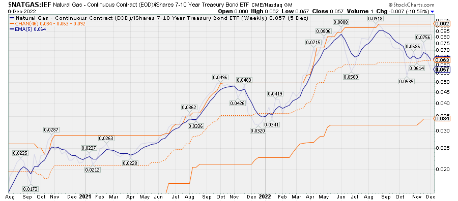
Chart Q. Natural gas threatens to breakdown against Treasuries. (Stockcharts.com)
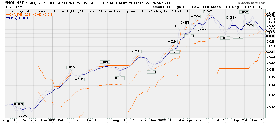
Chart R. Heating oil is also threatening to breakdown against Treasuries. (Stockcharts.com)
A more reliable gauge, however, are things like the direction of travel in MACD histograms, such as illustrated below in green and yellow, or the percentage price oscillator.
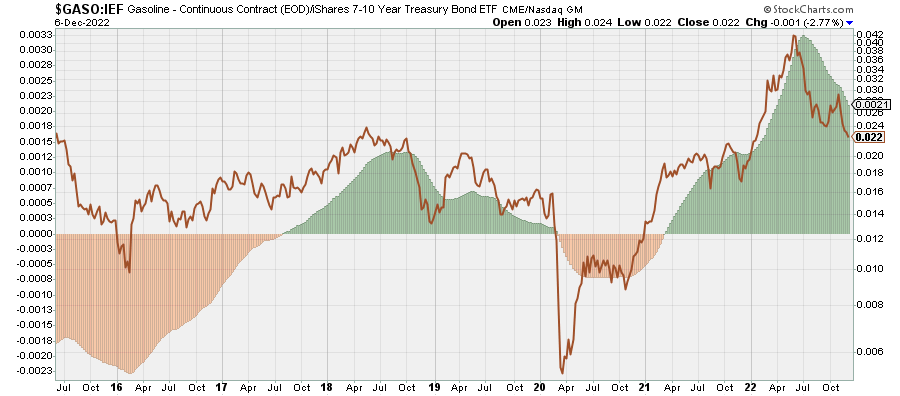
Chart S. Momentum in gasoline relative to bonds has broken down. (Stockcharts.com)
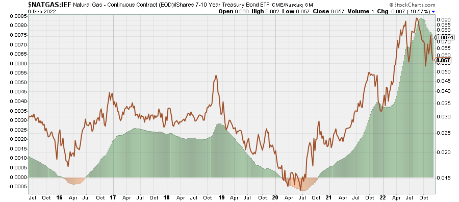
Chart T. Natural gas momentum is falling relative to bond momentum. (Stockcharts.com)
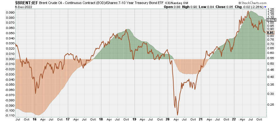
Chart U. Crude oil momentum is collapsing relative to bond momentum. (Stockcharts.com)
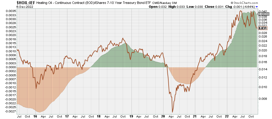
Chart V. Heating oil momentum appears to have finally decisively broken against bond momentum. (Stockcharts.com)
This is not a good way of identifying extreme levels, a task better suited to strength relative to precious metals, but it is a good way of drawing out the underlying cyclical momentum among all the short-term volatility. As you can see, cyclical momentum in crude, heating oil, natural gas, and gasoline has broken down across the board relative to long-term Treasuries.
Incidentally, in terms of relative strength, natural gas and heating oil have been at near record levels relative to crude oil in the last six months. This is not unusual, insofar as there is a tendency for natural gas and heating oil to rise relative to crude oil in the latter half of the year, presumably as winter in North America approaches. This may be another feather in the cap of those who insist that supply and demand are the primary drivers of commodity prices. In any case, at these levels, I would not be surprised to see heating oil to continue to decelerate relative to crude prices over the next six months.

Chart W. Natural gas often outperforms crude as winter approaches. (Stockcharts.com)
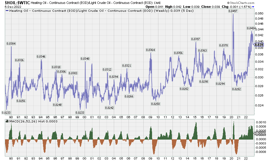
Chart X. Heating oil also has a distinct seasonal component relative to crude oil. (Stockcharts.com)
This could prove to be a potential drag for energy ETFs like DBE that track these types of commodities in addition to crude oil.
In any case, with most commodities, using cyclical momentum indicators like those described above, especially in conjunction with Treasuries, would have outperformed a buy-and-hold strategy in commodities over the last sixty years, assuming that one would have been able to track commodity spot prices in the first place. Because of the friction involved in trading commodities futures, it is generally very difficult to beat spot prices, although this can be done from time to time. The chart below, for example, shows the relative performance of DBE and the GSCI Energy Index.
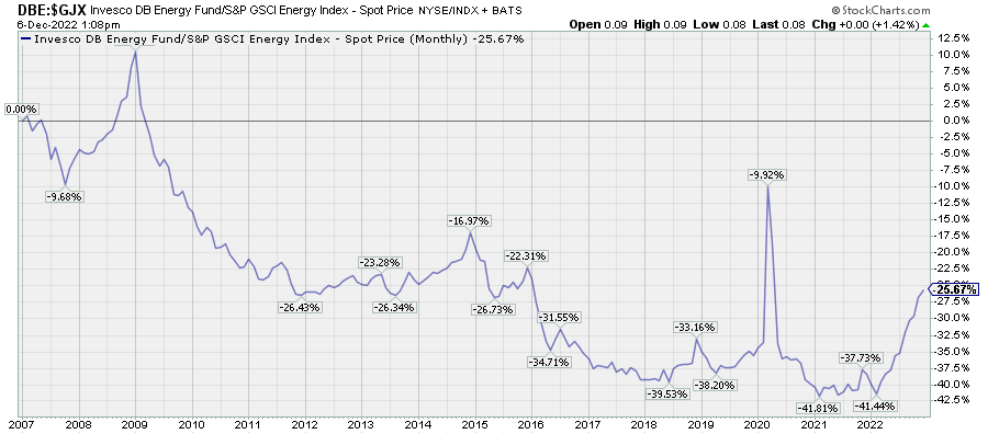
Chart Y. Energy ETFs, like other commodity ETFs, struggle to maintain parity against their underlying portfolio of commodities. (Stockcharts.com)
The outperformance of DBE this year appears to have been driven primarily by the outperformance of futures, as suggested below in the relative performances of WTI futures, but crude oil is moving back into contango (the green line, for example, shows that the May 2023 contract is now 1.01x more expensive than spot WTI), likely limiting the potential for ETF outperformance over the medium to long term.
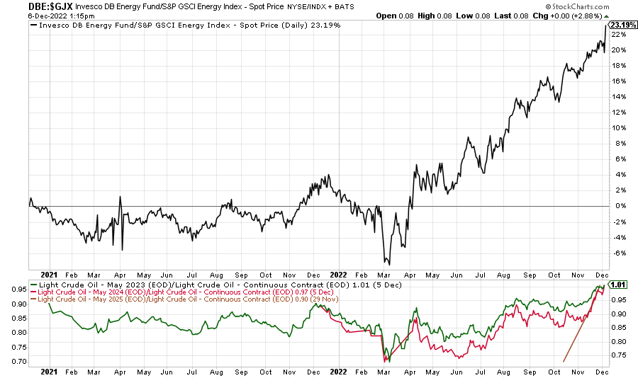
Chart Z. Contango is returning. (Stockcharts.com)
Conclusions
With momentum in the energy space rapidly decelerating relative to precious metals, industrial metals, grains, and bonds, and against the long-term backdrop of a general cyclical slowdown, itself within the larger context of a decade’s worth of depressed returns for markets, energy looks like a poor place to be right now. Treasuries look likely to outperform in 2023, and if one wishes to hedge against the risk of reigniting inflation, gold is likely to provide exposure to commodities while also being less prone to cyclical downside pressure.
A decline in energy prices is significant for equities for a number of reasons. For example, negative inflation in crude oil has tended to be a positive signal for equities. This has been a theme echoed in the ‘peak inflation’ and ‘pivot’ narratives whereby a decline in cost pressures is expected to reduce pressure from the Fed and consumers to tighten. Unfortunately, on many occasions, the stock market has not found its footing until the market cycle, including crude oil, bottomed, and there is no indication that that is about to happen. If we are in for a secular disinflationary growth shock—something that has not occurred since the 1930s—the bottom could be very far away indeed.
In other words, under the right circumstances, particularly coming out of a commodity supercycle, a decline, or even stability, in crude oil can be a boon to equities, as it was in the 1980s and the 2010s. But the payoff typically does not come until commodities have thoroughly crashed themselves. If they are only in the early stages of losing momentum, then that has typically indicated that a cyclical bear market in equities has only just begun.
Take the GFC. Equities were softening throughout the latter half of 2007 and into 2008, even as oil continued to rise to record levels. The break in oil prices may have relieved some pressure on the markets, but ultimately this was an indicator that the worst parts of the bear market were about to begin.

Chart AA. A decline in energy prices often points to an acceleration in a cyclical crisis. (Stockcharts.com)
I do not think 2008 is the best template for the current market, but from a cyclical perspective, it is not atypical either. Energy prices are late cycle, and when they crater after an energy shock, everything else tends to go along with them. That is the key difference between the bullish energy crashes of the 2010s and the energy crash of 2008 and the prospective crash of 2022-2024. Markets do well when energy is relatively stable and/or falling, but they do not do well when energy is falling after an energy shock.
Declining energy prices are likely also to be a drag on the energy sector itself, unsurprisingly. This could confuse the medium-term outlook for relative performance in equities. As I mentioned at the beginning of the article, I have expected and continue to expect a long-term underperformance of tech and outperformance of energy, but that does not mean that that has to hold throughout every single moment of the bear market.
If we are entering the more properly deflationary stage of the cycle, we ought to expect some white-knuckle drops in cyclical equities that have been primarily reserved for the tech sector up until now. In other words, we are increasingly likely to see some of the rot in tech spread to the entire market in 2023.
I continue to think that long-term Treasuries are likely to be the safest place to be going into the next year and even into 2024, and that there are opportunities to short the market as a whole. If the cycle is entering the deflationary stage, then ETFs that bet against the broader market such as TAIL, SH, and DWSH are likely to do well. Anti-beta ETFs like BTAL are likely to do well in a cyclical downturn, as well.
Be the first to comment