

Roberto/iStock via Getty Images
In June of last year, I argued in DBB: The Cyclical Downturn Has Likely Begun that long-term Treasury bond ETFs like the iShares 7-10 Year Treasury Bond ETF (IEF) and the iShares 20+ Year Treasury Bond ETF (TLT) would likely outperform the Invesco DB Base Metals Fund (NYSEARCA:DBB) as industrial metals prices fell. I also argued that Treasuries would outperform equities (SPY) generally. After that, industrial metals prices fell both absolutely and relative to Treasuries, but since July they have managed to creep up in fits and starts, and now both the absolute price of DBB and its relative strength versus Treasuries have returned to where they were in June of last year.
In this article, I intend to argue that, although most momentum measures that I consider reliable point to continued strength in industrial metals both absolutely and relative to Treasuries, the larger macro environment has not fundamentally changed, or at least it has not shown enough signs of having fundamentally changed to warrant a real revision in the cyclical and long-term outlook for industrial metals (indeed, equities, commodities, and bonds generally).
This analysis will begin with a review of relevant price action over the last seven months, then move on to some of the indicators that suggest continued industrial metals strength and outperformance relative to bonds, and then conclude with a review of the overall market environment and what it suggests about where industrial metals (absolutely and relative to Treasuries) are heading.
A Methodological Warning
But, before that, I should warn readers that some of the methods or theories employed here are likely to be perceived as unorthodox or heretical. I do not have much to say, for example, about EVs or China reopening. For readers curious about the underlying paradigms, here are some links to some of my previous writings and a very brief description of their themes:
- In March of last year, I argued why I was bearish on commodities generally, and I laid out five basic principles for cyclical and supercyclical commodity analysis.
- From May to June of last year, I wrote a four-part series exploring the links between stock prices, tech stock booms, equity yields, the unfolding of disruptive innovation waves, global political (in)stability, consumer inflation, and commodity prices over the last 200 years and found that these relationships and patterns were surprisingly stable.
- In November, after having been challenged by readers for having failed to incorporate supply-demand analysis into my outlook for grains, I conducted and wrote a brief historical study of the relationship between supply, demand, and price in commodities over the last 200 years. I found that, for primary commodities, quite simply, 1/supply = price, which presents difficult questions about how demand ought to fit in to commodity price forecasts.
Some of this will be illustrated over the course of our treatment of industrial metals prices below, but for readers looking for greater detail or justification for some of the assumptions, I hope they will refer back to the links above.
Price Action Since June
The following chart shows the absolute performance of DBB since June (in green) alongside the performance of the DBB/IEF ratio (in orange) and the SPY/IEF ratio (in yellow).
Chart A. Industrial metals have rallied hard over the last three months. (Stockcharts.com)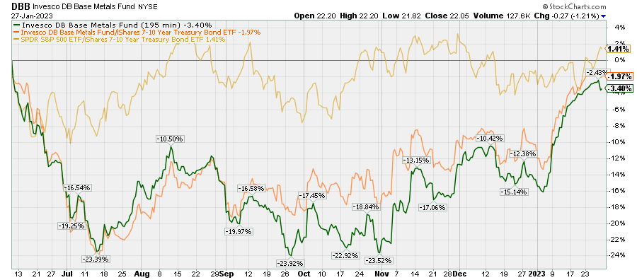
Generally, the outlook presented in June was in fairly good shape until the beginning of this month. Since then, we have seen just about everything rally, but particularly industrial metals.
The following chart shows the performance of a variety of DBB/Treasury ratios. Treasuries on the short end of the curve (SHV, represented by the green line) have done the best relative to industrial metals while those on the longest end of the curve (represented here by ZROZ in yellow), have fared the worst.
Chart B. Industrial metals have outperformed Treasuries since July. (Stockcharts.com)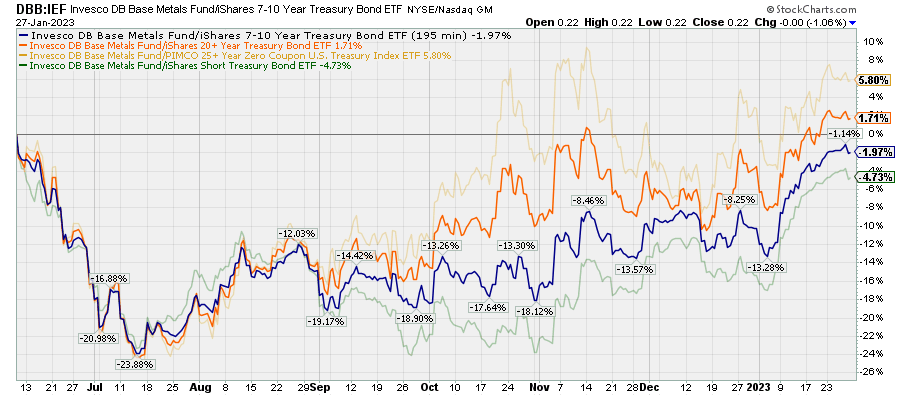
My argument is that, although I do not have any good way for identifying precisely when this momentum in equities and metals will likely break-and I would hesitate to aggressively short it-I believe that we are likely to see a return of the bearish action we saw in 2022 in 2023. Moreover, I think the best place to play it will be on the long end of the curve, for example with ETFs like TLT and ZROZ. Presumably, similar instruments, such as TLH, PLW, LGOV, VGLT, SCHQ, SPTL, and EDV will see similar outperformances, but Treasuries generally will likely outperform industrial metals, with the ETFs at the shorter end providing lower returns but with less risk.
Right now, however, that is not what the cyclical indicators are saying.
Cyclical Indicators
There are a number of indicators I like to use for industrial metals cycles, but I will just focus on a handful here. After reviewing them, I will move on to the broader macro backdrop.
Since we are going to be taking a closer look here at industrial metals, I should note that DBB tracks an equal-weighted index of aluminum (JJU), copper (CPER), and zinc prices, meaning that it does not include other important industrial metals such as nickel, tin, lead, and iron ore. Nonetheless, as I pointed out in the June article and as illustrated in the following chart, industrial metals are all highly correlated with one another, and whether we focus on the particular composition of the DBB or speak of industrial metals generally makes little difference. (I do think nickel (JJN), which is not included in DBB, is probably the most “overbought” of the industrial metals at the moment).
Chart C. The industrial metals cycle has come back to life. (World Bank)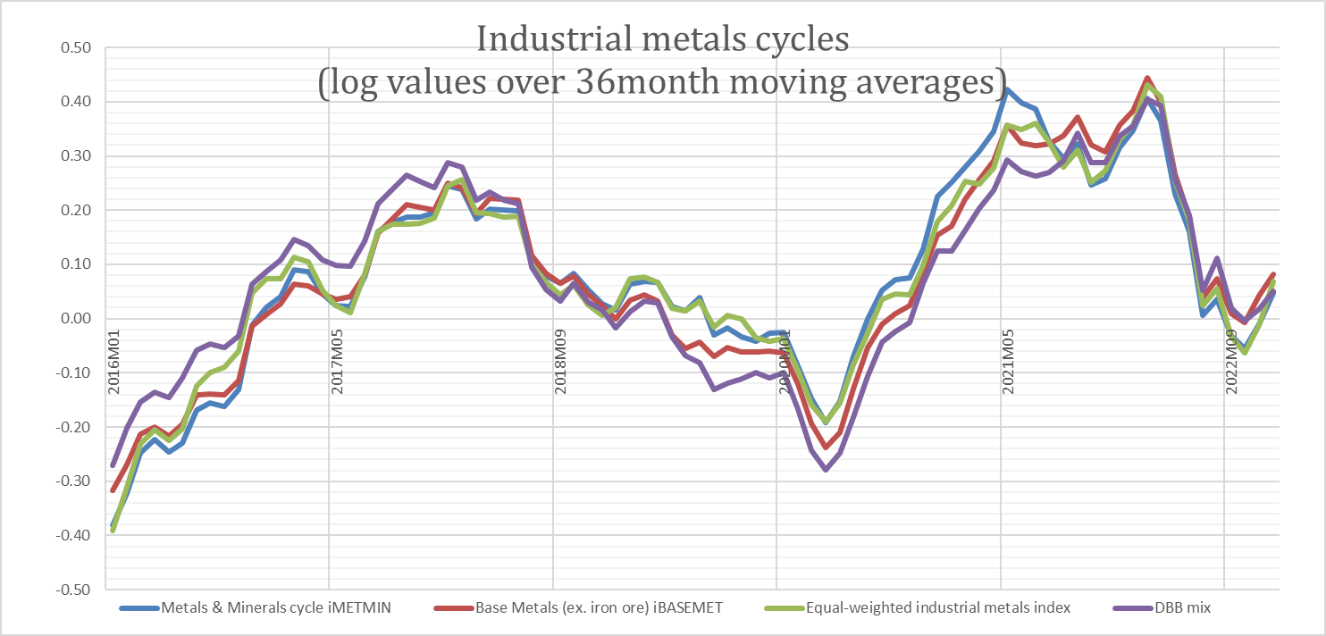
The chart above shows the rates of change of two trade-weighted base metals indexes (in blue and red), an equal-weighted index of those metals (in green), and the mix used for the composition of the DBB ETF (in purple). As you can see, these cycles are virtually indistinguishable. We can also see that there has been a marked change in momentum since the fall of last year.
But, before looking at the current state of metals momentum, I want to look at a more forward-looking indicator, the gold/industrial metals ratio.
Gold/Industrial metals Ratio
Peaks in gold/commodity ratios typically precede peaks in commodity momentum by about 12-20 months. As discussed in some of the articles linked to above, this is due to the nature of commodity cycles, which are themselves a part of a wider market cycle that includes corporate earnings, interest rates, and real GDP. To simplify, precious metals lead the market cycle, earnings and industrial metals coincide with the cycle, and agriculture and energy commodities, as well as interest rates, lag the cycle.
I have attempted to illustrate this with the chart below, which shows the ratio of gold prices to the S&P GSCI Industrial Metals Index (GYX) in brown alongside the 69-week rate of change in the GYX.
Chart D. The gold/metals ratio anticipates changes in industrial metals momentum. (Stockcharts.com)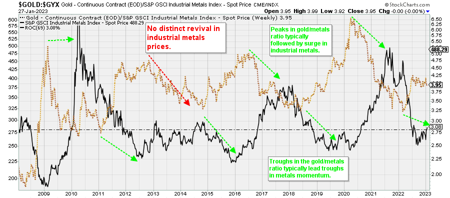
There are certain situations in which this relationship is less robust, particularly during commodity supercycles, but as I have argued before and I will reiterate later, it is unlikely that we are in a supercycle.
History suggests that it is possible but somewhat unlikely that we have seen the completion of the downcycle in industrial metals, although there was already a rapid deceleration in metals prices in 2022. Because it is not especially clear to what degree gold ratios are mean reverting, it can be difficult to say at any given moment whether or not gold is high, low, or otherwise relative to a given commodity or class of commodities. Gold, almost uniquely across the commodity spectrum, has shown a persistent tendency to rise over time. (For more on what drives gold prices over the long-, medium-, and short-terms, please check out Why You Can’t Ignore Gold).
Chart E. The gold/industrial metals ratio continues to rise slowly over the long-term. (World Bank)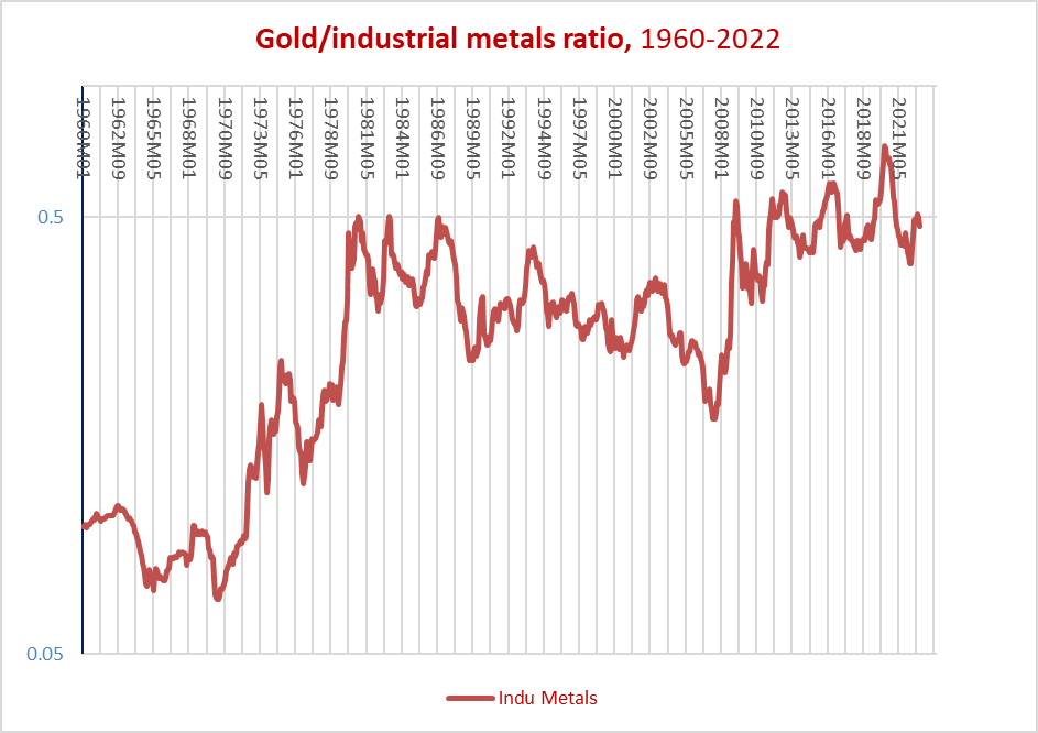
But, if we take out everything before the gold was unpegged in the 1970s, there appears to be a fairly stable relationship. In the chart below, I show the ratio of the DBB mix of metals to gold prices since 1975 (in red) alongside a cyclical rate of change (current price divided by a 36-month moving average) and the 16-month rate of change in the DBB mix (in purple and blue, respectively) and the 16-month rate of change in the DBB/Treasury index ratio (in magenta).
Chart F. Gold ratios are a good way of keeping track and anticipating commodity cycles. (World Bank)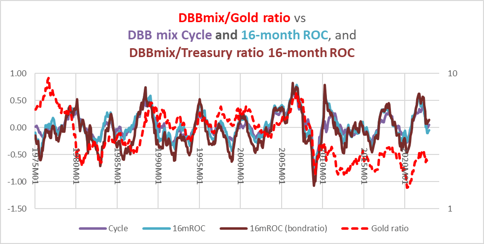
What is presented here is not a predictive relationship, of course, but it shows that gold is attuned to the commodity cycle. It also shows that one does not need to be too picky about precisely how a cyclical rate of change is calculated and that, generally, what applies to what we find about commodity cycles can be applied to the ratios between commodities and bonds.
Or, to put this even more succinctly:
- When momentum in commodities breaks, gold and Treasuries can both be expected to outperform.
- Over cyclical durations (16-36 months), extremes in the gold/commodity ratios are likely to be predictive.
I have tried measuring cyclical extremes in at least three ways. I am not a statistician, so perhaps these are not the best ways, but they seem to point towards the best ways to use this relationship. First is a straightforward correlation between gold/commodity ratios of the last 40-50 years (depending on whether or not one wants to assume gold’s price was ‘normalized’ in the 1970s) and subsequent 16-month returns (both absolute and relative to bonds). This produces a weak statistical relationship. Second is a comparison of gold/commodity ratios relative to their centered moving averages and subsequent 16-month returns (both absolute and relative to bonds). This produces pretty strong correlations, but in practice assumes that one knows what the average gold/commodity ratio will be over the next 12-18 months. Third is comparing rates of change in gold/commodity ratios relative to Bollinger bands and subsequent returns (absolute and relative to bonds). “Bollinger bands” are just a way of quantifying extreme levels or moves using rolling standard deviations. This approach is not quite as strong as the centered moving average approach but does not require knowing anything about the future.
Unfortunately, I have not yet taken the time to optimize the Bollinger band parameters to find the most predictive relationships, but in general the relationships appear to hold for most commodities and their bond ratios.
By that measure, the gold/industrial metals ratio has already returned to its cyclical median, as illustrated in the chart below. The 100% and 0% lines indicate points at which the gold/industrial metals ratio would have moved two standard deviations on a cyclical basis, with the former level being bullish for industrial metals and the latter bearish. The 50% level indicates that momentum in the ratio is not extreme on a cyclical basis.
Chart G. The gold/industrial metals ratio is effectively neutral at the moment. (World Bank)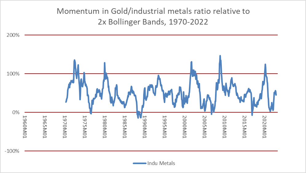
From July 2021 to March 2022, this measure hovered near extreme low levels suggesting subsequent 16-month returns in industrial metals would be low. Now it is somewhere near 45%, which is only slightly bearish for metals.
By this measure, the gold/industrial metals ratio is neutral on subsequent returns over cyclical durations in industrial metals.
The next thing to check is the status of cyclical momentum itself, both absolute and relative to Treasuries.
Industrial metals momentum
Before discussing the momentum of industrial metals prices themselves, however, it might be a good moment to talk about why we are focusing here on commodity/bond ratios rather than, say, commodity/equity ratios, and the reason is fairly straightforward: commodities and bonds have consistently been obedient to cyclical forces while stocks have not. The relationship between commodities and equities is at the supercyclical, or “secular”, level. Look at the ratio of industrial metals prices to the S&P 500 price index since 1996 in the chart below, for example.
Chart H. The relationship between commodities and stocks is decided at the supercyclical level, not the cyclical level. (Stockcharts.com)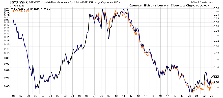
As I wrote about in greater detail in some of the links mentioned near the beginning of the article, this is most likely rooted in interrelated long-term fundamental forces. As such, I do not have any especially useful methods for predicting relative performances of commodities and equities over cyclical durations. Since early 2020, industrial metals have beat the S&P 500, and this is likely to continue.
Interest rates, however, like commodities, are highly cyclical, and this makes commodities (positively correlated to the cycle) and Treasury bonds (negatively correlated with the cycle) such a compelling pair. But let’s return to our examination of industrial metals momentum itself.
Three indicators are included in the chart below. One is the 10-month price channel and the other two are MACD histograms set for cyclical parameters. Strictly speaking, we should probably wait until the end of month numbers come in for the current month, but at the moment, these are all bullish on industrial metals, particularly the most sensitive and reliable indicator (in green). (Prices have not yet crossed the average of the price channel’s high and low numbers, but they are currently about 1% higher than the geometric average, which is where I draw the line normally).
Chart I. Industrial metals momentum has resuscitated. (Stockcharts.com)
In my own calculations on cyclical momentum, I blend two percentage price oscillator histograms into a single indicator, which I call the CyclesPlus indicator, and this points to industrial metals strength.
This perhaps provides a good segue way back into the discussion about relative strength in commodities and Treasuries.
Metals/Treasuries Ratios
In the chart below, I have applied this CyclesPlus indicator to corporate earnings per share, the consumer price index, the 10-year Treasury yield, and industrial metals prices. Generally, as mentioned earlier, cyclical momentum in earnings, yields, and commodity prices tends to move together, despite any “secular” or structural differences they might have. Consumer prices, composed largely of services, only shares this cyclicality slightly by comparison.
Chart J. Momentum is reviving in metals, but it is declining and peaking elsewhere. (World Bank, St Louis Fed, S&P Global, Shiller data)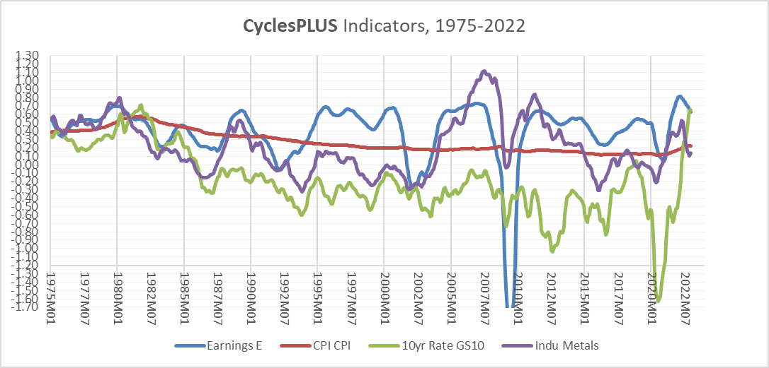
A closer view shows where we are now, or at least at the end of 2022.
Chart K. The overall market cycle continues to decelerate. (World Bank, St Louis Fed, S&P Global, Shiller data))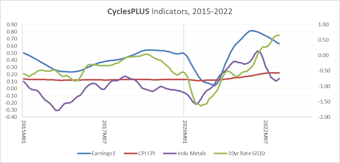
Industrial metals momentum was slowing until late 2022, consumer inflation appears to have leveled off, and corporate earnings have clearly decelerated, but momentum in bond yields continued to rise.
This rise in yields has generally contributed, albeit marginally, to the rising momentum of the metals/Treasury ratio, at least up until recently. This is illustrated in the chart below, which shows the industrial metals/Treasury ratio over the last seven years.
Chart L. The industrial metals/Treasury ratio has also regained momentum in recent months. (Stockcharts.com)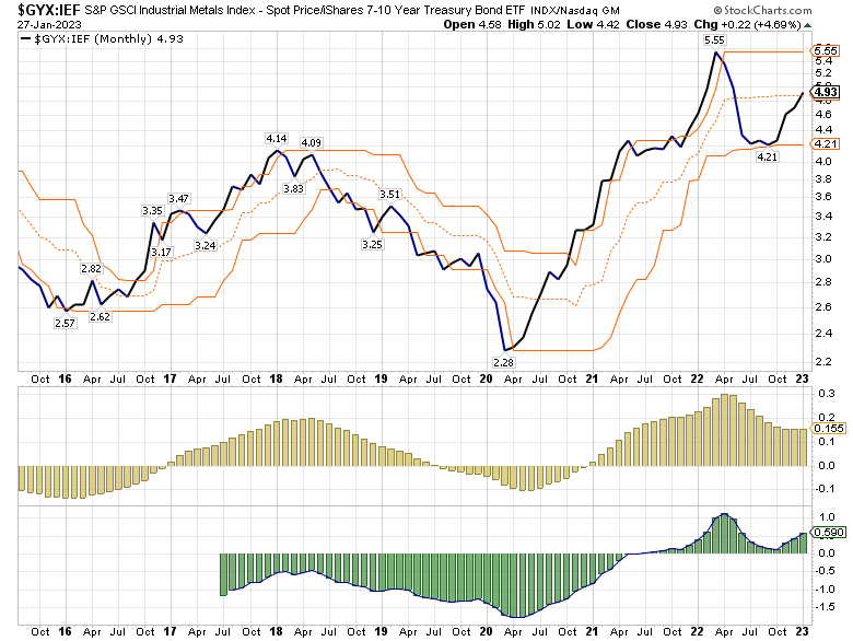
To make a long story short, it appears to me that momentum, especially on the long end of the curve is beginning to turn. The following chart is a monthly chart of the 30-year Treasury yield and three of its cyclical indicators. The less-sensitive histogram in yellow appears to be going negative for only the second time since the pandemic low in yields three years ago.
Chart M. The longest end of the curve is signaling deceleration. (Stockcharts.com)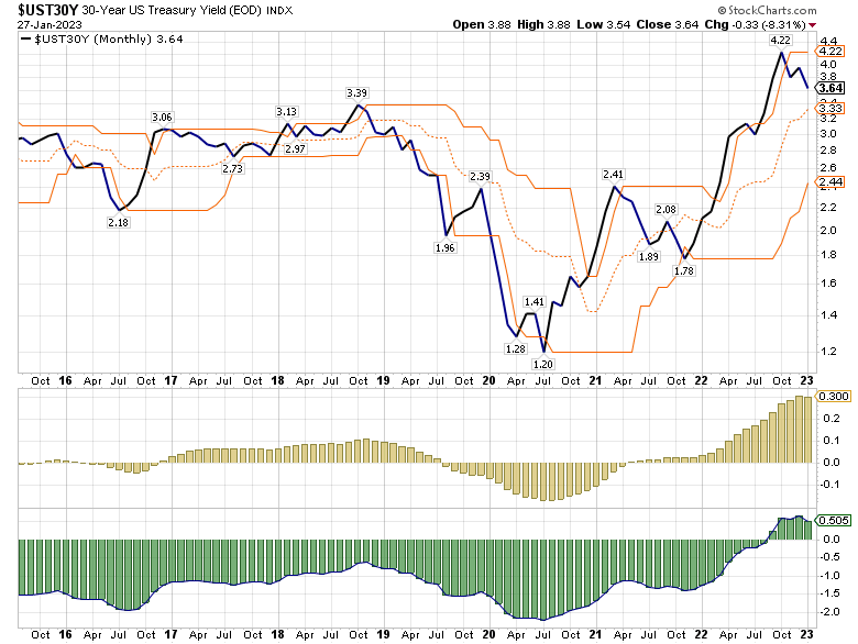
Ultimately, it is industrial metals prices that make for the decisive moves in the relative momentum of metals and Treasuries, but what looks like the beginning of the end for the cyclical surge in Treasuries points us to the wider cyclical environment.
The Market Cycle
The market cycle at the moment is somewhat fractured. We have the recent revival of metals prices and the sustained surge in interest rates on the one hand and we have the decline in corporate earnings, commodities, and consumer inflation on the other.
Now, commodities like energy and agriculture (which both make up the bulk of trade-weighted commodity indexes), corporate earnings, and consumer inflation are not (in isolation) lead indicators, but it has been unusual for earnings growth to come off a major peak and for industrial metals to not be left in the rubble for years in the aftermath. The primary exceptions to that rule of thumb have been commodity supercycles, such as in the 1970s and 2000s.
Chart N. It would be unusual for metals prices to trough so early in a general downcycle. (World Bank, S&P Global, Shiller data)
Again, it is unlikely we are in a commodity supercycle for reasons that will be presented shortly.
Before moving on to the question of supercycles, however, I would like to point out that, with the yield curve still inverted, a continued slowdown in profits and real GDP still seems likely over the coming year. It is likely, ultimately, that industrial metals will show signs of revival before profits and real GDP have troughed, but it is unlikely that that time has come because the overall cyclical environment suggests recession and disinflation.
The state of the supercycle
There are many ways in which the analysis here could be wrong, but one major way it could be wrong is if I have applied cyclical logic to a commodity supercycle. The CyclesPlus indicator I referred to above is a good way of avoiding that trap, but this article is largely built around why I think it should be downplayed in this instance.
A pristine definition of a commodity supercycle may not exist, but many elements of what can be considered a supercycle can be captured through analyzing the 7.5-year rate of change. Following major depressions in commodity prices, such as the periods between 1870-1895 or during the Great Depression, a generational low in commodity prices may occur, but the transition to a typical supercyclical frenzy may take some time. For example, the 1895-1920 period, which ended with the high inflation of World War I, or the 1932-1950 period, which culminated in the high inflation of the 1940s, may be seen as long reinflationary periods following a deep deflation, as opposed to decade-long frenzies in the commodities market. It is worth noting that while arguments can be made that the commodity supercycles began in 1895 instead of 1914, and 1932 instead of 1939, the distinction between long reinflationary periods and decade-long frenzies in the commodities market is probably preferable.
In the chart below, I present three different rates of change in an historical commodity index I pieced together by fusing World Bank data with older wholesale price indexes. The red area represents the 7.5-year rate of change, the green line the 20-year rate of change, and the black line the cyclical rate of change (the current price relative to a 36-month moving average).
Chart O. Commodity supercycles have occurred about every 30 years since the establishment of the Fed. (World Bank, Warren & Pearson, St Louis Fed)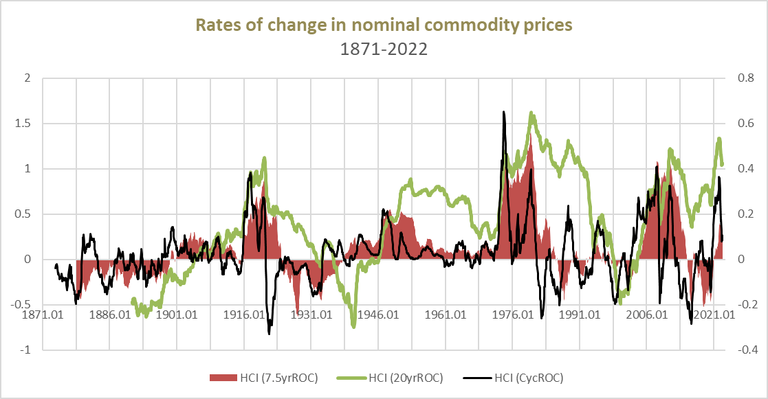
Since the establishment of the Federal Reserve in 1914, there has been a commodity supercycle every 30 years (the 1910s, 1940s, 1970s, and 2000s). Prior to that, peaks in commodity prices occurred every 50-60 years. If we assume that the supercyclical patterns of the last century continued, we ought not expect another commodity supercycle until the 2030s.
This supercyclicality of commodity prices is solidly correlated with the earnings yield (the inverse of the PE ratio) on the S&P Composite. The following chart contrasts commodity inflation with Shiller’s CAPE ratio over the last 150 years.
Chart P. Commodity inflation is consistently inversely correlated with PE ratios. (Shiller data, World Bank, Warren & Pearson, S&P Global)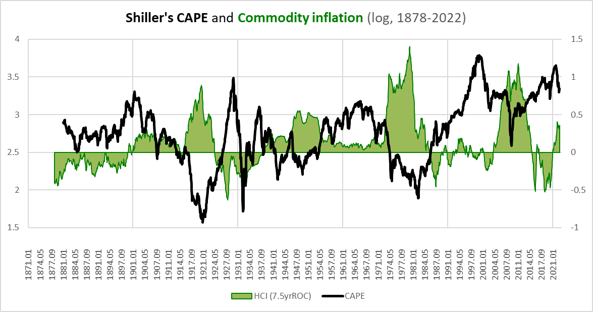
The following chart compares the 7.5-year rates of change in commodity inflation and the earnings yield with the earnings yield itself.
Chart Q. Long-term commodity inflation is most strongly correlated with long-term changes in the earnings yield. (World Bank; Warren & Pearson; Shiller; St Louis Fed; S&P Global)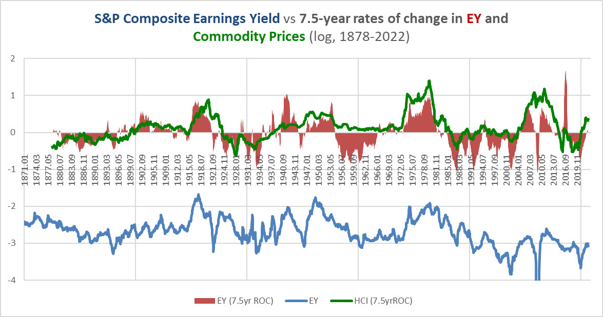
This is not the place to make my pitch for a grand theory of supercycles, but as I pointed out in the “Conjunction and Disruption” series linked to earlier, these supercycles appear to be closely tied to regular bouts of global disorder as measured in global deaths in battle. There is also an apparent link with waves of disruptive innovation, with decades in which inflation and yields are rising alongside global disorder being periods in which new communications and transportation platforms begin gestating (for example, the radio in the 1910s or the iPhone in the 2000s). Decades in which inflation, yields, and global disorder are falling tend to be periods of s-curve-like diffusions of these new platforms (for example, radios in the 1920s, TVs in the 1950s, PCs in the 1980s, and smartphones in the 2010s).
Assuming they exist, what is the status of these respective supercycles?
As I argued in “Conjunction and Disruption”, the wave of disruptive innovation has likely already crested. We moved rapidly from the introduction of the smartphone 15 years ago to supersaturation of the market. A key indicator, historically, of the cresting of the innovation wave is a boom in tech equities, which typically occurs as the s-curve exhausts itself. This tech boom likely came to an end in 2021. Certainly, new and exciting technologies with disruptive potential are emerging (for example, the language models OpenAI has put to use in ChatGPT), but there is little indication thus far that this will soon be combined with the diffusion of a new class of consumer communications gadgets.
All else being equal, the conclusion of a tech boom would be good for commodities. The collapse of the dotcom boom of the 1990s was quickly followed by the commodity boom of the 2000s. But, if tech booms collapse too soon, the result appears to be deflation. The tech boom of the 1920s, for example, coincided with the explosive growth in automobile and radio diffusion. When that boom ended in 1929, deflation followed, “because” the 30-year supercyclical pattern was not yet “ready” for a bout of sustained inflation.
Collectively, this suggests that we are resuming a period of low inflation and low commodity prices that will last much of the 2020s.
On the other hand, the prospects of global disorder appear to have turned decisively with Russia’s invasion of Ukraine last year. Not only did the invasion lead directly to death and destruction but it marked a point at which Russia and, effectively, China signaled a desire to break from the post-Cold War order. Both countries are ideologically married to their geopolitical aims and their opponents are ideologically committed to refusing those aims. “World War III” is a phrase that is regularly bandied around now, and although it does not at all appear imminent, that is the direction we are headed in at present. The kind of ideological revolutions required in places like Russia and China, or in their opponents, to avoid such a war would likely entail severe civil conflict. In other words, one plausible alternative scenario is not a global war, but rather a concurrent series of civil wars (as in the 1860-1870 period).
Nevertheless, these conflicts tend to build up slowly and then suddenly erupt. Japan swallowed up Manchuria in 1932, nearly a decade before Pearl Harbor. As early as 1934, Churchill was giving impassioned speeches about the dangers posed by the Nazi rearmament of Germany. Mussolini invaded Ethiopia in 1935, and the following year, Hitler remilitarized the Rheinland. But, the war in Europe did not really get into full swing until 1939.
From this perspective, assuming that we are heading into a period of increased global disorder, this is likely to provide long-term (i.e., over the course of the next 15-20 years) support for commodity prices, but history also suggests that this support is most likely to be felt in the 2030s rather than the 2020s.
There is one more implication here, however. That is, if, historically, real commodity prices have always been correlated with the earnings yield on the S&P Composite, as I have demonstrated in the articles linked to at the beginning, then that would suggest that commodity prices ought to be correlated with:
Author
The consumer price index times earnings per share for equities divided by the price per share of those equities ought to move with commodity prices.
In the chart below, I compare that equation (with appropriate multipliers) to a broad index of World Bank commodities and the DBB mix of industrial metals.
Chart R. The relationship between consumer inflation, corporate earnings, and stock prices can be used to model commodity prices. (World Bank; Shiller; St Louis Fed; S&P Global)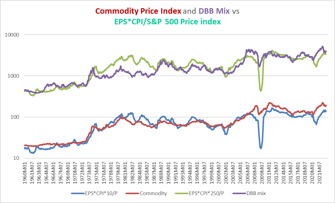
The correlations are pretty tight. The chart below compares the DBB mix of industrial metals to the price moves implied by the formula presented above. December 2022 levels are marked by the red dot, which lies both above the trend of the last 60 years and the levels one might expect were the r-squared 1.0 (indicated by the orange line) instead of 0.72 (indicated by the red line).
Chart S. This relationship suggests that industrial metals are a touch “overvalued”. (World Bank; Shiller; St Louis Fed; S&P Global)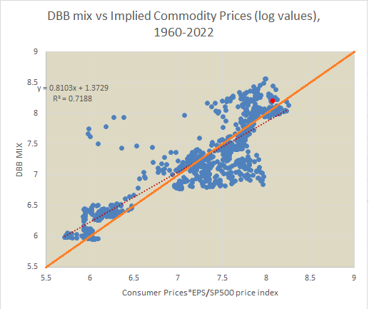
Both measures suggest that industrial metals or equities will need to fall and/or consumer prices or earnings will need to rise. Under current cyclical conditions, it would be easiest to resolve this “imbalance” by industrial metals prices falling or stocks falling, especially since earnings and inflation are following a downward trajectory.
Incidentally, it is unlikely that a relationship this consistent is merely coincidental, even if it is not strictly causal, and that makes it only that much more difficult to accept the supply/demand/price paradigm in commodities, because if that paradigm actually does determine commodity prices, then it would appear that supply/demand dynamics also determine the earnings yield multiplied by the consumer price index, as well. I would be interested in hearing well-reasoned contrary interpretations, however.
Conclusion
But, to return back to the main road of the argument, there are likely long-term forces building up that will lead to a massive boom in commodity prices, but those forces have probably not stored up enough energy to do so just yet. There needs to be more technological and geopolitical disruption for commodities to enter a supercycle. For those reasons among others, I tend to assume that industrial metals prices are probably too high on a medium-term basis (the 2020s) and that limits the upward cyclical potential of the current run in metals prices.
So, even though reliable cyclical measures suggest continued strength in metals, both absolutely and relative to Treasuries, I would expect them to see limited upside potential. That does not mean that they cannot appreciate considerably over a short amount of time, but my estimation is that their sustained upside potential is probably about 10% north of where they are now (thus, about $24 for the DBB ETF), and I suspect that there is much more potential for Treasuries, especially at the long end of the curve.
For those who are keen on gaining commodity exposure, I would argue that there is little that is encouraging but there may be some upside potential in cotton (BAL), and gold is a good way to limit downside risk (relative to other commodities) in case of a commodity collapse, but Treasuries will likely beat out gold, as well. Right now, I would be hesitant to short industrial metals under such circumstances, but if I had to short one, it would probably be nickel.
Chart T. Nickel prices may be the most ripe for a fall across the entire commodity spectrum. (Stockcharts.com)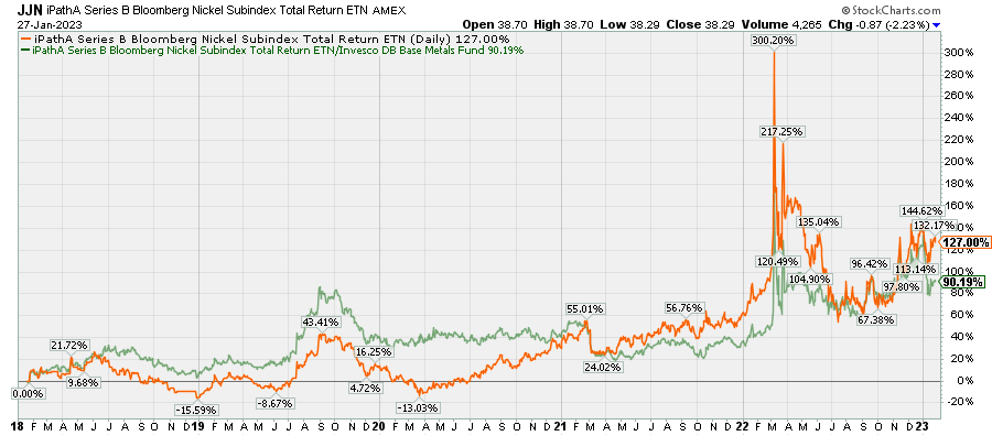
For those who are already in long positions in industrial metals, particularly DBB, it is not unreasonable to wait for clearer technical indications that the rally has exhausted itself, but generally I think there is little cyclical potential here and would prefer to position myself in Treasuries. In either case, it is prudent to keep a watchful eye on cyclical momentum.
Be the first to comment