

imagestock/E+ via Getty Images
Things are really heating up and changing by the hour. Markets are getting pretty nervous, but they are not predicting (yet) the end of the world as we know it. This post attempts to put the dollar and commodity prices in some long-term perspective.
What stands out the most is that the dollar is relatively strong vis a vis most other currencies, but commodity prices are also very strong; this conjunction of events is without historical precedent, so it’s tough to draw any conclusions (historically, the dollar and commodity prices usually move in opposite directions).
The only clear threat remains the “nuclear option.” That would indeed take us to an “end of the world as we know it” scenario, and in the process render all predictions useless.
Chart #1
Author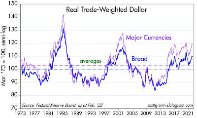
Chart #1 shows the Fed’s calculation of the dollar’s value relative to other major currencies and relative to a a broad basket of currencies. Both measures show the dollar is well above its long-term average value, but not extremely so.
Chart #2
Author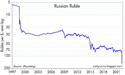
Chart #2 shows the value of the Russian ruble vis a vis the dollar. Few currencies (with the notable exception of the Argentine peso) have experienced such a dramatic decline over time.
In the past 2 ½ weeks, the ruble has lost about 50% of its value against the dollar. While not unprecedented, this is clearly a terrible shock for the Russian economy and its citizens.
Imported goods have effectively doubled in price almost overnight. This represents a massive tax increase on the citizenry. In a sense, Russia is paying for this war by stealing money from the pockets of anyone who holds rubles. Inflation is sure to skyrocket, and public unrest is sure to soar.
Chart #3
Author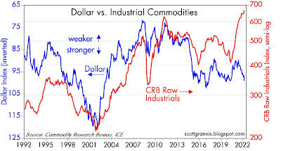
Chart #3 compares the value of the dollar (blue, inverted) to an index of industrial commodity prices. Note how the two tend to move together (i.e., inversely). But they’ve done just the opposite in the past few years: the dollar has been strong and commodity prices have been soaring.
This tells us that the value of the dollar is not driving higher commodity prices. But since commodity prices are rising in terms of nearly all currencies, it’s possible that the world’s central banks are way too accommodative.
In other words, it’s possible that all currencies are being debased, and that’s why hard assets are rising. In that case, look for inflation to be rising nearly everywhere.
Chart #4
Author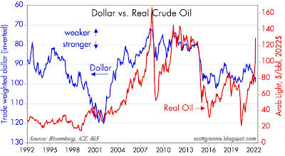
Chart #4 compares the dollar (inverted) to the price of oil. Here we see the same pattern as with industrial commodity prices.
Chart #5
Author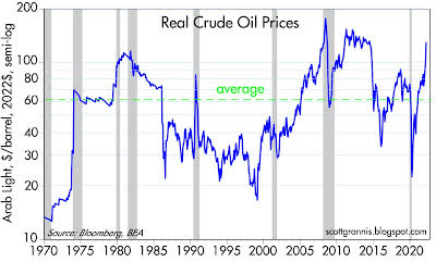
Chart #5 shows the inflation-adjusted price of oil. Note how virtually every recession has been preceded by a a very high real level of oil prices. Energy is so essential to growth that when oil becomes very expensive growth tends to weaken.
It would be tempting to say that this chart is good evidence that recession risk is high, both here and in the Eurozone. But I think it takes a few more things to happen before recession becomes imminent.
I go back to previous posts in which I point out that recessions are almost always preceded by very high real interest rates, a flat or inverted Treasury yield curve, and a significant increase in 2-yr swap spreads.
Currently we have none of these conditions. Real yields are very low, the yield curve is still positively sloped, and swap spreads (in the U.S., but not in the Eurozone) are still within normal ranges.
Liquidity is therefore abundant, and abundant liquidity is one of the best ways for an economy to avoid a recession. With liquidity, markets can efficiently shift risk to those willing to bear it; without liquidity, panic can ensue, much as happens when someone yells “Fire!” in a crowded theater.
Chart #6
Author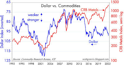
Chart #6 compares the inverse of the dollar to industrial metals prices. Metals prices typically go up as the economy strengthens, but in this case it’s not hard to argue that higher metals prices are part and parcel of the general rise in all commodity prices, and that this is all a function of very accommodative monetary policy worldwide. It’s also not hard to argue that the current surge in commodity prices will also feed back into higher measured inflation in the months to come.
Chart #7
Author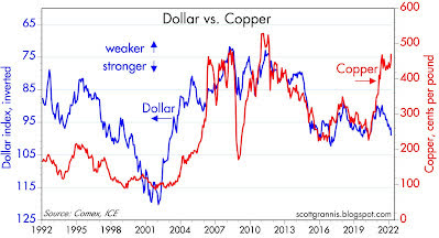
Chart #7 compares the dollar to copper prices. Same story as above.
Chart #8
Author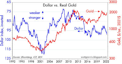
Chart #8 compares the dollar to gold prices. Here the correlation is not as high as with commodity prices. Gold has its own mind. Note that I’ve used the inflation-adjust value of gold.
Gold is now approaching its highest inflation-adjusted level in history, by the way. So you may like gold as a safe haven, but you should know that it’s extremely expensive at today’s levels.
People all over the world are willing to pay a very high price for gold because they are very concerned about all the bad stuff happening. And as I pointed out in a recent post, both gold and TIPS prices are very close to all-time highs. The risk-off trade is quite crowded these days.
Chart #9
Author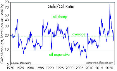
Chart #9 is quite impressive, in that it shows that the prices of gold and crude oil tend to mean-revert over time, averaging about 20 barrels of oil per ounce of gold. By this measure, oil prices are only moderately expensive given the level of crude.
If gold were to hold, say, at $2000/oz., then oil prices might continue to climb to $200/bbl without violating historical patterns (i.e., the ratio of gold to oil prices might fall to roughly 10). By inference, gasoline prices at the pump could break out to new all-time highs before this is over.
Chart #10
Author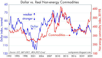
Chart #10 compares the dollar to non-energy commodity prices. Here again the same pattern as with all commodity prices.
Chart #11
Author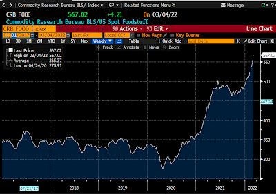
Chart #11 shows an index of food prices. The recent surge is likely understated, since many food items (e.g., wheat, of which Ukraine is a major producer) surged today and are not yet reflected in this index. Be prepared to pay even higher prices at your nearby grocery store. The Russia/Ukraine war is touching our lives in many ways.
Chart #12
Author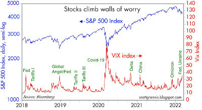
Finally, Chart #12 shows how rising uncertainty and escalating fears are depressing stock prices. We’re not at extremes yet, so this can continue to vex investors. I don’t pretend to know when this will end, but I do think that we will avoid an “end of the world as we know it” scenario.
Editor’s Note: The summary bullets for this article were chosen by Seeking Alpha editors.
Be the first to comment