


damedeeso/iStock via Getty Images
Investment Thesis
This article will take a look at Clough Global Dividend and Income Fund (NYSE:GLV). I looked at GLV over a year ago and my main worry was that it wouldn’t be able to sustain the distribution. I was correct to be concerned as GLV cut the distribution earlier this year. It was only a 6.3% reduction, but it was still a cut. I was also concerned about exposure to China, which has been reduced. However, despite the cut to the distribution, it doesn’t look like GLV is covering the distribution. And it isn’t even at a relatively cheap price.
What I look for in a CEF is a stable flow of income. I have developed a method of determining whether a specific CEF could provide a reliable stream of income. I developed my method after reading this article. My thinking is that rather than the share price, how the portfolio of the fund behaves and the income it generates is the determining factor in the reliability of the distribution. I think it is a mistake to see the fund’s NAV as the sole component of the fund’s value, but rather I think it is more productive to look at a fund’s NAV as the muscle that it uses to generate cash. So while it can be bad if the fund is eroding NAV (look at it as muscle atrophy), it is the fund’s ability to generate cash that is the true value. I look at a specific CEF and apply that method to determine if the fund has been supporting the distribution. Then based on current holdings and past performance, I try to determine whether or not the fund will be able to support the distribution in the future. You can read an explanation of my method and get links to the other articles in the series (published before March 27, 2022) here.
Back last year when I reviewed GLV with this method, it came up a bit short. Let’s look close to see why it still comes up short.
Clough Global Dividend and Income Fund
I like to look at a CEF as a collection of assets and possibly debt that generate cash to pay its investors. So to see how a fund is performing, I need to look at several metrics based on its portfolio’s performance. The first such metric is the fund’s total NAV return. This is the change in the fund’s NAV plus any gains from paying a distribution.
So how did GLV do over the last 12 months?
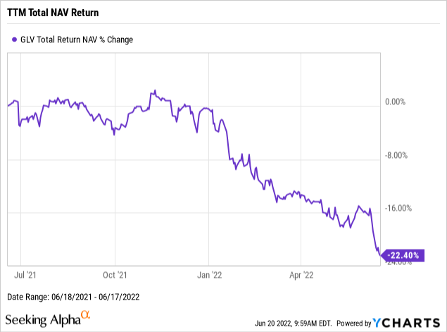
Well, not so good as it turns out. The portfolio actually had negative returns. Which is a fairly strong indicator that the fund didn’t earn enough to cover its distributions. The next step in determining that is to look at the fund’s NAV.
So how did GLV’s NAV do over the last 12 months?
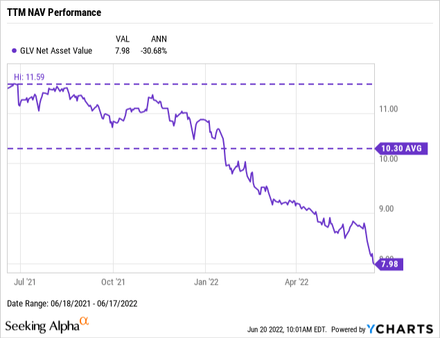
Again, not so good. The fund actually had a decline in NAV of over 30%. That is a big hit. Notice that both the average and the peak NAV are well above the current NAV. In fact, the NAV of the fund last hit either of those values back in 2021 and has been below them all of 2022 (so far anyway).
Normally, at this point, I would look at the distribution, and figure out a yield on NAV based on both the average and the peak NAV. But with the total NAV return being negative, there is no way that the yield on NAV, which is positive, will not exceed that negative number.
Let’s take a look at the distributions anyway. I got this information from CEFData.
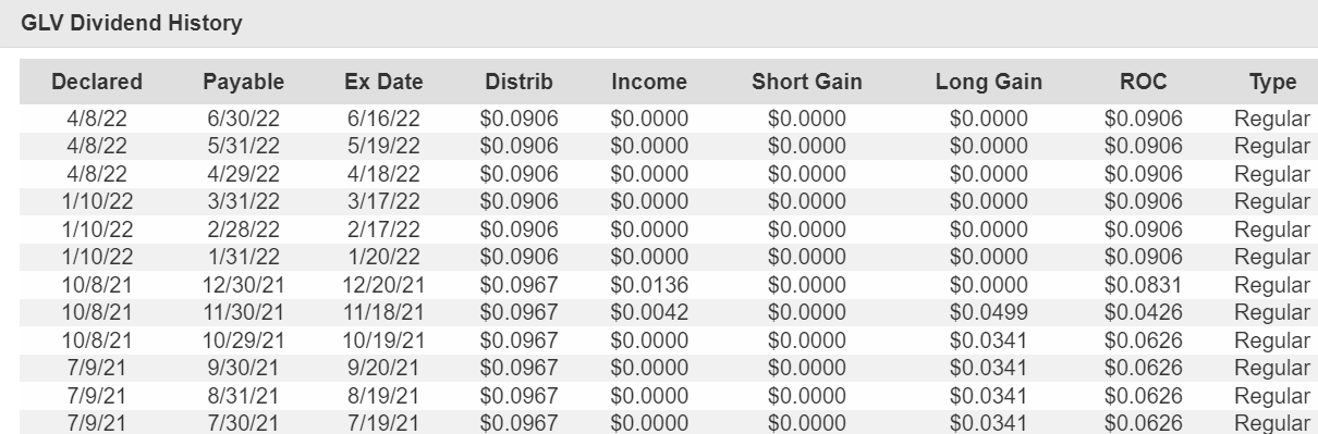
Distributions (CEFData)
Notice that the distribution for each month in 2022 was reduced from the amount the fund paid in 2021. Even so, the total distribution was a pretty attractive $1.1238.
Two things that are a lot less attractive are the increasing ROC (it is 100% of the distribution over the last several months) coupled with the declining NAV. And while one might have thought that cutting the distribution would shore up the NAV, it appears that the decline in NAV accelerated after the distribution cut.
Declining NAV and ROC tend to indicate a bad situation where the fund is selling off assets without enough profit to cover the distribution (or even at a loss). I like to compare the fund’s total NAV return to various benchmarks to gauge whether they have the cash to pay the distribution. Such a comparison can help me determine if the NAV decline is due to a decline in the market price of the assets.
So how did the portfolio of GLV perform relative to the benchmarks?
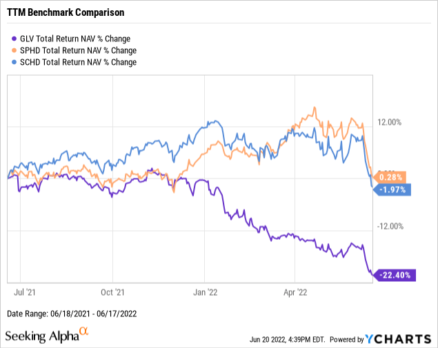
I used Schwab U.S. Dividend Equity ETF (SCHD) and Invesco S&P 500 High Dividend Low Volatility Portfolio ETF (SPHD) as benchmarks for dividend funds. And over the last year, GLV doesn’t do very well compared to either of these funds. While SPHD had a small gain, and SCHD had a relatively small loss, GLV had a pretty big (22.4% loss or around 10x times the loss that SCHD had).
Long-Term Trends
Any given year can be atypical, but it is hard to put together a string of years and look better (or worse) than the fund will behave over time. I like to look at the last 3 years. This provides a sufficiently long enough stretch that it is likely to be typical of the fund’s performance but recent enough that the fund is very similar to what it is now. Farther back in time increases the chance that the fund’s assets and strategies will be very different from what it is doing now or will do in the near future.
So what were the returns from GLV’s portfolio like?
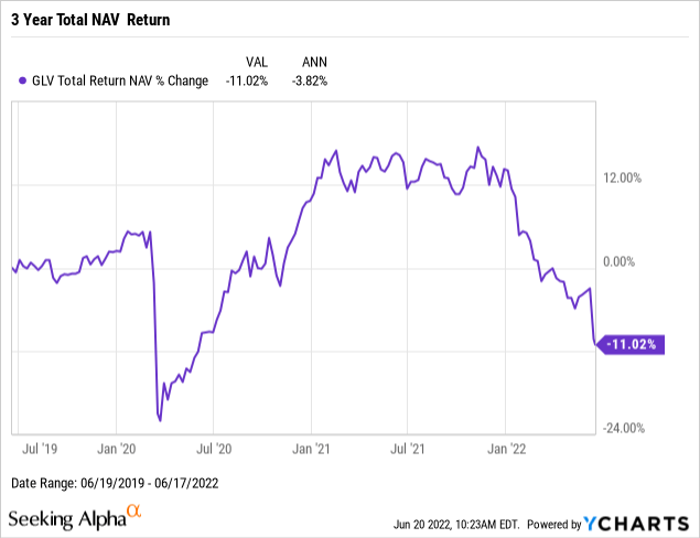
Again, very disappointing. Not that I was surprised as in my last article I looked at most of this period already. And found it wanting. A loss on total NAV return of just over 11% doesn’t bode well for the fund covering its distribution.
But, let’s take a look at how the NAV did.
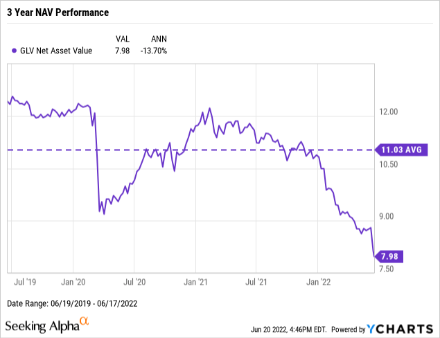
Anyone expecting to be surprised with an increase in NAV will be disappointed. NAV declined over the last 3 years. And this decline wasn’t really due to COVID, as the fund recovered from that hit by the end of 2020.
Normally, I would do a calculation of yield on NAV at this point to compare it to the total NAV return. But a positive yield on NAV will always exceed the negative total return.
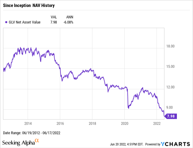
Looking at the NAV since GLV began, we can see the decline started in 2015 or so. That isn’t what I’d expect from a debt investment that was covering its distributions.
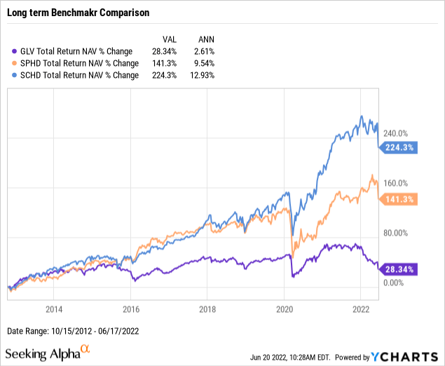
Comparing GLV to the two benchmark funds, SCHD and SPHD, we can see that it began to lag those benchmarks late in 2015 or early 2016. To me, that looks like solid evidence of a fund that is paying out too much.
One final bit of evidence is the long-term distributions.
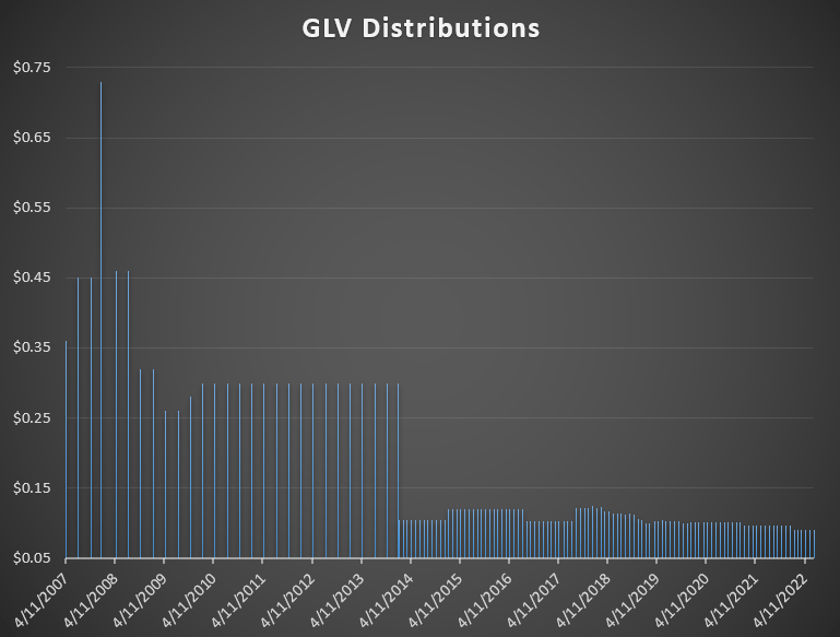
Distributions (CEFData)
I like to plot distributions this way so that you can see when there is a change in the frequency of payments. Often such a change can look like a big cut, or can hide a big cut. Here we see a change in the frequency of distribution from GLV in 2014 when the fund began paying monthly instead of quarterly. So the change from $0.30 a quarter to $0.1050 was a small bump in the distribution rather than a big cut.
I don’t see a regular pattern here (or even an irregular one of only increases). And I see a steady, if small, decrease in the distribution happening multiple times since 2018. This again points to a fund that isn’t able to maintain its distribution.
Future Distribution Coverage
While the past performance of GLV is important, investing is about what you can buy now and how it will perform in the future. The past is useful only as a guide for that process.
So, GLV has done a poor job of covering its distribution in the past, but if it can do a good job going forward, that poor past performance might just offer us a good price and an opportunity.
Last year when I looked at GLV, I was concerned by how much exposure it had to China (including Taiwan and Hong Kong). Looking at the latest factsheet, it appears that this exposure has declined.
Looking at the equity holdings, everything looks pretty good. I don’t see anything that might have done poorly in the past and can be expected to do better going forward. I also don’t see anything that I expect to perform significantly worse in the future.
My other concern last year was the large percentage devoted to bonds, particularly government bonds. 57% seems like a big allocation to fixed income, particularly when it contains less than 1% asset-backed securities. While this will certainly provide lower volatility, I see the chance for price declines here. But the cash flow should be safe.
So generally, I don’t see a big chance of the fund making a big move to improve its distribution coverage. The increase in fixed-income investments from 47% to 57% might make the distribution a bit safer, but I am not sure it is enough, even with the distribution cut this year, to fully cover the distribution. And if the economy gets weaker (or should I say when?), the dividend income from the equity positions could be reduced.
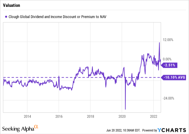
The distribution isn’t as safe as I would like, but are the shares cheap? As the chart above shows, not so much. GLV usually trades more than 10% below NAV. Now it is currently priced at less than a 3% discount. The valuation just isn’t attractive given the distribution coverage.
Conclusion
Clough Global Dividend and Income fund, GLV, has an attractive sounding name. And its distribution looks attractive. But it hasn’t been able to cover that distribution in the past, which has resulted in multiple distribution cuts. Even though these cuts are mostly small, I don’t like that. And the fund continues to over-pay the distribution, so future cuts are likely. I would look elsewhere to get income.
Be the first to comment