

S&P 500, VIX, Event Risk, Central Banks, Dollar and USDJPY Talking Points
:
- The Market Perspective: S&P 500 Bearish Below 4,100; EURUSD Bullish Above 1.0000
- A rebound in ‘risk assets’ in the second half of this past week leans against both seasonal (market conditions) and fundamental expectations
- While there are a range of important fundamental updates ahead that will tap into growth discussions, my top concern ahead will hold on rate speculation
Trade Smarter – Sign up for the DailyFX Newsletter
Receive timely and compelling market commentary from the DailyFX team
Subscribe to Newsletter
A Turn that Defies Seasonal Expectations
As we move deeper into the Fall trading session that historically brings greater market participation and volatility – and a closely followed average for S&P 500 performance – it is worth highlighting the contrast we would see through the second half of this past week. Despite the unrelenting warnings of major central banks of further tightening ahead and fears of economic strain moving forward, there was nevertheless a strong rebound from the US indices and other sentiment defined market measures. From the S&P 500 itself, a 3.7 percent climb through Friday represented the first positive performance in four weeks while the three-day tempo through Friday hits a tempo (4 percent-plus) that matches similar instances that topped or extended their climb through 2022. On a technical basis, the markets are still very early in mounting a recovery and the fundamental burden is almost as serious as the seasonal assumptions.
Chart of S&P 500 with Volume, 20 and 200-Day- SMAs as well as 3-Day ROC (Daily)
Chart Created on Tradingview Platform
In my own hierarchy of analytical importance, I believe ‘market condition’s should be the first concern followed by either fundamental or technical analysis. Within conditions, I believe participation and the predisposition (eg seasonality) towards certain risk trends can significantly alter the way traders and investors take in external market stimulus. As a reminder, the month of September has historically seen a rise in volume for my preferred, imperfect measures of sentiment – the S&P 500 – and it is also the beginning of the crest in volatility. What many will be transfixed on though is the only loss averaged out through via calendar months in an assessment stretching back to 1990. ‘This time is different’ is an important call to scrutiny, but the averages should nonetheless keep us dialed in.
Chart of S&P 500 Average Monthly Change, Volume and Volatility from 1980 to Present
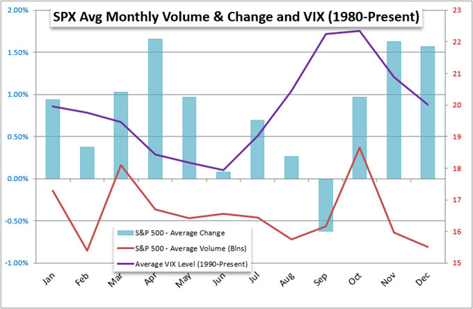
Chart Created by John Kicklighter
Volatility and general participation metrics can more readily confirm to historical averages owing to movement of funds dictated by societal norms. That said, directional considerations shares far greater reliance on the unique fundamental matters of the current era. Though, if that is our criteria, there is not much in the way of serious support for those with a long-term bullish bias. While the fear of recession has abated somewhat for the US and abroad, it is far from fully evaporating. Further, central banks are making a very concerted effort to warn of tighter financial conditions ahead. It is of course possible to push through these headwind, but the historical norms of three weeks of losses averaged from week 37 to 39 will draw some serious scrutiny.
Chart of S&P 500 Weekly Performance Averaged from 1900 to Present
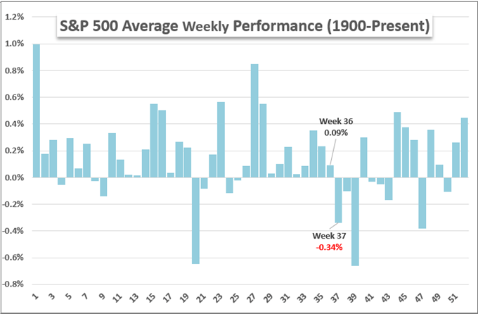
Chart Created by John Kicklighter
What to Watch for a Big Picture Assessment
Looking out over the coming week’s economic docket, there is plenty of high-level event risk that can charge volatility; but the ability to transition into systemic currents is generally reserved for only a few critical themes. Recession fears remains a lurking threat in my estimation; so some key event risk should be noted in our collective calendars. The UK GDP and GDP tracker on Monday is followed by New Zealand’s official 2Q GDP release Wednesday, US retail sales on Thursday and the Chinese August data run on Friday. As important as this run is, it is likely easier for monetary policy matters to escalate in sentiment. The Bank of England (BOE) rate decision has been pushed back a week in honor of Queen Elizabeth’s passing, but the UK is still due inflation figures. That data pales in comparison to the global reach of the US CPI on Tuesday though.
Calendar of Major Macro Economic Events
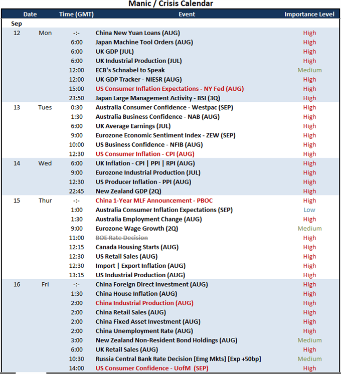
Calendar Created by John Kicklighter
Monetary policy remains a top catalyzer on the fundamental side, but there are a few ways to evaluate the information. For FX traders and other global macro participants, the contrast between overt hawks and doves is appealing fodder for speculation. However, my interests are more systemic in nature. There has been a strong motivation for risk taking that has at the very least borrowed some confidence from the world’s central banks massively building up their balance sheets over the past decade. The correlation between the S&P 500 and aggregate central bank stimulus looks less like happenstance to me. Given all the rhetoric from the major players to hike rates until inflation is tamed while certain players from the Fed and ECB weigh balance sheet reductions, there is serious blowback that may start from here.
Chart of Aggregate Major Central Bank Balance Sheets in US$ Overlaid with S&P 500 (Monthly)
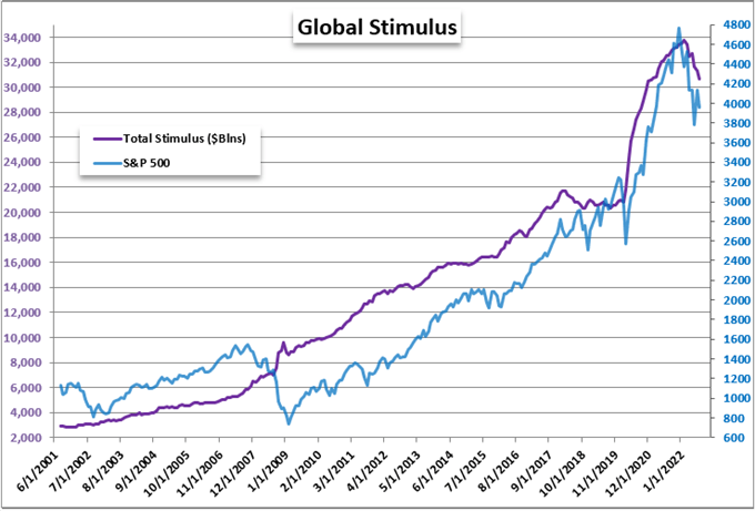
Chart Created by John Kicklighter with Data from St Louis Federal Reserve Economic Database
The Relative Consideration
While I consider a systemic shift in global monetary policy a severely important trends to monitor, there remains an almost occult interest around relative interest rate projections among the majors. This past week, the ECB (75bp), Bank of Canada (75bp) and RBA (50bp) all hiked and met expectations. Yet, that wouldn’t innately move traders who are underwhelmed by ‘in-line’ outcome. What’s more, with so many of the top centra banks pursuing hawkish polices to get back ahead of inflation, there isn’t much disparity to see this direct them arise to frequently nor aggressively.
Chart of Relative Monetary Policy Standing with Year-End Rate Forecast from Swaps
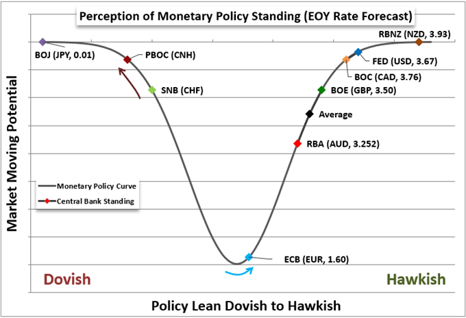
Chart Created by John Kicklighter
In looking through the scale of relative monetary policy standings, it is remarkable how similar the current rate and forecasts are for the likes of the Dollar, Pound, Canadian Dollar, Australia and New Zealand currencies. Moving towards an inflation fight seems the norm. However, there remains a very distinct contrasting counterpart to the hawkish charge. While so many authorities are the midst of strong tightening and warnings for what lies ahead, I believe USDJPY is a particularly useful gauge to watch. The contrast of ‘risk trends’, growth potential and capital pressures all come into the equation ahead.
Recommended by John Kicklighter
How to Trade USD/JPY
Chart of USDJPY with 20, 200-Day SMAs and 1-Day Rate of Change (Daily)
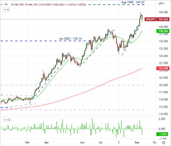
Chart Created on Tradingview Platform
Be the first to comment