


maybefalse
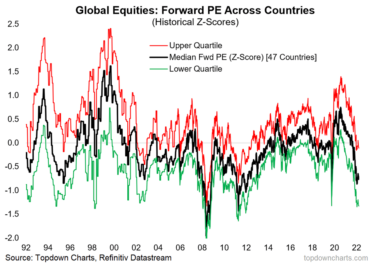
Forward P/E Ratios — Real Cheap (but for real?)
We have seen a major move in forward P/E ratios across countries this year. The median forward P/E ratio across countries has dropped to levels that you would clearly call cheap, and the proportion of countries with a “cheap” forward P/E ratio (more than 1 S.D. below average) has surged to over 1/3rd… but the problem is, do we believe the forward P/E?
First, let’s just make this crystal clear: the forward P/E takes price divided by Wall Street Analysts’ consensus estimates of earnings over the next 12 months. Both are pieces of quantitative information, but one is fact, and the other is opinion…
One issue that I have previously pointed out on the forward P/E is the extreme volatility in forward EPS that the pandemic brought about e.g. forward P/E ratios were looking “expensive” in mid-2020 which was clearly a false signal resulting from the earnings collapse (that’s what happens when you turn the economy off overnight).
Since then, earnings post-pandemic have surged thanks to extreme monetary + fiscal stimulus, pandemic related demand, and reopening rebounds. So there certainly is a question to be raised around the sustainability of those earnings, particularly in the face of removal of all of that stimulus, a global economic slowdown and high likelihood of recession.
In other words, yes global equities are cheap if you believe earnings stay strong and the global economy avoids recession…
Topdown Charts
Key point: Global forward P/E ratios look cheap, but there is uncertainty on the “E“.
[!! EXTRA CHART !!] To celebrate Topdown Charts turning 6 years old, I have thrown in a bonus chart this week.
Also, in case you missed it, be sure to check out my blog post where I reflect on the Ups and Downs of Topdown: “Changes and Choices: My Third 2 Years in Business”.
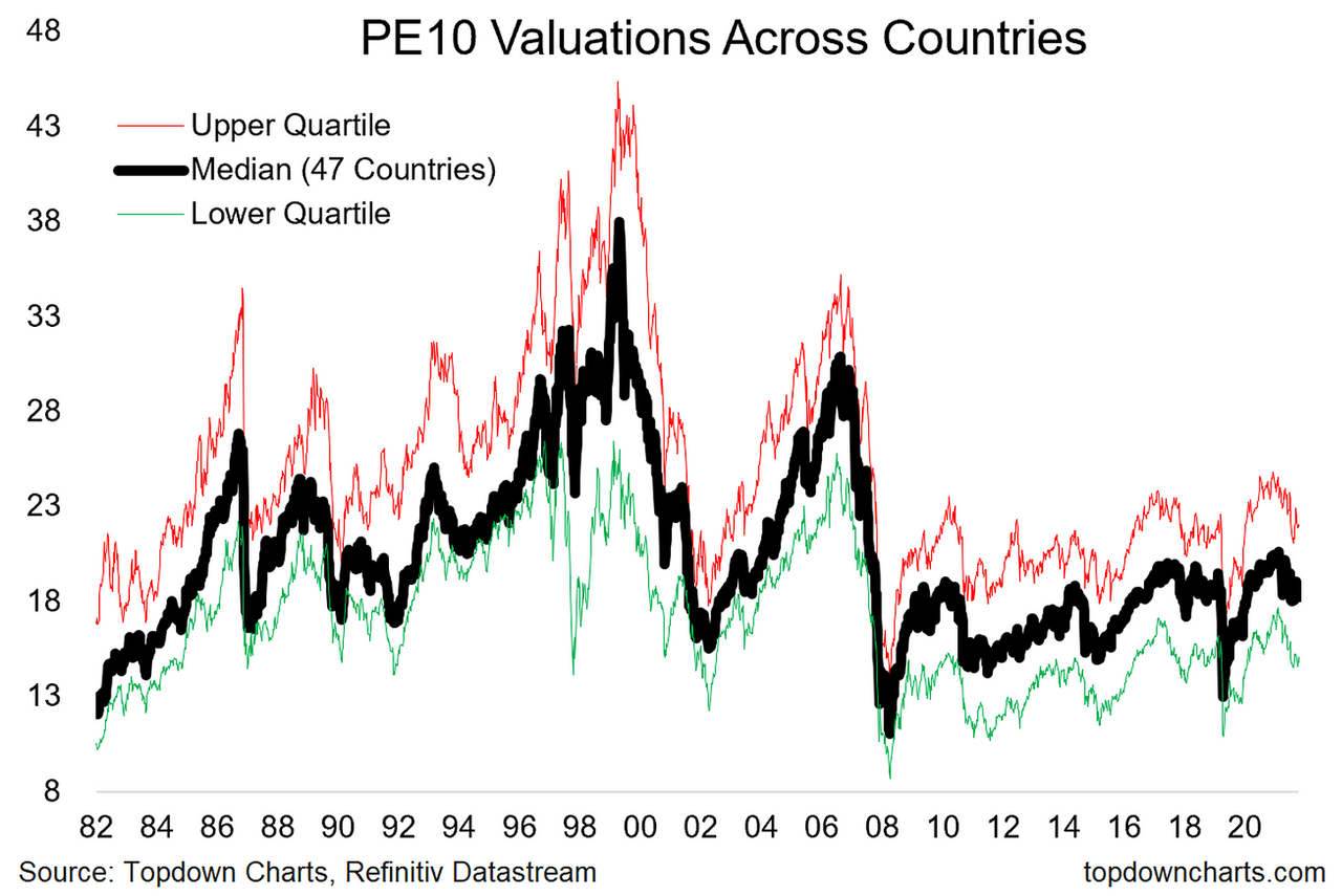
PE10 Valuations Across Countries
One way to ameliorate the issues in the previous chart is to look at the PE10 ratio (price vs. trailing average 10 years earnings), which is designed specifically to smooth out the volatility in earnings that I mentioned above.
On this lens we see that yes the median PE10 has come down, but nothing like the move in the median forward PE.
If there were no distortions around the pandemic, and if central banks were moving back to easing (instead of accelerating tightening) then I would look at that forward P/E chart as a reason to close your eyes and buy.
But the broader picture is simply still not equity positive, not to mention the fact that we likely still require a greater valuation cushion to offset lingering macro risks. So yes: equities are no longer expensive, but no: I would not say valuations are compelling cheap just yet either.
Topdown Charts
Key point: Global PE10 ratios are not expensive, but not compelling cheap either.
Be the first to comment