

shaunl/E+ via Getty Images
Backlog Backdown and Inventory Increase: This is one of the most intriguing charts on my desk at the moment, it shows our composite global PMI backlogs indicator falling to the lowest level in almost 2 years… meanwhile inventories are surging to record levels.
Part of this may well be a transition from the old “Just in Time” method of inventory management, which was one of many reasons/vulnerabilities that contributed to the chaos and disarray of the pandemic supply chain hell… to more of a “Just in Case” inventory management strategy.
The slump in backlogs likely reflects an element of simply working through things, reopening, retooling and reinvigorating supply lines, but as I have said all along – if there is no demand then there is no backlogs. So demand is also key.
And in this chart that notion is affirmed in some respects with the surge in inventories: part of this may indeed be overcompensating for “yesterday’s battle”, but equally, this is the type of thing you expect to see when demand comes to a sudden stop.
Inventories pile up, factory orders plunge, and backlogs are no longer an issue.
The next step is a growth slowdown, and disinflationary impulse.
Any questions?
Topdown Charts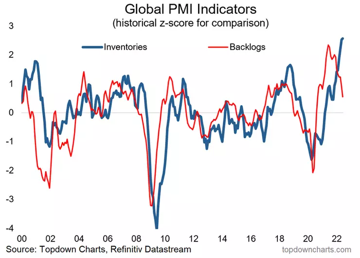
Key Point: Backlogs are backing down, and inventories are surging.
Be the first to comment