

Panuwat Dangsungnoen/iStock via Getty Images
For more than a year I’ve been arguing that monetary policy was way too easy and thus the risk of higher and persistent inflation was very high. (Check out my posts over the past year in the Blog Archive to the left.) With consumer price inflation now approaching double-digit territory, the bond market is beginning to catch on (as recently as last January I noted that the bond market was failing to catch on). The following charts show that only in the past month or two has the bond market begun to adjust to a higher-inflation reality; unfortunately, it still has a lot of adjusting left.
Chart #1
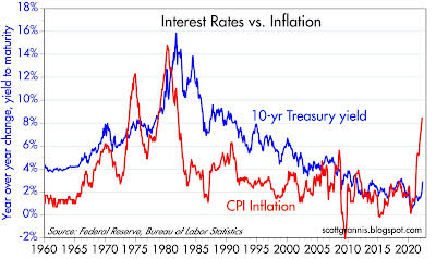
Chart #1 shows the long-term history of bond yields and inflation. Although the recent rise in yields has been rather sharp, yields are still an order of magnitude below where they should be if inflation is indeed persistent.
Chart #2
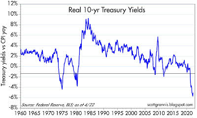
Chart #2 adjusts the yield on 10-yr Treasuries for the rate of inflation. Never have real yields been so low. What that means is that bond investors are beginning to learn that owning bonds is a great way to lose substantial purchasing power. How much longer will it take for bonds to at least compensate investors for inflation? By similar logic, anyone borrowing money at recent interest rates has made a killing if he or she used the borrowed money to buy real assets (e.g., property, businesses, commodities).
Chart #3
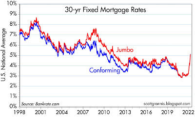
Chart #3 shows the nationwide average rate on 30-yr fixed-rate mortgages. It has surged from 3% to now 5.25% in a very short period, but it is still way below the rate of housing price inflation, which has been in double-digit territory for the past year or two. Lesson that is being learned: buying homes with leverage at current mortgage rates can be extremely profitable. That lesson will translate into more demand for houses and more borrowing, which will only exacerbate the inflation fundamentals at work in the economy today. It will also erode the demand for money, which will effectively require the Fed to raise rates even more.
Chart #4
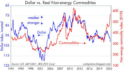
Chart #4 compares the strength of the dollar vs. other major currencies (blue line, inverted) with the prices of non-energy commodities. This chart is actually quite interesting because the typical correlation of the dollar and commodity prices has completely broken down: it used to be that a weaker dollar correlated with higher commodity prices; now it seems that the stronger the dollar, the higher commodity prices go. This can only mean that artificially low-interest rates are stimulating demand for hard assets, but they are not weakening the dollar—perhaps because most major currencies have exceptionally easy monetary conditions. The dollar is benefiting mainly from its safe-haven appeal.
Chart #5
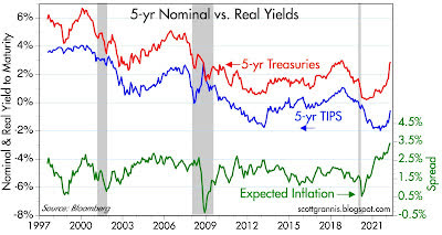
Chart #5 compares the nominal and real yields on 5-yr Treasuries (red and blue lines) with the difference between the two (green line), which in turn is the market’s expectation for what the CPI will average over the next 5 years. Inflation expectations have indeed risen and now stand at a historical high (recall that TIPS only came into existence in 1997). But the market is only expecting inflation to average a bit less than 3.5%, which is way less than the 11% annualized rate that we saw in the first three months of this year. In other words, the bond market is expecting inflation to fall significantly in coming years.
But since the Fed has not even begun to tighten, this is a rather brave assumption.
Editor’s Note: The summary bullets for this article were chosen by Seeking Alpha editors.
Be the first to comment