

Maks_Lab/iStock via Getty Images
The financial press currently is obsessed with the significance of the slope of the Treasury yield curve, because it’s thought that a flat or inverted curve is a predictor of recession.
Sure, a flat or inverted yield curve almost always precedes a recession, and I’ve been making that point for many years. But you need other things going on to make a recession happen. Inverted curves are a necessary but not sufficient condition for a recession. The following charts illustrate 4 other important indicators of an impending recession.
Chart #1
♻︎

Chart #1 compares the slope of the Treasury yield (measured by the difference between 1-yr yields and 10-yr yields) to the level of real short-term interest rates. Note that two things reliably precede recessions: a flat or inverted yield curve (red line) and very high real interest rates (blue line).
The yield curve inverts when the market senses that the Fed is so tight that the economy is at risk of collapsing, and that collapse would then prompt the Fed to ease. As many have noted, there are parts of the yield curve that today are inverted: 5-yr Treasury yields today closed at 2.50%, while 10-yr yields closed at 2.40%. But it would be premature to think that this materially increases the chances of a near-term recession.
Regardless, I think it makes more sense to compare a short maturity yield (i.e., something with less than 2 years’ maturity) to 10-yr yields, because short maturity yields are dominated by what the Fed is doing now and is widely expected to do over the near future. Once you get out to 2 or 5 years, lots of factors come into play, such as inflation and economic growth, and these can contribute different pressures to different areas of the curve.
As the chart shows, the spread between 1-yr and 10-yr yields is just over 70 bps, and that represents a fairly typical condition. It directly reflects the expectation that the Fed is going to be raising rates for at least the next year or so, and that beyond that the economy and inflation are likely to moderate. Nothing scary or crazy about that.
It’s also very important to note that an inverted curve today is not necessarily a sign of an impending recession. As the chart also shows, inverted yield curves often precede recessions by several years.
In my view, the level of real yields is arguably more important than the slope of the yield curve. Very high real yields, e.g., 4-5%, exert a powerful influence on the economy because they are driven by Fed tightening (which restricts liquidity) on the one hand, while they impose very high borrowing costs on the economy on the other hand. Very high real rates encourage people to avoid borrowing and at the same time they encourage people to increase their saving: both equate to an increase in the demand for money, and when taken to an extreme, high real rates can shut down consumption and growth.
Today, real yields are the lowest they have ever been. This encourages borrowing and it discourages saving. Cash is trash, since it is losing purchasing power rapidly. Better to borrow and spend these days than to save or pay down debt. Nothing about that is going to hurt the economy. If anything, today’s very low real rates are likely to pump up spending and give us a bigger inflation headache.
If the Fed doesn’t get nominal yields to rise to at least the level of inflation (which is currently running 7-10%), then monetary policy will remain very stimulative, and that’s not likely to cause the economy to collapse.
Chart #2

Chart #2 shows the level of Credit Default Swap spreads, which is a very liquid and reliable measure of the market’s confidence in the future health of corporate profits and the economy. Low spreads mean the market thinks the economy is going to be healthy and corporate profits are going to be solid. Currently, spreads are somewhat elevated from their recent lows, but they are nowhere near levels that have preceded recessions in the past. This is the bond market’s way of saying it is confident that corporate profits will remain reasonably healthy for the foreseeable future.
Chart #3
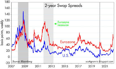
Chart #3 shows the level of 2-year swap spreads in the U.S. and in the Eurozone. Swap spreads are similar to CDS spreads, but they are more generic and reflect the risk of borrowing and lending between large institutional investors. A normal level of this spread would be roughly 15-35 bps. Levels of 70 bps and above are symptomatic of rising risk aversion and a general shortage of liquidity. Liquidity is being squeezed in Europe (not surprisingly) but it is still plentiful in the U.S. And that’s very important, because liquidity shortages can intensify other financial market stresses. With abundant liquidity, markets can trade efficiently; those who are averse to risk can shift the burden of risk to those who are willing and able to bear risk. Those who wish to run for the exits will have no trouble getting out.
Chart #4
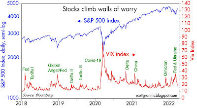
Chart #4 compares the level of the Vix index (the “fear” index) with the level of the S&P 500 index. Rising fears almost always accompany market declines, and vice versa. Currently the level of fear is declining and the stock market is recovering, presumably because tensions in the Russia/Ukraine war are subsiding.
Technically, the Vix index measures the effective cost of buying options (buying options is an effective way to reduce your exposure to risk). Very high Vix levels make buying options very expensive, which is another way of saying that it becomes very expensive to hedge one’s exposure to risk. So high levels of the Vix are a clear sign of just how nervous the market is. Today the market is breathing easier than it was just a few weeks ago, and investors are more willing to take on exposure to risk.
I don’t see anything in these charts that makes me worry about a near-term recession.
Editor’s Note: The summary bullets for this article were chosen by Seeking Alpha editors.
Be the first to comment