

Dzmitry Dzemidovich/iStock via Getty Images
This week, there were three key data releases.
The Consumer Price Index for All Urban Consumers (CPI-U) increased 1.2 percent in March on a seasonally adjusted basis after rising 0.8 percent in February, the U.S. Bureau of Labor Statistics reported today. Over the last 12 months, the all items index increased 8.5 percent before seasonal adjustment.
Here’s the chart of the data:
3, 6, and 12-month average Y/Y percentage change in total and core CPI (Data from FRED; author’s calculations)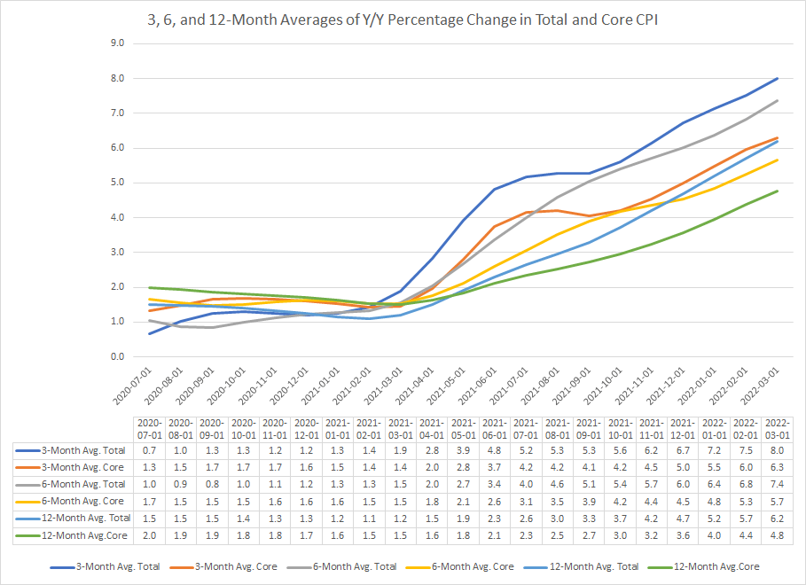
The above chart shows the 3, 6, and 12-month average Y/Y percentage change in the total and core CPI price indexes. All are moving higher while the shorter moving averages are above the longer moving averages. This means that price pressures will continue to rise for at least a few months.
The Producer Price Index for final demand increased 1.4 percent in March, seasonally adjusted, the U.S. Bureau of Labor Statistics reported today. This rise followed advances of 0.9 percent in February and 1.2 percent in January. (See table A.) On an unadjusted basis, final demand prices moved up 11.2 percent for the 12 months ended in March, the largest increase since 12-month data were first calculated in November 2010.
Here is the chart:
Three PPI indexes (FRED)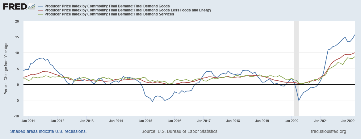
The above data shows that three key PPIs for final demand are rising at strong clips.
Combined, the price data supports the Fed’s current policy of raising rates. Remember that a number of Fed presidents have stated they would be willing to vote for a 50 basis point increase at an upcoming meeting.
Retail sales increased:
Retail sales release (Census)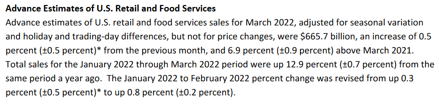
Here’s the chart:
Retail sales (FRED)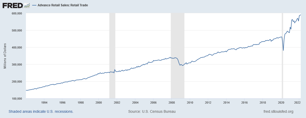
This coincidental data is at a series high.
Now (and for the foreseeable future) the primary issue for the markets is the Federal Reserve’s interest rate policy. The classic trading advice of “Don’t fight the Fed” is very much in play. This week’s price data indicates supports strong rate hikes from the Fed for the next few months.
Let’s turn to the technical data.
EMA picture for the major index and bond market ETFs (Stockcharts; author’s calculations )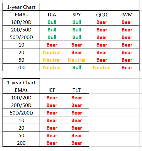
Let’s start at the bottom, noting that the bond market is clearly in a bear market. The four equity market ETFs are organized from conservative (left) to aggressive (right). The more aggressive the index, the more bearish it is.
Market Breadth Indicators for NYSE and QQQ (Stockcharts)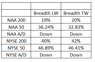
Market breadth is soft.
Now, let’s turn to the charts.
YTD for SPY, QQQ, DIA, and IWM (Stockcharts)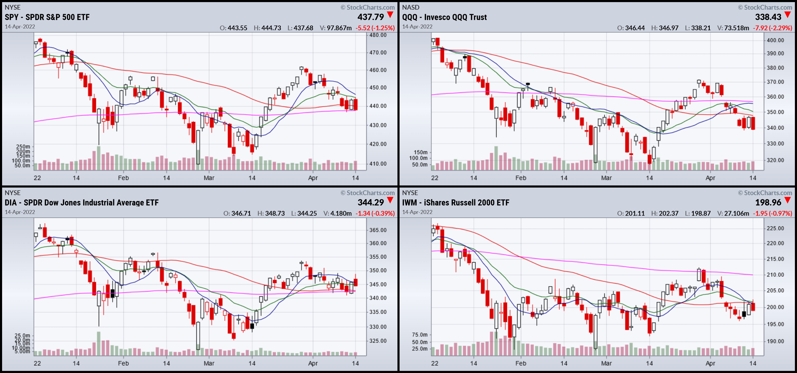
Year to date, the trend is lower. The markets declined from the beginning of January until mid-March. They all tried to rally but the advance stalled at the end of last month. Prices have been trending lower since, although the drop has been disciplined.
1-year SPY, QQQ, DIA, and IWM (Stockcharts)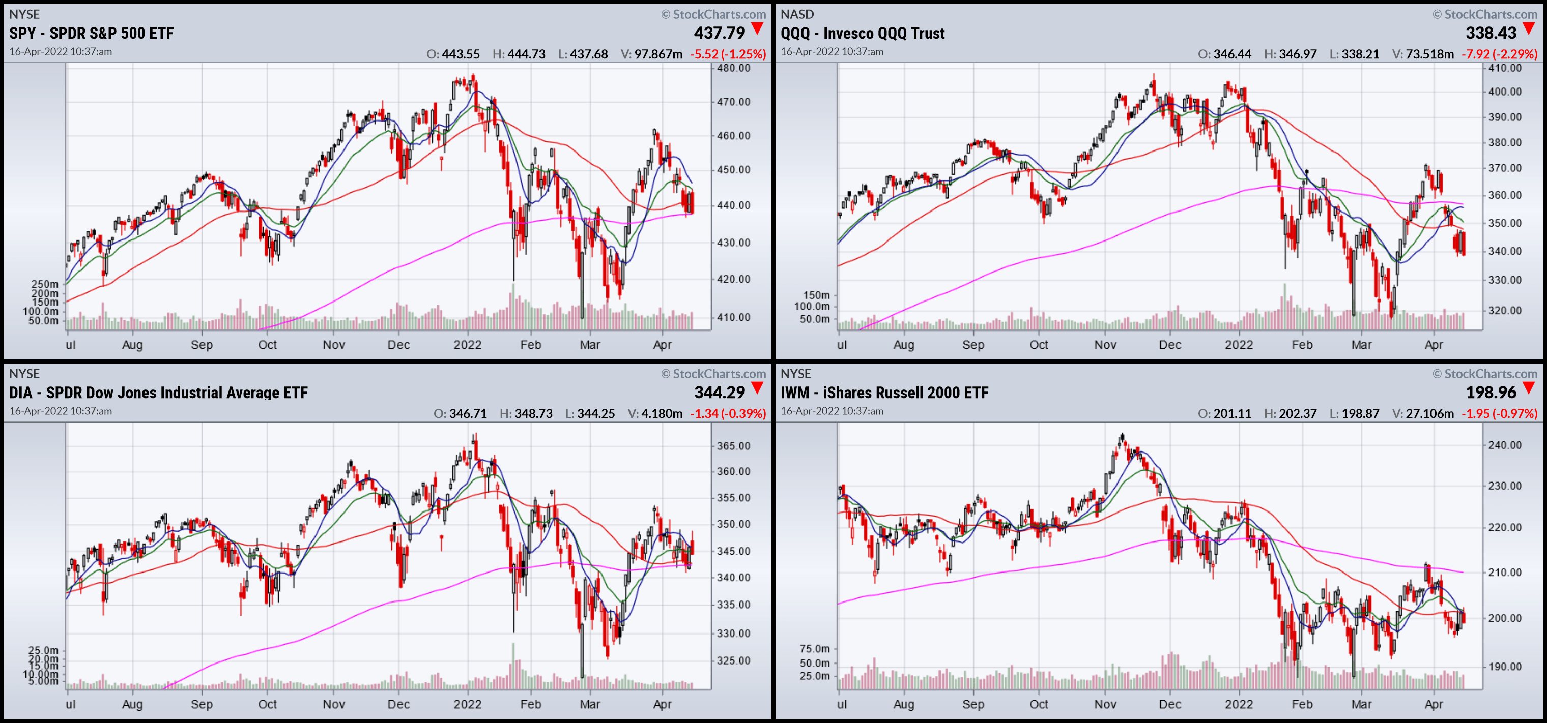
The 1-year charts show that prices peaked at the end of last year and have been trending lower since.
Only one index (the IWM) is decisively below its 200-day EMA. The other three are using their respective 200-day EMAs as a center of gravity, fluctuating around it. But against the backdrop of a hawkish Fed and increased risk aversion, the overall tone is at best neutral.
Be the first to comment