

chaofann/iStock via Getty Images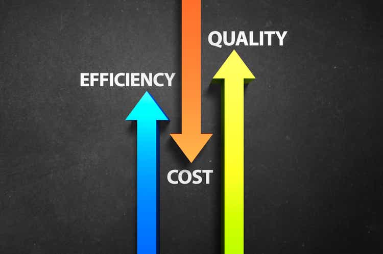
The above picture shows the relationship between efficiency, cost and quality. When efficiency goes up, costs go down and quality may even improve.
The inverse is also true when efficiency goes down. Costs rise and quality may go down as well.
For example, let’s say you have a budget of $3,000 to heat your home over the winter. To get your house heated up to 72 degrees for the whole winter, you need, making up a number, 1,000,000 BTU worth of heat.
Your goal as the home economist is to figure out the most efficient cost of heating fuel. Oil, propane, natural gas, wood, electric or coal are generally the options of heating for your home.
Each fuel source has its own input cost. Burning wood or coal is labor intensive but the cheapest options whereas electric, propane, oil and natural gas are not labor-intensive but are more costly.
Last year, you were able to use propane to heat your house to 72 degrees the whole winter, meeting the goal of 1,000,000 BTU on the $3,000 budget.
This year, as the costs of various fuels went up in price, you have calculated that you need $4,000 to get 1,000,000 BTU for a 72 degree home this coming winter using natural gas. Of course, this is assuming just as cold a winter as last winter.
The efficiency of your dollar, your income, has gone down in terms of its purchasing power from a year ago.
Like any creative economist, you have lots of options. Take $1,000 from another area of the budget, like the vacation fund or the private school fees and do without or simply lower the thermostat to 64 degrees for example.
In either case, you’ll be sacrificing your consumption and quality of life since the efficiency of your income has declined due to higher input costs.
You will either be consuming less BTU to heat your home or be doing without something else you may have budgeted for.
This is the essence of what happens during stagflation.
That lack of consumption will equal a lack of work for someone else to service that consumption. That hotel room won’t be getting rented this year or that 4th delivery of propane won’t be needing to come as you’ll be consuming 750,000 BTU instead since that is all you can afford.
It’s this kind of reasoning that leads to how I look at real GDP growth.
Real GDP Growth
One perspective on how to measure real GDP growth is simply the aggregate hours worked X the output per hour. This is my absolute preferred method as it’s very simple and practical.
This below chart is year-over-year percent change in Real GDP compared to the year-over-year percent change of aggregate hours worked X the output per hour or productivity.
Real GDP To Output Per Total Hour Worked (St. Louis Fed FRED)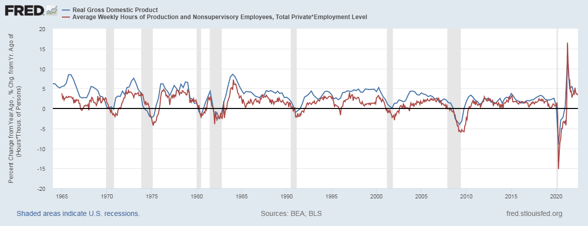
While this comparison is not precise, there is a great degree of correlation.
Recessions occur when the aggregate hours worked x output per hour declines as clearly shown in the chart above with few exceptions.
An important chart to see is this one I created that shows the average amount of market hours worked per capita in the US.
Market Hours Worked Per Capita (St. Louis Fed FRED)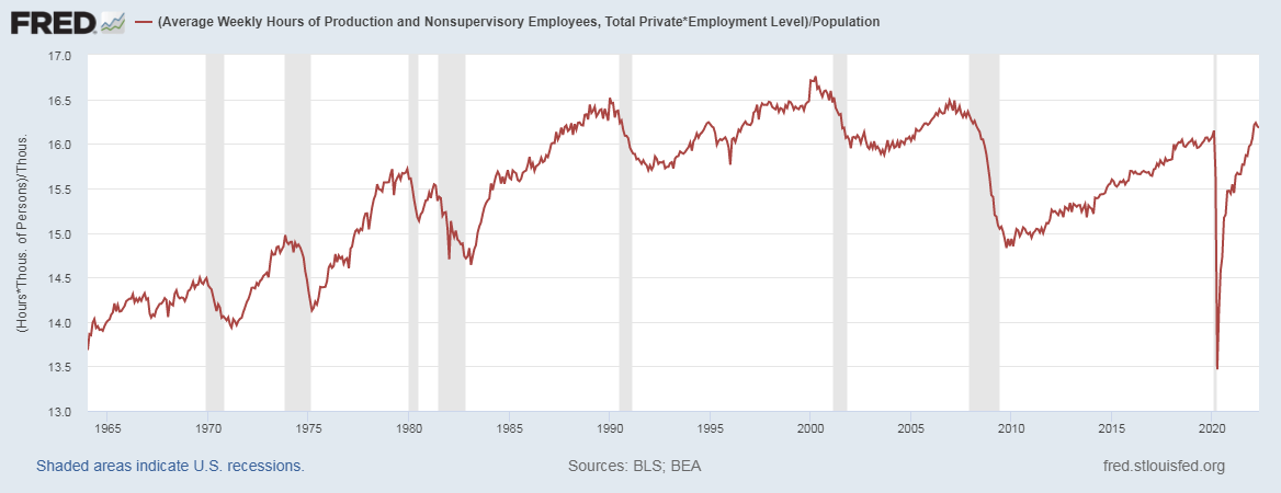
There was a long-term trend of rising market hours worked in the US economy from 1965 to 2000. This was as a result of women entering the workforce at a greater pace but peaking out around 2000.
Many factors have led to the ebbs and flows of this chart post 2000. For example, China joining the WTO in 2001 led to a massive exodus of goods producing jobs. The real estate boom helped jump job growth into 2007 before that fell apart. The 2010’s increase could be attributed to simply climbing out of the hole we were in.
In February of 2020, we averaged 16.15 market hours worked per capita. We peaked in March of 2022 at 16.23 market hours worked per capita.
As of May 2022, it’s trending down to 16.18 market hours worked per capita.
Just by looking at this chart, we are more or less fully employed economy with little capacity to add more hours worked.
At the same time, there is an obvious trend showing a decline in hours worked per capita since March of 2022.
Inflation and Productivity
For the past 15 months now, the rate of inflation has been higher than the rate of increase in weekly earnings.
This chart below shows weekly earnings – the rate of inflation.
Weekly Earnings – Inflation (St. Louis Fed FRED)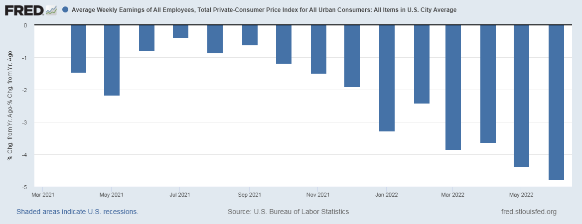
In June, this was the most pronounced yet at -4.79%!
So much of the high rate of inflation is due to increased input costs. Due to this, consumers are simply having to cut back and consume less. The thermostats are being turned down. Road trips are being cancelled.
The best chart I can think of to give justice to this idea is gasoline demand. It’s been a stunning collapse now year over year falling nearly 500,000 barrels of oil per day Vs. 1 year ago.
Gasoline Demand, EIA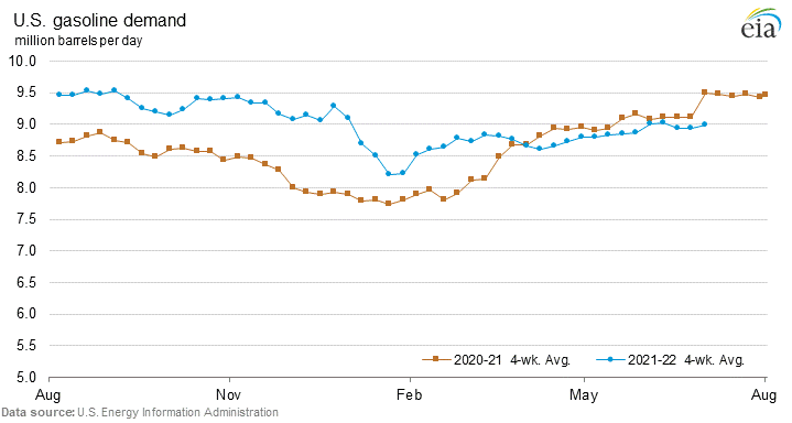
All year long, gasoline demand was higher Vs. the year before. I live near Cornell University, a college with nearly 30,000 students all together. They were practically remote learning in 2020/2021. So the 2021/2022 school year, they all came back and that required a lot of gas to get to school let alone all the comings and goings with all the breaks throughout the year.
On a side note, the cost to go to college has soared even more!
So the idea that beginning in March of 2022, we’re consuming less gas, most likely due to the inability to afford it, vs. a year ago when schools were closed is tremendous.
The most recent 4-week average use of gasoline demand was 8.98 million barrels per day Vs. 9.50 million barrels per day 1 year ago.
Conclusion
Efficiency of your weekly paycheck is going down. Costs are up and quality is down. This is the current state of the US economy.
The writing is on the wall here. We’re very likely in a recession now and the decline may have started in March with the peak in hours worked per capita.
Interestingly, the gasoline demand also started its year-over-year decline around March of 2022 as well.
Employment is simply dropping on account of less weekly hours worked. That’s what always happens when things slow down. You cut the employees hours. When it gets to the point when demand is just simply not there, you have to lay them off. So what should come next in the coming months are job numbers that should prove negative.
If the markets have not yet figured out we’re in or about to be in a recession going into 2023, there is very likely more downside to come in stocks with little place to hide.
The US dollar has been very strong as the world needs dollars to service and pay the debts that are owned in dollars. The dollar may well remain strong in the coming months as our stagflationary economy continues.
Be the first to comment