

24K-Production
We will look at 7 technical indicators while keeping in mind the limitations of technical analysis and the fact that it is more of a descriptive than a predictive method. Ultimately, prices are determined by fundamentals, but technical analysis, if done correctly, can provide some additional context.
A lack of extreme moves could be a sign of a bear market in the initial phases.
We start with a chart of S&P 500 (SPX) daily returns since about 1995.
S&P 500 Daily Chart with Daily Return, Standard Deviation and Mean Absolute Deviation Bands (Price Action Lab Blog – Norgate Data)
The top daily returns chart shows the +/- 5 standard deviation bands. The bottom daily returns chart (identical to the first) shows the +/- 8 mean absolute deviation bands. During the past two major bear markets, and even during the 2020 pandemic crash and the 2011 correction, daily returns exceeded the thresholds defined by the bands. However, this year, all action has been confined between those thresholds. The market’s decline has been exceptionally smooth and has been called “a slow pain trade.”
The lack of volatility extremes can also be seen below.
S&P 500 Daly Chart with 21-day Annualized Volatility and 14-Day ATR % (Price Action Lab Blog – Norgate Data)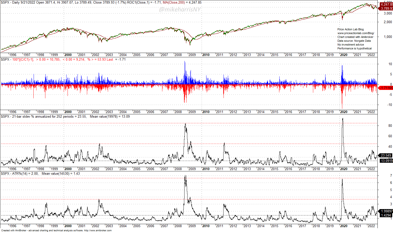
The horizontal red dotted lines show extreme levels of volatility, the 21-day annualized and the 14-day ATR as a percentage of closing price, during previous bear markets and large corrections. The S&P 500 index has not yet reached those extreme levels this year. It may be a regime change or an indication that we are near the start of a major move down.
The 252-day z-score indicator also confirms the lack of extreme moves.
Daily S&P 500 Chart With Z-score Indicator (Price Action Lab Blog – Norgate Data)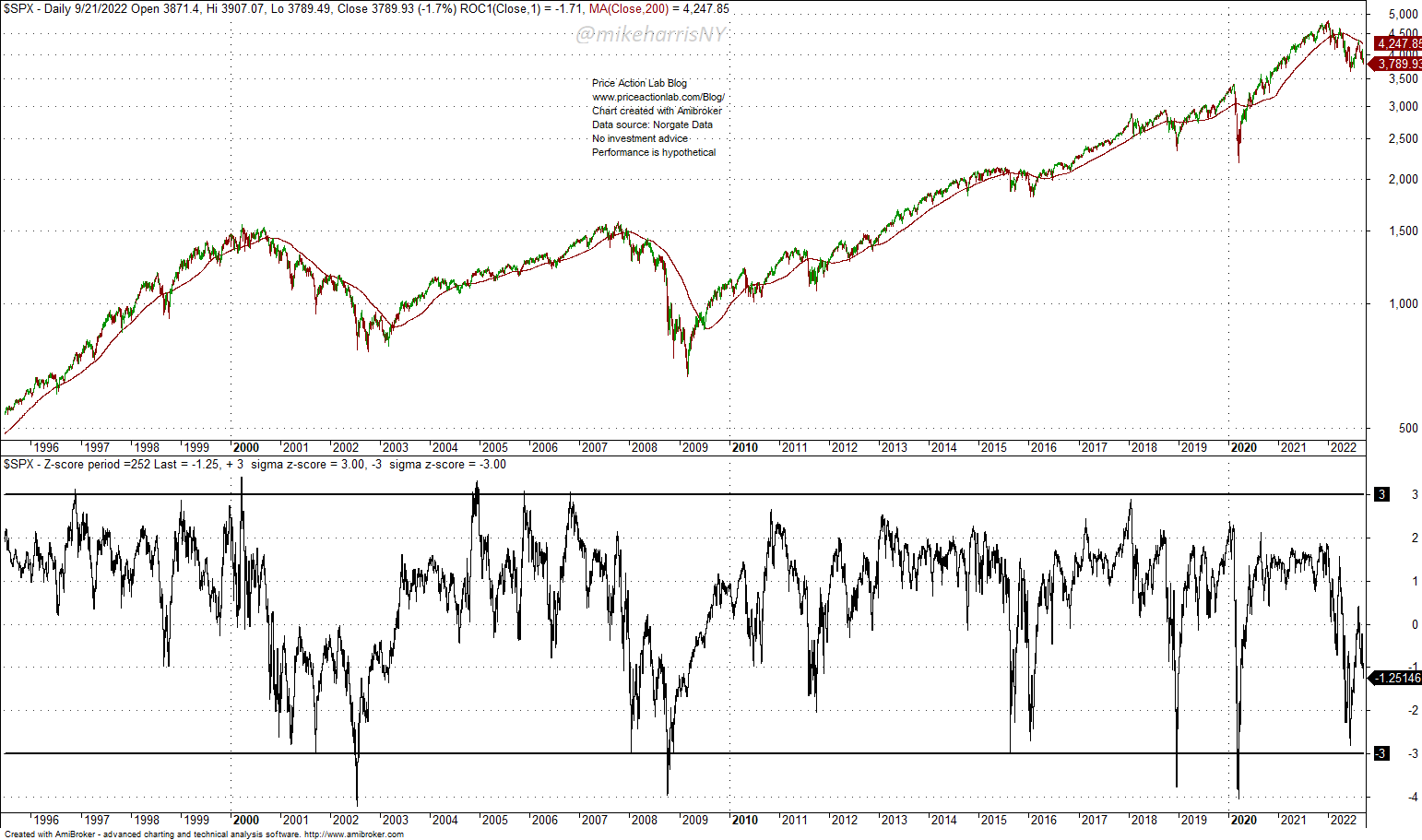
In most previous bear markets and large corrections, the z-score indicator crossed the lower -3 standard deviation band. This has not occurred this year, at least yet. This is due to the orderly correction, and as mentioned before, it could be a regime change, but that has a low probability. The scenario that we have not seen the worst of yet has a higher probability.
The indicator of the distance of price from the 200-day moving average in percentage terms also provides a similar perspective as above.
Daily S&P 500 Chart with Distance From 200-Day Moving Average (Price Action Lab Blog – Norgate Data)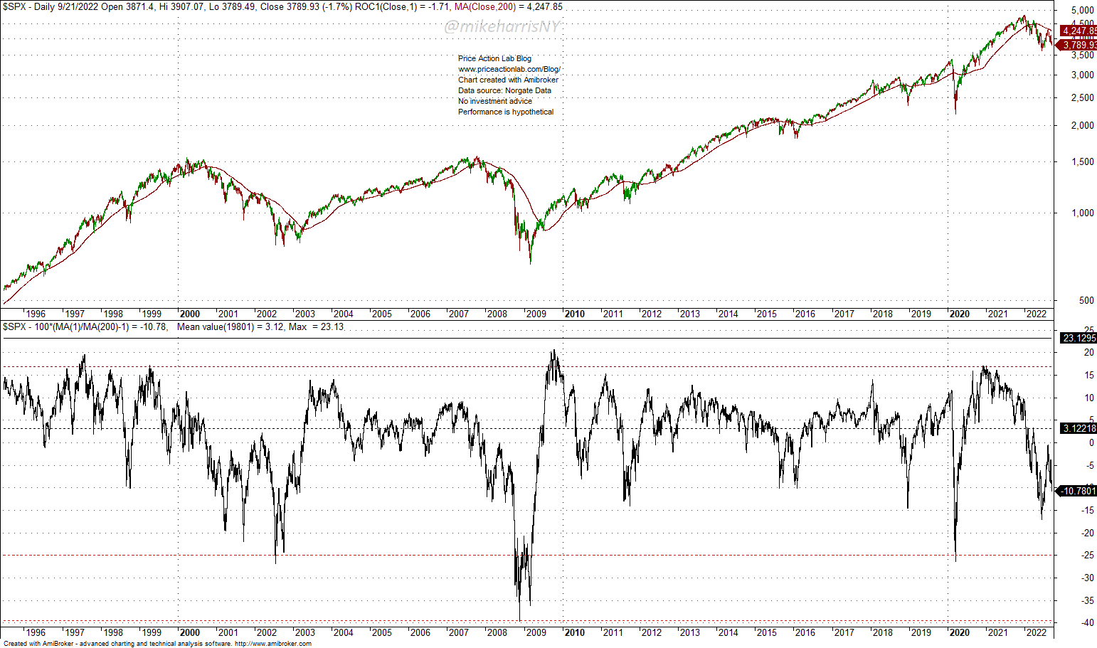
In both previous bear markets and during the 2020 pandemic crash, the distance from the 200-day moving average fell below -25% (red dotted line). The distance is currently at 10.8% after falling to about -16%. The current value could be the bottom, as in 2011, 2015, 2016, and 2018, or there is substantial downside potential.
The lack of strong relief rallies has surprised many traders this year. This phenomenon can be seen below.
S&P 500 Daily Chart With Large Daily Returns (Price Action Lab Blog – Norgate Data)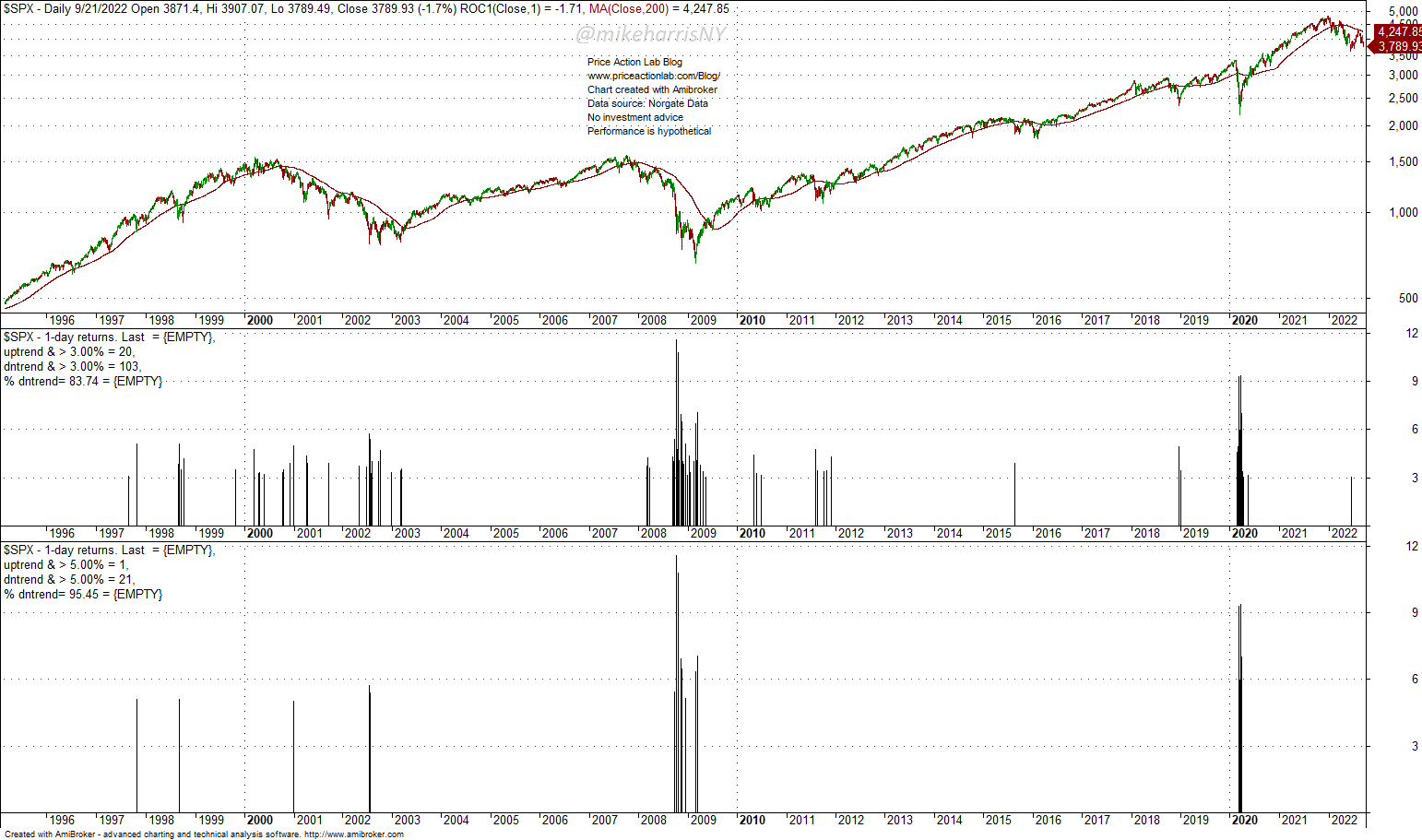
The top indicator chart shows daily returns greater than +3%. The overwhelming majority, or 83.74% of those returns, 103 in total, have occurred when the price was below the 200-day moving average. Only 20 of those returns occurred when the price was above the 200-day moving average. Note that these statistics are from March 1943. Only one return larger than 3% has occurred this year, on June 24. The bottom chart shows that no returns larger than +5% have occurred this year, although during previous bear markets they were frequent. Note that 21 of the 22 returns larger than 5% since 1943 have occurred when the price was below the 200-day moving average. Some of those occurred after a bottom, but the majority were relief rallies, especially during 2008.
This peculiar lack of relief rallies may be an indication of a regime change or that the real correction has not started yet.
The 12-month Relative Strength Index does not show any signs of oversold conditions.
Monthly S&P 500 Chart with 12-Month RSI (Price Action Lab Blog – Norgate Data)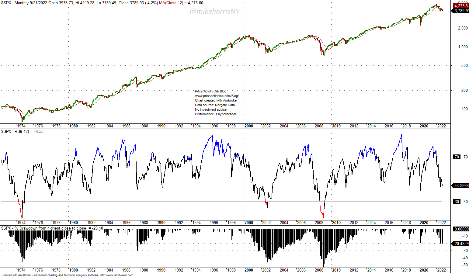
I included this indicator although I believe it is unreliable and conditional on the fact that it works if a bear market occurs; otherwise, it may provide false signals.
Note that in 1974, 2002, and 2008, the 12-month RSI reached oversold territory (below 30) and signaled a bottom. However, in the case of large corrections, in 2011, 2018, and 2020, for example, this indicator failed to signal a bottom. It is a good indicator to monitor, but it must be used along with other more robust ones. If a bear market evolves, looking at this indicator may provide clues about a bottom at the risk of false signals.
The final indicator is a linear regression chart of the S&P 500 since the GFC’s bottom and the start of QE, which caused the longest uptrend in stock market history.
S&P 500 Daily Chart with Linear Regression (Price Action Lab Blog – Norgate Data)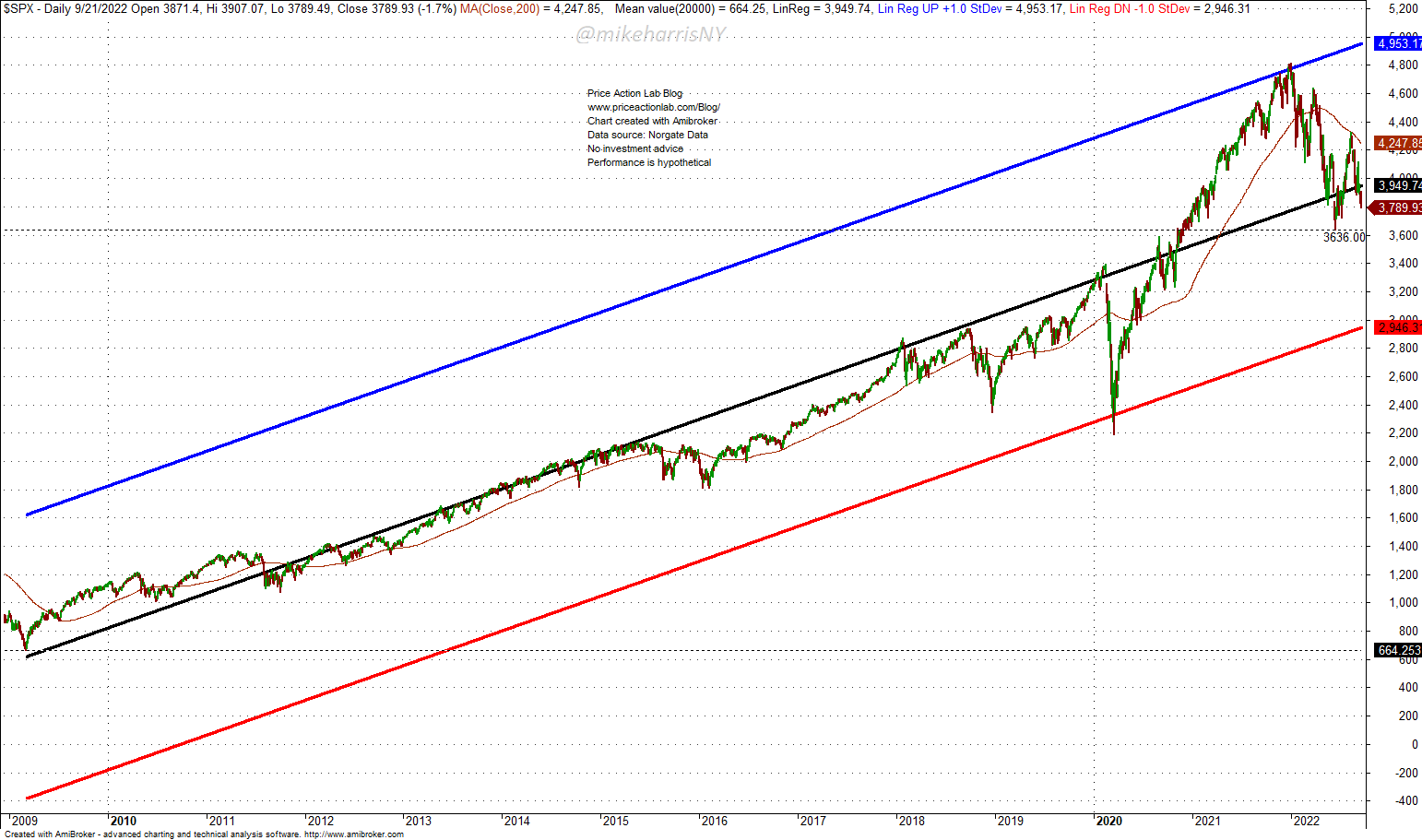
The chart shows the trend and the +1 and the -1 standard deviation lines.
Note that some misunderstand these charts in the following sense: the chart does not say the S&P 500 will fall about 20% more down to -1 standard deviation below the trend. The chart says that if the market drops to that line, it will be a high probability bottom, as back in 2020 during the pandemic crash.
Note that the irrational exuberance due to stimulus after the pandemic caused the index to reach the +1 standard deviation above the trend, an extreme move. Usually, those extreme moves to the upside are followed by extreme moves to the downside.
Conclusion
The lack of extreme moves in a 21% decline of the S&P 500 could mean two things:
- This is a normal correction to remove excesses.
- The correction is a start of a bear market.
I discussed 7 indicators above that illustrate this lack of extremes that have been so common in previous large corrections and bear markets. This change in market dynamics could be a new regime, or as they say, “this time is different”, or the initial phases of a more serious correction and a bear market. In my opinion, the latter scenario is much more probable but I will update my priors when new information becomes available.
Be the first to comment