

tuaindeed/iStock via Getty Images
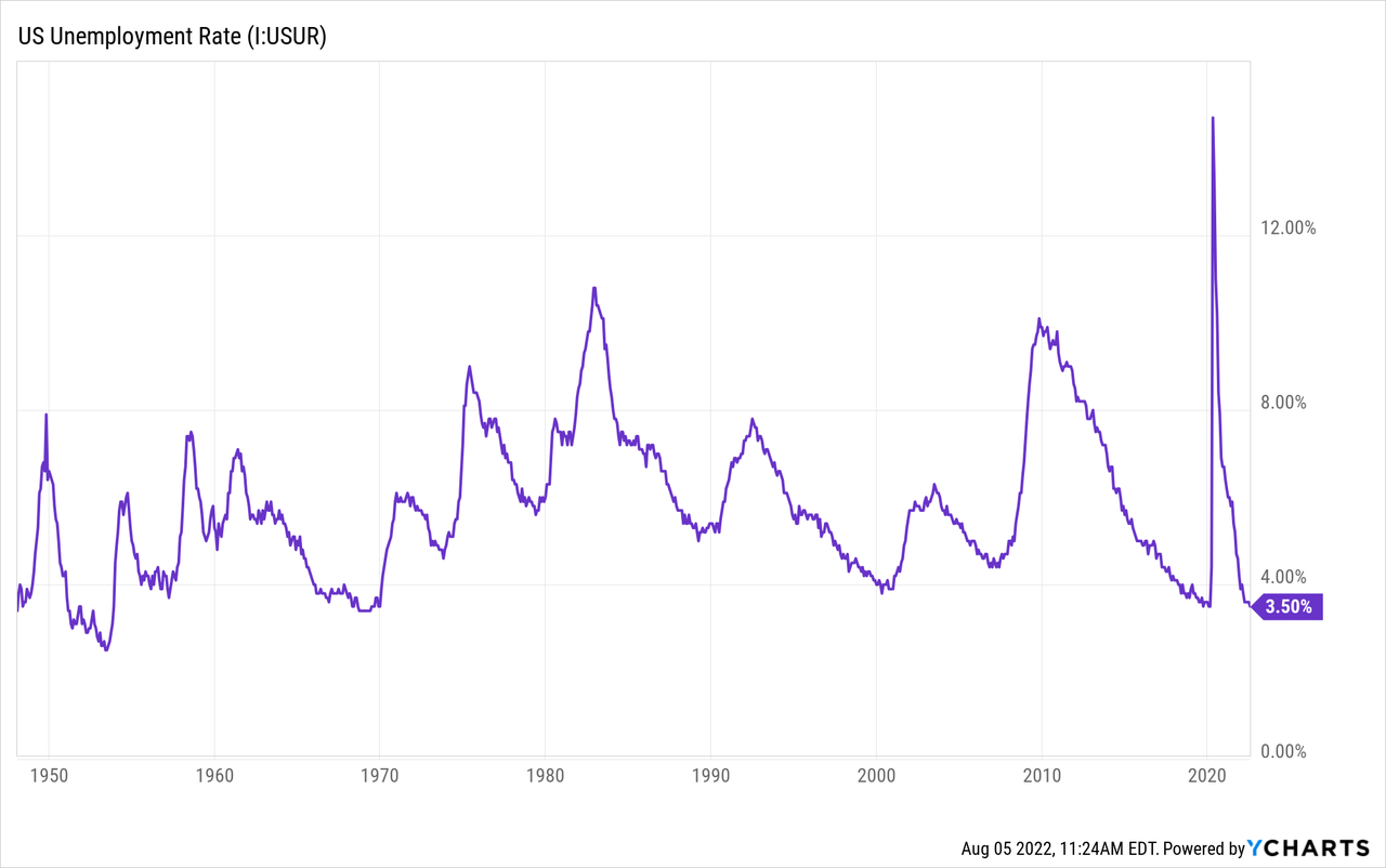
On Friday the BLS released its July monthly jobs report and the market interpreted the results as a strong labor market. Non-farm payrolls increased by 528,000 and the unemployment rate actually declined to 3.5%. These stellar advances were accompanied by a 0.5% MoM increase in wages, prompting immediate expectations of further monetary tightening by the Federal Reserve.
During the press conference on July 27th Federal Reserve Chairman Jerome Powell commented on the strength of the U.S. jobs market when he said:
I do not think the U.S. is currently in a recession and the reason is there are too many areas of the economy that are performing too well… This is a very strong labor market … it doesn’t make sense that the economy would be in a recession with this kind of thing happening.
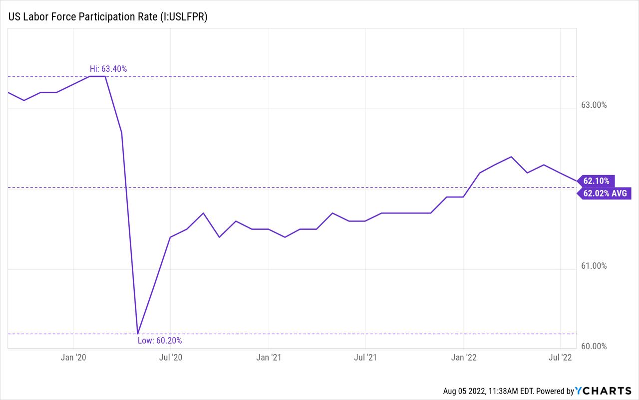
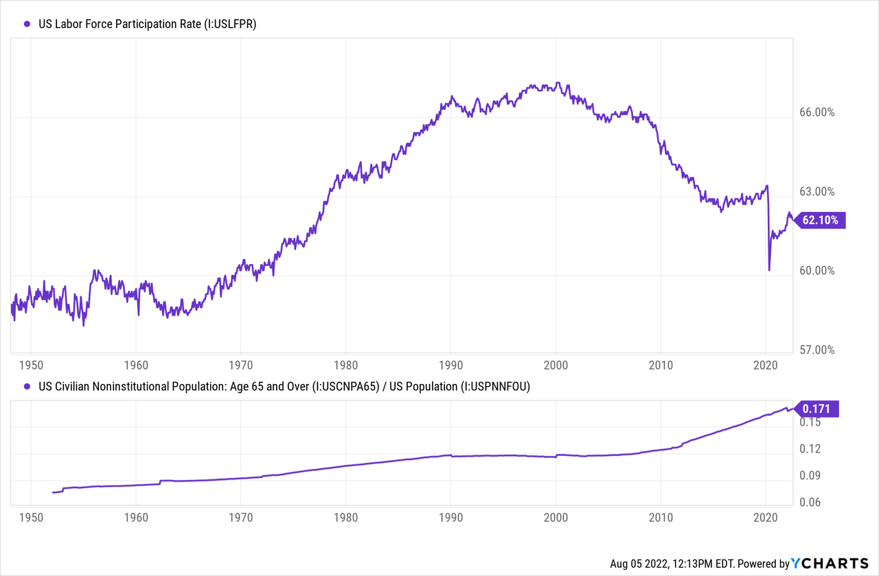
This viewpoint is commonly held by many financial analysts. The strong labor market is, perhaps, the most often cited indicator that there is no recession. The issue is that employment is a lagging indicator. The July report indicated that the labor participation rate dropped by -0.1% to 62.1% and Persons not in the labor force increased by 5.4% MoM. This weakness in the U.S. labor market is beginning to appear while leading indicators are looking grim.
In addition, it is unfair to compare today’s labor market to those of the past using only superficial metrics when the circumstances of today’s market are so unique. The aftermath of the pandemic and related lock-downs have disrupted the labor market in a lasting way.
The Appearance of Strength
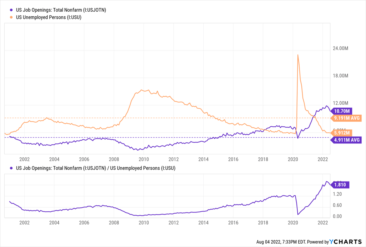
The labor market in the U.S. appears to be strong. The official unemployment rate is 3.5% which is very low. On top of that, there are 1.8 job openings for each unemployed person, the highest in over 20 years. On average, there have been 0.53 jobs per unemployed person.
So that’s it then. All done here.
Not so quick.
There are imperfections to the unemployment data that make it incomplete to assess the condition of the labor market. Unemployment data can miss persons who have given up seeking a job, persons who are working less hours than desired, and those that have effectively lost employment through reduced wages.
The macro events following the 2020 Pandemic seismically shifted trends in the labor market. It motivated many people to retire early to avoid workplace hardships. It caused many employers to lay off staff that now have difficulty hiring them back. It changed where and how people wanted to live and what kind of work they would be willing to do. It resulted in cost of living increases that caused many wage rates to become unworkable.
What’s Really Going on
Taking a closer look at the July jobs data we can see that 309,000 of the 528,000 new jobs come from the birth-death adjustment. Here is the definition of the adjustment from the BLS website:
Birth-death adjustment is an adjustment made to survey-based estimates to account for the net effect of businesses opening and going out of business… Respondents who are asked to respond in a BLS survey come from a longitudinal database of existing businesses. Therefore, businesses that are just getting started are excluded from the opportunity of being selected to be surveyed. Likewise, businesses that close are also not included. The net birth-death adjustment accounts for economic activity that surveys cannot capture.
I prefer not to view economic data that includes model-based adjustments in a vacuum.
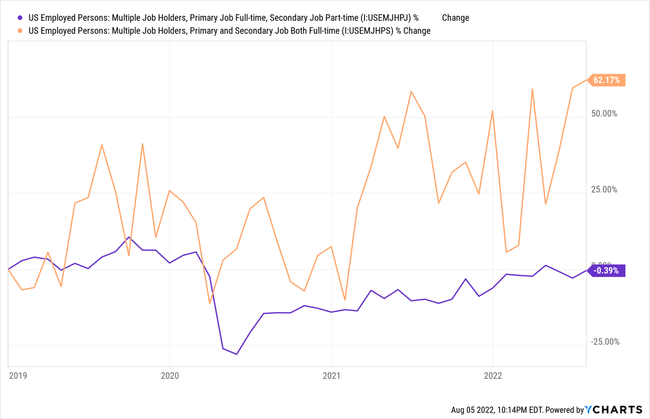
Since the start of the pandemic there are approximately 0.58 million persons missing from the workforce. The U.S. labor participation rate was 63.4% before the pandemic and is 62.1% today. In fact, the labor participation rate dropped by 0.1% from last month, suggesting that most of the new payrolls for July were second jobs. The report showed that 7.5 million persons worked multiple jobs in July, a 7.97% increase from the year prior.
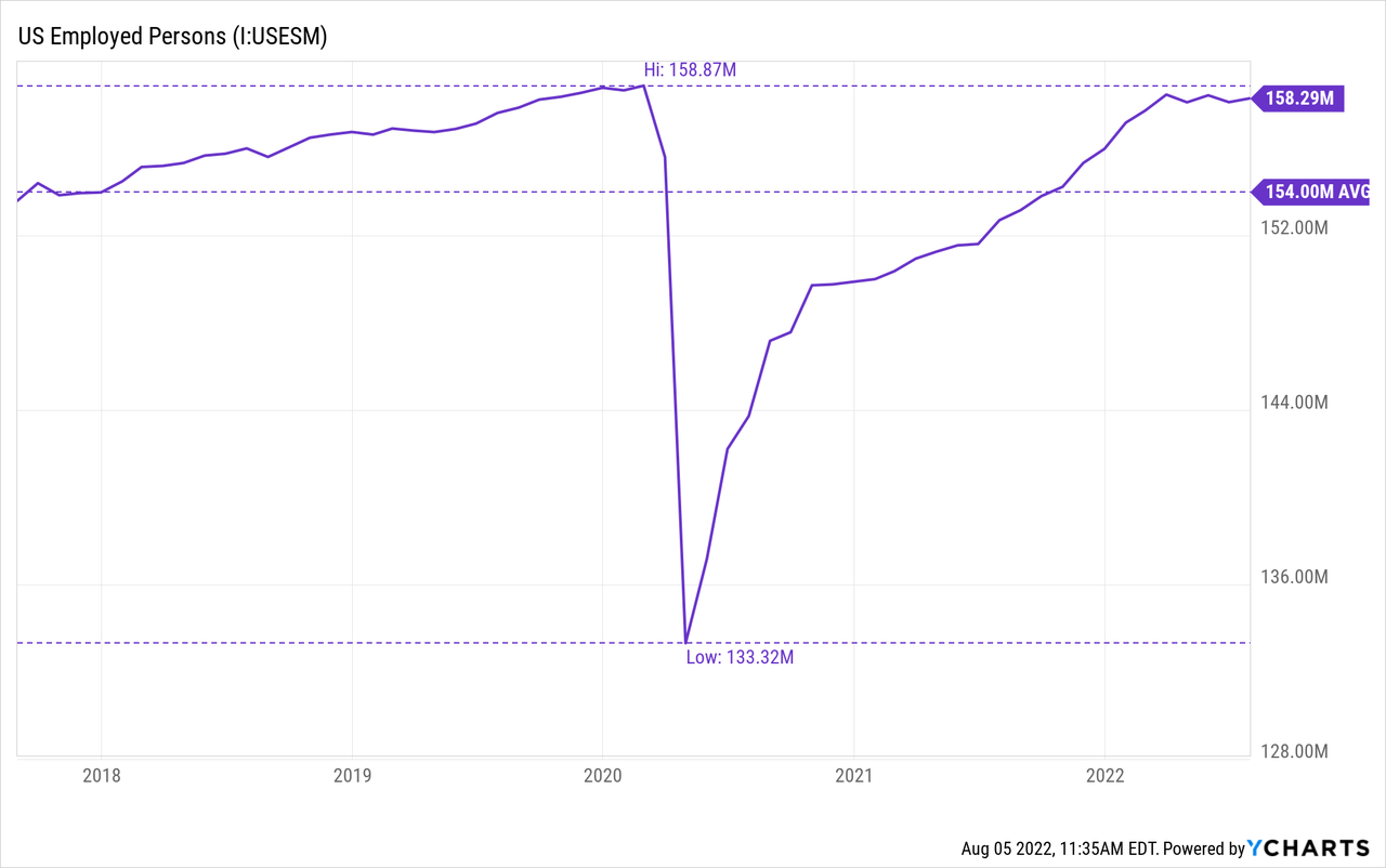
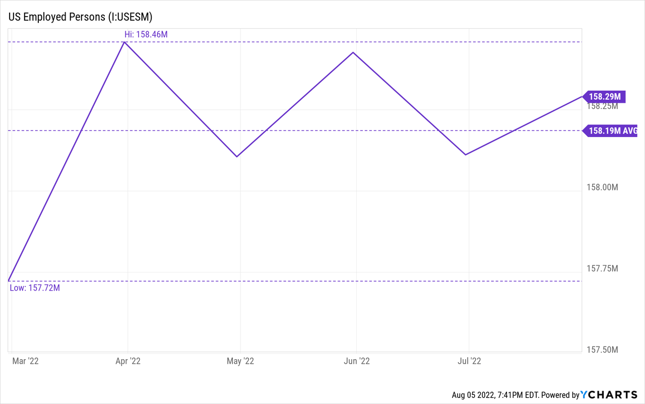
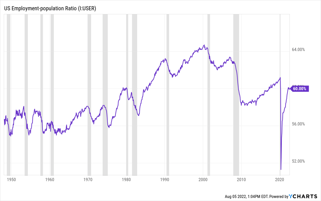
I prefer the U.S. employment to population ratio as a better gauge of overall employment activity. The ratio was 61.2% prior to the pandemic and has recovered to 60% today, although the ratio has not shown improvement since March 2022.
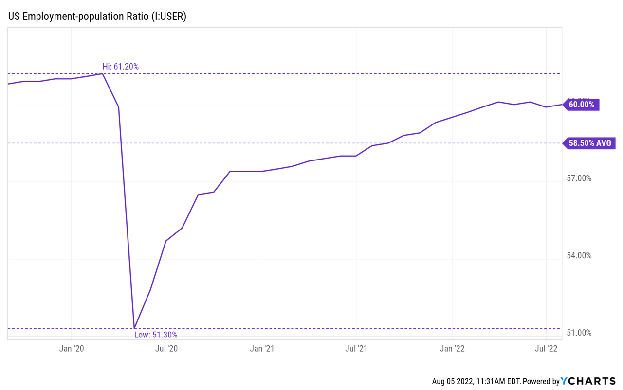
Since March, the number of employed persons has declined by 170,000 employees.
Historically, recession does not begin after the employment-population ratio declines but vice versa. Sometimes the ratio does not begin to decline until halfway through the recession.
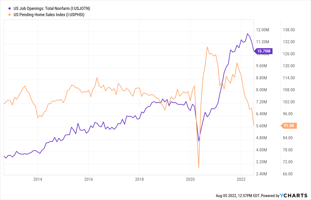
Now let’s talk about openings. The non-farm job openings topped out at a staggering 11.8 million in March 2022 and has trended slightly lower to 10.7 million today. This figure appears to be well above the number of unemployed persons at 5.67 million.
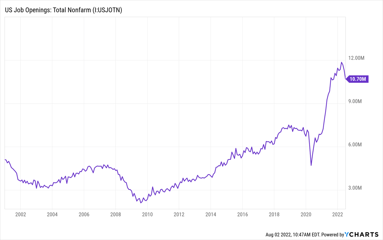
However, in addition to unemployed persons the Household Survey Data found that there are 6.2 million persons not in the labor force who currently want a job and were not included in the unemployment data. This was a MoM increase of 4.5%. Of the persons not in the labor force 0.55 million reported that the pandemic prevented them from seeking employment.
What helps to explain the gap in job openings and unemployed persons is the surge in personal spending as a result of M2 money supply growth which funded stimulus checks, extra unemployment benefits, and fueled wealth effects in real estate and equity markets. This swelled demand for goods and services that require labor while incentivizing workers to stay home.

It should come as no surprise, then, that the peak in M2 growth coincided with the peak in job openings growth. Both have been on a downward trend since April 2021.
Federal Reserve Economic Data | FRED | St. Louis Fed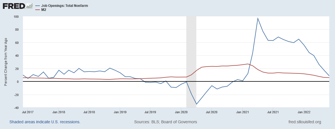
One explanation for the lower labor participation rate is the aging U.S. demographics. Since 2000 the proportion of the population older than 65 has been growing steadily and with it the labor participation rate has been in decline. But as Jason Furman points out only about one third of the deficit in LFP is due to aging demographics, further supporting the notion that people are choosing not to be employed.
Goosed by Housing
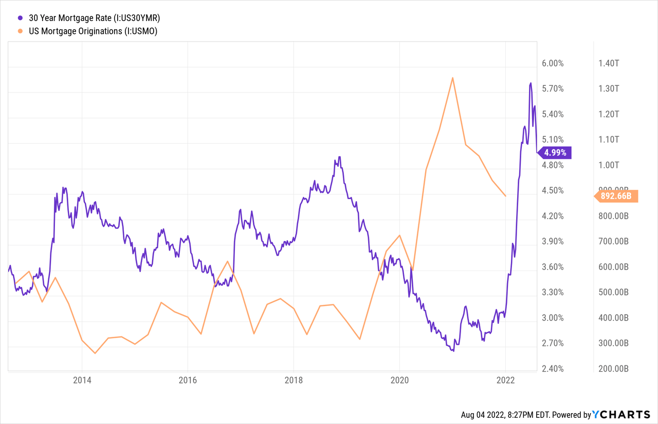
Housing is the backbone of the U.S. economy. The largest portion of each household’s budget is spent on housing and housing related goods such as appliances and furniture. The pandemic caused a never-before-seen change in home buyer behavior. All at once millions of people wanted larger homes in less urban areas and “right now” because of attractive financing. Through monetary stimulus the Fed caused mortgage rates to decline to record lows. Consequently, mortgage originations surged higher topping $1.3 trillion.
The extreme demand for housing and low rates spurred homes prices higher. This increase in price is a sign of the economic activity that was occurring in housing. This activity has far reaching effects in the labor market as millions of jobs serve the housing market from real estate brokers, insurance agents, and mortgage brokers. Then there are the careers involved in constructing and furnishing homes including plumbers, contractors, and landscapers. Many of these jobs receive compensation that is dependent on either the volume of home sales or the total value of sales. Both of which spiked higher in 2020 and 2021.
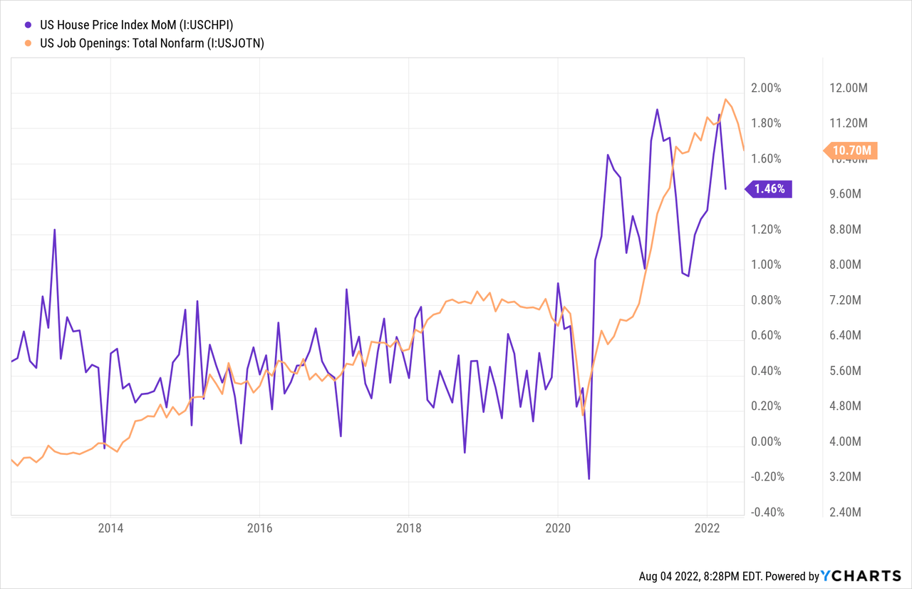
The economic activity that results from housing activity flows through the entire economy and ultimately has an indirect effect on every industry. This is why there is a correlation between housing, as measured by the NAHB Housing Market Index, and the unemployment rate. The index leads unemployment by 6-18 months. The chart below includes the index inverted in black and the unemployment rate in orange. The index is at 55 which corresponds to an implied unemployment rate of approximately 4.9%.
Charts by TradingView (adapted by author)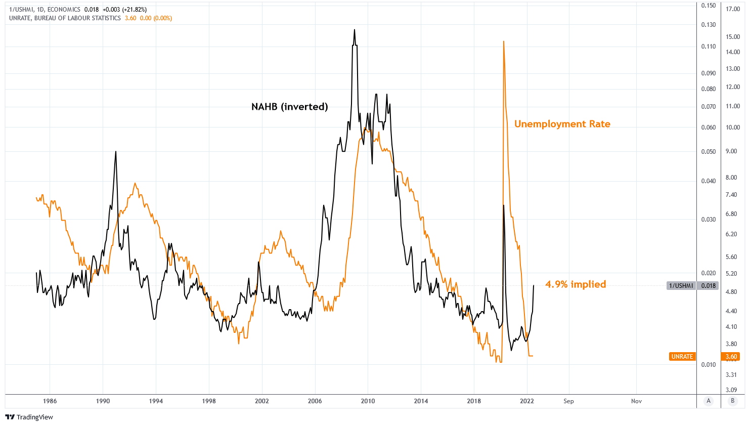
In March I wrote a piece on housing called “U.S. Housing is a Dead Man Walking.” I described how the U.S. housing market was ripe for a correction as affordability is too low. This is what I wrote:
The real mortgage payment has hit a 20-year high of $2,350 per month. This month, the median home sale price to median income ratio hit a record high of 6, which is far from the mean when compared to mortgage rates. At 4.5% mortgage rates, this ratio should be under 5. This implies a 17% drop in home prices just to reach mean. The ratio was similarly positioned in 2006 at a ratio of 5.1 when the mean was 4.4. By 2008, it dropped.
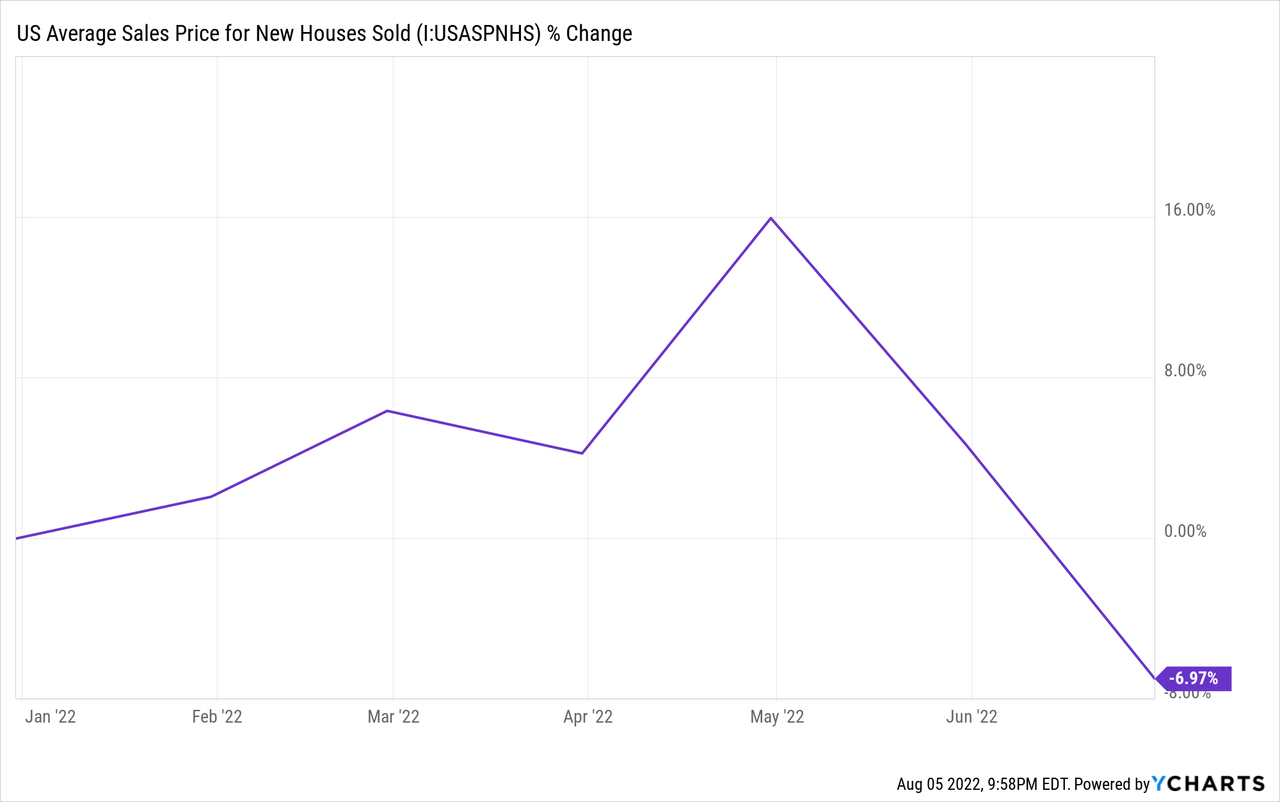
Prices for existing homes have yet to budge and mortgage rates are higher today than back then, creating the most expensive housing market on record. But the average sales price for new houses is down almost 7% year to date and the pending sales data is demonstrating significant weakness.
It’s the Money, Stupid
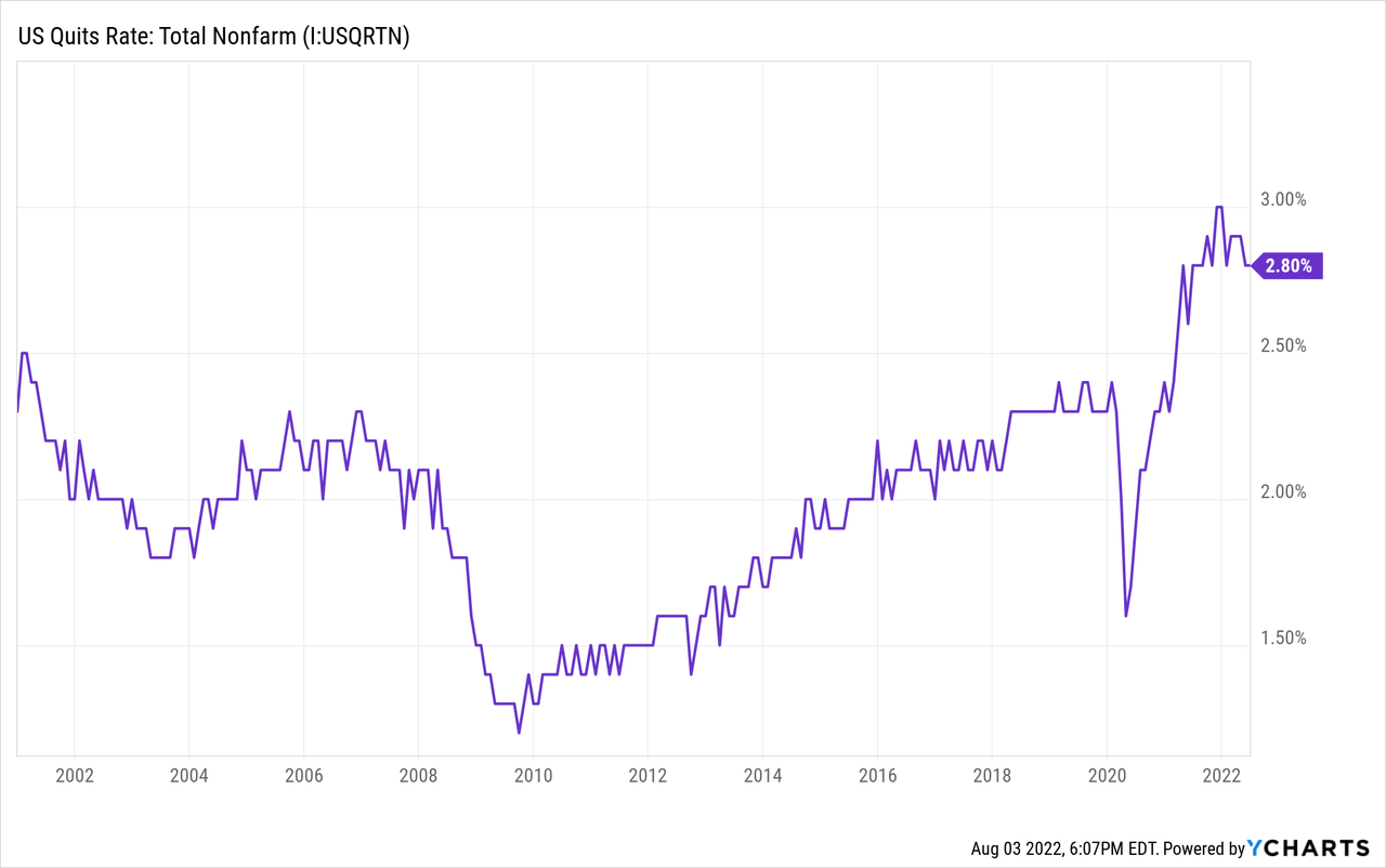
The labor market is experiencing the highest quits rate in 20 years as employees are seeking the most competitive job offer in a tight market.
This tightness has resulted in the largest increases to average hourly earnings in two decades. The average YoY increase in wages has been 5% since 2020. Again, a sign of employment strength until closer examination.
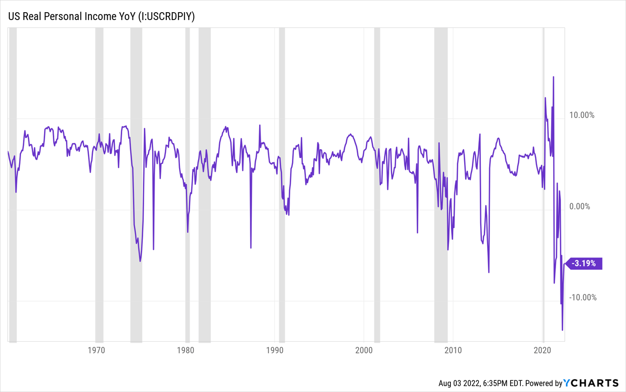
Federal Reserve Economic Data | FRED | St. Louis Fed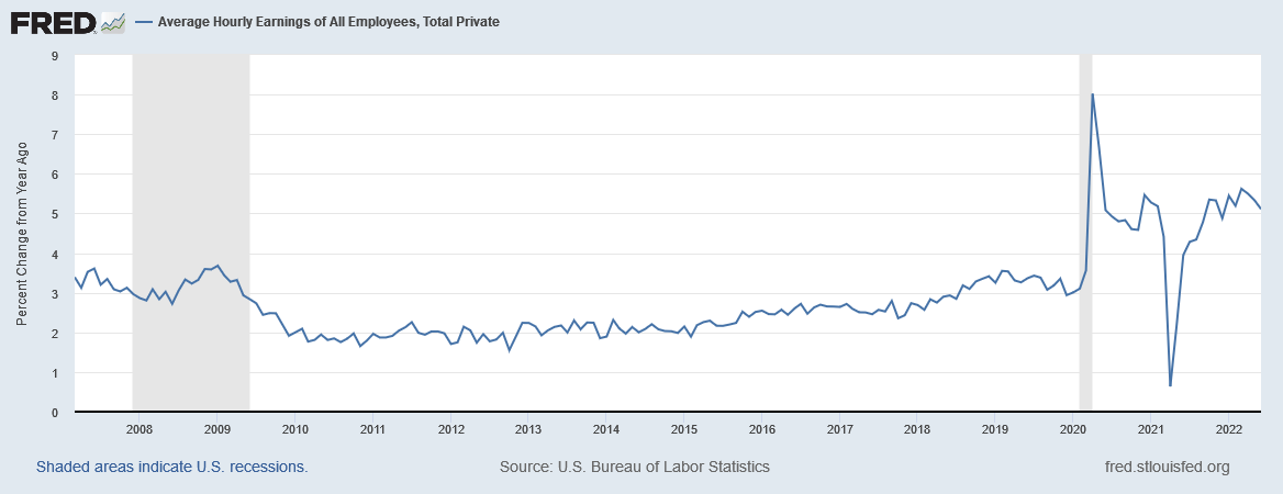
Officially, real personal income is down 3% YoY due to inflation outpacing wage growth.
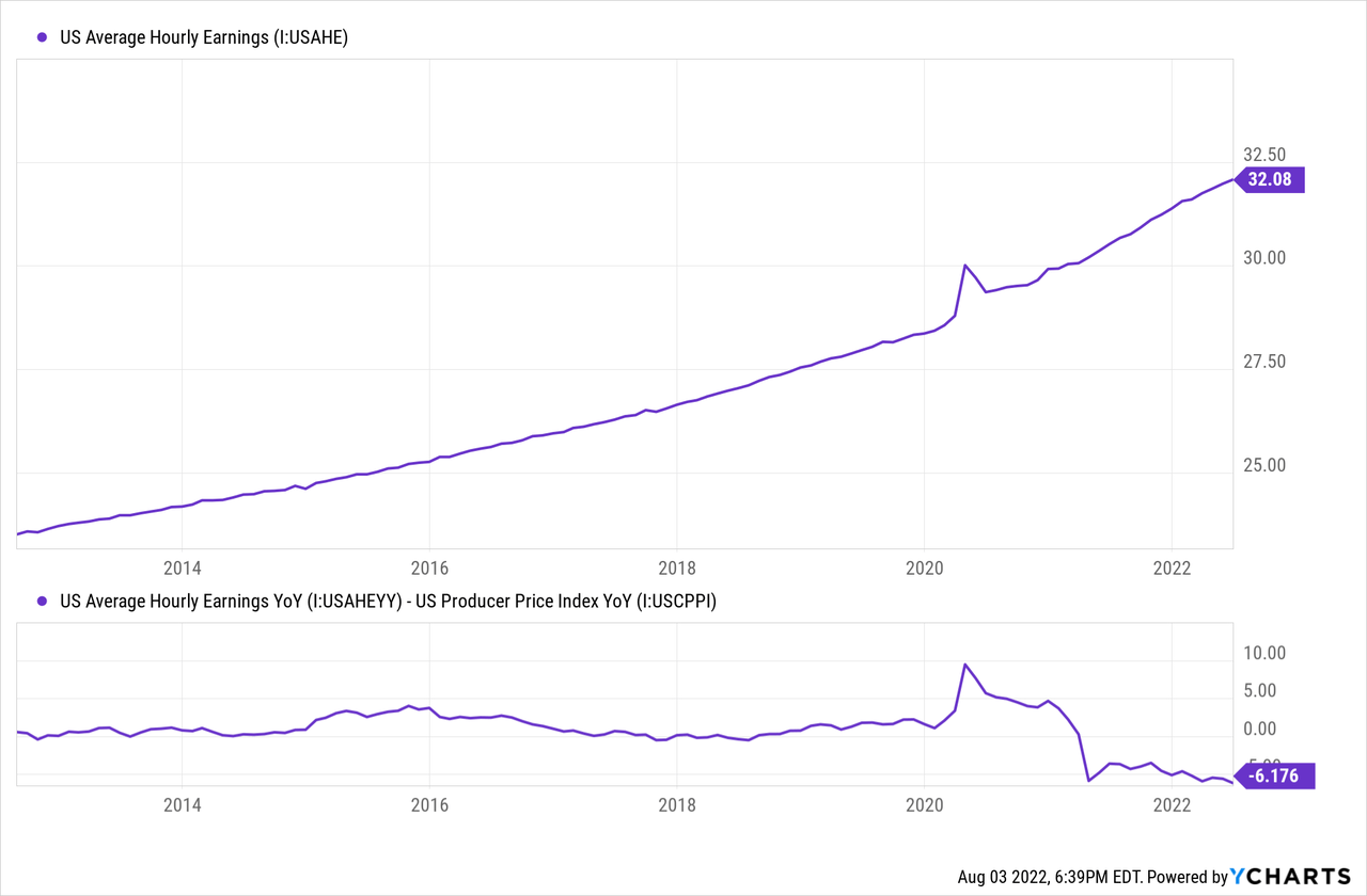
But when measured against the producer price index real wage growth is closer to -6% YoY.
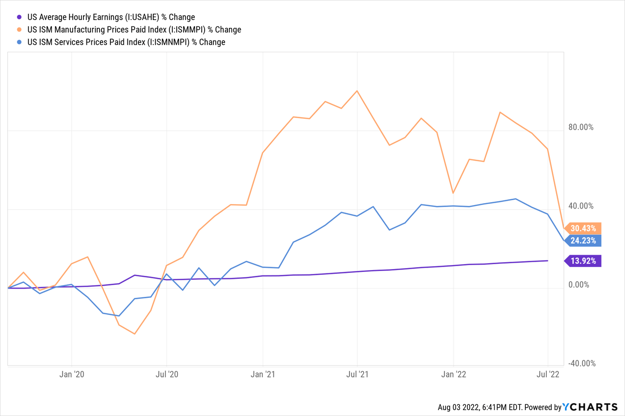
It gets even worse when compared to ISM prices paid data where average hourly earnings has grown 10-16% slower than price inflation since 2020.
This has largely resulted in an increase of multiple job holders which is padding the payroll stats. The number of persons employed at two full time jobs has increased a shocking 62.1% since 2019.
Real wages are calling the economy’s bluff. Economic strength should result in real wage growth, fewer second jobs, and a labor participation rate on trend with demographics.
Layoffs are Coming
The number of layoff announcements from U.S. companies is accelerating at an alarming rate. The Challenger US Job Cut Announcements data shows that June had the highest number of announced job cuts since early 2021 at 32,517. July was slightly lower at 28,510.
The Daily Shot (used with permission)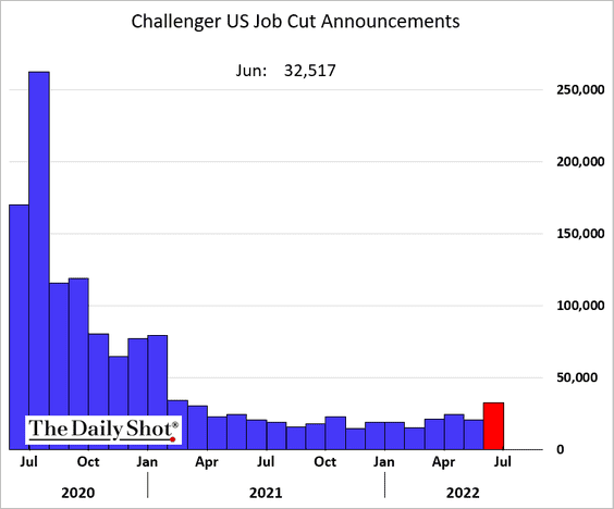
The announcements are coming from businesses large and small. Below are a few examples of recent cuts:
- Amazon (AMZN) cuts 100,000
- Robinhood (HOOD) cuts 25%
- Walmart (WMT) cuts 200
- Latch (LTCH) to cut 115
- Ford (F) cuts 8,000
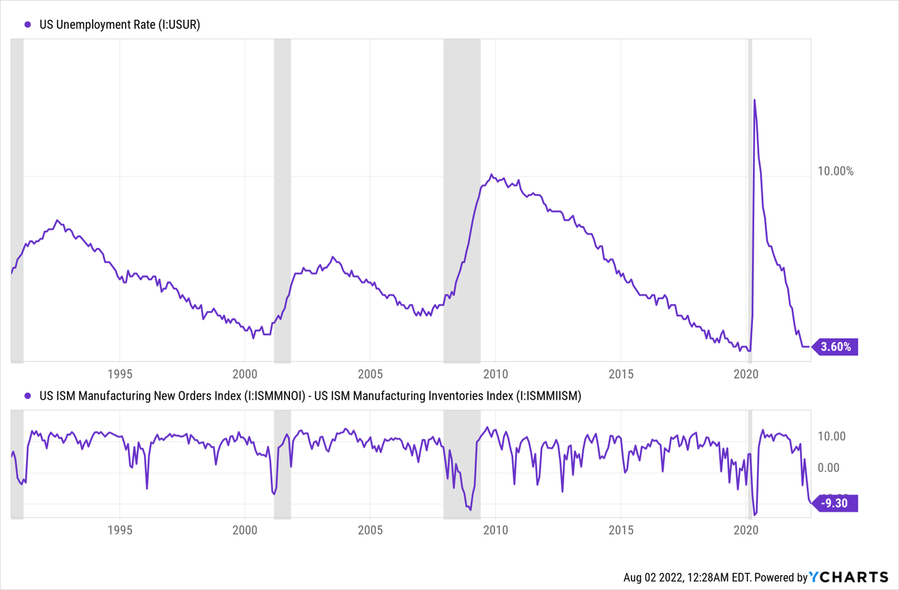
I believe this is the start of a contraction cycle in employment due to leading macro data that suggests further weakness. In addition to the decline in home sales the ISM manufacturing index is showing weakness. The spread between the ISM Manufacturing New Orders Index and Inventories Index is now at -9.3 which is the lowest since 2020 and 2009. Typically, when the spread has reached this low of a level it has corresponded with recession.
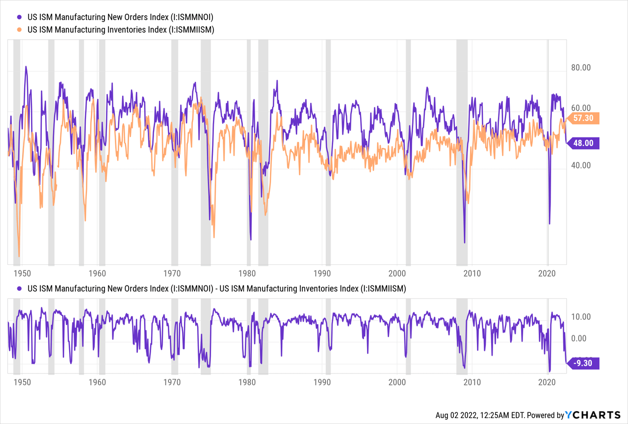
This point in the spread has also occurred near the bottom in unemployment rate and signaled a significant rise in unemployment in the subsequent months since 1990.
Initial claims for unemployment is a better gauge for the direction of the job market than unemployment because so many people are not actively seeking jobs in the wake of the pandemic. Since March 2022 initial jobless claims have risen 56% to 260,000. The nominal level is low, historically speaking, but the rate of change is significant. Claims are growing at 135% annual rate of change. During the 2008 recession the annual rate of change for claims peaked at 142%.

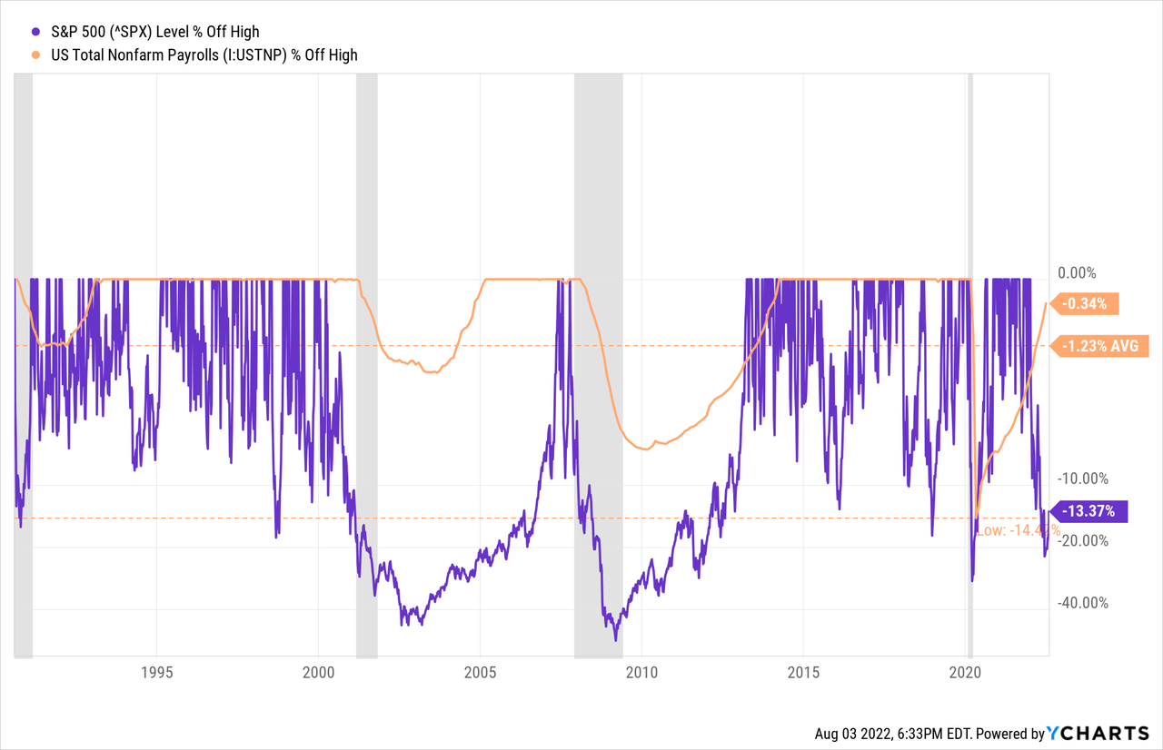
Non-farm payrolls tend to decline when equity markets decline significantly. The last three times that the S&P 500 experienced a 20% or greater decline from all-time highs it caused payrolls to decline 1-14%. The S&P hit the 20% mark in June but the payrolls have yet to decline. A quick recovery requires monetary easing. Not only is the Fed tightening but the “strong” employment data prolongs that policy position.
Summary
The labor market is not as strong as first appears. The excessive job openings and low unemployment rate is not a result of strong economic growth as real GDP has been negative since the start of the year. The demand for labor is a result of excessive monetary and fiscal stimulus, the recent equity market rally, and a red hot housing market.
Macro-economic conditions cannot sustain the current level of employment moving forward. Housing sales are slowing quickly and prices are showing weakness. Equity markets are pricing in tighter monetary policy and a slowdown in growth that hasn’t revealed itself in employment yet.
The labor market still has a novel tailwind with millions of people still re-entering the workforce from pandemic related departures. The highest inflation in 40 years is stalling many from entering back into employment because it’s just not worth the wage.
Job cuts, initial jobless claims, and hiring freezes are on the rise and it appears that this is the start of a new trend. How far that trend will go, that is the question. I expect that the job market is going to accelerate in a teeter-totter swing from tight to loose. Millions of people will be re-entering the job market, for a variety of reasons, just as employers are pulling back. The effect has the potential to feed on itself. As always, I’ll follow the data.
Be the first to comment