

XYLD’s distribution income is actually highly correlated to market volatility. DNY59
Foreword
This is part 2 of our covered call ETF series. Before reading this article, We highly recommend that you read our part 1 covered call ETF series on Global X NASDAQ 100 Covered Call ETF (QYLD). The summary of part 1 is as follows:
- We explained that the objective and methodology of our covered call strategies to actively generate income without forgoing upsides and our strategy differs from passive covered calls strategies (e.g QYLD).
- We also explained why it is structural for ATM-covered call ETFs to decline in value over time.
- Although QYLD’s price steadily declined over the past 9 years, QYLD’s historical distributions remain relatively constant throughout. This increases QYLD’s dividend yield annually.
- Since the Nasdaq (commonly known as the Tech sector) is commonly associated with growth rather than dividends or income generation, we found no reason to attempt to derive income from it through QYLD. As a result, QYLD has severely underperformed its underlying index over the past 9 years.
Introduction
Global X S&P 500 Covered Call ETF (NYSEARCA:XYLD) is Global X’s covered call ETF that shares a similar strategy to QYLD. Both ETFs involve selling ATM call options on their underlying index. This means that both XYLD and QYLD forgo all upside potential for a fixed profit, while sustaining the full downside risk.
Fig 1. XYLD and QYLD Strategy (Global X)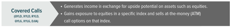
Since XYLD is similar to QYLD, many analysts and investors are indifferent to them, while others debate which is the better ETF. However, this study found concrete evidence suggesting that XYLD is superior to QYLD. Let’s examine.
XYLD Vs. QYLD: Quality Of Distribution
QYLD’s Distribution Characteristics
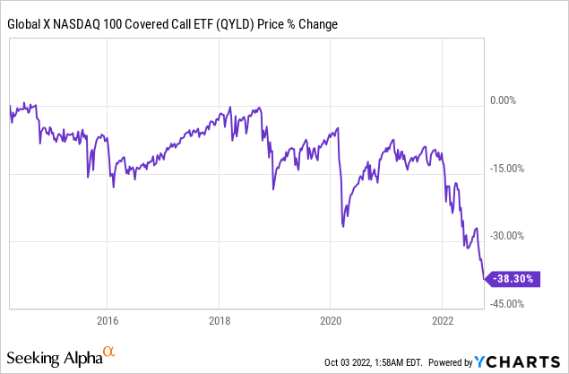
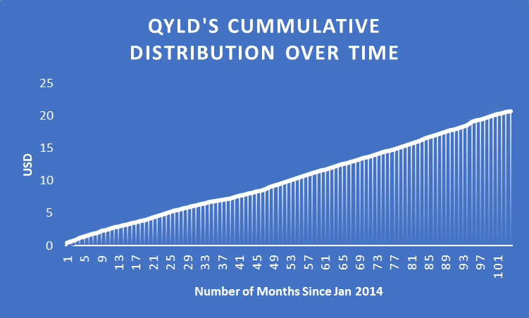
QYLD’s distribution has remained relatively constant throughout the years (Fig 1) despite a steady decline in share price (Fig 2). QYLD has distributed a total of $20.80 per share or a 9% average annual yield without compounding since the beginning of 2014 (Fig 3). This has 3 important negative implications: (1) investors can buy the same amount of future cash flow if they wait, (2) earlier investors are forced to reinvest their distributed income and dollar-cost average to take advantage of QYLD. The 2nd implication isn’t feasible for many folks who have other purposes for the distribution, such as retirement living expenses.
Fig 1. QYLD’s Distribution Remains Relatively Constant Despite Decline in Price (Author, www.globalxetfs.com) (Author, Global X) Fig 2. QYLD Price Steady Decline (YCharts) Fig 3. QYLD’s Distribution History Since Jan 2014 (Author, Global X)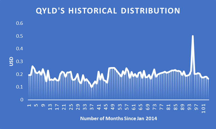
Perhaps the 3rd implication matters the most, that is, QYLD’s distribution isn’t adjusted by volatility. According to the Black-Scholes options pricing model, QYLD’s distribution (option premium) should be positively correlated to volatility. The more volatile the Nasdaq is, the more income QYLD should generate.
Fig 4 shows that QYLD’s distribution is rather weakly correlated to the volatility of the Nasdaq. The correlation between QYLD’s distribution income and Nasdaq volatility is only 0.315, which is a weak correlation by definition.
This can also explain why QYLD severely underperformed the Nasdaq where QYLD’s distribution couldn’t keep up with the volatility.
Fig 4. Nasdaq Volatility vs QYLD’s Distributed Income – Normalized Change (Author, Global X)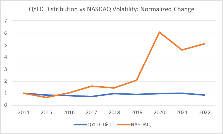
XYLD’s Distribution Characteristics
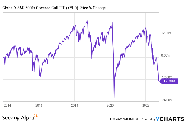
On the other hand, XYLD has distributed $26.54 since the beginning of 2014 which averages to 7% dividend yield annually. However, XYLD’s distribution over the past 9 years is steadily increasing (Fig 5). Hence, XYLD’s current yield is actually higher than 7%. For instance, XYLD’s yields in 2021 and 2022 are close to almost 10% and 10.5% respectively. Since XYLD engages in at-the-money covered options, this means XYLD’s upside is capped to the premiums collected while sustaining the full downside risk. Hence, it is expected that XYLD will remain in a range or trend downwards (Fig 7), which offsets the yield from the premiums.
Fig 5. XYLD Annual Distribution (Author, Global X) Fig 6. XYLD Cumulative Distribution Since 2014 (Author, Global X) Fig 7. XYLD Price Changes (YCharts)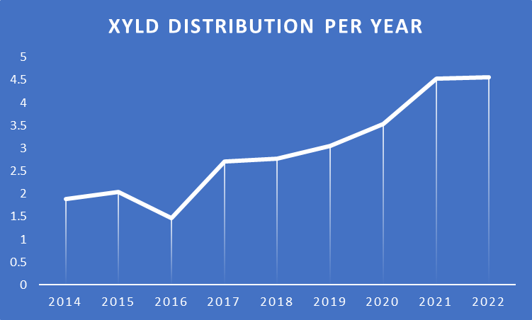

The main difference between XYLD and QYLD’s distribution is how the distributions are correlated to the underlying index volatility. As shown in Fig 4, QYLD’s distribution has little to no correlation to its underlying index. However, XYLD’s distribution is strongly positively correlated (=0.87) to its underlying index (Fig 8).
This means that XYLD compensates investors for incurring incremental risks (volatility), but QYLD does not.
Fig 8. S&P500 Volatility vs XYLD’s Distributed Income – Normalized Change (Author, Global X)
Does XYLD Really Have Superior Returns?
It is easy to dismiss QYLD as not having a superior risk premium because QYLD (average annual return = 4.9% since 2014) has severely underperformed the Nasdaq (23%). It is also easy to misjudge XYLD as having a superior risk premium because its annual average return (5.4%) is closer to the S&P500 (11%).
We also know that XYLD has risk-adjusted distributions while QYLD does not. Yet, this does not tell us whether investors are adequately compensated.
For this, we have to look at the risk premium, which is defined as the return compensated for taking on risk (volatility).
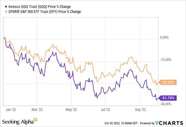
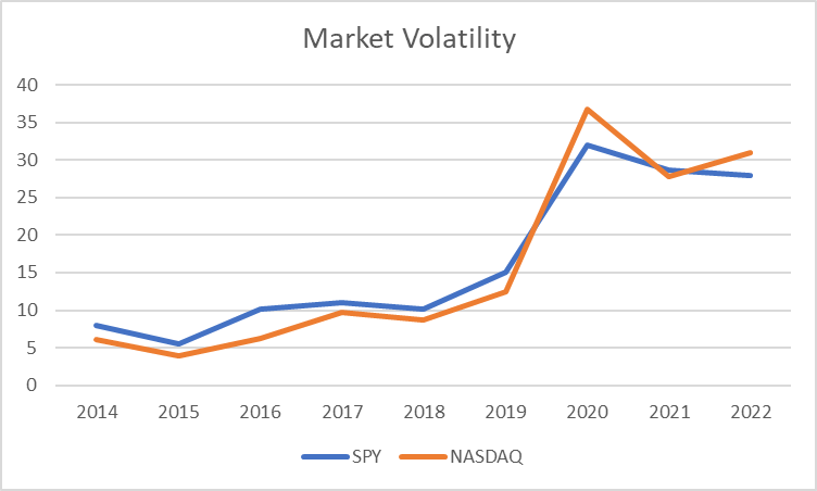
Contrary to popular belief, the S&P500 has been more volatile than the Nasdaq historically (Fig 11). It is easy to perceive the Nasdaq as being more volatile than the S&P500. Nasdaq’s return almost doubled S&P500’s during the 2020-2021 bull market (Fig 9) and also declined more than the S&P500 during the 2022 bear market (Fig 10). That’s not really the case (Fig 11).
For the period between 2014 and 2019:
- Both QYLD and XYLD have very similar average total returns:
- QYLD’s average total return is 7.5% (=($13.52 total distribution – $2.03 capital losses)/ $25.54 Close Price @ 31st Dec 2013 / 6 years)
- XYLD’s average total return is 7.7% (=($13.92 total distribution + $6.50 capital gain)/ $44.17 Close Price @ 31st Dec 2013 / 6 years)
- Both QYLD and XYLD have very similar required returns based on risk incurred:
- QYLD and XYLD’s Beta to their respective indices is 0.0978 and 0.1756. This means XYLD is riskier and should require a higher return.
- Assuming the average 2.5% risk-free rate, the resulting required return for QYLD and XYLD is 4.42% (=2.5%/12 + 0.0978*[1.84%-2.5%/12]) and 4.412% (=2.5%/12 + 0.1756*[0.98%-2.5%/12]) respectively.
- Both QYLD and XYLD provided a very similar excess return to the investors.
- QYLD Excess Return = 7.5% – 4.42% = 3.08%
- XYLD Excess Return = 7.7% – 4.412 = 3.288%
QYLD and XYLD also have similar excess returns for the period including the pandemic era (post-2020), though XYLD provided a little more (0.6%) excess return than QYLD.
- QYLD Excess Return = 4.9% Avg. Return – 4% Req. Return = 0.9%
- XYLD Excess Return = 5.4% Avg. Return – 3.9% Req. Return = 1.5%
Fig 9. S&P500 and Nasdaq during the 2020-2021 bull market (YCharts) Fig 10. S&P500 and Nasdaq during the 2022 bear market (YCharts) Fig 11. Market Volatility: SPY vs Nasdaq (Author)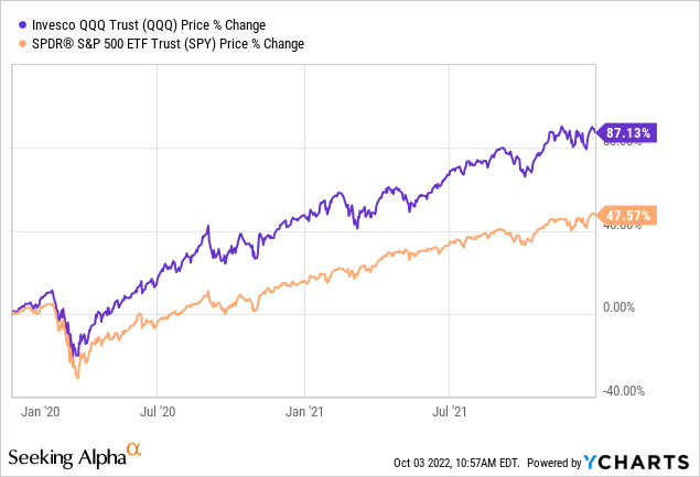
Verdict
This study found strong support for claiming XYLD to be superior to QYLD:
- XYLD’s distribution is strongly correlated to market volatility, while QYLD is not. Therefore, both XYLD and QYLD may have increasing yields over time, but XYLD’s increases in yield are derived from increasing distribution while QYLD’s increases in yield are derived from declining prices. This means that XYLD investors do not need to keep reinvesting to realize the yield increments, unlike QYLD investors.
- XYLD is able to provide about 10% more excess return than QYLD considering their risk and market performance pre-Covid, and 67% post-Covid.
That being said, investors should remember that both XYLD and QYLD have very limited upside and will not be able to take advantage of any strong bullish market reversal. Although we find XYLD to be superior to QYLD, we still retain our preference to accumulate blue-chip dividend value stocks now for income (read part 1 to know why). We also maintain our position to only invest in XYLD if we deem that the market is going to stagnate while remaining highly volatile.
Be the first to comment