

97
This monthly article series shows a dashboard with aggregate subsector metrics in Consumer Discretionary. It is also a top-down analysis of sector ETFs like the Consumer Discretionary Select Sector SPDR ETF (NYSEARCA:XLY), the Fidelity MSCI Consumer Discretionary Index ETF (FDIS) and the Vanguard Consumer Discretionary ETF (VCR), whose largest holdings are used to calculate these metrics.
Shortcut
The next two paragraphs in italic describe the dashboard methodology. They are necessary for new readers to understand the metrics. If you are used to this series or if you are short of time, you can skip them and go to the charts.
Base Metrics
I calculate the median value of five fundamental ratios for each subsector: Earnings Yield (“EY”), Sales Yield (“SY”), Free Cash Flow Yield (“FY”), Return on Equity (“ROE”), Gross Margin (“GM”). The reference universe includes large companies in the U.S. stock market. The five base metrics are calculated on trailing 12 months. For all of them, higher is better. EY, SY and FY are medians of the inverse of Price/Earnings, Price/Sales and Price/Free Cash Flow. They are better for statistical studies than price-to-something ratios, which are unusable or non-available when the “something” is close to zero or negative (for example, companies with negative earnings). I also look at two momentum metrics for each group: the median monthly return (RetM) and the median annual return (RetY).
I prefer medians to averages because a median splits a set in a good half and a bad half. A capital-weighted average is skewed by extreme values and the largest companies. My metrics are designed for stock-picking rather than index investing.
Value and Quality Scores
I calculate historical baselines for all metrics. They are noted respectively EYh, SYh, FYh, ROEh, GMh, and they are calculated as the averages on a look-back period of 11 years. For example, the value of EYh for retailing in the table below is the 11-year average of the median Earnings Yield in retail companies.
The Value Score (“VS”) is defined as the average difference in % between the three valuation ratios (EY, SY, FY) and their baselines (EYh, SYh, FYh). The same way, the Quality Score (“QS”) is the average difference between the two quality ratios (ROE, GM) and their baselines (ROEh, GMh).
The scores are in percentage points. VS may be interpreted as the percentage of undervaluation or overvaluation relative to the baseline (positive is good, negative is bad). This interpretation must be taken with caution: the baseline is an arbitrary reference, not a supposed fair value. The formula assumes that the three valuation metrics are of equal importance. A floor of -100 is set for VS and QS when the calculation goes below this value. It may happen when metrics in a subsector are very bad.
Current data
The next table shows the metrics and scores as of last week’s closing. Columns stand for all the data named and defined above.
|
VS |
QS |
EY |
SY |
FY |
ROE |
GM |
EYh |
SYh |
FYh |
ROEh |
GMh |
RetM |
RetY |
|
|
Auto + Components |
-39.35 |
-11.67 |
0.0567 |
1.0076 |
0.0098 |
13.36 |
23.72 |
0.0606 |
1.6294 |
0.0369 |
19.30 |
22.07 |
-12.68% |
-30.53% |
|
Durables + Apparel |
38.25 |
19.63 |
0.0856 |
0.9162 |
0.0377 |
30.32 |
34.83 |
0.0514 |
0.7006 |
0.0321 |
18.36 |
47.01 |
-4.58% |
-23.91% |
|
Retailing |
-20.03 |
15.36 |
0.0519 |
0.6748 |
0.0234 |
33.51 |
34.59 |
0.0497 |
0.8817 |
0.0397 |
24.74 |
36.30 |
-3.48% |
-22.43% |
|
Services |
-7.24 |
21.77 |
0.0223 |
0.4019 |
0.0240 |
22.02 |
31.60 |
0.0335 |
0.4125 |
0.0210 |
14.22 |
35.64 |
-10.87% |
-24.78% |
Value and Quality chart
The next chart plots the Value and Quality Scores by subsector (higher is better).
Value and quality in consumer discretionary. (Chart: author; data: Portfolio123)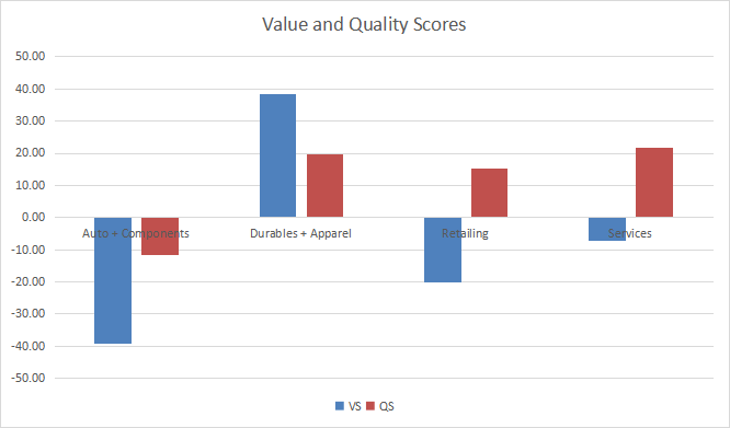
Evolution since last month
The value score has improved in all subsectors due to price action. Quality has drastically improved in services, and to a lesser extent in durables/apparel.
Variations in value and quality (Chart: author; data: Portfolio123)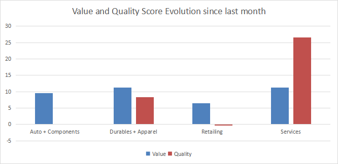
Momentum
The next chart plots momentum data.
Momentum in consumer discretionary (Chart: author; data: Portfolio123)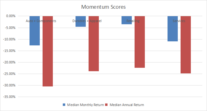
Interpretation
Durables and apparel are the only sector with good value and quality scores. The services subsector, which includes hotels, restaurants, leisure, and diversified services, is overvalued by about 7% relative to 11-year averages. An excellent quality score may justify it. Retailing is overvalued by about 20% and also looks good regarding quality. Auto and components are the less attractive subsector now, with both scores far below the historical baseline.
Fast facts on XLY
The Consumer Discretionary Select Sector SPDR Fund has been tracking the Consumer Discretionary Select Sector Index since 12/16/1998. It has 57 holdings and a total expense ratio of 0.10%, like VCR and a bit more expensive than FDIS (0.08%).
The next table shows the top 10 holdings with basic ratios and dividend yields. Their aggregate weight is 69.4%, with 40% in the top two names. Amazon (AMZN) and Tesla (TSLA) respectively represent 22.31% and 17.69% of the fund’s asset value.
|
Ticker |
Name |
Weight% |
EPS growth %TTM |
P/E TTM |
P/E fwd |
Yield% |
|
Amazon.com, Inc. |
22.31 |
-61.05 |
95.67 |
4515.31 |
0 |
|
|
Tesla, Inc. |
17.69 |
332.56 |
74.07 |
49.53 |
0 |
|
|
McDonald’s Corp. |
5.10 |
-11.61 |
29.96 |
24.75 |
2.50 |
|
|
The Home Depot, Inc. |
5.02 |
14.47 |
16.99 |
16.67 |
2.75 |
|
|
Lowe’s Cos., Inc. |
4.32 |
30.78 |
14.89 |
13.98 |
2.22 |
|
|
NIKE Inc. |
3.96 |
-6.48 |
24.86 |
29.62 |
1.39 |
|
|
Starbucks Corp. |
3.54 |
48.92 |
24.29 |
30.08 |
2.45 |
|
|
The TJX Cos., Inc. |
2.66 |
35.97 |
22.67 |
20.52 |
1.86 |
|
|
Target Corp. |
2.42 |
-29.85 |
16.55 |
17.91 |
2.97 |
|
|
Booking Holdings Inc. |
2.37 |
272.91 |
44.54 |
17.27 |
0 |
Ratios by Portfolio123
XLY has beaten the S&P 500 (SPY) by about 2 percentage points in annualized return since January 1999. Drawdown and standard deviation of monthly returns (volatility) point to a higher risk (see next table).
|
Total Return |
Annual Return |
Drawdown |
Sharpe |
Volatility |
|
|
XLY |
581.18% |
8.40% |
-59.05% |
0.43 |
19.53% |
|
SPY |
345.30% |
6.48% |
-55.42% |
0.38 |
15.42% |
Data calculated with Portfolio123
As of writing, XLY has underperformed SPY by 10.5 percentage points in 2022.
XLY vs. SPY in 2022 to date (Portfolio123)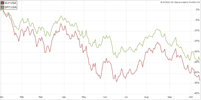
In summary, XLY is a good fund with cheap management fees for investors seeking capital-weighted exposure in consumer cyclicals. Fidelity’s fund is even cheaper, but the difference is insignificant. XLY has much more liquidity, making it a better instrument for trading and tactical allocation. Investors who are concerned by the high concentration in Amazon and Tesla may prefer the Invesco S&P 500 Equal Weight Consumer Discretionary ETF (RCD).
Dashboard List
I use the first table to calculate value and quality scores. It may also be used in a stock-picking process to check how companies stand among their peers. For example, the EY column tells us that a retail company with an Earnings Yield above 0.0519 (or price/earnings below 19.27) is in the better half of the industry regarding this metric. A Dashboard List is sent every month to Quantitative Risk & Value subscribers with the most profitable companies standing in the better half among their peers regarding the three valuation metrics at the same time. The list below was sent to subscribers several weeks ago based on data available at this time.
|
Golden Entertainment, Inc. |
|
|
MGM Resorts International |
|
|
Dave & Buster’s Entertainment, Inc. |
|
|
Williams-Sonoma, Inc. |
|
|
Murphy USA Inc. |
|
|
AutoNation, Inc. |
|
|
The Children’s Place, Inc. |
|
|
Nordstrom, Inc. |
|
|
Sally Beauty Holdings, Inc. |
|
|
Macy’s, Inc. |
It is a rotating list with a statistical bias toward excess returns on the long-term, not the result of an analysis of each stock.
Be the first to comment