


Douglas Rissing/iStock via Getty Images
We all are all now experiencing fatigue when we hear about the Federal Reserve, the quantitative easing or tightening. For better or worse, the past decade has been marked by unprecedented levels of monetary intervention in the markets and the Fed has become the only game in town.
Business fundamentals did not matter anymore, as I have explained time and time again and have given stark examples of why investors in companies like Tesla (TSLA) and Nvidia (NVDA) should not really care about business fundamentals as long as the Federal Reserve got their backs (see the analyses here and here).
I have also explained why recency bias is a thing in the market and why investors should stop thinking of their growth stocks as bargains, just because they have fallen by 30%, 50% or even 70% in a matter of just a few months. Adobe (ADBE) was one such company that is no longer a $600 stock in my view.
Even behemoths, such as Amazon (AMZN), were not spared and instead of thinking about Amazon’s next quarterly results, I showed why momentum exposure was far more important for future returns.
Why is this time different?
We all know the mantra that unconsciously we often resort to – this time is different. Although history always rhymes and we should not fall into the fallacy of thinking that due to technology advancements this time there will be no bear market (just ask Cathie Woods), every bear market differs in a way and we cannot simply use past market downturns as a playbook for navigating future market routs.
As I said earlier, the amount of monetary intervention has made the current cycle impossible to compare against most past periods. One key difference is that due to excessive liquidity and negative to near zero interest rates, certain parts of the markets are not behaving as they did during previous market downturns.
By far the best illustration of that is by observing the performance of the Vanguard Growth ETF (VUG) versus that of Vanguard Value ETF (VTV). For the better part of the past decade, these two ETFs were moving largely in unison with the former slightly outperforming the latter.
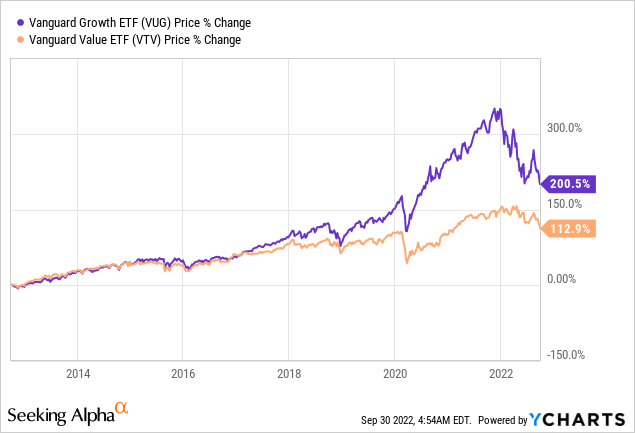
However, as the pandemic hit and interest rates were brought down to zero, the Federal Reserve unleashed its unlimited liquidity and even fiscal authorities distributed the so called ‘helicopter money’ (an event once thought as a pure theoretical concept), a wide gap has opened between the VUG and VTV. In a matter of just a few months, VUG exploded on the upside.
For anyone who has been observing this phenomenon, it has been clear to see that this is not sustainable and the index has disconnected from the reality.
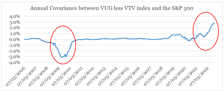
Therefore, to isolate the impact of this liquidity, I construct an index that takes the daily return of the VUG and from that subtracts the daily return of the VTV. Throughout this analysis I will refer to it as the VUG less VTV index.
Then, by taking the daily returns of this index and the S&P 500, I plot the rolling 1-year covariance between the two. To say the least, an interesting trend emerges.
For the most part, the covariance between the two is near zero, however, for the past year it has suddenly broken out of this trend on the upside.
prepared by the author, using data from Seeking Alpha
Even more interesting is the fact that during the Global Financial Crisis, the movement was in the opposite direction.
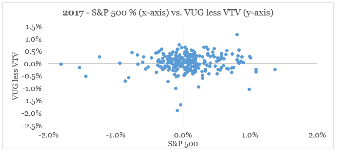
To properly illustrate what his means, down below I show the daily returns of the S&P 500 versus those of VUG less VTV.
prepared by the author, using data from Seeking Alpha
In other words, no strong relationship exists and the two variables seem to follow a random distribution.
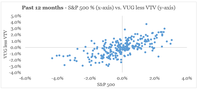
Now, let’s look at the same data set, but this time using daily returns for the past 12-month period. We clearly see that there is a positive relationship between the two variables. In other words, when the S&P 500 was having a bad day, the growth stocks were underperforming the value stocks by a wide margin and vice versa.
prepared by the author, using data from Seeking Alpha
Now let’s have a look at what the Global Financial Crisis looked like. During the most violent year – 2008, the relationship between the two was slightly negative, meaning that when the S&P 500 was having a bad day then growth stocks tended to outperform value.

prepared by the author, using data from Seeking Alpha
Following the market bottom in late-2008/early-2009, the relationship between the two variables only grew stronger. Over the course of 2009, the negative relationship was the strongest.
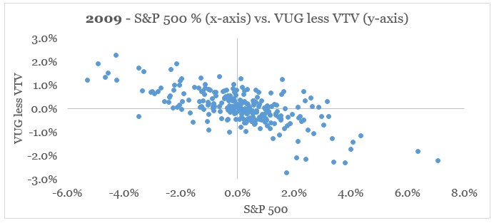
prepared by the author, using data from Seeking Alpha
What that means is that we might be far from seeing the peak of value outperformance over growth.
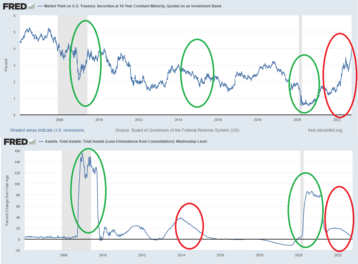
To understand why this difference between now and the Global Financial Crisis occurs, we should take a look at the overall liquidity within the markets. In the graph below, I have plotted the yield of the U.S. 10-year government bonds and the annual change of the Federal Reserve. The green circles show a time of supportive monetary conditions, i.e. falling bond yields and expanding of the Fed balance sheet. On the contrary, the red circles show rising bond yield and contractions of the Fed’s balance sheet.
To properly illustrate the trend, I have selected four periods – the first one is near the end of the Global Financial Crisis, the second is during 2014 which is the year following the so called ‘taper tantrum’, the third is the months around the pandemic and the fourth is the past year.
FRED
What we clearly see is that as opposed to any other period, the past year saw both slower pace of the Fed’s balance sheet expansion and a significant rise in bond yields. Moreover, we could now explain the negative relationship between the S&P 500 and the VUG less VTV index we saw above and why during 2022 this is now highly positive.
An Example From The Semiconductor Industry
As many investors cling to the exciting narratives and the eye-watering charts of Total Addressable Markets of their favourite growth stocks, the reality is that many of these businesses might not recover to their previous highs for many years ahead.
A good example of that is the semiconductor space, which has been a massive beneficiary of all the events described in the previous section.
For the purpose of the analysis, I have selected the largest and most popular names in the sector. As we see, the past 9-month returns have been devastating, although there is a very wide gap in performance.
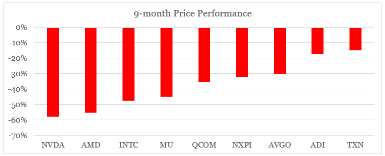
prepared by the author, using data from Seeking Alpha
By keeping the same order as above, I also plot the covariance of each of these stocks with the VUG less VTV index for both 2021 and the 9-months up to date.
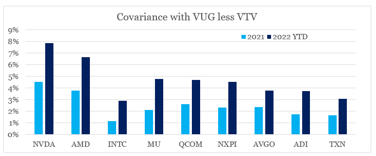
prepared by the author, using data from Seeking Alpha
If we plot the year-to-date share price performance against the 2021 covariance with the VUG less VTV index, we see a very strong negative relationship.
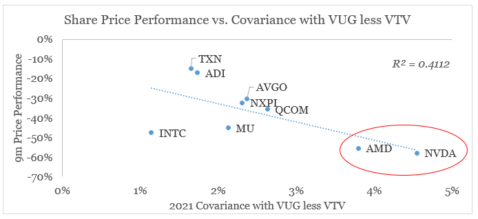
prepared by the author, using data from Seeking Alpha
This clearly illustrates that the performance across the board was not so much due to actual business performance (although Intel (INTC) was an outlier due to competitive pressures) or due to sector-wide slowdown as it was due to recent monetary policy decisions.
It also shows that some of the most beloved growth names in the semiconductor space – AMD (AMD) and Nvidia (NVDA) are both poorly positioned to deliver superior returns in the future, regardless of their actual business performance. At the same time, certain high quality businesses that have been overlooked for years could now be in a better position to deliver above-market returns.
Investor Takeaway
Many high growth and momentum stocks might not see their previous highs for a very long time due to monetary and fiscal decisions made over the past decade. As deglobalization trends accelerate and with inflationary pressures as a result of that persist, the path for future monetary policy and level of intervention appears less clear than it was a decade ago.
Although a new round of quantitative easing is a possibility, the most likely scenario ahead is of less tailwinds for momentum and growth stocks. Moreover, this makes the current market downturn vastly different from the last one we experienced during the 2007-08 period.
Having said that, not all parts of the equity market will be hit equally. As we saw so far, certain businesses appear better positioned to succeed in this new market reality.
Be the first to comment