

pawel.gaul/E+ via Getty Images
I have long been fascinated by emerging markets. In 2009, after years of emerging market equities, bonds and currencies being my favorite things to trade from the comforts of a New York desk, I took my family on a train trip through 23 countries, most of which were emerging markets I wanted to see “on the ground.” I then spent the following dozen years based out of Hong Kong, where I was in the middle of China’s continued rise, and managed to get much more hands-on experience with the many diverse markets in this fastest-growing part of the world. Based on that experience, I no longer see passive index funds as an effective way to invest within any individual emerging market, and I see it as an even less effective way to weight allocations among emerging markets. For brevity, I will refer to emerging markets as “EM” throughout this article.
In this article, I wanted to break down the current composition of the two largest emerging market ETFs by assets:
- The Vanguard FTSE Emerging Markets ETF (NYSEARCA:VWO), and
- The iShares Core MSCI Emerging Markets ETF (NYSEARCA:IEMG)
As the names of these two funds imply, one big difference is that VWO tracks an FTSE index while IEMG tracks an MSCI index. In this article, I will break down these emerging market ETFs as follows:
- First, I will look at the history of how different emerging markets have been included and weighted in the MSCI EM Index over time since 1994. I have yet to find similar historic snapshots of the FTSE EM index, otherwise, I would have included that as well.
- Second, I run a quick chart of the CAPE ratios of EMs for which we have the data, to see how cheap EM has become relative to U.S. stocks, and which EMs are cheaper than the others.
- Third, I take a quick look at the relative assets under management over time of VWO and IEMG, relative to the assets in the largest single country EM ETF. These numbers tell me that U.S. ETF investors still largely see EM as a single block, though the rising asset levels of more specialist China funds also say that there is increasing interest in being more deliberate about China allocations.
- Fourth, I will take a quick look at each of the EMs region by region, starting from east to west, but will stop at the Red and Black Seas, as the Asian markets up to that point already cover over 80% of VWO and IEMG. It is worth repeating that over half of that 80% is in Greater China alone, which is why I keep saying now is a good time to reconsider EM region by region rather than as a single block.
- Within each region, I will also point out some of the individual names investors can consider as clearer and more focused ways to invest in that region, instead of via VWO or IEMG.
How The MSCI Emerging Markets Index Has Evolved, 1994-2020
Just as the universe of stocks classified as “mid-caps” varies over time, the set of markets classified as “emerging” has varied over time, and the weights of these markets within the index have also evolved in dramatically different directions. The following three graphs are from MSCI, showing how their emerging markets index has changed, along with the relative sizes of each market’s GDP, over 13-year intervals from 1994 to 2007 to 2020.
When I look back at the MSCI EM index in 1994, three points stand out to me:
- Greater China wasn’t even in the index back then.
- Malaysia’s almost 20% weight seemed very out of proportion with the relative size of its economy, but this was also right before the Petronas Towers went up in 1998, in the wake of the Asian Financial Crisis. Similarly, Thailand’s weight in the EM index was much higher than its share of GDP before the Asian Financial Crisis. Only Indonesia had an index weight roughly in line with its GDP representation at the time.
- Latin America made up a larger share of EM then than now, and that weighting seemed roughly proportional to its share of GDP in EM.
MSCI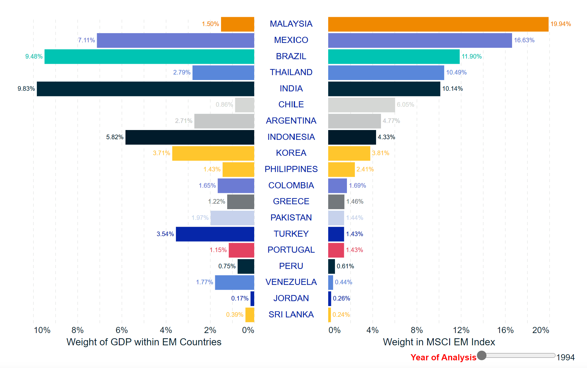
Fast forwarding to 2007, I see the following changes:
- Korea has risen to the top of MSCI EM, and in 2007 it looked like Malaysia in 1994, with an index weight over 4x that of its percentage of EM economic output.
- Nearby fellow Tiger Taiwan has also risen to the top of the EM index (this time, a few years after Taipei 101 went up), also with its index weight over 5x that of its GDP weight.
- Mainland China, which joined the World Trade Organization in 2001, quickly rose to become 1/8 of the MSCI EM index by 2007, but even more impressive was that its GDP was already 1/4 of EM GDP. Together, these three markets in East Asia alone were already making up 40% of MSCI EM in 2007.
- The “BRIC” markets of Brazil, Russia, India and China were probably at their most balanced around this point, with Russia’s economy larger than Brazil’s and Russia’s index weight higher than India’s. Some add an “S” for South Africa to make that “BRICS.”
MSCI
Finally, paging ahead to 2020 I note the following:
- Mainland China’s economy and stock market hold a dominant percentage of EM’s GDP and index weight like no other market since 1994.
- The top four markets are now all in Asia, and together makeup over 70% of the index.
- India remains an outlier with an index weight relatively low relative to the size of its economy.
- Israel left the index when MSCI reclassified it as a developed market in 2010, though has continued to classify Israel as “Middle East.” Saudi Arabia, Qatar, and the UAE all entered when MSCI reclassified all three from frontier to emerging, and Kuwait would follow in 2021.
MSCI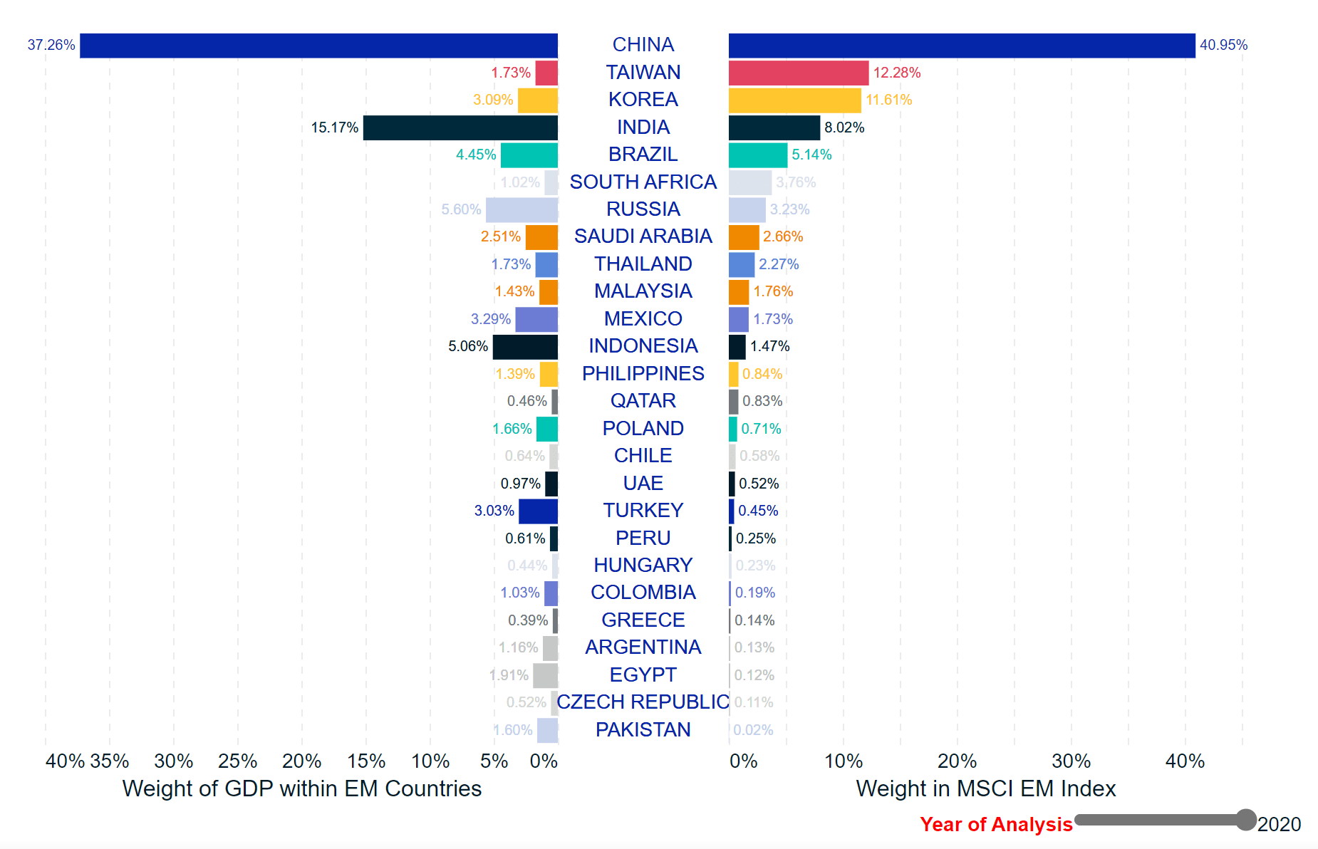
Current Valuation Levels of Different EMs
The following chart of historic CAPE ratios of individual emerging markets versus that of the U.S. going as far back as 1981, courtesy of Barclays. I include Hong Kong and Singapore in this chart because I see them as the best proxies for Greater China and ASEAN through the 1980s and 1990s. One pattern that has kept popping out at me since at least 2018 is:
- EM was expensive relative to the U.S. in 1981, and so the strong performance of U.S. stocks relative to EM stocks from the 1980s until 2000 seems largely due to the US becoming more expensive and EM becoming cheaper over that time.
- EM was relatively cheap and the US relatively expensive in 2000, and EM outperformed the U.S. from 2000-2010 as EM got more expensive and the U.S. got cheaper.
- EM was expensive relative to the U.S. in 2007-2010, and the U.S.’s strong outperformance over VWO and IEMG over the past decade seems largely due to the US getting more expensive and EM getting cheaper again.
Barclays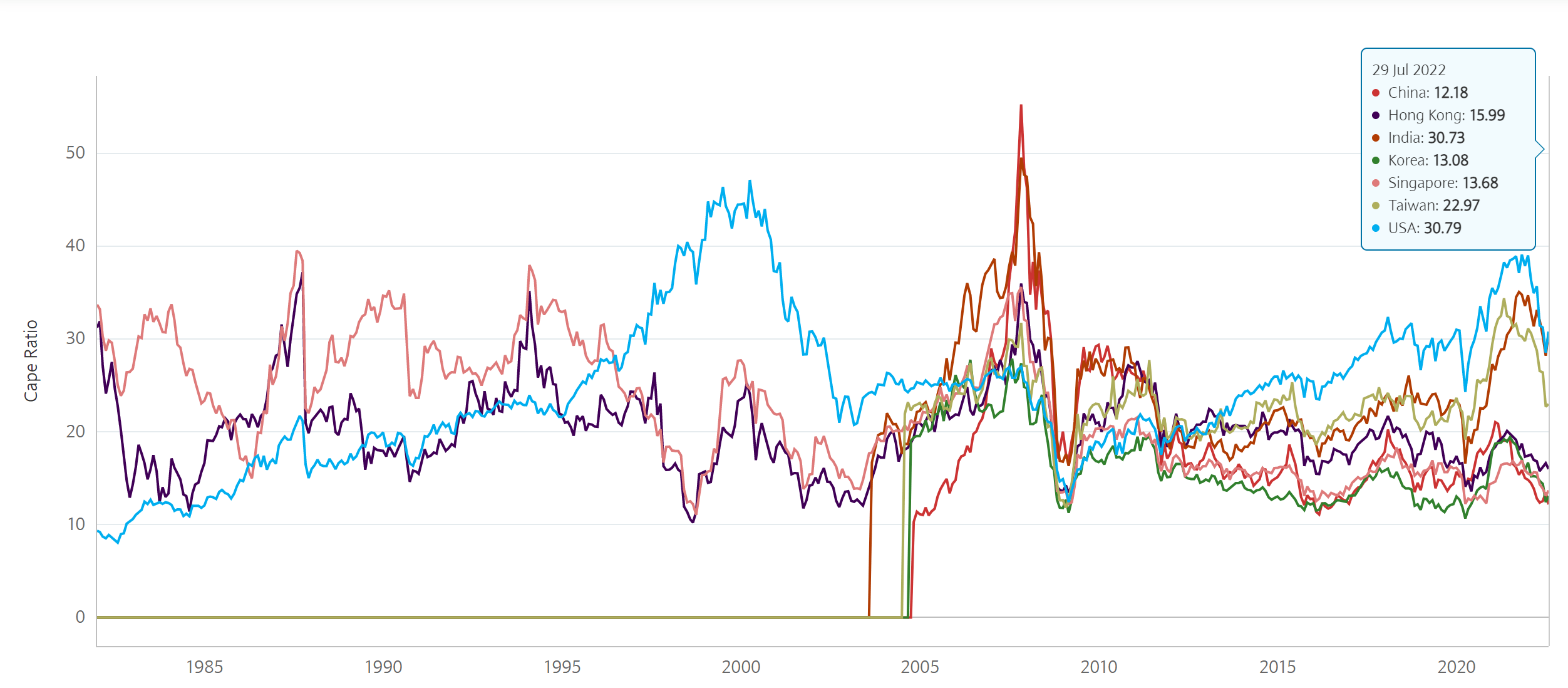
While it seems too simplistic to expect a plain repeat of EM’s 2000-2010 outperformance over U.S. stocks, I do clearly believe that EM’s cheaper valuations clearly put the odds in the EM investor’s favor, especially in the EMs with relatively strong fundamentals. By the above-charted CAPE metric, India looks almost as expensive as the U.S., while China and Korea are among the cheapest EMs on a CAPE basis.
AUM of EM ETFs vs Single Market ETFs
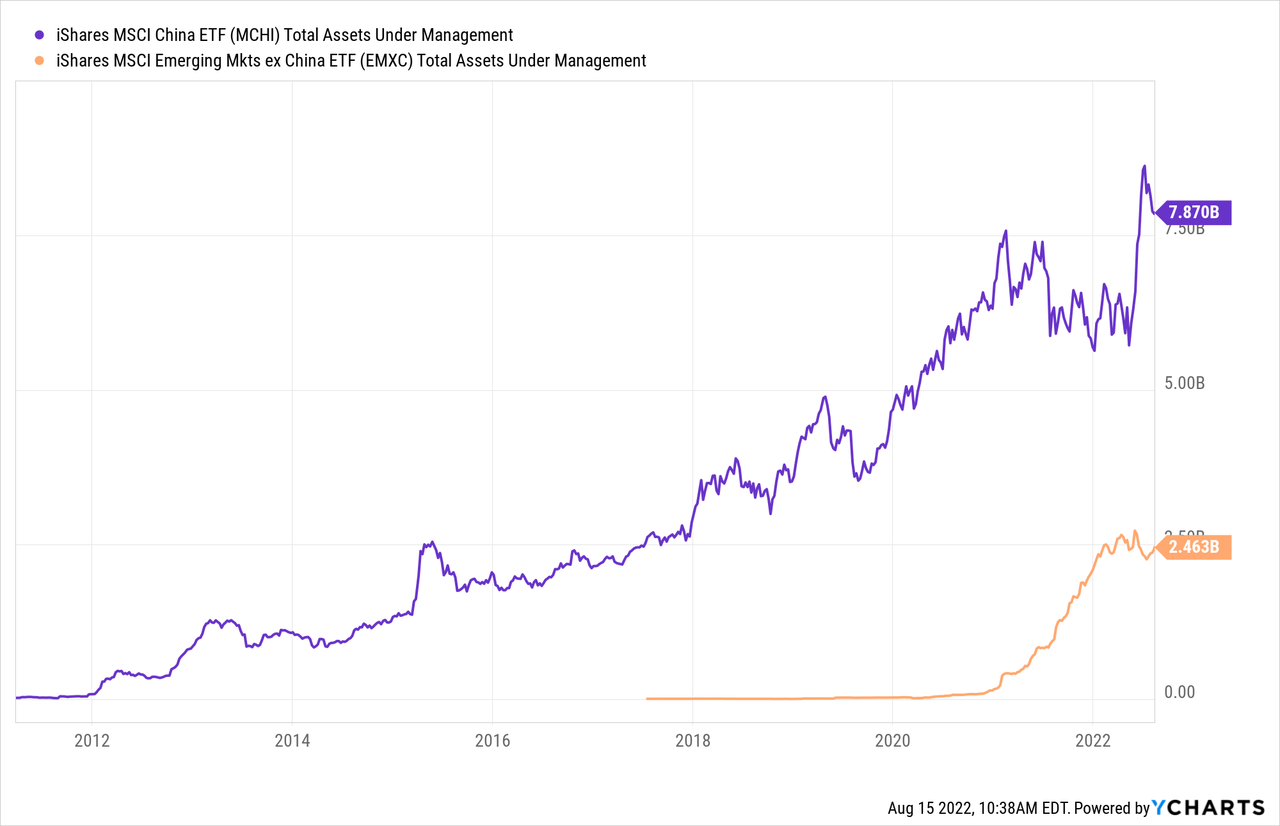
The following chart is one I periodically refresh to get an idea of how US-based investors are looking at EM. At the top right, we see how VWO and IEMG assets have grown, and have been almost neck and neck in recent years at around $70 billion each. BlackRock also continues to run the older and more expensive iShares MSCI Emerging Markets ETF (EEM) as a separate fund from IEMG, and while EEM has seen outflows relative to IEMG, EEM still holds over $25 billion. Combined, these top three broad EM index ETFs hold over $160 billion, and if we estimate around 40% of that is allocated to China, I estimate that over $60 billion of US passive index ETF assets are allocated to China. By contrast, we see less than $8 billion explicitly allocated to China via IEMG’s sub-index fund, the iShares MSCI China ETF (MCHI), and barely $100 million in VWO’s sub-index tracker, the Franklin FTSE China ETF (FLCH).
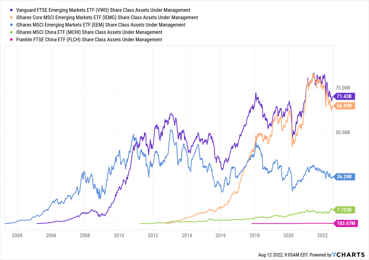
In general, iShares MSCI ETFs tend to be the oldest and largest single-market ETFs, while the Franklin FTSE ones tend to be newer and much cheaper. For example, MCHI launched in 2011 and has an expense ratio of 0.57%, while FLCH launched in 2017 and charges only 0.19%.
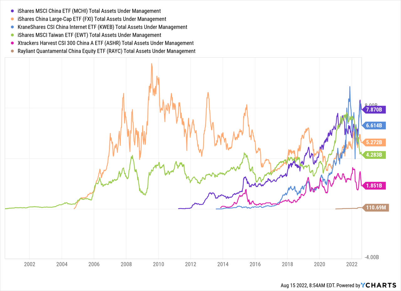
Although I often say that U.S. ETF investors have many times more assets allocated to China through broad index funds than through China focused funds, the above chart really does not tell the full picture. There are of course many other China focused funds with significant assets, as there are also many other broad emerging market funds (not all passive index funds) with significant allocations to China. Below I chart the evolution of MCHI’s AUM against that of five other China funds, the second and third of which I will reference again later in this article:
- The iShares China Large-Cap ETF (FXI), which is the oldest U.S.-listed Mainland China ETF, and biggest until 2020. FXI tracks the “FTSE China 50” index and is limited to Hong Kong listed shares,
- The KraneShares CSI China Internet ETF (KWEB), as the name implies, focuses on Chinese Internet companies, and like MCHI, has surpassed FXI in assets,
- The iShares MSCI Taiwan ETF (EWT),
- The X-trackers Harvest CSI 300 China A ETF (ASHR), which unlike MCHI, FXI, and KWEB, focuses on Chinese stocks listed on the Mainland Chinese exchanges in Shanghai and Shenzhen rather than in Hong Kong or New York. I first explained the difference between these China “A-shares” versus the Hong Kong listed “H-shares” in this 2015 article, and
- The Rayliant Quantamental China Equity ETF (RAYC), the newest China ETF, which not only focuses on the A-share market but aims to outperform ASHR through active management applying a number of China-specific factors.
EM ETF Investors’ $60 billion Question: China
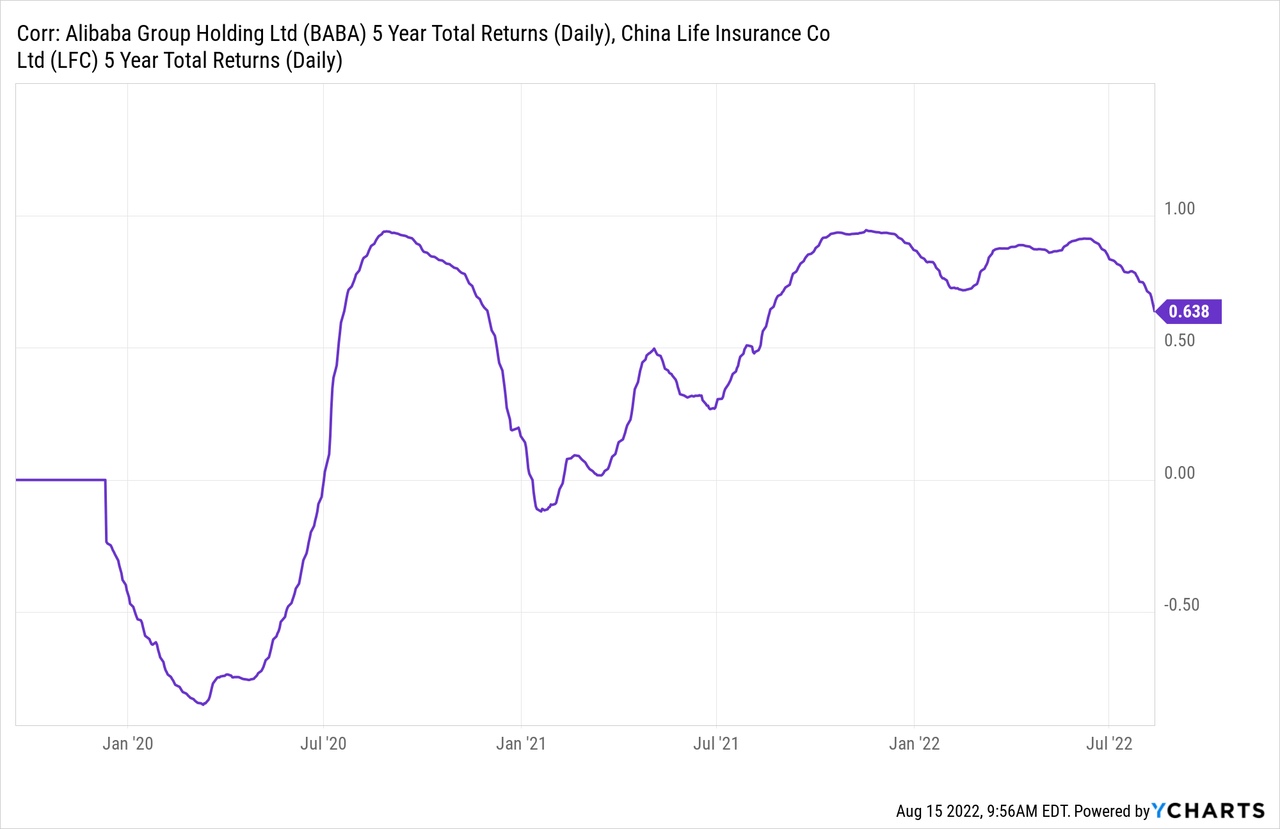
On one hand, I find Chinese stocks to be so varied that they hardly make sense to bundle together, but on the other hand, I have seen for years how many investors view and trade the whole Greater China region as a block. As little sense as it might make for shares of Internet giant Alibaba (BABA, OTCPK:BABAF) to be highly correlated with the financial firm China Life Insurance (LFC). As the chart below shows, the rolling correlation of the 5-year returns of BABA versus LFC has been above 0.8 more than it has been below 0.5 since these rolling 5-year periods started including the March 2020 COVID crash.
While many U.S. investors may think it makes sense that U.S.-listed companies based in Mainland China, even those from different industries, should go up and down together according to the overall “Beijing factor,” many are more surprised to see how highly correlated returns of MCHI are with those of EWT.
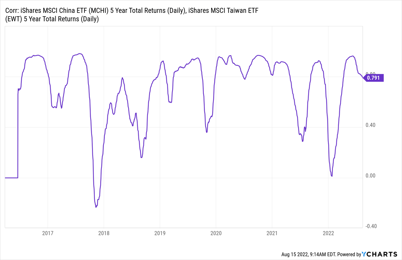
Even though there is zero overlap between the holdings of MCHI and those of EWT, and the markets trade on different exchanges in different currencies with no interconnectivity between them yet, I understand the two are highly correlated because of the very high overlap of investors trading these two markets. Longer-term, I expect most scenarios where Taipei-listed shares deliver good returns would also be scenarios where Shenzhen-listed shares also deliver good returns, which is why I group Greater China markets with its different currencies and risk factors the same way I group ASEAN’s markets. What I no longer believe makes sense though, is grouping Greater China with other emerging markets, including those of ASEAN or Korea.
Just as FLCH is the FTSE analogue to MCHI, the FTSE counterpart to EWT is the Franklin FTSE Taiwan ETF (FLTW).
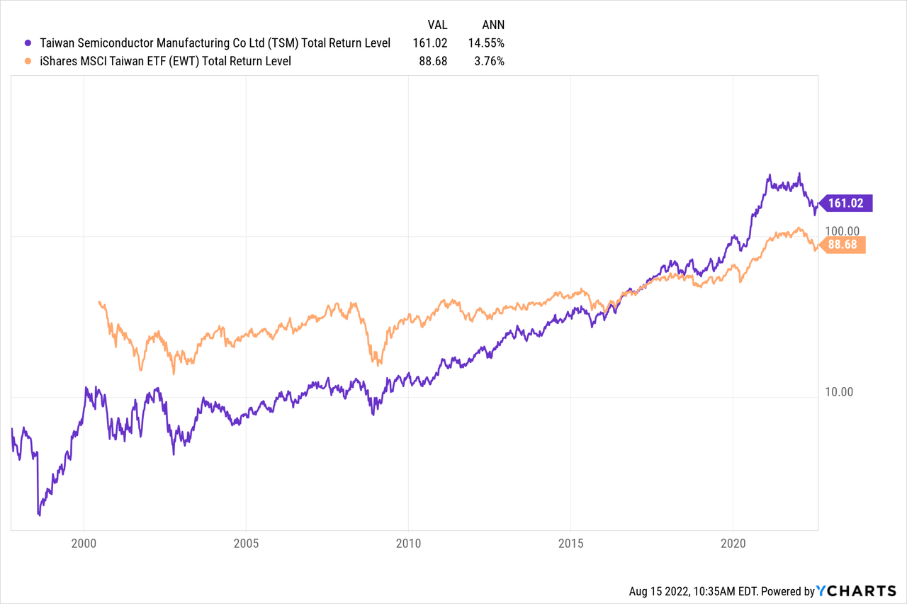
Since this Greater China block makes up 51.5% of VWO and 43.5% of IEMG, I believe it is important for serious investors in VWO to have an expected return model of FLCH and FLTW, and for IEMG investors to have an expected return model of MCHI and EWT. While I remain optimistic on Greater China, I do not believe broad market passive indexing works as well in these markets as it does in the US, so I would not only break my Greater China exposure away from the rest of EM, but I would prefer to further refine my Greater China exposure. Instead of FLCH or MCHI, I would prefer to own names in KWEB, RAYC, or in the WisdomTree China ex-State-Owned Enterprises ETF (CXSE), which I believe still have all the downside of FLCH or MCHI, but tend to focus on more profitable businesses with more upside. For Taiwan, I see Taiwan Semiconductor (TSM) as a high-quality leveraged play on the whole Taipei-listed market, undiluted by financials and other sectors, so I would either own TSM directly or aim to have no exposure directly.
That said, not everyone will agree with me about sub-dividing Greater China exposure, but I do believe allocating to VWO and/or IEMG are primarily based on your view on China: only buy them if you’re bullish. Otherwise, as the chart below shows, BlackRock offers the iShares MSCI EM ex-China ETF (EMXC), which has already raised almost 1/3 as much in assets under management as MCHI. Note that although EMXC excludes Mainland China, its single largest allocation is 21.3% in Taiwan, which as I argued earlier, is highly correlated to MCHI, so is not as clean a break from “China risk” as some EM investors might like.
VWO and IEMG’s Big Difference: Korea
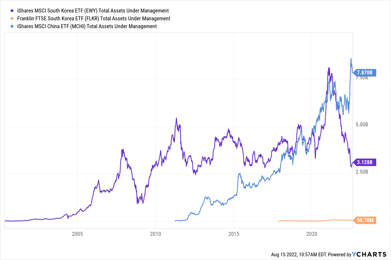
One major and long acknowledged difference between VWO and IEMG is that VWO has no allocation to Korea, while IEMG has over 12% allocated to Korean equities, and EMXC over 17% in Korea. VWO excludes Korea because FTSE reclassified Korea as a developed market in 2009, while MSCI continues to classify Korea as EM. While I earlier charted how cheap the Korean stock market looked on CAPE basis, the below chart is what really surprised me, showing that the assets under management of the iShares MSCI South Korea ETF (EWY) are at about the same level as in 2007, and EWY seems to have lost assets this year as MCHI has been taking in assets. Unlike the flows from EEM to IEMG, the outflows from EWY do not seem to have been going into the much cheaper Franklin FTSE South Korea ETF (FLKR), which still has only $54.7 million. Just as Americans sometimes refer to the Korean War as “The Forgotten War,” this chart seems to indicate that Korea may have become “The Forgotten Emerging Market.”
My big problem with Korea is that it is likely the most developed market which is “extremely difficult” for foreign retail investors to access directly. EWY’s biggest holding, Samsung Electronics (OTCPK:SSNLF, OTCPK:SSNNF), which makes up over 20% of EWY does not even have an over-the-counter ADR in the US market, let alone a listed one, so I need to trade its GDR on the London Stock Exchange. Only four US-listed tickers appear on the Seeking Alpha stock screener when I filter for “South Korea”: Coupang (CPNG), SK Telecom (SKM), KT Corporation (KT), and LG Display (LPL). I know off the top of my head this stock screener is missing at least three other names: Woori Financial (WF), Korea Electric Power (KEP) and POSCO (PKX), but that still doesn’t give US-based investors a lot of Korean names to choose from. There is no “stock connect” program like that opening up Shanghai and Shenzhen exchanges to foreign investors, and every other avenue of market access I’ve looked into so far seems relatively difficult. That might explain why MSCI Korea, despite having a 32.6% weight in information technology, 12.2% in consumer discretionary, and only 10.4% in financials still trades at such a cheap CAPE ratio, and why future expected returns may be high for those with a good way of accessing it.
I covered the idea of “forgotten emerging markets” in a 2017 article, where I considered closed-end fund discounts as a measure of U.S. investor sentiment towards a given emerging market. This observation on Korea makes me think it’s time to review those discounts on those other emerging markets that only make up a few percent or less of VWO and IEMG.
Conclusion
Even by looking at just the top three markets in VWO and IEMG, the lopsided weighting of these three markets means that it is more important for investors in these funds to have a view on these three markets than on the other dozen or so emerging markets combined. While I remain optimistic on all three of these emerging markets, especially Korea and certain sectors within greater China, that also leaves me for an emerging market portfolio with a meaningful allocation to some of those smaller emerging markets that may be as attractive as Korea but with different drivers. In many ways, I see allocations to many of those smaller emerging markets similar to how I see small cap value: that’s where the higher returns are, but the big funds will only give you the most watered-down exposure to them.
Be the first to comment