

LorenEvans/E+ via Getty Images
VLUE strategy and portfolio
The iShares Edge MSCI USA Value Factor ETF (BATS:VLUE) has been tracking the MSCI USA Enhanced Value Index since 4/16/2013. It has 150 holdings, an expense ratio of 0.15%, and a distribution yield of 3.02%.
As described in the prospectus by iShares, a value score is calculated in a universe of U.S. large and mid-capitalization stocks. It is based on three metrics: price-to-book value, price-to-forward earnings, and enterprise value-to-cash flow from operations. The number of constituents in the underlying index is calculated with a proprietary algorithm and updated twice a year. Their weights are calculated as the product of market capitalization and value score, then normalized so that sector weights are the same in the underlying index and in the stock universe.
VLUE invests almost exclusively in U.S. companies (98.4% of asset value), 63.7% in the large-cap segment and 36.3% in mid-caps. As expected, the current aggregate valuation ratios of VLUE are much lower than for the SPDR S&P 500 ETF (SPY):
|
VLUE |
SPY |
|
|
Price/Earnings TTM |
8.79 |
18.61 |
|
Price/Book |
1.49 |
3.59 |
|
Price/Sales |
0.96 |
2.39 |
|
Price/Cash Flow |
6.69 |
14.64 |
Source: Fidelity
The top 10 holdings represent almost 32% of asset value. The next table lists their weights and valuation ratios.
|
Ticker |
Name |
Weight % |
P/E TTM |
P/E Fwd |
P/Sales TTM |
P/Book |
P/FCF |
Yield % |
|
AT&T Inc. |
4.96 |
6.76 |
7.21 |
0.94 |
1.18 |
98.74 |
6.04 |
|
|
Intel Corp. |
4.75 |
7.83 |
15.53 |
2.04 |
1.48 |
N/A |
4.00 |
|
|
Cisco Systems, Inc. |
3.19 |
16.04 |
13.64 |
3.70 |
4.72 |
25.99 |
3.33 |
|
|
Ford Motor Co. |
3.17 |
5.46 |
7.65 |
0.43 |
1.44 |
13.30 |
3.82 |
|
|
Pfizer Inc. |
3.17 |
11.44 |
7.68 |
3.10 |
3.48 |
12.49 |
3.21 |
|
|
Micron Technology, Inc. |
2.95 |
7.32 |
7.49 |
2.22 |
1.46 |
16.06 |
0.72 |
|
|
General Motors Co. |
2.87 |
7.09 |
5.48 |
0.41 |
0.85 |
N/A |
0 |
|
|
International Business Machines Corp. |
2.58 |
21.50 |
14.20 |
1.88 |
6.21 |
74.31 |
4.99 |
|
|
Citigroup Inc. |
2.12 |
6.60 |
7.24 |
1.21 |
0.56 |
7.01 |
3.95 |
|
|
AbbVie Inc. |
2.02 |
19.96 |
10.20 |
4.37 |
15.40 |
19.93 |
3.99 |
Ratios: Portfolio123
The underlying index intends to keep the sector weights of a large and mid-cap universe at each rebalancing, so it is logical to find them very close to the S&P 500 sector structure. However, minor drifts can be expected between rebalancing dates due to constituent weights taking into account a value score.
VLUE sectors (chart: author; data: Fidelity)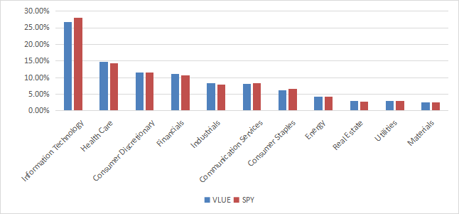
Since inception (4/16/2013), VLUE has lagged SPY by about 3 percentage points in annualized return, which does a material difference in total return: 142% vs 214%. Moreover, it has a higher risk measured in maximum drawdown and volatility (standard deviation of monthly returns).
|
Since Inception |
Total Return |
Annual.Return |
Drawdown |
Sharpe Ratio |
Volatility |
|
VLUE |
142.26% |
10.00% |
-37.68% |
0.61 |
16.52% |
|
SPY |
213.80% |
13.11% |
-32.05% |
0.86 |
14.35% |
Data calculated with Portfolio123
The next chart shows VLUE was almost on par with SPY until 2018, then it started underperforming.
VLUE vs. SPY since inception (Portfolio123)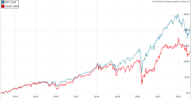
However, it has outperformed in the last 2 years:
VLUE vs. SPY, trailing 2 years (Portfolio123)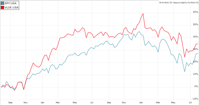
Comparing VLUE with my Dashboard List model
The Dashboard List is a list of 80 stocks in the S&P 1500 index, updated every month based on a simple quantitative methodology. All stocks in the Dashboard List are cheaper than their respective industry median in Price/Earnings, Price/Sales and Price/Free Cash Flow. After this filter, the 10 companies with the highest Return on Equity in every sector are kept in the list. Some sectors are grouped together: energy with materials, communication with technology. Real estate is excluded because these valuation metrics don’t work well in this sector. I have been updating the Dashboard List every month on Seeking Alpha since December 2015, first in free-access articles, then in Quantitative Risk & Value.
The next table compares VLUE performance since inception with the Dashboard List model, with a tweak: here the Dashboard List is reconstituted annually to make it comparable to a passive index.
|
Since Inception |
Total Return |
Annual.Return |
Drawdown |
Sharpe Ratio |
Volatility |
|
VLUE |
142.26% |
10.00% |
-37.68% |
0.61 |
16.52% |
|
Dashboard List (annual) |
198.82% |
12.52% |
-41.12% |
0.71 |
17.73% |
Past performance is not a guarantee of future returns. Data Source: Portfolio123
The Dashboard List outperforms VLUE by 2.5 percentage points in annualized return. However, the exchange-traded fund (“ETF”) performance is real, whereas the model performance is hypothetical.
Price to Book: A risky concept of value
The underlying index has two shortcomings in my opinion. The first and largest one is to classify all stocks on the same criteria. It means the valuation ratios are considered comparable across sectors. Obviously, they are not: you can read my monthly dashboard here for more details about this topic.
The second shortcoming comes from the price/book ratio (P/B), which adds some risk in the strategy. Speaking probabilities, a large group of companies with low P/B contains a higher percentage of value traps than a same-size group with low price/earnings, price/sales or price/free cash flow. Statistically, such a group will also have a higher volatility and deeper drawdowns in price. The next table shows the return and risk metrics of the cheapest quarter of the S&P 500 (i.e., 125 stocks) measured in price/book, price/earnings, price/sales and price/free cash flow. The sets are reconstituted annually between 1/1/1999 and 1/1/2022 with elements in equal weight.
|
Annual.Return |
Drawdown |
Sharpe Ratio |
Volatility |
|
|
Cheapest quarter in P/B |
9.95% |
-72.36% |
0.48 |
21.05% |
|
Cheapest quarter in P/E |
11.25% |
-65.09% |
0.57 |
18.91% |
|
Cheapest quarter in P/S |
12.62% |
-65.66% |
0.6 |
20.46% |
|
Cheapest quarter in P/FCF |
12.23% |
-63.55% |
0.61 |
19.05% |
Data calculated with Portfolio123
This explains my choice of using P/E, P/S and P/FCF, but not P/B in the Dashboard List model.
Takeaway
VLUE follows a systematic strategy based on a ranking system using three valuation metrics and keeps sector weights very close to the benchmark. It has lagged SPY by a wide margin between 2018 and 2020, but it has beaten it since then. The ranking system makes sense and the strategy avoids overweighting sectors and industries with naturally lower value ratios (especially financials): it makes it safer than value-oriented ETFs without sector weight constraints. However, it hasn’t brought excess return or risk reduction relative to the benchmark since inception nine years ago.
I think there are two shortcomings in its strategy: it ranks stocks regardless of their sectors, and the price/book ratio is a risky choice as one of the three valuation metrics. An efficient value model should compare stocks in comparable sets (sector, industry), like I do in the Dashboard List since 2015. My model prefers price/sales to price/book. Moreover, a simple profitability rule helps filter out some value traps and fix the number of holdings.
Be the first to comment