

Sezeryadigar/E+ via Getty Images
VOOV strategy and portfolio
The Vanguard S&P 500 Value ETF (NYSEARCA:VOOV) has been tracking the S&P 500 Value Index since 09/07/2010. The distribution yield of VOOV is currently 1.96% and the expense ratio is 0.1% (similar to SPY). Dividends are paid quarterly.
As described by S&P Global, the underlying index selects companies in the S&P 500 index exhibiting the strongest value score based on three ratios: book value to price, earnings to price, and sales to price. It is weighted by market capitalization and rebalanced annually.
VOOV invests almost exclusively in U.S. companies (98.6% of asset value), mostly in the large cap segment (80%). As expected, VOOV is cheaper than its parent index S&P 500 (SPY) regarding the usual valuation ratios reported in the next table.
|
VOOV |
SPY |
|
|
Price / Earnings TTM |
17.65 |
20.05 |
|
Price / Book |
2.74 |
3.85 |
|
Price / Sales |
1.86 |
2.58 |
|
Price / Cash Flow |
12.75 |
15.55 |
Source: Fidelity
The top 10 holdings represent 26.4% of the portfolio value. The next table lists their weights and valuation ratios. The heaviest position weights 3.17%, so the risk related to any individual stock is quite low.
|
Ticker |
Name |
Weight (%) |
P/E TTM |
P/E fwd |
P/Sales TTM |
P/Book |
P/Net Free Cash Flow |
Yield% |
|
Berkshire Hathaway Inc |
3.17% |
7.20 |
20.45 |
2.10 |
1.16 |
25.62 |
0 |
|
|
Johnson & Johnson |
2.59% |
24.20 |
17.50 |
5.05 |
6.41 |
55.88 |
2.52 |
|
|
Exxon Mobil Corp |
2.23% |
14.12 |
8.26 |
1.16 |
2.15 |
14.48 |
4.13 |
|
|
Procter & Gamble Co |
1.94% |
24.87 |
24.37 |
4.52 |
8.07 |
68.61 |
2.57 |
|
|
Chevron Corp |
1.85% |
13.39 |
8.35 |
1.55 |
1.89 |
18.68 |
3.99 |
|
|
UnitedHealth Group Inc |
1.49% |
27.35 |
23.04 |
1.60 |
6.55 |
34.67 |
1.32 |
|
|
Coca-Cola Co |
1.35% |
26.10 |
25.06 |
6.71 |
10.85 |
93.10 |
2.84 |
|
|
Merck & Co Inc |
1.27% |
16.46 |
12.45 |
4.29 |
5.71 |
38.45 |
3.00 |
|
|
Verizon Communications Inc |
1.18% |
10.13 |
9.63 |
1.63 |
2.61 |
N/A |
4.91 |
|
|
JPMorgan Chase & Co |
1.16% |
8.45 |
9.96 |
2.71 |
1.34 |
4.46 |
3.51 |
Ratios: Portfolio123
The top two sectors are healthcare (16.6%) and financials (15.1%). Compared to the S&P 500, the fund underweights technology, communication, consumer discretionary and over-weights all other sectors. It results in a better balanced sector composition.
VOOV sectors (chart: author; data: Fidelity)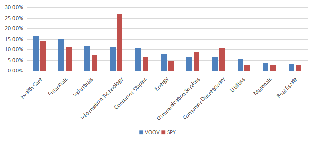
Since inception in September 2010, VOOV has underperformed SPY by 2.2 percentage points in annualized return and shows a slightly higher risk measured in drawdown and standard deviation of monthly returns (volatility).
|
Total Return |
Annual Return |
Drawdown |
Volatility |
|
|
VOOV |
235.91% |
10.84% |
-34.74% |
14.21% |
|
SPY |
323.75% |
13.05% |
-32.05% |
13.68% |
Data calculated with Portfolio123
The next chart plots the equity values of $100 invested in VOOV and SPY since VOOV inception. The two funds have been almost on par from 2010 to 2016, then VOOV started underperforming.
VOOV vs. SPY since Sept. 2010 (chart: author; data: Portfolio123)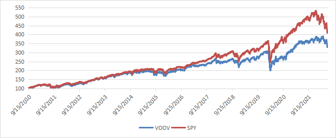
However, VOOV has outperformed SPY by 8 percentage points in 2022 (-12.2% vs. -20% year-to-date as of writing).
VOOV vs. SPY in 2022 (Portfolio123)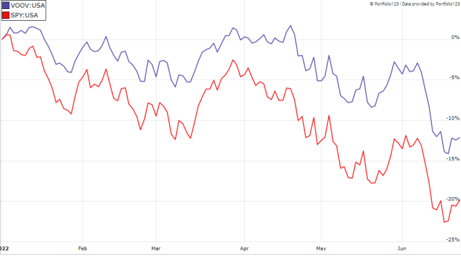
Comparing VOOV with my Dashboard List model
The Dashboard List is a list of 80 stocks in the S&P 1500 index, updated every month based on a simple quantitative methodology. All stocks in the Dashboard List are cheaper than their respective industry median in Price/Earnings, Price/Sales and Price/Free Cash Flow. After this filter, the 10 companies with the highest Return on Equity in every sector are kept in the list. Some sectors are grouped together: energy with materials, communication with technology. Real estate is excluded because these valuation metrics don’t work well in this sector. I have been updating the Dashboard List every month on Seeking Alpha since December 2015, first in free-access articles, then in Quantitative Risk & Value.
The next table compares VOOV performance since inception with the Dashboard List model, with a tweak: the list is reconstituted annually instead of once a month to make it comparable to a passive index.
|
Total Return |
Annual Return |
Drawdown |
Volatility |
|
|
VOOV |
235.91% |
10.84% |
-34.74% |
14.21% |
|
Dashboard List (annual) |
287.22% |
12.19% |
-43.70% |
16.08% |
Past performance is not a guarantee of future returns. Data Source: Portfolio123
The Dashboard List outperforms VOOV by 1.35 percentage points in annualized return. However, the ETF price history is real and the model performance is hypothetical.
Price to Book: a risky concept of value
The underlying index has two shortcomings in my opinion. The first and largest one is to classify all stocks on the same criteria. It means the valuation ratios are considered comparable across sectors. Obviously they are not: you can read my monthly dashboard here for more details about this topic. A consequence is to privilege sectors where valuation ratios are naturally cheaper, especially financials. Some other sectors are disadvantaged: those with large intangible assets like technology. To make things simple, companies with large intangible assets are those with a business model based on massive R&D, or a strong branding, or large user databases, or operating in a field where competition is limited by an expensive entry ticket. All these elements are not correctly reflected by valuation ratios.
The second shortcoming comes from the price/book ratio (P/B), which adds some risk in the strategy. Speaking probabilities, a large group of companies with low P/B contains a higher percentage of value traps than a same-size group with low price/earnings, price/sales or price/free cash flow. Statistically, such a group will also have a higher volatility and deeper drawdowns in price. The next table shows the return and risk metrics of the cheapest quarter of the S&P 500 (i.e.125 stocks) measured in price/book, price/earnings, price/sales and price/free cash flow. The sets are reconstituted annually between 1/1/1999 and 1/1/2022 with elements in equal weight.
|
Annual Return |
Drawdown |
Sharpe ratio |
Volatility |
|
|
Cheapest quarter in P/B |
9.95% |
-72.36% |
0.48 |
21.05% |
|
Cheapest quarter in P/E |
11.25% |
-65.09% |
0.57 |
18.91% |
|
Cheapest quarter in P/S |
12.62% |
-65.66% |
0.6 |
20.46% |
|
Cheapest quarter in P/FCF |
12.23% |
-63.55% |
0.61 |
19.05% |
Data calculated with Portfolio123
This explains my choice of using P/FCF and not P/B in the Dashboard List model.
Takeaway
VOOV follows a systematic strategy based on a ranking system using three valuation metrics. It has lagged SPY since 2010, but this period was mostly a huge bull market. VOOV might outperform in a bear market, like it did in the first half of 2022. However, I see two shortcomings in the underlying index: it ranks stocks regardless of their sectors, and one of the three metrics brings additional risk. An efficient value model should compare stocks in comparable sets (sector, industry), like I do in the Dashboard List since 2015. I also prefer price/free cash flow to price/book as valuation metric. Moreover, a basic profitability rule helps filter out some value traps and normalize the number of components.
Be the first to comment