

John M Lund Photography Inc/DigitalVision via Getty Images
What is the message of the market?
Primary Downtrend: Death Cross
The stock market is in a primary downtrend with all three major US averages experiencing a death cross (when the 50-day moving average crosses beneath the 200-day moving average) in recent months. While this does not guarantee that the powerful rally over the past week will fail, the bearish signal must be respected. In light of the well-established downtrend in the bond market and rapidly tightening liquidity conditions, the death crosses in the stock market take on added importance.
Technical Backdrop
Admittedly, there is nothing magical about using the 50-day and 200-day moving averages to determine the primary trend. The key concept at play is that we use a meaningfully long short-term average price and a sufficiently time-spaced, longer-term average price in order to identify trend changes while minimizing short-term noise.
In essence, the goal is to minimize random or frequent trend-change signals from moving average crossings that are too short in duration to be meaningful; while at the same time, producing trend-change signals that are not overly lagged. In other words, the signals need to be timely enough to be actionable but lagged enough to avoid false signals.
The 50- and 200-day moving averages can be thought of as roughly the last quarter’s average price and the last year’s average price, respectively. These periods are reasonably well linked to the nearer-term business cycle and reporting cadences of corporations as well as to human behavioral patterns. As a result, the 50- and 200-day moving averages offer an excellent choice for determining the primary nearer-term (annual) price trend.
S&P 500 Index
The primary gauge of the US equity markets is the S&P 500 Index. If one asked 100 investment professionals how the market is doing, 90% would answer by quoting the performance of the S&P 500. It is the single best representation of the value of US-based global corporations. To review the technical backdrop of the S&P 500 Index, I have chosen to use the SPDR S&P 500 ETF Trust (NYSE: NYSEARCA:SPY) as it is one of the most widely-quoted and traded Exchange Traded Funds that track the S&P 500.
As mentioned, there is a death cross in place on the S&P 500 index. This points toward a primary near-term downtrend being the most likely base case over the coming months to year. That said, when reviewing the technical setup, I find it is helpful to zoom out to place things into a long-term perspective.
The following monthly chart captures three full bull-market cycles and two bear-market cycles. I have highlighted key weekly resistance levels with the two orange lines. One is shorter and upward sloping, which represents a potential head and shoulders neckline drawn from weekly closing prices. The two primary weekly support zones are highlighted by the green and blue lines. Please note that the chart is of monthly closing prices, while the resistance and support zones have been carried over from weekly closing prices.
SPY max monthly chart (Created by Brian Kapp using a chart from Barchart.com)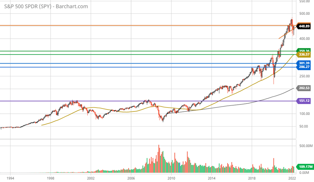
The purple line represents the resistance level that served as the bull-market top in both 2000 and 2007. I bring attention to this because the level was not breached until 2013, or a full 13 years following the 2000 market peak. I highlight this because it is important to remain grounded in the possibilities, good and bad.
From the perspective of the monthly chart, the market has not noticeably corrected the bull-market rally off the COVID bottom in March of 2020, let alone the bull market advance that remains in place since 2009. For a sense of how little price correction has occurred at the stock market index level, notice the gold line progressively growing steeper in relation to the grey line. These are the 50-month and 200-month moving averages. The following 10-year monthly chart provides a closer look.
SPY 10-year monthly chart. (Created by Brian Kapp using a chart from Barchart.com)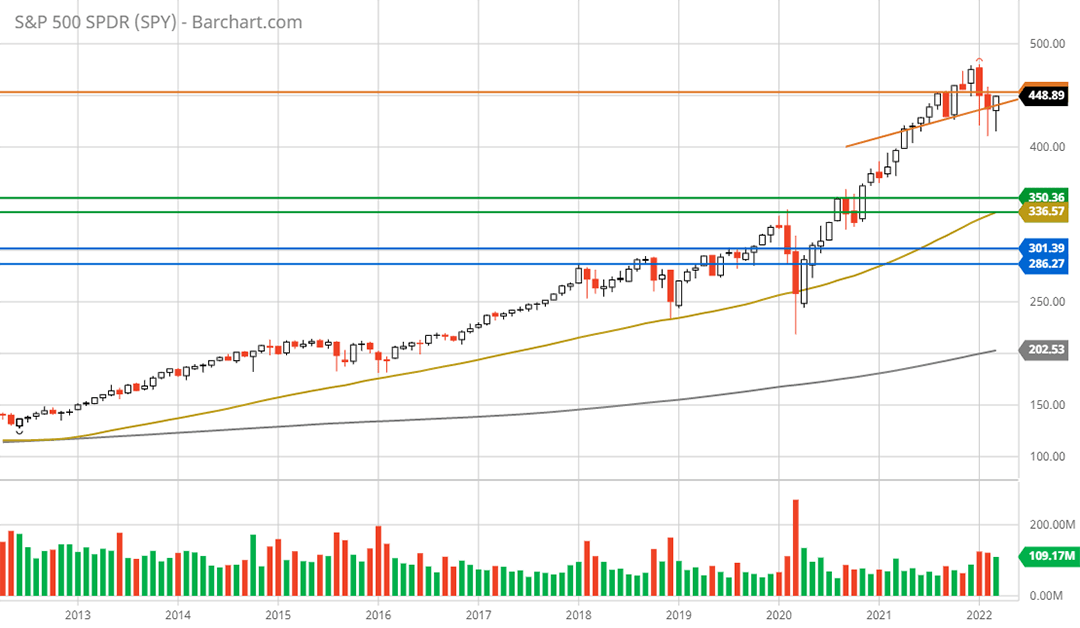
Notice that the short, upward-sloping orange line, which represents the neckline of a potential weekly head and shoulders top, is more easily visible and aligns quite well with the monthly closing prices. This level is currently being tested from underneath as can be seen on the following 5-year weekly chart.
SPY 5-year weekly chart. (Created by Brian Kapp using a chart from Barchart.com)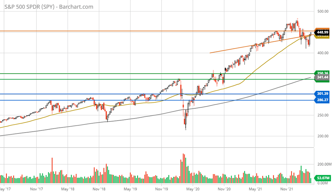
The orange horizontal line represents weekly support throughout the topping process between November of 2021 and January of 2022. As a result, the S&P 500 is now testing resistance at both of its primary resistance levels, the upward-sloping orange line and the horizontal orange line.
Importantly, beginning in January of 2021, the 50-week moving average began moving vertically compared to the 200-week moving average. This is coincident with the most speculative phase of the current bull market which peaked between February and March of 2021. The weekly price moving averages, like the monthly, attest to the fact that the S&P 500 Index has corrected extraordinarily little to date.
The following 2-year daily chart includes an additional upper orange line which represents a daily resistance level in addition to the weekly resistance levels being carried over from the prior charts. Please note the death cross is visible as the gold line (the 50-day moving average) crossing beneath the grey line (the 200-day moving average) on March 14, 2022.
SPY 2-year daily chart. (Created by Brian Kapp using a chart from Barchart.com)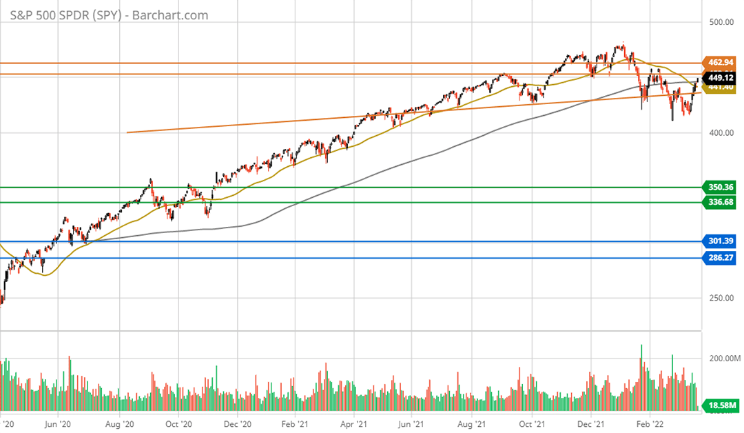
From the perspective of a head and shoulders topping pattern, the weekly head and shoulders neckline (represented by the upward sloping orange line) aligns very well with daily closing prices as was the case with monthly closing prices. This level represents an important area as it could become strong resistance if the price breaks back beneath the zone, confirming the primary downtrend signaled by the death cross.
On the support front, there is little in the way of longer-term (weekly) technical support until the S&P 500 reaches the area outlined by the green lines. This zone represents key resistance prior to the COVID pandemic and following the initial rally off the COVID bottom in 2020. This area should represent a considerably strong support base.
The price area outlined by the blue lines represents major resistance between 2017 and 2019. This zone looks likely to be a worst-case scenario as it proved to be early support during the recovery from the COVID market crash.
Technical Return Spectrum: S&P 500 Index
Translating the key technical levels above into a potential technical return spectrum quantifies the situation. In the following table, I calculate the price return to the green support levels (the upper and lower green lines), to the blue support levels, and to the orange resistance levels. I have highlighted in yellow what I view as the most likely downside scenario and in blue the likely upside return scenario.
Created by Brian Kapp, stoxdox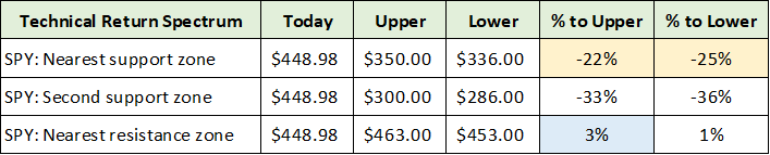
Please keep in mind that these returns are to key technical levels and are not my price targets. The 3% upside potential is clearly surmountable on any given day at this stage. The critical point is that, technically speaking, the risk/reward asymmetry is materially skewed to the downside. That said, there remain strong fundamental forces which could reinforce this technical downside potential as we will see in the overview of the bond market.
Nasdaq Composite and Russell 2000 Indices
The technical backdrop of the Nasdaq Composite and Russell 2000 indices is quite similar to that of the S&P 500 Index, with the exception of a potential head and shoulders topping pattern. Given the similarities, I will briefly cover the Nasdaq and Russell 2000 indices.
I have chosen to use the Invesco QQQ Trust (NASDAQ: QQQ) for the Nasdaq and the iShares Russell 2000 ETF (NYSE: IWM) for the Russell 2000. Please keep in mind that the QQQs track the Nasdaq 100 rather than the full Nasdaq Composite Index. The technical setup of each is identical for primary trend determination purposes. Of note, the death cross occurred on February 17, 2022 for the Nasdaq Composite Index and on March 1, 2022 for the Nasdaq 100 index.
The following 5-year weekly charts provide the key long-term support zones (the green and blue lines) and resistance levels (the orange lines) for the Invesco QQQ Trust and the iShares Russell 2000 ETF, respectively.
QQQ 5-year weekly chart. (Created by Brian Kapp using a chart from Barchart.com) IWM 5-year weekly chart. (Created by Brian Kapp using a chart from Barchart.com)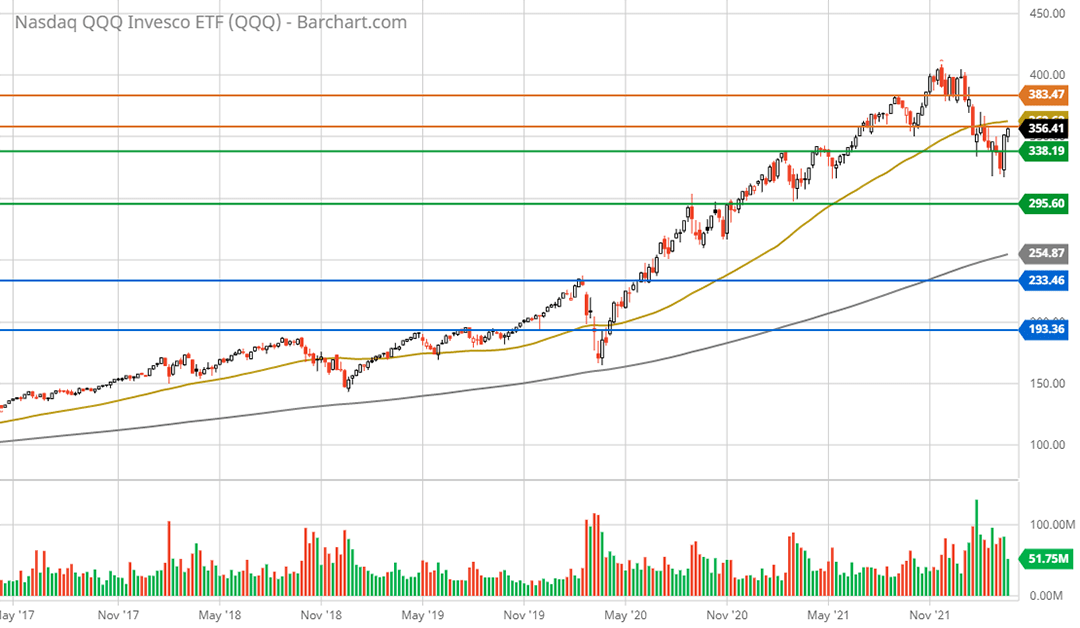
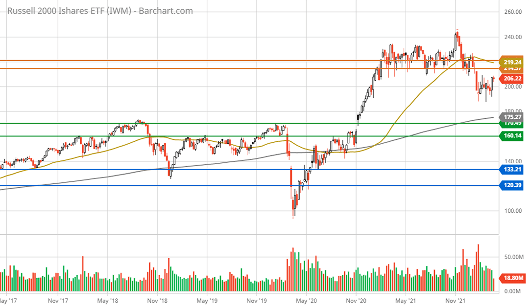
A key feature of each index, as was the case with the S&P 500, is that the 50-week moving average (the gold line) is abnormally extended above the 200-week moving average (the grey line). In contrast to the S&P 500, each index is in a well-defined weekly downtrend.
More specifically, each index has taken out and remains below its prior weekly lows. Whereas the S&P 500 has regained prior lows being above the head and shoulders neckline. The Nasdaq 100 and the Russell 2000 suggest the most likely resolution of the S&P 500 head and shoulders neckline is to the downside, thus consummating the pattern.
The following 1-year daily charts zoom in on the more pronounced downtrends in the Nasdaq 100 and the Russell 2000 indices, respectively. Note that key resistance levels are visible (the orange lines) and that many lower support levels (the green and blue lines) are not visible due to scale. Both indices remain beneath but are rapidly approaching key resistance levels (the orange lines).
QQQ 1-year daily chart (Created by Brian Kapp using a chart from Barchart.com) IWM 1-year daily chart. (Created by Brian Kapp using a chart from Barchart.com)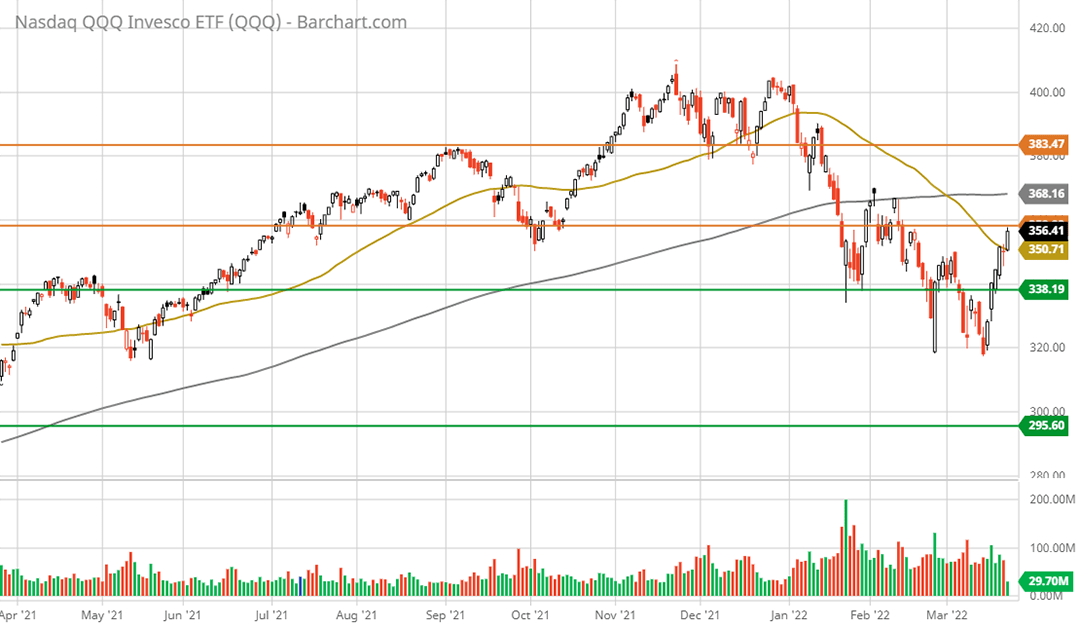
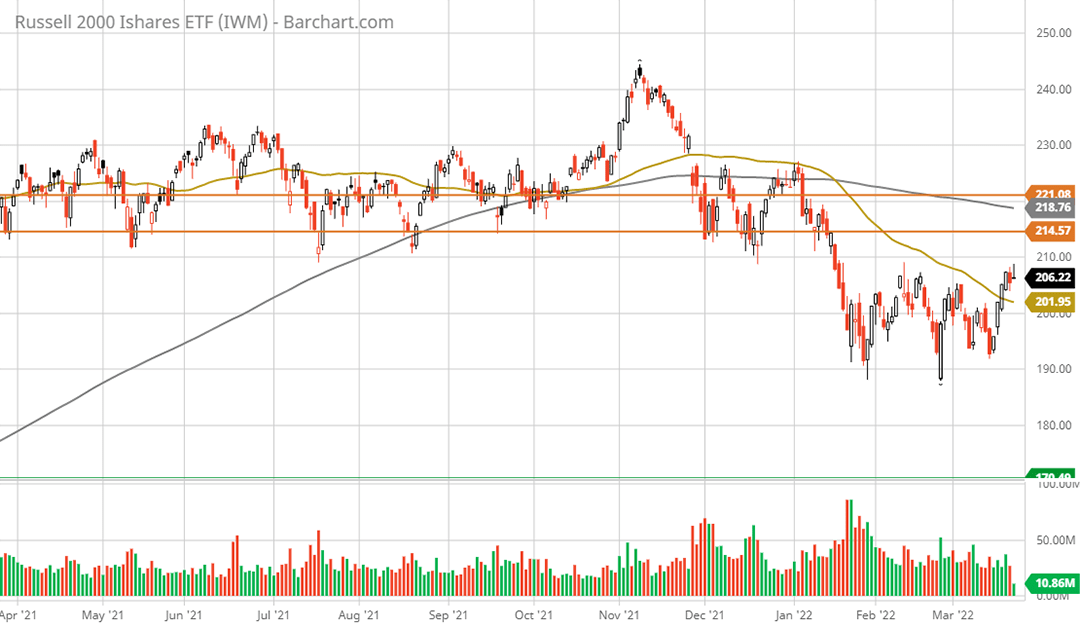
Recall that the gold line on each chart represents the 50-day moving average and the grey line is the 200-day moving average. The death cross is clearly visible on the 1-year daily charts.
Technical Return Spectrum: Nasdaq 100 and Russell 2000
Translating the key technical levels above into a potential return spectrum once again quantifies the situation. In the following table, I calculate the price return to the key weekly support and resistance levels outlined on the 5-year weekly charts. I have highlighted in yellow what I view as the most likely downside scenarios and in blue the likely upside-return scenarios. These are purely technical return targets.
Created by Brian Kapp, stoxdox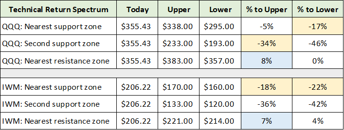
Like the S&P 500, technically speaking, the critical point of the above is not the exact potential return spectrum, but that the risk/reward asymmetry is heavily skewed to the downside. Strong fundamental forces emanating from the credit markets could reinforce this technical downside asymmetry as evidenced by trends in the bond market.
The Bond Market
While the downward blip in the equity markets is barely noticeable on a long-term chart, the bond market is an entirely different story. For a sense of conditions in the bond market, I will begin with a performance comparison to that of the stock market from each markets’ respective peak.
The upper portion of the table below displays performance details for the three stock indices covered thus far. The lower section displays the performance details for three primary US investment-grade bond indices: iShares 20+ Year Treasury Bond ETF (NASDAQ:TLT), iShares Core U.S. Aggregate Bond ETF (NYSEARCA:AGG), and iShares iBoxx $ Investment Grade Corporate Bond ETF (NYSEARCA:LQD). I have color-coded the comparable cells for ease of use.
Created by Brian Kapp, stoxdox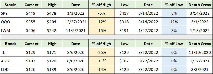
I have highlighted in yellow the price drawdowns from the peak for each index fund. The worst performer by far is the long-term US Treasury bond market (represented by iShares 20+ Year Treasury Bond ETF) at -25% from its peak in August of 2020. Given that US Treasury bonds are risk-free, the -25% drawdown is a pure indication that duration risk is leading the declines across broad financial markets. Said differently, the long-term cost of capital and thus discount rates used for valuation are increasing, which is putting broad downward pressure on most asset prices.
The iShares Core U.S. Aggregate Bond ETF and the iShares iBoxx $ Investment Grade Corporate Bond ETF are more broad-based investment-grade bond indices. They exhibit more moderate duration risk than the long-term US Treasury bond market (shorter bond maturities) and include credit risks that are not a feature of the US Treasury bond market.
The drawdown in these medium- to longer-term duration investment-grade bonds is nearly identical to that of the Nasdaq 100 and Russell 2000 stock indices. This suggests that the level of risk within the financial system is material and broad-based through the lens of general asset price levels.
In essence, stocks and bonds are now positively correlated leading to synchronized gains and losses. This is problematic from a systemic risk perspective as there is less ability to diversify portfolios using stocks and bonds.
I have highlighted in blue the percentage return since the most recent low. Notice that bonds are hitting fresh daily lows, while the stock market has staged an 8% to 12% rally over the past week or so. If the old saying remains true, “credit markets lead equity markets,” the bond market is confirming the bearish death cross signal in effect for the major stock market indices.
Interestingly, the bond market confirmed the recent stock market rally from a quality perspective. Looking across the major sectors of the global bond market, all yields are at, or mere basis points off of 52-week highs (prices at 52-week lows) except for the high-yield or junk bond market. Please note that 1 basis point or bps represents 0.01% or 100th of a percentage point.
The following table was compiled from The Wall Street Journal and displays the performance of major global bond market sectors YTD (year-to-date) and over the past 52 weeks. I have highlighted in yellow the bond market sectors for which the yield is at or barely off of the 52-week highs (price at 52-week lows). I have highlighted in blue the current yield and 52-week low yield for those sectors that have rallied recently in absolute bps terms (yields falling and prices rising). Notice the massive increase in interest rates since the 52-week lows in the high-yield bond market (highlighted in blue).
Source: The Wall Street Journal. Created by Brian Kapp, stoxdox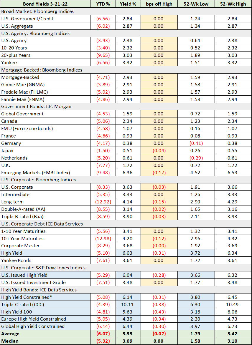
The massive increase in high-yield rates since the 52-week lows carries a negative signal for equities and especially for lower-quality stocks. Junk bonds rallying alongside the stock market is exactly what one would expect to see as junk bonds have equity-like features. With yields in the 4% to 6% range for the majority of the junk bond market, there remains ample room for the higher interest rate and thus lower valuation multiple trend to continue across the high-risk, equity-like portions of the bond market.
To place the junk bond yields in perspective, the 3% yield range at the 52-week lows translates into a stock market equivalent PE multiple of 33. The current 6% range equates to a stock PE multiple of 17. This dynamic sheds light on the valuation linkage between stocks and bonds. Higher bond yields drive lower stock market valuations. The carnage across the higher risk segments of the stock market over the past year attests to this fact.
Outside of junk bonds, the global bond markets are hitting fresh new lows (higher yields). The message remains the same, the cost of capital is increasing which translates into lower stock market valuations, all else being equal. This is because the interest rates used to discount future cash flows are increasing, which reduces the current valuation of future cash flows. A higher cost of capital and worsening liquidity conditions may put further upward pressure on the discount rate in addition to the general rising trend in interest rates.
Yield Curve Inversion
While there is much talk of yield curves inverting (when shorter-term rates are higher than longer-term rates), the primary slope remains solidly upward. While risk-free rates may become periodically kinked at points along the yield curve, global central banks appear to have the ability and resources to maintain upward sloping yields. This is especially the case given the extreme inflationary backdrop.
In fact, real yields remain deeply negative across the entire high-quality yield curve globally when adjusted for inflation. Consumer inflation is running at 8% and producer inflation is running at 10% in the US. In Europe, inflationary pressures are becoming extraordinary as evidenced by Germany’s recently reported producer inflation of 26%. It is important to keep in mind that producer inflation leads to consumer inflation as higher prices are passed through to consumers with a lag.
The following table was compiled from Bloomberg and provides a snapshot of the US Treasury bond yield curve. I have highlighted in yellow the current kink in the Treasury yield curve that is the source of today’s concerns regarding the yield curve inverting.
Source: Bloomberg. Created by Brian Kapp, stoxdox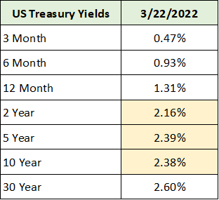
A yield curve inversion is a historically reliable recession indicator, hence the concern in the marketplace. While it is always wise to listen to the message of bond market yield curves, it is possible to overreact to the first signs of potential inversion along sections of the curve and lose sight of the larger forces at play.
As mentioned above, all primary sectors of the global bond market are hitting fresh new lows (fresh new highs in terms of yield) while inflation is raging at 40-year highs. Additionally, global supply chain constraints and war will likely continue to amplify the existing inflationary trends.
As a result, the bond market is currently sending the message that rates are rising across the yield curve, if in a volatile fashion. This suggests that interim kinks along the US Treasury bond curve are likely artifacts of rapidly shifting interest rate and inflationary expectations in the marketplace, rather than being attributed to a clear signal of an impending economic contraction.
The Message of the Markets
The stock and bond markets are currently delivering the same message: the primary trend is one of the generally lower asset prices. This primary trend signal is critical for the timing of investment decisions in order to minimize risks and maximize returns, especially under conditions of extreme volatility.
While the primary market trend is highly likely to be lower over the coming months to a year, this is precisely the type of environment in which incredible investment opportunities materialize for those that remain disciplined. This is why I quantify fundamental and technical return levels in my stock reports. They provide reference points to serve as an anchor for the selection and timing of investment decisions. Under extraordinarily volatile conditions, remaining disciplined while working from a blueprint becomes a competitive advantage.
How to Put the Primary Trend to Work
I will now provide an example of how to use the primary trend to one’s advantage in stock selection and timing while working from a blueprint. My recent PayPal (NASDAQ: PYPL) report is an excellent case in point of using the primary market downtrend, the associated higher volatility, and the market bottoming process to one’s advantage.
The PayPal report was published on March 4, 2022. I issued a positive risk/reward and strong buy rating with the price at $100.24. In just over two weeks, PayPal rallied 18% to near $118 per share compared to 3.5% for the S&P 500. The unusually rapid rally potential was highlighted in the report.
This was due to PayPal being severely overextended to the downside from a technical perspective, following a rapid, uninterrupted 67% price decline. When combined with the unusually low valuation near $100, the technical and fundamental backdrops were in alignment suggesting an asymmetric risk/reward opportunity.
With the initial price bounce in place and considering the primary market downtrend discussed here, this is not the type of environment to chase materially higher stock prices. This is true even though the risk/reward still remains quite favorable for PayPal over the coming 1-3 years. The following table from the PayPal report summarizes the potential return spectrum at the time of the report. Please note that the companies included below for relative valuation purposes are Visa (NYSE:V) and Mastercard (NYSE:MA).
Created by Brian Kapp, stoxdox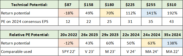
With a nearer-term potential return spectrum of -18% to +70% (the orange and yellow highlighted cells) the risk/reward asymmetry was highly skewed to the upside at the time of the report. The following table updates the potential return spectrum after the 18% rally over the past two weeks.
Created by Brian Kapp, stoxdox
Again, the orange and yellow highlighted cells represent my estimate of the most likely potential return spectrum over the nearer term. The downside potential has increased from -18% to -26% while the upside potential has decreased from +70% to +53%. While -26% to +53% remains positive from a risk/reward perspective, the risk of a short-term -26% drawdown is substantially higher than -18%.
Given the primary downtrend in the equity markets combined with the increased downside potential created by the rapid 18% rally, disciplined buying is highly likely to be rewarded. This is true whether one is long-term or short-term oriented. For example, those implementing very short-term trading strategies may find locking in the 18% gain over two weeks as an attractive option. For those making new, longer-term commitments, accumulating the shares on a material pullback is likely to offer meaningful upside return potential.
Summary
No matter if one is implementing a long-term oriented or a short-term oriented investment strategy, respecting the message of the markets is a prerequisite for long-term, sustainable success. The overriding message of the stock and bond markets today is that a primary downtrend is in place over the nearer term.
While the broad stock market averages have barely corrected off of all-time highs, this is decidedly not the case underneath the market index surface. As the -67% drawdown in the PayPal example proves, large segments of the stock market, including very high-quality growth stocks, have already experienced brutal bear markets.
Additionally, many sectors that were overlooked during the growth-stock phase of the bull market have incredibly strong supply and demand fundamentals while trading at very reasonable valuations. This is an opportunity-rich environment for individual stock investment, given the increasingly large set of asymmetric risk/reward opportunities compared to that available in the broad market averages.
Be the first to comment