

dolphfyn/iStock via Getty Images
By Rob Isbitts
It’s beginning to look a lot like…December 2018. Sorry if you thought that sentence would continue as a classic Christmas song. But the stock market just got some Grinch in it. So let’s examine what’s happening, and see what’s possible between now and year-end, at a time when many investors have already “called it a year.” As you see below, it can be very costly to “sleep on December.”
Like an ugly Christmas sweater…without the sweater
What happened during December of 2018? If you don’t recall, this article aims to remind you. Bottom-line, that month was like an ugly Christmas sweater…without the sweater. It was just plain ugly.
The strange thing back then was that few noticed. The S&P 500 fell 15.6% in just three weeks, from December 3 to December 24. Then, as if Charles Dickens was running the Federal Reserve, the market decline stopped cold. The S&P 500 rallied 6.7% in the final week of 2018.
As CNBC wrote at the time, “The S&P 500 in December 2018 fell more than 9% as investors feared a central bank ready to tighten monetary policy, a slowing economy, and an intensifying trade war between the U.S. and China. It marked the worst December since 1931. So, why call attention to that year, when 2022 is a completely different time?
You see, S&P 500 history doesn’t repeat, but it sure does rhyme…especially during bear markets. That may be happening right now. If the parallels to December 2018 continue, the S&P 500 could fall to…or down through its 2022 lows by year-end or in early 2023. This is not an all-or-nothing call. It’s a call to investors to make sure they are serious about risk management as the calendar turns.
This month, as opposed to the same time in 2018, the market is worried about more monetary tightening, not the start of a tightening cycle. But it is a similar concern. And, as in 2018, the economic slowdown is a threat to market sentiment. China is no less a U.S. economic quagmire for the U.S. than it was four years ago. So fundamentally, there are some rhymes in our midst.
What’s different in 2022 is that investors have developed one-track-minds about what the Fed will do. It wants free money like it used to have for so many years. That appears to be the bullish case, period, going into 2023.
I’m less a bull or a bear, but more of a realist. And as a 42-year veteran of starting at and trying to make sense of investment market charts, this 2022 versus 2018 recently caught my eye. Because in all the years I’ve managed money professionally, the most reliable tool I’ve seen to evaluate the risk of major loss investors are taking at any point in time is to analyze not what pundits are saying. It is to analyze what the market, via price movement, is actually doing. And so far in December of 2022, it is “doing” something a lot like it did in 2018.
The real key to this story
I’m going to show you the charts from both periods, and make some brief comments. But first, I want to make something extremely clear. This is based in part by some excellent (and a few not-so-excellent) discussions I have had with Seeking Alpha members in the comments section of my previous articles. I love every minute of the learning and the debate. But there is one thing that could easily be misinterpreted when we talk about technical analysis and parallels to past periods.
Specifically, I don’t use technical analysis as a tool to convince myself that I am 100% “in” or “out” of any security. To me, once you have done the fundamental and quantitative analysis to determine what you are willing to buy at a price, that’s where technicals come in. The chart is the “closer” in baseball to the starting pitcher and middle relievers. And, as in baseball, you can get eight great innings of pitching, only to have the closer blow it in the 9th inning. That’s why to me, not at least understanding the story the charts are telling us about a security, index or market trend is like thinking you have a great pitching staff, but don’t give any thought to who you will use to close out games when you are ahead.
Bottom-line: the two charts below, which focus on December 2018 and December 2022 (so far) are not about making an outright market call. Maybe there are “all-in or all-out” investors among us, but I don’t have the ability or willingness to speak to them.
For the rest of us, view these charts and the similarities I see between them as my opinion that near-term risk in the S&P 500 is very high. I made a similar evaluation at the start of 2022, which has served me well, not because I went “all short” or “all cash” for the whole year, but because I took account of the one thing that can crash any investment portfolio, any time: experiencing a significant loss that could have been reduced by a solid risk-management process. Here’s a peek into mine, using a current example.
2018
2018 (TC2000)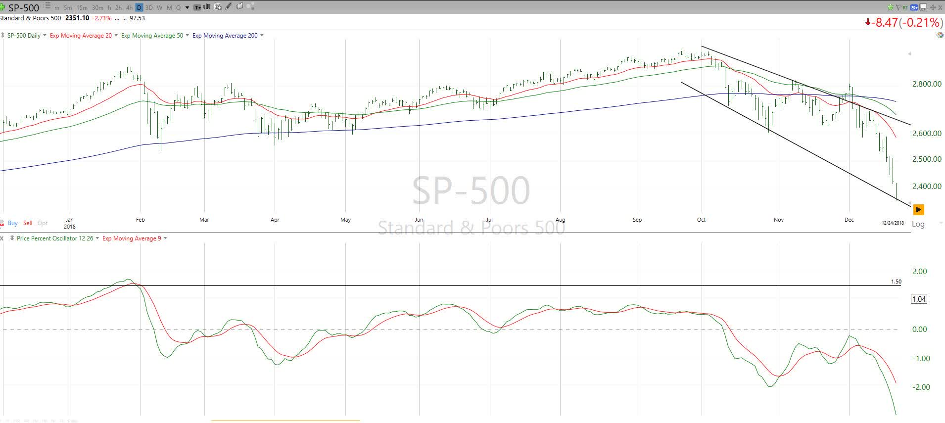
The S&P 500 topped for year in early October 2018. The market fell 19.2% peak-to-trough, though as noted earlier, most of it (15.6% of the 19.2%) occurred in just three weeks in December. Right at the time of year we are in now.
The chart above shows that the technical indicators I have come to rely on most over four decades gave us a clue that risk was not just rising as the year was closing. Risk was spiking. The trend channel I drew on the upper section of the chart became a “ceiling” the S&P 500 failed on several occasions to break. That just increased risk, and signalled that price action was getting progressively weaker.
Next, the 20-day moving average (in red) rolled over, and the rout was on. The lower part of the chart shows the Percentage Price Oscillator, which is my favorite type of oscillator indicator (doesn’t everybody have one?). That indicator tried in vain to rally (green line crossing above red line), but never did, and never reached the zero line that would signify a shift from bears in control to bulls in control. It gave way in December as well.
The S&P 500 fell hard that month, then landed spot-on the bottom of that “trendline” seen in the top part of the chart on the very right side. That made a bottom/bounce scenario much more likely. Santa obliged, and the market rallied hard through much 2019 and into 2020 before that Covid thing hit.
2022
2022 (TC2000)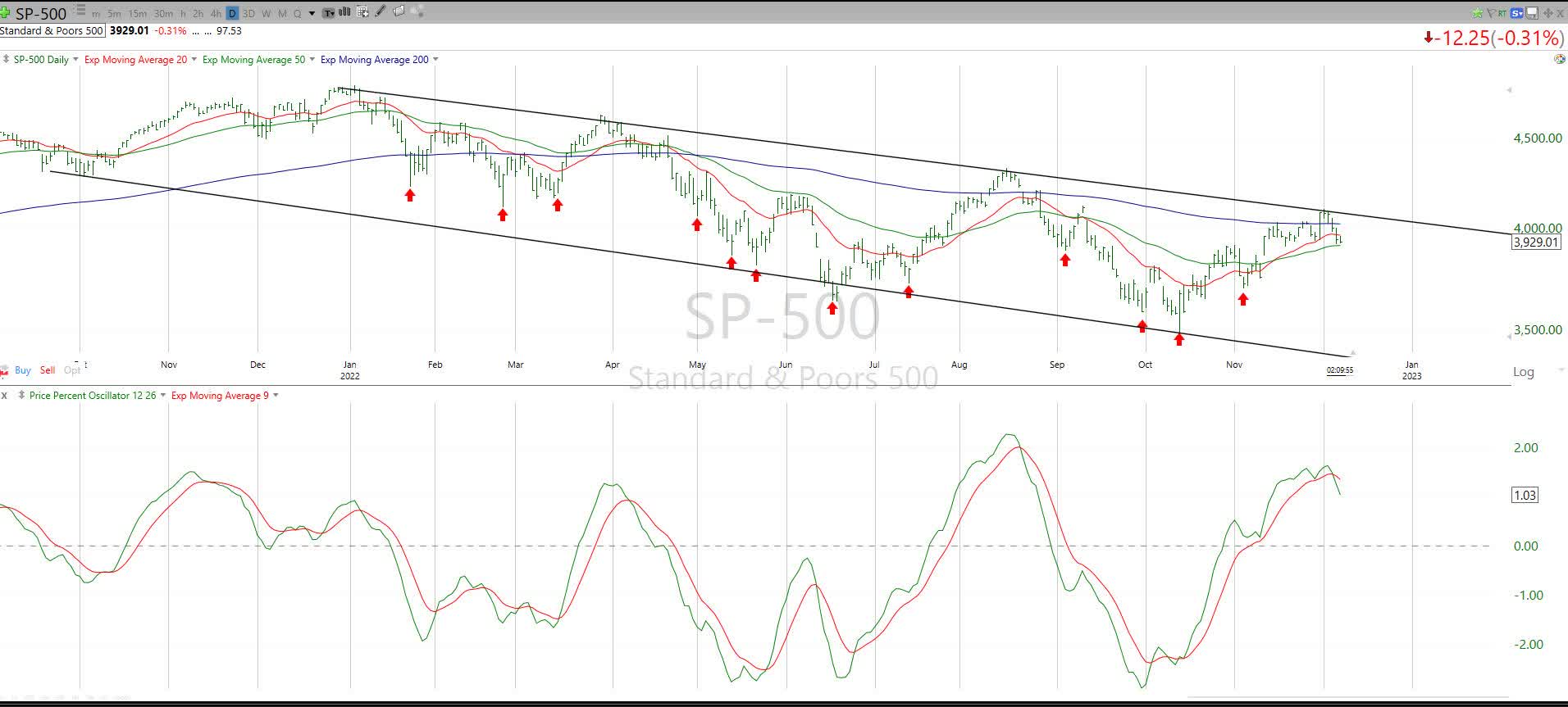
Let’s take that 2018 story, view the chart above, which shows the current S&P 500 chart, and see how many boxes we can check. To be clear, I’m not talking about boxes filled with holiday presents!
* Declining trend line: check
* 20-day moving average poised to roll over: check
* Percentage Price Oscillator rolling over from above zero: check
* Percentage Price Oscillator “downside cross” (green dipping below red)
What to get yourself for Christmas? How about a potentially valuable risk-management approach?
If we were to look for a pattern in the S&P 500 that says “risk is very high,” this is it. We never know for sure. But that’s not what investing is about. It is about seeking a comfortable balance of potential reward and risk of major loss. As in December 2018, the current market climate tells me that risk is very high.
In 2018, the S&P 500 fell 15.6% in 3 weeks. We are part of the way through that, and just to throw a little karma into the analysis, a similar countdown to Christmas and New Year’s Eve would project a potential target of 3,600, right around where the S&P 500 has stalled multiple times this year. That would make for some interesting headlines in late December or early January.
So, take this single-factor take on the current stock market, and determine what role, if any, it has in your own investment process. This is not an all-or-nothing call. It’s a call to investors to make sure they are serious about risk management as the calendar turns.
Be the first to comment