

Dan Dalton/iStock via Getty Images
This monthly article series shows a dashboard with aggregate industry metrics in consumer staples. It is also a review of sector ETFs like the Consumer Staples Select Sector SPDR ETF (XLP) and the Invesco S&P 500 Equal Weight Consumer Staples ETF (NYSEARCA:RHS), whose largest holdings are used to calculate these metrics.
Shortcut
The next two paragraphs in italic describe the dashboard methodology. They are necessary for new readers to understand the metrics. If you are used to this series or if you are short of time, you can skip them and go to the charts.
Base Metrics
I calculate the median value of five fundamental ratios for each industry: Earnings Yield (“EY”), Sales Yield (“SY”), Free Cash Flow Yield (“FY”), Return on Equity (“ROE”), Gross Margin (“GM”). The reference universe includes large companies in the U.S. stock market. The five base metrics are calculated on trailing 12 months. For all of them, higher is better. EY, SY and FY are medians of the inverse of Price/Earnings, Price/Sales and Price/Free Cash Flow. They are better for statistical studies than price-to-something ratios, which are unusable or non available when the “something” is close to zero or negative (for example, companies with negative earnings). I also look at two momentum metrics for each group: the median monthly return (RetM) and the median annual return (RetY).
I prefer medians to averages because a median splits a set in a good half and a bad half. A capital-weighted average is skewed by extreme values and the largest companies. My metrics are designed for stock-picking rather than index investing.
Value and Quality Scores
I calculate historical baselines for all metrics. They are noted respectively EYh, SYh, FYh, ROEh, GMh, and they are calculated as the averages on a look-back period of 11 years. For example, the value of EYh for food in the table below is the 11-year average of the median Earnings Yield in food companies.
The Value Score (“VS”) is defined as the average difference in % between the three valuation ratios (EY, SY, FY) and their baselines (EYh, SYh, FYh). The same way, the Quality Score (“QS”) is the average difference between the two quality ratios (ROE, GM) and their baselines (ROEh, GMh).
The scores are in percentage points. VS may be interpreted as the percentage of undervaluation or overvaluation relative to the baseline (positive is good, negative is bad). This interpretation must be taken with caution: the baseline is an arbitrary reference, not a supposed fair value. The formula assumes that the three valuation metrics are of equal importance.
Current data
The next table shows the metrics and scores as of last week’s closing. Columns stand for all the data named and defined above.
|
VS |
QS |
EY |
SY |
FY |
ROE |
GM |
EYh |
SYh |
FYh |
ROEh |
GMh |
RetM |
RetY |
|
|
Staple/Food Retail |
-28.84 |
6.32 |
0.0376 |
1.7097 |
0.0120 |
21.14 |
19.08 |
0.0432 |
1.9246 |
0.0319 |
16.60 |
22.37 |
-8.31% |
12.61% |
|
Food |
-4.33 |
10.60 |
0.0544 |
0.5979 |
0.0197 |
20.95 |
28.34 |
0.0460 |
0.6767 |
0.0245 |
15.35 |
33.45 |
-8.30% |
1.47% |
|
Beverage |
-11.69 |
-23.42 |
0.0355 |
0.2897 |
0.0107 |
18.72 |
40.75 |
0.0369 |
0.2676 |
0.0177 |
24.51 |
53.08 |
-8.15% |
3.38% |
|
Household prod. |
11.21 |
0.82 |
0.0759 |
1.2860 |
0.0066 |
18.25 |
38.89 |
0.0446 |
0.8780 |
0.0389 |
17.14 |
40.88 |
-21.81% |
-42.23% |
|
Personal care |
-9.25 |
8.67 |
0.0404 |
0.3945 |
0.0163 |
22.11 |
63.17 |
0.0384 |
0.4568 |
0.0202 |
21.47 |
55.24 |
-8.95% |
-7.29% |
|
Tobacco |
42.00 |
100* |
0.0657 |
0.7183 |
0.0233 |
207.17 |
50.86 |
0.0588 |
0.4644 |
0.0146 |
33.23 |
52.64 |
-6.62% |
-2.14% |
*Capped to 100 for convenience
Value And Quality chart
The next chart plots the Value and Quality Scores by industry (higher is better).
Value and quality in consumer staples (Chart: author; data: Portfolio123)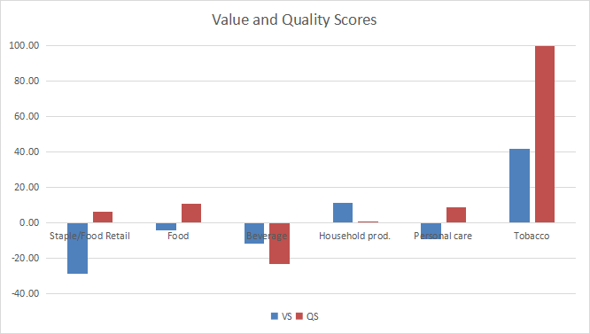
Evolution since last month
The quality score has improved in all industries due to price action, the most in household products.
Value and quality variations (Chart: author; data: Portfolio123)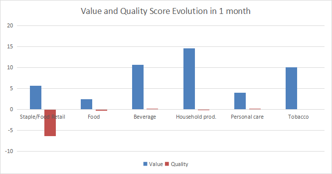
Momentum
The next chart plots momentum data.
Momentum in consumer staples (Chart: author; data: Portfolio123)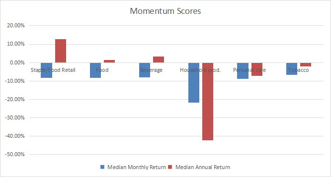
Interpretation
Tobacco still has the best value and quality scores of all consumer staples industries. A note of caution about statistics: only five tobacco companies are in my reference universe, this is a small sample size. Household products are undervalued by about 11% relative to 11-year averages, and quality is close to the baseline. Food and personal care products are slightly overvalued, but a good quality score may justify it. The beverage industry is below the baseline in both value and quality. Staple/food retail is overvalued by about 29%. The quality score is good, but not high enough to justify it.
Fast facts on RHS
Invesco S&P 500 Equal Weight Consumer Staples ETF has been tracking the S&P 500 Equal Weight Consumer Staples Index since 11/01/2006. It has a total expense ratio of 0.40%, which is significantly more expensive than the consumer staples benchmark XLP (0.10%). It has outperformed XLP since inception, but the difference is only 74 bps in annualized return. RHS is a little bit more volatile.
|
Total Return |
Annual Return |
Max Drawdown |
Sharpe |
StdDev |
|
|
RHS |
371.59% |
10.27% |
-35.78% |
0.81 |
12.45% |
|
XLP |
323.79% |
9.53% |
-33.45% |
0.79 |
11.61% |
Data and calculations: Portfolio123
The fund holds 33 stocks, which means their target weight on rebalancing is 3.03%. As of writing, weights are between 2.6% and 3.2%. The top 10 holdings have an aggregate weight of 31.4%. As a consequence, exposure to risks related to individual companies is moderate. This contrasts with the capital-weighted ETF XLP, whose top 10 holdings weigh about 70% of asset value, the top 4 representing over 45%.
RHS is cheaper than XLP regarding the usual valuation ratios reported in the next table.
|
RHS |
XLP |
|
|
Price / Earnings TTM |
21.89 |
24.37 |
|
Price / Book |
3.5 |
5.36 |
|
Price / Sales |
1.34 |
1.64 |
|
Price / Cash Flow |
15.88 |
18.04 |
Data: Fidelity
In summary, RHS is a good instrument for investors seeking exposure to consumer staples and avoid concentration in the largest companies. It is a better value play than the capital-weighted index. However, past performance since inception is very close to it. Liquidity makes XLP a better choice for tactical allocation and trading.
Dashboard List
I use the first table to calculate value and quality scores. It may also be used in a stock-picking process to check how companies stand among their peers. For example, the EY column tells us that a food company with an earnings yield above 0.0544 (or price/earnings below 18.38) is in the better half of the industry regarding this metric. A Dashboard List is sent every month to Quantitative Risk & Value subscribers with the most profitable companies standing in the better half among their peers regarding the three valuation metrics at the same time. The list below was sent to subscribers several weeks ago based on data available at this time.
|
USANA Health Sciences, Inc. |
|
|
Vector Group Ltd. |
|
|
Molson Coors Beverage Co. |
|
|
Coca-Cola Consolidated, Inc. |
|
|
Edgewell Personal Care Co. |
|
|
Walgreens Boots Alliance, Inc. |
|
|
Nu Skin Enterprises, Inc. |
|
|
Post Holdings, Inc. |
It is a rotating list with a statistical bias toward excess returns on the long-term, not the result of an analysis of each stock.
Be the first to comment