

fotofrog
Optimized Portfolio Construction using Bayesian Analysis
With macro headwinds picking up and the bears snarling, equity investors face an increasingly hostile environment. Even after the worst stock market in decades, the CAPE and Buffet indicators remain at nosebleed levels and that portends rough sledding for passive investing over the next couple of years. Gone are the halcyon days of putting capital into an ETF, buying any dip and heading for the beach. The key to success will be building a portfolio of individual stocks with a projected high rate of return and a low probability of loss ( PoL). Investors will be advised to “de-risk” their portfolio and take a lower rate of return on the chin because modern portfolio construction is based on the premise that investment returns are proportional to risk. In this article we will examine that premise and show it ain’t necessarily so.
Methodology
We start by creating a universe of stocks which have exhibited consistent compounding over the past 12 years. Long term compounders grow exponentially in price and thus exhibit a linear trend when plotted on a log scale. Take for example UnitedHealth Group (UNH)
Figure 1 (Author)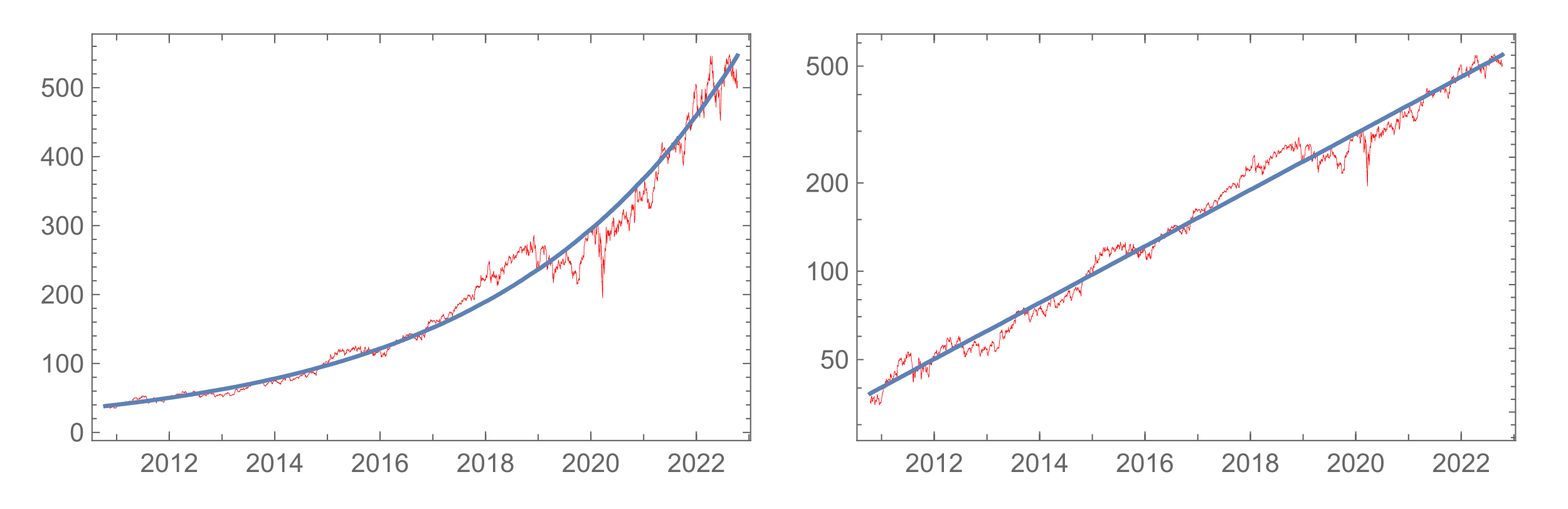
The left panel plots UNH price history using a linear scale superimposed with its best-fit exponential curve. On the right the same data is plotted on a log scale and exhibits near-perfect linearity.
The constant slope of the best-fit line on the log plot is a measure of the long-term growth rate. In statistics, the differences between the price on a given date and the best fit line is called the residual and its magnitude is one way to measure volatility. The further the residuals deviate from the best-fit line the more volatile the stock. A stock which exhibits good log-linearity tends to have symmetrical volatility limits because the residuals tend to have near-normal probability distributions and thus equal positive and negative excursions. As shown below, the volatility limits tend to form a channel centered on the best-fit line.
Figure 2 (Author)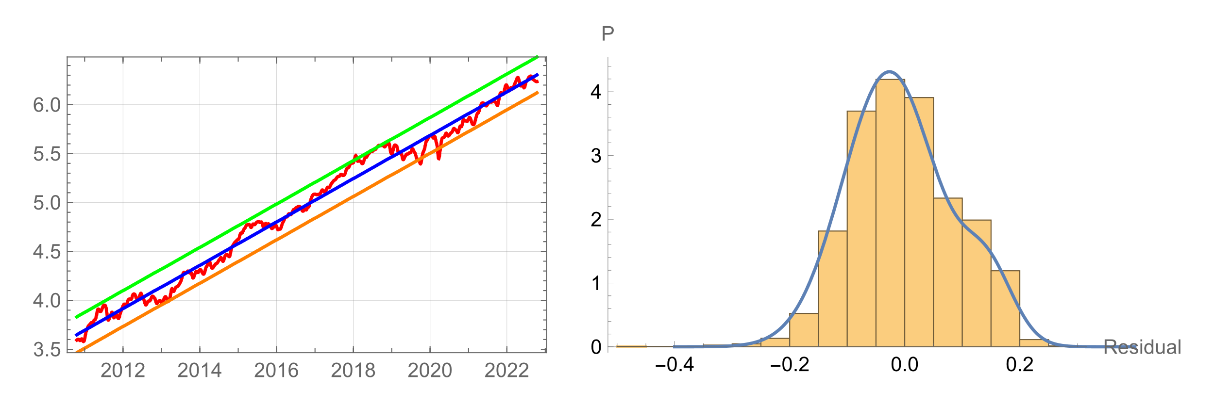
Figure 1– UNH Log Plot with Volatility Channel (left) PDF of Residuals (right)
If we create a scattergram of compounders identified by plotting their growth-rate versus volatility, we see that growth rates generally trends higher as volatility increases. Theory would hold that this increase in return comes with an increase in risk. But does higher volatility really equate to higher risk? Let’s look deeper.
Figure 3 (Author)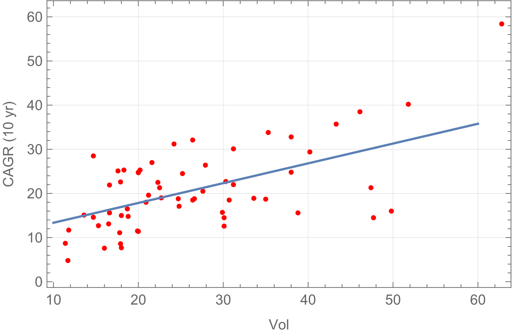
Volatility and Risk
Risk, properly defined, is the probability of loss of capital over some time period. And while the future is unknowable, probabilities are not- the probability density function (PDF) for each stock can be obtained from the statistical distribution of the residuals. Drawing random numbers from that PDF simulates future price action (daily moves) that statistically matches the stock’s historical PDF. By creating thousands of such price paths in a Monte Carlo analysis and examining the statistics of the results, one can determine the stock’s probability of loss. Plotting the results of such an analysis performed on each stock in our universe of compounders shows a surprising result.
Figure 4 (Author)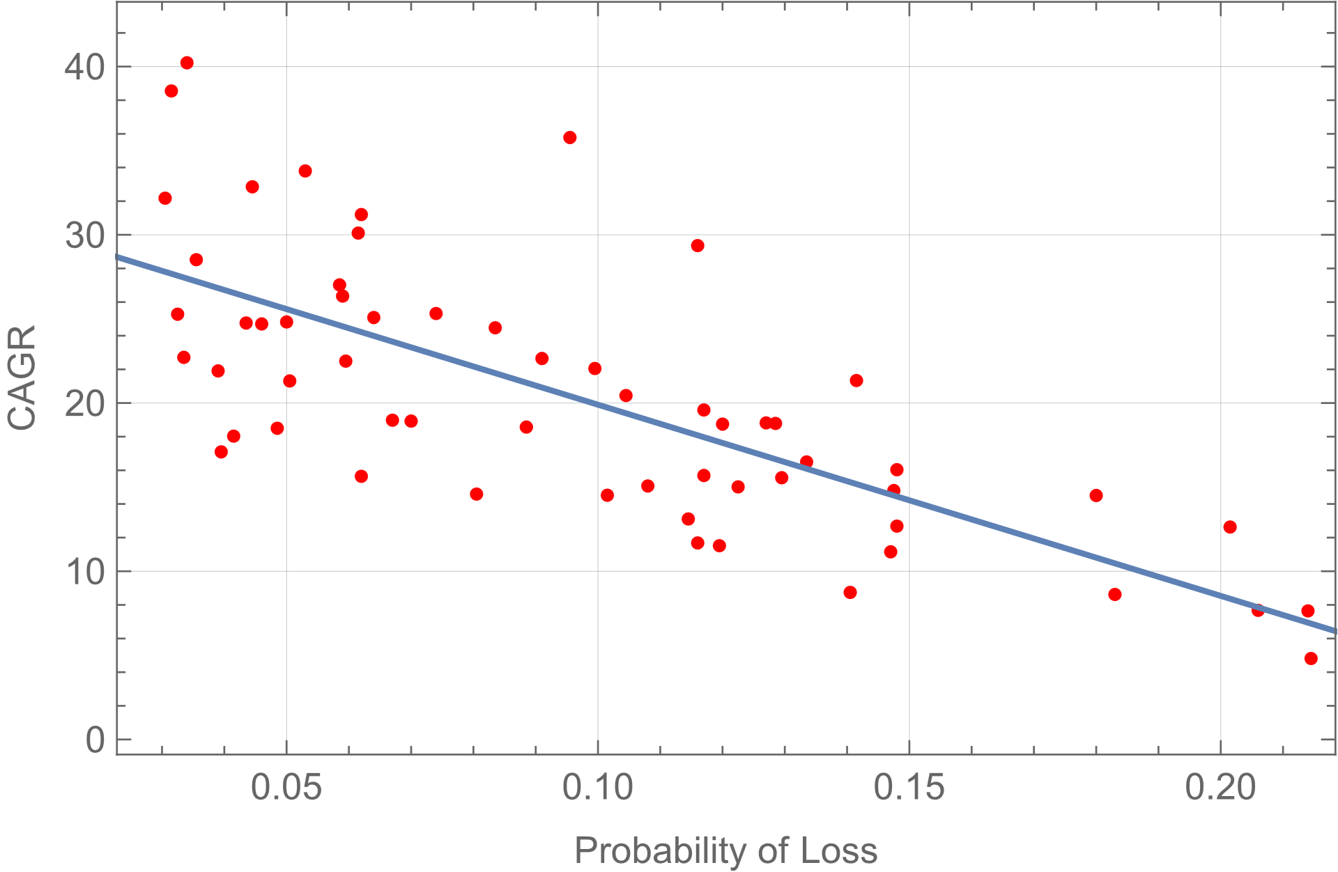
Contrary to theoretical expectation, the predicted growth rate is inversely proportional to risk. In fact, if we plot PoL versus volatility, we find the relationship between them is inversely exponential!
Figure 5 (Author)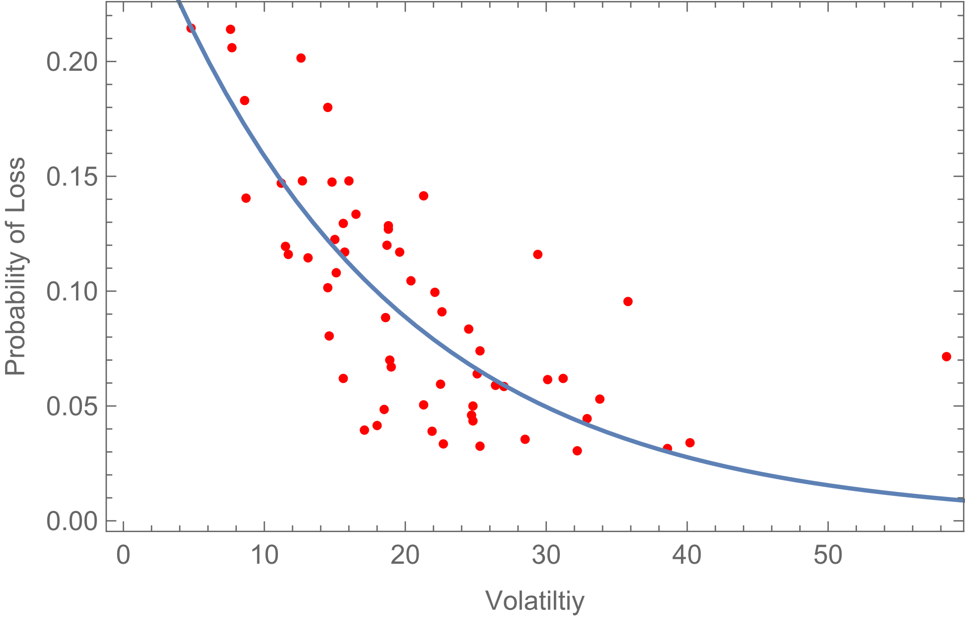
This result seems counterintuitive but on reflection it seems self-evident that returns should increase as the probability of loss decreases. Conversely then, we should expect the probability of loss to decreases with increasing CAGR. As the first scattergram showed, these compounders exhibit increasing CAGR with higher volatility. Logically then we should expect the probability of loss to decrease with higher volatility. What is surprising is how steeply the PoL decreases with increasing volatility.
Automated Portfolio Construction
An algorithm based on the Batesian methodology described above can be used to automate the construction of diversified portfolios optimized for the highest return for a given acceptable PoL. Selection criteria can be back tested using the same Bayesian Monte Carlo method by simply windowing the historical data to some previous date, selecting a portfolio using the proposed criteria and calculating the returns from the current prices. The process removes human subjectivity from the initial stock selection process but as noted below, due diligence is imperative to examine each stocks fundamental prospects before final inclusion.
For illustration, we present four back-tested strategies and present the results below. The learning period for all four include nine years of historical data projected three years to present (as of 10/18/22). No fundamental assessment was performed in the back-testing as we’re concerned here with validating the initial section method. Also note that dividends were ignored for this analyses.
Each back-test included the following common parameters:
Learning Window Date Range: Oct. 14, 2010, Oct 14, 2019
Monte Carlo parameters: 2000 3-year trials
Probability Distributions: Obtained from the Bayesian posterior
For comparison, the SPX 3-Year Return to present was 20.8% (CAGR: 7.35%)
Portfolio 1:
Here we set the selection criteria to specific thresholds that were found to maximize the log-likelihood function (maximize total return).
Selection Criteria: Probability of loss < 4%, CAGR > 30%
Selected Stocks: Amazon (AMZN), Broadcom (AVGO) , Cintas (CTAS), Domino’s Pizza (DPZ) , EPAM Systems (EPAM) , IDEXX Labs (IDXX), Texas Pacific Land Corp. (TPL)
Portfolio 3 Year Return (excluding dividends): 81.1%
CAGR: 19.1%
Individual Results:
| Symbol | Start | End | Gain | CAGR(%) |
| AMZN | $ 86.82 | $ 112.53 | 1.30 | 9.03 |
| AVGO | $ 281.66 | $ 437.97 | 1.55 | 15.85 |
| CTAS | $ 265.94 | $ 392.82 | 1.48 | 13.89 |
| DPZ | $ 252.20 | $ 333.26 | 1.3214 | 9.74 |
| EPAM | $ 188.20 | $ 330.17 | 1.75 | 20.61 |
| TPL | $ 605.52 | 2097.95 | 3.46 | 51.3 |
A portfolio survival function calculated from the composite portfolio distribution of returns gives the probability of the final return being below a given x value. The probability of loss for example can be read from (1-the y value) at x=1, the probability of doubling read at x=2 etc. Survival functions are a good way of comparing results (see below).
Figure 6 – Survival Function for Portfolio 1 at start of trial (Author)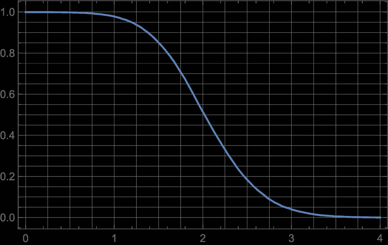
Portfolio 2:
For this portfolio rather than set specific thresholds we use a method based on Joel Greenblatt’s Magic Number method. Each stock is ranked according to PoL and again to CAGR. The magic number is simply the sum of the two ranks. We set a cut-off threshold (again found algorithmically to maximize the log-likelihood function) and further refine that list to include only those stocks selling at a discount to the best-fit line on the log chart.
Selection Criteria: Top 6 from the Magic Number ranked on PoL, CAGR and priced below mid-valuation
Selected Stocks: DPZ, TPL, Northrop Grumman (NOC), TPL, AMZN, AVGO, UNH
Portfolio 3-Year Return (excluding dividends): 88.6%
CAGR: 23.5%
Individual Results:
| Symbol | Start | End | Gain | CAGR (%) |
| DPZ | $ 252.20 | $ 333.26 | 1.32 | 9.74 |
| TPL | $ 605.52 | $ 2097.95 | 3.46 | 51.32 |
| NOC | $ 366.42 | $ 501.44 | 1.37 | 11.02 |
| AMZN | $ 86.82 | $ 112.53 | 1.30 | 9.03 |
| AVGO | $ 281.66 | $ 437.97 | 1.55 | 15.85 |
| UNH | $ 220.59 | $ 509.91 | 2.31 | 32.22 |
Figure 7 – Survival Function for portfolio 2 at start of trial (Author)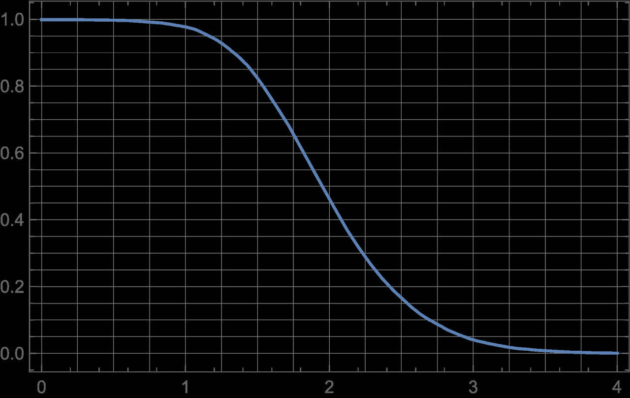
Portfolio 3:
Selection Criteria: Magic Number ranked on PoL, CAGR and Valuation < 40
Selected Stocks: DPZ, TPL, AVGO, Align Technology (ALGN), NOC, UNH, AMZN, EPAM, Home Depot (HD) , Visa (V)
Portfolio 3-Year Return (excluding dividends): 63.5%
CAGR: 17.8%
Individual Results:
| Symbol | Start | End` | Gain | CAGR (%) |
| DPZ | $ 252.2 | $ 333.26 | 1.32 | 9.93 |
| TPL | $ 605.52 | $ 2097.95 | 3.46 | 51.32 |
| AVGO | $ 281.66 | $ 437.97 | 1.55 | 15.85 |
| ALGN | $ 205.15 | $ 212.31 | 1.03 | 1.15 |
| NOC | $ 366.42 | $ 501.44 | 1.37 | 11.02 |
| UNH | $ 220.50 | $ 509.91 | 2.31 | 32.22 |
| AMZN | $ 86.82 | $ 112.53 | 1.30 | 9.03 |
| EPAM | $ 188.20 | $ 330.17 | 1.75 | 20.61 |
| HD | $ 234.18 | $ 282.83 | 1.20 | 6.49 |
| V | $ 177.36 | $ 184.66 | 1.21 | 1.35 |
Figure 8 – Survival Function for portfolio 3 at start of trial (Author)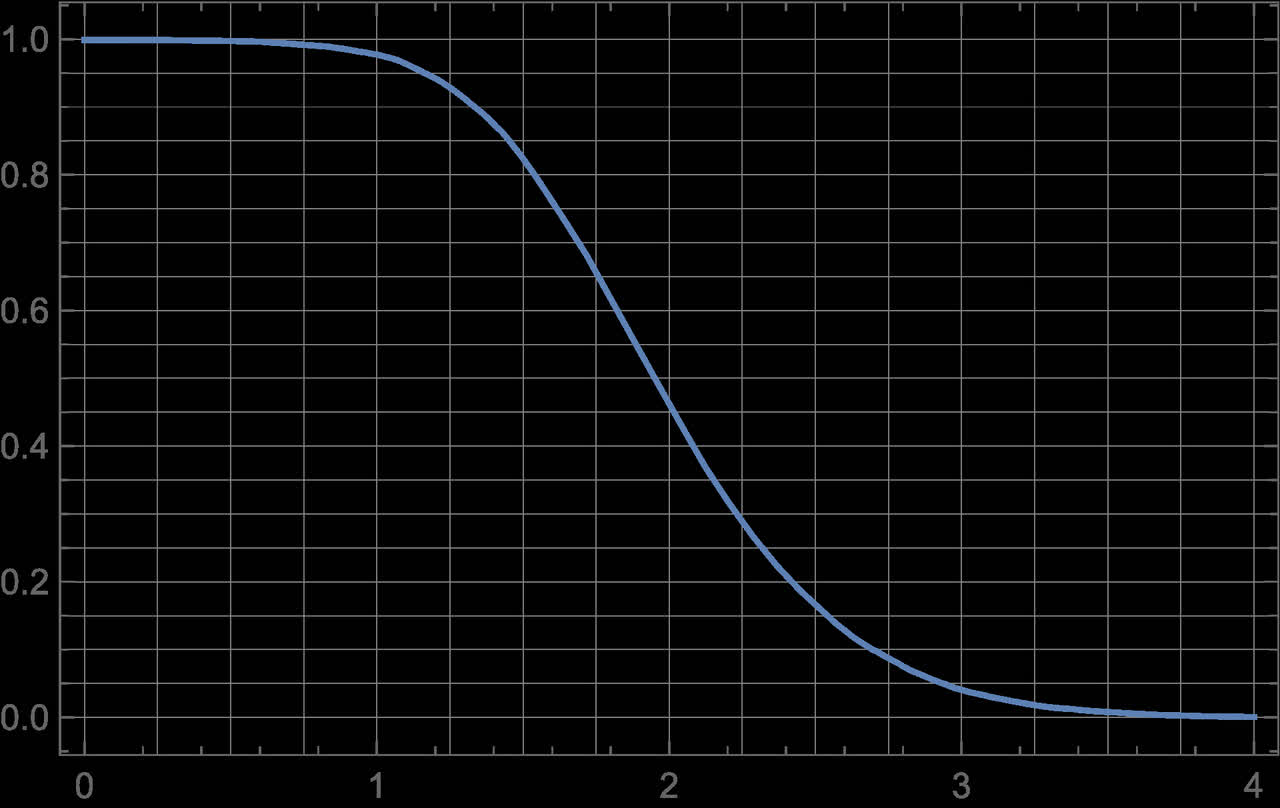
Portfolio 4:
For this portfolio we simply take the stocks with a PoL below a given threshold. I arbitrarily chose 1.5% which might not be the optimum value.
Selection Criteria: Probability of Loss < 1.5%
Selected Stocks: CTAS, HD, DPZ, V, EPAM, Sherwin-Williams (SHW)
Portfolio 3-Year Return (excluding dividends): 32%
CAGR: 9.7%
Individual Results:
| Symbol | Start | End | Gain | CAGR (%) |
| CTAS | $ 265.94 | $ 392.82 | 1.48 | 13.89 |
| HD | $ 234.18 | $ 282.83 | 1.21 | 6.49 |
| DPZ | $ 252.2 | $ 333.26 | 1.32 | 9.73 |
| V | $ 177.36 | $ 184.66 | 1.04 | 1.35 |
| EPAM | $ 188.20 | $ 205.68 | 1.12 | 3.89 |
Discussion
All four algorithms produced exceptional results especially given current market conditions. These results are probably quite conservative given the blind nature of the entry and exist prices. In practice one would use the algorithm to create an optimized watch list and look for entry points near the bottom of the volatility channel. Selling put options struck near the entry point is a good way to tranche into a position while generating returns in the meantime.
Strategies can also be compared on the basis of their survival functions. If we examine the survival functions of the four strategies by zooming in on the probability of loss (1-y value at x=1) and probability of doubling (x=2) points we find that at the start time, strategy 1 had a much higher probability of doubling and near the lowest probability of loss. Thus strategy 1 would have been chosen. And while it produced an impressive 19.1% CAGR, it was exceeded by strategy 2 which turned in 23.5%. This demonstrates the difference between prediction and probability. The goal is to maximize the probability of superior results but that doesn’t guarantee a particular portfolio will outperform all others.
Figure 9- Comparison of survival function at the loss and doubling points (Author)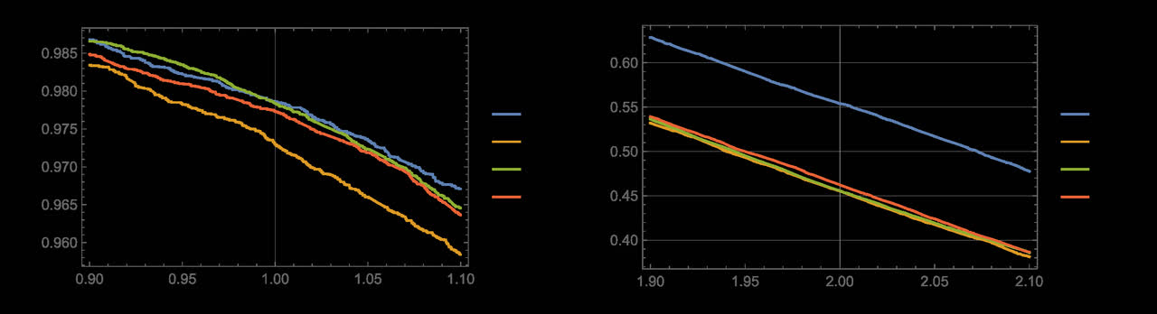
While these results validate the method, one should never let a computer do the thinking. When constructing a portfolio using any automated method, it is imperative to perform due diligence on each selected stock and consider factors which may make it unlikely that the past price performance is indicative of the future. This analysis can be computer aided by analyzing the stationarity of the residual distribution over time, but only a human can assess future prospects. Entry points should be validated using discounted cash flow or other methods with a suitable margin of safety. Such due diligence was not performed for the back tests presented here so the stocks analyzed may or may not have ultimately been the ones selected back then. The purpose here was to demonstrate the method and compare the different selection criteria.
My personal philosophy argues against over diversification – preferring a small basket of closely watched eggs. Loosening the selection criteria would result in a larger basket but may not give superior results. In practice the criteria selection itself done by algorithm to maximizing the so-called Log-Likelihood function which seems to yield 5-10 stocks but if greater diversity is desired, once an optimum basket is selected addition stocks which are in close proximity on the scattergram to those already selected will provides some protection from adverse events hitting a particular company without adversely affecting returns should no such event occur.
Caveats
The primary conclusion validated by all four strategies is that volatility does not equate to risk and it is not necessary to increase risk to yield substantial reward. But care must be taken not to generalize the result too far. It applies only to the parameters of this analysis, namely stocks which have exhibited compounding over an extended period with near stationary residual PDFs. To this end, the start of the learning period was selected to window the current secular bull market and the projections would not be valid if the current market correction turns out to be a regime change. The SPX log chart below shows a recent break below its long-term volatility band. Time will tell if this is the start of a secular bear market. If that is the case, the same techniques can be used to construct short portfolios.
Fig. 10 – SPX Log Chart with Volatility Channel (Author)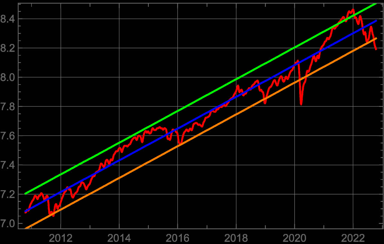
Conclusion
In this era of index ETFs and liquidity manipulation by the Federal Reserve, stock prices have become highly correlated and nearly divorced from fundamentals- witness the underperformance of value investing over the past decade and the outsized gains of momentum techniques. But as the current correction demonstrates yet again, those that live by that sword must be prepared to die by the same. By obtaining a better grasp of risk and with the aid of powerful statistical methods, portfolios can be constructed that produce market-beating returns while minimizing the probability of loss.
.
Be the first to comment