

Andres Victorero/iStock via Getty Images
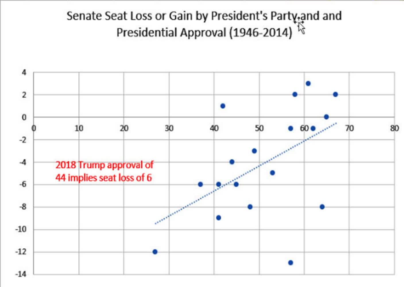
There has been a lot written about the Presidential election cycle, myself included, but little about how the market reacts to the mid-term elections, which are fast approaching. There is a history of disenchantment with the incumbent party that seems clear. Figure 1 shows the House seats lost or gained during the mid-term elections, and Figure 2 shows the same for Senate seats. It looks as though the President’s popularity needs to be remarkably high to gain seats.
Figure 1. House seats lost or gained in the mid-term elections based on the President’s approval rating. (www.presidency.ucsb.edu) Figure 2. Senate seats lost or gained in the mid-term elections based on the President’s approval rating. (www.presidency.ucsb.edu)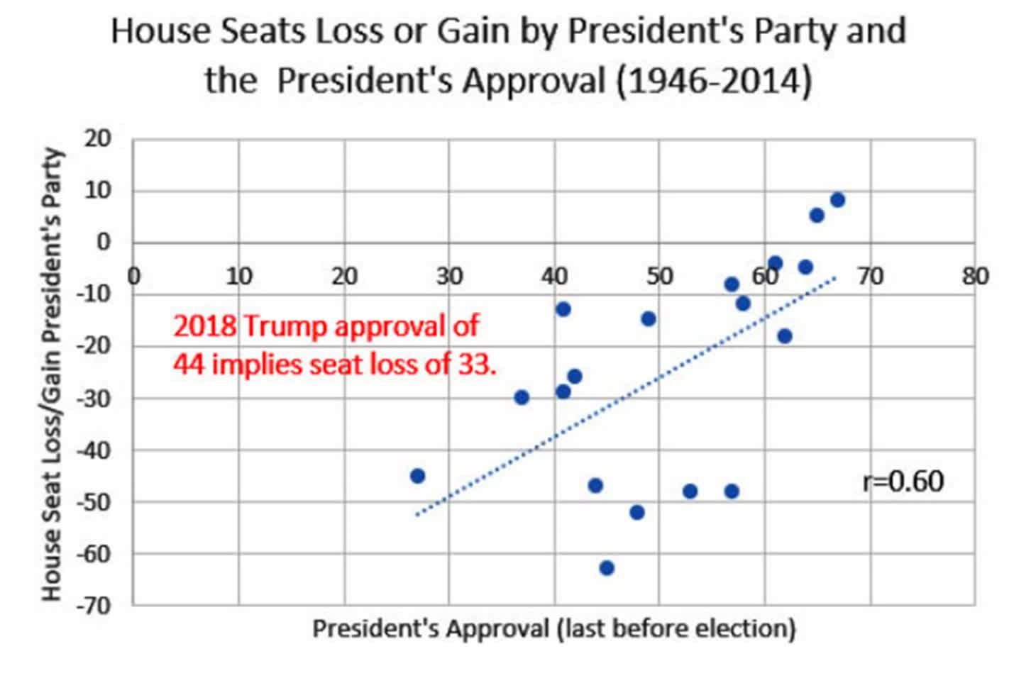
I am not going to argue with these numbers, they seem pretty clear. As an investor, I am more interested in how the equity markets will react in advance and after the mid-term elections, given that politicians in office would like to have a strong economy and positive PR to maintain control.
Reviewing How the Market Reacts to the Presidential Cycle
The most comprehensive study of the Presidential Cycle was by Adam White (“The Eight-Year Presidential Election Pattern,” Technical Analysis of Stocks & Commodities, 1984), but it was only one of many. Arthur Merrill published one in March 1992 in the same magazine. To compare then and now, we’ll use the numbers from White’s article. They are shown in Figure 3.
Figure 3. Comparing a previous Election Cycle study with more recent data. (Source: TAS&C (White) and data source: CSI)
Because the stock market keeps going up, it should not be surprising that average year in the cycle shows a positive return. It is likely that the 10-year bull market helped, even with the dot.com bubble in 2000 and the financial crisis of 2008.
Patterns have changed. In White’s study, the third year and the election year were strongest while more recently the first and third years are the best. The mid-term year (this year) and the election year have only small returns.
A Closer Look
It is interesting to take a closer look at the monthly patterns during the Presidential and mid-term election years. Figure 4 compares those years to the market average. The average (in blue) shows a pattern of below average in January to gains in December. The way we calculate these numbers is to divide the monthly index value by the yearly average, so a steady increase in the index throughout the year would show January as less than the average even when it had a positive return. It is one of the ways the government shows seasonality.
Figure 4. Monthly returns for all data, the Presidential election years, and the mid-term election years. (Data source: CSI)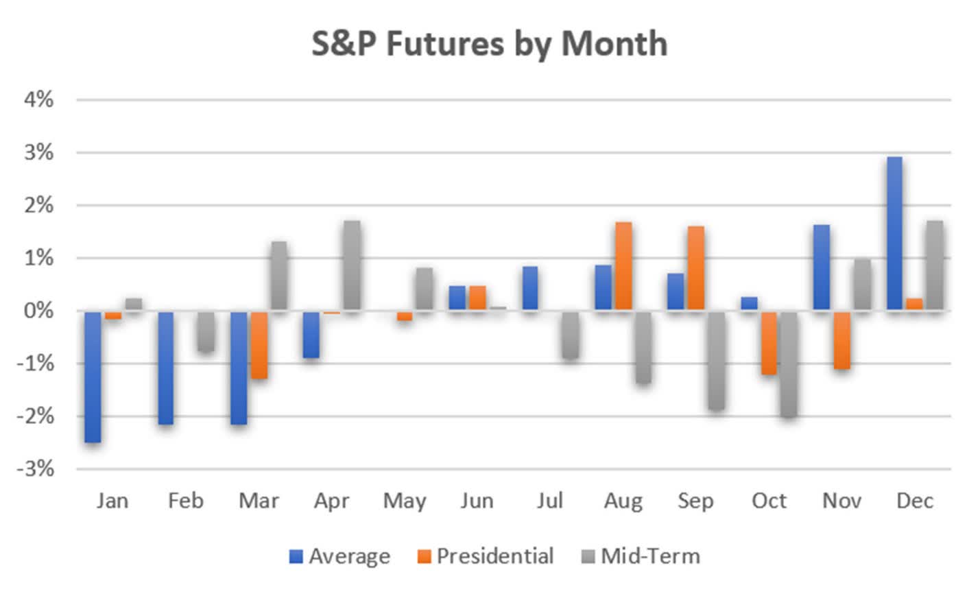
What we see in Figure 4 are sharp variations from the average, especially in the mid-term election years. The summer months preceding the election show increasing equity losses, followed by some optimistic recovery in the last two months of the year. Voters must be satisfied with the results.
This differs from the Presidential election years in which there is optimism ahead of the election (August and September) and a disappointing reaction in November and December.
Other Factors
We have unusual factors this year: High inflation, an expected large increase in interest rates, high energy prices, and the financing of both Covid and a war in Ukraine. Can we relate any of these to the election outcome? They all lead to inflation, and inflation leads to higher interest rates.
The pattern of interest rate is shown in Figure 5. We used the 10-year Treasury Note futures, considered the benchmark interest rate. Higher prices mean lower yields. The big picture for interest rates is that they spend much more time at lower yields, which stimulates business and employment. When inflation surfaces or when the stock market is showing signs of irrational exuberance, the Fed raises rates.
Figure 5. 10-Year Note futures prices show a mid-term tendency towards lower yields, higher prices. (Data source: CSI)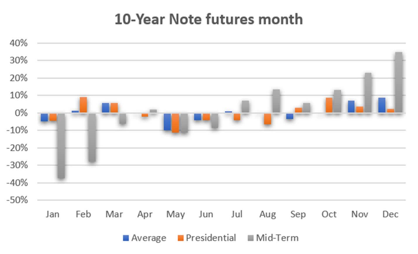
The mid-term year seems to most represent the long-term pattern of yields, getting progressively lower. Again, these values are found by dividing the returns of each month by the average of the year, so when January is lower, it may mean that it is below the yearly average but not necessarily negative. However, the mid-term values are very different from the averages and very different from the Presidential election years.
To see if the recent rise in rates is reflected in the pattern, Figure 6 shows the monthly returns for 2021, when futures were anticipating the Fed’s decision to raise rates. It shows uncertainty, with a tendency towards lower prices, higher yields. It is completely different from the long-term pattern in Figure 5.
Figure 6. 10-Year Note futures for 2021. (Data source: CSI)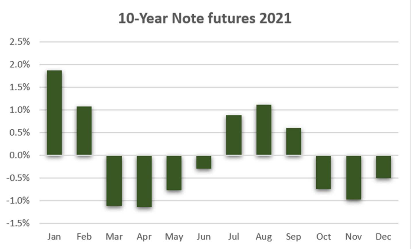
While the mid-term pattern of rates is the most consistent in showing progressively lower yields, this past year is nearly the opposite. It may not cause the stock market to decline, but it will have the most influence in preventing it from rising.
That makes the scenario for 2022 look like the pattern in Figure 4. Pressure on prices until the election, then a rally. Investors are ever hopeful.
Be the first to comment