

mihailomilovanovic
Sector and Industry Performance
As for the 1-month relative performance, the Consumer Cyclical did quite badly with a loss of 6.4%, beating, however, the poor Technology sector, which dropped by 8%.
1-month performance of sectors (Finviz)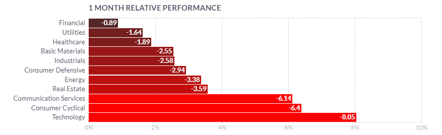
The 1-week return of the Consumer Cyclical sector has been, however, a stellar rebound. The sector led with 3.9%, beating Communication Services and Financial.
1-week performance of sectors (Finviz)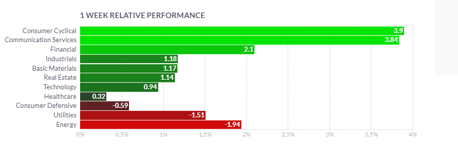
On the level of the Consumer Cyclical sector, the Department Stores industry did not really do so well. As a bottom-performing industry in the sector, Department Stores returned a loss of 8.69% over the last month.
1-month performance of industries within the Consumer Cyclical sector (Finviz)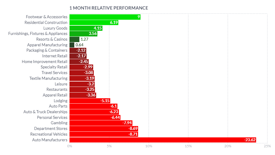
On the 1-week return basis, however, Department Stores are in green and in the middle of all the industries of this sector, with a return of 4.32%. Seems like Christmas shopping brought some good numbers and folks are getting ready to hit these resorts and casinos and to travel in general.
1-week performance of industries within the Consumer Cyclical sector (Finviz)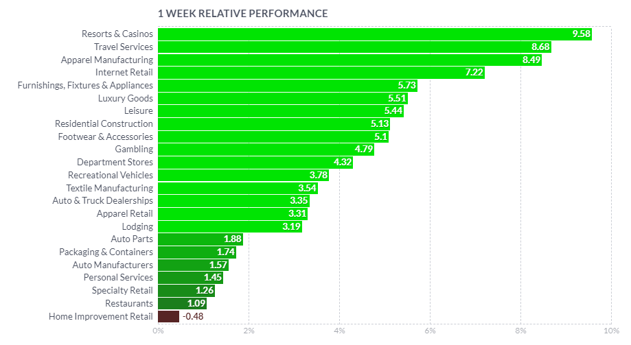
Peers and relative performance
Macy’s Inc. (NYSE:M) dropped out of S&P 500 index in April 2020, but I will still include the index (SPX) as a background of the general US market. As can be seen below in the comparison of Macy’s performance against its peers, it was slightly better than Nordstrom’s (JWN) and outperformed Kohl’s (KSS), but the whole group has been beaten widely by Dillard’s (DDS) (with -22.97%, -27.81%, -46.25%, 32.26%, respectively). The wide market returned a loss of nearly 19%.
1-year performance of Macy’s and peers (TradingView)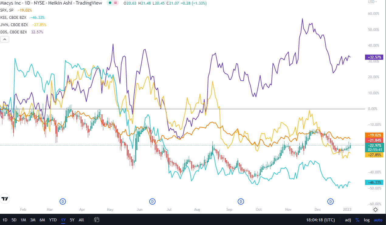
On the 3-month timescale, Macy’s has taken over Dillard’s and has returned 25.57%, outpacing widely the market and other competitors.
3-month performance of Macy’s and peers (TradingView)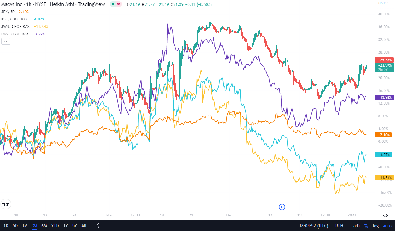
Explanation of My Technical Analysis Toolbox
I will analyze Macy’s from a perspective of a number of technical analysis tools and show the screenshots on the monthly, weekly, and daily Heikin Ashi candles charts – each timeframe presented through two separate sets of indicators – which I will complement with a simplified daily Renko chart.
The first chart setup (I will call it Chart 1) uses Bill William’s Alligator indicator and Awesome Oscillator, as well as Ichimoku Clouds and On Balance Volume indicator line. For fundamentals, I show the quarterly revenue trend which I use for quick visual triage.
The Alligator technical analysis tool uses three smoothed moving averages that are based on thirteen, eight, and five periods, called also Jaw (blue line), Teeth (red line), and Lips (green line), respectively. Due to the smoothing of each moving average, the Jaw makes the slowest turns and the Lips make the fastest turns. The Lips crossing down through the other lines signals a short opportunity while crossing upward signals a buying opportunity.
William’s Awesome Oscillator (AO) is a market momentum tool that visualizes a histogram of two moving averages, calculated on median prices of a recent number of periods compared to the momentum of a larger number of previous periods. If the AO histogram is crossing above the zero line, that’s indicative of bullish momentum. Conversely, when it crosses below zero, it may indicate bearish momentum.
As for the Ichimoku Cloud – I am not using a full set of lines of Ichimoku lines, only the Leading Spans A and B, whose crosses dictates the color of the cloud and whose individual lines provide levels of the strongest support and resistance lines. Ichimoku averages are plotted into the future which in its own right provides a clearer picture but have no predictive powers.
On-Balance-Volume (OBV) indicator is a volume-based tool and is supposed to indicate the crowd sentiment about the price. OBV provides a running total of an asset’s trading volume and indicates whether this volume is flowing in or out, especially when viewed in divergence with the price action.
The second chart setting (Chart 2) uses 2 moving averages (10- and 50-period), volume, and volume’s 20-period average. On the screenshot from top to bottom, you will see the Composite Index Divergence Indicator (CIDI), which I learned from the book of Constance Brown, as well as J. Welles Wilder’s Directional Movement Indicator (DMI). I also use MACD (Moving Average Convergence Divergence) which is well known to everybody: I seek crossovers of MACD and signal, as well as above/below the zero level.
CIDI comes from a combination of RSI with the Momentum indicator. For more literature, see Brown’s paper or read her book. CIDI has been developed to solve the problem of RSI not being able to show divergence. I personally use the CIDI’s crossover above and below its slow and fast-moving averages, as well as the position of the averages against each other.
As for DMI, I skip the ADX line because it doesn’t give me anything. Instead, I focus on the crossovers of the Positive Direction Indicator DI+ and Negative Direction Indicator DI-. When the DI+ is above DI-, the current price momentum is upwards. When the DI- is above DI+, the current price momentum is downwards.
On the use of Heikin Ashi candles and Renko boxes, I use them as tools for trend reversal and continuation identification. Renko charts do not have a time scale and they are built on price movements that must be big enough to create a new box or brick. Similar to Heikin Ashi, Renko charts filter the noise.
As you might have guessed, my focus is on identifying the trend reversal and filtering the noise that allows the position continuation without the risk of too many false signals. However, I will be honest with you – I am not showing here all the technical indicators that I use for screening and analysis since they belong to my secret sauce.
The Long-Term Trend
For the long-term trend analysis, I use monthly charts. See below Chart 1, where we can notice a number of positive technical signals switched on but in somehow subdued values. First, the current month’s candle is already the fourth one and we can see the volatility of prices in these last months become narrower, possibly leading to an explosive change up or down. The Ichimoku Cloud has the beginnings of the color change to green but it has narrowed as well, reflecting the recent ranges. Awesome Oscillator is in the positive values, but the current bar has started lower. The On-Balance-Volume line is also still undecided and somewhere in the middle of 2020 bottom and 2021 high. The lines of the Alligator are also in the positive set-up (green above red, red above blue) but they lay flat and may go either direction. The lowest pane on the screenshot is for the annual revenues – not really a technical signal but I use it for visual signs of divergence of stock direction vs. the top line.
Chart 1 – Monthly (TradingView)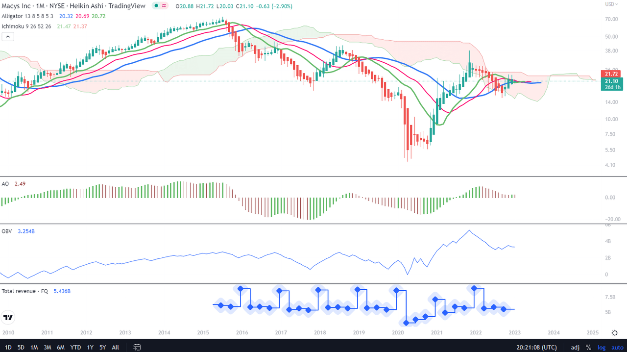
On Chart 2, we can see positive confirmations in the positioning of the 10-month MA over the 50-month MA, although they are still sloping downwards. CIDI crossed the fast (green) average and is crossing the slow one from below, remains to see next month if this materializes. The same for MACD and its signal – they are both above the zero level, but MACD is still to cross above the signal line. DI+ has gotten dangerously close to DI- but has not crossed below it ever since December 2020. The long-term technical signals give signs of hope but those can also be signs of indecision.
Chart 2 – Monthly (TradingView)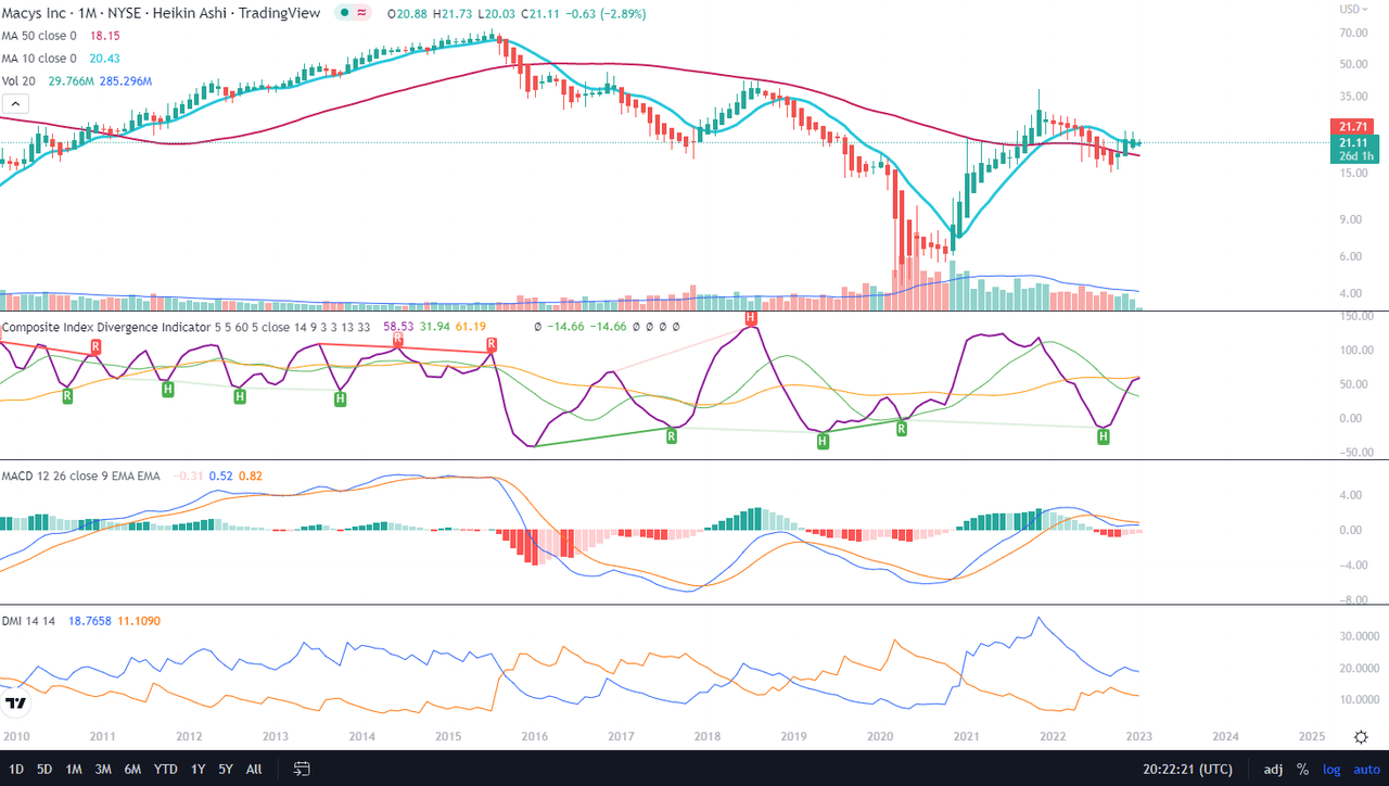
The Mid-Term Trend
As we can notice in Chart 1, we are dealing with a similar indecision situation. Cloud narrowing but still red, Alligator’s lines in a good position but flattish, AO in positive but dropping, OBV basically not moving. I have added an additional S/R line (orange) on the level of $27 which is clearly indicated by the upper edge of the red Cloud. This is, according to me, the major resistance line on his timeframe.
Chart 1 – Weekly (TradingView)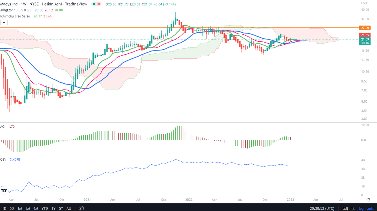
On Chart 2, at last, the indicators are showing signs of the preparation for a more decisive move. The 10-week MA is crossing the 50-week MA from below, CIDI has made a U-turn and is directing upwards, with the fast average above the slow one. Both MACD and its signal have just crossed the zero line, while DI+ has just bounced off DI-. This chart shows more dynamic than the previous one.
Chart 2 – Weekly (TradingView)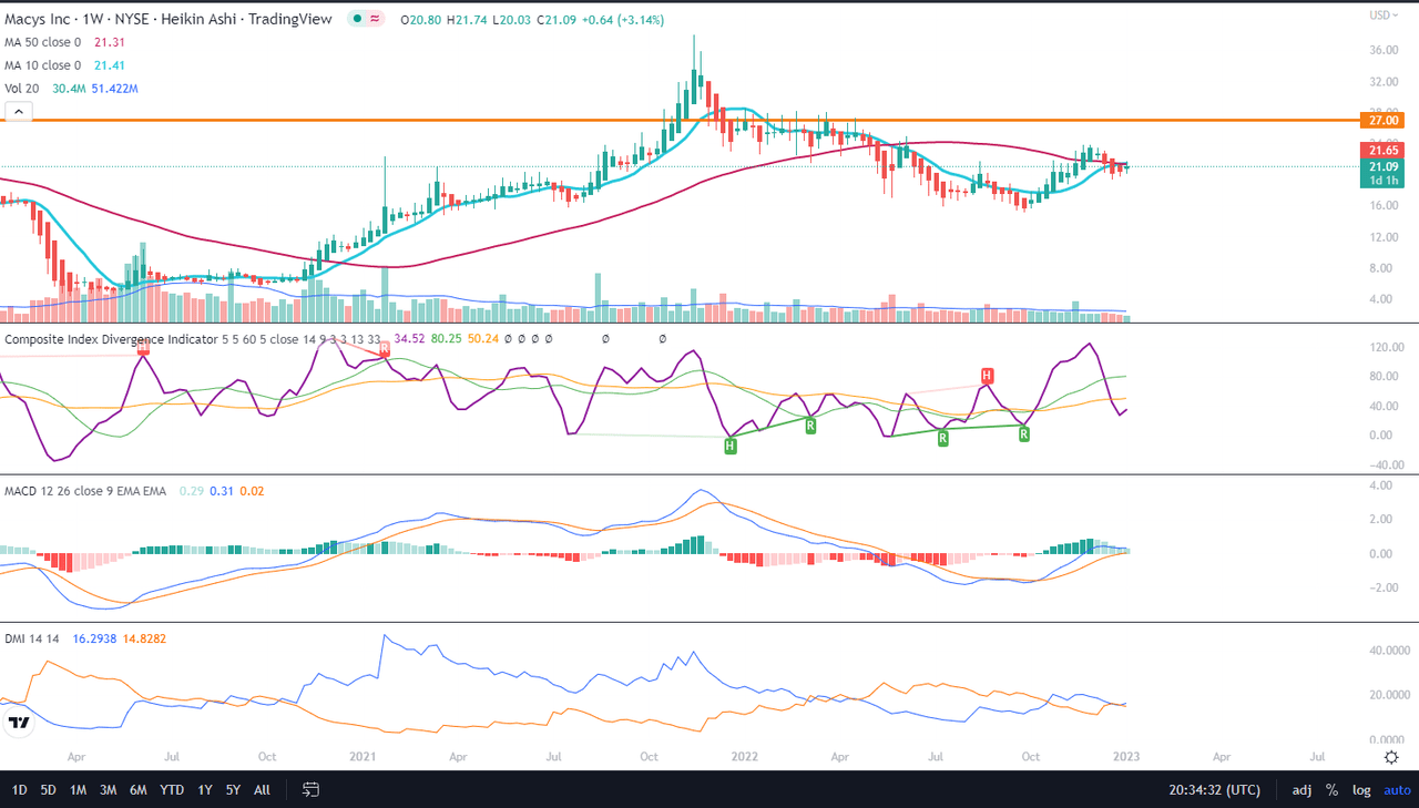
The Short-Term Trend
As we can see on Chart 1, there is some directionality visible in the indicators, otherwise so unbothered on the higher timeframes. Here the Cloud has the rising lower edge, even though the current switch is in red. Alligator’s lines made round bottoms and are all facing upwards, although not making any significant cross-over. AO is below zero but rising. The same rising momentum we can see with OBV, which is reaching the levels of November-December highs.
Chart 1 – Daily (TradingView)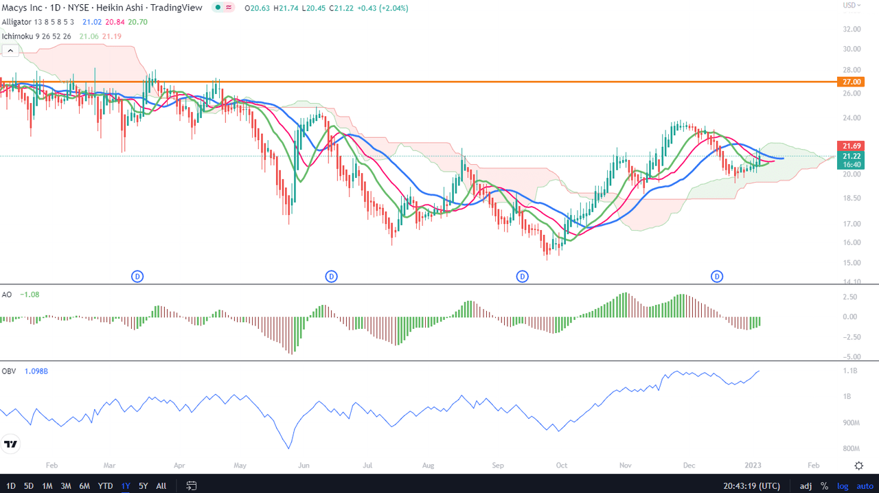
As for the picture on Chart 2, the 10-day MA still has to cross the 50-day MA, and MACD still needs to cross the signal. It is possible that Macy’s will gain a couple of dollars within the span of the next 2-3 weeks, most probably rising up to the $25-27 range. The only negative reading is the DI+ undecided about the direction – luckily, it’s already above DI-. A short-term rally is very much to be expected.
Chart 2 – Daily (TradingView)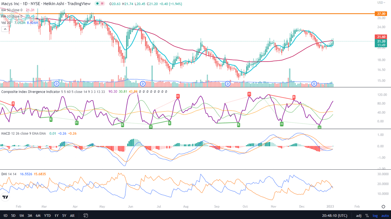
Price Momentum
The daily Renko chart presents still the expectation of the 10-box MA crossing above the 50-box MA to materialize, as well as the MACD crossing recently the zero line. The last time it happened was in Jan 2021 around a level of $16, giving way to a 107% rally over the following 10 months. In my opinion, the momentum is there but it is being kept low-key.
Renko Daily (TradingView)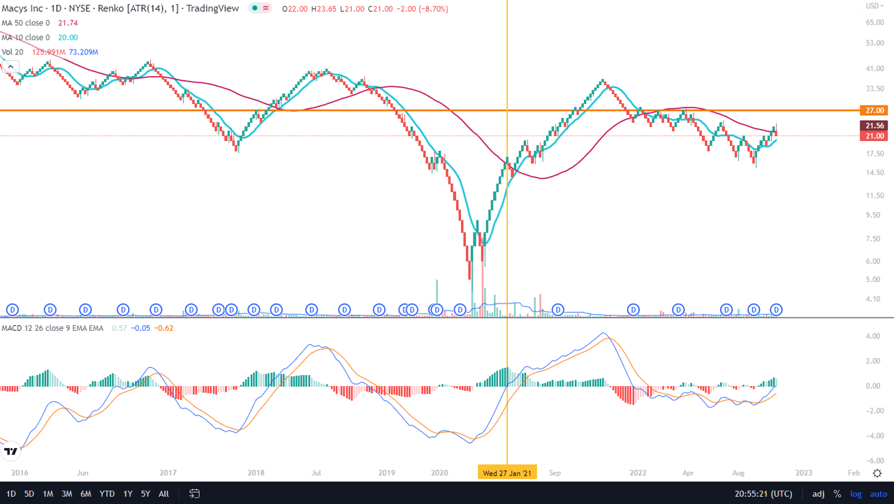
Conclusions
Technically, Macy’s seems to be in a very lull, unassuming, undecided period. However, based on Renko chart, I would suggest watching Macy’s price action every day and choosing an entry point according to the resistance lines being broken and indicators cross-overs. I think that Macy’s rally will surprise everybody.
Be the first to comment