

Pavel Muravev/iStock via Getty Images
This monthly article series shows a dashboard with aggregate industry metrics in healthcare. Companies used to calculate these metrics are the largest holdings of ETFs like the Health Care Select Sector SPDR ETF (XLV) and the iShares U.S. Healthcare ETF (NYSEARCA:IYH). Therefore, this is also a review of such funds.
Shortcut
The next two paragraphs in italic describe the dashboard methodology. They are necessary for new readers to understand the metrics. If you are used to this series or if you are short of time, you can skip them and go to the charts.
Base Metrics
I calculate the median value of five fundamental ratios for each industry: Earnings Yield (“EY”), Sales Yield (“SY”), Free Cash Flow Yield (“FY”), Return on Equity (“ROE”), Gross Margin (“GM”). The reference universe includes large companies in the U.S. stock market. The five base metrics are calculated on trailing 12 months. For all of them, higher is better. EY, SY and FY are medians of the inverse of Price/Earnings, Price/Sales and Price/Free Cash Flow. They are better for statistical studies than price-to-something ratios, which are unusable or non available when the “something” is close to zero or negative (for example, companies with negative earnings). I also look at two momentum metrics for each group: the median monthly return (RetM) and the median annual return (RetY).
I prefer medians to averages because a median splits a set in a good half and a bad half. A capital-weighted average is skewed by extreme values and the largest companies. My metrics are designed for stock-picking rather than index investing.
Value and Quality Scores
I calculate historical baselines for all metrics. They are noted respectively EYh, SYh, FYh, ROEh, GMh, and they are calculated as the averages on a look-back period of 11 years. For example, the value of EYh for healthcare providers in the table below is the 11-year average of the median Earnings Yield in this industry.
The Value Score (“VS”) is defined as the average difference in % between the three valuation ratios (EY, SY, FY) and their baselines (EYh, SYh, FYh). The same way, the Quality Score (“QS”) is the average difference between the two quality ratios (ROE, GM) and their baselines (ROEh, GMh).
The scores are in percentage points. VS may be interpreted as the percentage of undervaluation or overvaluation relative to the baseline (positive is good, negative is bad). This interpretation must be taken with caution: the baseline is an arbitrary reference, not a supposed fair value. The formula assumes that the three valuation metrics are of equal importance.
Current data
The next table shows the metrics and scores as of last week’s closing. Columns stand for all the data named and defined above.
|
VS |
QS |
EY |
SY |
FY |
ROE |
GM |
EYh |
SYh |
FYh |
ROEh |
GMh |
RetM |
RetY |
|
|
HC Equipment |
-22.29 |
3.09 |
0.0285 |
0.2202 |
0.0235 |
13.86 |
67.86 |
0.0337 |
0.2816 |
0.0334 |
14.07 |
63.03 |
5.74% |
-16.14% |
|
HC Providers |
12.62 |
1.64 |
0.0582 |
1.5276 |
0.0763 |
19.31 |
19.96 |
0.0526 |
1.4531 |
0.0625 |
15.90 |
24.39 |
11.56% |
2.40% |
|
Pharma/Biotech |
14.10 |
48.77 |
0.0450 |
0.2257 |
0.0461 |
41.02 |
79.97 |
0.0376 |
0.2536 |
0.0345 |
20.69 |
80.56 |
12.27% |
15.16% |
|
Life Science Tools |
-16.87 |
9.51 |
0.0298 |
0.1825 |
0.0277 |
17.62 |
59.22 |
0.0301 |
0.2935 |
0.0314 |
15.74 |
55.31 |
3.89% |
-19.29% |
Value and Quality chart
The next chart plots the Value and Quality Scores by industry (higher is better).
Value and quality in healthcare (Chart: author; data: Portfolio123)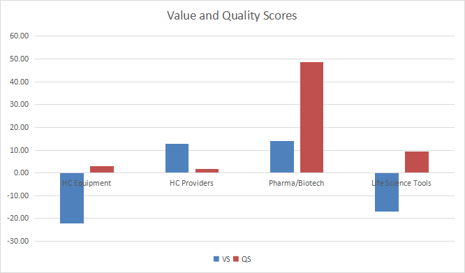
Evolution since last month
The value score has deteriorated in pharmaceuticals/ biotechnology and improved in other subsectors.
Value and quality variations (Chart: author; data: Portfolio123)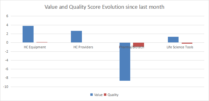
Momentum
The next chart plots median returns by subsector.
Momentum in healthcare (Chart: author; data: Portfolio123)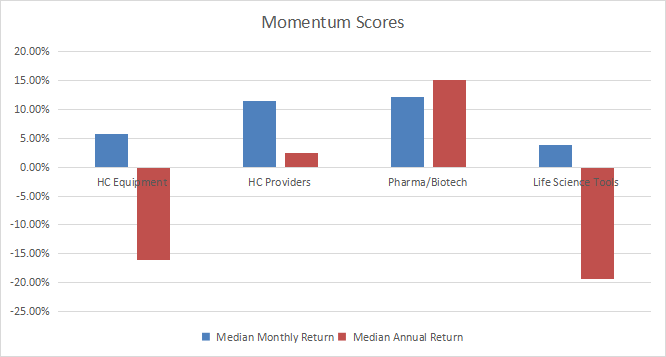
Interpretation
Pharma/biotech and healthcare providers are moderately undervalued relative to 11-year averaged. The former has an excellent quality score, whereas the latter is close to the baseline. Life science tools and healthcare equipment are overvalued by about 17% and 22% in my metrics, respectively. Their quality scores are good, but not high enough to justify such overvaluation.
Fast facts on IYH
The iShares U.S. Healthcare ETF (IYH) has been tracking the Russell 1000 Health Care RIC 22.5/45 Capped Index since 06/12/2000. It has 115 holdings, an expense ratio of 0.41% and a distribution yield of 1.03%.
The next table lists the top 10 holdings with fundamental ratios. The portfolio is quite concentrated: their aggregate weight is 54.6% of asset value.
|
Ticker |
Name |
Weight% |
EPS growth %ttm |
P/E ttm |
P/E fwd |
Yield% |
|
UnitedHealth Group Inc. |
9.48 |
3.8646 |
28.9909 |
24.4074 |
1.2459 |
|
|
Johnson & Johnson |
9.33 |
31.1561 |
24.0027 |
17.4342 |
2.536 |
|
|
Pfizer Inc. |
5.86 |
121.74 |
11.8739 |
7.827 |
3.0918 |
|
|
Eli Lilly and Co. |
5.56 |
0.9265 |
49.1777 |
39.5584 |
1.1821 |
|
|
AbbVie Inc. |
5.36 |
146.2799 |
22.0263 |
10.9915 |
3.6714 |
|
|
Merck & Co. Inc. |
4.79 |
102.0643 |
16.9896 |
12.862 |
2.9065 |
|
|
Thermo Fisher Scientific Inc. |
4.15 |
-3.5225 |
28.0947 |
23.6864 |
0.2227 |
|
|
Abbott Laboratories |
3.66 |
35.1825 |
25.2015 |
22.2773 |
1.7276 |
|
|
Danaher Corp. |
3.24 |
35.9961 |
29.622 |
24.8487 |
0.391 |
|
|
Bristol-Myers Squibb Co. |
3.18 |
201.3344 |
26.851 |
10.1042 |
2.8553 |
Ratios: Portfolio123
Since June 2000, IYH has lagged XLV, but the difference in annualized return is not significant (30 bps). Risk measured in drawdowns and standard deviation of monthly returns is similar in both ETFs.
|
since inception |
Total return |
Annualized return |
Max Drawdown |
Sharpe ratio |
Volatility |
|
IYH |
465.25% |
8.16% |
-43.13% |
0.51 |
14.18% |
|
XLV |
499.75% |
8.45% |
-40.53% |
0.54 |
14.61% |
IYH vs. XLV (Chart: Portfolio123)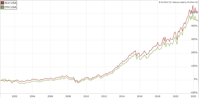
Is IYH a good alternative to XLV? Not really. It is more expensive in total expense ratio (0.41% vs. 0.10%) and the higher number of holdings (115 vs. 65) doesn’t make a significant difference in past performance. Both funds are concentrated with over 50% of asset value in the top 10 holdings. Moreover, XLV has a much higher trading volume, making it a better choice for short-term trading and tactical allocation. If concentration is a concern, the Invesco S&P 500 Equal Weight Health Care ETF (RYH) may be a better choice.
Dashboard List
I use the first table to calculate value and quality scores. It may also be used in a stock-picking process to check how companies stand among their peers. For example, the EY column tells us that a large pharma/biotech company with an Earnings Yield above 0.0450 (or price/earnings below 22.22) is in the better half of the industry regarding this metric. A Dashboard List is sent every month to Quantitative Risk & Value subscribers with the most profitable companies standing in the better half among their peers regarding the three valuation metrics at the same time. The list below was sent to subscribers several weeks ago based on data available at this time.
|
Vir Biotechnology Inc. |
|
|
QuidelOrtho Corp. |
|
|
Moderna Inc. |
|
|
DaVita Inc. |
|
|
AmerisourceBergen Corp. |
|
|
Organon & Co. |
|
|
Tenet Healthcare Corp. |
|
|
UniQure NV |
|
|
Hanger Inc. |
|
|
iTeos Therapeutics Inc. |
It is a rotating list with a statistical bias toward excess returns on the long-term, not the result of an analysis of each stock.
Be the first to comment