

Richard Drury
Investors who have bought into the idea that investing in broad market index funds is the best way to achieve their retirement goals are almost always told that a “total market” index fund is a better way to invest than buying the S&P 500 because the total market fund supposedly offers them a more diversified portfolio. We see the impact of this especially strongly in the Vanguard Target Date Funds as these funds use the Total Market Index Fund as the US stock component of their portfolio.
I bought into that “diversity is better” argument years ago, back before I started digging into the details of how the indexes that index fund follow are constructed. As a result, the bulk of my stock investment went into VTI over the past 20 years and I have left a considerable amount of money on the table.
As you can see in the chart below, the Vanguard S&P 500 ETF (NYSEARCA:VOO) that tracks the S&P 500 has significantly outperformed the Vanguard Total Stock Market Index Fund and ETF (NYSEARCA:VTI) over the last decade, even taking into account the impact of 2022’s bear market.
VOO Outperformed the VTI Over the Past Decade
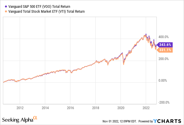
It is easy to attribute VOO’s outperformance to the outsized role that a handful of mega cap Tech stocks have played in the S&P 500’s performance. After all, at the height of the market the S&P 500’s top 10 stocks made up fully 29.09% of its total value. Even after the 2022 bear market correction got going, that percentage was largely unchanged. When I wrote about VOO on March 14, 2022 those top 10 stocks still made up 28.28% of its value.
Since the Vanguard Total Stock Market ETF holds far more stocks, investors may assume that it isn’t as top heavy in just a couple of company’s stocks. After all, at the beginning of 2022 the Vanguard Total Stock Market ETF held shares in 4,145 stocks, which is over eight times as many stocks as are held by VOO, the S&P 500 ETF. But though those Top 10 stocks do make up a smaller percentage of VTI’s total weight, it turns out that “smaller” is a deceptive term here as the actual difference between the weight of the largest stocks in both ETFs is not that large.
Both VTI And VOO Are Still Dominated By A Handful Of Mega Cap Stocks
When I wrote about VTI and VTSAX on January 7, 2022, stock prices were still very near their post-COVID peak. At that time, the top 10 stocks in VTI made up 24.85% of the total value of VTI. That was only 4.24% less than the weight the top stocks represented in VOO at the same time. Clearly, over the past 10 year time span, the diversification that is VTI’s main selling point may actually be diworsification, to use the wonderful term coined by Peter Lynch.
Possible Reasons For VTI’s Underperformance Besides Tech Dominance
VTI’s underperformance may be due to the fact that small cap and mid cap stocks are more exposed to the negative effects of weak economies, which was especially true during the bizarre economy of the lock down COVID year, 2020, and the year that followed it.
Or it might be because Total Market Indexes include unprofitable stocks including those of the most ridiculously overpriced “unicorns” like Clover Health (CLOV) down 79.54% over the past year or speculative stage biotechs like Novavax (NVAX) down 86.76% this year.
One last, very significant factor, is that VOO typically has a slightly higher yield than does VTI. As I write, the SEC yield of VTI is at 1.68% and VOO is at 1.76%. Since I usually look at total return when comparing long-term investments, that kind of yield difference will compound over the years.
There Was A Decade When The Total Stock Market Fund Outperformed The S&P 500 Fund
When you look back further into market history, you see that there was a time when Total Stock Market funds did outperform the S&P 500. The chart below illustrates that period, which covered the years that followed the crash that ended the 1990s Dot.com boom. In the chart below we see the total return of VTSMX, the investor share class of the same fund of which VTI is the ETF share class and VFINX, the investor share class of the fund of which VOO is the ETF share class.
The Vanguard Total Stock Market Index Fund Outperformed
The Vanguard 500 Fund from 2002 – 2012
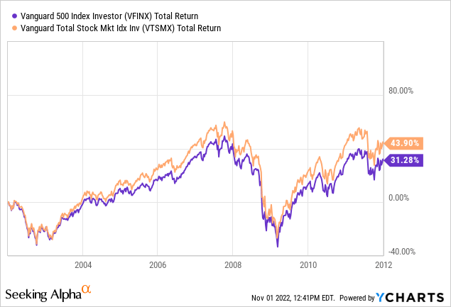
As you can see, the Total Stock Market Index Fund (VTSMX) outperformed the Vanguard 500 Index Fund (VFINX) over that period by a margin similar to that by which VOO outperformed VTI more recently.
That is why I find myself wondering if now if we are headed into another period where VTI might once again be a better long-term investment than VOO. We have seen after a period where Tech stock overvaluation led to a serious correction, that recent earnings reports make it clear that the earnings growth of most of those top 10 mega cap stocks, which used to be growth stocks, has declined into the single digits.
A Closer Look At How VOO And VTI’s Holdings Differ
To see if VTI might hold an advantage going forward, I used a very handy tool provided by the ETF Research Center, which provides a very useful tool for comparing the holdings of two ETFs. The chart below shows how the sector emphasis differs between VOO and VTI.
VOO (Right) and VTI (Left) Sector Emphasis Differences
ETF Research Center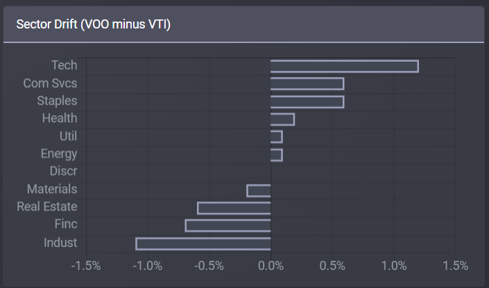
As you can see VTI holds slightly more industrial and financial stocks than VOO, though the percentage difference is quite small, with only VOO’s concentration in Tech rising above a 1% difference from VTI’s.
Getting more granular, when we look at specific holdings we see the following:
VOO Top 10 Stocks Over/Underweights Compared to VTI
ETF Research Center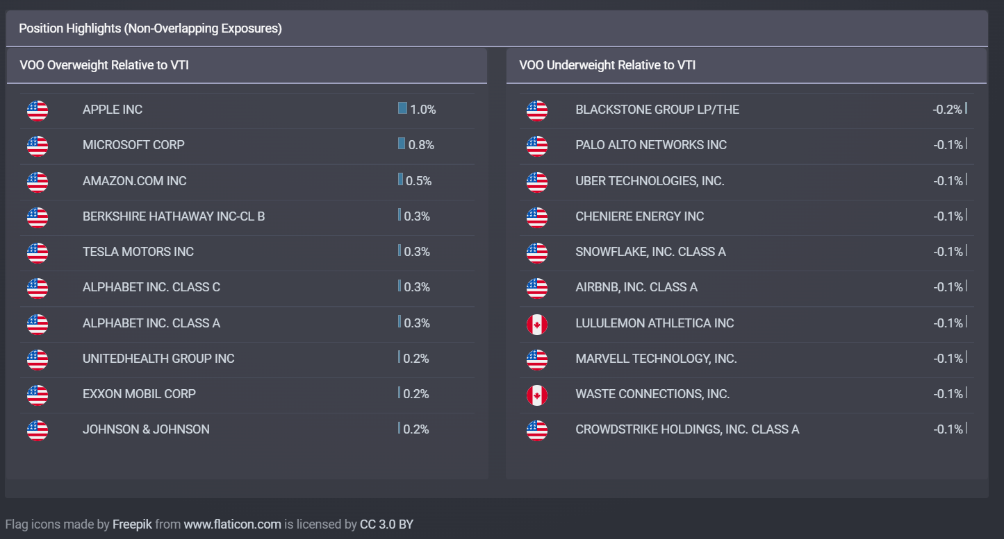
As you can see, the actual amount by which VOO is overweight in individual stocks held by both VOO and VTI is very small. Only Apple (AAPL), Microsoft (MSFT), and Amazon (AMZN) and the two Alphabet share classes considered as one (GOOG) and (GOOGL) have weights in VOO that are more than .5% greater than their weight in VTI.
You will also see that the stocks held in both ETFs that are overweighted in VTI are overweight by amounts that are only .1% or less than their weight in VOO. However, because there are over 3600 stocks held in VTI that don’t appear in VOO at all, that huge collection of stocks should contribute a significant amount of overweighting. Except that, as you can see on the graph above, the difference in performance between the two ETFs during periods when Tech stocks were not outperforming, does not suggest that those other 3600 stocks make much of an impact.
That’s because while unsophisticated investors think they are “buying the whole market” when they buy VTI, they are buying only miniscule amounts of most of the stocks in VTI that aren’t in its top 500 holdings.
The last time I did a detailed analysis of VTI’s holdings, I found that over 1500 of VTI’s stocks each contributed less than .0018% of the value of the whole ETF. 1000 of those stocks contributed less than .0008% each. This of course means that if you invest $10000 into VTI, you are buying a whopping 18 – 1 cents’ worth of each of those 1500 stocks. By the same token since their total weight is such a small part of VTI’s total value, their contribution to the overweighting of VTI vs VOO would also work out to an average of perhaps .0010%.
So both VOO and VTI’s results are fundamentally driven by the results of the same large cap stocks. The main difference, as explained in my many previous articles comparing the two investments is that the S&P 500 does not hold stocks in companies that don’t have a history of earning a profit for at least a year while the Total Stock Market index used by VTI holds almost all stocks that are actively traded on U.S. stock markets. The stocks in the S&P 500 are also selected by a committee. So there is a slight tilt towards quality in the S&P 500. You can see the details of exactly how these ETFs differ in this article I wrote in November of 2020. Though the numbers may be a bit different, the fundamental differences remain the same.
But those differences aren’t what concern us here. What we really want to know is whether the market has changed enough that VTI might repeat its outperformance of the 2000 decade.
How Similar Is Today’s Market To That Of 2000?
While considering this question, I found an interesting article from the Los Angeles Times published on January 2, 2001 that reported on how much of the weight of the S&P 500 at the height of the Dot.com boom was made up of tech stocks. It tells us,
With the tech-stock mania that began around December 1998, the sector’s weighting in the S&P; more than doubled, to 29.9%, by the end of 1999.
The peak came in the second week of last March, when tech reached 35% of the index’s capitalization.
In the aftermath of the plunge in most tech shares since March, the sector’s weighting in the S&P; 500 is now 21.9%, according to Bloomberg News data. But that still makes tech by far the largest industry represented in the index. [Emphasis mine]
The article also points out that because of how sectors are defined, quite a few stocks that a reasonable person would think of as being Tech stocks were classified in other categories. This continues to be the case now.
The 29.9% of the S&P 500 that the overvalued tech stocks made up in 1998 is not all that different from what we saw at the peak of the COVID-19 Tech boom when Mega Cap tech performed so strongly that it counterbalanced the poor performance of so many other sectors.
With that in mind, consider what happened next to the Vanguard 500 Index Fund’s (VFIAX) and Vanguard Total Stock Market Index Fund’s (VTSAX) total return back after 2001. (I am using the Admiral Share class of both of these securities in this comparison as they had recently become available and had lower expense ratios.)
VFIAX and VTSAX Total Return Jan 2001 – March 2009
Seeking Alpha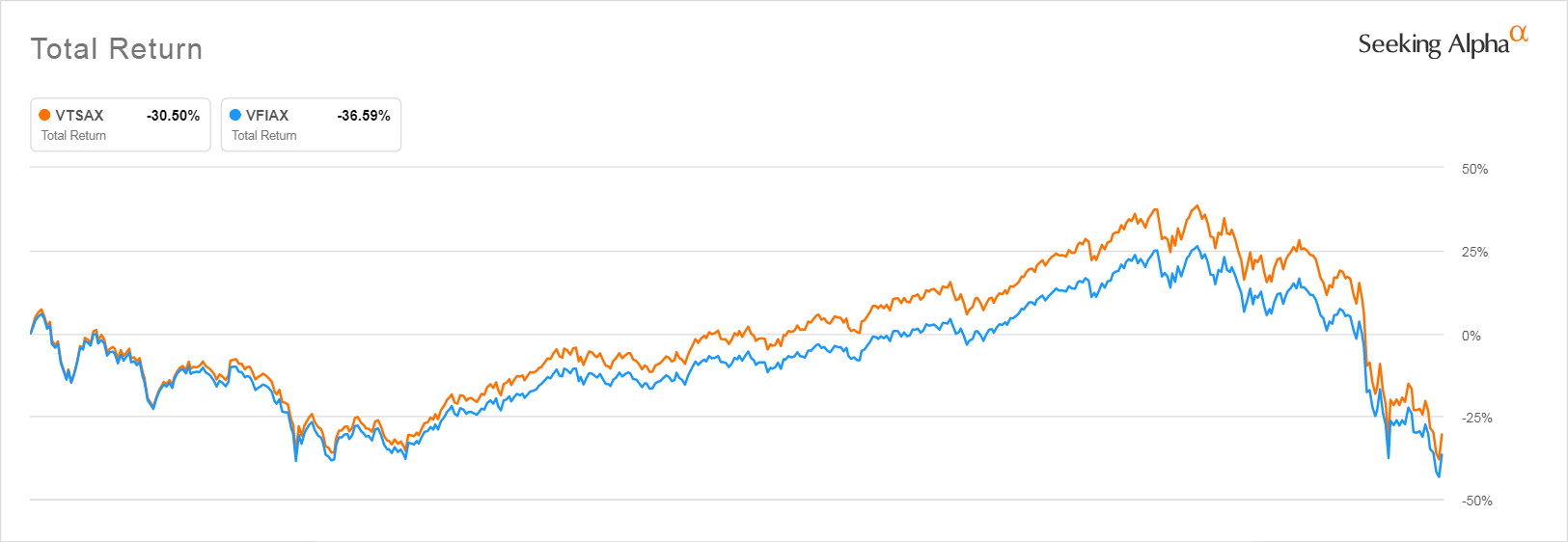
When the January 2, 2001 article was written, the author, like most investors assumed that the worst was behind them. As it turned out, the Vanguard 500 Index fund dropped by another 35.95% in the months leading to its bottom on October 7, 2001. It was after that second steep drop that investors in the Total Stock Market fund began to significantly outperform, although as you can see, they were to see their gains evaporate again in 2009.
I can’t find any data that would tell me what the sector allocation of the Total Market Index Fund would have been in 2001. But given what we know about what stocks performed best during that “lost decade” it is likely that an investor “flight to safety” in boring, dividend-paying stocks had a lot to do with it. Note too that those dividend stocks at the time included a lot of smaller financials–banks and insurers–which are held in VTI but not the S&P 500. Below you can see how the Financial Select Sector SPDR ETF (XLF) outperformed the rest of the S&P 500 as represented by VFINX during the period where VTI outperformed.
I can’t find an index product going back that far that shows how a financial sector total market would have performed, but it is probably safe to assume that smaller banks and insurers would have also outperformed over that period.
Financial Sector (XLF) vs. S&P 500 (VOO) Jan 2001 – Dec 2007
Seeking Alpha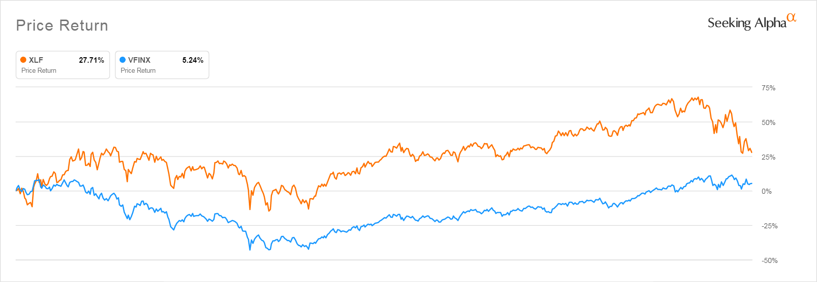
Inflation Is The Wild Card That Makes It Unlikely That VTI Will Repeat Its 2000 Decade Outperformance
The possible contribution of a healthy financial sector during the period when VTI outperformed is a concern because, as older investors will recall, inflation was very tame during that period and that interest rates were also quite healthy, too. You can see below what the average annual inflation was over the period 2000 – 2008 and what the Fed Funds Rate was during the same period. As you can see, inflation was relatively low in 2000 and stayed under 3% from 2001 to 2007. The Federal funds rate remained higher than inflation for almost all of this period.
| Year | Inflation Rate | Fed Funds Rate |
| 2008 | 3.8 | 1.92% |
| 2007 | 2.8 | 5.02% |
| 2006 | 3.2 | 4.97% |
| 2005 | 3.4 | 3.22% |
| 2004 | 2.7 | 1.35% |
| 2003 | 2.3 | 1.13% |
| 2002 | 1.6 | 1.67% |
| 2001 | 2.8 | 3.88% |
| 2000 | 3.4 | 6.24% |
Data from USinflationcalculator.com and Macrotrends.com
So as a result, during this period mortgages were very profitable for banks, because of the combination of low inflation and higher mortgage rates, while companies could afford to borrow because inflation was not driving up their cost of materials, plant, labor and transportation. Real estate boomed. Industrial companies did well, too, another sector slightly more heavily weighted in VTI.
But now that inflation has reared its ugly head and shows signs that it will persist, VTI has probably lost any advantage that the decline in Tech stocks might have given it. Rising interest rates are hard on industrials as is the inflation-driven rise in the costs of raw materials, running plants, transportation will hit them hard. At the same time, VOO is slightly heavier in Energy stocks than is VTI, too, while energy stocks are outperforming.
VTI And VOO Make Good Tax Loss Harvest Partners
Those of you investing in a taxable account can safely tax loss harvest into VTI from VOO and back again. Though, like me, you should be aware that if the market turns you may be stuck in whatever of the two you invested in at the time due to acquiring large taxable capital gains when the market surges. Because of this, I would be careful to keep my investments balanced between both ETFs, rather than switching from one to the other.
But in view of what happened in 2001, when investors, like those now, thought the worst was behind them, I’m not in a hurry to invest much in either, preferring to keep investing in individual Treasuries and CDs yielding 4% or better, with maturities ranging from 3 months to 5 years. With 5 year CDs available today yielding 4.90% it is hard to justify gambling that we won’t see another significant leg down in both VTI and VOO.
Be the first to comment