

takasuu/iStock via Getty Images
This dividend ETF article series aims at evaluating products regarding the relative past performance of their strategies and quality metrics of their current portfolios. As holdings and weights change over time, I post updated reviews when necessary.
PFM strategy and portfolio
The Invesco Dividend Achievers ETF (PFM) has been tracking the NASDAQ US Broad Dividend Achievers Index since 09/15/2005. It has 348 holdings, a distribution yield of 1.75% and a total expense ratio of 0.53%.
As described on Nasdaq website, the index “is comprised of US accepted securities with at least ten consecutive years of increasing annual regular dividend payments”. The index is reconstituted annually and rebalanced quarterly. It employs a modified market capitalization weighted methodology, so that the maximum weight of any security does not exceed 4% on rebalancing dates.
PFM invests almost exclusively in U.S. based companies (99.5%) and mostly in large caps (80.3%). The heaviest sector is technology like for the S&P 500 (SPY), but PFM has a much better balanced sector composition: the top 5 sectors are between 12.9% and 16.8%. Other sectors are below 9%. Compared to SPY, it significantly overweights consumer staples, industrials and utilities. It underweights technology, communication and consumer discretionary.
PFM sectors (chart: author, data: Fidelity)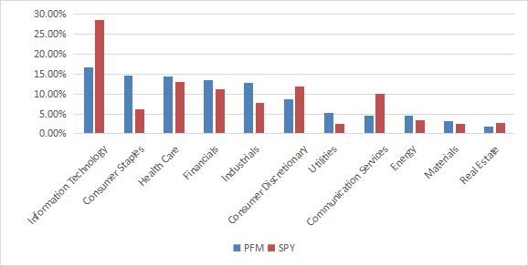
PFM is slightly cheaper than SPY regarding usual metrics (see ratios in the next table).
|
PFM |
SPY |
|
|
P/E TTM |
21.14 |
23.05 |
|
Price/Book |
3.78 |
4.3 |
|
Price/Sales |
2.23 |
3 |
|
Price/Cash Flow |
14.81 |
17.22 |
Data: Fidelity
The top 10 names are listed below and represent 26.4% of asset value.
|
Ticker |
Name |
Weight% |
EPS growth %TTM |
P/E TTM |
P/E fwd |
Yield% |
|
Microsoft Corp |
3.62 |
39.98 |
32.55 |
32.61 |
0.81 |
|
|
UnitedHealth Group Inc |
2.94 |
12.83 |
26.72 |
22.35 |
1.20 |
|
|
Johnson & Johnson |
2.91 |
41.72 |
21.97 |
16.25 |
2.47 |
|
|
JPMorgan Chase & Co |
2.91 |
72.70 |
9.94 |
13.47 |
2.62 |
|
|
Procter & Gamble Co |
2.52 |
6.94 |
28.55 |
27.34 |
2.15 |
|
|
Walmart Inc |
2.51 |
-58.77 |
48.79 |
21.74 |
1.58 |
|
|
Visa Inc |
2.46 |
26.04 |
38.70 |
32.05 |
0.66 |
|
|
Home Depot Inc. |
2.42 |
29.24 |
24.05 |
23.25 |
1.84 |
|
|
Exxon Mobil Corp |
2.22 |
202.69 |
15.09 |
12.57 |
4.32 |
|
|
Pfizer Inc |
1.92 |
118.17 |
15.73 |
12.59 |
3.02 |
Performance
Since inception in September 2005, PFM has lagged the S&P 500 by about 2 percentage points in annualized return. Despite a lower volatility, it is also behind the benchmark in risk-adjusted performance (Sharpe ratio).
|
Total Return |
Annual Return |
Drawdown |
Sharpe Ratio |
Volatility |
|
|
PFM |
271.34% |
8.34% |
-53.21% |
0.58 |
13.45% |
|
SPY |
409.41% |
10.45% |
-55.19% |
0.67 |
14.85% |
Data calculated with Portfolio123
The next chart plots the equity value of $100 invested in PFM and SPY since PFM inception.
PFM vs SPY (Chart: author)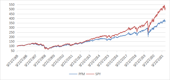
PFM was almost on par with SPY until 2012, then it started underperforming.
Comparing PFM with a reference strategy based on dividend and quality
In previous articles, I have shown how three factors may help cut the risk in a dividend portfolio: Return on Assets, Piotroski F-score, and Altman Z-score.
The next table compares PFM since inception with a subset of the S&P 500: stocks with a dividend yield above the average of their respective indexes, an above-average ROA, a good Altman Z-score and a good Piotroski F-score. It is rebalanced annually to make it comparable with a passive index.
|
Total Return |
Annual Return |
Drawdown |
Sharpe ratio |
Volatility |
|
|
PFM |
271.34% |
8.34% |
-53.21% |
0.58 |
13.45% |
|
Dividend & quality subset |
684.49% |
13.40% |
-41.52% |
0.86 |
14.62% |
Past performance is not a guarantee of future returns. Data Source: Portfolio123
The dividend and quality subset beats PFM by 5 percentage points in annualized return, and also shows better risk metrics. A note of caution: PFM return is real, whereas the subset performance is hypothetical. My core portfolio holds 14 stocks selected in this subset (more info at the end of this post).
Scanning PFM with quality metrics
Among 348 stocks held by the fund, 30 are risky stocks regarding my metrics. In my ETF reviews, risky stocks are companies with at least 2 red flags: bad Piotroski score, negative ROA, unsustainable payout ratio, bad or dubious Altman Z-score, excluding financials and real estate where these metrics are less relevant. They weigh only 10.4% of asset value, which is a good point.
Based on my calculations of weighted factors, PFM is superior to SPY in ROA and Altman Z-score, and has a similar Piotroski F-score. The return on assets is especially good.
|
Altman Z-score |
Piotroski F-score |
ROA% TTM |
|
|
PFM |
4.21 |
6.34 |
9.28 |
|
SPY |
3.75 |
6.48 |
7.38 |
In summary, PFM is slightly superior to SPY in portfolio quality.
Takeaway
PFM tracks a dividend-growth index with a market capitalization weighting and a maximum weight constraint to limit the risk related to individual stocks. Its aggregate valuation and quality metrics are slightly better than for the S&P 500. Moreover, its sector composition shows a better balance. However, its past performance is rather disappointing. Some of its competitors in the dividend growth ETF arena have a better track record in return and risk-adjusted performance: for example VIG (review), RDVY (review), DGRW (review). They have a common point differing from PFM: adding quality filters to dividend growth criteria. PFM has 4 stars at Morningstar: I find it a bit overrated. For transparency, a dividend-oriented part of my equity investments is split between a passive ETF allocation (PFM is not part of it) and my actively managed Stability portfolio (14 stocks), disclosed and updated in Quantitative Risk & Value.
Be the first to comment