

Tryaging/iStock via Getty Images
This monthly article series shows a dashboard with aggregate subsector metrics in industrials. It is also a top-down analysis of sector exchange-traded funds (“ETFs”) like the Industrial Select Sector SPDR ETF (NYSEARCA:XLI), whose largest holdings are used to calculate these metrics.
Shortcut
The next two paragraphs in italic describe the dashboard methodology. They are necessary for new readers to understand the metrics. If you are used to this series or if you are short of time, you can skip them and go to the charts.
Base Metrics
I calculate the median value of five fundamental ratios for each subsector: Earnings Yield (“EY”), Sales Yield (“SY”), Free Cash Flow Yield (“FY”), Return on Equity (“ROE”), Gross Margin (“GM”). The reference universe includes large companies in the U.S. stock market. The five base metrics are calculated on trailing 12 months. For all of them, higher is better. EY, SY and FY are medians of the inverse of Price/Earnings, Price/Sales and Price/Free Cash Flow. They are better for statistical studies than price-to-something ratios, which are unusable or nonavailable when the “something” is close to zero or negative (for example, companies with negative earnings). I also look at two momentum metrics for each group: the median monthly return (RetM) and the median annual return (RetY).
I prefer medians to averages because a median splits a set in a good half and a bad half. A capital-weighted average is skewed by extreme values and the largest companies. My metrics are designed for stock-picking rather than index investing.
Value and Quality Scores
I calculate historical baselines for all metrics. They are noted respectively EYh, SYh, FYh, ROEh, GMh, and they are calculated as the averages on a look-back period of 11 years. For example, the value of EYh for transportation in the table below is the 11-year average of the median Earnings Yield in transportation companies. The Value Score (“VS”) is defined as the average difference in % between the three valuation ratios (EY, SY, FY) and their baselines (EYh, SYh, FYh). The same way, the Quality Score (“QS”) is the average difference between the two quality ratios (ROE, GM) and their baselines (ROEh, GMh).
The scores are in percentage points. VS may be interpreted as the percentage of undervaluation or overvaluation relative to the baseline (positive is good, negative is bad). This interpretation must be taken with caution: the baseline is an arbitrary reference, not a supposed fair value. The formula assumes that the three valuation metrics are of equal importance.
Current Data
The next table shows the metrics and scores as of last week’s closing. Columns stand for all the data named and defined above.
|
VS |
QS |
EY |
SY |
FY |
ROE |
GM |
EYh |
SYh |
FYh |
ROEh |
GMh |
RetM |
RetY |
|
|
Aerospace+Defense |
-26.31 |
-11.37 |
0.0433 |
0.5956 |
0.0261 |
17.89 |
19.86 |
0.0551 |
0.7899 |
0.0389 |
20.46 |
22.12 |
-2.56% |
-1.19% |
|
Building+Equipment |
-46.95 |
24.24 |
0.0317 |
0.3607 |
0.0094 |
12.23 |
31.58 |
0.0424 |
0.8323 |
0.0229 |
9.64 |
25.95 |
-6.50% |
-8.12% |
|
Machinery+Conglomerates |
-26.58 |
4.12 |
0.0428 |
0.4300 |
0.0172 |
20.87 |
37.70 |
0.0496 |
0.5503 |
0.0308 |
19.30 |
37.66 |
-4.29% |
-10.05% |
|
Services+Distribution |
-24.35 |
23.36 |
0.0385 |
0.2970 |
0.0203 |
33.81 |
48.92 |
0.0404 |
0.4726 |
0.0295 |
22.96 |
49.18 |
-5.44% |
-10.81% |
|
Transportation |
43.39 |
4.44 |
0.0552 |
1.1618 |
0.0338 |
29.66 |
21.75 |
0.0542 |
0.7074 |
0.0206 |
23.31 |
26.64 |
-9.58% |
-18.90% |
Value and Quality Chart
The next chart plots the Value and Quality Scores by subsector (higher is better).
Value and quality in industrials (Chart: author; data: Portfolio123)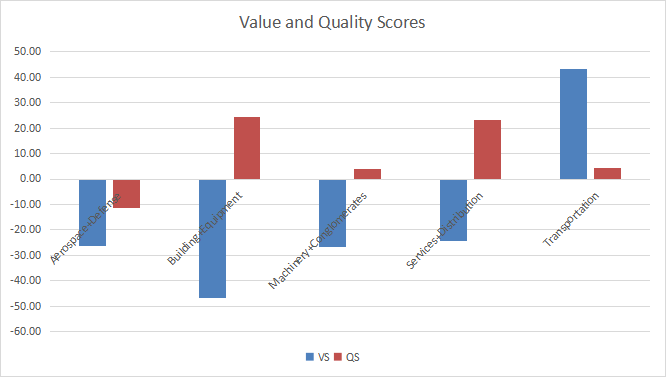
Evolution Since Last Month
Valuation has improved in all industries due to price action, the most in transportation.
Score variations (Chart: author; data: Portfolio123)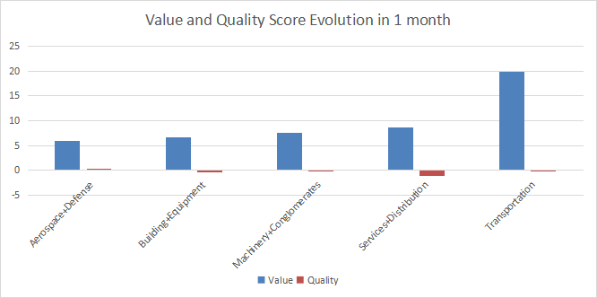
Momentum
The next chart plots momentum data.
Momentum in industrials ( Chart: author; data: Portfolio123)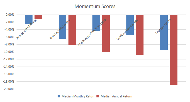
Interpretation
The industrial sector is the most overpriced one in the U.S. stock market in October 2022 regarding my metrics (see article here). Transportation looks attractive, but other subsectors are overvalued by 24% to 47% relative to 11-year averages. Overvaluation may be partly justified by a good quality score in services/distribution, and to a lesser extent in building/construction/equipment. In aerospace/defense, both value and quality scores are significantly below the baseline.
XLI Fast Facts
The Industrial Select Sector SPDR ETF (XLI) has been tracking the Industrial Select Sector Index since 12/22/1998. It has 72 holdings, an expense ratio of 0.10% and a dividend yield of 1.8%.
The next table shows the top 10 holdings with basic ratios and dividend yields. Their aggregate weight is 40.6% of asset value. The largest one weighs about 5%, so risks related to individual companies is moderate.
|
Raytheon Technologies Corp. |
5.06 |
106.65 |
28.47 |
18.11 |
2.59 |
|
|
Union Pacific Corp. |
4.97 |
22.17 |
18.32 |
16.91 |
2.64 |
|
|
United Parcel Service, Inc. |
4.84 |
77.45 |
13.15 |
12.77 |
3.72 |
|
|
Honeywell International, Inc. |
4.83 |
4.10 |
24.22 |
20.51 |
2.32 |
|
|
Deere & Co. |
4.13 |
15.95 |
18.35 |
16.05 |
1.23 |
|
|
Caterpillar, Inc. |
3.91 |
56.70 |
14.65 |
14.63 |
2.62 |
|
|
Lockheed Martin Corp. |
3.87 |
-32.26 |
23.49 |
18.00 |
2.96 |
|
|
General Electric Co. |
3.01 |
34.20 |
N/A |
25.40 |
0.47 |
|
|
The Boeing Co. |
2.99 |
41.81 |
N/A |
N/A |
0 |
|
|
Northrop Grumman Corp. |
2.95 |
29.12 |
14.01 |
20.22 |
1.38 |
Ratios by Portfolio123.
Since January 1999, XLI has outperformed the S&P 500 (SPY) in total return (441% vs. 356%). The difference in annualized return is about 80 bps (7.4% vs 6.6%). XLI beats the broad index by 6 percentage points in 2022 to date:
XLI vs. SPY year-to-date (Portfolio123)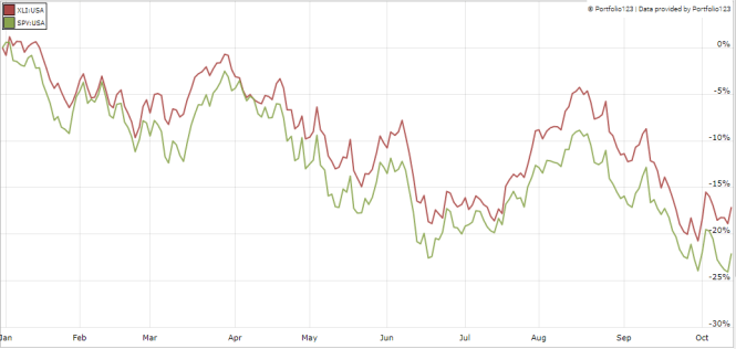
Dashboard List
I use the first table to calculate value and quality scores. It may also be used in a stock-picking process to check how companies stand among their peers. For example, the EY column tells us that a transportation company with an Earnings Yield above 0.0552 (or price/earnings below 18.12) is in the better half of the subsector regarding this metric. A Dashboard List is sent every month to Quantitative Risk & Value subscribers with the most profitable companies standing in the better half among their peers regarding the three valuation metrics at the same time. The list below was sent to subscribers several weeks ago based on data available at this time.
|
Patrick Industries, Inc. |
|
|
Robert Half International, Inc. |
|
|
The Brink’s Co. |
|
|
Matson, Inc. |
|
|
Builders FirstSource, Inc. |
|
|
Boise Cascade Co. |
|
|
Encore Wire Corp. |
|
|
Titan International, Inc. |
|
|
Sturm, Ruger & Co., Inc. |
|
|
Vontier Corp. |
It is a rotating list with a statistical bias toward excess returns on the long-term, not the result of an analysis of each stock.
Be the first to comment