

Jitalia17
Over much of the last two months, long-term US Treasuries have rebounded from a two-year long bear market. This rebound has occurred during a period of very low long-term nominal and real returns and low long-term returns relative to equities. Despite the substantial rise in yields this month, this rebound in bond returns is likely to continue. Indeed, the change in cyclical momentum (which will be defined below) suggests that the rebound is likely the beginning of a cyclical bull market in long-term Treasuries. This will be argued primarily on the basis of the performance of long-term US government bonds going back a century and a half but also on the basis of the relative performance of long-term bonds over that period.
Chart A. The 10-year yield has trended lower the last two months. (Stockcharts.com)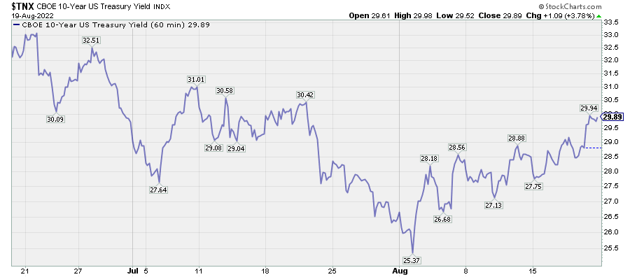
In articles over the first half of the year, I argued that stocks would likely begin both cyclical and “secular” downturns and that Treasuries would outperform over the cyclical portion of that bear market. That is, “secular” bear markets tend to see a much higher degree of cyclicality than bull markets, but it has been unusual, historically, for Treasuries to outperform stocks except in extreme circumstances. The chart below from ” The Death of Irrational Exuberance” shows only a handful of occasions in which Treasuries outperformed stocks over 20-year durations (e.g., 1910s-early 1930s, 1929-1949, 1989-2009, 2000-2020).
Chart B. Stocks only rarely underperform bonds over the long term. (Shiller data; St Louis Fed, own calculations)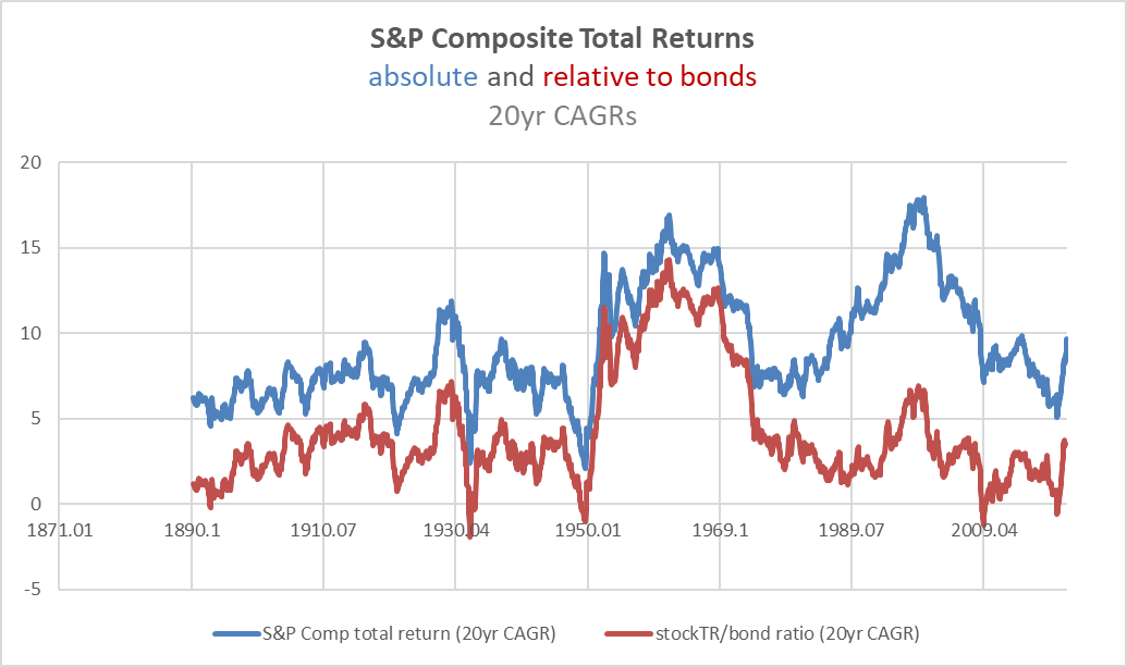
It also suggests that the relative performance of Treasuries is driven largely by the absolute performance of stocks. Each of the underperformances of equities was driven primarily by stock market weakness.
To bet on Treasuries over equities, you have to either anticipate a structural change in this relationship or you have to be willing to time the markets to one degree or another. We will return to the possibilities and ramifications of a structural change later in the article but focus primarily on the question of timing for the bulk of this piece.
Stock market outlook
Again, the performance of Treasuries relative to equities has depended largely on the performance of equities rather than Treasuries. I have written a number of articles this year and last arguing for both cyclical and “secular” downturns across the entire equity space, with tech leading the way lower. This thesis is rooted in the notion that markets do not behave in the way a bottom-up logic would suggest but that they instead behave in a way that suggests a kind of systemic logic tied into specific valuation, inflation, geopolitical/ideological, and technological dynamics. Some of the indicators that equity markets are preparing to transition (from a “secular” bull market to a “secular” bear market) include very high PE ratios, high earnings growth, highly dispersed long-term sectoral returns, high tech/low energy performance, and an energy shock. Inverted yield curves have also been signals within this context.
For additional detail on some of these relationships, please see the following articles:
A Primer On Long-Term Sector Rotations And Where We Are Now
Conjunction & Disruption: Technology, War, And Asset Prices
The Death of Irrational Exuberance (linked above)
How And Why I Am Breaking My Rules For Commodity Trading
The US has only had three “secular” bear markets in the last century (the Depression, the 1970s, and 2000s). The worst of them, the Depression, came without warning, and even after the first stomach-churning selloffs, intelligent people were still claiming that markets had a reached a ” permanently high plateau“, or in today’s language, they had “a floor”. As I have discussed in previous articles, academics still argue today that equities were not overvalued in 1929. It is possible they are correct in a specific academic sense, but if I were an investor in 1929, and one of those academics traveled through time to visit me, I would be pretty ticked off if they were to tell me that, based on their research, equities were “fairly valued”. We are just not good at understanding how and when these “secular” bear markets begin.
Market cycles point to trouble ahead
But, we have hints such as those mentioned above, and since “secular” bear markets are highly cyclical-that is, market cycles are pronounced during “secular” bear markets-this is where paying attention to cycles can pay off. Market cycles are a constant through bull markets and bear markets, but in “secular” bear markets, they are amplified, and the cycle dominates everything. In a “secular” bull market, the relationship between stock prices and earnings tends to break down; in “secular” bears, stocks become extremely attentive to earnings and commodity momentum.
Chart C. Stocks tend to behave more cyclically during “secular” bear markets. (Shiller)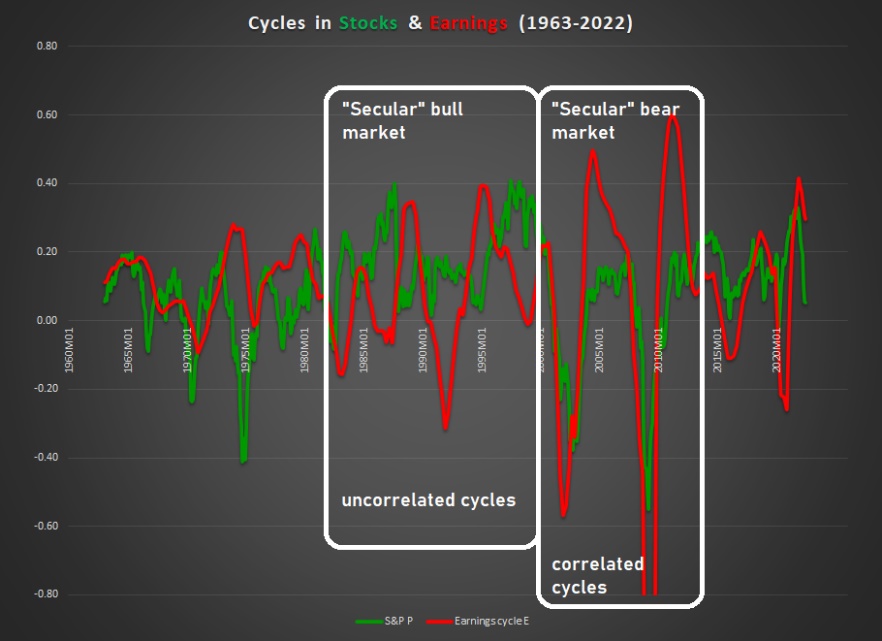
In short, in “secular” bear markets, earnings, commodity prices, stock prices, GDP, and interest rates start moving in sync. Then they begin to decelerate, and then they begin to fall. From this point of view, the biggest development of 2022, apart from the damage sustained by tech stocks, is the growing uniformity in the deceleration of these factors-earnings, commodity prices, stock prices, GDP, and interest rates. Many of these factors have seen absolute declines as well, but the defensive sectors have yet to show signs of a real downturn yet.
Chart D. Relative rotation graphs show defensive sectors have been most resilient. (Stockcharts.com)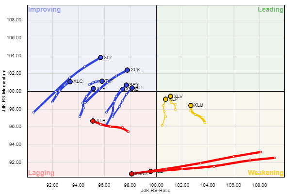
Unfortunately, nothing is for certain until after it has already occurred (and even then, there is room for skepticism), but this deceleration in this “secular” context appears to confirm a bearish market outlook. We ought to expect continued economic and market deterioration over the next two years, with significantly lower levels of earnings, stock prices, commodity prices, inflation, GDP, and interest rates.
Chart E. Earnings, interest rate, and commodity cycles tend to be correlated with one another. (World Bank; Shiller; St Louis Fed)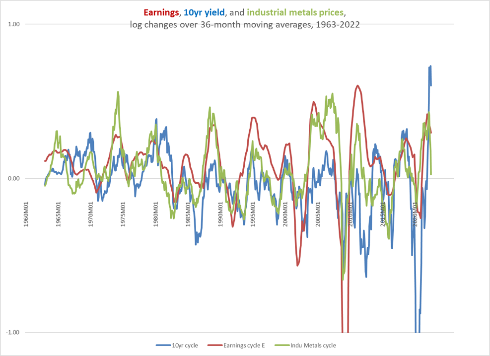
Earnings, industrial metals, and yields are the three most important cyclical indicators. Other measures (for example, energy prices or industrial sector stocks) provide additional information but primarily in the context of the momentum found within these three factors, and within that triumvirate, earnings are first among equals.
So, when I speak of “cycles” here, I mean the collective momentum of these factors, where momentum is measured either as a 16-month rate of change or the rate of change relative to a 36-month moving average (as in the chart above). The 16-month rate of change was something I first observed about a decade ago, primarily in the shape of a 69-week rate of change (69 weeks happens to be about 16 months). A 36-month moving average is essentially a smoothed-out 18-month moving average (that is, 36÷2=18) which allows us to draw out some of the relationships between these market factors (earnings data only comes out once a quarter, for example) as well as some interoperability (so to speak) with older, annual-frequency datasets, a problem that we will run into later in the article.
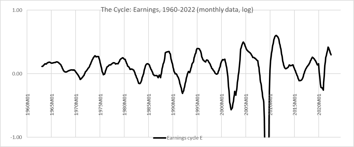
In June in The Cyclical Downturn Has Likely Begun, I argued that industrial metals were likely pointing to a deceleration in S&P 500 earnings, and that has clearly begun. I have broken Chart E into Charts F, G, and H below to highlight the recent change in momentum.
Chart F. Industrial metals are a cyclical bellwether and they are sharply decelerating. (World Bank) Chart G. Earnings are clearly decelerating too. (Shiller; S&P Global) Chart H. The long-term interest rate cycle is starting to decelerate. (Shiller; St Louis Fed)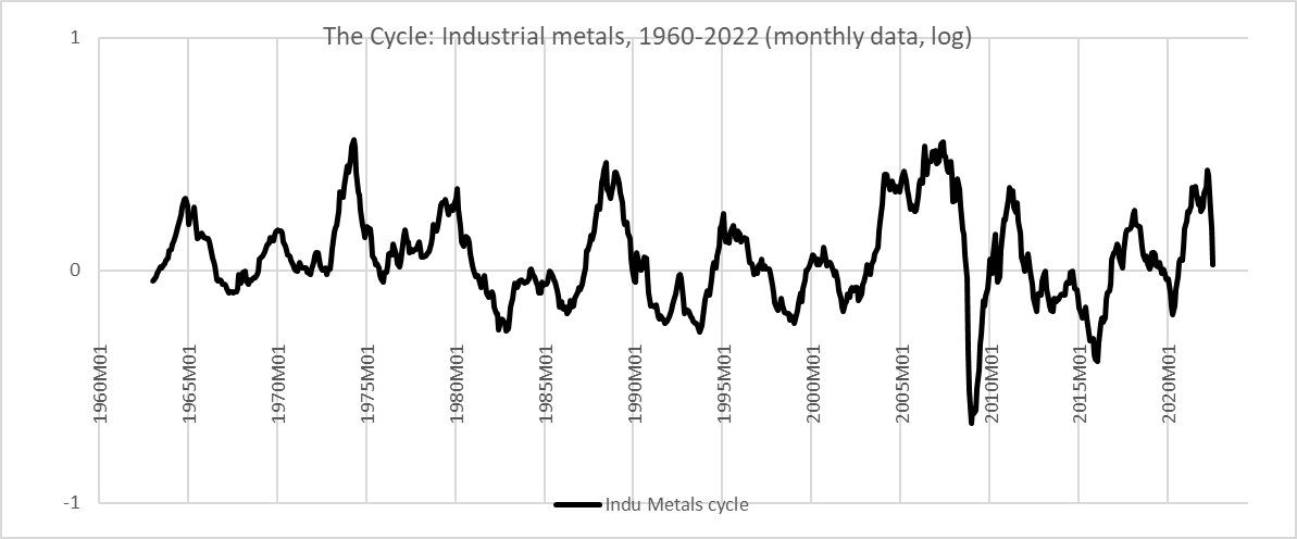
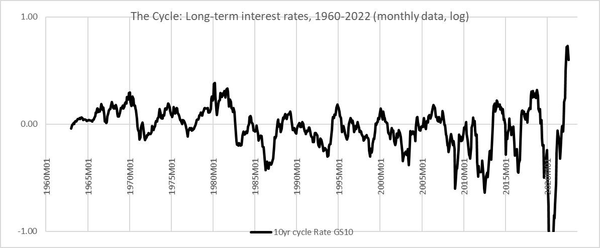
In the table below, we can see the cross-correlations among cyclical momentum in these factors since 1960. Interest rate cycles are most highly correlated with the rate of consumer inflation, followed by energy and industrial metals.
Chart I. Interest rate cycles since 1960 are most highly correlated with consumer inflation and energy cycles. (Shiller; St Louis Fed; World Bank)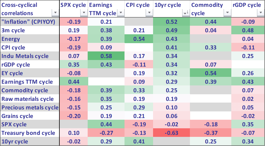
This is somewhat misleading, however. The most consistent correlation, calculated by taking both the averages of their respective three-year rolling correlations and the respective standard deviations of those correlations, is with industrial metals. The nondurables PCE price index cycle (the maroon line in the chart below) comes in a close second.
Chart J. Nondurable goods price cycles also have a strong relationship with interest rate cycles, but energy prices should start becoming a cyclical drag. (St Louis Fed)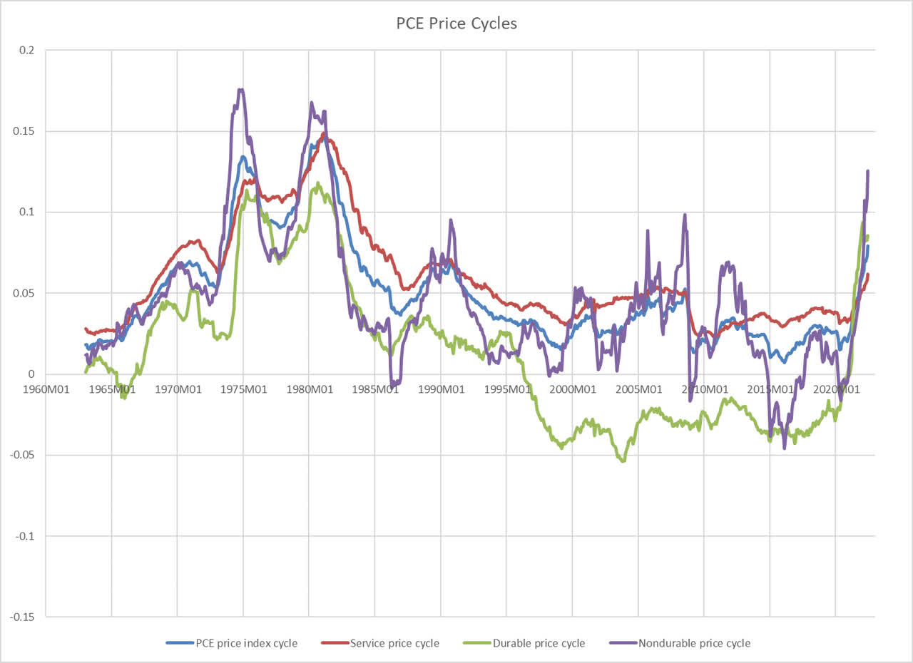
As of June (July numbers will not be reported for another week), that volatile price cycle remains elevated, but sensitive to fuel prices, the nondurables price index is likely to decelerate in the coming months.
In short, the deceleration in the most highly cyclical elements of the market – earnings, commodities, and interest rates – suggest absolute future declines in the coming quarters, and this is likely to lead to bond price appreciation on top of the interest accrued along the way.
Let’s take a step back from the cyclical element for a moment to put some of this in the context of long-term historical behavior. That might help think about how to arrange our expectations about the future and how a given investor can utilize this information in structuring their own portfolio.
Historical performance of Treasuries
Falling interest rates mean bond prices go up. But what is the downside risk here?
Below is a total return index for long-term Treasuries based on the monthly stock and bond data Robert Shiller publishes. For the period prior to 1953, he based this monthly data on the annual average for a given year which is then used as the January value for that year. All subsequent values are calculated as weighted averages of that January value and the subsequent January value. For a long-range chart such as the one below, this makes no real difference. But, when it comes to studying rates of change, momentum, and relative performance, this can produce misleading results. To adjust for that, I took the volatility of corporate bonds, for which there is ample monthly data, and superimposed it on the annual values of the government bonds. Thus, I made sure to preserve the absolute annual values while introducing month-to-month variation. The useful fiction, in other words, is that there was a constant spread between corporate bonds and long-term Treasuries over the course of any given year. This leads to some occasional anomalies, but it is almost certainly a more faithful approximation of government bond yields than is supplied in Shiller’s data set, if simply because it makes sure the averages of the monthly values of each given year are identical to the actual annual averages of the original data sets Shiller has relied upon.
Chart K. Treasury bear markets tend to be short. (Shiller; St Louis Fed (own calculations))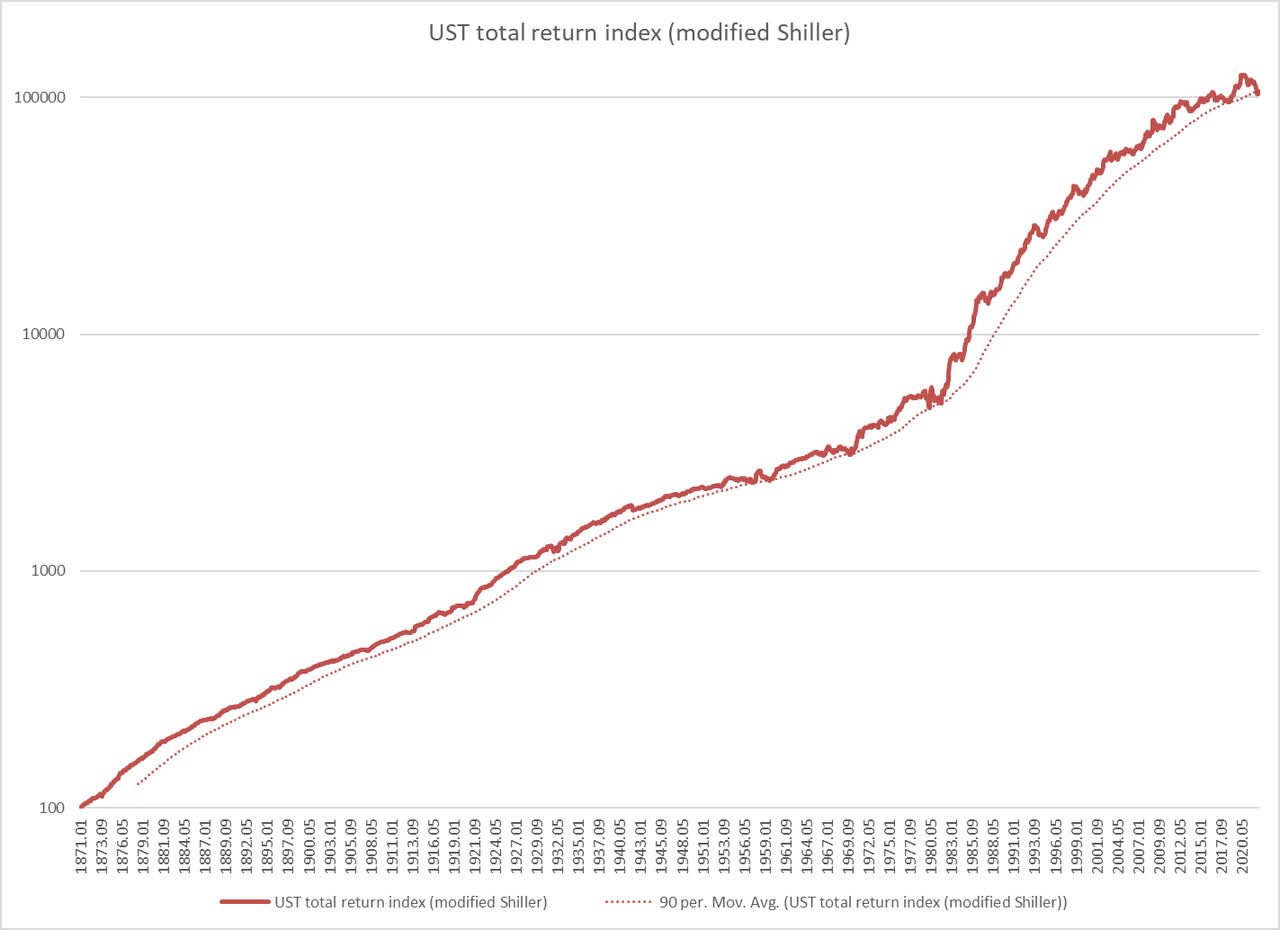
I had expected that using corporate bonds would make the new data set unrealistically volatile, but the most volatile reasonable version I came up with is still less volatile than the post-1952 data. It will be difficult to see, but the chart below shows Shiller’s original values in blue, alongside a recentered Shiller value (in orange) that is more in tune with the actual movements of a host of corporate bond data sets (supplied by the St Louis Fed) rebased to the Treasury yield.
Chart L. Monthly Treasury yields have to be reconstructed somewhat. (Shiller; St Louis Fed) Chart M. Rebasing corporate bond yields around a recentered annual value produce broadly similar results. (St Louis Fed; Shiller (own calculations))
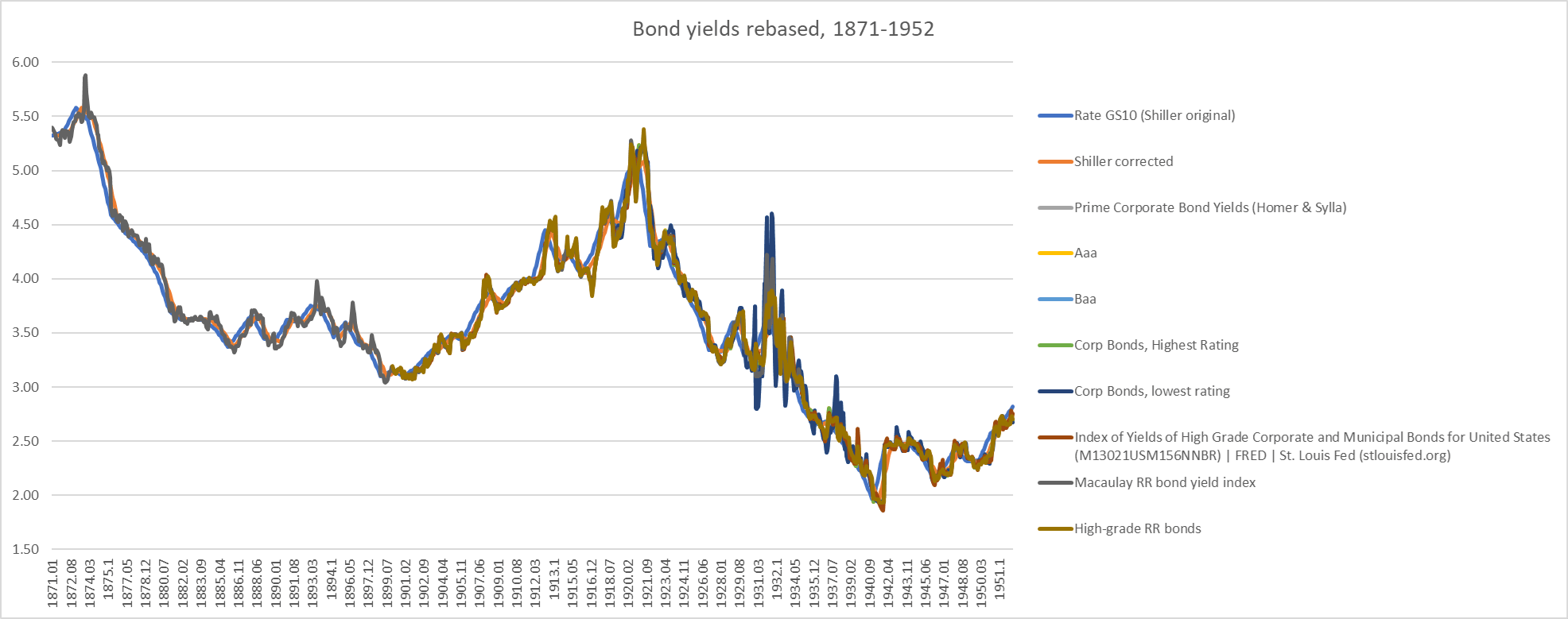
Ultimately, I decided that a geometric mean of nearly all of the values in the chart above, rebased on the annual Treasury yield values, provided the closest fit. I also cross-checked it with quarterly 19th Century New England municipal bond data and felt that this was a close approximation.
So, the discussion below will be based on that reconstituted version of Shiller’s data.
The chart below shows nominal and real long-term Treasury returns. These real returns have been consistently positive, except (primarily) for the bursts of inflation that occurred in the 1910s, 1940, and 1970s. Nominal returns have been among the lowest since the 1970s, and it is these already low nominal returns combined with a cyclical burst of Covid-era inflation that has pushed those real returns negative.
Chart N. Negative real bond returns are driven by inflation supercycles. (Shiller; St Louis Fed (own calculations))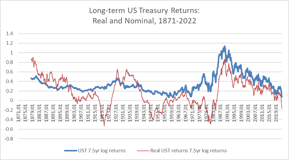
The chart below shows nominal yields and returns for long-term Treasuries.
Chart O. Nominal bond returns are highest after supercyclical peaks in yields. (Shiller; St Louis Fed (own calculations))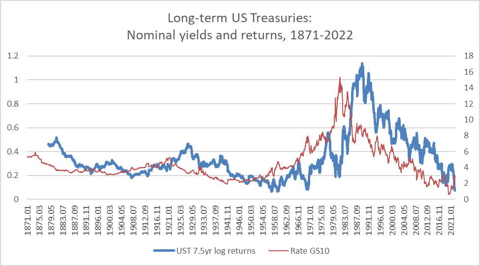
Unsurprisingly, nominal returns are highest after yields peak at supercyclical highs (such as the 1870s, 1910s, and 1970s). Although we know that yields can go lower and even negative, history suggests that we should not expect high bond returns in the future.
But Chart K above also suggests that it is unlikely that one would see nominal losses in the Treasury space over the long term (unless the US government were in danger of default). Real losses would therefore have to come from high inflation. As I argued in “The Death of Irrational Exuberance”, that is more likely to occur in the 2030s than the 2020s, and cyclical indicators, as mentioned above, point to disinflation being in charge for now.
The following chart shows the relationship between nominal yields and cyclical Treasury returns (“cyclical” here is the 16-month rate of change).
Chart P. Cyclical bond returns are highest after cyclical yield peaks. (Shiller; St Louis Fed (own calculations))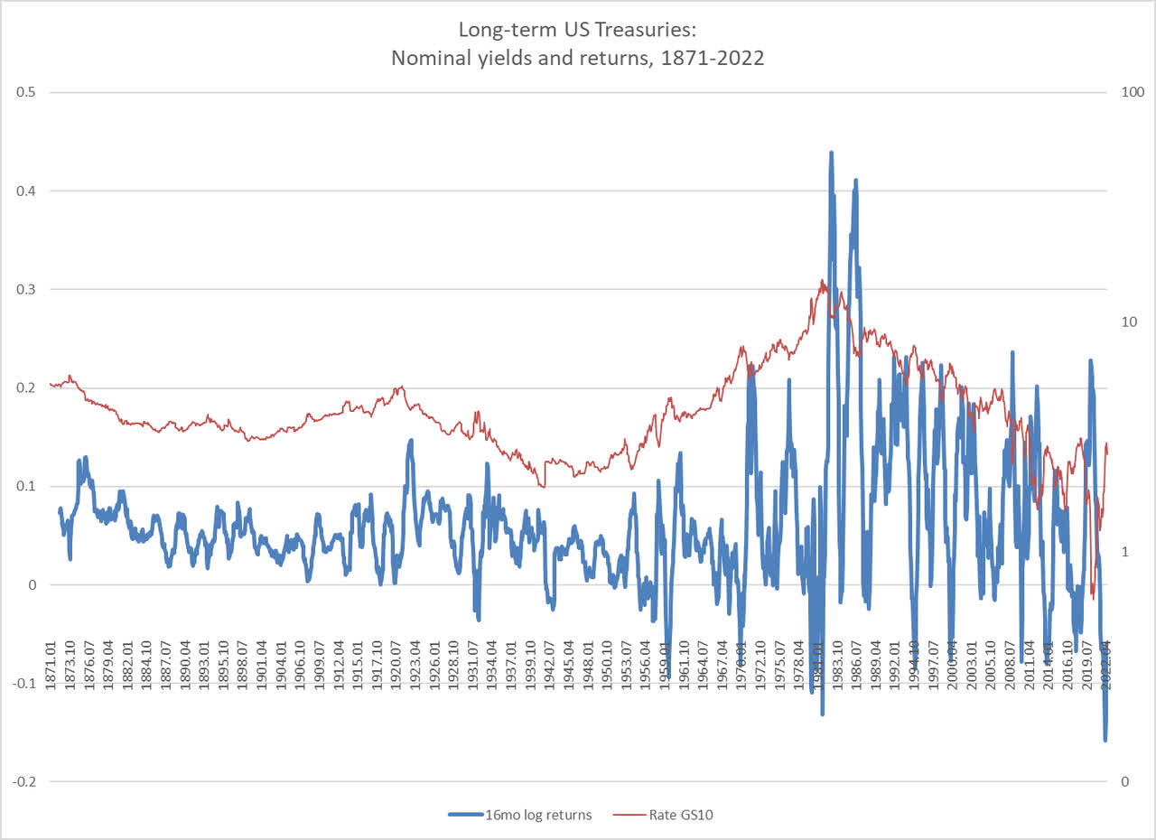
The current interest rate cycle has seen one of the worst performances ever, but there is precedent for more sustained losses, most notably in the late 1970s. Why is it unlikely that we will see a similar such decline? Again, commodities are falling and inflation pressures seem to be moderating. In such an environment, geopolitically-driven spikes in commodity prices are more likely to cut into growth than reignite inflation.
We are likely, therefore, to see a stabilization in long-term interest rates and probably a sustained cyclical decline.
The chart below shows both the cyclical and supercyclical growth rates in nominal long-term Treasuries, just to emphasize the point about how unusually poorly Treasuries have performed and that it is unlikely for this to continue indefinitely.
Chart Q. The recent peak in yields made for some of the lowest cyclical and long-term nominal returns ever. (St Louis Fed; Shiller (own calculations))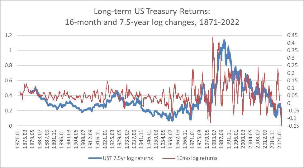
In short, it is not unusual for long-term Treasuries to experience cyclical bear markets, but it would be unusual for them to experience long-term absolute declines. An absolute decline would require a structural breakdown emanating from a collapse in the legitimacy and viability of the American state and the dollar. Nowadays, with the global body politic increasingly ill, nothing can be ruled out, but there is no indication (so far as I am aware) of an imminent risk to the viability of the US government. In the absence of tangible political risk and with decelerating inflation pressures, there seems to be relatively low downside risk between now and the end of 2024.
Treasuries and relative performance in 2022
Historically, the risk in Treasuries has not come from risk of absolute losses but from underperforming other asset classes, most notably equities but also corporate bonds and commodities. I am going to set corporate bonds aside – partly because my Treasury dataset, as described above, is partly shaped by corporate bond yields-and assume that they are likely to provide returns somewhere between equities and Treasuries. Instead, I am going to focus on the performance of Treasuries relative to equities and commodities.
Just as Treasuries have, over the last 150 years, exhibited little risk of absolute losses, stocks have rarely underperformed Treasuries. That was illustrated at the beginning of the article in Chart B. When stocks have underperformed, it has been primarily due to stock market weakness. As a general rule of thumb, where one expects stocks to be at risk of a substantial decline, Treasuries are likely to be a better alternative, simply because they are unlikely to see sustained absolute losses.
This tactic has had mixed results this year, as illustrated in the chart below. The ratio of the SPDR S&P 500 ETF (SPY) to the iShares 7-10 Year Treasury Bond ETF (NASDAQ:IEF) – IEF covers the range of Treasuries closest to those in the dataset used in this article – is almost exactly where it was at the beginning of the year as of the time of writing.
Chart R. The SPY/IEF ratio has oscillated in 2022. (Stockcharts.com)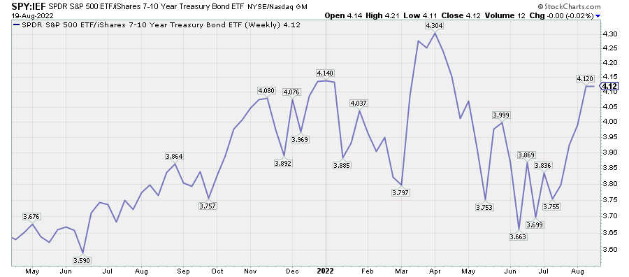
Longer maturity bond ETFs like TLT have underperformed the SPY by 15% this year. The long-term zero-coupon bond ETF ZROZ has underperformed by 27%.
Chart S. Stocks have strongly outperformed long-duration Treasuries in 2022. (Stockcharts.com)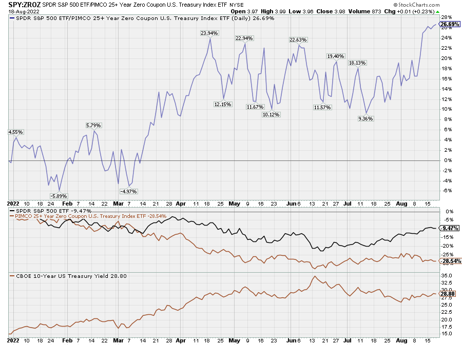
Bonds just did not get the kind of lift that ought to be expected from a typical equity selloff.
This year’s big winner has been commodities, which have beaten both equities and bonds by a wide margin, although this situation has eased somewhat during the exceptional market rally of the last two months.
Chart T. Commodities have been the big winner of 2022, although they have given up ground in the last two months. (Stockcharts.com)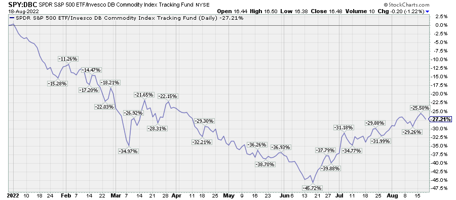
So, how might we untangle this mess?
Relative performance tactics
Historically, relative momentum has been a good way of anticipating subsequent returns, especially if this is placed in context of a longer-term outlook.
Let’s start with the relative performance of commodities.
Using the World Bank’s monthly commodity data for 1960-2022, I have found that someone who traded in line with the 16-month rate of change of nearly every commodity/bond ratio would have outperformed both commodity and Treasury markets. (This assumes that they could properly track spot commodity prices, which is difficult to do, and avoided any friction that comes with frequent trading). In other words, if one only held either commodities or bonds depending simply on which had stronger momentum, that person would have (theoretically) beat both markets.
The chart below, for example, suggests that one should have switched from commodities to bonds in the spring.
Chart U. Commodity momentum has decisively declined relative to that of Treasuries. (Stockcharts.com)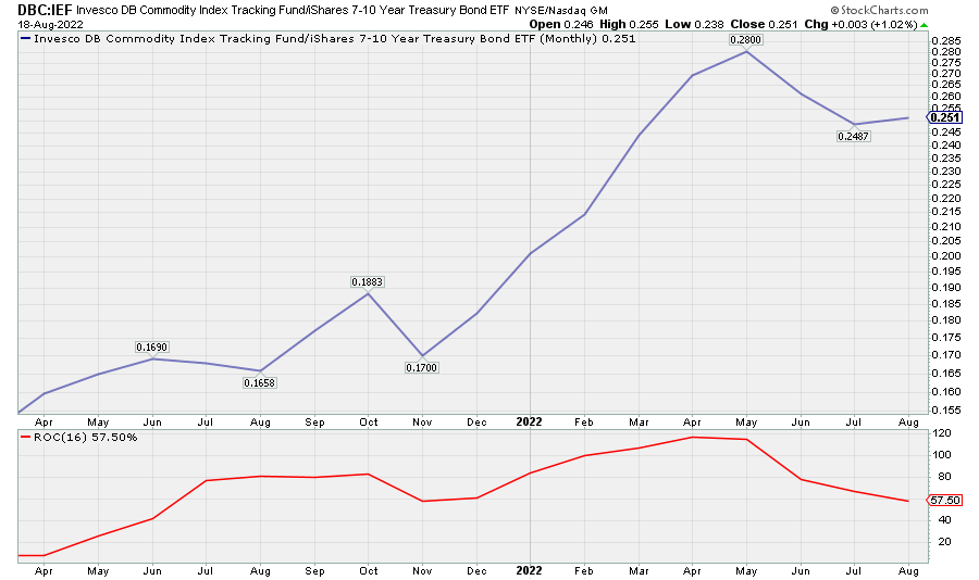
Perhaps readers will find that using a different way of measuring momentum is more effective, but the point is that momentum appears to have provided useful information historically. And, for now, momentum continues to tilt in favor of 10-year Treasuries over a basket of commodities (of the 40-odd commodities that I keep tabs on, all of them, except natural gas and tea, have negative momentum relative to Treasuries). Tack on the friction that comes up with commodity trading, and Treasuries look even more promising at the moment.
What about equities?
This same technique appears to have worked when comparing stocks and bonds, so long as one ignores dividends. Even setting dividends aside, this technique works less well on a stock/bond cross than it does a commodity/bond cross, simply because stocks are less cyclical than commodities and yields. Because of the correlation between commodities and yields, using bond prices as the denominator amplifies the cyclical signal. Stocks are just less reliably cyclical, although there appears to be a genuinely secular trend towards greater equity cyclicality over the last fifty years.
The chart below illustrates that, I believe, although it requires a little bit of explanation.
Chart V. Commodities have historically been more cyclical than stocks, but this has begun to change in last 30 years. (Fama-French; Shiller; St Louis Fed; World Bank (own calculations))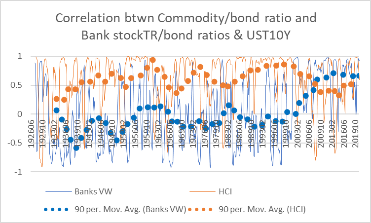
The thin orange line is a 16-month rolling correlation of my Historical Commodity Index/bond ratio and long-term Treasury yields in 1926-2021. The thick, bubbly orange line is a 90-month moving average of that 16-month rolling correlation. The thin blue line is a 16-month rolling correlation of a ratio of the total returns for the Fama-French cap-weighted Bank index relative to bond prices and long-term Treasury yields over the same period.
Commodity/bond ratios have been consistently positively correlated with yields over the last century, although there have been sharp deviations at times. Stock/bond-vs-yield correlations have tended to be negative for much of their history. This is slightly exaggerated in bank stocks (partly why I wrote that investors ought to generally ignore rising interest rates when it comes to analyzing financial stocks), but as with bank stocks, there has been a market-wide shift to a positive correlation, even more positive than the commodity/bond-vs-yield correlation. This preceded the 2008 financial crisis and has remained stable since.
This makes things a little tricky. The stock/bond relationship is not stable, but it has become more reliable in the last thirty years, even more reliable than the commodity/bond relationship. I wish I had a good explanation for the underlying driver here, but none comes to mind. There appears to be a negative correlation between the commodity/bond-vs-yield and stock/bond-vs-yield correlations, but it does not really illuminate what the driving forces are.
In any case, the central point here is that the stock/bond relationship is typically less amenable to straightforward cyclical techniques. But, my research suggests that momentum is still a reliable guide. I have found, for example, that using a 10-month stochastic oscillator on stock/bond ratios tends to outperform a buy-and-hold stock strategy. In plainer language, when the stock/bond ratio falls below the midpoint between 10-month highs and lows, bonds tend to outperform, and when the ratio rises above that midpoint, stocks tend to outperform. This 10-month period is something I derived from the 16-month cycle. As I said before, this 16-month cycle was something I got from what appeared to be 69-week cycles in yields (and other highly cyclical phenomena). In the article I linked to, I also noted that there were often weaker 23-week cycles embedded within the 69-week cycle (23 x 3=69). Two 23-week cycles make 46 weeks, which comes to about 10 months.
Again, as with the 16-month cycle, I have not optimized it for trading results. Perhaps a 9-month or 11-month oscillator would work better.
A 10-month oscillator also works better on some sectors and styles than others. For example, historically, it appears to have done excellently on real estate stocks but not so well on defensives like nondurables (essentially Staples), retail, and healthcare stocks. The chart below shows the hypothetical 10-year performances of this technique used on the tech/bond ratio.
Chart W. Using a 10-month stochastic oscillator seems to help time cyclical and (implicitly) secular bear markets. (Fama-French; Shiller; St Louis Fed (own calculations))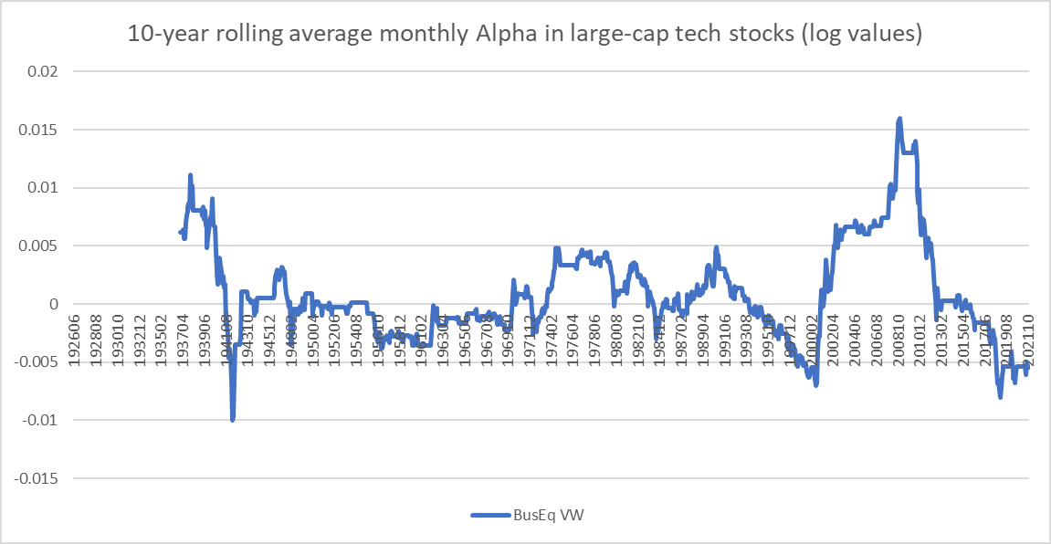
Unsurprisingly, all of the “alpha” here comes from holding bonds during the 1930s, 1970s, and 2000s, that is, the three major bear markets of the last century. The chart below shows the hypothetical performance of this technique on healthcare stocks.
Chart X. Stochastic oscillators work less well on defensive sectors. (Fama-French; Shiller; St Louis Fed (own calculations))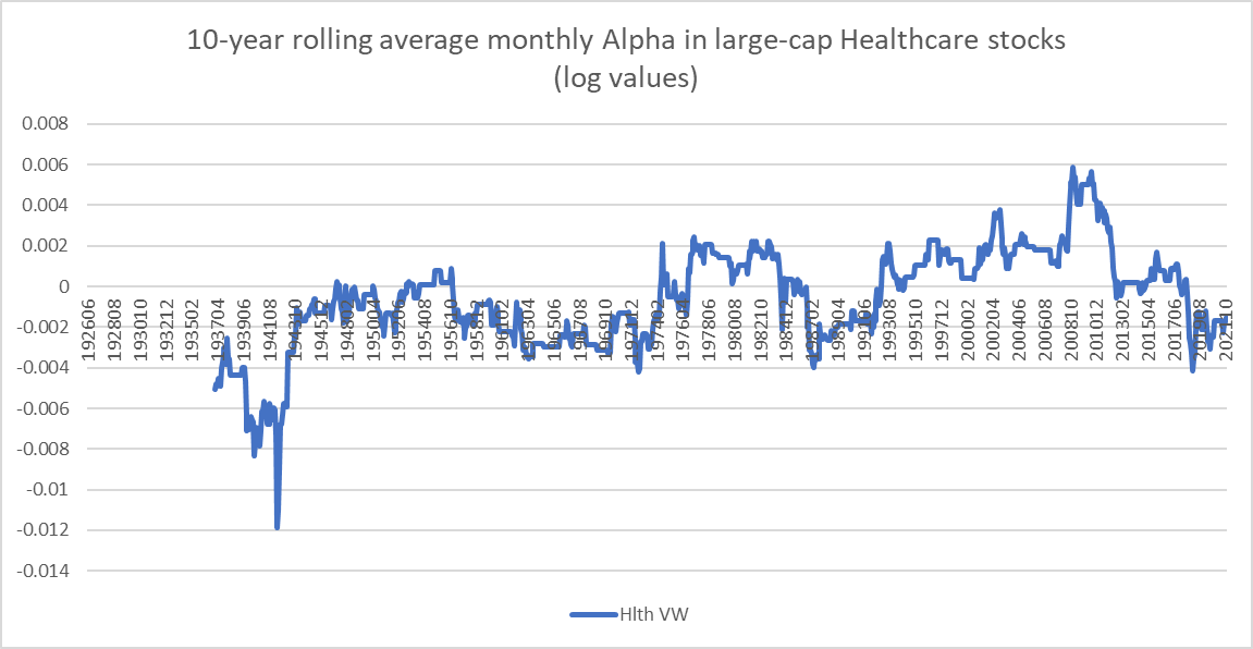
The performance has been much less satisfactory, again, probably because of the less cyclical nature of healthcare stocks. But, much of the periodic “alpha” that was generated came during the equity bear markets of the 1970s and 2000s.
I believe this suggests that, although these technical indicators may show promise as stand-alone tools, their use can probably be amplified when used in conjunction with “secular” and cyclical theses.
At present, the SPY/IEF ratio is well above its 10-month moving average, as illustrated in the chart below. (Note the rate-of-change indicator in the lower panel, as well. Adding a three-month moving average lowers the outperformance of the indicator but also reduces the number of trades necessary. Note also that the Covid low appears here as the culmination of a cyclical decline rather than a bolt from the blue; this is also suggested by the yield curve has inverted in 2019).
Chart Y. Momentum currently favors stocks over bonds, but I believe this is a head fake. (Stockcharts.com)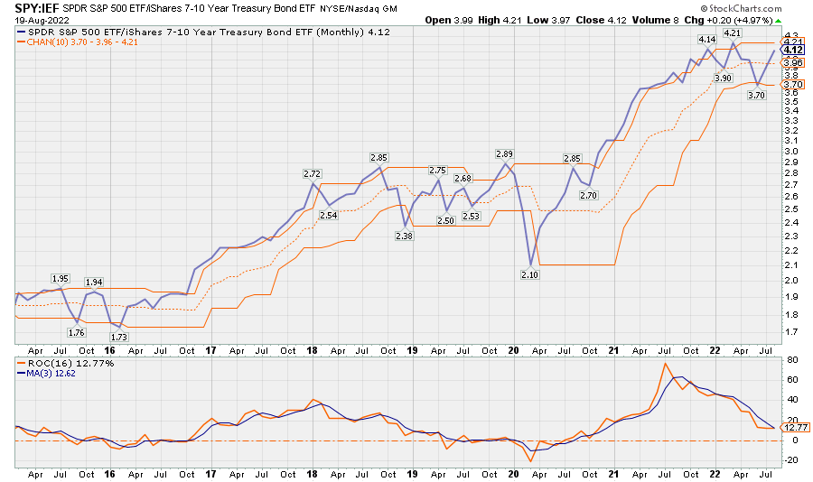
A strict application of this stochastic oscillator technique above suggests that one would do better to be long stocks rather than bonds, but the larger context-that is, that we are entering both “secular” and cyclical bear markets-suggests that this condition is not likely to hold, just as it did not hold after 2019. Therefore, I believe that the stock/bond ratio being above the midpoint actually presents a good place to underweight equities and overweight Treasuries.
Summary
The chart below uses the 16-month rate of change of the S&P Composite/Treasury bond ratio to determine when to hypothetically switch from stocks to bonds since the 1880s. Although this is a less reliable indicator than the oscillator when it comes to stocks, especially over the last century, it has also produced positive results during the bear markets of the 1930s, 1970s, and 2000s.
Chart Z. Relative momentum appears to have had a long history of anticipating subsequent returns in stocks and bonds. (Shiller; St Louis Fed (own calculations))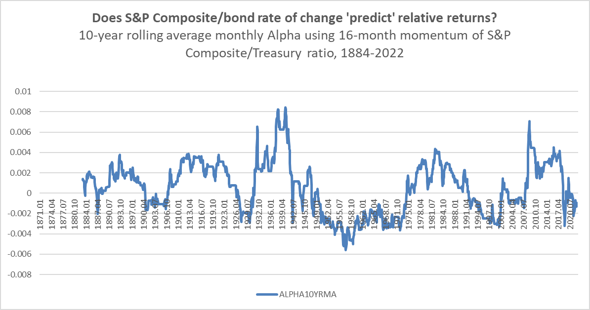
Using bond ratio momentum is more effective against commodities, as shown in the following chart.
Chart AA. Using relative momentum works better on commodities than stocks, but both seem to outperform their respective markets in the long term. (Shiller; St Louis Fed; World Bank (own calculations))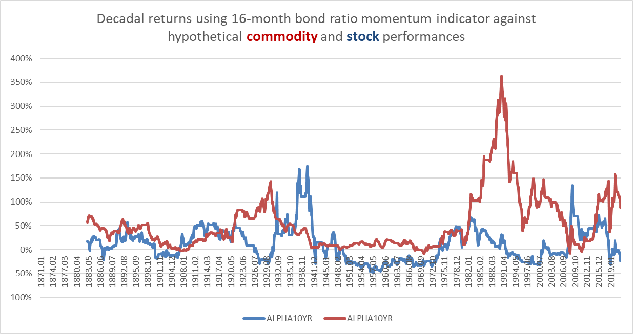
I believe that judicious use of these simple indicators may help protect investors from the risk of severe declines in equities, especially within the context of a transition to a “secular” bear market. Those “secular” conditions, outlined earlier, include valuations well above their historical averages, long-term earnings growth rates above their historical average, a steady and accelerating deterioration in the world political-economic system, the effective conclusion of a technological adoption cycle, the long-term outperformance of tech and underperformance of energy, highly dispersed sectoral returns, and the subsequent revival of energy and other commodities resulting in an energy shock, along with an inverted yield curve. These are the kinds of conditions that emerge at the conclusion of a “secular” bull market. What follows has historically been an extended unwinding and reversal of the previous trends and the emergence of pronounced cyclical trends, not only in commodities, earnings, and interest rates, but in equities and GDP, as well.
At the moment, the signals are negative for commodities relative to bonds and negative for bonds relative to equities, but my argument is that the totality of market conditions points to an outperformance of bonds against both commodities and equities over the coming quarters, as longer-term trends point to a substantial “secular” and cyclical downturn. In other words, the rise of the stock/bond ratio, in my opinion, is a “head fake”. It is possible that the ratio will oscillate around some level as it did in 2018-2019, but the “secular” and cyclical pressure points to a greater likelihood of a strong outperformance of bonds over both stocks and commodities to 2024. Over the long term, with yields as low as they are, there is little reason to feel great enthusiasm for Treasuries. Their chief virtue is that, at the moment, the bears are likely coming and Treasuries are just the least dull blade in the drawer.
IEF tracks an index of US Treasury bonds with maturities between seven and ten years. This broadly conforms with the span of interest rate maturities approximated by the historical series used in this article and so is the most likely to conform to the patterns laid out here. Treasury ETFs that track longer maturities such as TLH, TLT, and ZROZ may provide higher returns in the event of the anticipated decline in long-term yields, but the relative lack of historical data for those durations makes it difficult to be certain how they might behave under different market conditions.
Chart AB. Longer duration ETFs may outperform IEF as yields fall. (Stockcharts.com)
There is good reason to expect IEF to outperform both commodities and equities, based on the historical patterns outlined in this article. Those with higher risk tolerances or greater certainty about the likelihood of a decline in long-term yields can consider ETFs that encompass bonds with longer durations.
Be the first to comment