

ollo
The remainder of the 2020s are likely to see low and volatile returns across all asset classes. This is one of the central themes of my market thesis for the last year. Another theme has been the reversal of the primary trends of the previous decade. Tech dominance would likely be replaced by a cyclical triumvirate-energy, first and foremost, followed by industrials and basic materials. A third theme has been that this “secular” bear market would also likely be highly cyclical in the sense that equities, earnings, yields, and commodities would tend to move together and see a couple of years of dramatically falling levels followed by a couple of years of dramatically rising levels, only to be followed by a couple of years of falling levels, and so on. In other words, markets will likely be cyclical in more ways than one. That includes commodities.
History suggests that one of the ways to anticipate cyclical developments is to understand and anticipate supercyclical (or, what people often call “secular”) trends. Supercycles occur with relatively regular occurrence across asset classes, but rarely at the same time. The tech boom of the 1990s was followed by the commodity boom of the 2000s, which was followed by the tech boom of the last decade. When an asset class slips out of its supercyclical frenzy, it is much more likely to return to more prosaic patterns, although often not until undergoing a spectacular crash first.
The remainder of the 2020s are likely to see low and volatile returns across all asset classes. That means, we are likely hitting an air pocket in markets wherein no real supercycles will be allowed to develop, although the conditions for the following supercycle-most likely in commodities-will no doubt be gestating in preparation for the 2030s.
Are we in a commodity supercycle now?
As I argued in March, commodities are probably not currently in a supercycle. Rather, the last couple of years have seen an exceptionally powerful cycle, and cycles tend to be brief (a couple years) while supercycles tend to be long and relentless (five to twenty-five years), with the most frenzied period typically lasting five to ten years. What typically comes between commodity supercycles is two decades of low, cyclical returns (e.g., the 1920s and 1930s, 1950s and 1960s, 1980s and 1990s, and the 2010s and 2020s, I suspect).
Chart A. Anticipating what happens next likely hinges on differentiating whether this is a supercycle or simply a strong cycle. (Stockcharts.com)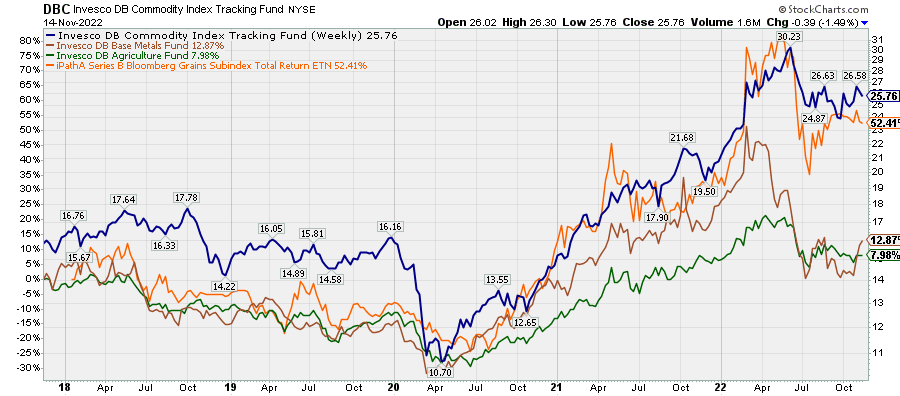
I outlined five key indicators and principles for anticipating commodity prices, based on nearly 300 years of data, in March. In May and June, in Conjunction & Disruption: Technology, War, and Asset Prices, I placed these in larger historical context. Although commodity supercycles tend to ignite as tech booms collapse, global political order begins to disintegrate, and PEs fall (as in the 2000s), that has not always been the case. The transition from the Roaring Twenties to the Depressing Thirties saw a tremendous collapse in stock prices, especially tech stocks (autos and radios), but there was no commodity boom. Quite the opposite. And although the interwar years were transitioning towards confrontation, most notably with the Japanese invasion of Manchuria in the early 1930s, there was still a hope for peace, infamously, as late as Munich. And PE ratios did not really fall-earnings did.
Supercycles-using this word in a somewhat grander sense-in technology, global warfare, yields, and inflation tend to be spaced out by about three decades, with two decades of stability being followed by a decade of disruption and chaos. The 1910s, the 1940s, the 1970s, and the 2000s were periods of war and high commodity inflation. The years in between saw the diffusion of new consumer technologies and rising global stability.
History suggests that it is just too soon for a real commodity supercycle to begin. Although we may find that the 2020 lows in commodity prices-particularly in real, inflation-adjusted terms-turn out to be the low for the next twenty years, it is unlikely that commodities are in a period of sustained and frenzied growth. By my count, we have only had five commodity supercycles in the last 200 years, and three in the last 100 years, so we do not have a lot to go by, but-despite the emergence of factors that will likely contribute to very long-term real commodity price appreciation (wars and rumors of wars, peak equity valuations, a tech bust)-this is not yet enough. Equity markets still need to be flushed of their excesses.
In the meantime, under the assumption that we are not in the middle of a commodity supercycle but rather on the downslope of a commodity cycle, it is cyclical indicators we should be applying to commodities. Those indicators point to considerable downside risk between now and 2024, and at the moment, it appears that grains-things like wheat, corn, soybeans, rice-are at heightened risk of decline.
Funds that track grains prices
Teucrium runs the Teucrium Wheat Fund (NYSEARCA:WEAT), the Teucrium Corn Fund (NYSEARCA:CORN), and the Teucrium Soybean Fund (NYSEARCA:SOYB) that each track futures in their respective commodity spaces (unfortunately, more general grain ETNs like JJG and GRU have either been recently suspended or will soon expire). Each of these commodities look set to decline between now and 2024 and to significantly underperform long-term Treasuries and gold in the meantime. (Fertilizers and energy commodities are probably not far behind).
In addition to the commodity articles mentioned earlier, I have also written on gold (GLD), industrial metals (DBB), and agricultural commodities (DBA). Agricultural commodities, as a category, are more internally idiosyncratic than industrial metals, so they can be somewhat more difficult to generalize about. The grain components, especially at this moment, however, look much more in lockstep and ready to decline effectively in unison, which is why I am focusing on them at this moment. Making up about a third of the DBA fund, they will likely provide additional downside pressure over the coming quarters.
Cyclical indicators
This brings us to the two most predictive cyclical indicators for grains and most commodities generally: cyclical rotation and momentum. Commodity cycles tend to begin with precious metals (most notably gold), then work their way through industrial metals, textiles (e.g., cotton and rubber), agricultural commodities, fertilizers, and, finally, energy (most notably crude oil). As discussed in other articles on commodities, we can also squeeze corporate earnings and Treasury yields into this progression, with the former tending to coincide with industrial metals and the latter energy. This progression, although imperfect, tends to produce patterns in relative strength indicators that are, on average, predictive of medium-term (16-month) returns in commodities (and their relative performance against defensive instruments like Treasuries).
To summarize: at the supercyclical level, commodities, consumer inflation, earnings and bond yields tend to move all together, but at the cyclical level, there tends to be this progression, and it appears to be predictive.
The other weapon in our arsenal are momentum indicators. These can be used on absolute prices and on ratios between a given commodity or commodity class and other asset classes, most notably bonds. The most appropriate indicators can vary depending on one’s trading horizon, how frequently one wants to trade, and on whether one is looking at raw, absolute prices or relative performance and precisely which relative performance one is looking at.
These are all factors that emanate from the way commodity/market cycles progress. Unfortunately, many of the most sensitive indicators that provide high-frequency signals seem to produce higher returns than the more ponderous indicators. Both because I am not especially interested in short-term, high-frequency trades and because it is possible that conditions could change between the time I write this and the time readers read it, I am going to use lower frequency indicators that nevertheless appear to allow one some hope of outperforming a buy-and-hold strategy.
Before outlining what these indicators are signaling at present, it is important to note that the primary databases I am using for this article are monthly series that stretch back to the 1960s but I have also cross-checked these indicators on more generalized commodity data going back to the 1870s that I have pieced together from various sources.
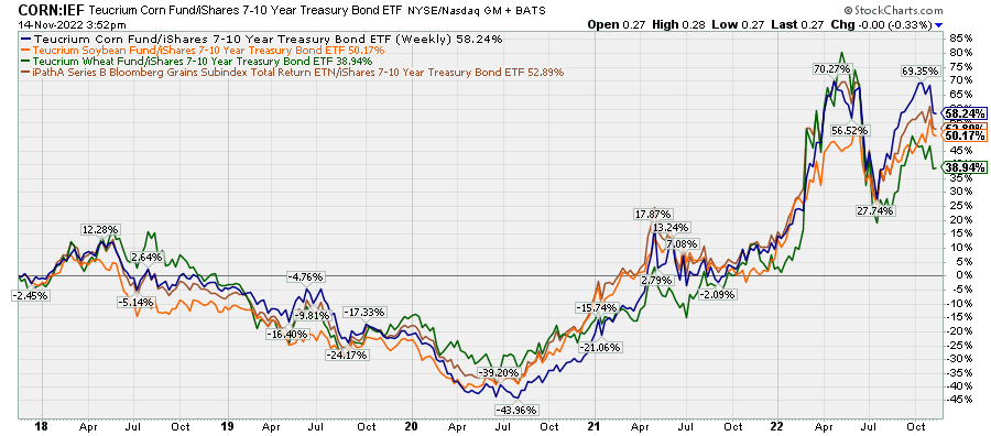
These datasets are mostly monthly averages of spot prices, but ETFs and ETNs in the commodity space tend to attempt to track futures. Futures prices often deviate from spot prices, usually to the detriment of those who try to bet on commodities, thanks to contango and the need to roll futures contracts as their expirations approach. The chart below shows the performances of CORN, SOYB, and WEAT relative to the spot prices of their respective underlying commodities over the last ten years. Although these funds can occasionally outperform, the tendency is to underperform over time, roughly by about 3% per year.
Chart B. Grains funds underperform the spot prices of underlying prices by about 3% per year. (Stockcharts.com)
The following chart shows March 2024 contract prices relative to spot prices for corn, wheat, and soybeans this year. The discounts that were available in the first half of the year have largely evaporated.
Chart C. There was a huge discount on grains futures in March, but this is now gone. (Stockcharts.com)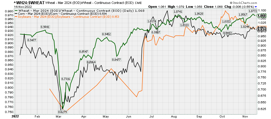
To take a long position in these funds, you really have to believe that there is considerable upside potential.
This is not to dismiss the utility of these instruments. The following chart shows that, since its inception, the grains subindex JJG (the now defunct ETN equally weighted between wheat, corn, and soybeans) has held its own against both equities (SPY) and Treasuries (IEF).
Chart D. Despite the drawbacks of these kinds of commodity funds, they can still provide outperformance at key times. (Stockcharts.com)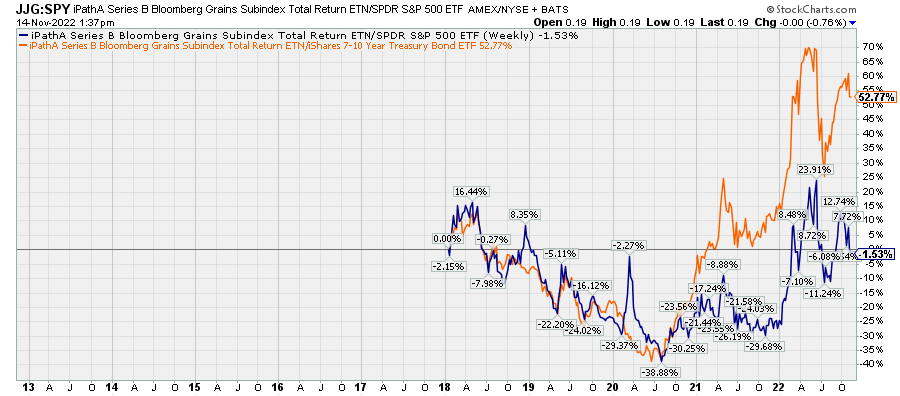
The point is not that these funds are uninvestable. Far from it. The point is, you really need to believe that the wind is at your back. The indicators mentioned above suggest to me that, for now, the headwinds are only growing stronger. Let’s look at some of them.
Cyclical progression indicators
In the following chart, I try to simply illustrate the nature of the progression from gold (in black in the top panel) to industrial metals (bottom panel) to agricultural commodities (in orange), using their 69-week (about 16 months) rates of change. Momentum peaked first in gold, then in metals, then in agriculture. Note that gold was clearly accelerating well before the outbreak of Covid and the appearance of the forces (money printing, fiscal largesse, supply chains) that are commonly blamed for the subsequent burst in inflation during the pandemic. Gold (and the yield curve?) knew what was coming!
Chart E. Typically gold momentum leads industrial metals lead agricultural commodities. (Stockcharts.com)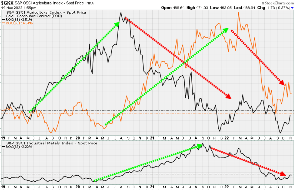
This permits gold, and especially the ratio of gold to a given commodity to anticipate subsequent performance in that commodity, going as far ahead as 16 months into the future. The chart below shows the ratio of gold to a grains index (I am using an equal-weighted index of corn, soybeans, wheat, and rice here) alongside the subsequent 16-month momentum of the grain index.
Chart F. Even though gold has rather consistently outperformed grains over the last 60 years, it still anticipates grains momentum. (World Bank)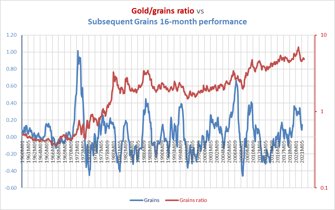
The overall correlation is quite weak (0.08), primarily because gold has been in a long-term uptrend relative to grains. If you look more closely, however, you might notice that many of the wrinkles in the gold/grain ratio were followed by similar patterns in subsequent grains momentum. The spike in grains momentum in the mid-1980s, for example, was preceded by a surge in the gold/grains ratio. The collapse in grains momentum during the GFC in 2008-2009 was preceded by a collapse in the gold/grains ratio.
If you take every 16-month segment of the chart above and calculate rolling correlations for the entire chart, the picture improves. The average correlation over all of these periods is 0.53. For the gold ratios of the individual commodities, they are 0.57 (soybeans), 0.59 (corn), 0.56 (rice), and 0.61 (wheat).
Extreme moves in the precious metals ratios are often predictive of subsequent extreme moves in the relevant commodities, and this is especially true in grains. A two-standard deviation down-move in the PM/grains ratio, which held as of October, has historically been followed by a 35% (±20%) decline, on average, in grain prices between that period and the next 32 months. In other words, prices at some point over the next 32 months tended to be down 35%, on average, from their current price. Over the next 16 months, an average decline of 26% (±25%) was experienced, suggesting that most of the declines occurred in that period. Over the next six months, a 19% decline (±28%) occurred. Even a single standard deviation move in the PM/grains ratio has tended to produce a fall somewhere between 6% and 47% in grains prices sometime between then and the next 32 months.
The chart below illustrates the volatility the PM/grains ratio.
Chart G. Extreme moves in PM/grains ratios typically precede inverse moves in the denominator. (World Bank)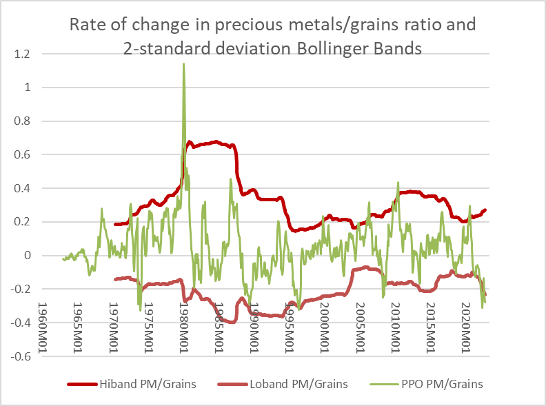
It should be noted that there is a -0.83 correlation between these 2x moves (in either direction) and the subsequent performance of the PM/grains ratio itself, meaning that the PM/grains ratio is likely to be higher than it is now in February 2024. Although this has historically been driven by declines in grain prices, precious metals have shown a slight tendency to improve over these durations. This suggests, in other words, that gold and other precious metals would make for a better commodity bet than grains over the next year or so.
Calculations from World Bank data suggest that wheat and corn prices are primarily responsible for driving the current extreme moves in the overall grains space. The subsequent 16-month performance of wheat/Treasury ratios and corn/Treasury ratios have been -27% and -13% on average after having moved down two standard deviations, meaning that long-term Treasuries are likely to provide superior returns over the next year.
The gold/wheat, gold/corn, and gold/soybeans ratios are all currently in excess of one standard deviations, and this has historically suggested quite consistent outcomes across these three grains. They typically underperform Treasuries by 23%-24% (±28%-35%) over the next 16 months.
To my naked eye, it appears to me that the momentum in the battle between grains and Treasuries is already moving in favor of the direction of Treasuries, despite their weakness this year, which can be seen in the following two charts.
Chart H. Grains and Treasuries tend to be inversely correlated. (Stockcharts.com) Chart I. Momentum in the ratios between grains and Treasuries appears to be decelerating. (Stockcharts.com)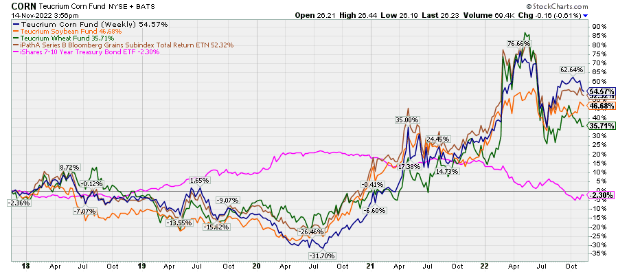
Momentum indicators
As I indicated earlier, there are a handful of momentum indicators that we can look at when trying to anticipate subsequent commodity moves, and these can generally be applied to raw price data and to ratios with Treasury bonds. These include the 16-month rate of change, a rate of change relative to a 36-month moving average, a rate of change relative to a 15-year moving average, a percentage price oscillator (PPO), which is essentially the same as a MACD, and 10-month relative strength stochastic oscillator. These momentum indicators are all built around the intuitions that 16-month and 7.5-year rates of change are among the most meaningful.
At present, these indicators are diverging. Although some of the high-frequency indicators are pointing to a shift in momentum from grains to Treasuries, the steadier varieties do not yet indicate that. But, some of the steadier indicators are showing a deceleration in the absolute price data. The following two charts show one of the most consistent indicators, the PPO histogram, on both raw prices for soybeans, wheat, and corn for their respective long-term Treasury ratios.
Histograms for soybeans, corn, and wheat prices each show clear deceleration from June of this year. I have backtested this measure to 1975, in the middle of the 1970s commodity supercycle. By my calculations, and assuming that one could buy and sell at average monthly spot prices, a long-only strategy that traded on momentum in the histogram for grains would have outperformed a buy-and-hold strategy by about 2.5x over the 1975-2022 period. A long/short strategy would have outperformed by about 5x.
Chart J. Momentum in PPO histograms of grains prices suggest weakness in grains in coming months. (World Bank)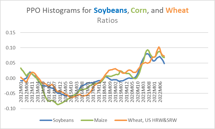
The following chart shows histograms for these commodities bond ratios. Soybeans are decelerating relative to long-term Treasuries while momentum in wheat and corn have bounced in recent months.
Chart K. Momentum in grains/bonds ratios are more equivocal. (World Bank)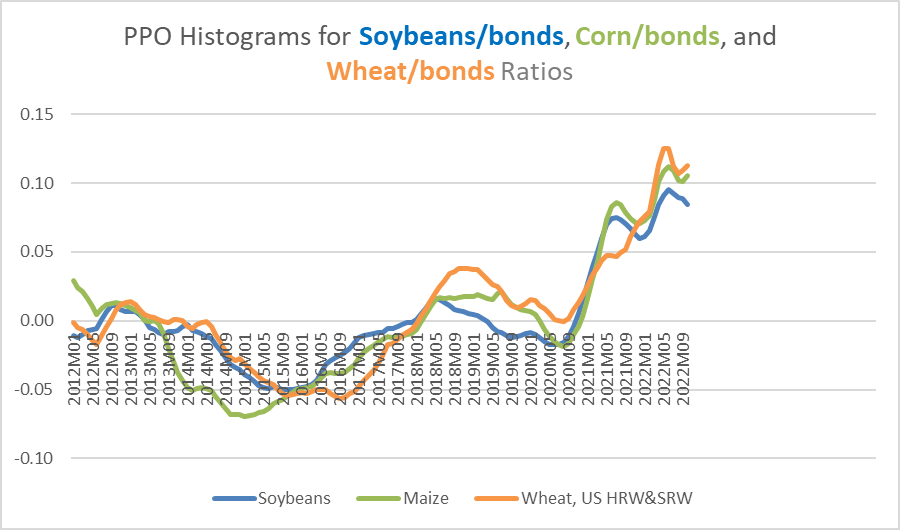
These are indicators that have to be checked monthly or even weekly. If a strategy of switching between long positions in these commodities and Treasuries had been employed on the basis of the direction of travel of these histograms-again, assuming frictionless trading-a portfolio would have beat a buy-and-hold strategy in grains by about 13x and would have beat buy-and-hold in 10-year Treasuries by 1.25x from 1975 to 2022.
Conclusion
Except in soybeans, these short-term indicators suggest that momentum is weakest in Treasuries at the moment, but momentum in the absolute prices of these commodities has been breaking down decisively and uniformly. Against the backdrop of the extreme moves in the overall commodity cycle over the last three years, which was outlined in the previous section, we should expect further significant downward pressure in these commodities, especially relative to Treasuries, going well into 2024. Layer on top of that the low likelihood that we are in a commodity supercycle, and there is little reason to expect significant upside in these grains. Layer on top of this the technical problems of tracking spot prices and the drip-drip of underperformance of these types of funds, and it is hard to argue in favor of them at this point in time. Defensive assets like gold and Treasuries are likely to outperform grains by a considerable margin over the next 16 months. There is also a better than even chance that they will underperform industrial metals but outperform energy.
This might also prove to be trouble for stocks that are tied into the production, transportation, and sale of grains. A quick scan of correlated equities produces names like Pangaea Logistics Solutions (PANL), Intrepid Potash (IPI), LSB Industries (LXU), Adecoagro (AGRO), Bunge (BG), Titan International (TWI), Brasilagro Companhia Brasileira de Propriedades Agricolas (LND), and Archer Daniels Midland (ADM). As you can see from the following charts, many of these companies trade within ranges of grain prices over the last four years.
Chart L. The sideways direction of many of these ratios illustrates their correlations with grains prices. (Stockcharts.com) Chart M. IPI is in the fertilizers business. (Stockcharts.com) Chart N. LXU produces chemicals for agricultural markets. (Stockcharts.com) Chart O. AGRO’s farming segment comprises planting, harvesting, processing, and marketing of rice. (Stockcharts.com) Chart P. BG is involved in the supply and transport of agricultural commodities. (Stockcharts.com) Chart Q. TWI produces wheels, rims, and tires for agricultural machinery. (Stockcharts.com) Chart R. LND focuses on the acquisition, development and exploration of agricultural properties. (Stockcharts.com) Chart Q. ADM engages in the production of oilseeds, corn, wheat, cocoa, and other agricultural commodities. (Stockcharts.com)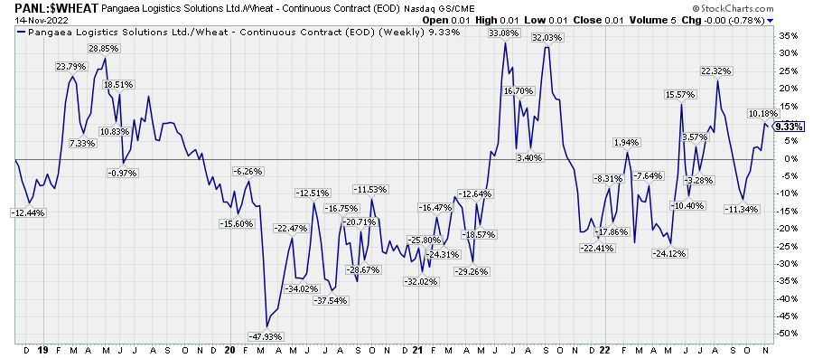
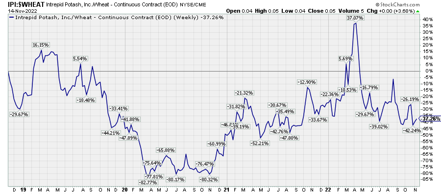
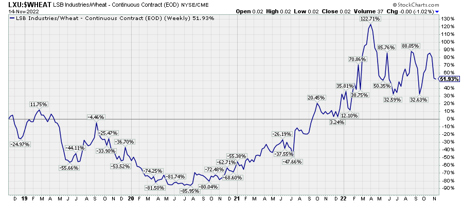
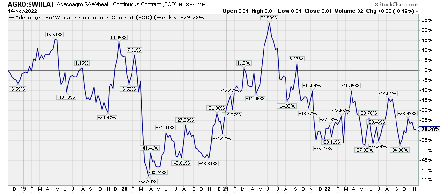
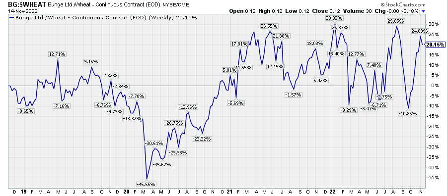
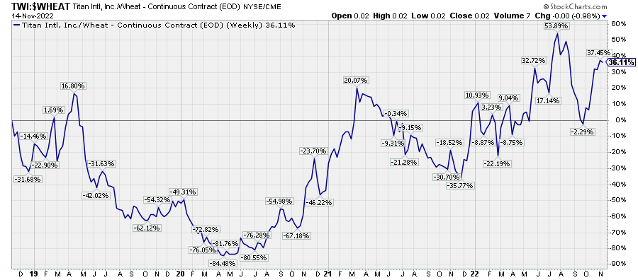
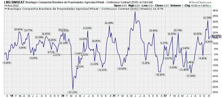
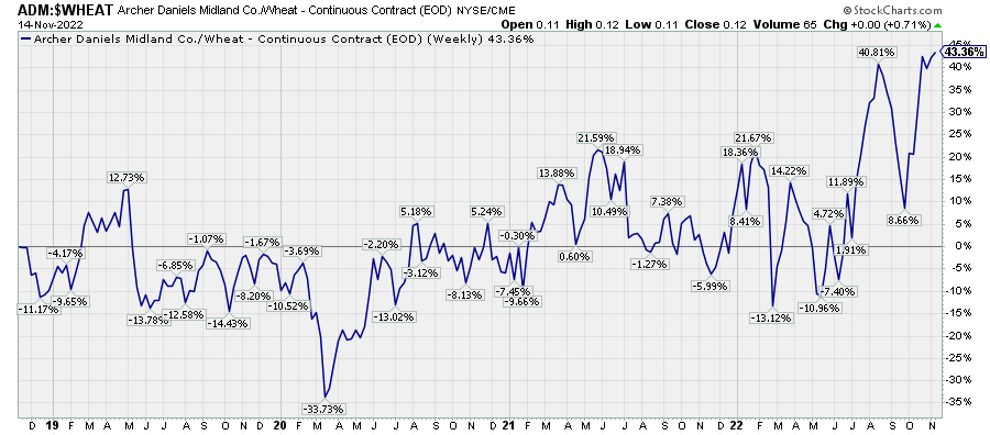
This is not intended to be a comprehensive list, and I do not have strong opinions or insights into these companies. I only note that they have shown consistent price correlations with grain prices over the last decade, and they might suffer under a significant decline in grain prices.
Looking forward, I continue to expect general downward pressure across the commodities space, but the pressure appears to be growing on the late-cycle commodities like grains, fertilizers, and energy. I expect we will see sudden drops in these prices over the next year or so as the cyclical bear market resumes. At the same time, we live in a world that appears to be aggressively deglobalizing, and over the very long term, this kind of instability has led to high inflation and commodity supercycles. Unless one has information that World War III is going to break out next Tuesday at 2:31 PM or something along those lines, it is probably best not to speculate on a commodity boom at this juncture of the cycle.
And, although Treasuries have done terribly this year and the historical momentum factors have not turned in their favor relative to grains (except soybeans) yet, investors with a one- or two-year time horizon would probably be better served by taking refuge in government bonds. For those who want to protect against the risk of an inflationary shock, gold will likely provide less disappointment than almost any other class of commodities, including grains.
Be the first to comment