

Hannes Magerstaedt
The above image of Tutankhamun’s 24-pound solid gold burial mask is on display in Egypt today. King Tut was an Egyptian pharaoh who ruled between 1332 – 1323 BC, roughly 3,350 years ago. Gold has clearly been a valuable asset throughout human existence. The key question is why?
I will answer the question in the context of portfolio management; however, the properties of gold are truly extraordinary, which imbue elemental value. For example, Nasa’s recently launched James Webb Space Telescope features gold-plated beryllium mirrors. They enable it to view objects too old, distant, or faint for the Hubble Space Telescope. For the first time, humanity will be able to observe the first stars and galaxies in addition to detailed atmospheric conditions on exoplanets. This is quite valuable.
A key property of gold for space exploration is that gold is chemically unreactive. In other words, gold doesn’t change easily and remains incredibly stable. This makes gold the most effective element for many important purposes, in addition to being the most reflective element for infrared light applications.
Stability is a key feature for those looking to preserve wealth, as is on display in the picture of King Tut’s burial mask. It remains unchanged after 3,350 years with a current gold value of approximately $650,000 in a 24-pound package. History has proven that currencies and financial instruments can become unstable over longer time periods while many will lose all of their value. Gold is unique in that it is guaranteed to remain unchanged forever, on an elemental level.
The Efficient Frontier
In portfolio management, the return distribution of each asset class is a key and defining feature. Essentially, what is the most likely risk/reward potential for each asset through time? Another key factor is how closely the returns of each asset class are correlated. The less correlated the better in achieving the lowest portfolio risk for a given return objective. Diversification is at the core of portfolio management.
Correlation
Historically, precious metals have proven to be one of the least correlated asset classes in relation to all others. The following table displays the historical correlations between asset classes as of 2019. It is from an optimization analysis I conducted at the time using long-term historical data. As a result, if updated, the historical correlations would be little changed today. A value of 1 means the assets are perfectly and positively correlated. A value of 0 means the assets are perfectly uncorrelated.
Created by Brian Kapp, stoxdox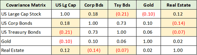
I removed many asset classes from the above matrix to focus on those that have been uncorrelated historically, or those that normally diversify a portfolio. Historically, bonds and real estate have been uncorrelated with stocks and provided portfolios with valuable diversification benefits.
Estimating base correlation assumptions using very long-term datasets is a necessary first step for portfolio optimization. The key question is always whether today is an average environment? Do we need to adjust forward-looking assumptions for current extremes? Where are we in the cycle?
When I ran this portfolio optimization in late 2019, there were many extremes for which adjustments were required. I have highlighted in yellow the historical correlations that were at risk of not repeating in the intermediate-term future.
Each of these historical correlations, or lack thereof to be precise, have since broken down and all have become highly correlated. This was due to each asset classes’ returns becoming increasingly dependent on the same factors, extremely low interest rates and high liquidity. As a result, most importantly, bonds are not serving their usual diversification role during the current bear market. Real estate too has become highly correlated with stocks and bonds.
Notice that gold is uncorrelated with each asset class. This has remained true since 2019. For example, when the bear market began during the first months of 2022, gold advanced by roughly 10% while Barrick Gold (NYSE:GOLD) rallied 46%. Gold miners, under certain conditions, can offer a uniquely asymmetric risk/reward opportunity. They offer high beta exposure to an uncorrelated asset which can be a powerful combination from a portfolio management perspective. It should be noted that the conditions and outlook for the miners today are generally favorable.
Return Distribution: Kurtosis
Gold’s historical return distribution further amplifies the portfolio attractiveness of its uncorrelated return profile. For return distributions, the tails are a defining feature. Long or fat tails point to extreme return potential, up or down.
In statistical terms, such fat-tailed distributions are referred to as Leptokurtic distributions. The following image from Corporate Finance Institute captures the three primary return distribution shapes, with returns on the x-axis and the frequency of returns on the y-axis. The black line represents a Leptokurtic or fat tail return distribution. Notice that there is greater area under the black line at both extremes in this example, up and down (right and left).
Source: Corporate Finance Institute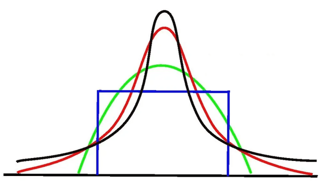
Gold’s historical return distribution is Leptokurtic. The degree of fat tail potential is statistically measured and is called excess kurtosis. Gold’s historical excess kurtosis was near 10 at the time of the 2019 optimization, the highest of all asset classes. For reference, US large cap stocks had an excess kurtosis score of 1.75 at the time.
Return Distribution: Skewness
With extreme return potential, or high excess kurtosis, the question is in which direction? For this, we turn to the skewness of the return distribution. Are returns above and below the average by an equal amount and frequency? Are returns more extreme in one direction, up or down? The following image from ResearchGate displays the three general shapes of skewness in return distributions. Returns are on the x-axis with their frequency is on the y-axis.
Figure 1. a) Negative skewness; b) Normal curve; c) Positive skewness (Durkhure and Lodwal, 2014) (Source: ResearchGate)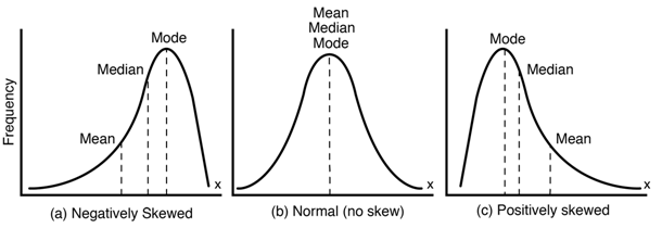
In terms of skew, positive skewness points toward the potential for extreme positive returns being more likely. Gold’s skewness score was just over 2 as of the 2019 optimization, double the nearest asset class.
Looking at the positively skewed chart on the right, notice that the majority of returns cluster below the average return or mean. Under most conditions, gold performs below average or relatively poorly. This is a feature of assets that exhibit extreme positive returns or positive skewness and must be accounted for when adjusting portfolio weights in real time.
Combining the excess kurtosis (or fat tail potential) with the positive skewness points toward gold’s extreme return potential being more likely to occur to the upside if history is a guide. There is fundamental support for this to remain true into the future.
The fundamental price support for gold relates to its cost of production. The following chart from Lundin Gold’s (OTCQX:LUGDF) October 11, 2022 investor presentation displays the industry’s cost curve on a per ounce produced basis.
Source: Lundin Gold’s October 11, 2022 investor presentation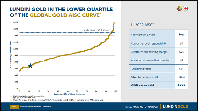
The x-axis represents the percentage of global production accounted for while traveling from low-cost per ounce gold producers to high-cost producers. Roughly 15% of global gold production costs $1,400 per ounce or more to produce.
Importantly, these cost estimates are likely to err on the side of understating true costs, as many are excluded from industry calculations of all-in sustaining costs. Furthermore, high-quality low-cost gold deposits are mined and depleted first, leaving lower-quality higher-cost ounces for the future. As a result, the cost to produce each marginal ounce of gold is likely to continue higher as has been the case historically. This is especially true given normal cost inflation through time.
The cost of production for a commodity represents a fundamental price support level over the intermediate term.
The Markowitz Model
Returning to portfolio optimization, the return distribution for each asset class is combined with each asset class’s correlation with all others to produce a risk/reward framework for portfolio construction.
The efficient frontier is best approached as a mental model, pioneered by Harry Markowitz, for thinking about and constructing portfolios. In essence, underlying the model is the idea that investors should always prefer less risk (defined as portfolio volatility) for the same expected return (the average expected return). Conversely, investors should always prefer higher expected returns for a given level of risk. The following image from Quantpedia displays the typical shape of an efficient frontier in portfolio optimization.
Source: Quantpedia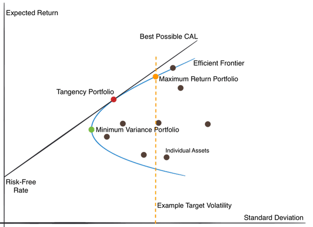
In the above image, the dots represent portfolio options with various asset class allocations. The expected portfolio volatility is plotted on the x-axis and the expected return on the y-axis. Using a target volatility or risk level as the primary portfolio constraint, the orange vertical line serves as an example. Given a risk constraint, or target level for portfolio volatility, investors should always prefer the portfolio represented by the orange dot to any other beneath it.
The red dot represents the most efficient portfolio. It offers significant risk reduction (distance to the left of the orange dot) with little loss of expected return (distance vertically from the orange dot). It is also the portfolio that is tangent to the CAL or capital allocation line, which plots all possible combinations of risk-free and risky assets. The green dot represents the minimum risk portfolio option.
Gold’s historic role is in limiting portfolio volatility, as is evidenced by its lack of correlation and its fat-tailed, positively-skewed return distribution. The average historical return for precious metals (primarily gold) was 8.33% per year at the time of the 2019 portfolio optimization. This is below historical US stock returns but remains competitive. As a result, gold would be featured more heavily in the portfolios represented by the green and red dots as compared to the orange, all things being equal.
Historical returns aside, in late 2019, I adjusted the expected stock market return to 4.5% annually over the intermediate to longer term. This was based on the elevated valuations in place at the time and the more recent sequence of extremely high rates of return for stocks. This highlights a key feature of statistical portfolio optimization using the efficient frontier as a model, it is garbage in, garbage out.
Meaning, using historical returns as expected returns when conditions are extreme is likely to produce large forecast errors. Modulating one’s gold allocation in tune with prevailing extremes is a powerful portfolio management strategy.
Gold: Portfolio Weight
I have run many Monte Carlo simulations over my career in order to view optimal portfolio allocations under various assumptions. What I can say with certainty is that the most efficient portfolio allocation to gold is almost always vastly higher than what is implemented in practice.
Today, I see studies showing that institutions have a 0.5% weighting to gold in their portfolios, on average. Portfolio optimization points toward something many multiples of this. To me, the relative underinvestment represents a source of demand should traditional asset returns continue to revert to the mean. Additionally, we have entered a higher volatility regime than has been the case in some time, which further supports fund flows toward greater diversification for which gold is a top choice.
Technicals
Gold is an element, a commodity, and thus lends itself quite well to technical analysis. Meaning, the only thing that can change is price and volume. Gold is what it is and doesn’t change. The technical backdrop for gold is one of the more bullish long-term setups in the market today. The following 20-year monthly chart presents a bird’s eye view of the technical setup for gold. Note that the orange lines represent resistance levels and the green lines depict key support areas.
Gold 20-year monthly chart (Created by Brian Kapp using a chart from Barchart.com)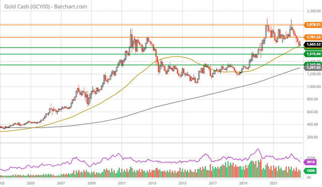
The defining feature of gold’s technical backdrop is a massive 10-year cup and handle formation. In essence, gold has been moving sideways or consolidating for over a decade. This followed an incredible bull market run in the first decade of the 2000s. The bull market created extreme upside returns as the first decade of the century came to an end. Those excesses have now been reversed through a decade long reversion to the mean.
Today, gold is sitting on top of a major support area between $1,515 and $1,620 (the two upper green lines). This zone should offer incredibly strong support given its proximity to the marginal cost of gold production across the mining industry. A sustained move to the lower support level near $1,340 (the lower green line) looks unlikely in light of production costs. The following 5-year weekly chart provides a closer look.
Gold 5-year weekly chart (Created by Brian Kapp using a chart from Barchart.com)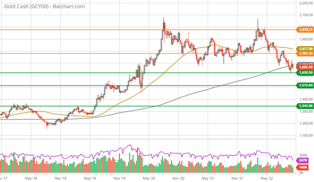
As can be seen above, gold has been in a bull market since the bottom near $1,200 in late 2018. The move from $1,200 to just over $2,000 was a perfect example of gold’s upside return asymmetry — a 67% gain over two years. With a peak in August of 2020, gold has once again been in a consolidation phase which is now into a third year.
The grey line on the above chart is the 200-week moving average, which is at the current price. Gold is clearly not extended to the upside as was the case in August 2020. Additionally, from the 20-year monthly chart, gold is not extended to the upside on a longer time frame as it has been moving sideways for over a decade.
The current technical backdrop for gold suggests no adjustments are required and that we can use historical return data with added confidence. Gold remains a top allocation choice for reducing portfolio volatility while introducing upside return asymmetry.
Gold Miners
With gold displaying a strong technical backdrop, being near long-term support levels, the outlook is favorable. This is especially true given the aforementioned cost of production realities. The question then is how best to gain gold exposure today within a diversified portfolio, buy gold or gold miners?
For those with the discretion to choose, gold miners look relatively attractive in relation to gold itself. The following monthly chart of the VanEck Gold Miners ETF (NYSEARCA:GDX) is in stark comparison to the 20-year gold chart above. The miners have been decimated since the early 2000s logging some of the poorest returns of any industry over the period. The VanEck fund began trading in May of 2006 and has lost roughly 50% of its value through today.
VanEck Gold Miners ETF long term monthly chart (Created by Brian Kapp using a chart from Barchart.com)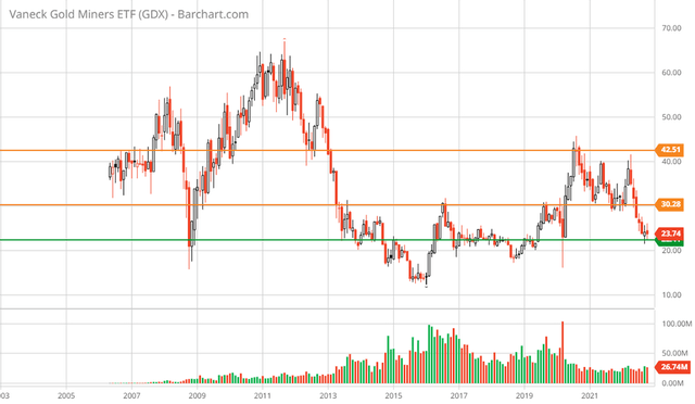
The green line is a major support level which the miners are now testing. This area should offer incredibly strong technical support. The orange lines represent the primary resistance levels. The upside to each is 24% and 77%, respectively.
The higher resistance level was tested into the August 2020 gold peak and looks to be a reasonable intermediate-term target. Keep in mind that the gold miners tend to move very quickly once momentum is ignited, up and down. The following 5-year weekly chart provides a closer look at the current technical setup for the miners.
VanEck Gold Miners ETF 5-year weekly chart (Created by Brian Kapp using a chart from Barchart.com)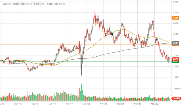
Sitting on top of a major support zone, the miners are at an ideal accumulation level, technically speaking. Note that the grey line is the 200-week moving average and the gold line is the 50-week moving average. The miners are extended to the downside and are well below the long-term moving average, thus they are technically oversold.
Additionally, the 50-week moving average has come down and is now touching the 200-week moving average. If a new bull market in gold began in late 2018, which appears to be the case, the 50-week moving average is highly likely to remain above the 200-week for the miners over the intermediate term. This further supports the timely accumulation case for the gold miners.
Fundamentals And Summary
The top miners are generally trading in the mid-teens PE range with some trading in the high single-digit PE range. Given the dispersion, a separate review of top mining ideas requires its own write-up. I have reviewed many of the top miners in the past year and continue to view them positively. They are some of the top companies in the VanEck Gold Miners ETF above, which is weighted by market capitalization.
While a mid-teen PE ratio does not stand out as a bargain price, importantly, earnings estimates for commodity producers must be taken with a grain of salt. The reason lies in their operating leverage to commodity prices.
Consensus gold price forecasts are for generally flat prices from today into the intermediate future. If gold resumes its upward trend, earnings for the gold producers will expand rapidly as price increases flow straight to the bottom line, rendering consensus estimates far too conservative.
With gold likely to be in a moderate uptrend over the intermediate term, extreme upside returns from the price itself look to be unlikely outside of a crisis, whether financial or geopolitical. Additionally, the positive skewness of gold’s historical return distribution points to below-average returns being much more common than above-average returns.
My base case for gold is a moderate bull market trend over the intermediate term following the recent consolidation, leaving the upside return asymmetry in the gold miners rather than in gold itself. Gold miners can offer a uniquely asymmetric risk/reward opportunity. They offer high beta exposure to an uncorrelated asset class. That is a powerful combination in portfolio optimization. Gold is on the efficient frontier.
Be the first to comment