

David Commins
The traditional 60/40 portfolio has experienced its worst year since 1936 by losing 19.4% through August, according to Bank of America. It is tempting to deploy capital after a correction that large. This is one reason I’ve seen a number of articles on Seeking Alpha titled something like this: “Buy X stock because it is 30% off.” While I welcome lower prices for stocks that I like when the fundamentals have not changed, this assumes that fundamentals have not changed.
The fundamentals for stocks and bonds have changed and this is the reason for the poor performance in 2022. Inflation has risen to unacceptable levels and the Federal Reserve has transitioned from tapering to quantitative tightening. The Fed has a goal of averaging 2% inflation per year and their credibility depends on reaching that goal.
I have chosen to protect my portfolio from monetary tightening and raging inflation with my largest position: cash.
What?
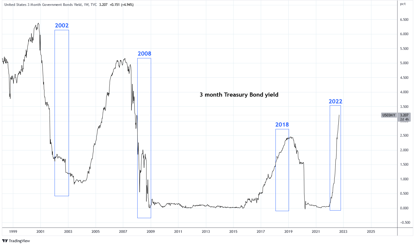
I’ve taken a lot of criticism from readers about my large cash position. I can sympathize. According to data from BlackRock and from Novelinvestor.com in their graphic below, cash (represented as 0-3 month Treasury bills) has consistently been among the worst performing assets over the last 20 years. That is except for four key years: 2002, 2008, 2018, and 2022.
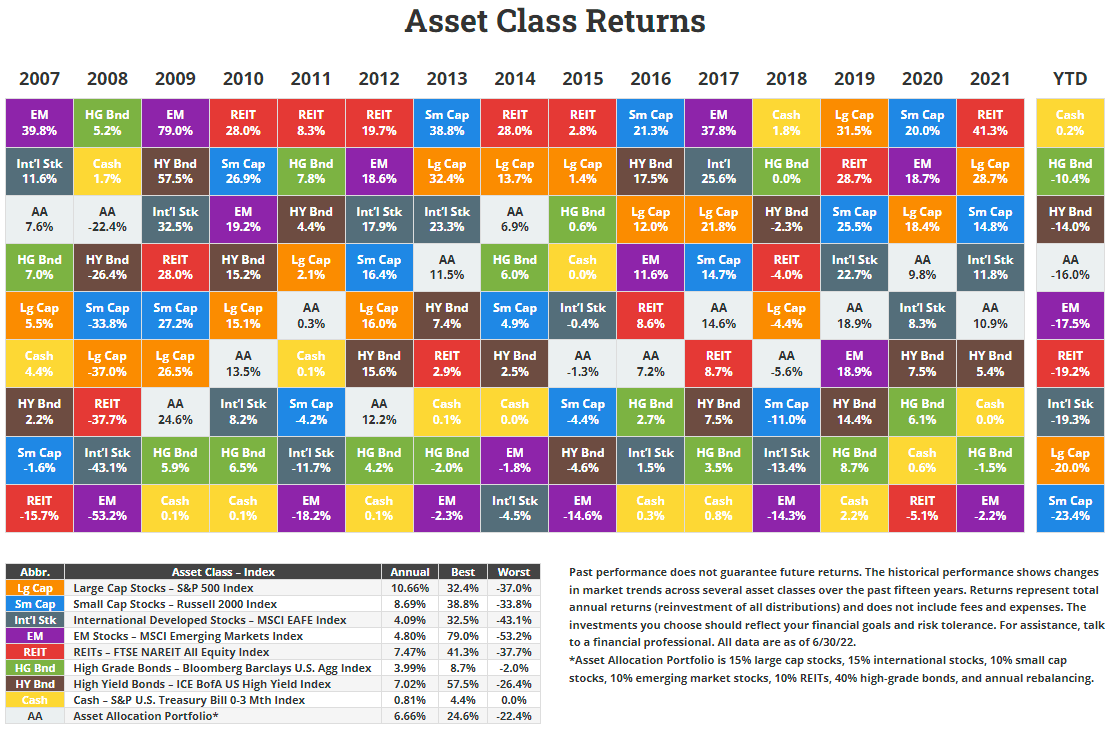
novelinvestor.com (used with permission)
In each of those years either cash or high grade bonds were the best performing asset. The pattern is unmistakable; these years have macro conditions in common. These macro conditions will continue into the near future and that’s why I’m maintaining my cash position until the data changes.
Rewind to 2002
A comparison of the Nasdaq Composite chart from 1998 to 2002 is remarkably similar to the chart of the ARK Innovation ETF (ARKK) from 2020 to today. This is not merely a coincident. The 2000 dotcom bubble and the 2021 meme stock/crypto bubble shared similar characteristics of excessive liquidity, excessive speculative enthusiasm, and disregard of fundamentals.
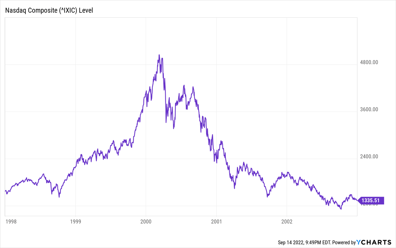
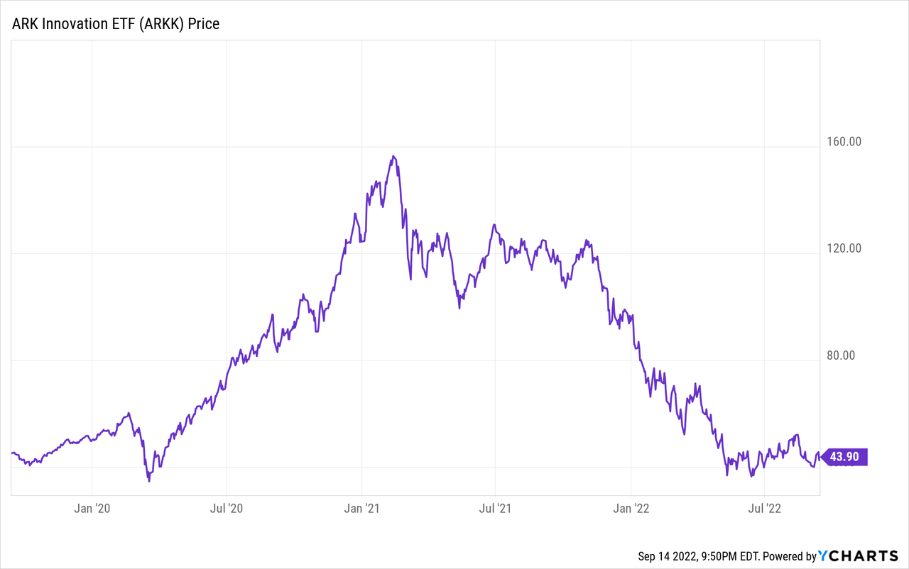
One of the causes of this event was the Federal Reserve creating excessive liquidity by expanding the money supply at a 22% annualized rate in late 1999. The dotcom bubble burst when the Federal Reserve began tightening monetary policy in 2000. During 2020-2021 the Fed increased the money supply by 27%. The growth of money supply flat-lined in January 2022 after months of the Fed talking about tightening.
During both cases, equity markets became grossly overvalued. The Buffett Indicator is a valuation model I prefer. During the dotcom bubble the market cap to GDP ratio reached 150% which is 2 standard deviations from the historical trend line. In 2021 the ratio peaked at 200%, also slightly above 2 standard deviations from trend. Today, the indicator is above 1 standard deviation from trend and would need to fall to 100% to match what equity markets did in 2002.
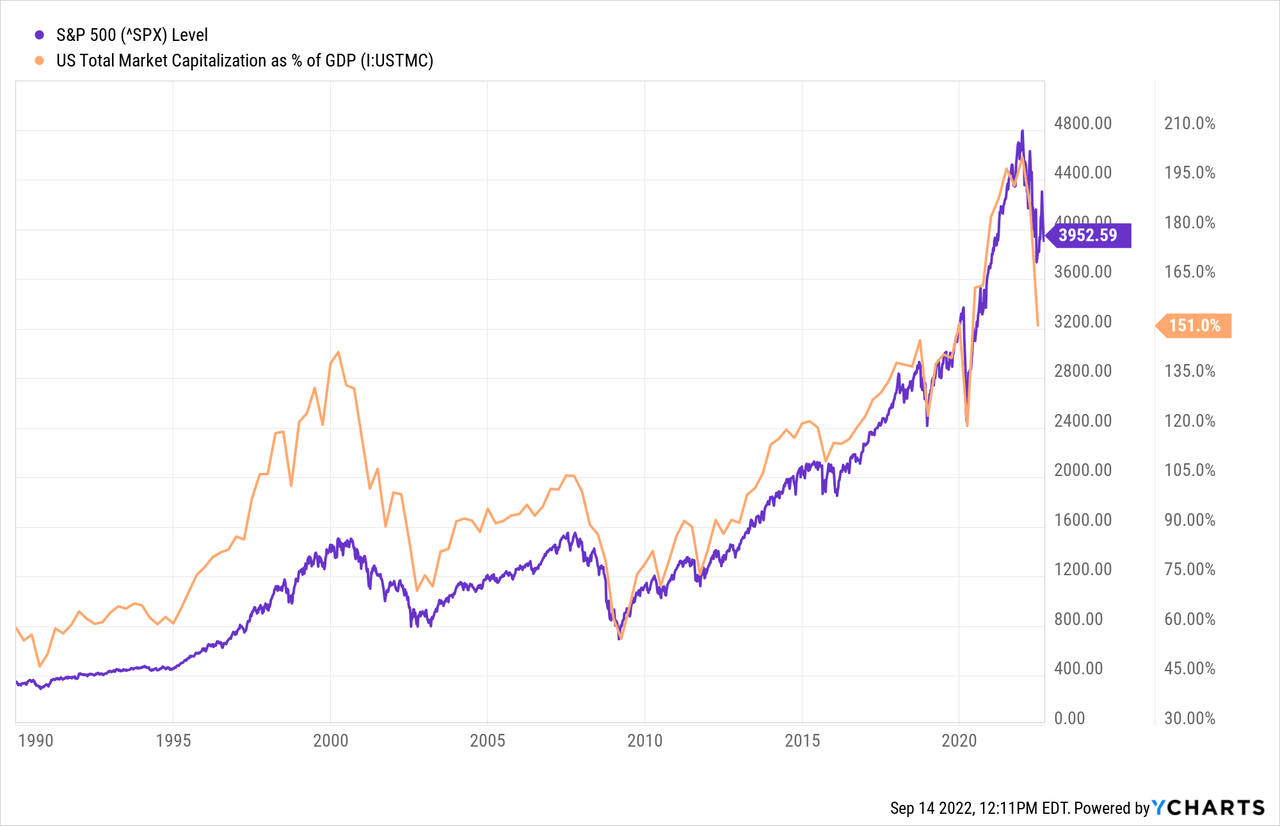
Such a decline would depend on global Central Banks continuing to reduce their balance sheets. The market capitalization of large cap equities correlates strongly with Central Bank assets. Figure 6 from this report from Yardeni Research shows that the S&P 500 is fairly valued in comparison to major Central Bank Assets and that a continued decline in assets will likely result in declines of equity markets. In 2002, the S&P 500 declined by 50% top to bottom. Today, the S&P is off by 18%.
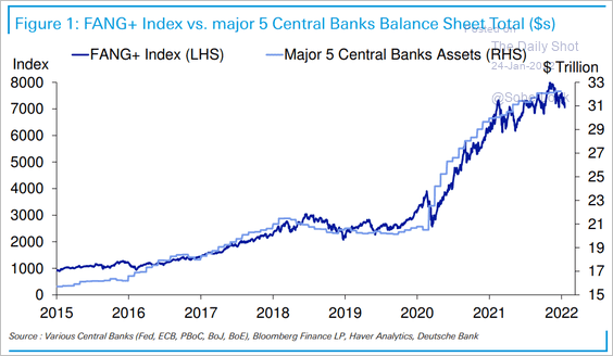
The Daily Shot (used with permission)
The 10 year minus 3 month yield curve has consistently signaled the end to raises to the Federal Funds Rate when the inverted curve steepens. The yield curve steepened in January 2001 and May 2007, both prior to the years of cash outperformance. Today the yield curve has yet to invert but I expect that to occur shortly thus following the 10-2Y curve which has already inverted and tends to lead the 10Y-3M.
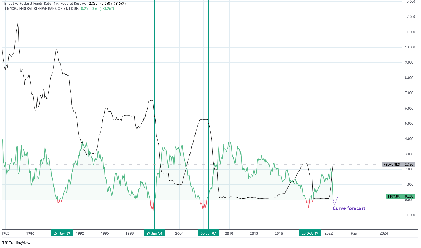
Charts by TradingView (adapted by author)
Rewind to 2008
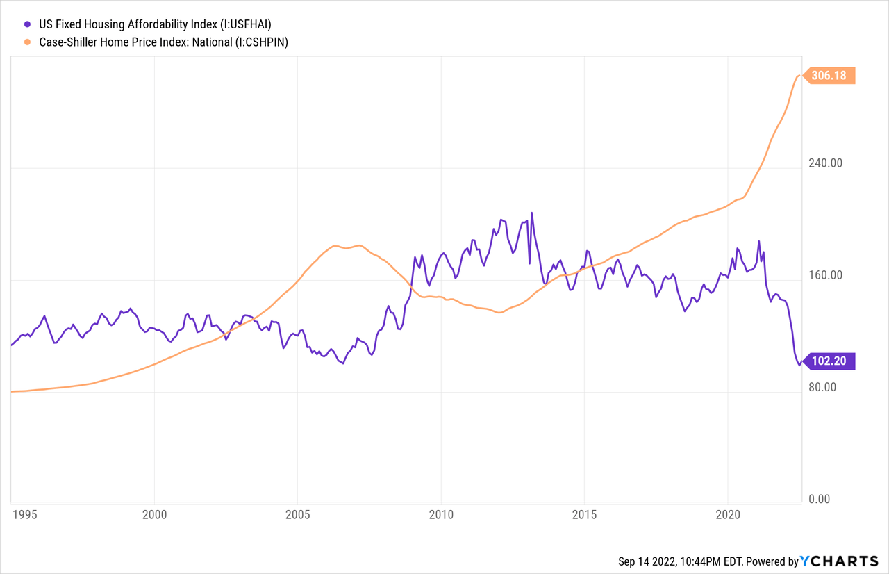
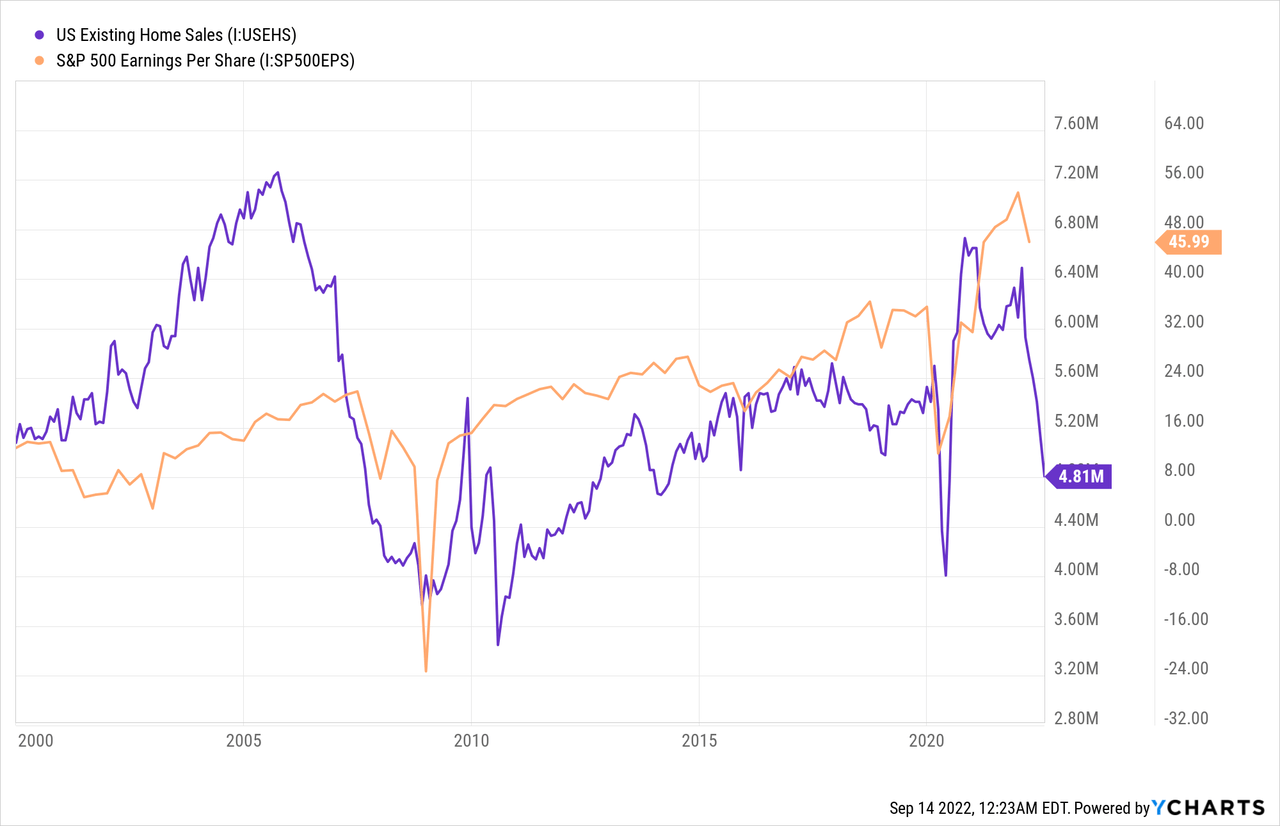
The most significant similarity between 2008 and today is the affordability of housing. The Case Shiller Home Price index surged higher in 2005-2007 causing affordability to fall. Since 2020 home prices have surged higher and, in combination with higher mortgage rates, have caused affordability to reach the same lows of 2007. The issue is two-fold: lower affordability means lower home sales and higher inflation.
First, new and existing homes sales have fallen dramatically in 2022 in response to affordability issues. New home sales are down 50% from two years ago and the supply of homes has risen 27% in the last year. These trends do not bode well for equity earnings as the “housing market is the economy” and sharp declines in home sales often lead to earnings contraction.
Over the next twelve months, new home sales are forecasting lower forward earnings:
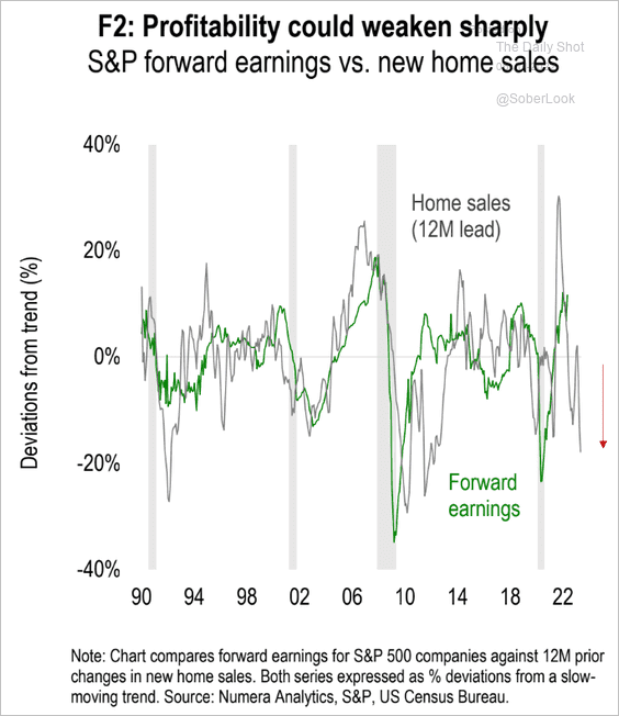
The Daily Shot (used with permission)
Second, the Fed is considerably motivated to get inflation under control and housing inflation is one of the biggest obstacles to that goal. The Fed needs the housing market to soften in order to normalize inflation. From my perspective, the Fed is trying to induce a mini-GFC. They are working to achieve this by raising risk-free rates. The spread between the QQQ free cash flow yield and the 2Y Treasury is now 0.1% which is the lowest since January 2008.
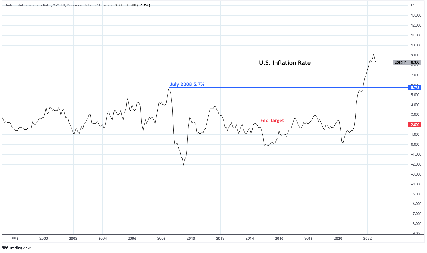
The rate of inflation in July 2008 was 5.7% which is the highest mark between 1998-2020. The inflation rate was bolstered by higher commodity prices and housing, like today. The GFC alleviated the inflation of 2008. Today, the Fed is intentionally initiating a similar event to achieve the same end.
Charts by TradingView (adapted by author)
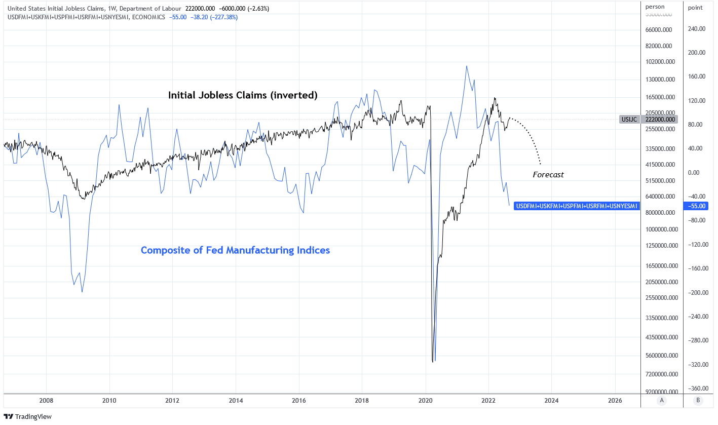
The Fed is finding success. The unwinding of the balance sheet has caused volatility in the bond market to reach levels that were seen during the GFC in 2008. Some estimates suggest that $2.8 trillion of assets need to be removed by 2025 to complete normalization. The next effect of unwinding will come in jobless claims. I wrote more about the subject that you can read here. Jobless claims are currently very low but rising slowly. Below is a chart of a composite of Fed Manufacturing Indices and initial jobless claims inverted. The composite is at -55 which is the level reached in 2008 and 2020 that coincided with large gains in jobless claims. The same level was reached in 2016 when jobless claims did not rise but monetary policy was accommodative in 2016 and is restricting today.
Charts by TradingView (adapted by author)
Like home sales, higher jobless claims lead to lower earnings for the S&P 500. I expect increases in jobless claims which will translate into weaker earnings.
Rewind to 2018
Today is similar to 2018 in that quantitative tightening is occurring once again in the post-GFC era. Balance sheet reductions accelerated in January 2018 which caused market volatility to rise during the year.
Federal Reserve Economic Data | FRED | St. Louis Fed
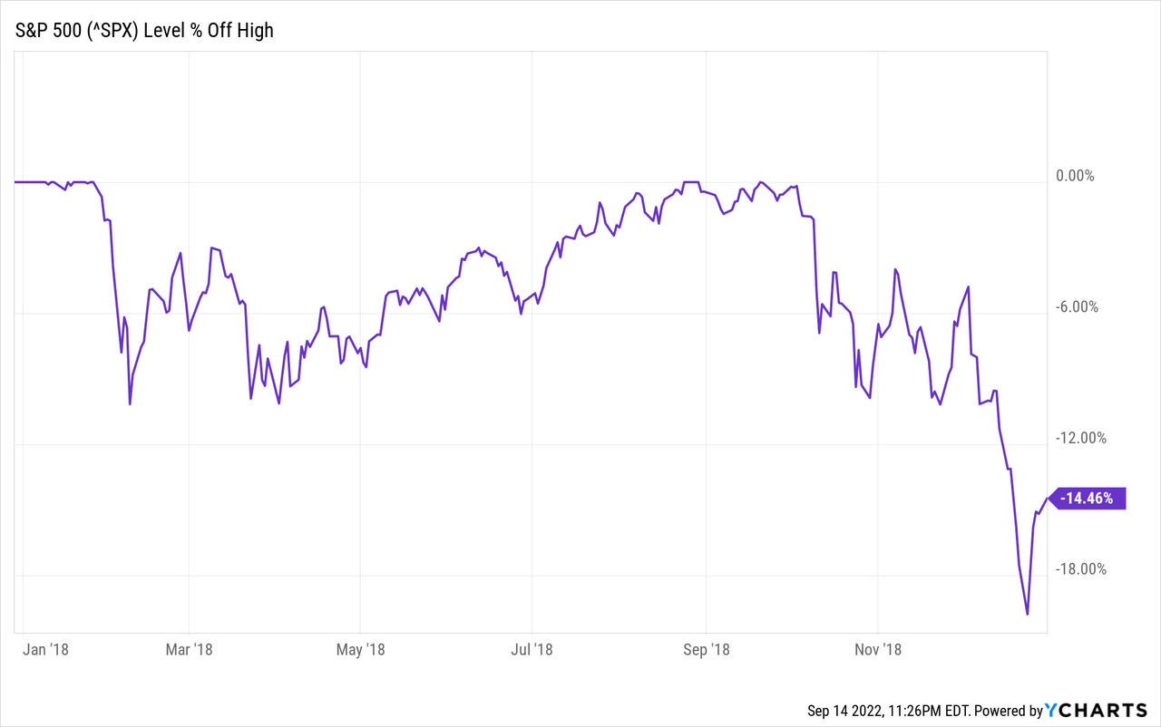
Markets didn’t bottom until the Fed pivot approached in early 2019 after the S&P lost 20% from its previous highs.
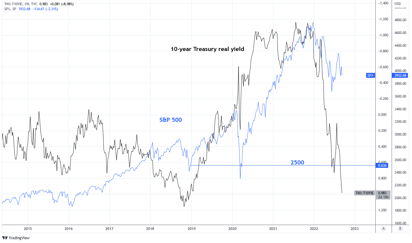
The bottom in equities coincided with a peak in 3 month Treasury rates which was preceded by a peak in 10-year Treasury rates two months earlier. Importantly, the 10-year Treasury real yield topped at 1.18%. The next chart shows that the 10-year Treasury real yield (inverted) is at 0.98% today. The last time that real yields were this high the S&P 500 was at 2,500 with an earnings yield of 4.8%. Today the earnings yield is also 4.8%, demonstrating that the decline in the S&P 500 thus far is mostly due to risk premium adjustment and is not adequately considering economic implications of a weakening economy and further tightening.
Charts by TradingView (adapted by author)
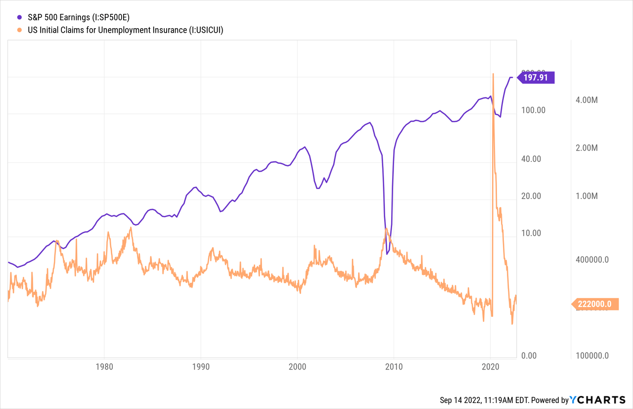
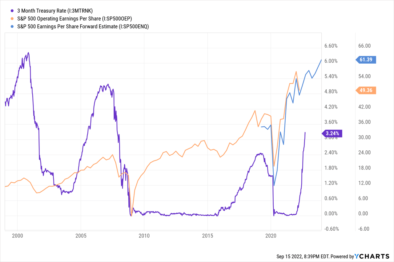
Since 1999, the 3-month Treasury bill rate has climbed higher 3 times prior to 2022. Each period was followed by a decline in S&P 500 earnings including 2002, 2008, and 2018. These periods were followed by recession. I’ve already written about why I think recession is in progress which you can read here. And yet, forward earnings estimates remain strongly positive reaching $61.39 per share.
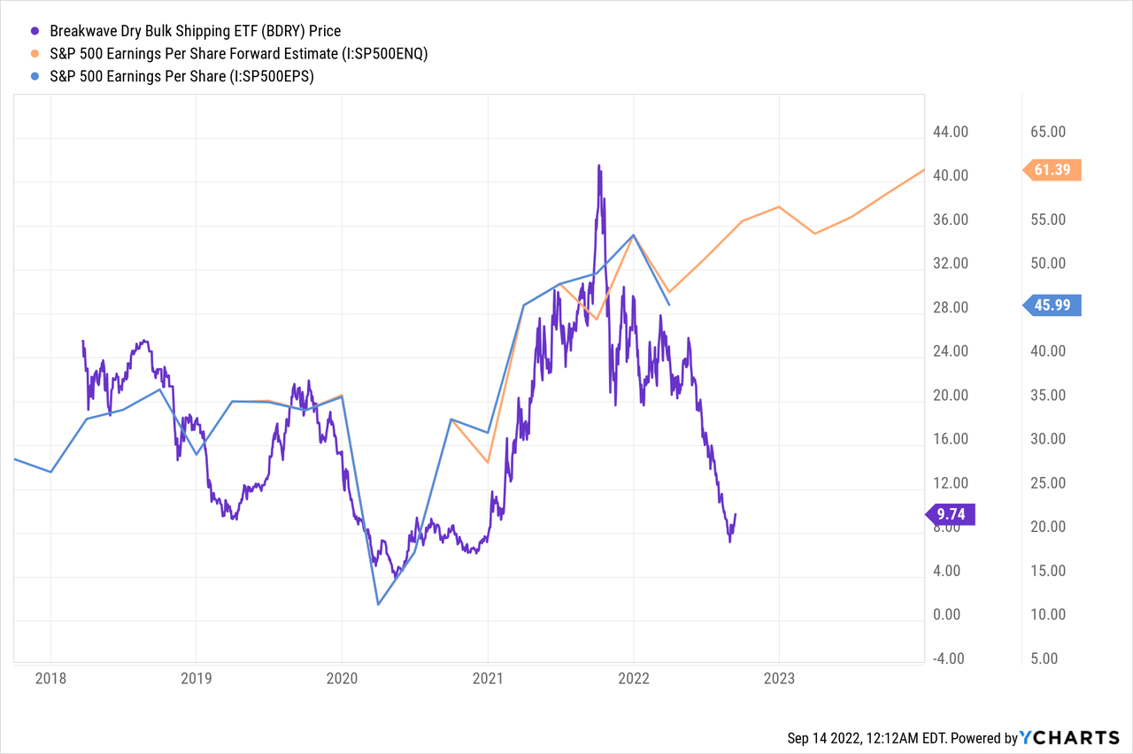
Dry bulk shipping is not supporting higher earnings forecasts. The Breakwave Dry Bulk Shipping ETF (BDRY) tracks dry bulk freight futures and is both an indicator of inflation and economic growth. I wrote more about the subject which you can read here. The BDRY is projecting S&P 500 earnings to decline between $5-20 per share.
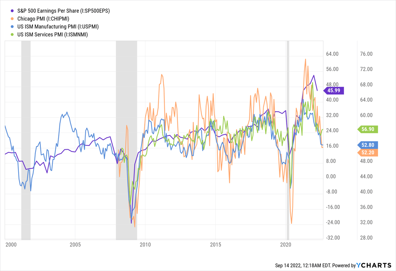
The Chicago PMI, ISM Manufacturing PMI, and ISM Services PMI are all falling towards contraction territory and are not supportive of higher equity earnings. The ISM index is forecasted to decline to recessionary levels of 41-42, which would inevitably weaken earnings.
This model from Alpine Macro is forecasting a 9-10% decline in S&P 500 earnings over the next year. Using FAST Graphs to forecast price returns in 2023, a 10% decline to earnings would result in a 17.8% price decline for the S&P if the same price to earnings multiple was reached that occurred at the bottom of the 2018 decline.
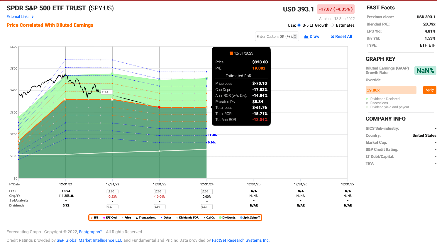
FAST Graphs
Existential Fight Against Inflation
Federal Reserve Chairman Jerome Powell had this to say last week regarding the Fed’s policies on inflation:
History cautions strongly against prematurely loosening policy. I can assure you that my colleagues and I are strongly committed to this project and we will keep at it until the job is done.
The Fed has the responsibility for price stability, by which we mean 2% inflation over time… The longer inflation remains well above target, the greater the risk the public does begin to see higher inflation as the norm, and that has the capacity to raise the costs of getting inflation down.
What Powell is saying is that time is running out for the Fed to gain control over the situation and that acting too conservatively can cause longer lasting issues. This is not the message I would expect to see near a turn in policy stance.
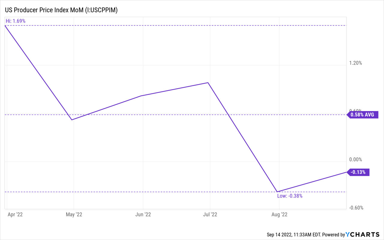
CPI index data for August demonstrated a 0.1% MoM increase in price inflation resulting in 8.3% YoY price inflation, above the forecast of -0.1% MoM. However, my preferred measure of price inflation in the producer price index. August PPI data demonstrated a -0.1% MoM increase in price inflation resulting in 8.7% YoY price inflation. This is following July’s PPI of -0.38% MoM and continues a downtrend since April.
Milton Friedman described inflation by saying:
Inflation is always and everywhere a monetary phenomenon, in the sense that it is and can be produced only by a more rapid increase in the quantity of money than in output.
The U.S. money supply, measured by M2, rapidly increased in 2020 and 2021 and has since fallen to near zero growth. The M2 money supply tends to lead price inflation by 12-18 months. The recent slowing in PPI has been forecasted by M2 money supply for several months and continues to suggest that price inflation will continue to moderate.
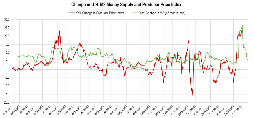
Chart by author (data from FRED)
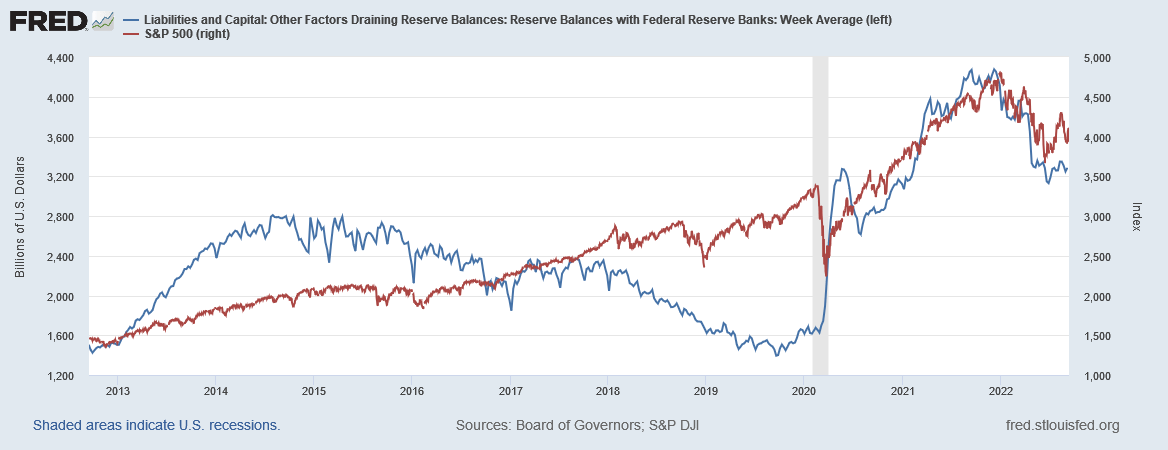
The Fed began reducing its balance sheet in June 2022 at a rate of $47.5 billion per month. Starting this month that rate is expected to increase to a maximum of $95 billion per month. Since the beginning of the year, Reserve Balances with Federal Reserve Banks have been declining and equity markets have been following closely. As the balance sheet continues to decrease, I expect the Reserve Balances to decrease as well.
Federal Reserve Economic Data | FRED | St. Louis Fed
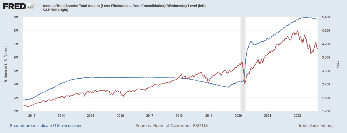
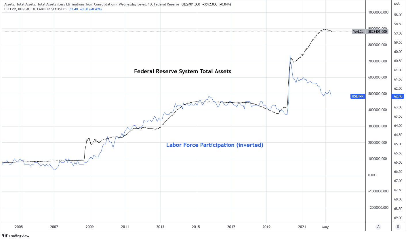
Since the GFC, the Federal Reserve’s balance sheet has expanded proportionately to the US labor force participation rate. The relationship is necessary to maintain financial stability in response to aging Demographics. Today the balance sheet is in excess of the LFP rate by about $3.8 trillion. I expect these two data points to converge closer to each other before a policy stance change.
Charts by TradingView (adapted by author)
Financial Conditions are Getting Tight
This week Bluford Putnam of the CME Group published this article on interest policy. It included this statement:
Based on this analysis of inflation expectations and adding perhaps 0.5% for inflation uncertainty premium, pushing the federal funds into the 3% territory takes interest rate policy out of the accommodative state into neutral territory. The neutral territory was last seen pre-pandemic back in 2018 when the Fed was raising rates with the intention of moving out of accommodation and into neutral territory. The effort was short-circuited by the pandemic of 2020, to which the Fed responded by cutting rates and heading back into an accommodative state.
Next week the Fed is expected to announce a 75 basis point increase to the Fed Funds rate, putting it above 3%. Figure 3 from the article shows that the Fed Funds Rate has reached a neutral policy state, the first time since 2018. Both 2002 and 2008 were characterized as restrictive policy states. Continued monetary tightening is on the path toward a restrictive state.
The problem for risk assets is that asset appreciation has been significantly contingent upon the concept of There-Is-No-Alternative because risk-free rates have been so low. Rates are now climbing into territories that offer substantial income which is raising risk premium across asset classes. I wrote more about the subject which you can read here.
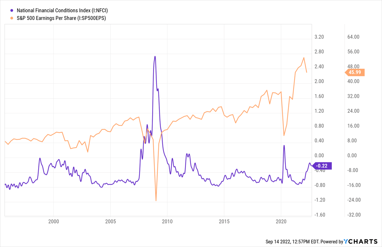
This restrictive policy state is manifesting itself in tighter financial conditions which are represented by the National Financial Conditions Index. Equity earnings are negatively correlated with financial conditions. The Fed is trying to induce tighter financial conditions in an effort to control inflation.
Short-Term Rates are Becoming Attractive
Data from Bespoke Investment Group shows that Fed Fund Futures are expected to exceed the YoY CPI rate by March 2023 if MoM inflation increases by 0.1% or less. I think it’s likely that CPI will remain below 0.1% MoM until then. The 3 month Treasury is now yielding over 3% which is equal to 0.25% per month. Fed Funds futures are expecting an 84% probability that the FFR will be above 4.25% by March. Therefore, I expect positive real yields on cash over the next 2 quarters.
Below is a chart of the 3 month Treasury rate and the four years of cash outperformance. Notice that during each rate hike cycle the period of cash outperformance occurs earlier in the hiking cycle. I believe this is due to increasing investor anticipation of the event and an acceleration and shortening of cycle intervals. History shows that cash outperforms for about one year during these cycles. I expect this period of cash outperformance to continue for 1-2 quarters but this is data and policy dependent.
Charts by TradingView (adapted by author)
Summary
Cash has been the best performing long only asset class of 2022 year to date. This does not happen very often or for very long. Monetary policy continues to tighten and will no longer be accommodative soon.
The Fed is trying to achieve price disinflation which has resulted in asset price depreciation. By raising short term risk-free rates the Fed is telling investors to sit on cash.
Quantitative tightening increases volatility of risk assets and economic uncertainty. This is why my largest position since the start of the year has been cash. I am anxiously waiting to deploy that cash for attractive investments. But the fundamentals are not supportive of risk assets and the yield on 3 month Treasuries is attractive and rising.
I am concerned that the bearish sentiment for risk assets and bullish sentiment for the U.S. dollar may be overdone and ready for a reversal. Therefore, I’m watching the data closely and will be ready to adapt to changing conditions.
Be the first to comment