

Panuwat Dangsungnoen/iStock via Getty Images
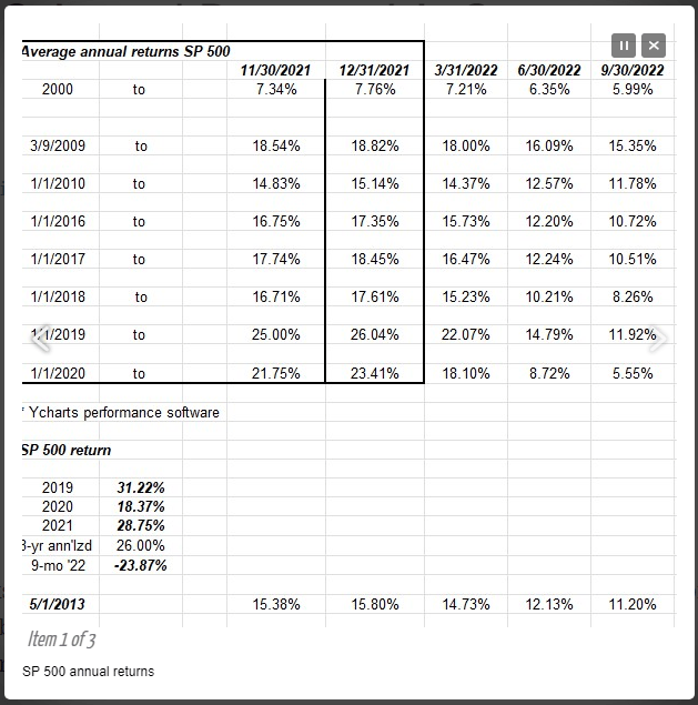
This blog post in late 2021 looks ok in the cold light of hindsight in 2022, but the important part of that Fundamentalis blog post was the above table, for which a minute was taken this weekend to update the numbers. This blog post from late January 2022 was pretty good too.
To quickly explain the math, the far-left column is the starting data for the “annualized” or “annual” or “average, annual” return calculation, and I’ve seen the number referred to by all three monikers. But going forward, the “annual” return will be used to describe the above math.
- The table (or dataset) above “YCharts performance software” shows the annual return for the S&P 500 over multiple time frames, starting with the year 2000, and ending with the time period starting 1/1/2020, through 9/30/22.
- The S&P 500 return and the numbers below are the calendar year returns for 2019, 2020, 2021, which then shows the 26% “annual” 3-year return, and then the 9-month YTD return for the S&P 500.
- The last line starting “5/1/13” readers might find interesting: after the S&P 500 peaked in March 2000, at 1,550, there wasn’t a new all-time-high made consistently until early May 2013. By consistently is meant the S&P 500 didn’t drop back below 1,550 after the breakout in May 2013.
What’s the point of all this?
If readers look at the last column on the table, under 9/30/22, shows that except for the year 2000 and the 5-year return starting 1/1/2018, all longer-term returns still look elevated or “above average.” But as readers can see from the table, the returns are dropping sharply thanks to this year’s equity market.
While clients are nervous and getting antsy, the fact is a good October 2022 flush for the S&P 500 might go a long way to bringing these longer-term returns back into a “normal” range. Looking back to 1970, the arithmetic average return for the S&P 500 through 2021 is 12.5% annually, and the average S&P 500 EPS growth rate since the mid-1980’s is 8% per year.
Since I talk to clients about the post-2009 market returns from 1/1/2010 to 9/30/2022, the “annual” return for the S&P 500 is 11.78%, just below the longer-term average since 1970 of 12.5%.
Another look at annual returns
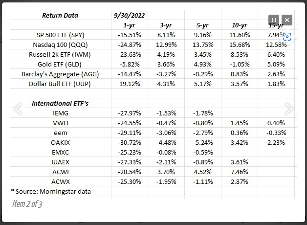
This table adds a number of other indices besides the S&P 500 and then also looks at international index returns including emerging market ETFs (EEM, VWO) and the Oakmark International Fund (OAKIX – all return data courtesy of Morningstar.)
Here’s what jumps out after looking at the data:
- 15-year returns for the EEM and VWO and the Oakmark International Fund are barely positive, well behind the US equity market annual 15-year return and even well behind Gold (GLD).
- The Barclays Aggregate (AGG) now has negative returns through 5 years. 10- and 15-year annual returns are also barely positive, part of that being a function of the very low interest rates the last 14 years.
- The Nasdaq 100’s (QQQ) 10- and 15-year returns still stick out like a sore thumb.
It’s always hard to make a case for “non-US” but if there ever was a case, now is the time given the horrid returns and what is the complete lack of interest in the asset class, thanks to Ukraine and China.
Summary / conclusion
It’s getting interesting in the US equity market with the worst year on record for the 60% / 40% balanced portfolio, the worst year ever for US bond market returns, and a pretty ugly year for the S&P 500.
What worries me is not that the Fed is still raising with the fed funds at 3.125%, it’s that 3% becomes the “new normal”. Back in the early 1990s during the RTC crisis and the commercial real estate choking of the banking system, Greenspan cut rates all the way to 3% by late 1993 and everyone thought that was a very low fed funds rate – too low. Today, after 14 years of zero interest rates, 3% now feels like 1980 and fed funds at 20%.
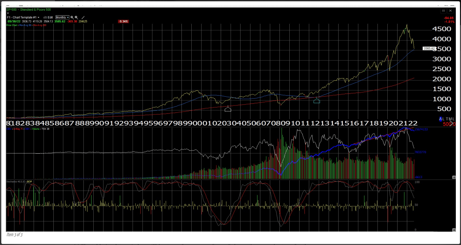
Technically the S&P 500’s close of 3,585.62 was below the June 2022 lows of 3,636 and not a positive from a technical analysis perspective. However, this monthly chart above of the S&P 500 shows the 3,500 level being roughly the point of the S&P 500’s “50-month” moving average on the chart. (To be precise, 3,522 is the exact 50-month moving average.)
The jobs report next Friday is looking for 238k jobs created per Briefing.com, with the consensus projection of 250k. The average hourly earnings are expected at +0.3% and the unemployment rate is expected at 3.8%.
JOLTS, the ADP report, and the weekly jobless claims all precede Friday morning’s nonfarm payroll report. So, if you aren’t confused by Thursday, Friday will only complicate it.
| None of this is a recommendation to buy, sell or hold and past performance is no guarantee of future results. Take this all with substantial skepticism, since it is simply one person’s opinion. |
Editor’s Note: The summary bullets for this article were chosen by Seeking Alpha editors.
Be the first to comment