

wildpixel/iStock via Getty Images
The major indexes experienced their worst first nine months of the year since 2002, with declines in the Dow Industrials of -18.6%, S&P 500 of 22.5% and NASDAQ Composite of 30.5%. These sizable declines are a result of rising interest rates driven by the Federal Reserve’s restrictive monetary policy designed to reverse the highest inflation the economy has registered in 40 years. Fed Chair Jerome Powell communicated unequivocally that the Fed would keep tightening interest rates without regard to the market or the economy so as to not capitulate to market or political pressures as the Fed mistakenly did during the 1970s:
“…my main message has not changed at all since Jackson Hole. The FOMC is strongly resolved to bring inflation down to 2%, and we will keep at it until the job is done. So the way we’re thinking about this is the overarching focus of the committee is getting inflation back down to 2%.”
Since 2009, Federal Reserve policies created artificially and historically low interest rates which led to overvaluations in stocks, bonds, and real estate. Because of the record 40 year high inflation, which has developed in the last two years, the Federal Reserve is reversing its extraordinary financial accommodation causing stocks, bonds, and real estate to experience price declines.
The Federal Reserve is attempting to slow the economy through tightening activities which will reduce demand and lower inflation. This is a very tough task because inflation itself is not just the result of excessive accommodation. For example, there are inflationary supply chain issues which grew out of the COVID-19 pandemic and energy shortages due to ESG policy errors in Northern Europe and North America. Unfortunately, restrictive interest rate policies don’t solve semiconductor shortages, produce ample energy nor produce abundant food supplies. So the Federal Reserve looks to slow the economy enough that demand ebbs and price pressures fade.
Markets are adjusting to rising interest rates and it doesn’t feel good. While markets are under pressure, these conditions provide opportunities to buy securities which will perform well in the future. This letter explores how much worse stock and bond markets can get, and what investments make sense.
Inflation
Inflation is a terrible situation that won’t be solved quickly. Consider the chart below which analyzes countries where inflation exceeded 5% and how long it took for inflation to decline back to 2% — the Federal Reserve’s stated inflation target rate. “It takes on average 10 years to drop to 2%.”
duration of inflation reversion (The Transcript Substack)
Markets in Perspective
Interest rates directly correlate with asset prices. Consequently, the question investors want to know is how much more restrictive monetary activity will be needed to reverse the current trend of rising inflation? We don’t know nor does anybody else. What we do know is that global stock markets have lost $24 trillion in value this year, home prices are peaking and bond holders are seeing their worst performance in 40 years. [Wait! Bonds have been where investors have parked their safe money for decades and now they are losing on their safe money!?] These sad facts will cool economic activity.
By reviewing the history of interest rate and stock market cycles we will provide market perspective to evaluate how much worse markets might get. In short, rates can move higher still, but we may be close to an inflection point in rising rates globally.
Equity Markets
To estimate how much further the stock market could decline, we use the “Fed Model” or Risk Premium Model because it links the valuation of stocks with bond yields. This model below is especially powerful when the earnings trend of the S&P 500 is highlighted. Earnings ultimately power stock prices. Today, those earnings estimates are turning down. The key question is will the Federal Reserve tighten so much that the economy starts contracting and firms must lay off workers. If employment begins to decline sharply, an economic downward spiral could start which could lead to a 50% decline in earnings. The Fed hopes to slow the economy enough to reverse inflation but not create a recession, especially a recession that is global, deep, and or lengthy. [Think of the 1970s.]
Look at the earnings declines in the charts below that accompanied the three major declines since 1999. In 2000, at the height of the Tech Bubble, earnings peaked and led to declines of 83% in the NASDAQ 100 and 50% in the S&P 500. In 2007 earnings peaked again, as the Great Financial Crisis commenced, and the economy contracted and led to decline of 53% in the NASDAQ 100 and 54% in the S&P 500. In 2020, the COVID-19 pandemic triggered an economic collapse and a rapid decline in earnings with the shutdown, and the S&P 500 index declining 36% and NASDAQ 100, 31%.
Today’s environment resembles the Tech Bubble where earnings are not collapsing, but the economy is in a protracted decline, the boom in technology stocks has ended, but energy, value stocks, and inflation beneficiaries are leading the stock market.
Fed Model (Portfolio 123.com)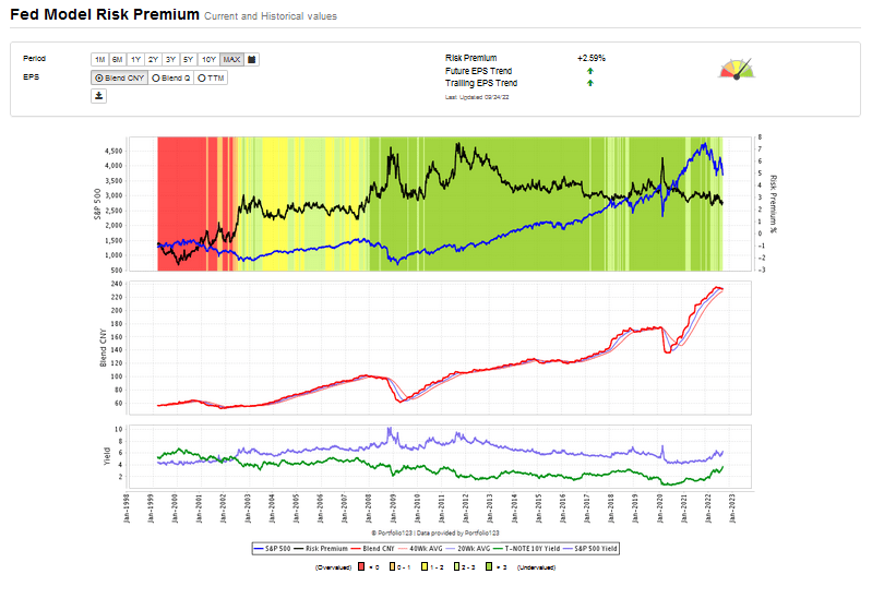
Another measure of downside is “Buffett’s so called Favorite Indicator” which compares the total market value of equities to the GDP. The chart below suggests that there could be 31% further downside which we believe is reasonable but does not assume problematic and persistent inflation nor consequential geopolitical developments. Our view is that we will experience a year and a half of large sideways to downward swings which will provide opportunities for portfolio repositioning while the pace of inflationary reversion is to be determined.
Buffett “favorite indicator” (www.currentvaluations.com)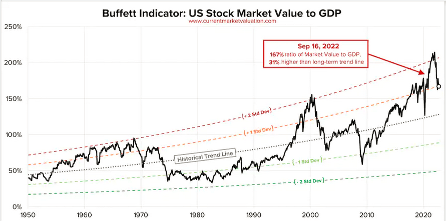
Investors are susceptible to recency bias, meaning that most investors fail to look at markets within a valuable long term market perspective. The chart below of Robert Shiller’s long term CAPE ratio and bond chart below, show that PE ratios can afford to contract further, and interest rates could rise a good bit further when seen in the context of a 140 year perspective.
CAPE ratio and bonds (CAPE chart by Shiller w bonds over 140 yrs)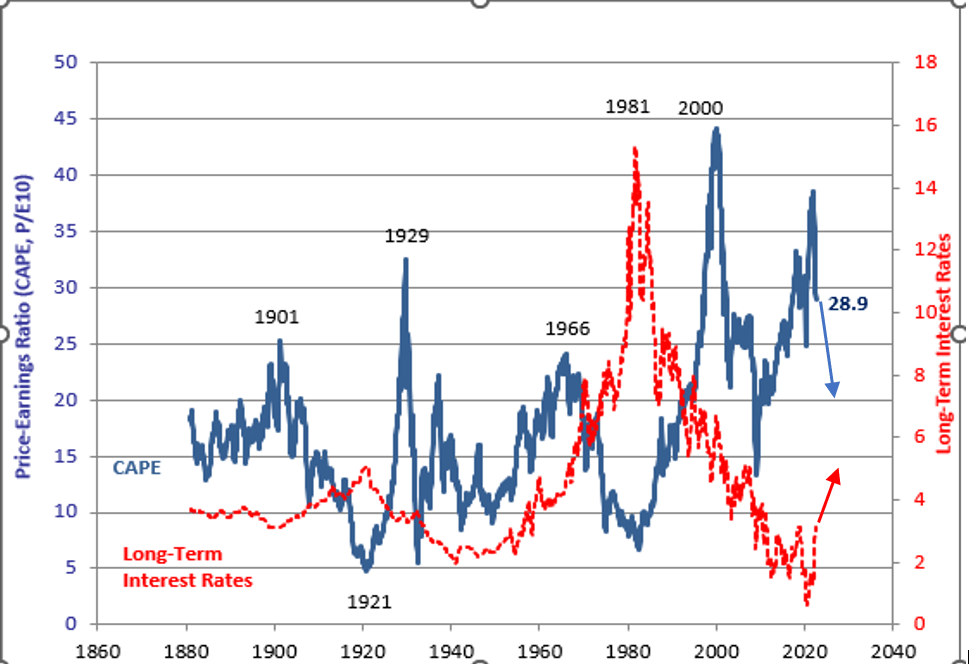
Interest Rates
The Federal Reserve’s principal tool is the Fed Fund rate. The chart below shows the Fed Fund rate rising from near zero to 3.08%. This current rate rise is far sharper than the three previous tightening cycles. The Fed expects the rate to rise to 4% by year end, but if its current actions do not result in moderating inflationary data, the Fed Fund Rate could rise into the 5 – 6% range.
Fed Fund rate history (Saint Louis Federal Reserve Database)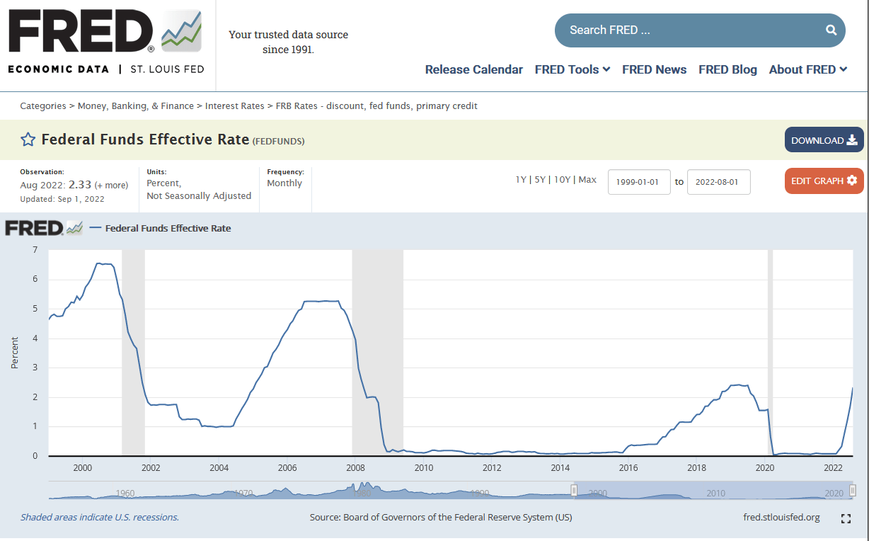
The chart below shows longer maturity bond yields like the 10-year US Treasury, reflecting what interest rates are for mortgages and corporations. The higher the yield on the 10-year US Treasury, the more counter-cyclical or restrictive interest rates are for much of the economy. The chart below shows 10-year US Treasury rates have soared from 0.5% to 4% in the last two years. More importantly, today’s near 4% yield is still well below normal cyclical reversions which could lead 5% or 6% yields.
10year treasury yield chart (Saint Louis Federal Reserve Database)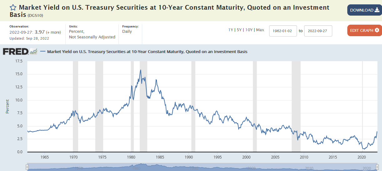
Source: Saint Louis Federal Reserve Data Base.
While most investors may not think about what US corporations pay to issue debt, most families do know how important owning a home and having a low mortgage rate is. 30-year fixed rate mortgages have more than doubled in the last year. This interest rate rise has dramatically changed the affordability of homes. Effectively, your typical mortgage buyer of homes can buy only half the home he could a year ago. The collapse of this ubiquitous form of finance means that real estate prices have stopped appreciating and now are beginning to decline.
30 year mortgage yield chart (Yahoo Freddie Mac)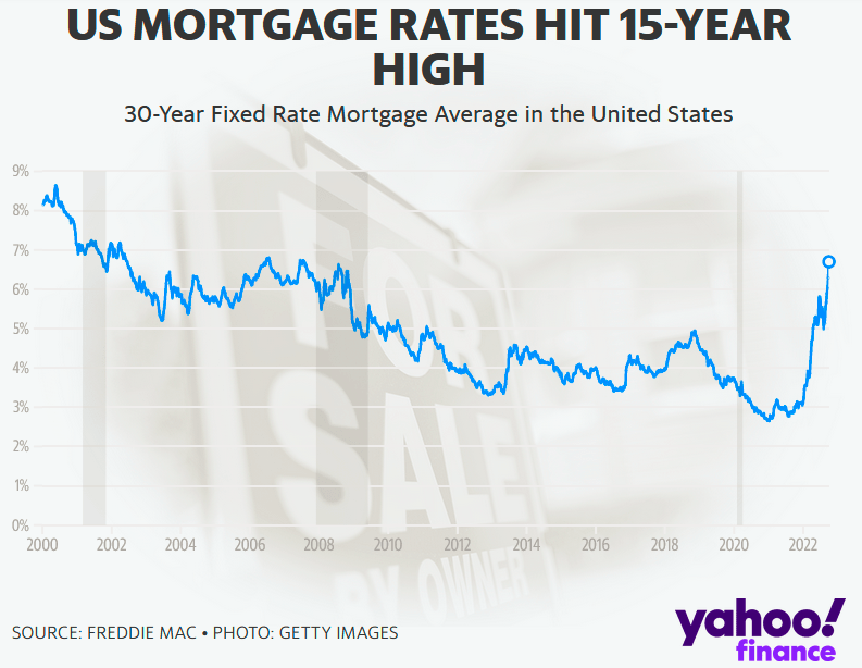
Where to Invest?
We have entered an inflationary period where the S&P 500 underperforms relative to inflation. The chart below shows distinct periods of inflation and deflation. The last two inflationary cycles were 1971-1982 and 1999 – 2008. Both periods were associated with rising oil prices and lower returns from the S&P 500. Consequently, long duration assets such as growth stocks, technology stocks or long duration bonds will underperform and value stocks, energy stocks and inflation beneficiaries will outperform.
inflation and deflation historical chart (Longtermtrends.com)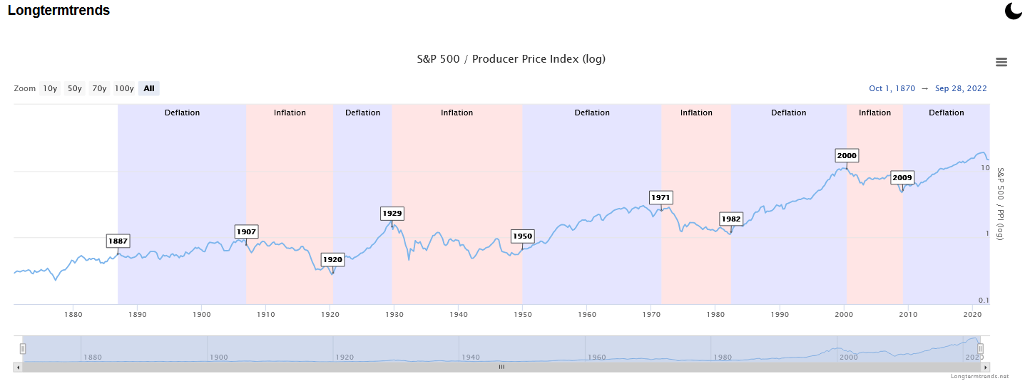
Our primary takeaway is that this inflationary period will be protracted. The last two inflation cycles were on average 10 years. Furthermore, the prior illustration shows it takes 10 years on average for inflation to revert to 2% after exceeding 5%. Consequently, we believe that past performance records of outperformance in long duration assets including technology stocks, growth stocks and longer term bonds will lose their appeal and be increasingly de-emphasized in portfolio allocations. This is especially true with the 60% stock 40% bond allocation that has been the key stone strategy to investment allocations of the last 40 years.
The chart below of the performance of the 60% equity 40% bond allocation portfolio shows how poorly this strategy is working now that bonds are declining, and stocks are declining as well. What is worse, is when you look at the real return for the balanced portfolio and assume inflation will be in the 5% to 3% range for the next several years, this classic strategy will be a very poor provider of real (after inflation) diversified portfolio return.
Because the 60% equity 40% bond strategy will offer a weak risk adjusted real return and based on our study of previous inflationary cycle winners, we expect that emerging markets, precious metals, MLPs, high yield bonds, and inflation beneficiaries will have superior investment performance going forward. Furthermore, we believe that the new bull markets should be protracted, and the former leading strategies will not return to their former exceptional return histories.
60 40 allocation return history (Lazy Portfolio ETF)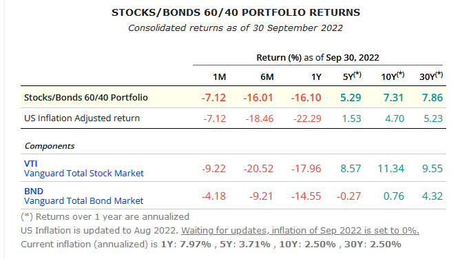
“Markets will be Volatile”
John Pierpont Morgan famously said markets will be volatile when he was asked for his market prognosis. Stated differently, we will continue to experience period of sentiment swings and over bought and over sold conditions. We want to be buyers of panic and pain and sellers of euphoria and relief.
The markets are near a trading buy level. This is thoughtfully illustrated by Ari Wald of Oppenheimer below where he shows stocks are both oversold, and sentiment is bearish. Much like the June bottom, a rebound from recent selling should lead to a tradable rally.
market with sentiment and oversold indicator (Oppenheimer Capital)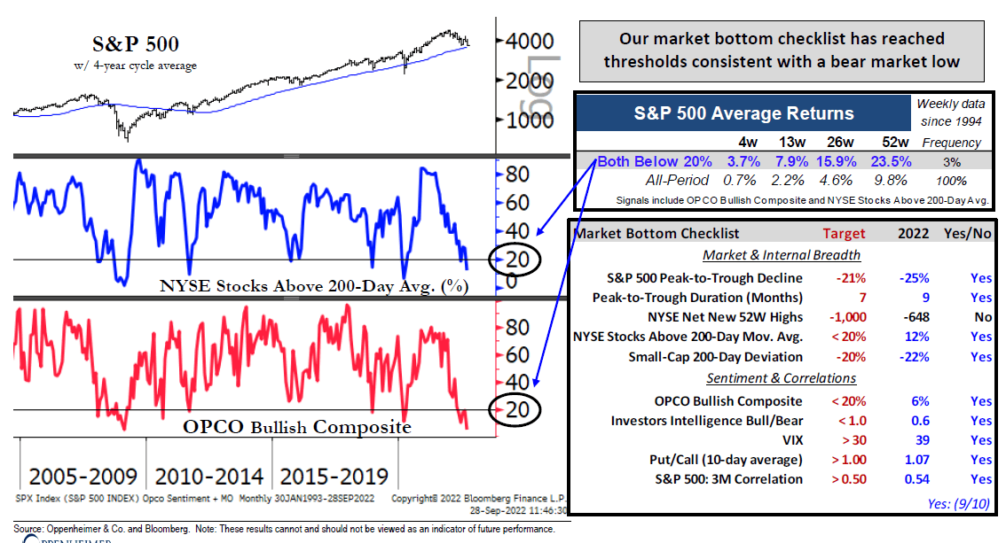
We continue to recommend inflation beneficiaries such as energy, minerals which will be necessary for the green transition infrastructure, MLPs for attractive income, high yielding investments, and precious metals for a proven asset with durable purchasing power preservation qualities.
Among specific names which we own for our customers that we are keen on are:
Energy: Antero Resources Corporation (AR), Tellurian Inc. (TELL), Warrior Met Coal, Inc. (HCC), and Hallador Energy Company (HNRG).
Minerals: Rio Tinto Group (RIO), BHP Group Limited (BHP), and Albemarle Corporation (ALB).
MLPs: Energy Transfer LP (ET), Enterprise Products (EPD), MPLX Partners (MPLX), and Magellan Midstream (MMP).
High Yielding investments: Antero Midstream Inc. (AM), Icahn Enterprises LP (IEP), and GAMCO Gold, Natural Resources & Income Trust (GGN).
Precious Metals: Barrick Gold Corporation (GOLD), Sibanye Stillwater Limited (SBSW), Van Eck Gold Miners ETF (GDX), SPDR Gold Shares (GLD) and iShares Silver Trust (SLV).
Conclusion
We are in the midst of a cyclical and secular rotation away from 40 years of declining interest rates. The last 13 years have witnessed historically low interest rates which led to bubble valuation levels in stocks, bonds and real estate. The Federal Reserve is particularly responsible for this monetary policy failure, but rampant Federal spending has also contributed to today’s inflation nightmare.
Investing with an eye toward new industries and sectors that have under performed in deflationary periods and outperformed in inflationary periods will be critical to future investment success. Our experience and research have shown that investing in energy, mineral, precious metal, MLPs and high yielding investments can provide material outperformance; furthermore, those hanging onto old leading stocks, sectors, long term bonds and conventional strategy like the 60% stock 40% bond portfolios will find themselves with poor portfolio performance due to recency bias.
Superior investing requires courage, diligence, and independence. Investors need to buy panic and fear but sell into relief and euphoria. Contrarian investing is never easy because man is a herd animal. Today’s dismal market performance is a reminder that investing is a dynamic process and there are no simple strategies. We recommend accumulating inflation beneficiaries on weakness and selling past deflationary leaders on strength.
Be the first to comment