

Time to Leap Over the Rough Spot metamorworks
A recession is when ordinary people lose their jobs. A depression is when economists lose their jobs. Despite numerous proclamations of recession hardly anyone lost jobs lately. We’ve added 2.8 million non-farm jobs in the last 6 months and 6.1 million in the last year. Recovery from the covid recession has had among the fastest rates of job growth in history.
John Early Economic Leads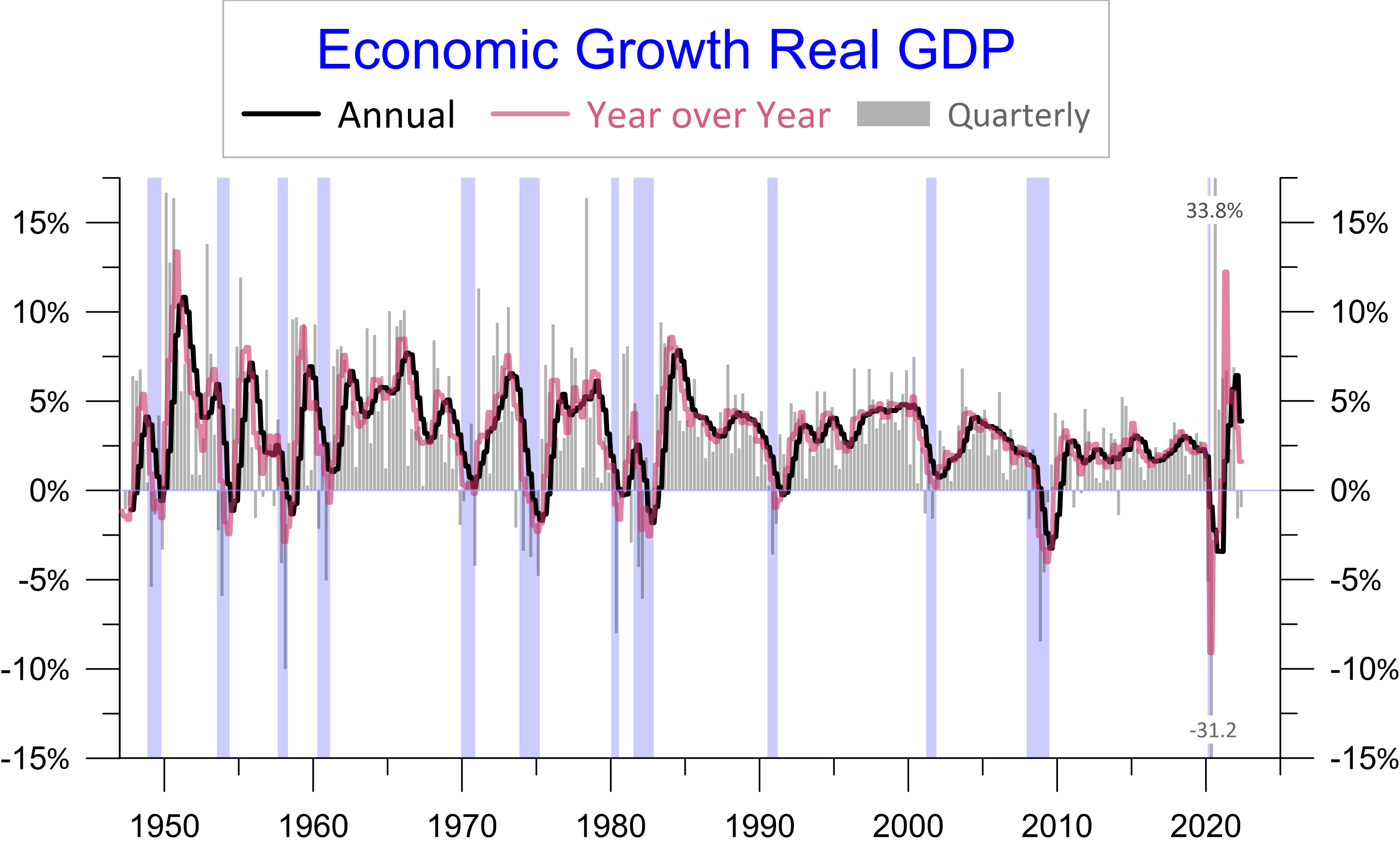
Some people think of two consecutive quarters of declining GDP as a recession; the committee that officially dates them at the National Bureau of Economic Research (“NBER”) does not. The two recent negative quarters are more like digesting a really big meal rather than going hungry. The average of the last 4 quarters is 3.8% larger than the average of the four quarters before that. This 3.8% annual growth rate (black line in chart) is faster than any annual growth rate between 2004 and 2021.
The fast growth brought higher inflation. Many compare recent inflation with the stagflation of the late 1970s early 1980s, but unlike then we have had strong growth and a rising dollar. The current inflation is more like what happened in 1950 the last time year over year growth went above 12.5% (rose colored line in the chart). Also, the Korean War started in 1950. Strong growth and war pushed inflation to 9.5% in 1950. By 1952 both year over year growth and inflation fell to the 2% range. Our current year over year growth is already below 2%. Inflation will likely peak soon or perhaps already has.
The annual and year over year growth rates will likely weaken further, but quarterly growth appears on track to turn positive. It’s unlikely the NBER committee will declare a recession. That committee examines lots of indicators in declaring the beginning and end of recessions. Their decisions will be very understandable if you follow the four indicators in the chart below: inflation adjusted or real personal consumption, industrial production, non-farm jobs and real personal income. If all four have a deep and/or sustained decline the economy will be ruled in recession.
John Early Economic Leads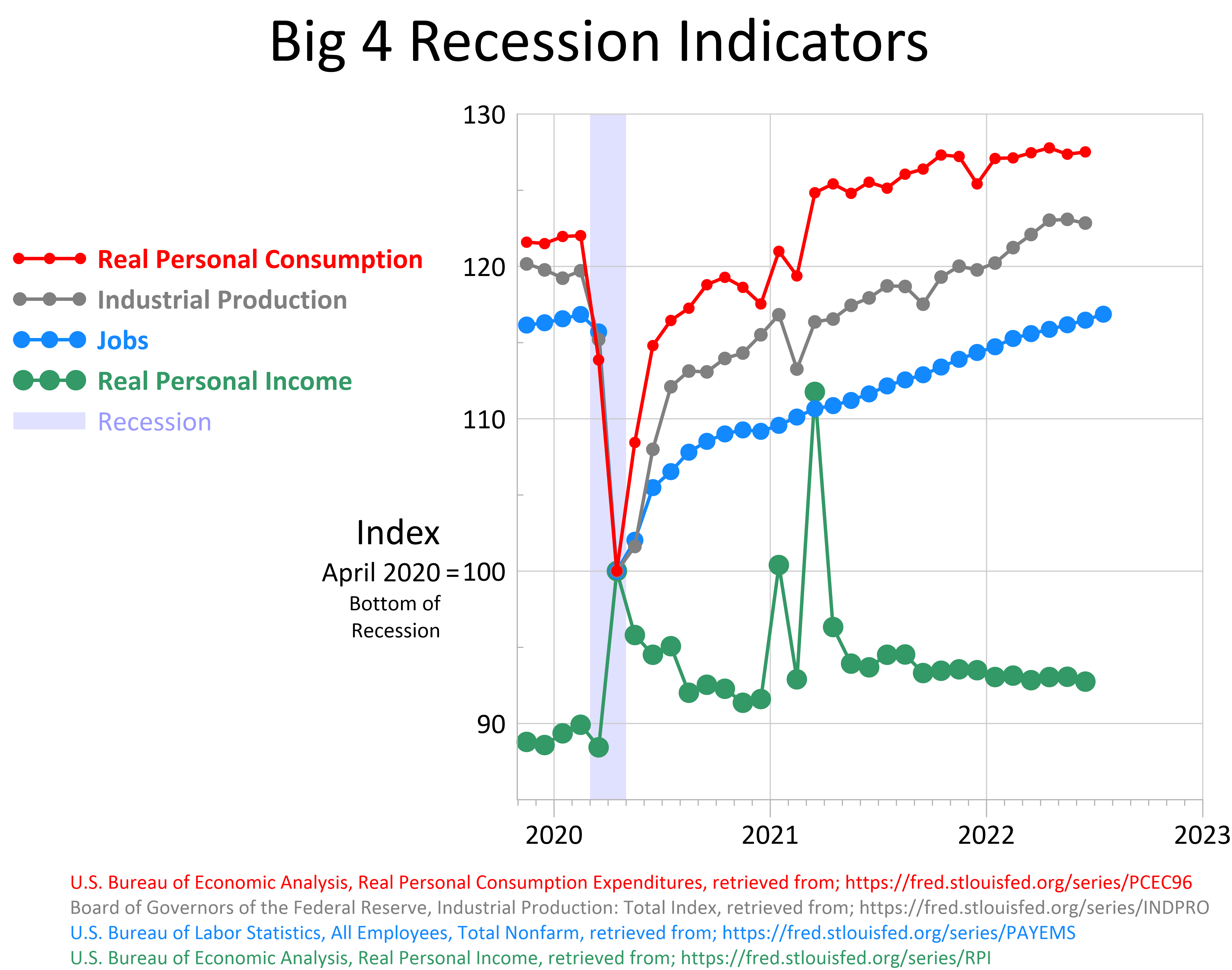
Real personal consumption (red line in chart) has grown the most since the bottom of the covid recession, in April 2020. In the last nine months its growth has flat lined, but has not trended down. Industrial production (gray line) declined in June, but has trended up over the last few months. Jobs (blue line) as mentioned above have had continuous robust growth. Unlike consumption, personal income has not keep up with inflation and real income (green line) has trended down for over a year.
Federal stimulus created ironic perturbations in real personal income. For example, income was 11% higher at the bottom of the covid recession in April 2020 than it was at the peak of the previous expansion in February 2020. Currently real income is well above the peak of the previous expansion, but enormously below the stimulated peaks.
If in the next six months real income continues down and the other three indicators rolled over into a decline a recession would be called. It appears more likely growth will resume for a couple more years.
The strength may have started in July. In addition to strong job growth, auto sales ticked up, along with S&P Global Composite PMI, ISM Services New Orders, ISM Services and NFIB Business Optimism. The goods and services trade deficit also improved.
Business Behaves Like an Expansion
While earnings of the S&P 500 have ticked down 7% after inflation that’s quite modest compared to recent recessions. In the last four recessions inflation adjusted earnings for the index fell 43%, 55%, 92% and 33% respectively.
John Early Economic Leads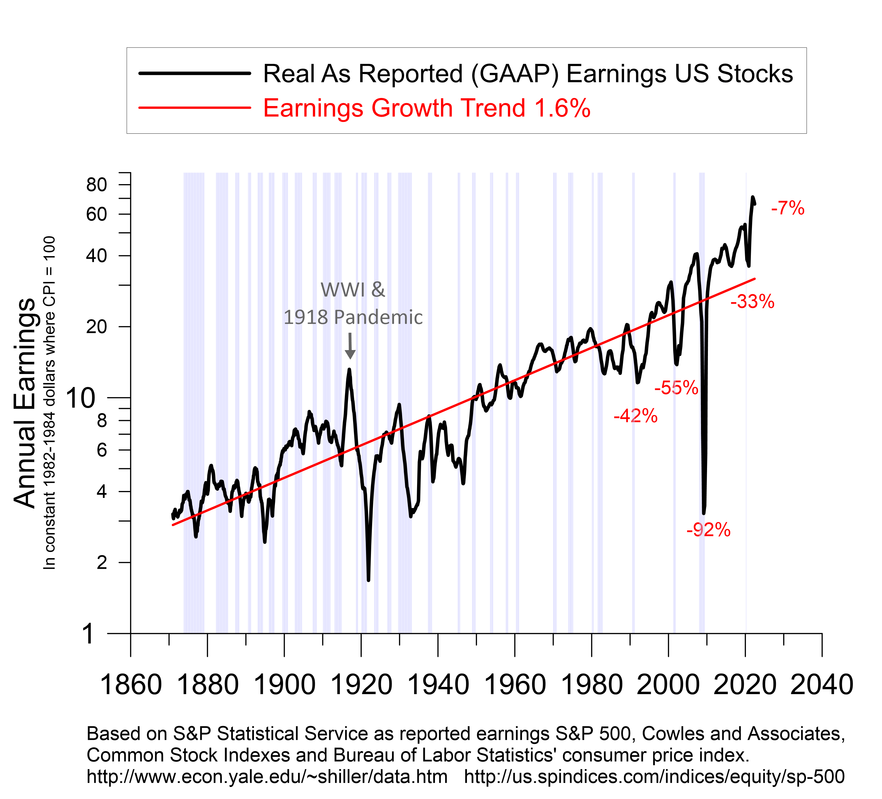
In recessions companies clear out the dead wood. Lines of business that are losing money and don’t appear to have a bright future are discontinued. Loses of discontinued operations show up in generally accepted accounting principles (GAAP) earnings that are reported for tax purposes, but do not show up in operating earnings which only keeps track of ongoing operations. In the last three recessions GAAP earnings dropped more than 20% below operating earnings.
John Early Economic Leads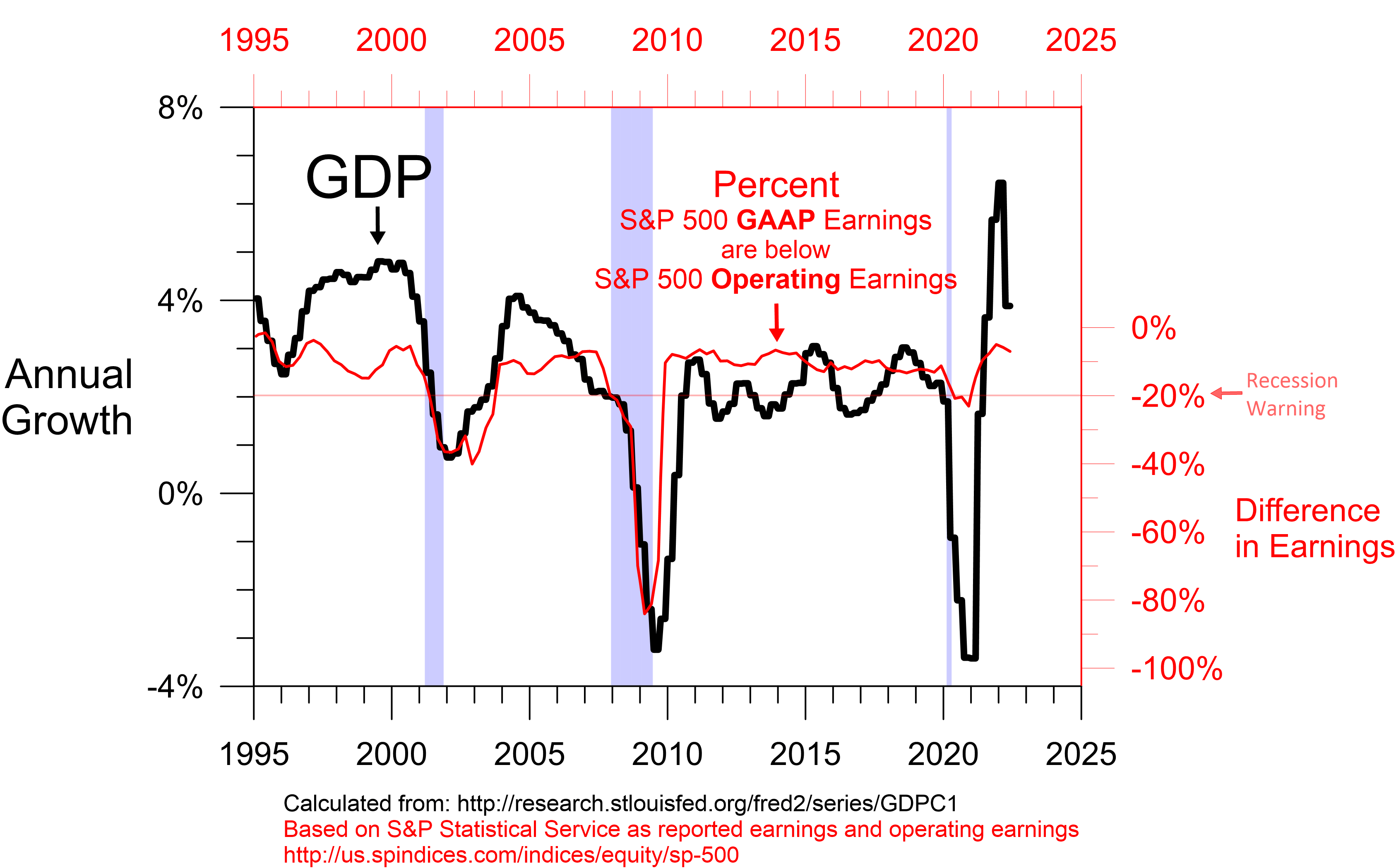
In the 2022 second quarter GAAP earnings are only 7% below operating earnings. This is slightly weaker than at the end of 2021, but it is about the best level of the previous 25 years. The covid recession cleared out the dead wood and current corporate behavior is about as far removed from recession as it has been for decades.
Yield Curve Shows Renewed Expansion
There are lots of ways to look at the yield curve. I examine many of them. Here we’ll look at the difference between the 10-Year Treasury yield and the 1-Year Treasury yield. When there is enough desperation for financing in the short term to drive the 1-Year yield above the 10-Year yield that desperation shows up in weaker economic growth after a lag.
John Early Economic Leads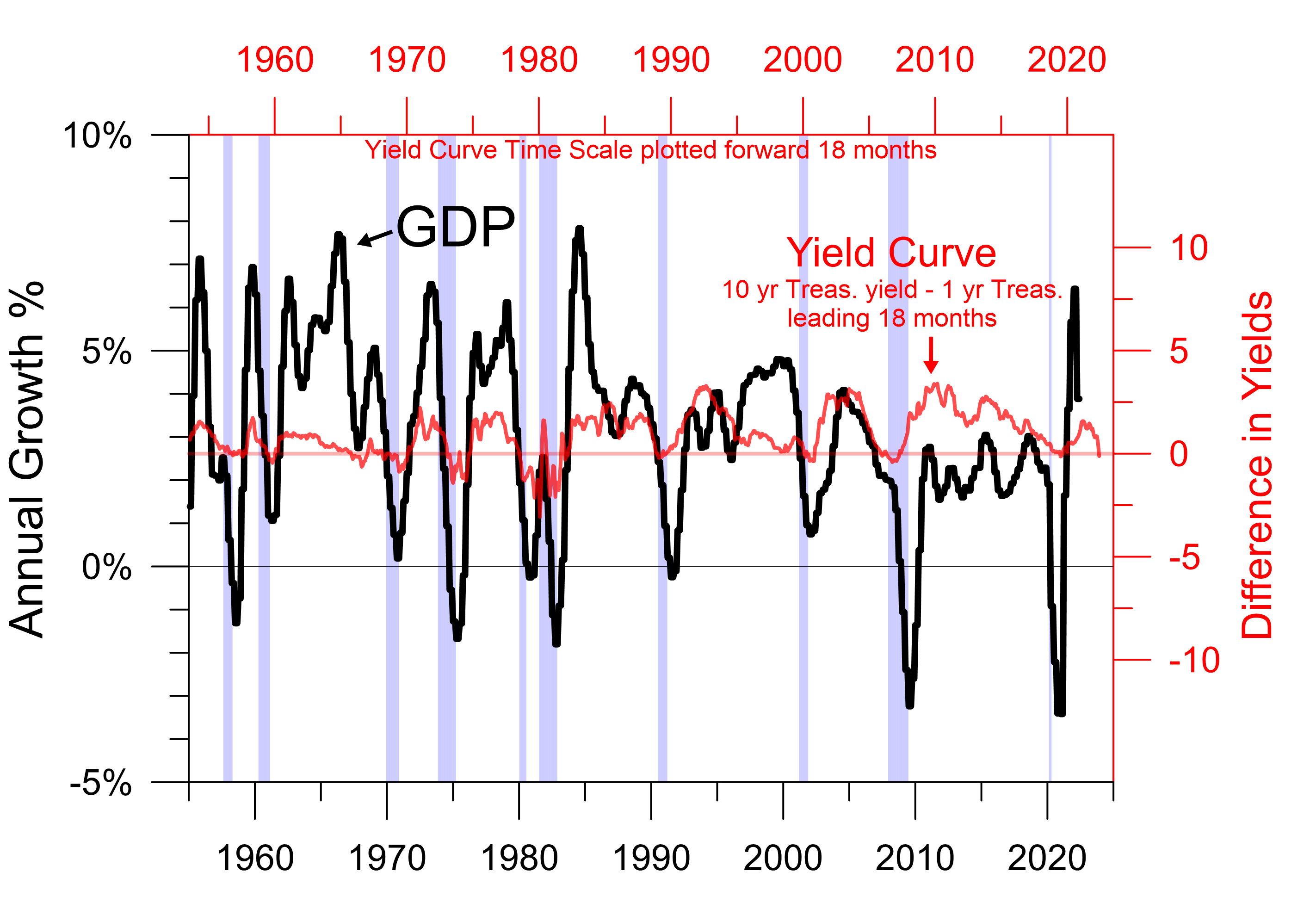
The vertical red scale on the yield curve above is calibrated to the correlation between growth and the yield curve. When the 10-Year Treasury yield is more than 40 basis points above the 1-Year yield the correlation between the yield curve and growth is pretty weak. The correlation is stronger if you just examine when the 10-Year yield exceeds the 1-Year by less than 40 basis points.
John Early Economic Leads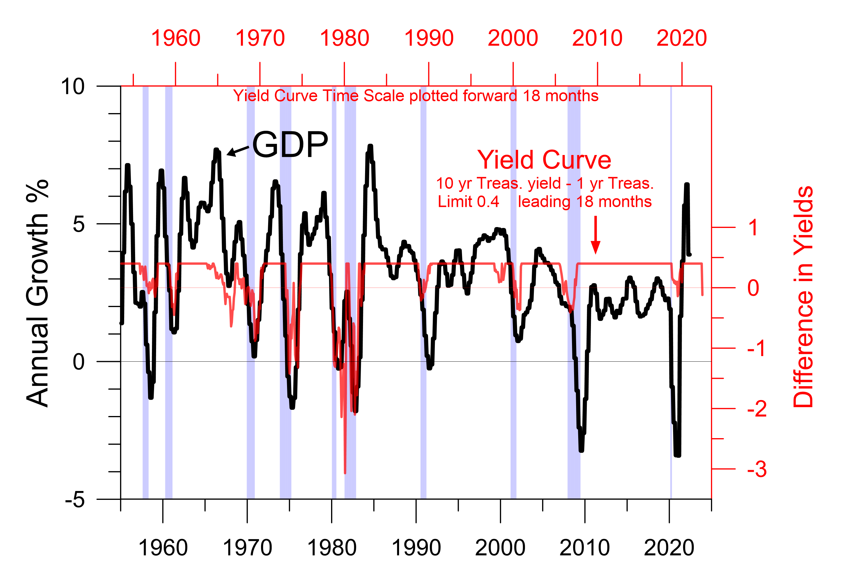
It’s easier to see the recession forecast looking at the yield curve this way. In the period from 1955 through the 1981-82 recession the correlation optimizing lead time for the yield curve and the annual growth rate was 18 months. Since then, the optimizing lead time appears to be longer.
John Early Economic Leads
For the 1990-91 recession, the 2001 recession and the great recession the correlation maximizing lead time between the yield curve and annual growth is 32 months. I don’t know why the lead time shifted, but I suspect it has to do with a change in monetary policy following the addition of the dual mandate.
Before stable prices were added to the mandate monetary policy focused on keeping interest rates low and stable to support a strong job market. Interest rates were less volatile, but growth in the money supply and fluctuations in quarterly GDP growth were more volatile. Since the dual mandate interest rates have been more volatile and growth has averaged having smaller fluctuations.
As I look at the chart above, I believe the pandemic preempted the recession that would have started in December 2020 or in 2021. The chart suggests the annual growth rate will turn down in 2025, but looking at the correlation with quarterly growth will probably give a better sense of when a recession will start.
John Early Economic Leads
The 25-month lead time for quarterly growth suggests the yield curve that inverted in July 2022 could show up as a recession around August 2024. In the meantime, the yield curve suggests the economy will be in expansion mode.
I currently interpret the two negative quarters of GDP as a remnant of a recession that would have been if not preempted by covid and a brief respite from an economy over-stimulated by the Federal Government. So far data for July suggests growth has resumed. The current expansion should be the shortest one since the 12-month recovery/expansion between the back-to-back recessions of the early 1980s.
While I still believe the stock market is horribly over-valued, a resumption of economic expansion probably limits much further downside for now. New highs are quite possible in the next year and a half. The next really dangerous period may come in 2024.
Be the first to comment