

MicroStockHub
The purpose of this article is to examine the USA sectoral flows for December 2022 and assess the likely impact on markets as we advance into January 2023. This is pertinent, as a change in the fiscal flow rate has an approximately one-month-lagged impact on asset markets and is a useful investment forecasting tool. Other macro-fiscal flows can point to events many months ahead or even years ahead.
The table below shows the sectoral balances for the USA and is produced from the national accounts.
US Treasury and author calculations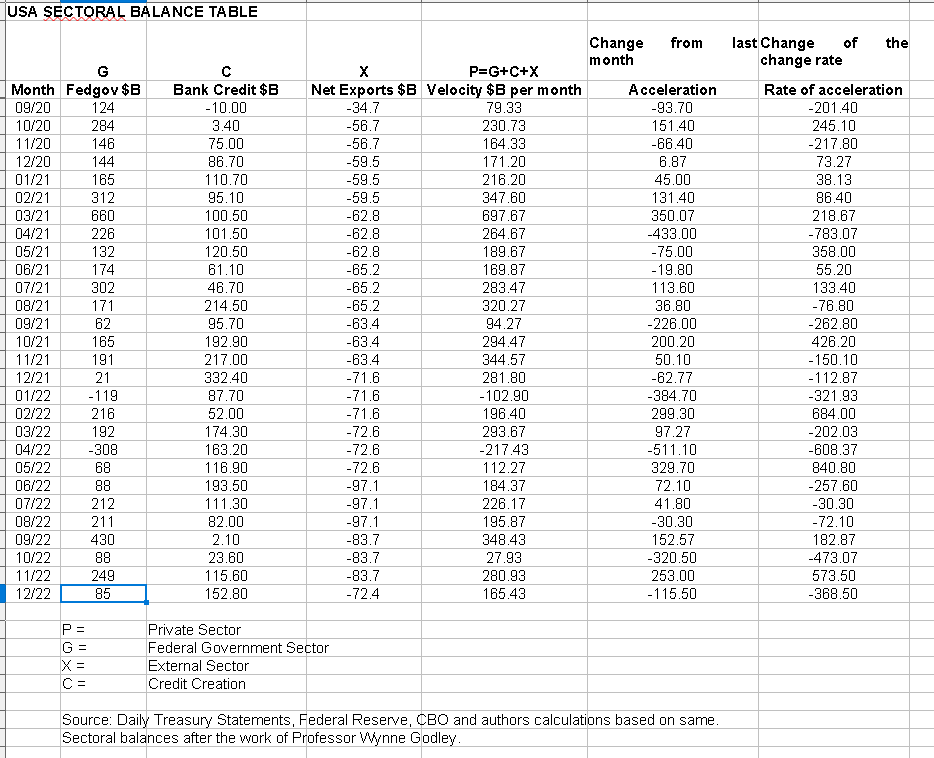
From the table, one can see that the $165+ billion private sector injection of funds came from a $85+ billion injection of funds from the federal government, plus a $152+ billion of credit creation from commercial banks and less the -$72+ billion that flowed out of the private domestic sector and into foreign bank accounts at the Fed in return for imported goods and services. The fiscal acceleration and rate of acceleration numbers are negative because this month’s number is less than last month’s number and represent therefore a weakening of overall financial system liquidity flows and point to weaker asset market outcomes in January.
The chart below shows the above data plotted in nominal terms. A trend line has been added to give an idea of the broad direction, which is downwards for both the private domestic sector (where asset markets are located) and the SPX. The calculation is Federal government spending (G) plus the external sector (X and normally a negative factor) to leave that amount of money left to the private domestic sector (P) by accounting identity true by definition.
US Treasury and SPX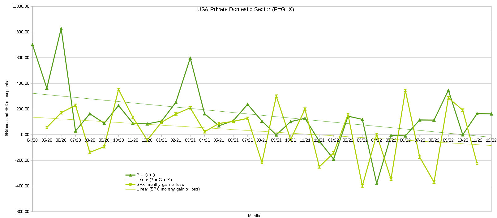
The following chart emerges when one graphs the change rate of the information in the USA sectoral balances table above and adjusts for impact time lags.
Mr Robert P Balan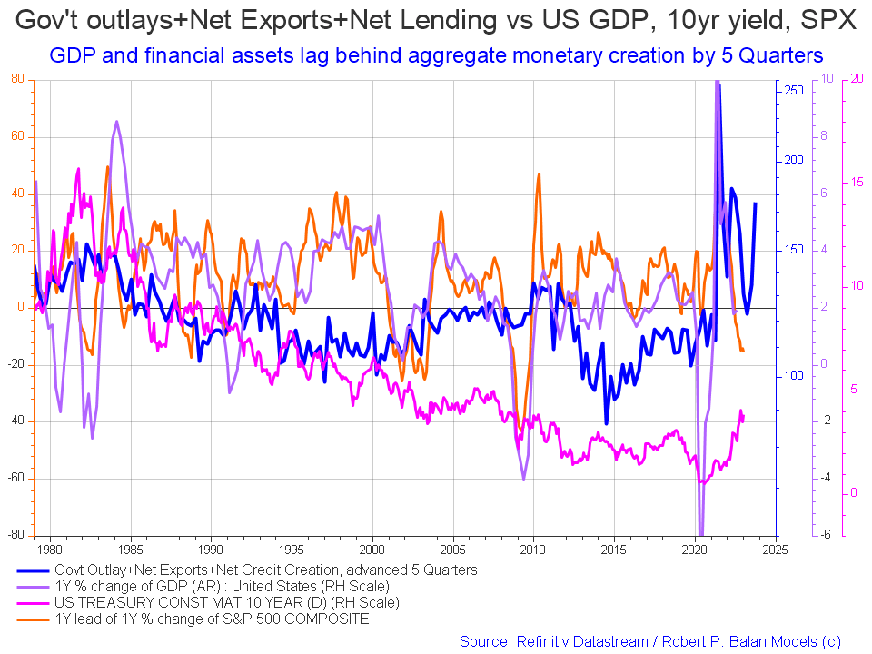
The blue line shows the fiscal impulse from federal government outlays plus bank credit creation and less the current account balance and leads by up to five quarters [a year and three months]. Though still trending downwards at present the orange SPX line is due to start trending back upwards and follow the leading blue line in about mid-2023. The granularity of this chart does not allow for a more precise timing than this but it does point to better times ahead. But for the moment the direction is downward.
The chart below shows the five-year average of the seasonal stock market patterns for the SPX (SPX), NDX (NDX), Dow (DIA), Russell 2000 (RTY), and Biotech (IBB) market indexes. The black oval shows roughly where we are (trading day 10) at the time of writing and the end of the green line on the chart below.
Mr Robert P Blalan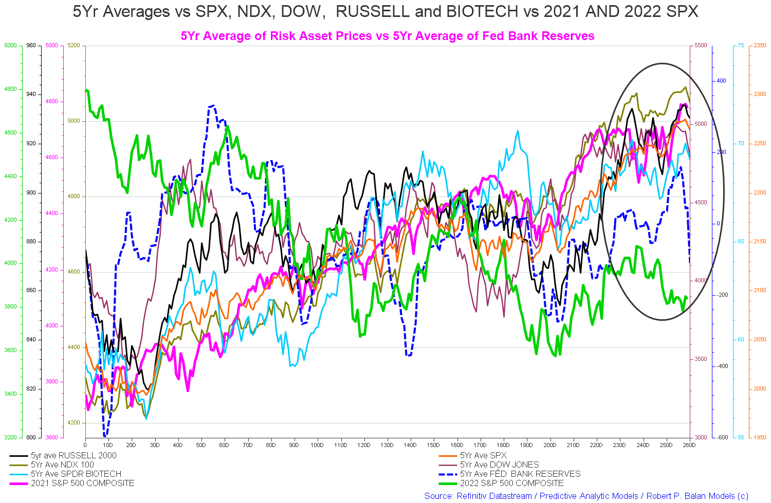
The chart above is a repeating annual pattern. When one reaches December at trading day 240 one begins again from the start at trading day zero.
The general trend now according to the averages, which are becoming more reliable now that the huge covid related fiscal spending wave has worked its way through the system, is for asset markets to fall into trading day 30.
The chart below of the SPX 20-year index seasonality shows this more clearly. After a rise in February markets then fall again into the middle of March where a large federal corporate and income tax collection takes place and this drains a lot of money all at once out of private bank accounts that might otherwise have been invested in asset markets.
The most likely pattern for asset markets this year is the green line on the chart above [2022 S&P 500 Composite] given that the Fed is set to continue its demand destruction monetary policy. The Fed has gone so hard and fast with its harsh monetary policy since Xmas 2021 that a recession at the end of this year or early 2024 is inevitable in my opinion and will be discussed in more detail below.
Equity Clock dot com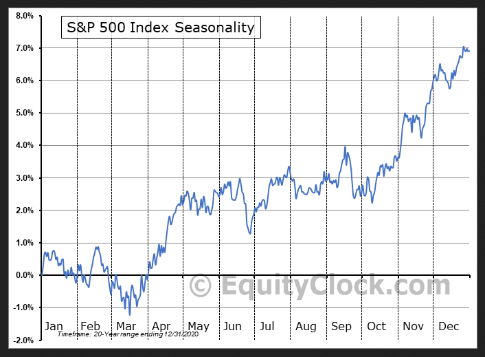
The chart below shows how the external balance has made a macro change of direction that has lasted two full quarters [6 months].
Economics dot com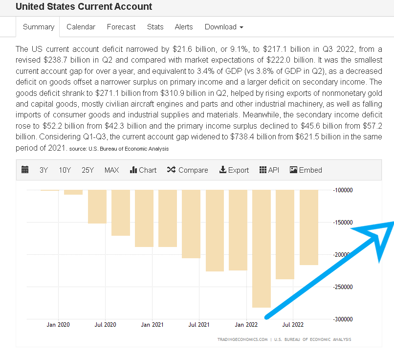
The big macro change happened after the Fed began its demand destruction policy about Xmas 2021 and since then the US current account has fallen dramatically. This leaves more dollars in the private domestic sector and less sitting sterilized at the Fed in foreign ownership as bank reserves and T-securities. This adds to private domestic sector financial assets.
In a sense, the Fed [and by proxy the USA] can be said to be exporting unemployment in that by demanding fewer imports of goods and services from foreigners it causes foreign production to reduce and thereby starts a spiral of lower output and employment in the affected land.
The table below shows the total federal withdrawals from their account at the Federal Reserve Bank. A withdrawal by the federal government is a receipt/credit for the private sector and therefore a positive for asset markets.
US Treasury and author calculations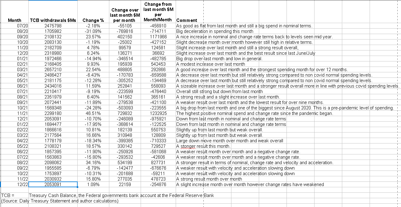
The above table shows the federal government spent strongly in December but less than in November and this makes for negative change rates and flat market outcomes. The sectoral balance table earlier in the article shows that the overall federal government deficit spend [private sector surplus] was much less than in November, despite overall federal outlays being approximately the same, this was because of the large federal tax collection in mid-December made a deduction from the private sector surplus.
The chart below shows graphically the relationship between the federal government (currency creator) and the private sector (currency user) and is from ANG Traders of the Away from the Herd SA Marketplace service. The bottom panel highlights in red and green the financial relationship between the currency creator and currency users. One’s loss is the other’s gain and vice versa.
The 20-day average of the daily net-transfers has managed to remain positive (+$0.33B/day) even though the December tax-take was large. The infrastructure bill, the 2023 discretionary-spending bill, the SS inflation adjustment increase of ~8%, and the increasing interest-income payments will all help to keep the net-transfers positive this year.
(Source: Mr. Nick Gomez, ANG Traders, Away from the Herd SA Market Service).
ANG Traders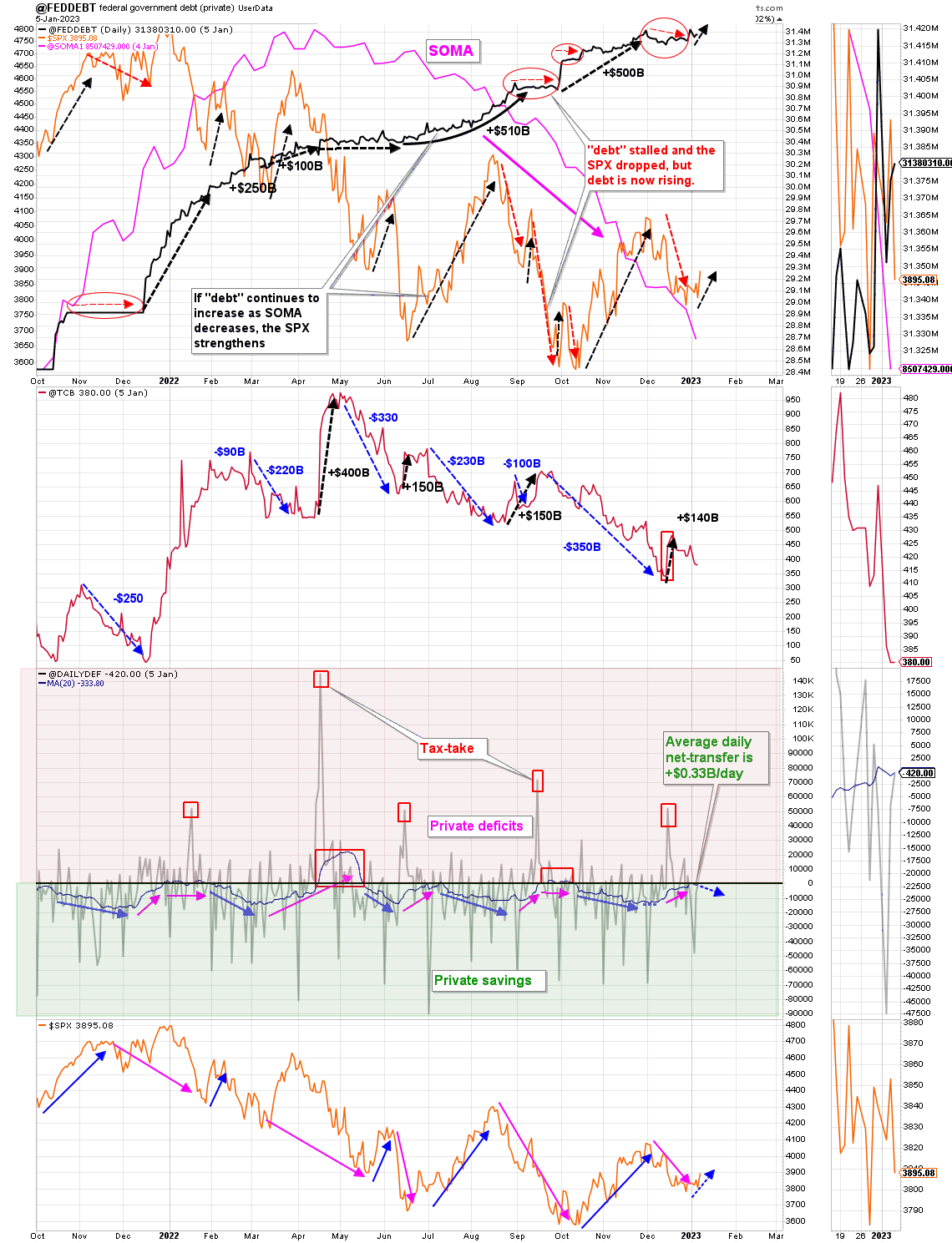
The chart above shows that since the Fed started its quantitative tightening and rate rises the Fed’s balance sheet (SOMA) has steadily fallen while interest rates have risen and markets have fallen. This is just one more factor working against markets at present.
At the White House in the last month, the fiscal budget for the new year was passed and we now have an interesting situation where the budget has been approved but the debt subject to limit has not. This means that the federal government would be unable to implement its approved budget because the US Treasury has been artificially prevented from issuing the treasury securities required to fund total expenditure over and above federal tax collection.
The Debt Subject to Limit is shown in the table below taken from the Daily Treasury Statement dated 9 January 2023.
US Treasury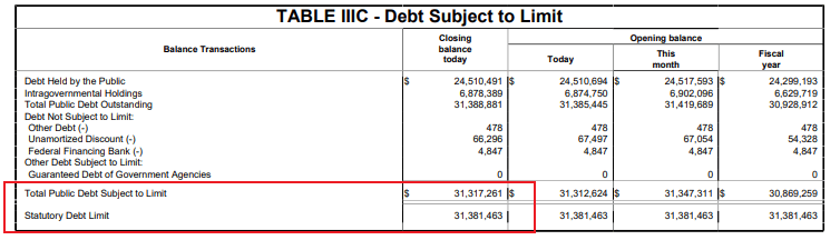
The mid-January federal tax collection will take some pressure off the federal government as the tax collections are recorded in the government’s account balance at the central bank and deducted from bank accounts in the private sector.
There is another FOMC meeting at the end of January that almost coincides with the above-mentioned mid-January federal tax collection. At the next Fed meeting, it is likely that there will be another rate increase but perhaps by less this time.
The Fed has sown the seeds of a recession that is now baked into economic outcomes which is shown in the following chart and chat extract from the PAM discussion forum and is a very important takeaway from this report.
Mr Robert P Balan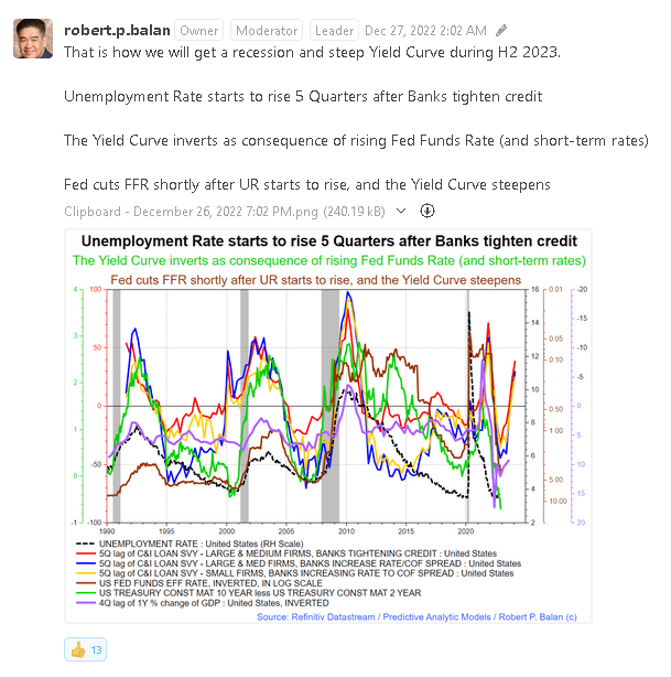
The chart and forecast naturally led to many questions from the members of the PAM community and the following additional information was tabled to explain the situation more fully.
Mr Robert P Balan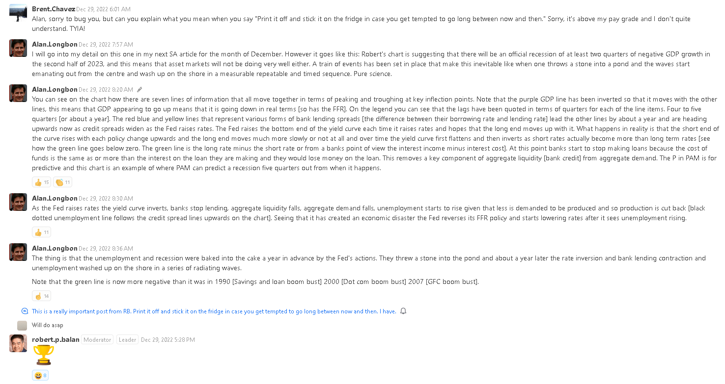
On a related topic, this week I became aware of Sahm’s Law and this is illustrated in the chart below.
FRED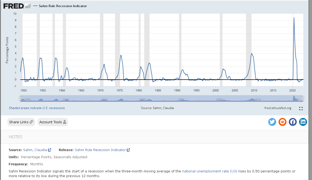
This law can be observed in real-time at FRED on the above chart, and I will add a link in the comments section below. Like a slow-moving train wreck, we will watch it unfold as the Fed raises interest rates causing the unemployment level to rise and cross the ‘magic’ 0.50 percentage point threshold relative to its low during the previous 12 months on a three-month moving average rate basis.
So with a recession baked into the financial flow cake, there is little to no prospect that asset markets will rally and move upward between now and then. A continuation of the year-long asset bear market is the most likely outcome.
On the larger world macroeconomic side we have the G5 chart below. The chart below comes from Mr. Robert P. Balan of Predictive Analytic Models and is part of his SA Marketplace service information for subscribers. The chart shows the level of money creation by the top five world governments (the G5) in a change rate format, along with a host of other indexes. This chart gives a sense of important inflection points and direction.
Mr Robert P Balan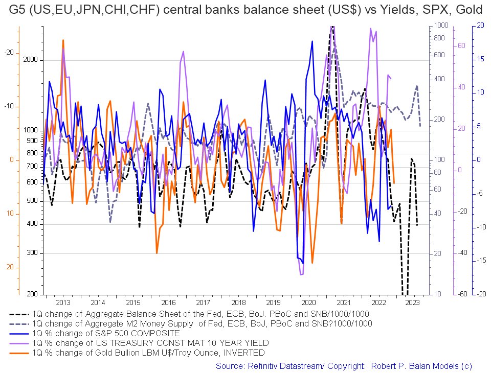
When one zooms in a little more, on the above chart, to achieve a little more granularity the following chart emerges.
Mr Robert P Balan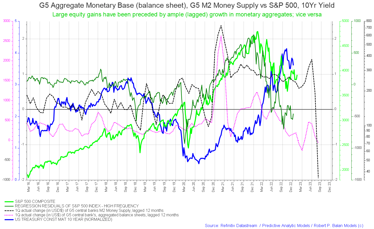
One sees how the M2 money supply drops and goes negative around September 2023. The green subtitle on the chart can be rewritten in this context to now say “large equity losses have been preceded by ample [lagged] declines in monetary aggregates and; vice versa.”
The chart below tracks the activities of the top five central banks (the C5) and shows a similar trend (dark green line on the chart) and a sense of amplitude (not that great).
Mr Robert P Balan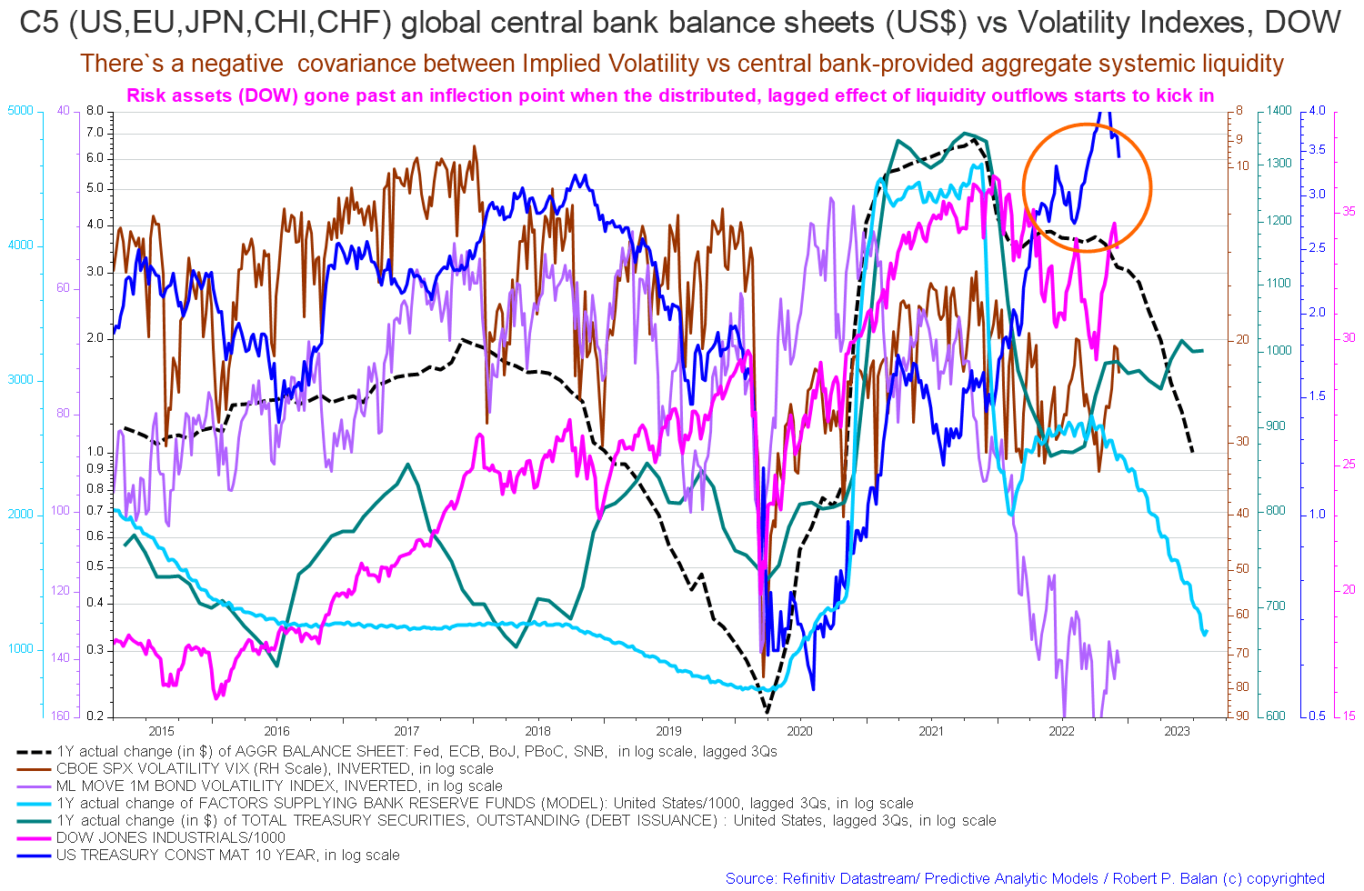
If you are looking to make a market entry, sometime in the last quarter of 2023 is likely to be a good time judging by the macro tidal forces that underpin the asset markets. Best to wait now until the recession has come and gone.
Be the first to comment