

Avalon_Studio
By SCHIFFGOLD
The headlines keep telling us the US has a robust job market, but a deeper dive into the data tells a much different story.
A Tale of Two Reports
Every month, the BLS releases two job reports. The Nonfarm Payroll Report generates all the headlines and gets the most attention. The second report which gets much less fanfare is the Household Survey. The plot below shows both reports.
As shown, the Household report had been significantly lower than the Headline Report going back to April of this year. December flipped that in a big way with the Household report showing 3.2x more jobs than the Headline Report (717k vs 223k).
December was the biggest deviation since October 2020. It cannot be explained by holiday hiring as last December saw the Household survey at 93% of the Headline Report.
Figure: 1 Primary Report vs Household Survey – Monthly (Author)
Even the massive deviation in December 2022 will rank as the biggest discrepancy (70.2%) between the two reports since 2013 (63%). Typically, the Household Survey ranges from 85%-120% when compared to the Headline Report.
Figure: 2 Primary Report vs Household Survey – Annual (Author)
There is another report published by the BLS called the Quarterly Census of Employment and Wages (QECW). According to the BLS, this is a far more accurate and rigorous report covering 95% of jobs available at a highly detailed level. Due to the rigor, the report is released quarterly on a 7-month lag.
The data shown below is only updated through June 2022. As can be seen, even in this report, 2022 is showing the widest deviation of any year back to 2010. The QECW shows job growth at 66% of the Headline Report. Even when filtering for the first 6 months of the year across all years (not shown), 2022 is the year where the Headline Report is overstating jobs by the largest amount.
Figure: 3 Primary Report vs QCEW – Yearly (Author)
The BLS also publishes the data behind their Birth/Death assumptions. These are the jobs that the BLS assumes based on companies starting or closing. While the data is not seasonally adjusted, it directly impacts the Headline Report. The chart below shows the impact of Birth/Death jobs on the total number. While this year represented a modest 30%, up from 20% in 2021, the aggregate number is worth noting.
Before 2021, the Birth/Death assumptions were right around 1M. In 2021 and 2022, the assumptions surged 30% to over 1.34M in both years. Essentially, 700k jobs over the last 2 years were due to larger assumptions being made on top of baseline assumptions.
Figure: 4 Primary Unadjusted Report With Birth Death Assumptions – Annual (Author)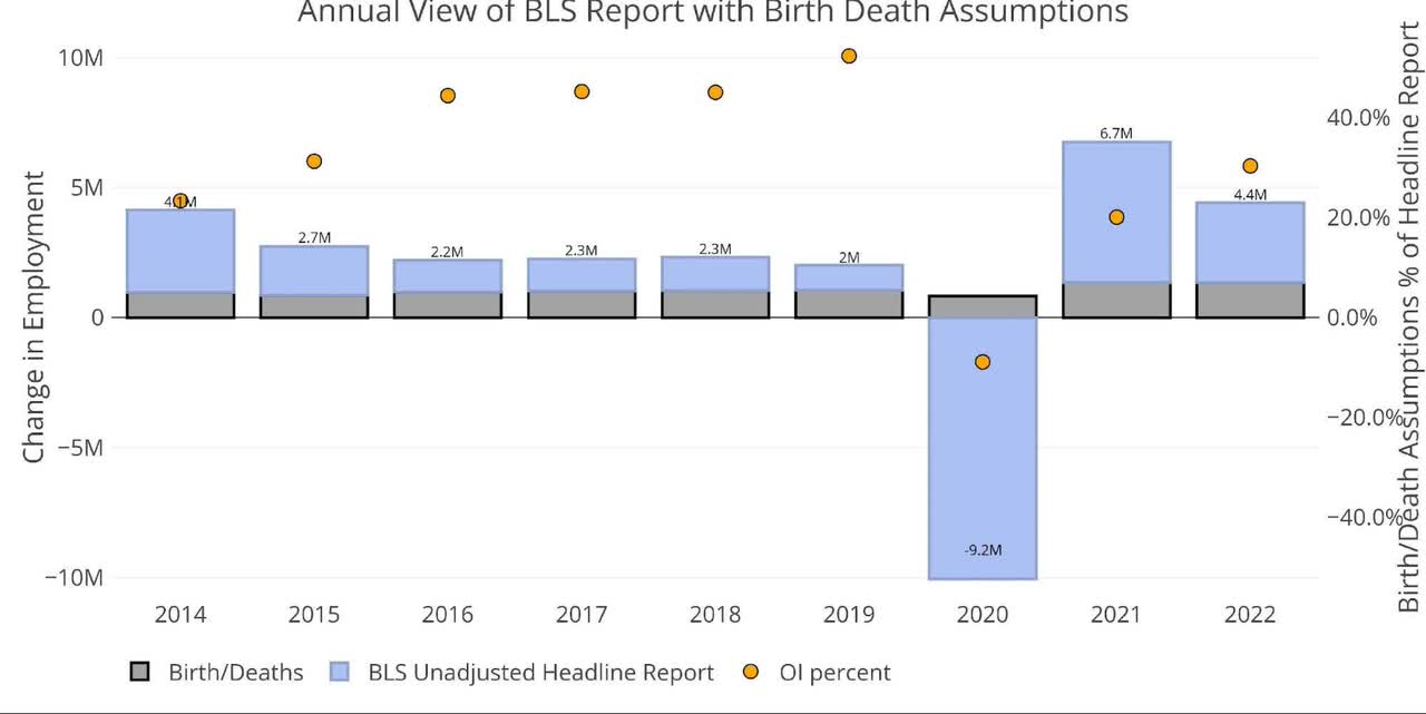
Looking at the quarterly Birth/Death data shows that 41% of Q3 jobs were made up of the Birth/Death assumptions. Q4 saw 26.4% of jobs come from the Birth/Death assumptions which were 413k jobs.
Given the recessionary environment, these are very generous assumptions. Considering the data from the Household Survey and QECW, it is very likely these assumptions are just plain wrong.
Figure: 5 Primary Unadjusted Report With Birth Death Assumptions – Quarterly (Author)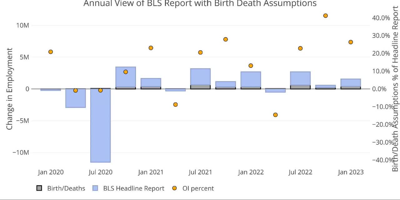
Current Trends
Even though we just spent a few paragraphs and 5 charts showing how the BLS Headline Report is not very reliable… that is what the market takes as gospel. This is also what the Fed uses in shaping monetary policy, thus it is still important to understand the data, even if it’s probably wrong.
The US Economy added 223k jobs in December as the Unemployment rate fell to 3.5% and the Labor Force Participation rate increased to 62.3% from 62.2%.
Figure: 6 Change by sector (Author)
When looking at the data for multiple job holders, we can see that the number surged from 7.68M to 8.05M. Some quick math shows that 370k jobs were directly a result of multiple job holders.
Let’s subtract this from the 223k, and carry the 1… oh wait… the jobs report would have been -147k if not for 370k second jobs being created! If that isn’t a sign of a healthy economy, I don’t know what is (sarcasm).
Figure: 7 Multiple Full-Time Employees (Author)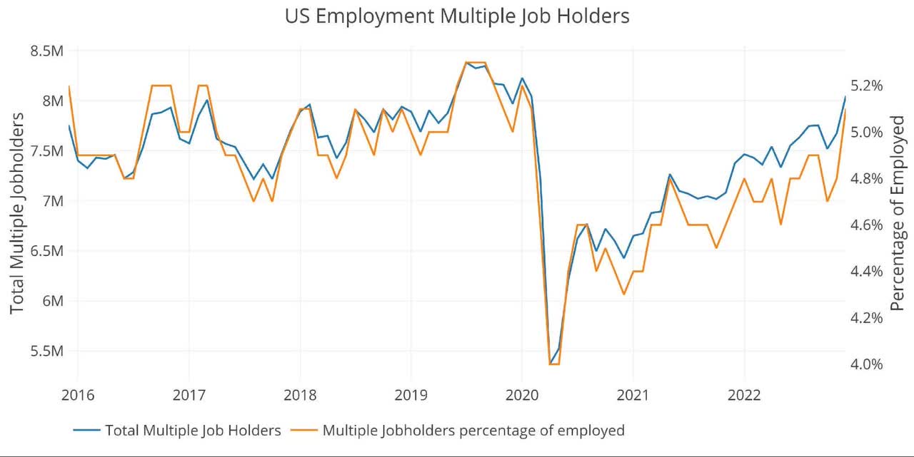
If we poke the report a little harder, we can see that the raw numbers were -244k. This means the raw numbers were adjusted up by 467k. Looking historically, this is the biggest December upward adjustment going back to at least 2010.
Figure: 8 YoY Adjusted vs Non-Adjusted (Author)
Breaking Down the Adjusted Numbers
Even with the massive adjustment up, the jobs report was still weak. 7 of the 8 trends came in below the 12-month average.
Figure: 9 Current vs TTM (Author)
The table below shows a detailed breakdown of the numbers.
Key takeaways:
- The current month is below the 3-month average
- Professional Business actually shed jobs as did Information
- Construction showed a significant rebound, surging above 3-month, 12-month, and 3-year trends
Figure: 10 Labor Market Detail (Author)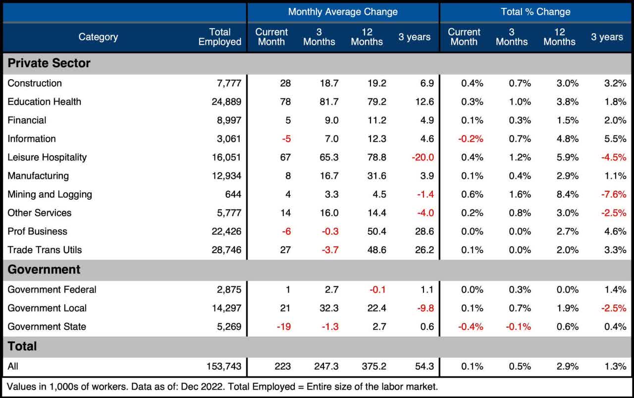
What it means for Gold and Silver
As we unpack the labor report, we can see that the actual employment situation is much weaker than the headlines suggest. This is not a conspiracy; this conclusion can be reached using the numbers provided by the BLS!
The Household Survey has been weaker, the QECW data has been weaker, we are seeing record jobs created through assumptions in the Birth/Death model, and December just saw the largest adjustment up from non-seasonally adjusted to seasonally adjusted.
The underlying weakness in the data is getting missed by the mainstream and even the Fed. Everyone focuses on the Headline Report. When the weakness is finally seen by everyone, it will be far too late to do anything about it. You can bet that the Fed will try though with a hard and fast pivot. The gold market seems to already be pricing this in, racing out of the gates to start the year and closing out the week above $1860.
It’s still not too late to get on the train before it leaves the station… but that train is picking up speed.
Data Source: https://fred.stlouisfed.org/series/PAYEMS and also series CIVPART
Data Updated: Monthly on first Friday of the month
Last Updated: Dec 2022
Interactive charts and graphs can always be found on the Exploring Finance dashboard: https://exploringfinance.shinyapps.io/USDebt/
Editor’s Note: The summary bullets for this article were chosen by Seeking Alpha editors.
Be the first to comment