

Pgiam/iStock via Getty Images The Master Sentiment Index [MSI] vs SPY (Michael McDonald)
Master Sentiment Index Indicates the End of the Bear Market
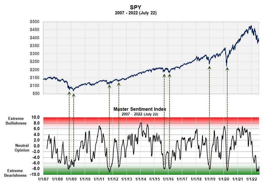
This 16-year chart plots the Master Sentiment Index, which is a composite index made from seven historical sentiment indicators, against the S&P 500 Spider ETF. It’s signaling the end of this bear market since the current level is at the same levels registered at the eight previous bear market lows. We’ll explain how this composite is formed and why we believe the current reading is so significant.
Theory of Contrary Opinion
The theory of contrary opinion states the following: when the vast majority of investors think stock prices will advance, they almost always decline. Likewise, when the vast majority think prices will decline, they usually advance. In other words, prices will move contrary to what investors expect but only when those expectations have reached an extreme.
Notice that the theory does not consider the economic reasons that are making everyone bullish or bearish in its forecast. It simply states that the necessary and sufficient condition for a major market top or bottom is the existence of an extreme level of bullish or bearish sentiment.
My first book, published in late 1999, was written to forecast the end of the 1982 to 2000, 18-year bull market. It was based solely on the fact that bullish sentiment in 1999 had gotten so extreme that the moment had to represent the end of the “great” bull market. Even though it wasn’t clear in 1999 what the economic reason behind a market decline would be, we still made the forecast. History now shows that assessment was correct.
But we have the opposite situation today – an extreme amount of bearish sentiment.
Measuring Bearish Sentiment
How do you determine when there is “extreme bearish sentiment?” Since the theory was first formulated by Humphrey Neill in 1954, different ways to “measure” investor opinion have developed. Some are based on investor activity, such as the amount of investor short selling, short interest or put buying.
Other methods are based on market surveys such as the “American Association of Individual Investors” bullish and bearish percent, or the “Investors Intelligence” bullish-bearish advisory ratios. The latter was started in the mid-1960s and history shows it has worked pretty well over the last 60 years at locating market bottoms.
Sentiment indicators worked better at locating and forecasting bear market bottoms than bull market tops. But no one indicator always worked best; one or two seemed to work better in some markets than others. So, it became important to see if the different sentiment indicators could be combined into one composite sentiment indicator in a logical and mathematically consistent way.
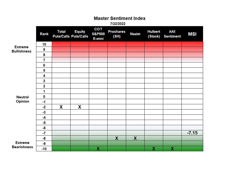
The MSI Indicator Table (Michael McDonald)
Combining individual sentiment Indicators to form a Master Sentiment Index
Combining multiple indicators to form one sentiment indicator is not easy. How do you combine a puts and calls ratio of 1.0 with a 40% Investor’s Intelligence bearish percent? Everything has to be mathematically consistent. We accomplished it in the following way.
We took each indicator back as far as history allowed (the smallest time period being 17 years) and determined the range of values that contained the highest 5% of its values. Then we determined the range of values that contained the next highest 5%. This procedure was continued in 5% increments down to the 5% band that contained the smallest values. This activity allowed us to put every indicator on the same 21 range scale which was labeled 10 to -10.
We then added each indicator’s position number (10 to -10), which determines where it is historically, and divided the total by the number of indicators in the composite. Out came a composite number between 10 and -10 that represented the average bracket value of all the sentiment indicators.
The MSI Red and Green Zones
The graph at the top of this article is the plot of this number against the SPY. As you can see it oscillates between 10 and -10. Large white area in the middle represents periods of time when there is no extreme opinion. The red area on the chart represents when the indicator is getting into the “extremely bullish” range. The lower green band shows when the index is getting into the “extremely bearish” range. There is no sudden demarcation line but a graduated area that shows greater and greater bearishness. The chart clearly shows how the current level compares to levels at major bottoms of the last 16 years.
The first column in the table lists the 21 rankings that go from +10 to -10. This is followed by the names of the seven indicators used in the composite with an X showing the current ranking of each. Two of these indicators – the buying of ProShares Short S&P 500 ETF (SH) and the Short position of asset managers in the S&P 500 E-mini futures – were explained in Seeking Alpha articles, “Commitment Of Traders Data Is Signaling A ‘Risk-On’ Moment For Stocks” and “DOG, PSQ, SH: 3 Contrary Opinion Indicators Pointing To Major Market Bottom“. The last column displays the ranking number of the MSI index which on July 22 was -7.3. (At some point we intend to expand the master index to include eight indicators.)
Understanding Why the Theory of Contrary Opinion Works So Well
After 50 years of study and application, I still don’t completely understand why the theory works so well. I know the reasons people usually give for why it works: that at the market top, when everybody’s bullish, there are no buyers left to push prices higher, so they decline. And vice a versa at the bottom: after everyone’s turned bearish and sold their positions expecting prices to go lower, there’s no one left to sell so prices begin to rise with just a meager amount of buying.
But there is more to it than this. There’s an economic aspect to the theory that people have either forgotten or are unaware of.
Humphrey Neill’s original 1954 book called “The Art of Contrary Thinking” was not about the stock market but about the economy. It cited numerous times in the first half of the 1900’s when the economy went opposite to what everyone expected. When most people expect a recession, they got expansion. When they expected inflation after World War 2, it never came. Which brings us to two silly, little acronyms I coined 25 years ago to explain this – BABES and O’BUCS.
Of BABES and O’BUCS
If contrary opinion is a fundamental theory in predicting stock prices, as I and many others believe it is, then it follows that there must be a BABES and an O’BUCS (I know they’re silly names but stay with me.)
BABES stands for “Broadly Agreed to But Essentially wrong Scenario.” O’BUCS stands for “Occluded But Ultimately the Correct Scenario. The basic idea of all this is that the economic outlook that is making everyone bullish or bearish must be wrong—there must be some holes in the data or thinking about the data.
In applying the theory, you try to discover the true economic scenario people are missing—finding the O’BUCS idea. Locating the O’BUCS idea is the action of finding today the economic scene that is about to emerge that will explain why stock prices moved opposite to what everyone expected. This is what Humphrey Neill meant in his book. History shows this, more often than not, is the case.
So, what’s the current O’BUCS idea? I believe it’s this. That this sudden jump in inflation is temporary and about to end. Serious, endemic inflation doesn’t start this way; it starts gradually then grows bigger and bigger. Both the suddenness and the size of this current round are clear signs to me of a temporary situation. I think the Fed rate hikes will bring an end to it real fast and even bring about some deflation and they will quickly reverse their actions. By that time the market will be 25% to 50% higher.
Be the first to comment