

natasaadzic
Introduction
With last week’s report on Q2 GDP, and Monday’s update of the Senior Loan Officer Survey of bank lending by the Federal Reserve, we have almost all the information from the midpoint of this year we need to take a long range peer into the likely state of the economy one year from now, via the long leading indicators.
What Are The Long Leading Indicators?
I have several systems for forecasting the economy. One is the high-frequency “Weekly Indicators,” which, as the name implies, is updated weekly and is thus very timely. For the short term, up to about 6 months out, a second, K.I.S.S. method, relies on the Index of Leading Indicators, is a perfectly adequate tool with the inconvenient habit of being right more often than most highly paid Wall Street forecasters.
To forecast the period over 6 months out, I turn to “long leading” indicators, relying for that on monthly and quarterly data which has been extensively vetted in for decades already, and as during that time going back 50 years has a sustained record of turning one year or more before the onset of a recession.
Most of what you read which seeks to forecast the economy falls into two categories of leading you astray:
1. Most observers simply project existing trends into the future, overlooking that there are some data-points that reliably turn before others, and thus completely miss turning points until they are already in the rear view mirror.
2. A great deal – perhaps most – of what you read about the economy starts off with an ideology and a conclusion based on that ideology already baked into the cake. The writer then marshals a series of data-points that confirm that already-determined conclusion. The very same utterly decisive economic metric from last year that was moving in one direction is completely ignored this year when it is moving in the opposite direction, and vice versa.
By contrast, my method is to look repetitively at a bank of indicators that have decades – in a few cases, over a century – of history, and a demonstrable record of being reliable harbingers of the continuation or reversal of an existing trend.
Now let’s return to my main topic at hand. Geoffrey Moore, who for decades published the Index of Leading Indicators, and in 1993 wrote “Leading Economic Indicators: New Approaches and Forecasting Records,” identified 4:
- Housing permits
- Corporate bond yields
- Real money supply
- Corporate profits adjusted by unit labor costs
A variation of the above is Paul Kasriel’s “foolproof recession indicator,” which combines real money supply with the yield curve, i.e., the difference in the interest rate between short- and long-term treasury bonds. This turns negative a year or more before the next recession about half of the time.
Another long leading indicator has been described by UCLA Prof. Edward E. Leamer, who wrote “Housing IS the Business Cycle.” In that article, he identified real residential investments as a share of GDP as an indicator that typically turns at least 5 quarters before the onset of a recession.
Several other series appear to have merit as long leading indicators as well. Real retail sales in several forms also have value as a long leading indicator and, in particular, real retail sales per capita. Additionally, the tightening of credit conditions also appears to have merit as a long leading indicator.
That gives us a total of 7 categories of long leading indicators. All of these economic series have a long-term history of turning a year or more before a recession.
Important Previous forecasts
Back in February 2021, forecasting through the end of last year, I wrote:
“the long leading indicators support a firm, even strong expansion through the remainder of 2021.”
And so it was, as the economy Boomed, with 5.5% real growth for the year; employment grew 4.7%, production gained 3.7%, real income grew 2.4%, and real sales grew 2.1%.
But by August of last year, looking ahead to now, the situation had changed. Then, I wrote:
“while the long leading indicators confirm a firm, even strong expansion through the remainder of 2021, by spring of 2022 they are neutral, suggesting a much softer economy, although not a recession before the midyear limit of this forecast.”
The economy was indeed much softer by the first half of this year. Although real GDP clocked in slightly negative for each quarter, payrolls, production, and real income continued to climb at least through May, while real sales declined.
When I looked at these indicators in January of this year, I concluded that:
“the long leading index . . . forecast[s] an outright stall by year end 2022. It would not take much – an inverted yield curve, or a further softening of business profits – to tilt the forecast negative (for 2023). But we’re not there yet.”
In May, because there had been significant developments since January, I wrote a special update, concluding that
“for the first time since the pandemic began the long leading forecast in my premiere system is now negative, warranting a ‘Recession Watch’ for the period 12 months past the last date, i.e., beginning with Q1 of 2023.”
Current Trends In The Long Leading Indicators
Corporate Bond Yields
On a monthly basis, corporate bond yields data goes back over 100 years to 1919. With the exception of the 1981 “double-dip,” the fiscal contractions underlying the 1938 and 1945 recessions, 1926, and – excusably I think! – 2020’s pandemic – corporate bond yields have always made their most recent low over 1 year before the onset of the next recession, as shown in the graph below of the last 40 years (although the correlation goes back much further):
Corporate bond yields (FRED)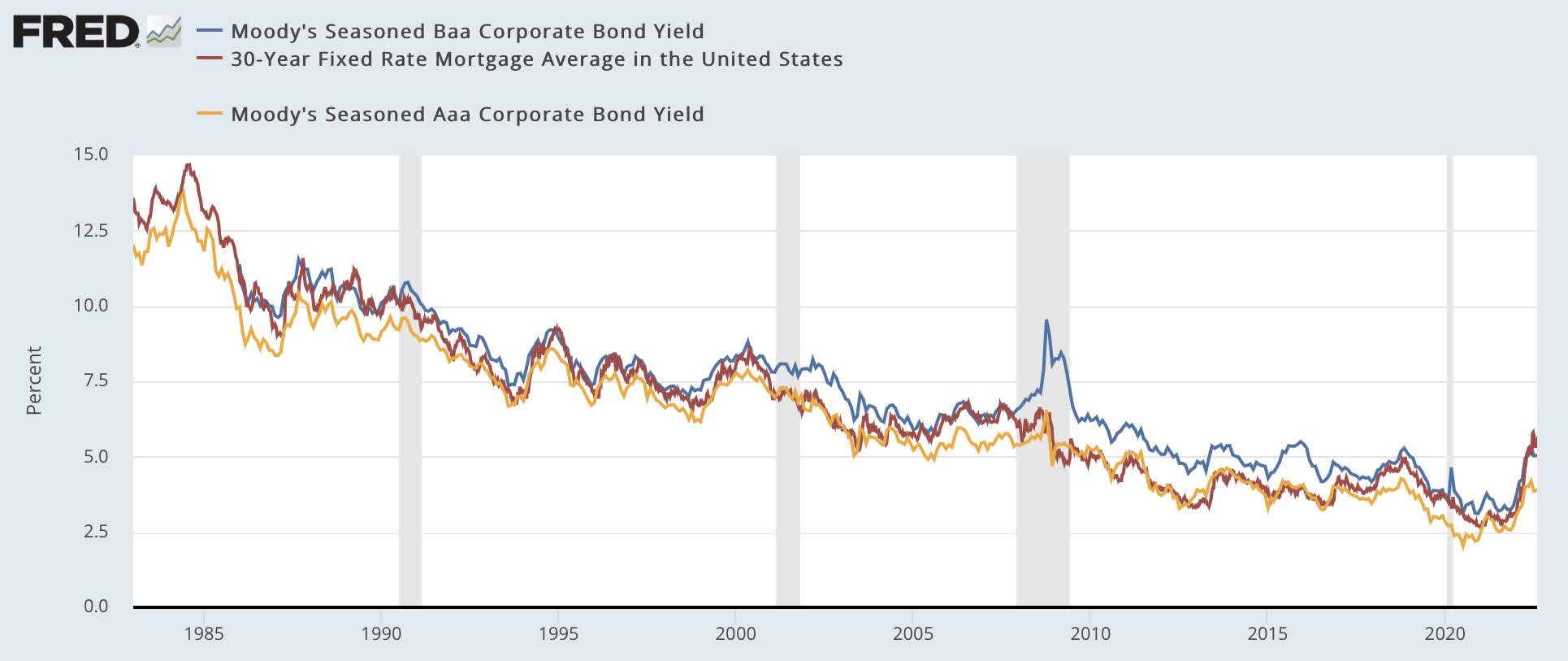
Now here is a close-up of the last 10 years:
Corporate bond yields (FRED)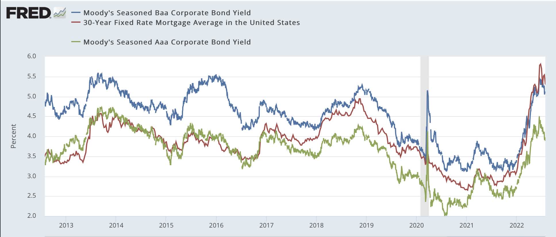
AAA-rated bonds last made a new low in July 2020; BAA-rated bonds in December 2020. Mortgages reached all-time lows in early January 2021. In the 2nd Quarter of this year, corporate bonds approached 10 year high yields, and mortgage rates made new 10 year highs. In the past 40 years, only in 1994 did a conquerable move not result in a recession. Thus corporate bonds are very negative.
At the same time, note that bond yields have declined significantly in the last month. Should this continue, it may be an important signal of when the economy will resume growth.
Housing
Housing, which typically follows interest rates with a few months’ lag, has typically declined by over one year, and by 20% or more before the onset of a recession (the mild recession of 2001 being the exception, with only a 10% decline), as shown in the below graph of housing permits, both total (not shown) and single family (red in the graph below) as well as new home sales (gold):
Housing metrics (FRED)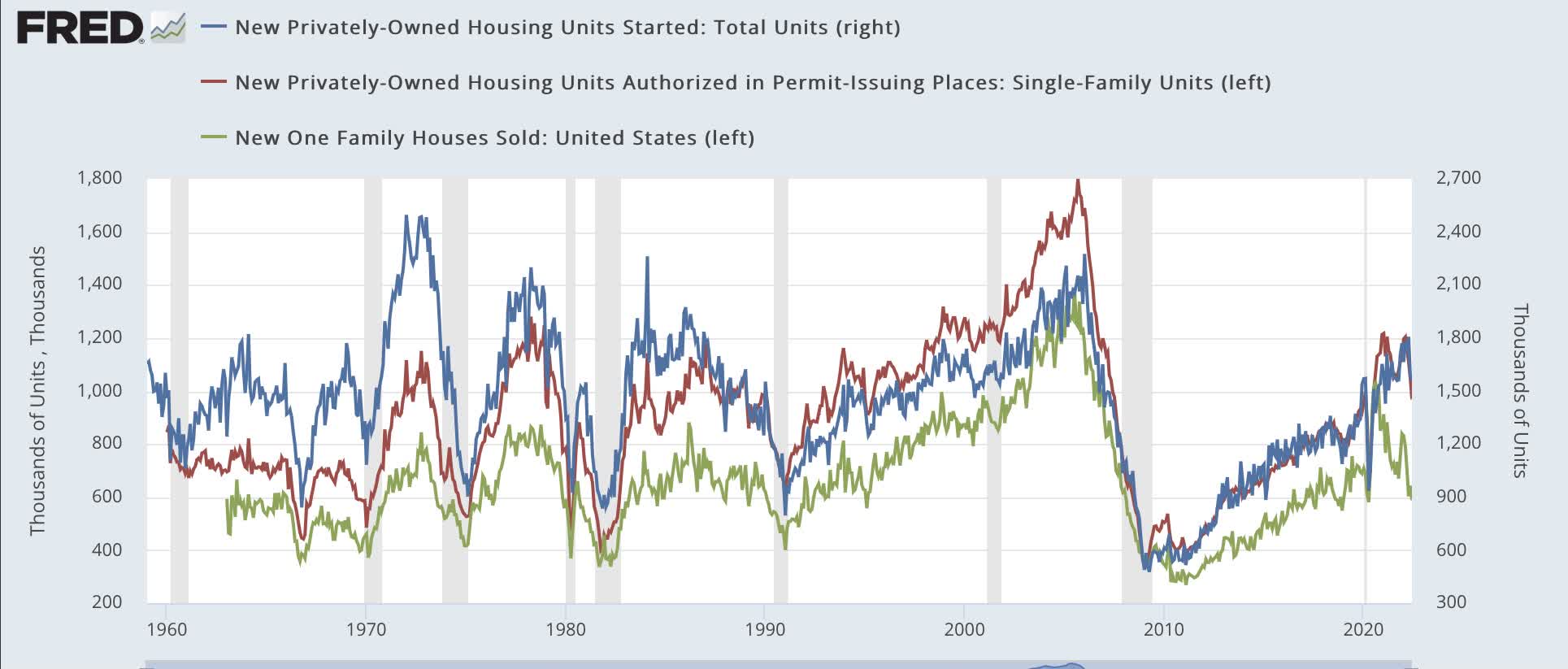
Housing followed the pattern of interest rates in 2021, peaking early before declining nearly 20% by early autumn and then recovering somewhat. This year so far, sales (the most leading indicator but very noisy) have declined by 30%, while single family permits (the least noisy) have declined 19%. Additionally, the three month moving average of housing starts (blue) is down 6% from its high earlier in spring:
Housing metrics (short term) (FRED)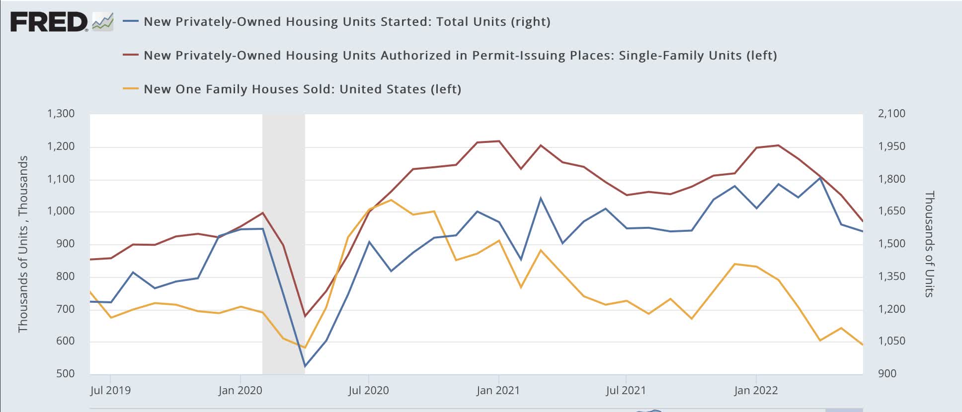
I have given the last measure extra weight this year, due to the record number of houses authorized but not yet started. In the last 2 months, starts have declined sharply.
Additionally, housing as a share of GDP declined further in Q2, and in real terms is now down 11% from its 3-year peak in Q1 2021:
Housing as share of GDP (FRED)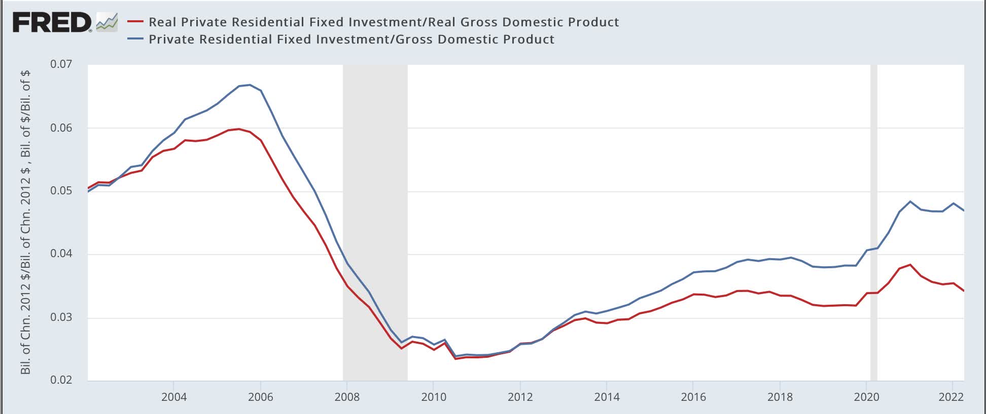
Housing is now a firm negative.
Corporate Profits
Corporate profits deflated by unit labor costs have an excellent track record going back over half a century as well. Below I show them both with and without inventory adjustments:
Corporate profits (FRED)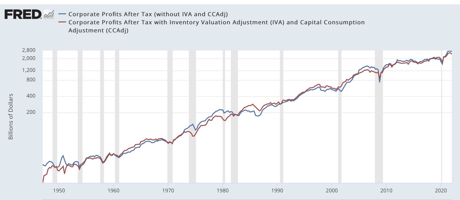
Through Q1 these are down from their respective peaks in Q2 and Q3 of last year, respectively, by -3.6% and -7.0%.
Although corporate profits will not be reported for Q2 until the next update in GDP at the end of this month, the placeholder of proprietors’ income was reported in July’s first installment. Frequently both corporate profits and proprietors’ income turn together, but sometimes proprietors’ income lags by 1 or 2 Quarters. But the actual leading metric deflates for unit labor costs, which also aren’t known yet for Q2. So here is a bar diagram for the last 21 months of the Quarterly % change in corporate profits (BLUE), proprietors’ income (dark purple), and unit labor costs (red):
Corporate profits and Unit Labor Costs (FRED)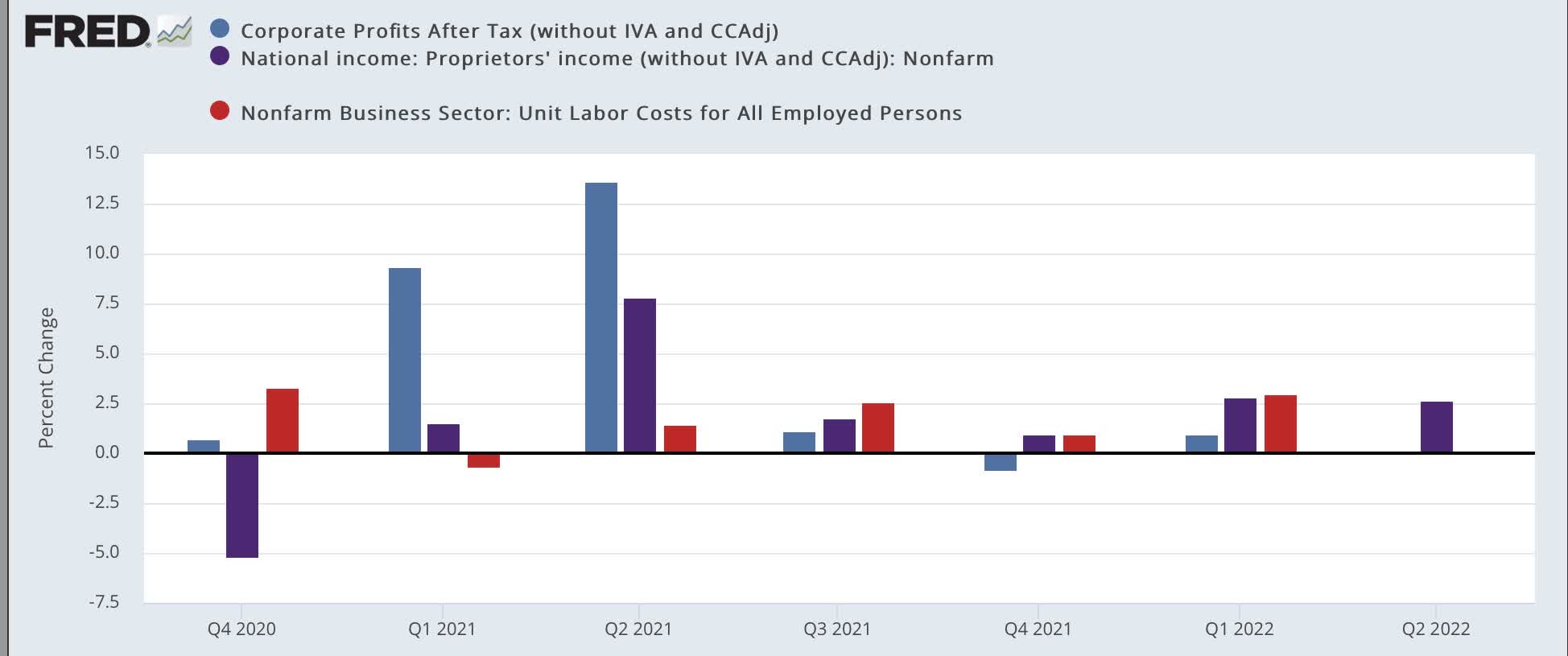
If unit labor costs rise in accord with their last 3 quarters, then proprietors’ income will still be slightly positive for the Quarter, but still below their peak in Q2 2021, a full year ago.
As a result, this indicator, which was neutral in January, is now a negative. At the same time, since Q2 improved over Q1, it is another item to remember in estimating when the economy is likely to turn back up.
Real Money Supply
No recession has ever started without at least real M1 turning negative or real M2 declining to under +2.5%. Here is this relationship going back over 60 years on a YoY% basis:
Real M1 and M2 (FRED)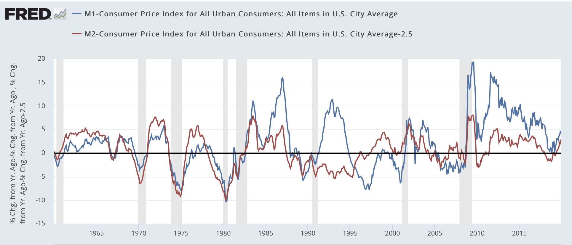
As of March, Real M2 turned negative YoY. It was joined by real M1 in May. Currently both are down -3.1 and -2.7%, respectively.
Real M1 and M2 (FRED)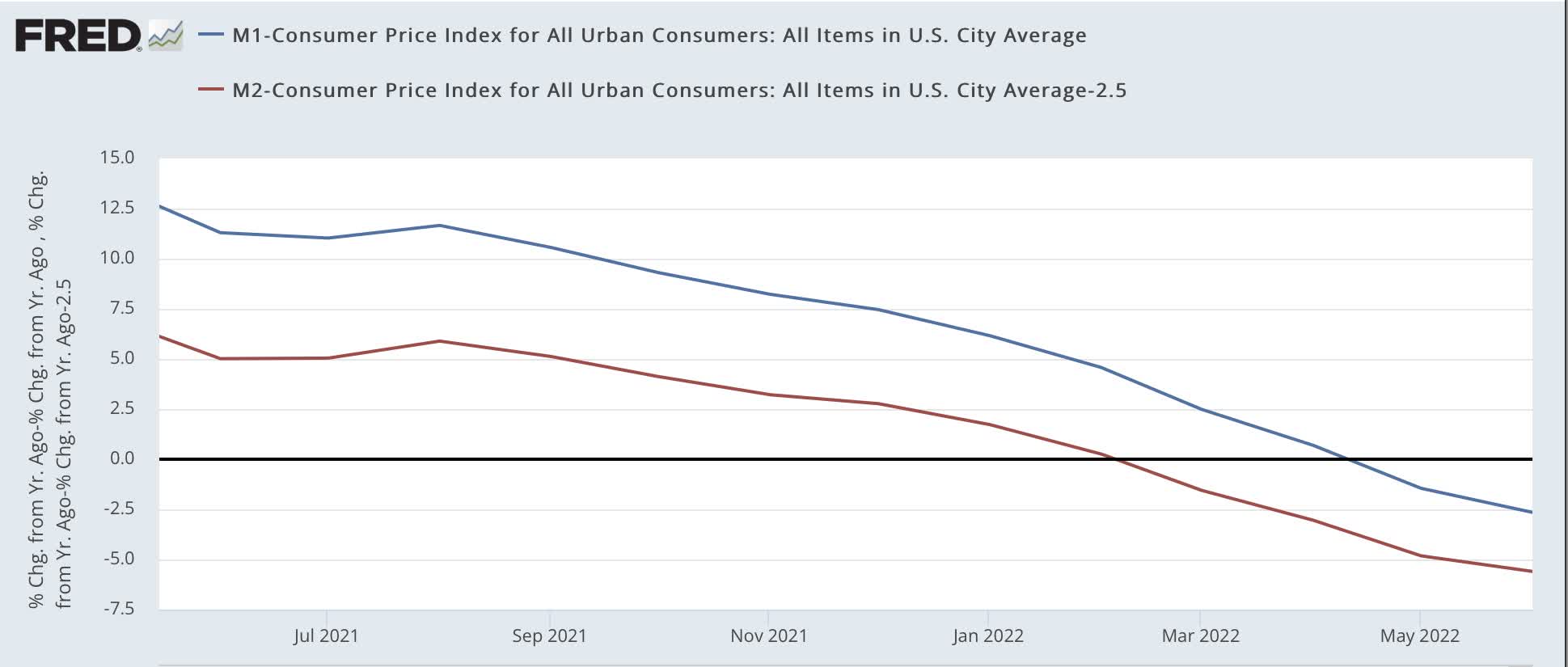
Real money supply is also a negative.
The Yield Curve
This has been an excellent long-range forecasting tool in times of inflation (although I do not think a positive yield curve is definitive in low interest rate deflationary environments). In the last 60 years, typically, a recession has begun after the Fed raises rates to combat inflation, and sufficiently so that the yield curve inverts.
Here is what the yield curve across the spectrum of Treasury maturities looked like at the beginning of January (dark red) compared with the end of last week (light red):
Treasury yield curve (Stockcharts.com)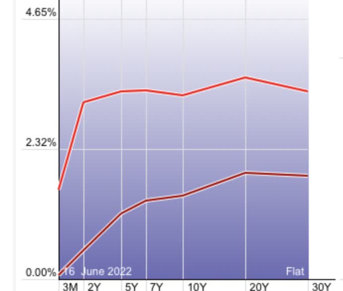
The maturity with the highest yield is the 1 year, at 2.99%. The curve is completely inverted from there out through 10 years, which yielded 2.66%.
Here is what 3 popular measures of the yield curve, the 10 year minus 2 year Treasury, 10 year minus 3 month Treasury, and 2 year Treasury minus Fed funds rate, look like for the past 10 years:
Treasury yield spreads (FRED)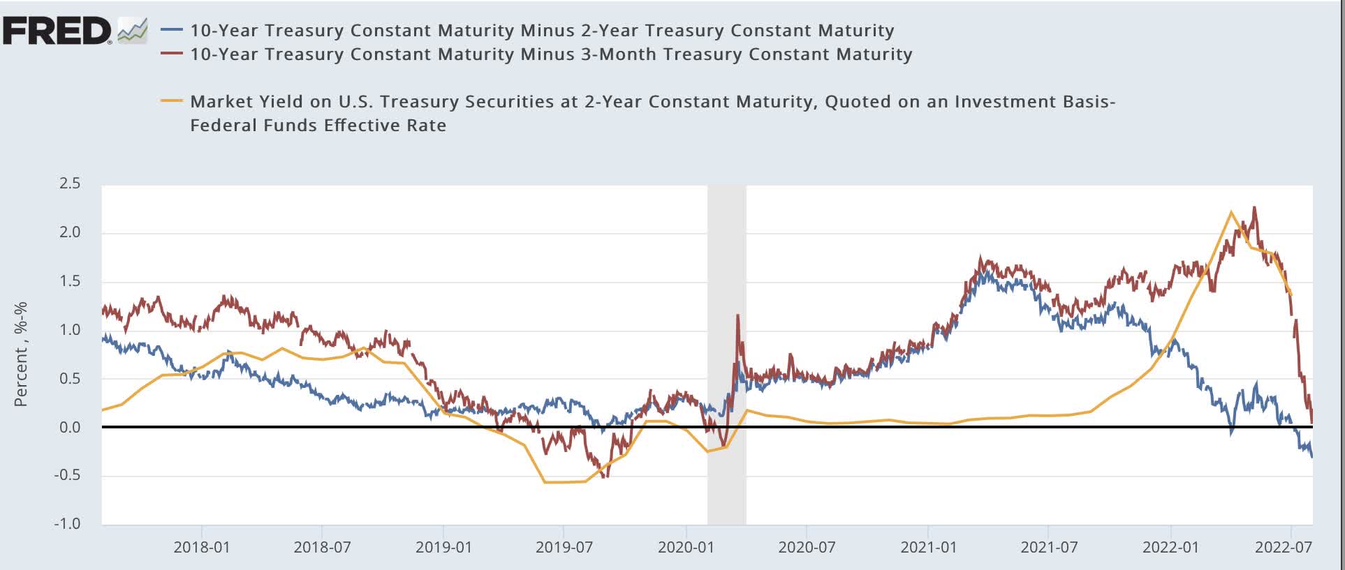
While the first measure has turned negative, the other two have not yet joined it. The reading from this indicator is mixed.
Credit Conditions
The loosening or tightening of credit also appears to be an important component of changes in the economy over one year out. Although it only has a 30-year track record, two components of the Senior Loan Officer Survey have had a good track record.
The first component, the percentage of banks tightening vs. loosening standards for commercial loans to large (blue) and small (red) firms, has turned very positive in the series. Note that a “positive” number actually means tightening. Don’t blame me!:
% banks tightening credit (FRED)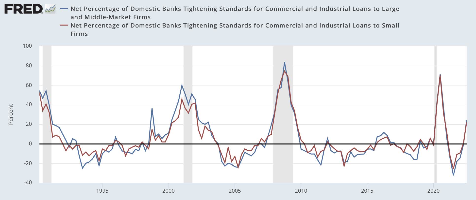
The second component, demand for loans by large (blue) and small (red) firms, however, turned even more positive to one of its stronger readings for the entire 30 year series – and, confusingly, for this metric positive really is positive!:
Firms’ demand for credit (FRED)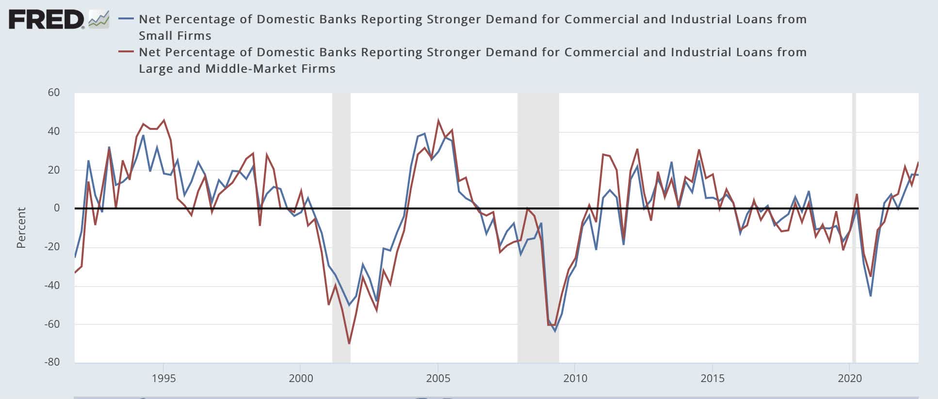
It is worth noting that the Chicago Fed Financial Service Index, Adjusted Financial Conditions (red) index, and Leverage subindex, which have a good record anticipating the Senior Loan Officer Survey’s result re tightening credit, also are at levels which, with two exceptions (1987 and 1998) signaled a recession within the next 12 months, and have been at those levels for three months:
Chicago Fed Financial Conditions Indexes (FRED)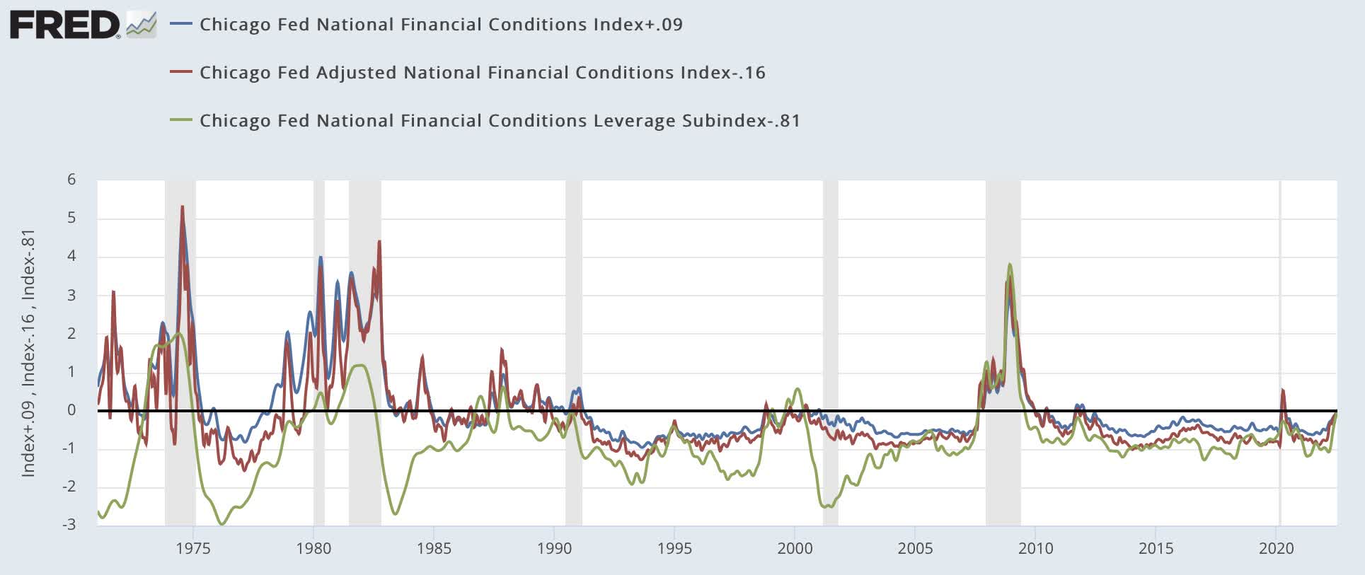
Because one indicator is negative (tightening conditions) and one is positive (demand for loans), this indicator is neutral.
Real Retail Sales Per Capita
These peaked more than a year before the onset of the last two recessions, but made troughs within six months of each recession bottom.
These made record highs last March and April, during the stimulus spending spree, then declined into autumn before rising again very slowly into April, their recent high at 0.5% above last May. They have declined again to -0.9% below May 2021 in the past two months:
Real retail sales per capita (FRED)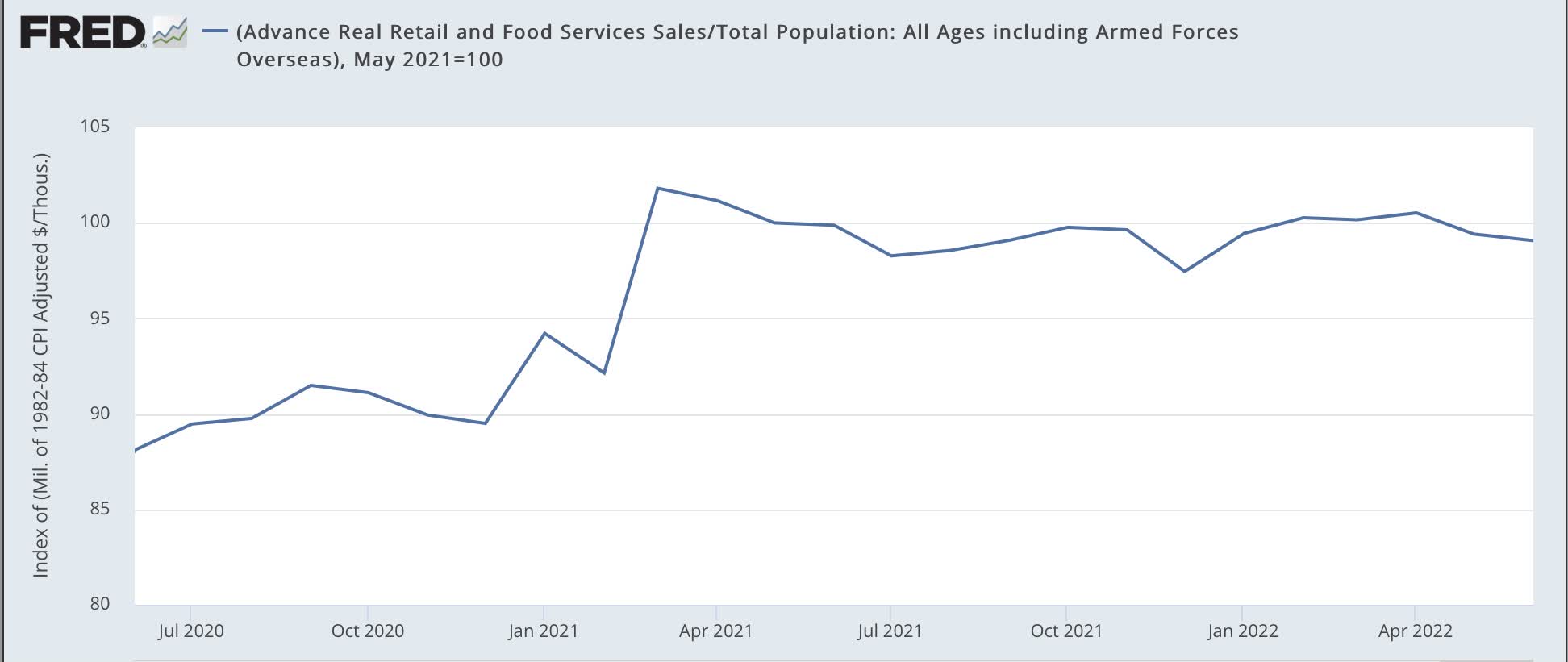
This special issue regarding the 2021 stimulus makes for a unique situation. Measuring since May 2021, there is no clear decline, but no significant advance either. As a result, these are neutral.
Summary And Conclusion
Let me point out, first of all, that this is a more comprehensive set of indicators, and in some cases, indicators with longer and better track records than are found in my more timely “Weekly Indicators” columns.
The indicators have continued to deteriorate in the past 6 months. As of now, not a single one is positive.
Three are mixed or neutral: credit conditions, real retail sales per capita, and the yield curve.
The remaining 4 – all of the indicators in Prof. Moore’s model – are now negative: corporate bonds, housing, corporate profits, and real money supply.
Further, recently two *may* have made a bottom, but the evidence is by no means definitive yet: corporate bonds and corporate profits.
Based on these indicators, the “Recession Watch” beginning in Q1 of 2023 remains in force. In other words, I anticipate that the coincident indicators of production, employment, sales, and income will continue to deteriorate in the immediate future. There is at present no reliable indication when the downturn might reverse.
I will update my short term forecast for the next 6 months separately.
Be the first to comment