

Worawut Prasuwan
About SPLG
This monthly article series reports sector metrics in the S&P 500 Index. It is also a top-down review of all funds tracking it. Among them, the SPDR Portfolio S&P 500 ETF (NYSEARCA:SPLG), launched in November 2005, is less popular than the SPDR S&P 500 Trust ETF (SPY). However, it has a lower expense ratio (0.03% vs. 0.09%) and a lower share price, offering more flexibility to investors who can’t trade fractional shares. It has about $13B of assets under management and an average daily volume of 3.8 million shares. SPLG pays quarterly dividends.
Shortcut
The next two paragraphs in italics describe the dashboard methodology. They are necessary for new readers to understand the metrics. If you are used to this series or if you are short of time, you can skip them and go to the charts.
Base Metrics
I calculate the median value of five fundamental ratios in every sector: Earnings Yield (“EY”), Sales Yield (“SY”), Free Cash Flow Yield (“FY”), Return on Equity (“ROE”), Gross Margin (“GM”). All are calculated on trailing 12 months. For all these ratios, higher is better and negative is bad. EY, SY and FY are medians of the inverse of Price/Earnings, Price/Sales and Price/Free Cash Flow. They are better for statistical studies than price-to-something ratios, which are unusable when the “something” is close to zero or negative (for example, companies with negative earnings). I also calculate two momentum metrics for each group: the median monthly return (RetM) and the median annual return (RetY).
I prefer medians rather than averages because a median splits a set in a good half and a bad half. Capital-weighted averages are skewed by extreme values and the largest companies. As a consequence, these metrics are designed for stock-picking rather than index investing.
Value and Quality Scores
Historical baselines are calculated as the averages on a look-back period of 11 years for all metrics. They are noted respectively EYh, SYh, FYh, ROEh, GMh. For example, the value of EYh for technology in the table below is the 11-year average of the median Earnings Yield of S&P 500 tech companies.
The Value Score “VS” is the average difference in % between the three valuation ratios (EY, SY, FY) and their baselines (EYh, SYh, FYh). The same way, the Quality Score “QS” is the average difference between the two quality ratios (ROE, GM) and their baselines (ROEh, GMh).
VS may be interpreted as the percentage of undervaluation or overvaluation relative to the baseline (positive is good, negative is bad). This interpretation must be taken with caution: the baseline is an arbitrary reference, not a supposed fair value. The formula assumes that the three valuation metrics are of equal importance, except in energy and utilities, where the Free Cash Flow Yield is ignored to avoid some inconsistencies. VS and QS are capped between -100 and +100 when the calculation goes beyond these values.
Current Data
The next table shows the metrics and scores as of last week’s closing. Columns stand for all the data defined above.
|
VS |
QS |
EY |
SY |
FY |
ROE |
GM |
EYh |
SYh |
FYh |
ROEh |
GMh |
RetM |
RetY |
|
|
All |
-14.28 |
10.54 |
0.0431 |
0.3695 |
0.0235 |
17.85 |
46.78 |
0.0453 |
0.4472 |
0.0296 |
14.98 |
45.90 |
9.80% |
-12.60% |
|
Cs. Discretionary |
-17.79 |
9.20 |
0.0423 |
0.5967 |
0.0205 |
26.74 |
33.75 |
0.0467 |
0.6621 |
0.0311 |
21.25 |
36.45 |
9.14% |
-19.60% |
|
Cs. Staples |
-12.45 |
-2.91 |
0.0412 |
0.4799 |
0.0164 |
24.04 |
37.91 |
0.0441 |
0.4981 |
0.0225 |
23.65 |
40.98 |
8.43% |
9.39% |
|
Energy |
100* |
100* |
0.1033 |
0.4544 |
0.0636 |
28.15 |
46.14 |
0.0183 |
0.5385 |
-0.0151 |
5.21 |
42.54 |
25.91% |
63.82% |
|
Financials |
-1.43 |
14.89 |
0.0760 |
0.4110 |
0.0667 |
12.84 |
79.98 |
0.0691 |
0.4524 |
0.0703 |
10.67 |
73.09 |
10.55% |
-13.18% |
|
Healthcare |
-6.50 |
7.08 |
0.0399 |
0.2708 |
0.0308 |
18.18 |
64.01 |
0.0374 |
0.3013 |
0.0367 |
16.23 |
62.65 |
9.41% |
-14.58% |
|
Industrials |
-28.50 |
9.34 |
0.0382 |
0.4004 |
0.0186 |
24.67 |
36.58 |
0.0471 |
0.5799 |
0.0289 |
20.62 |
36.94 |
11.84% |
-10.46% |
|
Technology |
-19.38 |
14.42 |
0.0365 |
0.2082 |
0.0294 |
26.87 |
63.07 |
0.0405 |
0.2864 |
0.0372 |
20.96 |
62.69 |
8.49% |
-18.20% |
|
Communication |
-22.92 |
-13.80 |
0.0369 |
0.6247 |
0.0146 |
11.66 |
56.18 |
0.0493 |
0.5269 |
0.0386 |
16.81 |
54.53 |
9.02% |
-27.62% |
|
Materials |
-4.42 |
13.59 |
0.0605 |
0.5866 |
0.0143 |
20.70 |
37.86 |
0.0449 |
0.6218 |
0.0248 |
16.92 |
36.11 |
8.01% |
-16.69% |
|
Utilities |
-13.72 |
3.39 |
0.0507 |
0.3977 |
-0.0741 |
9.81 |
41.34 |
0.0511 |
0.5423 |
-0.0464 |
9.67 |
39.23 |
1.92% |
2.69% |
|
Real Estate |
44.78 |
19.71 |
0.0332 |
0.1138 |
0.0116 |
8.81 |
64.30 |
0.0208 |
0.1150 |
0.0066 |
6.24 |
65.44 |
2.42% |
-21.85% |
*capped for convenience
Score charts
The next chart plots the Value and Quality Scores by sector (higher is better).
Value and quality in the S&P 500 (Chart: author; data: Portfolio123)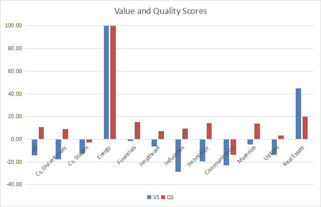
Score variations since last month:
Variations in value and quality (Chart: author; data: Portfolio123)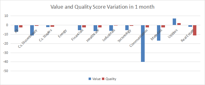
Momentum chart:
Momentum in the S&P 500 (Chart: author; data: Portfolio123)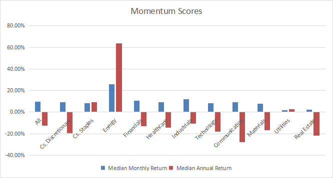
Interpretation
A hypothetical S&P 500 “median” company is overvalued by about 14% relative to average valuation metrics since 2011. Its quality score is about 10% above the baseline. We can translate median yields in their inverse ratios:
Price/Earnings: 23.2 – Price/Sales: 2.71 – Price/Free Cash Flow: 42.55
All this year, energy has been the best-ranked sector regarding my 3 scores in value, quality and momentum. Real estate also has excellent value and quality scores. Usual fundamental ratios are less meaningful in financials and real estate, but comparing aggregate metrics to their own historical averages makes sense. Financials, materials and healthcare are overvalued by less than 10% relative to 11-year averages. It may be justified by good quality scores. Other sectors are overvalued by 12% to 29% relative to the baseline. Industrials and communication are the most overvalued. All sectors are above the quality baseline, except consumer staples and communication. Communication had a sharp fall in value score since last month, despite a positive momentum for the same period. This points to a significant deterioration in the sector’s fundamentals.
SPLG and SPY are down -14.8% in 12 months, the median return of the S&P 500 is at -12.6% (reported above in the table) and the equal-weight average at -10.3% (measured on RSP). It means the capital-weighted index performance was slightly skewed to the downside by mega caps.
We use the table above to calculate value and quality scores. It may also be used in a stock-picking process to check how companies stand among their peers. For example, the EY column tells that a large consumer staples company with an Earnings Yield above 0.0412 (or price/earnings below 24.27) is in the better half of the sector regarding this metric. A Dashboard List is sent every month to Quantitative Risk & Value subscribers, with the most profitable companies standing in the better half among their peers regarding the three valuation metrics at the same time.
Be the first to comment