

Jun/iStock via Getty Images
A 60:40 allocation to passive long-only equities and bonds has been a great proposition for the last 35 years …We are profoundly worried that this could be a risky allocation over the next 10.”
Sanford C. Bernstein & Company Analysts (January 2017)
Bull markets are born on pessimism, grow on skepticism, mature on optimism, and die on euphoria”
Sir John Templeton
Life and investing are long ballgames.”
Julian Robertson
Introduction
Life is often a matter of perspective. One person’s tremendous struggle can be the source of another person’s opportunity. This was the case for much of the time period between 2010 and 2020, where downward pressure on commodity prices and downward pressure on interest rates created perhaps the best backdrop for big business in the United States in history. Traditional 60/40 investment strategies soared, with stocks and bonds both ascending to the heavens on seemingly lower interest rates forever.
The biggest stocks in terms of market capitalization had an additional benefit in the form of an increasing share of fund flows directed towards passive investment strategies. This mindless, price insensitive and valuation insensitive approach to investing, which has merits when used appropriately, created a top heavy stock market bubble.
This stock market bubble was merely the cherry on top of a sundae of an everything bubble, and we are starting to see the unraveling in 2022, as traditional 60/40 investment strategies have had one of their worst years on record. Rising interest rates are indeed proving to be the gravity of the financial markets, just the opposite of falling rates, and low rates for longer, which spawned the TINA acronym.
60/40 Portfolio On Track For Worst Year In 100 Years (Bank Of America)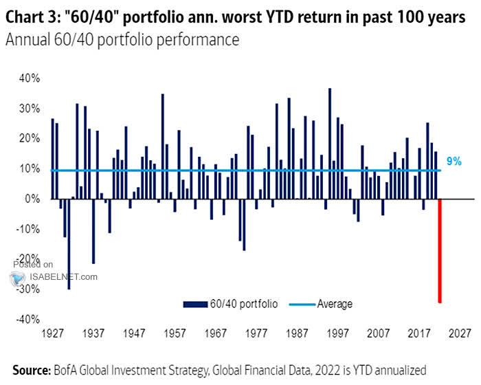
One sector, however, has stood out in terms of relative and absolute outperformance, and that sector is the energy sector, with the Energy Select Sector SPDR Fund (XLE) up 66.0% year-to-date in 2022 and the SPDR S&P Oil & Gas Exploration & Production ETF (XOP) up 58.6%.
XLE XOP XME SPY GDX QQQ 2022 YTD Performance (Author, StockCharts)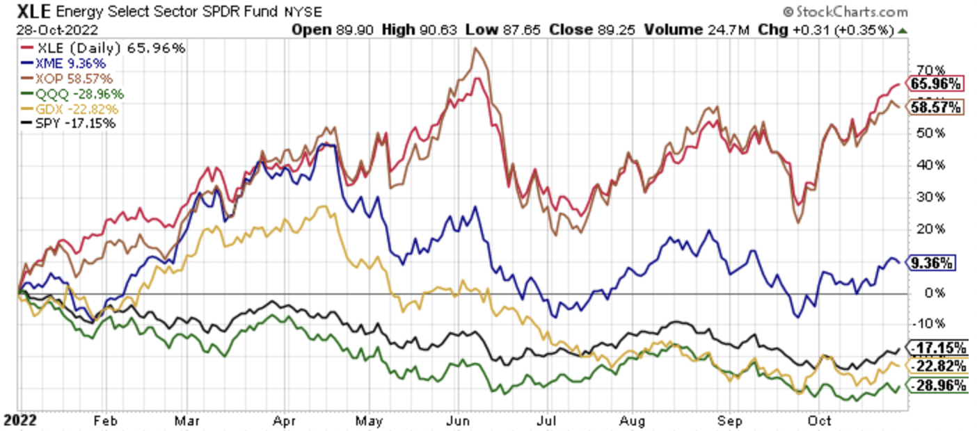
Energy has trounced the broader equity market, with the SPDR S&P 500 ETF (SPY) down 17.2% YTD, and the Invesco QQQ Trust (QQQ) down 29.0% YTD.
The outstanding 2022 for the energy sector follows a strong year of absolute and relative performance in 2021, with XLE higher by 53.3% in 2021, XOP higher by 66.7%, both handily ahead of SPY’s 2021 gains of 28.7%, and QQQ’s 2021 gains of 27.4%.
With energy equities surging, and energy prices ramping higher too, there have been many who say energy prices are too high. Building on this narrative, we have had one of largest strategic petroleum releases in history to curtail energy prices, specifically oil prices. The funny thing, however, is that crude oil prices were over $100 per barrel on average from 2008 to 2014, and adjusted for inflation, to get to equivalent prices today, crude oil prices would have to be much higher.
Oil Prices Through A Long-Term Perspective
WTIC oil prices have been very volatile over the last 30-plus years, however, they turned higher on a secular basis in 2000-2010, coinciding with China’s “S Curve” ascent into being a global economic power.
$WTIC Oil Prices Long-Term (Author, StockCharts)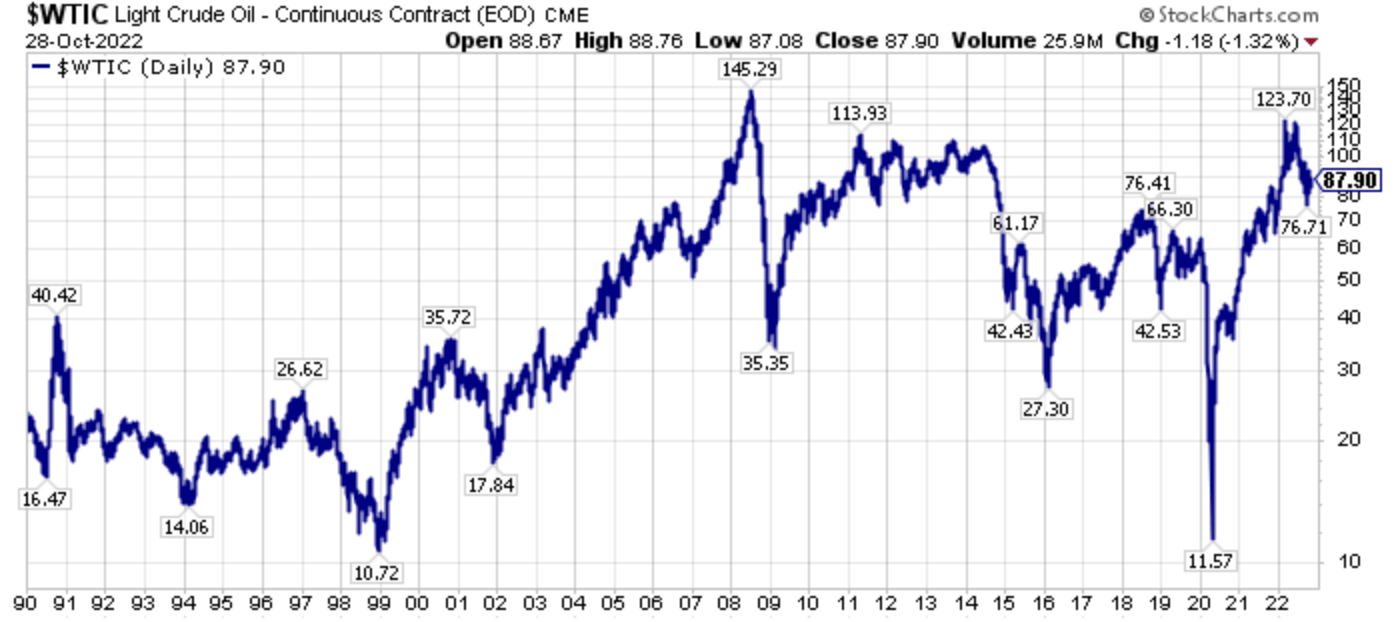
Peaking in 2008 before the financial crisis at a price over $145 per barrel, oil prices plunged into 2009; however, oil prices rebounded quickly and averaged over $100 per barrel from 2008-2014.
2014-2016 saw OPEC try to undercut U.S. shale oil growth, and this was initially successful. However, the plunge in oil prices from 2014-2016 caused a wave of bankruptcies among U.S. producers, who collectively emerged in a stronger position, having shed debt, and thus the U.S. oil industry, which was newly unencumbered, grew quicker from 2016-2020.
The surge in U.S. production growth from 2016-2020 was driven by high grading, meaning using the best tier-1 drilling locations, the increasing using of proppants, including sand and custom blended mixes, and it was driven by operators collectively plowing over 100% of their operating cash flows back into production growth. These temporal growth drivers eventually ran out of runway, with the best drilling locations disproportionately used, proppant usage maximized, and shareholders, fed up with years of losses, demanding shareholder returns from free cash flows.
In 2022, several years into an oil bull market following the pandemic lows, WTIC prices peaked over $120 per barrel, as positive supply demand fundamentals that have been building since 2019 were amplified by the Ukraine-Russia war. Since peaking earlier in the year, oil prices have fallen back to $87.90 at Friday’s close. We are constantly bombarded with the fact that oil prices are high, including the language around gasoline prices, but this ignores that oil prices were above $100 per barrel largely from 2008-2014. Additionally, we have had quite a bit of inflation since those prices.
Oil Prices Viewed In Inflation Adjusted Terms
Let’s take a look at the graph of WTIC oil prices again.
$WTIC Oil Prices Long-Term (Author, StockCharts)
Using an inflation calculator, 2008’s high price of $145.29 is equivalent to $200.29 today. Similarly, the $113.93 price in 2011 is equivalent to $150.33 in 2022 prices. Continuing this example, a $110.31 price in 2013 is equivalent to a $145.55 price in 2022. So looking at the chart above, without adjusting for inflation, oil is still cheap today, at $87.90 compared to the 2008-2014 price band. When you adjust for inflation, however, today $87.90 prices are remarkably cheap.
Using Exxon Mobil To View The Markets From Another Perspective
One of the articles that I look back upon with the fondest memories is this public article, where I outlined in August of 2020 how removing Exxon Mobil (XOM) from the Dow Jones Industrial Average (DIA) would be a mistake.
More specifically, the article opined that replacing the venerable, longest listed Dow Jones component with Salesforce.com (CRM) would turn out to be a high water marker for the current state of the financial markets. Since that fateful date, where active decision makers at S&P Global (SPGI) removed Exxon and added Salesforce.com because they thought that Salesforce.com was more representative of the future of the market, Exxon shares have trounced the performance of Salesforce.com shares.
XOM Versus CRM Since August 2020 (Author, StockCharts)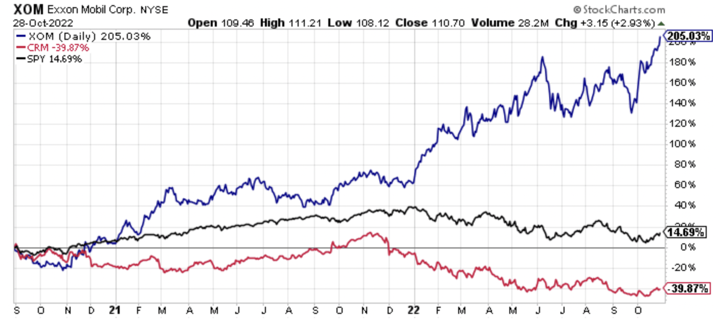
Exxon shares are up a sizzling 205.0% compared to Saleforce.com’s loss of 39.9% since late August 2020. Even with this very strong share price performance, Exxon’s market capitalization is below $500 billion, good for ninth place in the S&P 500 Index (SP500), ranking behind Apple, Microsoft (MSFT), Alphabet (GOOGL) (GOOG), Amazon (AMZN), Tesla (TSLA), Berkshire Hathaway (BRK.A), (BRK.B), UnitedHealth Group (UNH), and Johnson & Johnson (JNJ).
Remarkably, Exxon’s market capitalization is less than 1/5th of Apple’s market capitalization, which is roughly $2.5 trillion, even though their third quarter 2022 profits were very similar, with Exxon nearly matching Apple in profits.
Continuing on this narrative, if you could take a time machine back to April of 2008, which we can via Visual Capitalist, Exxon Mobil had a similar market capitalization back then to what it is today, and Exxon Mobil was the largest market capitalization stock in the world at the time, a title it largely held from 2005-2010. Interestingly, PetroChina (OTCPK:PTRCY), which Buffett and Berkshire owned at one point, was the second-largest market capitalization company. Interestingly, today, Buffett and Berkshire have aggressively bought the energy sector again, this time in the form of purchases in Chevron (CVX), and Exxon peer and competitor, and Occidental Petroleum (OXY).
April 1st, 2008 Market Capitalizations (Author, Visual Capitalist)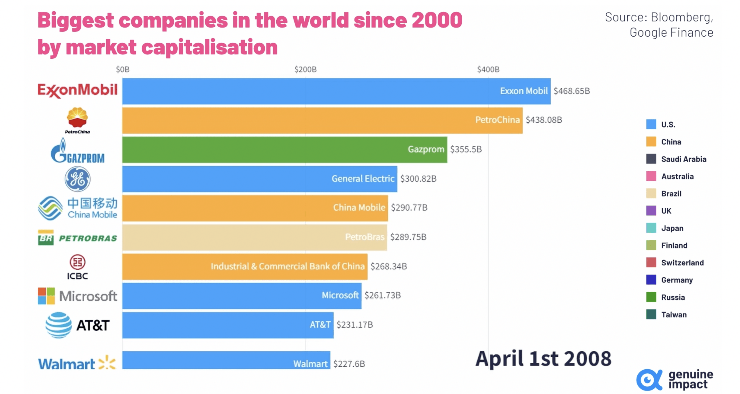
Taking a look at historic market capitalizations is interesting; for example, the other day, I was looking back to January of 2000 and looking at Intel (INTC) and it was pretty remarkable how that stock has performed the last 20-plus years now. Looking at this chart above, notice that Apple in April of 2008, had not yet broken into the top 10 companies. In fact, Apple had a deal with AT&T (T) to distribute the iPhone, and AT&T had a larger market capitalization than Apple in 2008.
Moving forward in our time machine from April 1, 2008, to January 1, 2010, we see now that Exxon Mobil was just behind PetroChina, and moderately ahead of Microsoft, BHP Group (BHP), and Walmart (WMT). Meanwhile, by 2010, not only has Apple surpassed AT&T in terms of market capitalization but a host of companies, with Apple now firmly inside the top-ten market capitalization list.
January 1st, 2010 Market Capitalizations (Author, Visual Capitalist)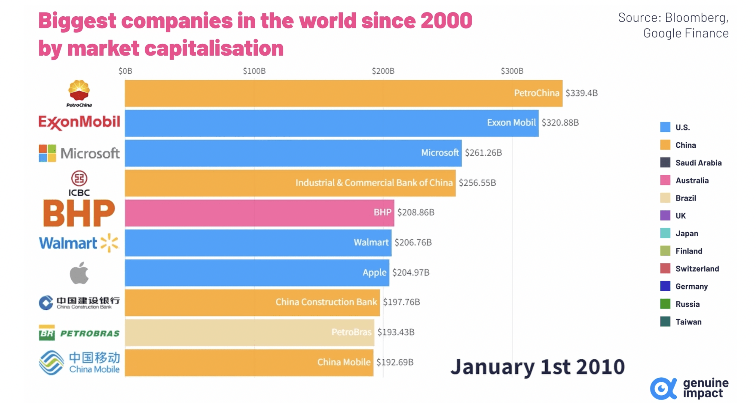
Fast forward all the way to July of 2022 and look at the almost unbelievable changes in this top-ten list of market capitalizations. Apple was just behind Saudi Aramco (ARMCO), with Exxon Mobil not on this list.
July 1st, 2022 Market Capitalizations (Author, Visual Capitalist)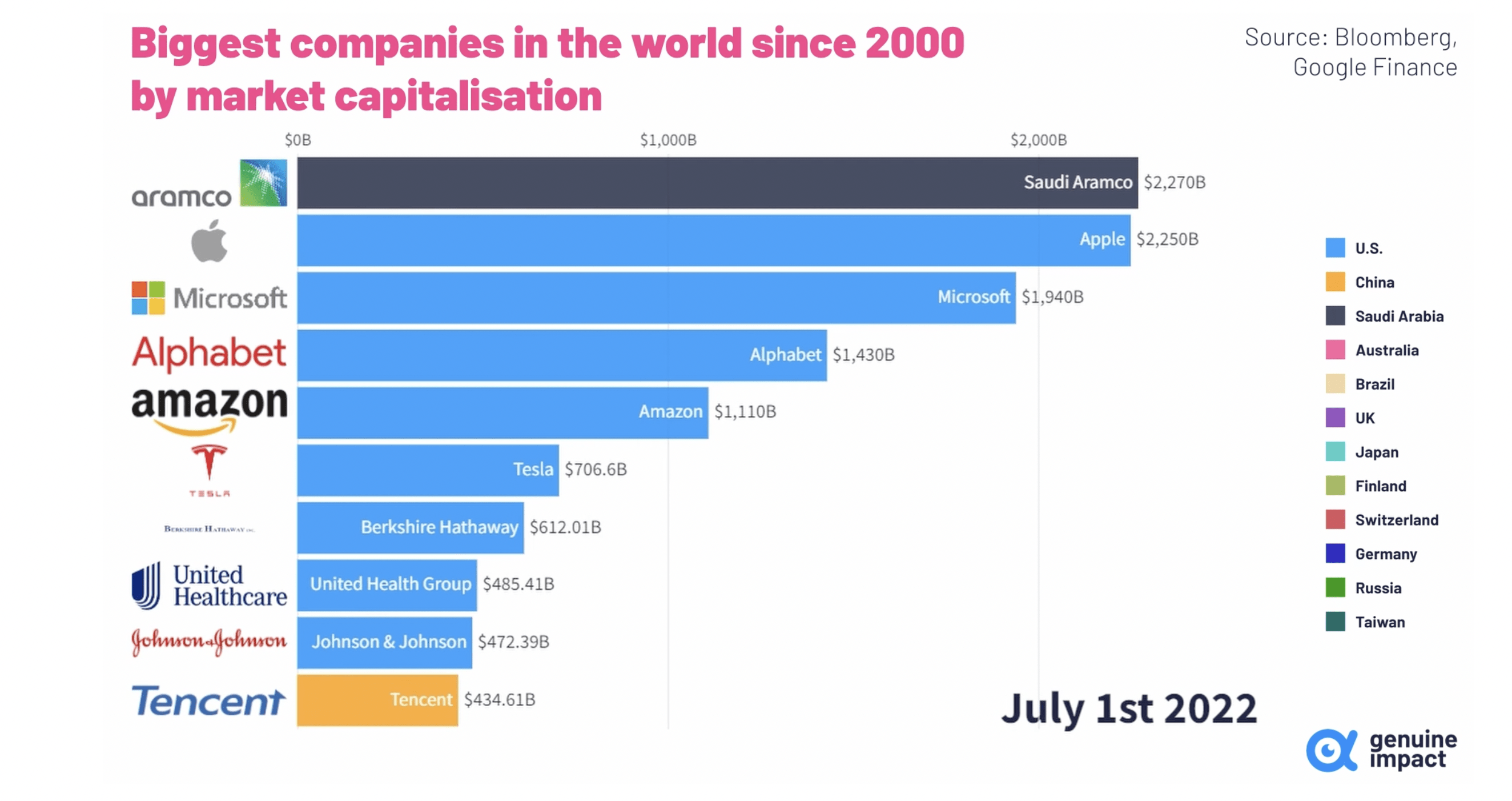
Of course, if this list were updated today, as we have discussed earlier in this section of the article, Apple has roughly a $2.5 trillion market capitalization, and Exxon Mobil is closing in on the $500 billion market capitalization, though Exxon is still behind United Healthcare and Johnson & Johnson in terms of market capitalizations. The key difference with Exxon is both earnings growth and free cash flow growth have accelerated in 2022, while most of the technology-oriented majority of this list has seen their earnings growth and free cash flow growth stagnate. In fact, as we said earlier, Exxon’s third quarter 2022 profits are on par with Apple’s profit.
Looking at the long-term stock price performance chart of Exxon Mobil, we can see that Exxon’s shares are at all-time highs. Now remember, our examination of oil prices earlier, which are not only not at 2008-2014 highs, but they are a long way away from these inflation adjusted highs.
XOM Long-Term Stock Chart (Author, StockCharts)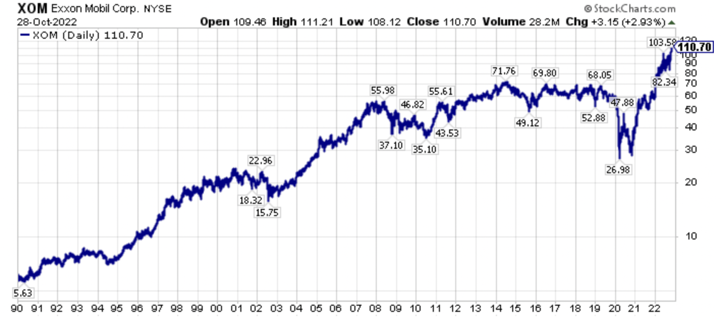
The recent price strength breakout to all-time highs in XOM shares came after a severe stock price breakdown in the midst of the pandemic, and after a long period of consolidation, or going sideways. This consolidation phase lasted over 12 years, which is food for thought for some of the stocks that have consolidated in a range, like Realty Income (O), which has run in place for over six years now.
Given how much bigger Apple’s market capitalization is compared to Exxon’s today, with a similar level of profits, this gap in market capitalizations is poised to close further, which could be spurred on by a further increase in oil prices. Again, this is probable, as oil prices could potentially go much higher, especially in inflation adjusted terms.
Closing Thoughts – A Reversion To The Mean Is Just Getting Started
Given how much energy stocks have rallied year-to-date in 2022 and how much they have outperformed the broader market since their March 2020 lows, it is tempting to say oil prices are high, and the run in energy stocks is over. While easy to say, or rationalize, that statement could not be further from the truth, as oil prices are still substantially below their 2008-2014 price band, and this is especially true when viewed in inflation adjusted terms.
So, yes indeed, energy stocks have significantly outperformed, particularly since March 23rd of 2020, which marked the broader equity markets’ bottom.
XOP XLE XME SPY QQQ GDX Performance Since March 23rd, 2020 (Author, StockCharts)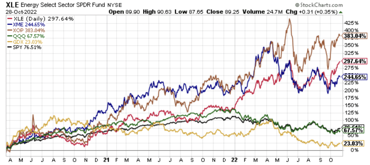
Material stocks, as measured by the SPDR S&P Metals and Mining ETF (XME) have outperformed as well, with precious metals equities, as measured by the VanEck Vectors Gold Miners ETF (GDX) the significant laggard. Even with the historic outperformance by energy equities in the last couple of years, Apple still has a larger market capitalization than the entire combined market capitalizations of all the U.S. listed energy equities, and energy stocks still only make up roughly 5% of the S&P 500 Index.
Energy 5.1% Of The S&P 500 Index (Bloomberg)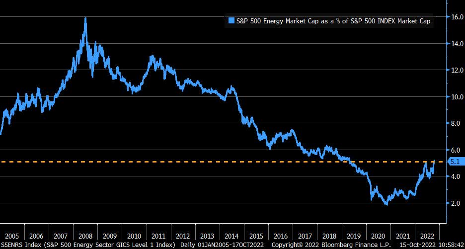
Comparatively, Apple is roughly 6.8% of the S&P 500 Index as I write this article, with Microsoft at roughly 5.3% of the S&P 500 Index, so the entire energy sector is eclipsed by the market capitalization of two, individual single companies. This simple fact probably illustrates that there is more room to go in the reversion-to-the-mean trade.
The untold story with the rise in energy equities is that this is a supply side story. Going further, the capital cycle is playing out in real time as energy equities collectively emphasize shareholder returns, specifically buybacks and dividends, diverting operating cash flows that used to almost entirely be reinvested back into operations. This, along with still low valuations, has interrupted the normal capital and created a backdrop for a secular bull market.
Capital Cycle (GMO)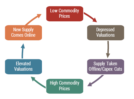
With traditional 60/40 portfolios suffering their worst year in a very long time, investors will be looking for non-correlated sectors and non-correlated stocks, so there is room for the energy sector to attract further investor flows. Notably, this dual decline in stocks and bonds year-to-date in 2022 is impairing the traditionally popular 60/40 portfolio as well as the previous very in-favor risk parity strategies. On this note, commodity stocks, specifically the once loathed, and still generally unloved energy equity sector, certainly fit the bill as a portfolio diversifier, and enhancer, which we have seen play out in spades in 2022.
Resource Equities Have Had Low Correlations To The Broader Market (GMO)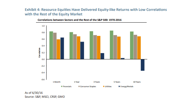
Wrapping up, quietly at first, and now more rapidly as the capital rotation has broadened in scope, we have seen a passing of the baton of market leadership. At this juncture, many investors may think it is too late to jump on board, however, energy prices are still comparatively low, with oil prices trading far below where their 2008-2014 price band would be if these prices were inflation adjusted.
Recognizing this changing backdrop after years of study, including being too early, I have been pounding the table on the extremely out-of-favor commodity equities for several years now, and I still think we’re in the early innings of what will be a longer-term secular bull market, albeit with significant volatility. Personally, I think we will supersede the capital rotation that took place from growth-to-value during 2000-2007, which also coincided with the last secular commodity bull market which ran from 2000-2008.
Investors skittish of commodity equities should research cast aside financials as they also will benefit from a renewed steepening of the yield curve, which is probably forthcoming following the eventual Fed pause and pivot, whenever it occurs, which could even be a year out at this juncture.
Understanding the bigger picture, then having an understanding of the bottoms-up fundamentals has been the key to outperformance, and this is a path that has not been easy with those participating confirming this reality. However, the road less taken is sometimes the better one, and I firmly believe that today, as traditional stocks, bonds, and real estate continue to offer very poor starting valuations, though they’re better than at the start of this year when I opined it was better to be in cash for the next seven years, and very poor projected future real returns from today’s price levels. More specifically, the out-of-favor assets and asset classes, including commodities and commodity equities and out-of-favor specific securities, are where the historic opportunity has been, and that’s where it still stands, from my perspective.
Be the first to comment